Categories: General

Progress in the making

Since posting the seven initial design directions for the Mozilla brand identity three weeks ago, we’ve continued to shape the work. Guided by where Mozilla is headed strategically, principles of good design, and the feedback we’ve received through this open process, today we release four design contenders. These will continue to be refined over the course of the next two weeks, then put through global consumer testing. We expect a brand identity recommendation to emerge in October.
mj_tm_Moz_Nashville_edits for new pics.key

If you’re just joining this process, you can get oriented here and here. We’re  grateful that this process has sparked such interest among Mozillians, those who care about Mozilla, and the global design community—dozens of articles, hundreds of tweets, thousands of comments, and perhaps tens of thousands of words of feedback. As believers in transparency at Mozilla, we consider this a success.

Thanks to all of you who have added your voice to the conversation. Your many constructive comments and suggestions have helped us chart a path forward. Some of you will find that your favored design directions have been let go in the pursuit of something better. We hope you’ll find a design here that you feel best represents Mozilla today and tomorrow.

mj_tm_Moz_Nashville_edits for new pics.key

Some that we’ve left behind.
Of our original seven, four have fallen by the wayside, one has remained intact and two others have directly led to new ideas. We have let go The Open Button, which upon further study we found lacked a clear connection to Mozilla’s purpose, and Flik Flak, which had its fervent supporters but was either too complex, or too similar to other things, depending on your point of view.

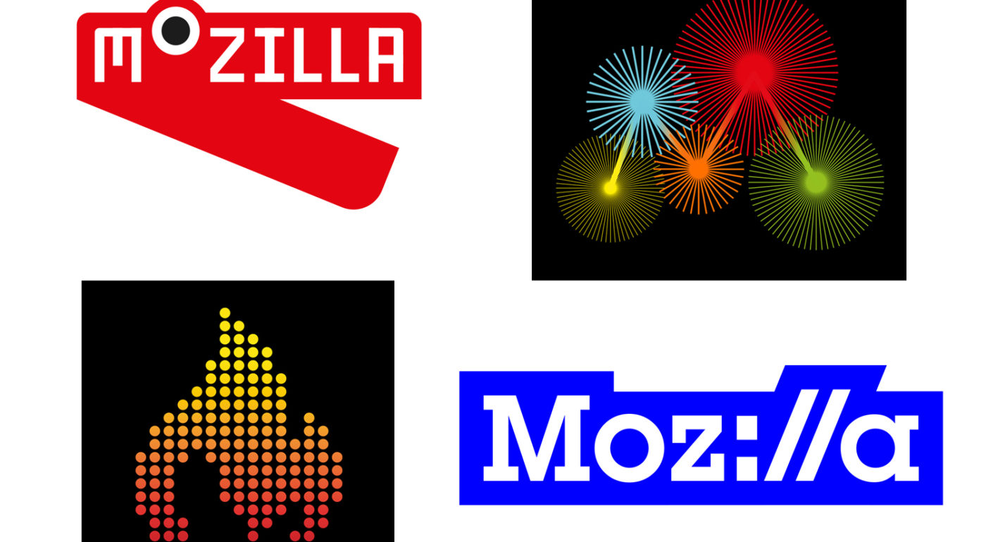
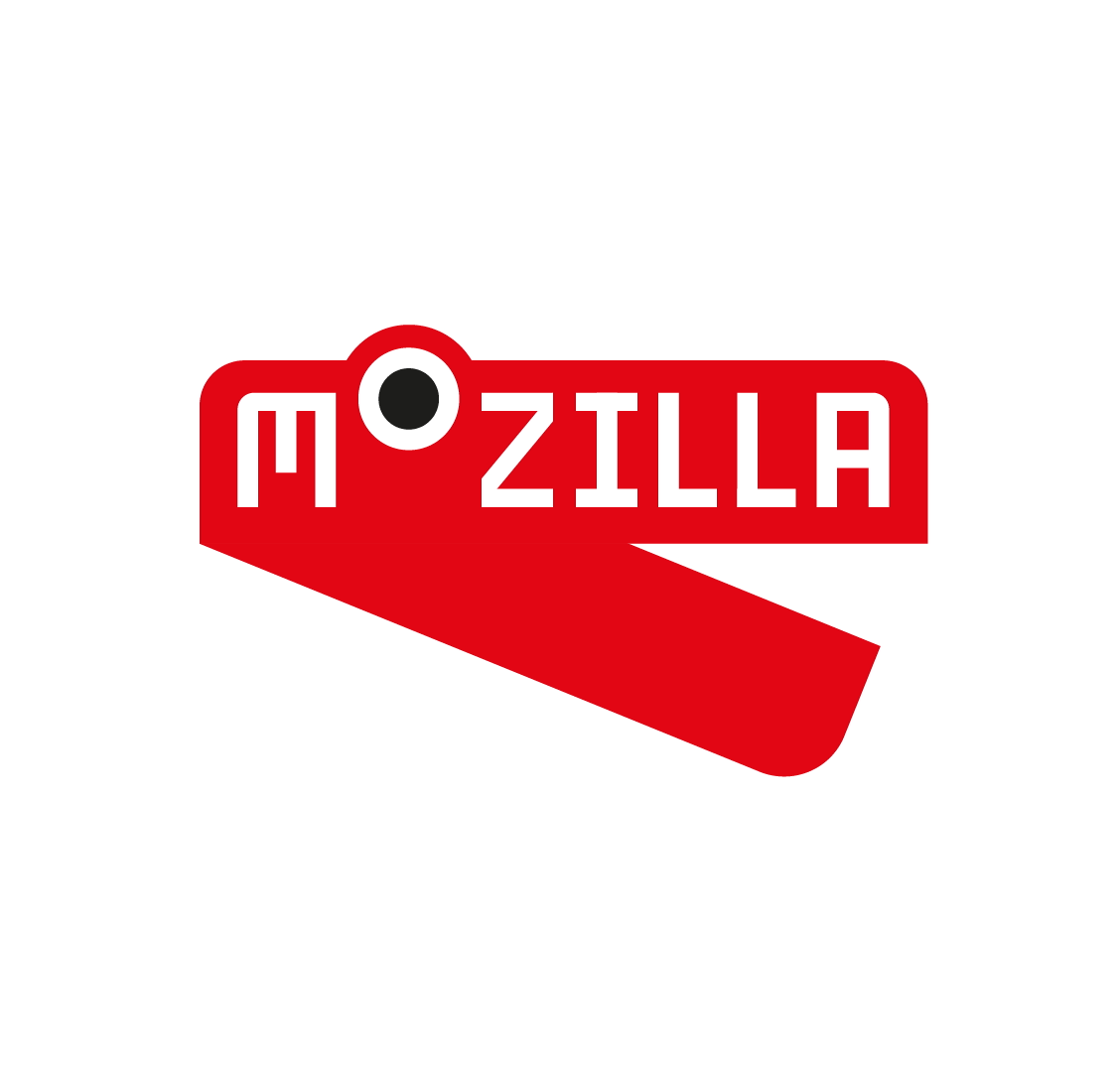
For many, The Impossible M was an early favorite, but we discovered that it was just too close to other design treatments already in the public domain. The Connector stayed in the running for some time, but was eventually overtaken by new ideas (and always slightly suffered from being a bit too complex).

What we resolved to do next.
Working in tandem with our London agency partner johnson banks and making the most of our time zone difference nearly around the clock, we agreed to redirect efforts toward these design goals:

  • Focusing first on the core marks, particularly on their visual simplicity, before figuring out how they extend into design systems.
  • Exploring the dinosaur. From the blog feedback, it was clear that we had permission to link more directly back to the former dinosaur logo. Aside from The Eye, what other paleo elements might we explore?
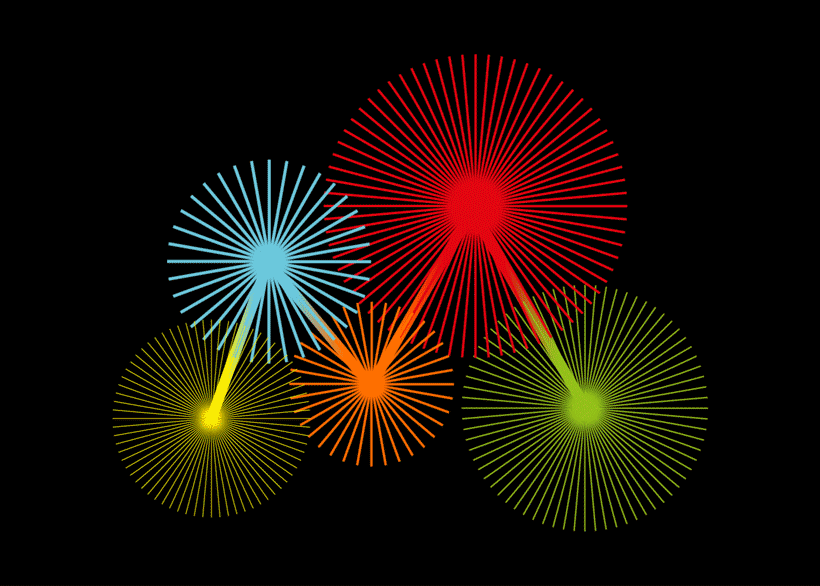
  • Celebrating the Internet. Rather than seeking ways to render the Internet in three dimensions (as Wireframe World and Flik-Flak had bravely attempted to do), might be influenced by the random beauty of the Internet works and how people use it?
  • Refining and simplifying the two routes, Protocol and Wireframe World, that showed the most promise in the first round.
How the work links to the core narratives
At this stage of the project, we’re down to four overarching narratives, three from the original set and a new one:

The Pioneers: This is still a strong and resonant territory, and one that works well with at least one of the final four.
Taking a stand: This positioning emerged directly from our earliest discussions and is still very strong.
The maker spirit: We’ve seen from the first round, the community of Mozillians is vocal and engaged and is key to the organization going forward.
The Health of the Internet: This is a new idea that posits Mozilla is a guardian and promoter of the Internet’s overall well-being.

The Final Four
Below is our continued work in progress on the four refined identity directions that we’ll take into testing with our key audiences. Please click on the image to be taken to a page revealing the related design system, and make individual comments there. If you wish to compare and contrast these designs, please do so in the comments section below.
Route One: Protocol
protocol_master_logo
 
Route 2: Burst
burst_rotating
Route 3: Flame
flame_flicker
Route 4: Dino 2.0
dino_2-0_chomping1So there you have it: four final directions. Let us know what you think!

117 comments on “Progress in the making”

  1. Tehmul Ghyara wrote on

    Dino 2.0 combined with Protocol :)

    1. Justen Stall wrote on

      Yeah if there was a logical way to blend elements of a dinosaur into Protocol, that would be awesome

      1. Filippo Gianessi wrote on

        I agree, but maybe the dino is too related to google chrome, if I think of dinosaurs plus browsers, I think to the chrome’s offline mini-game.. Don’t know, just a thought I had!

        1. Sinchan wrote on

          How about this combo of Dino + Protocol?

          mozillalogo

          1. Sinchan wrote on

            Higher res version!

            mozillalogo-1

    2. Leônidas wrote on

      THIS!

    3. Ybalrid wrote on

      Great idea!

    4. Dustin Emory wrote on

      Yes! Exactly what I was thinking as well.

  2. nnethercote wrote on

    Round 2 is a lot stronger than round 1! Good to see.

    Burst does nothing for me. Busy, uninspiring, doesn’t mean anything. The other three are all pretty good. Though Dino 2.0 looks like a stapler, and might be too cute for its own good, and age badly. Protocol was my favourite from the first round, and I still like it a lot. Flame looks good, but I’m not sure about the connection to Mozilla.

    1. Seth Angel wrote on

      Burst while I agree with you that it’s busy, it’s pretty obvious that the different colored bursts are connected in a large “M” which forms the center of the logo.

  3. Gerald wrote on

    First impressions, from best to worst:
    1. Protocol: Still one of my favorite ones, thank you for exploring it further.
    3. Flame: I really like the look & animation, but I have difficulty seeing the ‘M’ in it.
    4. Dino stapler: Meh, a bit too simple. Childish-looking?
    2. Burst: Headache-inducing for me. Literally, I can’t look at them for longer than a few seconds! :-(

    Is it ok to pinch some of the discarded designs? They’d make nice t-shirts! (Personal printing of course.) If yes, could you please store high-def versions somewhere, e.g.: assets.mozilla.org?

  4. Michelle Marovich wrote on

    I love bringing back the Dino. I’d vote for that in a heartbeat.
    But on first glance the current design is Wilson’s red stapler from Office Space. I can’t unsee the stapler, which seems to be pretty antiquated for an internet organization.

    The flame idea is nice but, like Burst, it doesn’t say anything to me. The animation is busy and Burst also hurts my eyes.

    I’m left with Protocol as the only really solid choice out of these 4. I wish it incorporated the Dino color scheme in some way.

    I do appreciate your process, patience and willingness to engage Tim, we are definitely getting somewhere!

    Protocol is my current only choice then.

  5. esphen wrote on

    Great to see the return of the dino! I always loved that guy. Also, I feel red is Mozilla’s colour. Hopefully you will explore variations of that logo

    Though protocol is promising, the blue is a bit dominant, and it still has issues with looking eerily similar to the curl logo

    The other two logos are just not good enough for mozilla!

  6. Gene Wood wrote on

    I agree with nnethercote that this round is much better than the first.

    Burst : This doesn’t speak to me, it seems very abstract
    Dino 2.0 : This looks too childish and I don’t think sends the right message about Mozilla
    Protocol 2.0 : This one is ok, I like the idea, the blue and white doesn’t look great to me
    Flame : I like this one, if I had a vote I’d say this is the way to go.

  7. Camden Narzt wrote on

    My opinions for what they’re worth:

    Protocol: Still my favorite.
    Flame: Reminds me of Tinder, not a good thing.
    Dino: Looks like a stapler, need to add at least one tooth.
    Burst: Scrolling that down the page gives me a headache.

  8. Theo Albers wrote on

    I like simple designs, so that leaves Protocol and Dino 2.0. I think red is a bad choice, since https://www.quora.com/Why-is-red-colour-associated-with-danger. Blue could be associated with no risks, boring.
    I’m a big fan of the Firefox logo especially because of the world association.
    What about the Protocol logo, but without blue background and with some nice font / color.

    1. Kal wrote on

      Except red is also known to draw in the most customers. Red is the best color choice for company logos, with blue being a good second … at least that was what I read a few years ago.

  9. Les Orchard wrote on

    Burst & Flame look like fun HTML5 Canvas demos, but not what I’d really want to use as a logo. Burst also hurts my eyes with the moire patterns, FWIW.

    Protocol is nice & old-school, kind of against the grain of a lot of modern browsers hiding the http:// in the URL bar. Still, nice emphasis on the web in our DNA

    Dino, I like the best, because I’ve always loved the Mozilla dinosaur and have been sad & disappointed when I hear word that our branding plans get farther & farther away from those roots.

  10. Regnard Raquedan wrote on

    How I would rank it:

    1 – Dino 2.0
    2 – Protocol
    3 – Flame
    X – Burst

    While the Dino looks a bit childish, it exudes the friendly, accessible, and open values of Mozilla. Protocol looks a bit cooler, but there is an aspect of pretentiousness that divides a line between techies and non-techies.

  11. Nathan Bylok wrote on

    This second round definitely shows a lot of refinement and I am all for positing that Mozilla being a guardian and protector of the web!

    Of these four I see Protocol and Dino as the strongest identities going forward. Burst and Flame, I feel, have at best abstract associations with Mozilla’s mission, and could just as easily work for brands associated with music, marketing, etc. Flame also reminds me of Drupal’s logo, if we are speaking to associations.

    Of the two I like, Dino is my absolute favourite! First impressions are of a brand with a lot of personality and memorability. It will be very easy for people to recall this logo, and the identity that can be built around it will be personable and captivating, to say nothing of going back to Mozilla’s roots (I had, full disclosure, thought the last iteration of Dino to be conceptually the weakest of its bunch and had advocated for other concepts in that round). That said, I agree with the comments above in that it may be too childish at present. Some exploration of the personality of that dino is in order!

    1. Nathan Bylok wrote on

      First sentence should be:
      This second round definitely shows a lot of refinement and I am all for positing that Mozilla is a guardian and protector of the web!

  12. Allen Meyer wrote on

    Protocol: This has the feeling of inevitability about it. It is a strong, playful and well, a bit safe. It is a vast improvement over the current word mark. I am a bit concerned the entire visual language is mostly typographic based and perhaps a bit impersonal. Which leads me to:

    Dino 2.0: As much as I loved the graphic strength of the first version, I was deeply concerned about unintended associations. Dino 2.0 really challenges the status quo and is memorable. There is something a bit too childish about it, it’s gone too far from the first version, which leads me to:

    I’m with Temul here: Protocol + Dino 2.0 mashup!!!

    The other two:
    Flame: The M in the flame is just not recognizable. If you want to play the negative space game, take a look at the FedEx logo/arrow mash-up for how this works. Fire: Lovely symbolism, but gosh, a bit too common, unless we want to have a strong relationship to FIREfox.

    Burst: Great strategic thinking here but the execution is kind of an art school exercise that hurts my eyes.

    One last thought: I’m attaching an image here from an email newsletter I got (the origin of which I’ve forgotten, I did not create it). I keep wondering, how is the new Mozilla logo going to look in the ecosystem of tech brands? I think a version of Protocol or Dino is going really stand out

    inside-design-hero

    1. Karla Hernandez wrote on

      Yo podria estar de acuerdo con esto un mashup de protocol y dino podria ser una mejor propuesta… aunque en lo personal ninguna me gusta. Como miembro mozilla no me identifico con niguna ni aun despues de leer el significado…

    2. Kal wrote on

      If they were to remove the background/outline from Protocol, it would fit in with those in that image perfectly. It could be very professional then.

  13. Wesley wrote on

    I think that protocol is still my favourite, but I’d like to see it in the same color red that Dino 2.0 is, that way we can keep part of the original brand.

  14. Pandeli wrote on

    Protocol

  15. zweiohrmensch wrote on

    Protocol 2.0: still love like the idea. I think it’s the best idea. I really love it in the animated context like the Vimeo video. But please complete lowercase. ;) But in my opinion red is the Mozilla color and the logo should not be blue.

    Flame: It’s not bad as logo, but I don’t see the connection to Mozilla, not even the “M” of Mozilla.

    Burst: The worst of the four logos in my opinion.

    Dino 2.0: I love the return of the Dino! :) I don’t know if the dinosaur has to look like in this proposal, but the idea of bringing back the dinosaur is great! And it has the right color. ;)

  16. Andrei Petcu wrote on

    1 Protocol
    2 Dino

  17. Merowinger wrote on

    I like “Flame” a lot. Burst is not bad too.

  18. jack wrote on

    please choose logo that
    – goes naturally with other image like Adobe.
    – symbols new innovation

    “the protocol” is looks too old.

  19. Erin Houseman wrote on

    This is such a dangerous way to evolve a brandmark and I feel for Johnson Banks to have to work like this. They will be rebranding in another 18 months. Design is subjective. People are adverse to change and will vote with what they know. Disappointing, Mozilla.

    1. Tim Murray wrote on

      Hi Erin,

      Thanks for contributing your point of view and for your empathy for our brilliant design partner johnson banks. One of the values in the Mozilla Manifesto points to how important we feel transparency and participation are to fostering trust and community. We are obligated to conduct this Open Design process in full view; we wouldn’t have it any other way; and johnson banks eagerly joined us in trying something different.

      How should designers react to an ever more connected world? Do we continue to create in isolation or might we look for ways to include others in our creative process? We hope that this experiment may offer some clarity around those questions. We are not crowd-sourcing a solution or voting on a result here. No one has been asked to do spec work. And in addition to this online solicitation of comments, we’re holding live crit sessions and will be conducting a global consumer survey starting next week. All of these sources of feedback are valuable as we determine our path forward. We are making good progress. Although it may look messy, what design process at this phase doesn’t?

      Thanks for coming along for the ride. It will be interesting to see where we end up!

  20. Riccardo wrote on

    Protocol

  21. y6nH wrote on

    I like Flame as a thing, and it obviously links into the Firefox brand. This iteration isn’t strong enough, but maybe with a stronger “M” it would be a contender. Splitting it into dots doesn’t necessarily help.

    Protocol works, it’s nice and simple, but I find the blue really unpleasant. I get that it’s the default link colour, but it’s ugly and difficult to pair with other colours. Mozilla Red please!

    Dino2 is my favourite at this stage. Strong colours, and anything with a face draws the eye. But it’s too simple a form, it looks too much like an industrial product – I was thinking jack-knife instead of stapler, until it moved.

    Burst – nope. Looks boring and doesn’t scale.

  22. Jim Cook wrote on

    Protocol. The logo and the “M:” is strong.

  23. Sebastian Castiblanco Franco wrote on

    Protocol looks closer to what someone is expecting when is presented to Mozilla, other exercises are nice to explore, like BURST, but I think there are more experimental and less connected with a solid top-of-mind concept about this company.

    Although I love the BURST interactions shown in the video, the connected-negative M is an excepcional finding and does the job for me, this is the strongest road after Protocol, if BURST makes itself playable (and customizable) for the audience like shown in the video, it will give the sense of open, personalization, and adaptability. Concepts that are obviously taken in care by Mozilla.

    In conclusion:
    Protocol: Strong visuals at time present, clear objectives and understanding, excellent visual execution and familiar.

    BURST: A step pushing forward, innovative, breaking the rules, daring and evolutive. Maybe a little hard to understand at first, but an opportunity waiting his chance.

    With that said, I’m happy that this options are stronger and it’s nice to see a great work in the background.

  24. Nico wrote on

    Seriously: Burst & Falme… I don’t even recognise Mozilla and its strong brand in it.

    Dino 2.0 is a more funny idea, but… I’ve the feeling of seeing a crocodile, not a dino.

    Protocol idea stays my favorite, but the execution REALLY needs to be improved, I think it was better in the first round. :-\

  25. Emily wrote on

    Dino! Such a strong branding tie-in. The others are all so generic. But agree it needs to be more dinosaur and less crocodile/stapler. The eye animation is super fun. I loved the first round dino too. Maybe there can be some fusion between that iteration and this one.

  26. Alex Davis wrote on

    My favorites in order:
    1) The dino! Easy to read and back to our roots but now that someone said it looks like a stapler, I can’t help but see that too. lol Still my fav though. :)
    2) Moz://a . Although very geeky, it does remind me about how Mozilla tries to set standards in the web world. I can’t help but wonder why we deviated from red with this one. Seems like too many tech companies have blue text logos. (Twitter, Facebook, LinkedIn, etc.)
    3) Burst. Too busy. It doesn’t resonate with anything I know or associate to Mozilla.
    4) Flame. It’s pretty but I don’t see an M and I don’t know how anyone is suppose to associate this to Mozilla. Flames with Firefox, maybe… but flames with Mozilla, I don’t see it. I also wonder how much of its pazazz will be lost without the animation.

  27. Ryan wrote on

    I’ve heard that over half of the code in Firefox is from volunteers.

    Much in the way that Unilever’s new brand identity reflects their multitude of brands, I think it would be great if the Mozilla logo could reflect how we’re composed of community.

    Schools of fish assuming a larger form?
    Inter-locking part forming into a dino head?
    Many Davids versus the Goliaths?

    I’m not sure. But at Mozilla, the whole of our community is greater than the sum of its parts. Would be nice to see this reflected (and obviously complement whatever is happening with the Firefox brand identity)

  28. Brad Werth wrote on

    1) Flame looks best and ties into our most familiar product. I also like the orange in the color treatments.
    2) Dino is fine but I feel like it needs teeth, literally and figuratively.
    3) Protocol feels like just another wordmark and I can’t see the advantages of adopting it. We already use “moz” as a preface on lots of things, and adding the colon and slashes doesn’t gain us much. If we’re going to reference protocols used in browsers, then the block serif font also feels out of place. The per-character color highlight around the letters is also unlike anything seen in the URL bars that we’re referencing. In summary, it’s a wordmark that kinda looks like a protocol (remember those?) but not really.
    4) Burst is not appealing at all. The colors look like fireworks, the lines look bad at small sizes, and the “M” is lost unless it’s paired with “Mozilla”, in which case what is it really adding to the text?

  29. Brad Werth wrote on

    From the post:
    Exploring the dinosaur. From the blog feedback, it was clear that we had permission to link more directly back to the former dinosaur logo. Aside from The Eye, what other paleo elements might we explore?

    A dino footprint. If it’s got three toes and is facing downward, you could even make it evoke an “M”.

    1. André Jaenisch wrote on

      So an upside-down version of the attached image (it’s the logo of Sabayon Linux)?

      sabayon_5.4_logo

  30. Sarah Beth wrote on

    I appreciate incorporating the dinosaur that was inspired from the roots of Mozilla, but I feel there could be another way to incorporate it that isn’t necessarily in the logo itself (after all, branding and the visual identity is about more than the logo). Looking back at the problem with your visual identity in the first place, it could be helpful to look from a larger perspective and keep the logo simple without specific imagery.

    I do agree that this iteration of the dinosaur looks like a stapler. I also agree that when I think of Mozilla, I immediately think of warmer colors like red and orange. Exploring colors can be part of the last stage, but as far as form, the protocol concept seems the strongest and left a lasting impression on me.

    We really appreciate that you are keeping the discussion on your rebrand open to the public.

  31. Jake wrote on

    Dino:
    Looks like a stapler. Maybe an alligator at a push. Has no personality.

    Burst:
    Ugly. Colours clash. Bland.

    Flame:
    It’s a flame. Just a flame. Perhaps 13-year-old me would have thought it was cool.

    Protocol:
    It’s got a colon and forward slashes because internet. Didn’t we drop this unsubtle nonsense in the 90s?

  32. Tenzin Jashar wrote on

    Allen Meyer brings up a good point about how the new logo will look in comparison to the logos of other software/tech companies.

    Protocol: Why associate your brand with an element that your developers have purposely hid in the FireFox browser address bar?

    Burst: Reminds me of a sales chart with figures that are ultimately trending downward.

    Flame: Will it scale well? How will it look on other mediums besides digital?

    Dino 2.0 : This logo has the most promise. I like the use of your iconic dinosaur in this logo, but I echo the sentiment of others that it looks like a stapler. I also agree with others that it has a very juvenile feel to it.

    All in all, this set of designs trump the first set by miles. I hope that your corporation is able to find the logo that genuinely displays your desires and hopes for the future as well as your reverence towards past accomplishments.

  33. Mark Lenthall wrote on

    Protocol – A vast majority of your audience won’t know or care what this means.
    Burst – Did you guys take this from my local fireworks night flyer?
    Flame – Will look dated within 24 hours of being released.
    Dino 2.0 – Dinosaurs eat things.

    I may be being harsh, but none of the first round really got me going, and I’m still struggling to get over that hurdle in this second iteration.

    If the dinosaur thing is developed, it needs to be more subtle otherwise you’re just harking back to the past rather than looking to the future.

    Conceptually, the flame is the strongest as it seems to work from whichever viewpoint you choose and resonates with human beings, but it’s execution needs to be smarter.

  34. George Triadafillou wrote on

    Protocol is the definite route. The M: styling works well for social media and scales well for smaller screens (like phones) and smaller size Merchandise or branded items that are small or large. Things such as Profile photos on social media work well with the M:, resolution and size wouldn’t be a problem. The M: would be easily recognized by users. People would look at it and think “That M followed by a colon. Oh! That’s Mozilla!” Protocol is also much easier to use on different colored backgrounds. I think it could be refined a bit but overall is definitely a good match for the brand.

    Burst is a definite no. It doesnt scale well and would look bad on mobile devices. It’s multiple colors can also make it difficult to work with different colored backgrounds. The m isn’t as instantly recognizable either.

    Flame Dino 2.0. isn’t a bad option but once again doesn’t work as well as Protocol for scaling etc. It kind of reminds me of a toy store too.

    Flame is nice but it represents itself. It’s a flame and doesn’t really feel relative to Mozilla or at least original to it. The average person would look at it and think Fire, or burning, or flammable.

  35. Manuel wrote on

    Route 3 the flame is my favorite. Second is route 4, the dino.

  36. Yorel wrote on

    You should consider taking a real graphic design studio!
    This is really bad, all idea are too literally, the fonts are badly design, there is no researches on a specific color, all logos look like they came out of the 90s.

  37. IknowShit wrote on

    PR0T0C0L.

  38. Yat wrote on

    Also agree that Dino 2.0 looks too much like an upside down stapler. Especially when he closes his mouth and opens it again. Otherwise I do quite like it, although it does look a bit childish.
    Burst kind of looks very bland and unexciting.
    Flame reminds me of the dots/square that go up and down when you listen to music. Don’t love it or hate it.
    Protocol is my favourite. Immediately obvious what Mozilla is all about. The coded-type look makes it seem like Mozilla is a fundamental part of the web.
    This is so fun. I love Johnson Banks.

  39. Greg K Nicholson wrote on

    Mozilla is a red dinosaur.

    If we can’t use a variation of the old red dinosaur logo (for some reason that I haven’t yet seen stated publicly – is there one? what is it?), then this one will do.

    I like the interpretation as a megaphone – we’re all about communication and giving a bigger voice to smaller groups. If we could tweak the main Dino 2.0 logo so that it always looks a little more like a megaphone, I’d be sold.

    I’d really be disappointed if there was no clear lineage from the Hack poster to our new logo.

  40. Nathan wrote on

    Thanks for elaborating on each logo; reading through the separate summaries and the explorations of how the logos would work in different contexts was helpful.

    I don’t understand how Flame works as a logo; there’s nothing in there that’s readily identifiable as belonging to Mozilla.

    Burst is eye-catching, but the overlapping circles look way too busy, and if you don’t have the connected circle centers spelling out letters (as in the examples for countries, or even Mozilla-associated events), then there’s very little tying the logos back to Mozilla.

    My first reaction to Dino was, as people have noted above, the Office Space stapler…but Dino stands out in its “remixes” for country communities and other efforts (MDN, All-Hands, etc.). The remixes really capture the nature of the events or communities while still integrating a strong Mozilla visual identity. I’d almost pick Dino on the strength of the remixes alone.

    I like Protocol just because of my engineering bent, and its remixes work pretty well, especially the “M:” bit. It is pretty focused on just one aspect of Mozilla’s existence, though, and I’m unsure how many people readily identify with protocols nowadays…

  41. Stephen Bell wrote on

    Honestly, what will come out of this? How can you possibly take on all these comments and end up with any creative integrity? It brings to mind the quote….’ A camel
    Is a horse designed by committee’ What I REALLY want to know as a potential consumer is what Mozilla think represents them and their vision best. Take some ownership, make a decision and get on with it!

  42. Lico wrote on

    I loved the protocol and dino ones, and completed disliked the others.

  43. dan wrote on

    Route One: Protocol

  44. Mirela wrote on

    Protocol. It is simple and easy to remember/recognize, but with a tech funk -because of the://.
    Congrats to the whole process and the teams involved!!

  45. Warren Croce wrote on

    Protocol, hands down. It’s what logo design is about – creating an intelligent, delightful montage of seemingly disparate elements.

  46. Glenn wrote on

    1 more vote for protocol! It drives at the tradition behind the Mozilla brand most. The other logos are great, but remind me of other companies through their colors and thematic elements. Protocol is the only one that’s pure Mozilla.

  47. punctum35 wrote on

    “protocol” was not my top choice during the initial 6, however, given these 4 new options I must favor “protocol”.
    route 2 is simply too busy
    route 3 makes me think of yet another music streaming app
    route 4 reminds me of saturday morning cartoons:)

  48. Burt wrote on

    So I think people are saying something like this…

    ScreenShot2016-09-21at10.16.19PM

    1. Ben Lunsford wrote on

      DING! DING! DING!!

      Burt has it exactly right. I love this logo. Green is a better color than red, ‘specially for a dino (and it goes without saying that the dinosaur concept should be preserved). The protocol lettering is a perfect fit.

      Thank you for allowing our input.

  49. Guillaume wrote on

    Protocol’s got my vote, but Flame could be my favorite if the ‘M’ was more obvious. I saw it after a while and it was like a kid discovery, I like it !
    Dino 2 is nice and easy but a bit naive.
    And Burst seems too far from what it means (and also hurts my eyes)…

  50. John wrote on

    Definitely the Dino, but it needs a little refining to make the connection with the old Dino logo (more T-rexy). Protocol means nothing to non-tech people, aka most people.

More comments:1 2