Categories: General

Fine Tuning

At the Brand New Conference in Nashville two weeks ago, we shared a snapshot of our progress and posted the designs here simultaneously. About 100 graphic designers and brand experts stayed after our presentation to share some snacks and their initial reactions.

Since then, we’ve continued to refine the work and started to gather feedback through quantitative testing, reflecting the great advice and counsel we’ve received online and in person. While we’ve continued to work on all four designs, Dino 2.0 and Flame show the most dramatic progress in response to feedback from conference attendees and Mozillians. We wanted to refine these designs prior to testing with broader audiences.


Meet Dino 2.1

Our early work on Dino 2.0 focused on communicating that Mozilla is opinionated, bold, and unafraid to be different. Embodying the optimism and quirkiness of our culture, the minimalist design of this dinosaur character needed to extend easily to express our wide array of programs, communities, events, and initiatives. Dino 2.0 met the challenge.

On the other hand, the character’s long jaw reminded some commenters of an alligator and others of a red stapler. Colleagues also pointed out that it’s playfulness might undermine serious topics and audiences. Would we be less believable showing up to testify about encryption with a dino logo smiling from our briefcases?

So the dinosaur has continued to evolve. A hand-cut font helps shorten the jaw while a rounder outline shifts the mis-perception that we sell office supplies. After much debate, we also decided to make the more serious Mozilla portion – the upper part of the jaw – the core mark.

mozilla-dino_3oct-blog_2


mozilla-dino_3oct-blog_3mozilla-dino_3oct-blog_4mozilla-dino_3oct-blog_5

Wait, does that doom the dino character? Not at all.

Since the bulk of our Mozilla brand expression occurs on screens, this shift would allow the animated dino to show an even wider range of emotions. Digitally, the core mark can come to life and look surprised, hungry, or  annoyed as the situation warrants, without having those expressions show up on a printed report to Congress. And our communities would still have the complete Dino head to use as part of their own self expression.

Should Dino 2.1 end up as one of our finalists, we’ll continue to explore its expressions. Meanwhile, let us know what you think of this evolution.


Making Flame eternal.

The ink was still moist on Flame, our newest design direction, when we shared it in Nashville. We felt the flame metaphor was ideal for Mozilla, referencing being a torch-bearer for an equal, accessible internet, and offering a warm place for community to gather. Even so, would a newcomer seeing our name next to a traditional flame assume we were a religious organization? Or a gas company? We needed a flame that was more of the Web and more our own.

So we asked: what if our core mark was in constant motion — an eternal flame that represents and reinforces our purpose? Although we haven’t landed on the exact Flame or the precise font, we are on a better design path now.

mozilla-flame_3oct-blog_2mozilla-flame_3oct-blog_3mozilla-flame_3oct-blog_4mozilla-flame_3oct-blog_5


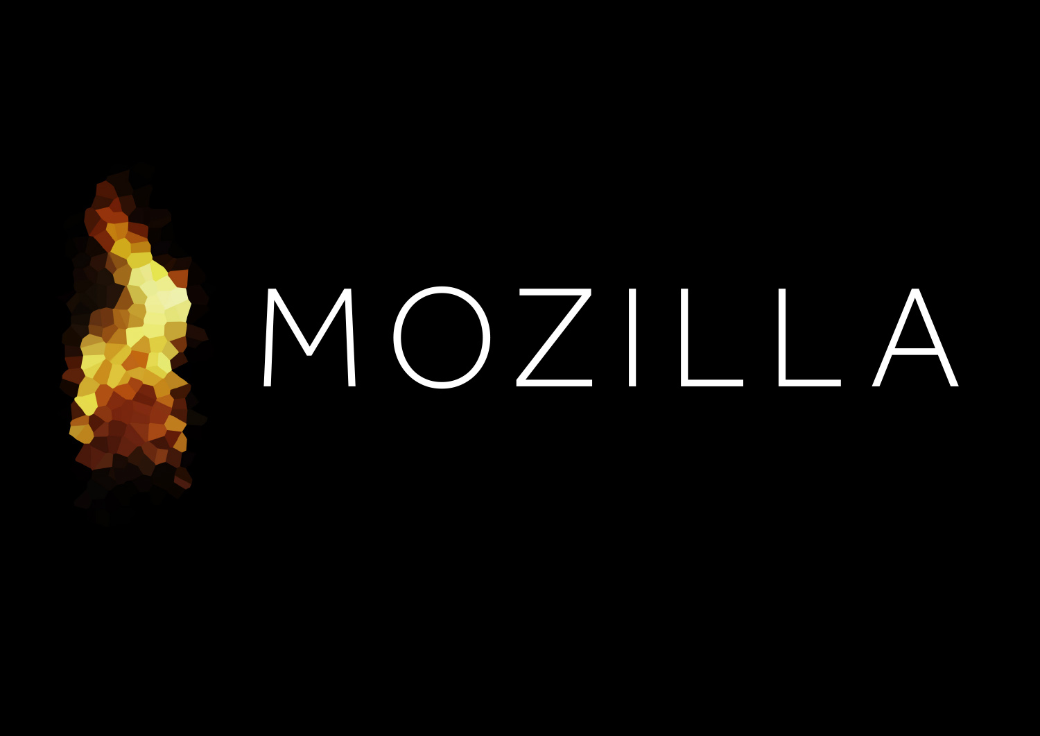
Should the Flame make it into our final round, we will continue to explore different flame motions, shapes, and static resting states, along with a flexible design system. Tell us what you think so far.

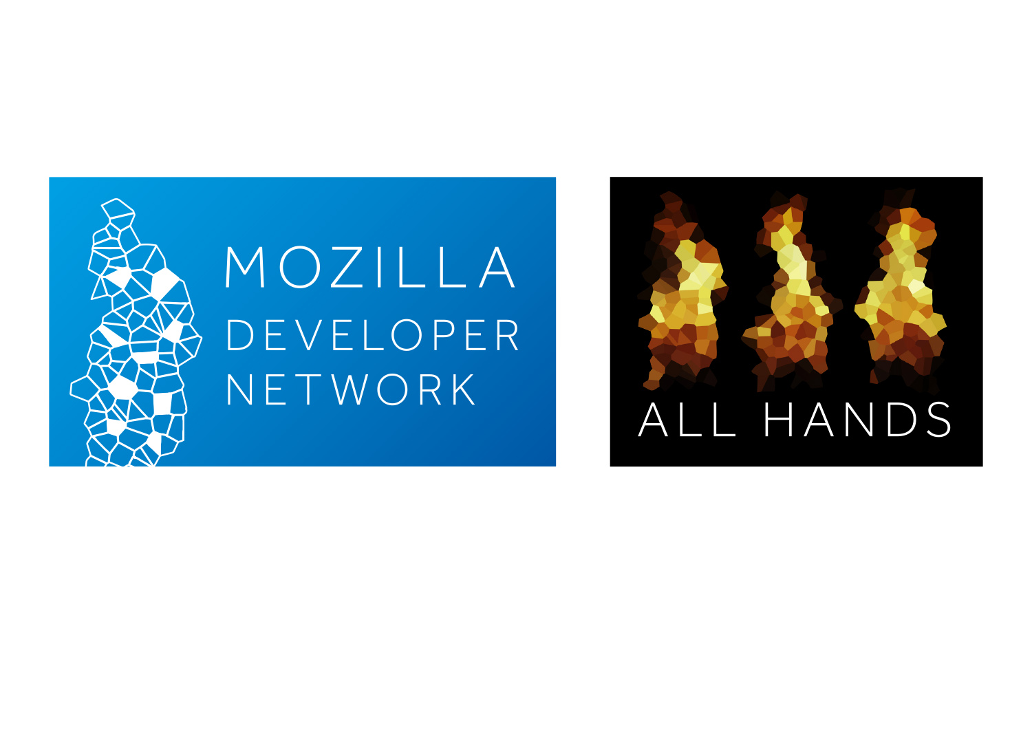
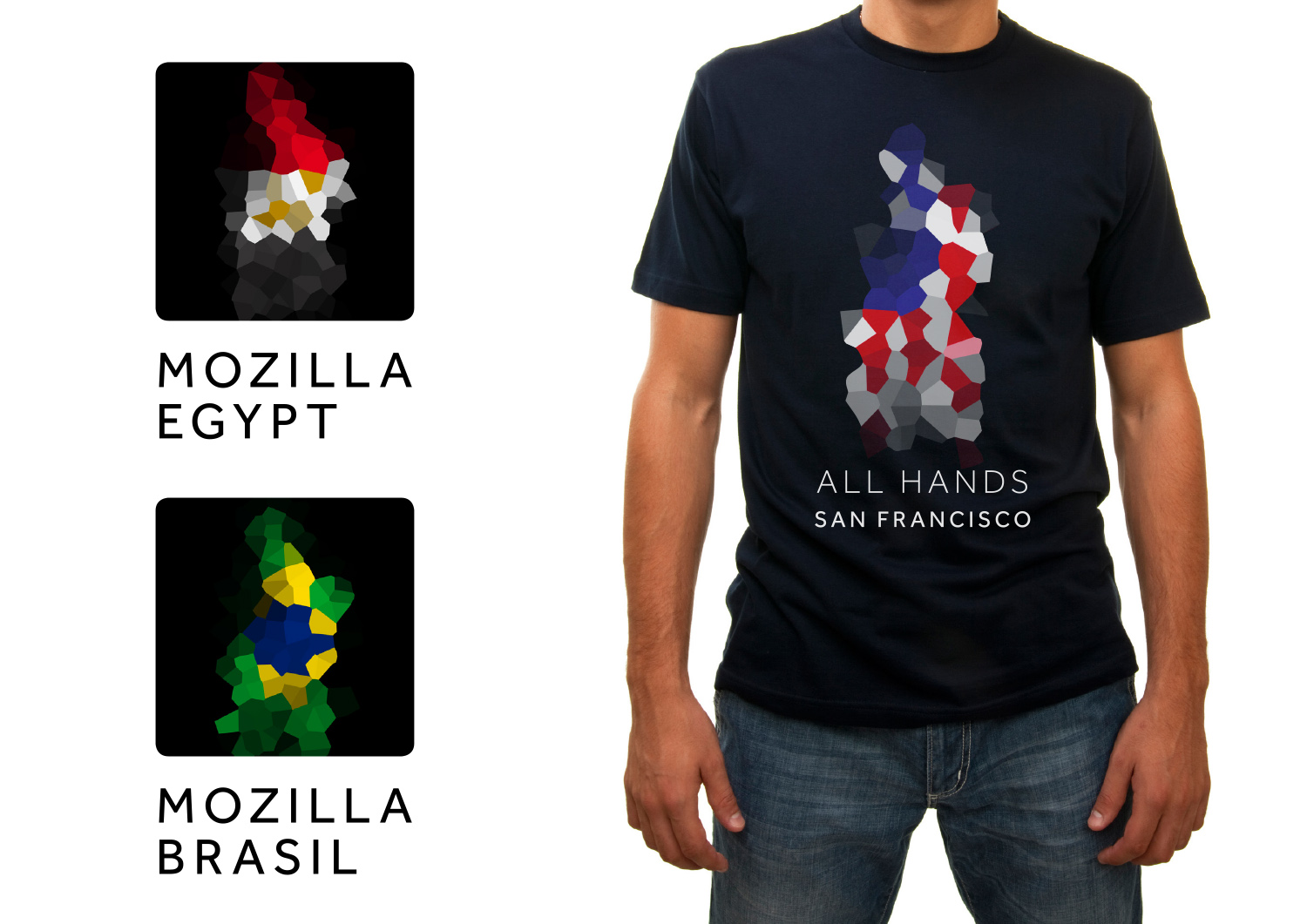
What about Protocol 2.0 and Burst?  We’ve shifted Protocol 2.0 from Lubalin to an open source font, Arvo Bold, to make it more readily available globally. We continue to experiment with Burst in smaller sizes (with reduced spokes) and as a means to visualize data. All four designs are still in the running.

burst_rotating

Testing 1,2,3.

This week begins our quantitative consumer testing in five global markets. Respondents in our target audience will be asked to compare just one of the four designs to a series of brand attributes for Mozilla, including Unique, Innovative, Inclusive, and others. We have also shared a survey to all Mozillians with similar questions plus a specific ask to flag any cultural bias. And since web developers are a key audience for us, we’ve extended the survey through the Mozilla Developer Network as well.

This research phase will provide additional data to help us select our final recommendation. It will help us discern, for instance, which of these four pathways resonates best with which segment of our audience. The findings will not be the only factor in our decision-making. Comments from the blog and live crit sessions, our 5-year strategic goals as an organization, and other factors will weigh into the decision.

We’ll share our top-level research findings and our rationale for proceeding as we go. Continued refinement will be our next task for the route(s) selected in this next round, so your insights and opinions are still as valuable as ever.

Thanks again to everyone who has taken the time to be a part of this review process. Three cheers for Open Design!

17 comments on “Fine Tuning”

  1. Ethan wrote on

    WHAT HAPPENED TO THE PROTOCOL CONCEPT?

    THIS WAS YOUR ONLY HOPE. SOS.

    1. Tim Murray wrote on

      Hi Ethan,
      No worries…all four designs are still in the running. The post has been updated to make this point more clear. Thanks!

  2. CSmithy wrote on

    I’m not sure how removing the dino’s lower jaw helps make it a stronger contender — unless a viewer has context, they’re not going to have a hint of an idea what that icon is supposed to represent (not that it was super obvious to begin with). I’d argue it hints crocodile even more than it did before. It’s not a strong design.

    Flame is okay and I like some of the supporting identity rough concepts, but it screams Photoshop filter. I think the icon could use significantly more development work.

  3. Alex wrote on

    All of them look fantastic, except for burst. I do think that the Mozilla Protocol best typifies the spirit of Mozilla, however, as it seems to me to both embody the hacker and technical background of Mozilla and the history of Mozilla engaging with the early web.

  4. hoosteeno wrote on

    I was glad to see the dino again; I have always loved the dino. But the version above is a bit too docile; it’s a friendly cartoon dinosaur, while I want a dinosaur that has some teeth and fire (Mozilla logo fans may recognize the flames). Those changes also demand a fiercer, less-round eye.

    Much of Mozilla’s work has adversarial underpinnings. This dino is a fighter.

    zilla_with_fire

    1. Brad Werth wrote on

      Yes! Teeth!

  5. Emily Shirtz wrote on

    While exploring the idea of using new styles and techniques to distinguish the Mozilla M and dinorsouar in new ways their developments have been positive but conceptualy for the logos that fit this category they push on the side of building company image over reputation ( which is not a bad thing ).
    But it is to consider when the flame is in question since even in development its potential to be a warm and enviting image while promoting the base of the web visually through pixels or pixelation is exciting and enviting for everyone across gender, age , nationality, etc. it’s potential as a relatable and recognizable mark is great. It also embodies many of the traits Mozilla strives to embody through their work on the open web. It’s a force to reckoned with but it is also warm and comforting.
    Both Dino 2.1 and protocol 2.0 are distinguishable logos that feed off what Mozilla is and does and work well in animation and decontructed environments. The dinorsaur worries me with is crocodial-ish look and whimsical demeanor. Protocol 2.0 has promising visuals With the use of commonly used glyphs relaxing text. This emediatly gives the viewer a good idea of what Mozilla does to a short extent. The font change is nice with a more universal style and animation could lead to great copy write campaigns. My only concern is that to some viewers the style and use of :// may not come across and give off a sense of alienation to those who do not understand it’s use.
    -M

  6. Kat Suricata wrote on

    Burst is too noisy, Protocol looks like it’s from the early 2000s, Flame looks like a generic Photoshop filter, and… I like the dino, but there’s just something so–I don’t know. Mozilla is a Serious Organization, and the eyeball and garish palette is just jarring. It looks like a game company logo, not a logo for a huge non-profit.

  7. Jw wrote on

    Please DON’T use RGB blue for Protocol…please NO!!!
    That blue is blood ugly, please call the police!

    1. Doug Belshaw wrote on

      +1 to this. The idea is great, but the colour is primary school blue! ;)

  8. M-Michael wrote on

    I don’t like Protocol because the font strongly reminds me of the IBM logo and their current advertising campaign. I think Dino is great because of its uniqueness.

  9. PWD wrote on

    Dino 2.1 > Protocol > *

  10. Adrian wrote on

    I really do not like the new Flame concept. It doesn’t look like a flame at all to me in most cases, except when it is animated (and even then, it’s not really clear). It looks more like a map somehow? I kinda feel like I’m looking at a map of California, which is not was I would want for Mozilla’s logo.

    Honestly, I think the previous iteration of the Flame logo was much better in every domain: more identifiable, easier to decline, more meaningful, and prettier.

    The Dino looks “childish” to me, like a toy brand, and I sincerely hate the Burst logo. There is potential in the Protocol logo but as it is now it’s not appealing to me. Like Kat said, it’s so 2000.

  11. Shaun Evans wrote on

    Personally the flame idea, at least in its present manifestation presents little emotional feeling. As others have commented a construct of Adobe filters rather then a powerful burning call to arms. I do enjoy the Dino, although ask myself whether it is necessary to be so ‘tab’ looking. Perhaps its just a question of introducing angles rather then 90 and 180°. Or the introduction of a slightly less wide-eyed startled appearance.
    Protocol feels corporate and linked to the back story of Mozilla and I can image the glyphs being strong in using language to add emotion and narratives globally.
    Finally hats off to you, in thirty years of working in design and branding, this is a wonderful first that benefits professionals and non-professionals alike in revealing what it practically takes to develop a brand.

  12. Astonished wrote on

    I am so surprised how unprofessional all of these are. The execution and rationale for these concepts are appalling. You really made a mistake going with this agency.

  13. Martin wrote on

    Dino still needs adjusting. Downsizing the jaw slightly wasn’t enough – make bottom jaw thinner, and perhaps evoke the back of the tyrannosaurus head and you’ll have something interesting.

    Protocol – the blue NO. It’s a color used by way too many companies and is the go to for companies that are like: “I dunno…I like that royal blue”. This doesn’t feel officially “Mozilla”

    Starburst…something changed? C’mon guys, push a little bit here…is your branding company even trying? Sorry for harshing on your mellow, but the above three could have been explored just a little more. Perhaps were not seeing the thousands of comps that were made to get here.

    The Fire – ok, now you have some push as in you have taken an original idea and pushed it further, as in seriously moved it. Has merit, and potential. Not quite in the likeable stage since the “flame” doesn’t have a distinct flame shape, and the colors may be a bit too subtle. Go with your reds and oranges that already exist add a strong yellow, making your dots more hard flat colors, and make the flame more flamey (whatever that means, i think a wider base on the flame would help), and perhaps incorporate the hard outline directly into the moving flame (perhaps only on ones side of each shape) to distinguish the shapes some.

    But maybe the idea here isn’t a flame anymore – but perhaps some sort of nebulous cloud/crowd, a conglomeration of shapes (read people) of various colors, sizes, combinations, connections, overlap representing openness, working together and all the other things that represent “Mozilla”. And then make it an auto-generated shape so it’s different every time but based on the core structure as shown in the outlined view. (But don’t make it a flame anymore). The distinction comes from the fact you’re using this fractal approach.

    Ah. Move from flame to fractal.

    I think this will end up giving you guys the most flexibility, the combinations can be endless, and the applications suitable to the organization as a whole. It would be bold, flexible, open, and all the other things you wanted.

  14. Chris Jorgensen wrote on

    Looking at the candidates again Protocol and Dino are still my favotites, possibly as a combination. Burst is way to complex and I do not associate Flame with you.

    The dino on the other hand is pretty unique and has followed you a long time. I was reading a blog on corporate logo redesigns (http://www.underconsideration.com/brandnew/) some time back and looking at the examples it was clear to my that the most successful redesigns were the ones that managed to take something people recognize and update it just enough to make it look fresh and new. Generally I think the results for companies that decided to let more or less go of their previous identity were much less successful. It is positive that the dino’s lower jaw has been shortened (look less like a stapler) but I still think the design is way to minimalistic and needs to pay more homage to the old dino designs. It does simply not have enough character. The idea of only using the upper jaw is terrible as it really limits the ways the logo can be used. I know that minimalistic and flat design is everywhere but this is only the more of a reason to come up with something more complex as I think Dino 2.1 quickly could end up looking dated.

    Protocol is still good but as many pointed out the color is very different from your current colors. I understand that it is a reference to early links but would still prefer your current color scheme. Maybe also experiment more with some different fonts?