Categories: General

Design Route C: The Open Button

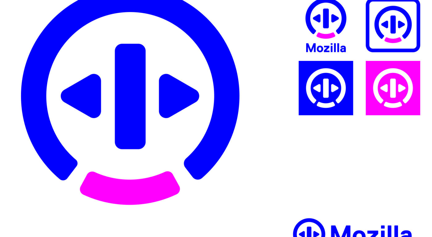
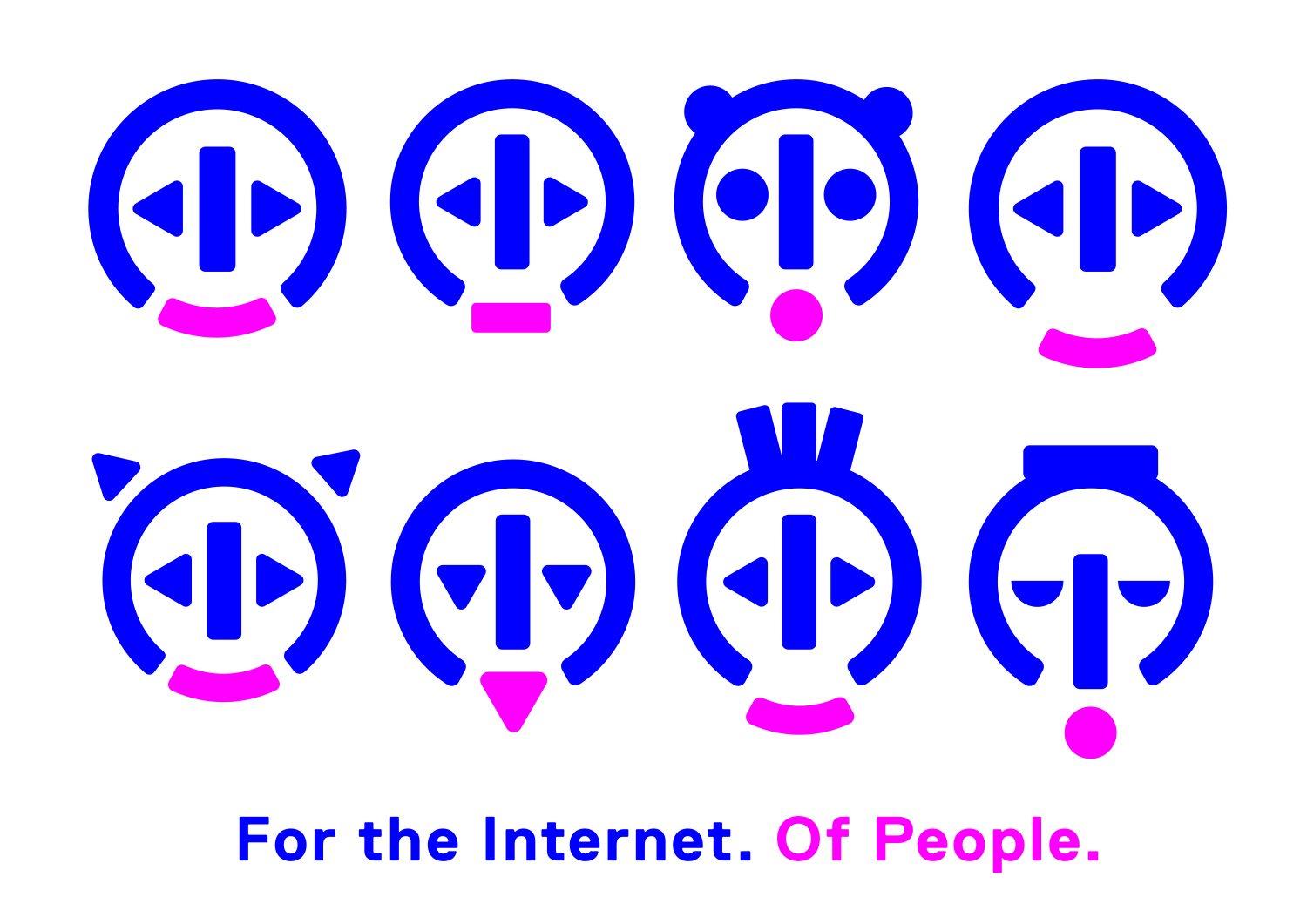
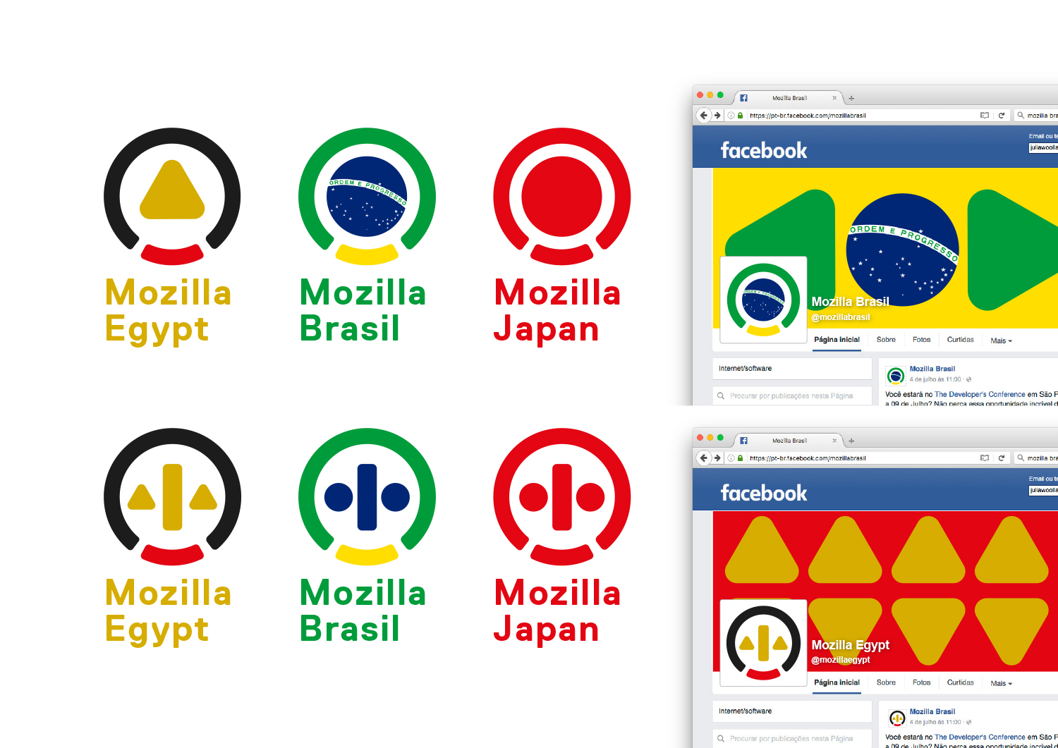
Mozilla stands for an Internet that’s open to all on an equal basis – but most people don’t realise that certain forces may divide it and close it off. How could we communicate ‘open’, quickly and simply? Could we find a current symbol or pictogram of ‘open’ and adapt it to our needs? There is one, and it’s around us almost every day…

This design direction stems from the narrative theme called Choose Open.

Choose Open

The future of the Internet can be open, or closed. We choose open. We choose an internet that is equal and accessible by default. Open to ideas, open to collaboration, open to everyone. But it isn’t a choice we can make alone. An open web is something we all have to choose together. And it involves many other choices. e tools we use. e products we support. e way we behave online. Those choices can be complex, but the guiding principle should always be simple. Choose open.

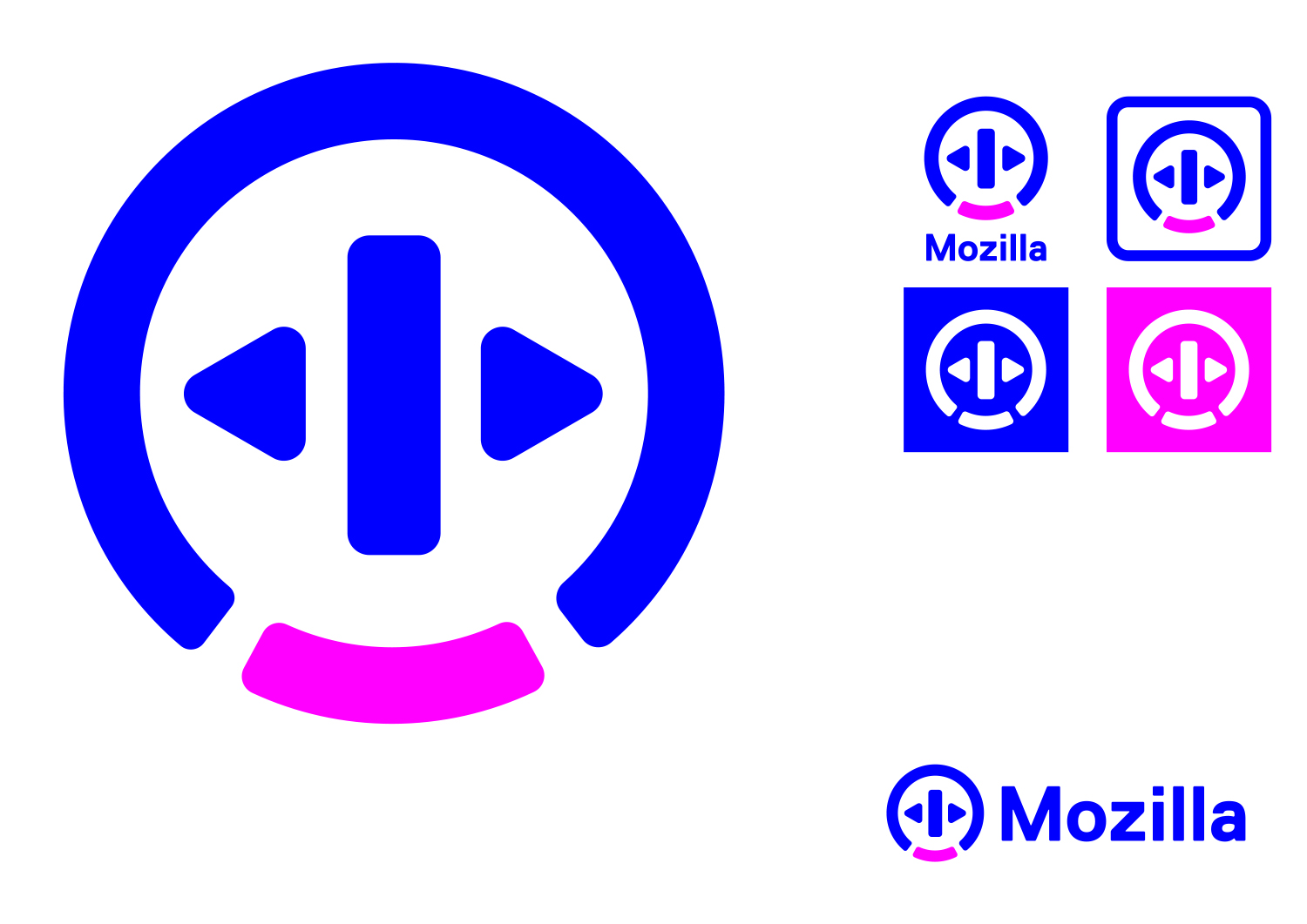
Click the image below to see how this logo might animate:

jb_Mozilla_design_pres_edit_3.keyjb_Mozilla_design_pres_edit_3.keyjb_Mozilla_design_pres_edit_3.keyjb_Mozilla_design_pres_edit_3.keyjb_Mozilla_design_pres_edit_3.keyjb_Mozilla_design_pres_edit_3.key

98 comments on “Design Route C: The Open Button”

  1. Satrio wrote on

    What are you, a car insurance company? Doesn’t fit Mozilla identity at all.

  2. Enrico wrote on

    The main logo looks like a sad expression to me, even with the smiling lips. I think it’s due partly to the choice of the two colors, partly to the lips being placed far down, where the chin should be, and partly because of the triangulr eyes.

    Moreover the basic design (in blue and fuchsia) looks “cheap” to me and quite retrò. I’d rather choose the glowing version on the t-shirt.

  3. lehasb wrote on

    No. How do people know this is supposed to mean ‘open’? It looks like a logo with random geometric shapes. (Sure, it mimics an elevator button, but those logos are only ever used in elevators, nowhere else, so . . . )

  4. Danilo R wrote on

    Please keep in mind that outside the US/America (as someone else already pointed out) this is not the usual icon for an elevator open button. This was made with good intentions, but would reflect a US-centric view of the world. (And yes, it looks a bit like some kind of play/pause/reverse button…)

    1. jgreenspan wrote on

      Thanks, Danilo, we agree, this needs to be universally understood regardless of cultural norms. Great point.

  5. Greg Searle wrote on

    This seems very cliche. Everybody does round logos. Based upon the “power button” symbol. That looks roughly like a smiley face. As cliche as writing a bunch of sentence fragments. This creative company needs a more creative logo.

  6. Blake Gonzales wrote on

    I just don’t see how this design even represents Mozilla. maybe it’s there but I don’t see it at first glance. I don’t like it.

  7. brendan wrote on

    logo triggers nostalgic remembrance of slow computers and slow internet.

  8. The Watson wrote on

    My number 1 pick! It kinda has past, present & future about it. Something Ancient feeling, something modern, yet something totally futuristic feeling about it. Could relate worldwide & go far. I would at least darken the backdrops a bit. Could totally see the Mozilla Spinner brought back with this! Would make a nice icon too. This is more in line with Apple & Googles fumble on new/old guidelines…. Its pleasing to look at too. I got flashes of the future & even some Star Trek when I first saw it… Designer did well here.

  9. Pacifica wrote on

    So this does sound like the US election. Which of the bad choices do you at least want to live with (even if you cannot stand any of them). Frankly I am going for the one I can at least read and can easy distinguish. It’s definitely not this one. At a glance the variations all look like the same power button you press when X has crashed again and you need to do a restart. Or with those colours bring to mind a sexuality reference that has way to much blue and only a wee pink. Yes this logo looks like a Y bang up and really looks inadequate for the job.

  10. Christophe wrote on

    Hi !
    When i first look at “open button” and “Protocol”, i had a reject.
    When i watch again and finally i love theese 2 designs : simple, clear, graphical.
    I just asked me : “Do you want to see this button on your browser…” and “Do you find they’re are understable”. Then, it was obvious to me :
    First choice : Open button (btw i want this t-shirt !)
    2nd choice : Protocol (love the mug and the cap !)

    Good luck guys for the choice : i can tell you there are big talks about the design here in France !
    Regards,

  11. Brit wrote on

    I’m not sure why you are rebranding, but this is the best of the available choices. It’s not as busy as the others, and more elegant.

    I’d choose a different accent color than fuchsia. If you are looking for contrast, orange is the classic complimentary color for blue, but a light or less saturated blue in the same family would work well. Again, I think solidity, simplicity and elegance are essential, particularly as you’ve lost browser share due to stability issues. It would only hurt your brand to seem scattered.

    But I’m fond of the Firefox and the old Phoenix logos.

    1. Tim Murray wrote on

      Hi Brit, this design exercise is for Mozilla, the nonprofit that champions the Internet as a global public resource for all. It’s not meant to suggest a replacement for the logo of Firefox, the open-source web browser made by Mozilla. We’re seeking a brand identity that can tell the Mozilla story beyond Firefox. If you have the time to read more, we suggest reviewing some of the earlier posts on this blog or checking out https://blog.mozilla.org/opendesign/now-were-talking/ Thanks for being a part of this design review process.

  12. Endyl wrote on

    Until I saw the animations I thought this was one of the most boring versions but then it struck me as fun, “colorful”, youthful, modern and has a moderate amout of Mozilla vibe to it. Not my favourite but I could get to like it, should this be the final one.

  13. Leo wrote on

    This logo doesn’t really communicate anything to me

  14. Ross wrote on

    Please, no. While friendly, this looks like a series of animal faces for a music player, if that music player was making fun of people. Your brand isn’t visible in this at all.

    ScreenShot2016-08-23at8.31.12AM

  15. Eric Shepherd wrote on

    This doesn’t seem to have much to do with Mozilla; I think it’s a stretch between the “open button” iconography and the openness of Mozilla. They’re totally different meanings of the word “open” and it just doesn’t work. I also don’t particularly like the mockup of the MDN logo based on this imagery. It just doesn’t make sense for what is primarily a documentation resource (the word “Network” remains confusing in this name, but that’s another issue).

    I also feel these colors are too far removed from traditional Mozilla black and orange and blue coloring. The weird bright blue and… fuschia? magenta? Not sure what that color is… don’t seem to go together well and just look out of place for Mozilla, to my eye.

  16. David wrote on

    Ugly. Ugly face. Ugly elevator ‘open’ button. Nowheresville. Fails to get across anything positive or actually anything at all.

  17. Rick Colby wrote on

    Pros: Clean, flat, simple mark. Feels like “tech”. Flexible — forms many “faces” yet remains consistent.

    Cons: It looks like the logo of a consumer electronics company. The power button idea reminds me of hardware. The color palette reminds me of Baskin-Robbins turned up to 11.

  18. Uy Le wrote on

    It’s definitely a quirky idea. Yet somehow I feel something Apple Music about it. The executions come across as a bit childish. And the cryptic symbols appears more ‘tribal’ than ‘tech’ to me. Not really a big fan of this route.

  19. Juribiyan wrote on

    This is a logo of a mobile phone company. It looks very much like HTC and when I see «Mozilla» I can’t help but read «Motorola»

  20. Jason wrote on

    The colors are very 8 bit, the symbol is very “oh look, we’re a tech company so we use a symbol from computers,” (really, it’s well past the mid-90s, so we can safely assume EVERY company is a tech company) and the whole thing does really give a guiding vision/mission/purpose to the company. Basically a uselessly bland logo. It would be a mistake to use.

    1. Jason wrote on

      Edit: I meant DOESN’T give a guiding vision/mission/purpose to the company.

      Shouldn’t make typos when you’re being snarky. Sorry.

  21. Victoria wrote on

    I see no reference to Mozilla here at all. And the colors are really make an awkward feeling. For me it would not do at all.

  22. Sherry Moore wrote on

    May I suggest that you would increase the size a bit, of the triangles (arrows) in the center and then bring them closer together to “effect” an M! A contrasting color would also be helpful in this edit. Thank you for including me in your project.

  23. André Jaenisch wrote on

    Why is Maker Party yellow?

    Web Literacy vs. Privacy & Encryption resp. Speaking Out vs. Open Systems look too close to each other.

    I dislike the pink. It’s too bright (“neon-like”). The blue is okay.

    The attached image is from Telegram group. Nice pun :-)

    photo_2016-08-25_21-36-19

  24. Vanessa Rusu wrote on

    This design is my favourite in regards to rebranding Mozilla. Though some other concepts are really great design, I feel that this one has the most potential, and steers towards classic rather than trendy. I do agree that it draws similarities to napster/music logos, but I think that could be worked out during the refinement stage. The flexibility of the icon is great, it’s got a slight retro feel, and can be evolved to stand through a long period of time.

    I’m not 100% sold on the colours, I find them too primary and unrefined. I understand what they are trying to accomplish, but I think they could be evolved a bit via creating a bit of depth, softening the shades ever so slightly, or adding a bit of realism through lighting effects.

  25. Rackskop wrote on

    This is a very generic design approach for a logo. There’s a ton of media related icons known to the majority of people that this could relate to but well, it wouldn’t. You cannot argue about uniqueness in context speaking about how the pictogram is a metaphor of freedom when standing alone it cannot communicate the subject at all. I find it to be a very enthusiastic thought to visualize freedom of choice. Even more so when after looking at it again and again it looks actually more closed than open, the highlighted part being some sort of gate or door. If you’re about to merchandise it like it’s showcased here the logo got to speak for itself. You cannot just throw something into peoples heads and “hope” that it works. This would need gradual disconnection from the logo type over quite some time in my opinion.
    The color choice feels poor and not really thought about (Is blue open because it is the color of the sky? Why is the accented part pink then? Is it the wonder of freedom?). People might think colors are only personal choice but in fact there’s a whole lot more to them.

  26. Graham Swartzell wrote on

    This is definitely a step up from Protocol by being clear AND distinctive. The variations also add some character to the whole thing.
    But ultimately it doesn’t feel like a Mozilla thing, I feel like this would be printing my ticket at a trendier metro station.

  27. Smeikx wrote on

    – The colours are trendy = not timeless.
    – The colours are aggressive.
    – The colours seem cold and technical, I’d rather be reminded of a friendly, open-hearted Mozilla.
    – Behind that logo I’d expect an elevator company.
    – The faces look weird and a bit frightening, like somewhere from Uncanny Valley.

  28. Pedro Phillipe wrote on

    A ideia é boa, mantem um pouco da essência da logo atual, não perdendo sua fidelização com os clientes. O intuito de colocar características de cada país é fantástica, porém as cores utilizadas foge um pouco do padrão. Dá impressão de algo antigo! Para uma empresa de internet não fica legal! Usaria cores mais moderas e manteria essa conectividade de pessoas e países! A ideia é ótima, Parabéns aos Designers!

    Abraços!
    Pedro Phillipe
    Brazil

  29. Pedro Phillipe wrote on

    Com cores mais claras e modernas! Para visão é mais agradável!

    mozilla-5

  30. John wrote on

    Mozila fire kiss. Logo

  31. ayesha wrote on

    Lets try these. I get the concept of a human face. the colors are not right, pink is definitely a color that shouldn’t be in a corporate logo unless your running a spa or nail Salon. A look has to be given to Jung – man and his symbols –
    See if the logo changes shown below is a better way forward.

    jb_Mozilla_C_open_1-1400x990red2b

    jb_Mozilla_C_open_1-1400x990red2

    jb_Mozilla_C_open_1-1400x990red

  32. Teradyne Ezeri wrote on

    When I first saw this, all I could think is “Open button? It looks like a Power/Sleep logo.” This would definitely look nice on something like a Foxbook, or as the power emblem for Firefox OS/B2GOS. Then I realized it was a stylized face, after thinking about it rather hard and seeing the other brand logos below the initial one. As a branding that wants to encompass the values of Mozilla, it falls short on first sight, and that’s not good.

    The project-specific logos look amazing, and out of the choices, this is my favorite in that regard. The base logo doesn’t say “Mozilla” to me at all. Maybe if the eyes and nose were shifted to form an M, and could animate into the look of a person, I could see it. However, it still doesn’t feel like “Mozilla”, even with that. I’m not sure why though, and that bug me.

  33. J. White wrote on

    I vote No.

    This feels too much like an Intel logo. An Intel logo from the 90’s.

  34. Seburo wrote on

    Hi

    This concept feels a bit weak to me, a collection of shapes without a sense of purpose. The variations almost feel like a codemoji puzzle. Perhaps this a a bit harsh, but I struggle to identify with this one.

  35. Ana Paula wrote on

    The premise behind this one is really good and some of the variations are also very much spot-on. My favorite part would definitely be the countries.
    However, it doesn’t quite cut it for me. Perhaps it’s the pink and blue color scheme? Not sure, though.
    Love the idea, but don’t love it as a whole.

  36. Wesley wrote on

    This one looks nice. It’s simple. It’s appealing. It represents the Mozilla brand. The only thing I don’t like about this concept is the current color scheme. Perhaps if we changed up the colors to something else than it would look a bit better.

More comments: 1 2