Categories: General

Design Route C: The Open Button

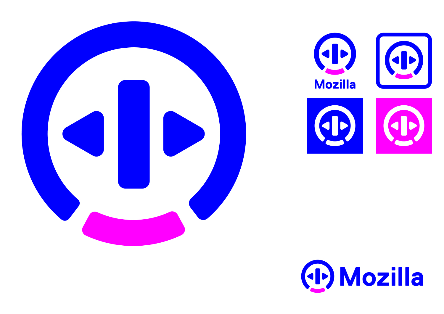
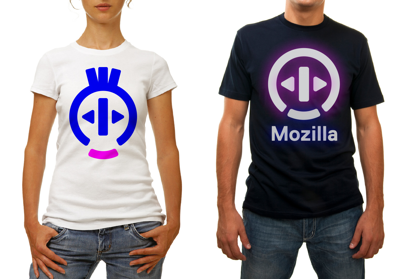
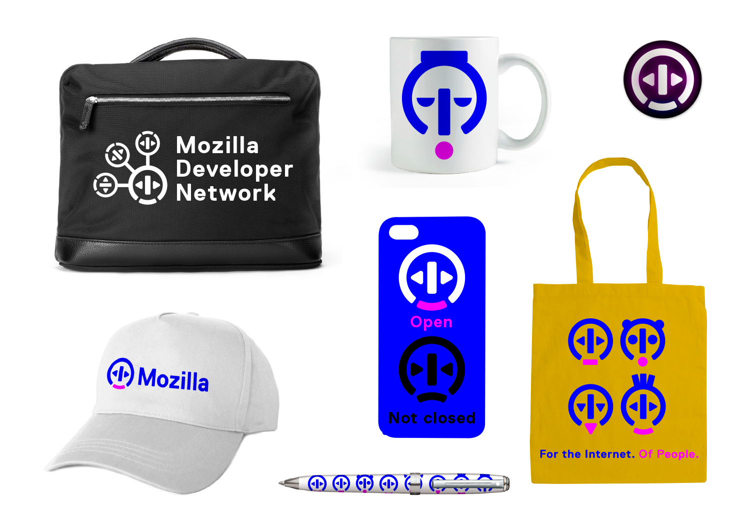
Mozilla stands for an Internet that’s open to all on an equal basis – but most people don’t realise that certain forces may divide it and close it off. How could we communicate ‘open’, quickly and simply? Could we find a current symbol or pictogram of ‘open’ and adapt it to our needs? There is one, and it’s around us almost every day…

This design direction stems from the narrative theme called Choose Open.

Choose Open

The future of the Internet can be open, or closed. We choose open. We choose an internet that is equal and accessible by default. Open to ideas, open to collaboration, open to everyone. But it isn’t a choice we can make alone. An open web is something we all have to choose together. And it involves many other choices. e tools we use. e products we support. e way we behave online. Those choices can be complex, but the guiding principle should always be simple. Choose open.

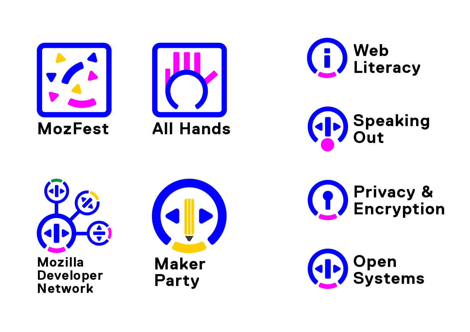
Click the image below to see how this logo might animate:

jb_Mozilla_design_pres_edit_3.keyjb_Mozilla_design_pres_edit_3.keyjb_Mozilla_design_pres_edit_3.keyjb_Mozilla_design_pres_edit_3.keyjb_Mozilla_design_pres_edit_3.keyjb_Mozilla_design_pres_edit_3.key

98 comments on “Design Route C: The Open Button”

  1. Lyre Calliope wrote on

    I didn’t even notice that each option had their own posts when I wrote out all my feedback in the ‘Now for the fun part.’ post.

    Seeing more thinking around each logo option, I’m doubling down on this one as the only real option.

    I don’t completely love it yet, but I’m close. Really close.

    A little more iteration, then ship it.

  2. Michael Kaply wrote on

    This one just doesn’t do it for me. I can’t really explain why. It just doesn’t feel like Mozilla.

    The logo itself feels too much like a music player.

    1. bjorn wrote on

      napster…. it was the first thing that came to mind when i saw the logo.
      however, looking at the other options, it’s either this or ‘protocol’

    2. Stefan Pisslinger wrote on

      Totally agree!

  3. Jason Hunt wrote on

    Just confusing.

  4. Milena wrote on

    Between all the given examples, this one is the strongest in my opinion.
    It is easily memorable and adaptable, modern and clean, effective and powerful.

    One thing…
    I would change the colors, and wouldn’t use neon effects on black backgrounds.. unless you want it to look like it comes out of ‘Tron’ This kind of blue with the pink combined together are very striking, slightly trippy , or might be just the effect of too many coffees. ;)

    1. Bem wrote on

      Totally agree.

  5. Emily Campbell wrote on

    While visually this isn’t my favorite, this is the variation that immediately spoke “Mozilla” to me. I can’t pinpoint why, but the rest of the directions didn’t embody the feeling of Mozilla – technical, cutting edge, a little different, a bit of a throw back… The character abstractions are very fun, too, without seeming kitschy or too On Trend. On the other hand, “The Impossible M” is the variation I prefer the most as strictly a visual exercise, but doesn’t at all relate back to what Mozilla means to me.

  6. Bel Cassinelli wrote on

    This one is my favorite. Simple, strong, fun.

  7. Carlos El Halabi wrote on

    This one is confusing. I didn’t quite get the Mozilla reference.

  8. Halleh Tidaback wrote on

    I appreciate how this concept leans into the people/human side of the brand while keeping a technical look/feel. It conveys subject matter expertise with a sense of approachability. It feels unique and funky, fresh, a little odd– but in an endearing way. (The faces remind me a bit of Wilson in the Tom Hanks movie, Cast Away)

    I think the simpler versions are working best . The versions with the outer glows and more intricate renderings fall short and dilute effectiveness overall (Maker Party and Brazil mark).

    A few things that bother me… the logo is based of an existing symbol and the word I think of when seeing this symbol is Power, not open. It also feels limited in terms of scalability compared to some of the other concepts. I’d like to see it pushed further and how it plays with type, texture, etc. Right now, all I’m seeing are a bunch of silly face shapes vs. a brand language.

  9. Olaoluwa Jesubanjo wrote on

    I’m bothered about the colours. Doesn’t work.

    1. Anant wrote on

      I agree 100%. The design itself isn’t too bad but the colors are what throw me off. Also I’m not sure I understand how this connects with Mozilla and how it could be an entire brand identity. The possibilities feel limited.

    2. Davide wrote on

      Yes, definitely. Design is ok, but colors are definitely off-putting.

      1. Alexandre Abraham wrote on

        I am totally not into this one, feel like a music player, but if it is chosen one, yes, the colors are definitely a show-stopper.

  10. nicolas wrote on

    Without more thinking, I can’t explain why, but this isn’t Mozilla to me. The shapes are very technological, the colours not human enough. It also feels like the heads fun will grow old too quickly.

    I’m not talking about details in the execution, because it’s probably not very relevant at this point in the project.

  11. Sychedelix wrote on

    The colors seem strange and flashy in bad way. Also the logo is not that unique.

    Beside my feeling is I hate it sorry! Still I like the idea of adapting to countries.

  12. Eloi wrote on

    It feels like a music-related brand. Reminds me of Napster for some reason..

  13. Gerardo wrote on

    Esté diseño me gusta. Hace sentir un aspecto empresarial muy sólido. Aportando creatividad e innovación en la tecnología.

    1. Raül wrote on

      Totalment d’acord. És el que més m’agrada.

  14. Russell wrote on

    My first thought upon seeing this logo was “Baskin Robbins Ice Cream!” The color scheme is already the core of a well know national chain, and along with the softer corners and round shape immediately takes me to food rather than technology. Perhaps sharpening the corners and moving away from these specific colors for the core logo and you could have a contender.

  15. Shae wrote on

    Very simple and boring. It doesn’t feel unique or original. Feel like a music-related company, the symbol looks too similar to the classic play, rewind, pause buttons of any music player. The colors don’t feel right either.

  16. Jon Moorman wrote on

    I love the simplicity. It would prove to be a memorable and timeless logo, however I’m not sure it speaks properly to the Mozilla brand. The color choices are not doing it at all for me. The animations and possibilities that come with that will prove to be a great for UI elements within the branding. Also, I think the type choices need to be researched and explored a lot further, as I’m finding the existing one to be a bit stale. Maybe stay with the modern sans, but one that has the same (or similar) slightly rounded corners represented within the icon to marry the two.

  17. Zoraida wrote on

    I actually love this system, but I don’t believe it aligns well with Mozilla… It feels like it would be perfect for a music company.

  18. Bea wrote on

    Interesting.
    Maybe a bit “deja-vu”?

  19. Michael Cordover wrote on

    I really like the way the variants work together, but the main logo unavoidably to me brings to mind an oncoming train.

  20. Emanuel E. Bravo wrote on

    I like this design, is the best of the seven others…

  21. W. Zhang wrote on

    Looks similar, visually, to the Open Source Initiative logo and conceptually to the Linux Foundation logo. I’m not feeling any connection to Mozilla.

  22. NJB wrote on

    The colors are a bit too gaudy. Also, I didn’t see the “elevator button” metaphor immediately as our open buttons don’t have that vertical line in between, and I really thought the logo is an electrical socket.

  23. Sergio Schaart wrote on

    I like this the most. KISS (keep it simple stupid). I like the colors and the modern look.

    1. jgreenspan wrote on

      Thanks for your input, Sergio.

  24. Victoria Black wrote on

    It’s a very plain logo, some of the “options” look like a train from the front (with the circles) some look like a open button in the lift , music player, and Allianz bank logo (that’s just me). Just not suitable at all.

    allianz_logo

  25. NOne wrote on

    I’m starting to realize I really don’t understand this branding/marketing thing. Why would you want to replace the Mozilla identity with something that looks like the fusion of an elevator button (open doors) and an exotic electrical plug profile from some distant nation.

    You’ve got that iconic Shepard Fairey logo, you’ve got the dinosaur mascot from the “waiting to load” game… Mozilla has long branded itself around the dinosaur (it’s in the name “zilla”)… why start over with something so– I don’t want to be insulting– but so confusing???

  26. M wrote on

    It’s not clear to me what this logo represents. I certainly wouldn’t guess ‘open’. I like that idea of ‘open’ being the central theme, but this branding doesn’t convey that theme to me. I don’t like that it kind of looks like a face. The pink blue colours are distinctive but do they have any significance?

  27. Albert Freeman wrote on

    If I have to pick one, it’s this one. Least worst logo of the bunch.

    It doesn’t particularly say “browser” (or anything else, for that matter). It’s the IKEA of symbology – saying nothing, but probably works OK with most things.

  28. Manu Poletti wrote on

    After reading the back story I get why this is proposed and like the concept, however the logo does not associate well with me. I think it’s supposed to be a derivative of a lift button symbol but I did not get it immediately. Maybe some other ‘open’ icon would work better like something based on a physical item; book, lock, box, door. Or maybe this concept is over subscribed.

    1. Jürgen A. Erhard wrote on

      I didn’t read the rationale. I still don’t. And won’t.

      Because a logo has to work on its own. So that’s what I’m looking at.

  29. Erika wrote on

    The color scheme feels cold and does not at all seem to fit Mozilla. The logo reminds me of the on/off buttons on appliances. I think this is among the worst of the options.

  30. Chris wrote on

    Of the choices given, this is the only logo/design I can even come close to liking. This looks professional. The others look like something I might have doodled in my notebook in junior high school.

  31. christina wrote on

    Ugh. Looks like a sign in a public transit station.

  32. Walter Milliken wrote on

    I like the visual simplicity, but that’s about the only part of this I like. My first thought seeing it was: “It looks a VCR remote and the old Apple hockey puck mouse had kids”. I’d also want to simplify the base logo by taking out the two arrows, except then it probably looks too much like the logo for Mopar, the auto parts company. It also strikes me as the most “stodgy US corporate” of the seven options.

  33. Dominik wrote on

    Nice idea. But as a someone specialized on brand identities, I feel like this is too flexible. The symbols in the logos just change the logo as a whole too much. I feel like it would take away all the personality that Mozilla has.

  34. Sysau wrote on

    Convey no meaning, could be anything.

  35. Jeremiah Lee wrote on

    This is my second least favorite. The base design is not strong enough for the variations to be strong associations.

  36. Rabi Khan wrote on

    I very much enjoy this logo. It’s not frightening, and it’s not too complicated. It has nice color and a straightforward, memorable feel. And more importantly, I feel your dedication to open-source and transparency is the heart of what makes Mozilla one of the best browsers.

  37. Justas wrote on

    To me Open logo is most vibrant and easily memorable. Plus simple lines and shapes makes it easily recognizable from the first glance

  38. Simon Kenyon wrote on

    i like this one because it is the only one that realistically could be an icon.

  39. kz wrote on

    this logo would work well for Otis Elevator, but it just doesn’t scream “Mozilla” to me. OTOH, it is clean and relatively uncomplicated. Of the designs presented, this one would win the Bronze.

  40. Redmess wrote on

    The design is nice and simple, and colorful. It is however a bit generic, it could be used for any electronic or digital product really. It would take a lot of work to make this distinctly Mozilla.

  41. Robert Kaiser wrote on

    I’m not 100% with it yet but the idea of this logo is very interesting. I don’t like the color set, I think we should get “back” to more traditional Mozilla colors, but this idea is worth exploring.

  42. bithakr wrote on

    I like this concept in general, especially the glowing black T-shirt logo, but the magenta and blue are *really* harsh against a while background. While its a nice look, it seems a little too generic.

  43. Naylan wrote on

    When I look at this logo I see a media player icon, a robot’s head, or a discount store’s logo. I don’t see Mozilla, a company enabling people to use the web. It so generic that it means nothing.

  44. Jarrod wrote on

    The first thing I thought of was that this looked more like a logo for a gas station or a button on a remote.

    The design isn’t very strong. It is versatile only because is very generic. Among all the images that may appear on a page this one fades into obscurity.

    I would take the Japan version and use that in place of the “o” in Mozilla for the main logo, keeping it all one color, then use the Japan version with a M knocked out of the solid circle for icons. Then you can adjust color for each application of the icon and add text as in the examples for each country.

  45. Mike Thompson wrote on

    Nope.

    Unclear. Not an intuitive tie-in. Not visually appealing.

  46. James wrote on

    This design is really bad. What is it supposed to be? An elevator button? An on button on a microwave? What part of this has anything to do with Mozilla?

    There’s no pre-established ideogram for “open”, and nobody would look at that logo and think “Oh! Open!”

  47. Andrew A Tatge wrote on

    Particularly the eyes, but also the blue color, makes many of these characters look like depressed robots. I do like that browser navigation buttons can make up the face and maybe even spell out Mozilla.
    Exceptions to this are the faces that don’t use the ” eyes. Even the “negative” emotion faces that don’t use the triangles pointing left and right look more lively and friendly.

    I associate the blue and pink with Intel Pentium Processors, the faces with depressed Napsters.

  48. rugk wrote on

    I like how you can change this logo for different countries and also different parts of Mozilla, but apart from this the colors are maybe a bit too much.

    I would say this is okay, but not my favourite.

  49. Paco Núñez wrote on

    highly confusing

  50. Namsommut wrote on

    This design is just right to me. Through conservative and plain approach, the logo should be recognisable for another 10-15 years. I still have a fond memory of early phoenix, firebird and firefox. Another angle to look at is more or less similar to “Push” button for the connectivities.

More comments:1 2