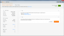
In Firefox 21 we introduced a new feature called Firefox Health Report. FHR helps our users monitor browser usage and fix issues with their browser.
After designing FHR for desktop, we redesigned it for mobile often questioning what made sense in the context of mobile at several steps in our process. The goal was to design a simple solution for mobile that preserves the intent and values of FHR.
Designing the content
At the start, we asked “do the same use cases make sense in the context of mobile?” This directly tied to what data we collected in addition to making feature prioritization easy.
Some features were prioritized higher because it was a low-hanging fruit in the context of mobile. Also, a lot of stuff we did first on desktop did not make sense on mobile.
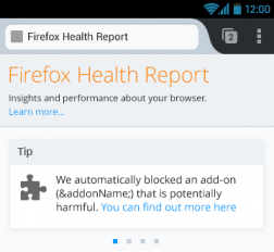
One feature that we included on mobile was to let the user know when Firefox blocks an add-on that they have been using because it was found to be malicious. This was prioritized higher considering it was useful and straightforward to implement. On a relevant note, this is also a feature that we would like to include in FHR for desktop.
Many desktop users quit the browser between interactions, so start up time is important; slow start up time will drive users to investigate a problem. The situation is very different on an Android device. Firstly, “quit” isn’t a meaningful concept. Secondly, much of the contribution to slow start up is out of the user’s hands (a slow phone rather than a bulky add-on). Thirdly, there is a distinction between UI start up time and Gecko start up time; this muddies the waters. The reduction in value and increase in complexity led to us deprioritizing start up time presentation.
Interacting with content
Do the same interactions make sense in the context of mobile? When exploring FHR the first thing that users often interact with are the tips served at the top. These are Firefox health related tips served often specifically for a user. On desktop, tips are minimizable and multiple tips are displayed at the same time. Tips are a powerful way to communicate with our users, particularly on mobile. Thus, we have designed tips to be more important on mobile and we made a few changes to the design to reflect that. To start with, we collapsed tips into a carousel that you can swipe to see more tips, when available. This allowed users to conveniently read through multiple tips while saving limited screen estate available on mobile.
As we made progress with the design, we also realized that it was difficult to visually differentiate between the multiple tips – they all looked the same. In some cases, we also understood that we may want to catch a user’s attention more quickly – we briefly explored designing this interaction to be a system- level notification (this may be implemented in a later version). For now, we do not have tips that required that level of interruption, and we decided to use tip-specific icons to solve the aforementioned issues.
Preserving intent
At Mozilla, we care deeply about giving choice to users in a convenient way, particularly when collecting any type of data. You can see how that has been accomplished on desktop by enabling users to turn ON/OFF FHR right from any of the pages in FHR.
On mobile allowing users to conveniently change the settings from the home page was trickier due to the limited screen estate. From an Android stand- point, it made sense to include this ability under Settings within Firefox, where all other settings are present – it was convenience vs consistency.
The final implementation provides a link to the settings where the state can be changed. Thus, FHR now makes it easy for users to understand state and change it anytime easily. Making it a link instead of a switch also means that we made it hard for users to accidentally change the settings with a mis-tap.
Designing communication
Using words to communicate the state of FHR meant that there was a chance for users to misread it. We considered changing the wording entirely to make it hard to misread. However, that may be too subtle. At the end, we included an icon next to the link to persistently communicate current state to the user.
Another place where we used an icon to communicate was when links automatically opened in a new tab. Non-FHR links that we linked on the page automatically open in a new tab so as to preserve context of your current page. This is currently indicated by using this icon .
As FHR transforms into a full product, we are excited about how it will provide you with a seamless & smooth experience on the web with Firefox for Desktop and Mobile.
FAQ for FHR http://mzl.la/fhrFAQ & Original blog post http://mzl.la/FHR
Special thanks to Richard Newman, FHR Engineer for the tech bits and for reviewing. Also, thanks to Larissa Co, FHR designer for reviewing.

