How AI-assisted native prototypes changed what usability testing could show me.
If you’ve ever simplified an interaction just to make a prototype manageable, you’ve probably felt the tension between what you designed and what the prototype could actually support. The risk is that when a design fails in usability testing, you can’t always tell why. Was the experience itself the problem, or was it really the prototype getting in the way: a missing connection, a laggy transition, a path you didn’t build?
I ran into this while working on Report Broken Site for Firefox Android, and it led me to a different way of prototyping: building directly inside the real app with AI (Claude), so the test reflects native fidelity rather than a simulation of it. That’s when I started worrying just about the design failing, and not the prototype.
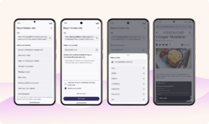
Feature: Report Broken Site
Reaching limits of walled prototypes
In tools like Figma, prototyping requires anticipating every possible interaction and defining it explicitly. For the user to feel the true experience, each path needs to be connected, each transition set, and each variation accounted for. As complexity grows, it tends to increase the cost of maintaining it: screens multiply, connections become fragile, and animations become tedious to maintain.
At some point, you’re no longer designing the experience. You’re managing the prototype.
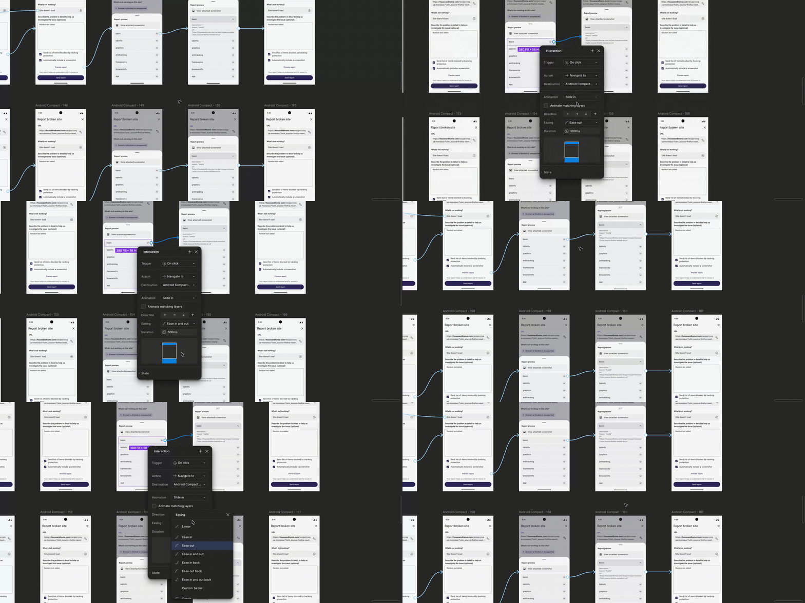
E.g. Changing the animation for one node, requires updating it everywhere manually.
To cope, we simplify the prototype. We reduce the number of paths, guide users through predefined flows, and limit what they can do on the prototype. The result is what I’ve started thinking of as a walled prototype — like a walled garden: a bounded space where users can move, but only within the paths we’ve pre-defined.
Some designers might argue that Figma’s recent additions of variables and advanced logic solve this problem. However, even with these tools, the designer is still building and managing the prototype. Figma prototypes simulate a system; it is not the system itself or a part of it. These prototypes have been useful, but they have also shaped the participant testing experience in ways that haven’t always been obvious.
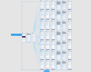
When the logic of a feature is handled by manual connections, the canvas quickly turns into spaghetti of fragile dependencies.
Prototypes shape participant behavior
This becomes especially noticeable in usability testing. Test participants tend to recognize when they are interacting with a prototype, and that awareness can change how they behave. They may hesitate to explore, follow the perceived intent of the task, or tap around when they get stuck.
For example, to keep a prototype manageable, I might only make a few issue types selectable. But then participants are doing two things at once: deciding what they want to do and guessing what the prototype will allow. Their feedback can become shaped by the prototype’s limits, not just the design — like a visitor to the walled garden checking which paths are actually open to them.
That constraint can be useful in early concept testing, where a narrower path helps focus the conversation. It becomes more limiting when we are trying to understand how the full experience behaves.
Research and practice have long acknowledged that prototype fidelity and testing setup can influence participant behavior. But in practice, many workflows still rely on constrained, screen-to-screen simulations.
I’ve often wondered:
How a user’s perceived experience might change if they weren’t encountering the feature in the isolation of a walled prototype?
From walled to native fidelity prototypes
Designing and prototyping is often described in terms of fidelity — from low-fidelity sketches to high-fidelity designs ready for dev handoff. That framing focuses on how closely we represent the product, but not necessarily how the experience itself behaves.
As building realistic interactions becomes easier using AI, it may now be possible to move beyond simulating flows in Figma and towards observing how people actually behave. So, alongside designing it in Figma, I built the feature directly into a local version of the Firefox Android app using Claude. It wasn’t straightforward at first, but even the friction of getting it working revealed things I wouldn’t have seen in a Figma prototype.
When I did this, I noticed there were no predefined paths to manage or fragile connections to maintain. The experience felt more continuous, allowing users to move more freely, not just within the feature, but within the app itself. I started thinking of these as prototypes with native fidelity — native to the app, native to the device, and aligned with how users expect interactions to behave.
When prototypes need to handle dynamic behavior
The difference between the two types of prototypes is not just theoretical; it starts to change what the experience can support. In walled prototypes, content is often fixed, and interactions move users between predefined screens. While this works for simple flows, it becomes harder to represent how interfaces behave when content needs to update dynamically based on user interaction.
In the Report Broken Site feature, this was important. A walled prototype struggles with:
- Capturing website data: Depending on the browsing tab, metadata like the URL, screenshot, browser info, and tracking data needs to be captured and reflected back to the user.
- URL editing: Simulating real text entry, cursor movement, and auto-correct behavior.
- Branching logic: If a user selects “Site doesn’t load” as issue type, the details are optional, but if they choose “Something else,” details become required.
- Error handling: For “Something else,” the system must validate input length in the description box and show an error if it’s insufficient.
Have you ever run into interactions like these and found yourself simplifying them, just to make the prototype manageable?
When I built it directly using Claude, the native fidelity prototype was able to handle metadata capture, text input, and branching logic more naturally.
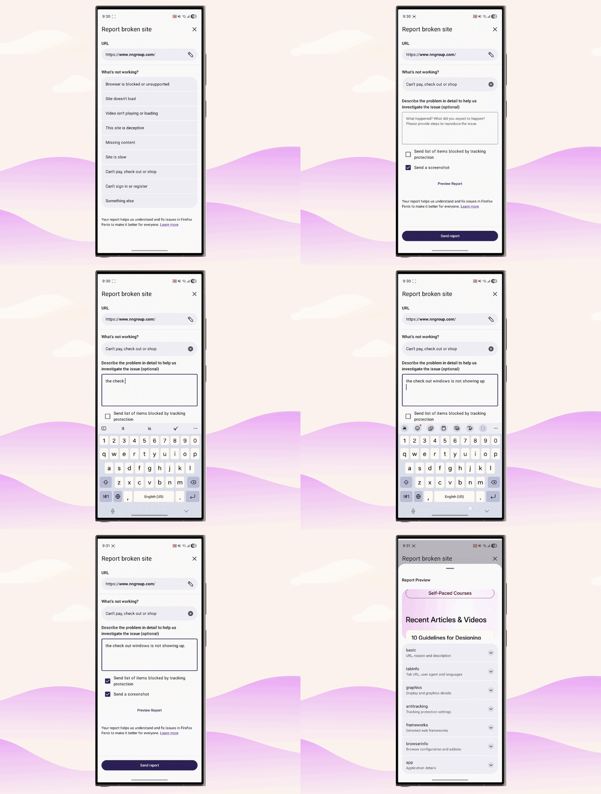
The native fidelity prototype inherits native behaviors like metadata capture, keyboard interactions, and dynamic state changes.
The environment is part of the experience
Another challenge is the environment in which the prototype is experienced. In walled prototypes, layouts are often fixed, and responsiveness is limited. Differences in device size, orientation, or performance can introduce inconsistencies that don’t reflect the intended final experience.
In practice, this can show up as:
- Oversized UI elements on larger devices as the prototype was created for an average phone size.
- Laggy interactions on slower networks as Figma prototypes fail to be responsive sometimes.
- Layouts that don’t adapt as expected because of the constraints of the prototyping environment.
When the interaction is built directly in the app, the experience inherits the native environment of the device. Layouts respond to screen size, interactions feel more consistent, and the overall experience is closer to what users would encounter in the final product. This could reduce the likelihood of testing interfaces being mistaken for design issues.
Tradeoffs and new realities
This approach introduces its own challenges. First time setup for a designer is complex, and navigating the codebase and working through unfamiliar tools takes effort.
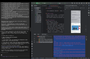
Using Claude on the Firefox for Android codebase in Android Studio to build the prototype.
Adopting this approach requires a shift in the UX designer’s toolkit. It raises the barrier to entry by requiring baseline comfort with the terminal, build environments, and IDEs. But it also allows designers to move beyond “faking the experience” in Figma prototypes and start building directly in the app.
Building the prototype this way also changes how the work evolves. Instead of worrying about defining everything upfront, requirements tend to emerge through interaction —i.e. edge cases, missing states, and unclear behaviors as the experience is built. In Figma, many of these details are easy to overlook; when you create a prototype by building directly, they become easier to find.
Of course, this realism has its limits. While the experience feels like a continuous system rather than a sequence of steps, I haven’t yet connected it to a backend, pulled in APIs, or tested cross-device capabilities across mobile, tablet, and desktop. I’m still at the start of this exploration. What I want to understand next is how native fidelity prototypes change the testing environment itself: whether participants explore differently, whether failures are easier to interpret, and what new friction this approach introduces for designers and teams.
Start failing for the right reasons
To put it simply: if prototypes constrain user behavior, they may also shape the insights we get from usability testing.
For Report Broken Site, the value of the native prototype was not just that it handled more states. It gave me a more honest way to sit with the experience before putting it in front of participants. I could edit the URL, switch issue types, trigger validation, and move around the app as the feature would exist in context. Because this was a mobile experience, that context mattered: I could test it on a real device, with real navigation patterns, real input behavior, and the surrounding app experience intact. Those details helped me look past whether the prototype was working and focus more directly on whether the experience was working.
That is what I mean by letting the design fail for the right reasons: understanding whether an experience fails because of the design itself, not because of a missing screen-to-screen connection, bad transition, or laggy Figma prototype. The next step is to test whether this translates into different participant behavior and more useful usability insights.
Originally published on medium.com.