Update on Firefox 13’s Home and New Tab Redesign

Two Firefox features getting a redesign in Firefox 13 (currently in beta) are the Home Tab and New Tab. Home Tab can be viewed by clicking house icon in Firefox or by typing “about:home” into your URL bar. New Tab appears when you click the “+” at the end of your tab strip.

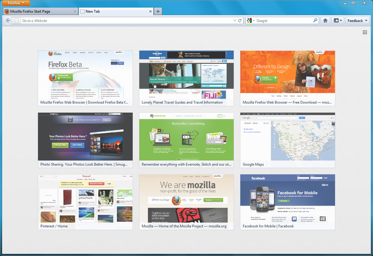
Firefox 13 New Tab Page

Firefox 13 New Tab Page

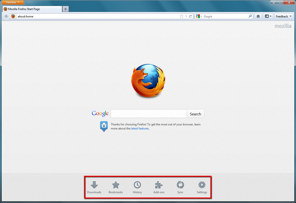
Firefox 13 Home Tab Page (launch targets emphasized)

Firefox 13 Home Tab Page (launch targets emphasized)

Firefox’s Home Tab and New Tab have, until now, had fairly basic pages. In Firefox 12, Home Tab had a large search bar, a “snippet” which Mozilla uses to display messages to users, and little else. The main reason the search bar is on Home Tab is because many users click the Home button to initiate a search, either unaware of the toolbar search box or preferring not to use it. The snippet allows Mozilla to give a message to users, such as last October when it asked users in the United States to contact their representatives when the anti-internet-freedom bill SOPA was being heard in the House of Representatives. Such messages can be important while not being urgent enough to disrupt users with a notification.

New Tab, for most of Firefox’s history, has been completely blank. This was done deliberately to offer users a clean, fresh “sheet” to begin a new browsing task. However, a blank tab may not be distracting, but it’s also not useful.

Surely, we thought, we can present a more helpful design than a blank page! Using Mozilla Test Pilot, we began to research how Firefox users use New Tabs. What we learned is that each day, the average Firefox user creates 11 New Tabs, loads 7 pages from a New Tab, and visits two unique domains from a New Tab. The average New Tab loads two pages before the user closes or leaves it.

What this tells us is that users create many New Tabs, but they’re very likely from those to return to a limited number of their most-visited websites. So, we began to experiment with giving users quick access on New Tab to the websites they visit most frequently.

What you’ll see on the New Tab page of Firefox 13 are your most-visited sites displayed with large thumbnails, reducing the time it takes to type or navigate to these pages. This data comes directly from your browsing history: it’s the same information that helps Firefox’s Awesome Bar give suggestions when you type. Or, if you want to go somewhere new, the URL bar is still targeted when you type on a New Tab page. If you want to hide your top sites – permanently or temporarily – a grid icon in the top right wipes the new tab screen to blank.

Mozilla Home is getting a redesign, too! While still keeping the prominent search bar and snippet, the graphic style is softer, the text is more readable, and launch targets at the bottom allow you to quickly access areas such as Bookmarks, Applications, and previous Firefox sessions.

Both Home and New Tab are being improved as part of our longterm vision of making Firefox more powerful, engaging, and beautiful. Over the next few releases, more design improvements will be made towards this goal. For now, please try out Firefox’s new Home and New Tab pages in Firefox 13 Beta and tell us that you think!
68 comments on “Update on Firefox 13’s Home and New Tab Redesign”

  1. Ping from Update on Firefox 13′s Home and New Tab Redesign « CSS Tips on

    […] (Note: the following has been cross-posted to Mozilla UX) […]

    1. P4 wrote on

      I´d like to see greater flexibility, why not allow the user to set the number of entries on the New Tab? I want to have more than 9 and I´m sure I´m not alone.

      I searched in about:config for a way to increase the number of entries but had no luck. Is there a way to do this?

      1. webling wrote on

        I would like to be able to enter much more than 9 top sites also. Other browsers offer this ability and is better.

  2. Stroke wrote on

    I don’t like this new trend where browsers just put my history/bookmarks all over the place along with screenshots.

    The only thing that calms me down a bit is that Firefox always allowed enough customization so I can just turn these off and not worry about it.

    1. Disappointed wrote on

      Completely agree!
      Give us the option to keep or turn off this recent browsed site “feature”.
      I hate it.

      1. Jennifer Morrow wrote on

        If you click the grid icon in the top right, you’ll hide the thumbnails. The next versions will give more options regarding hiding, showing, or showing something else. Thanks for the feedback!

        1. Chuck wrote on

          Awesome, lets show the world my porn surfing habits.

          1. Jennifer Morrow wrote on

            Your porn should be yours! You can disable New Tab Page by clicking the grid in the upper right of the page. Or, click the X on a thumbnail to hide it for goods

        2. Renne wrote on

          Thank you! I don’t really like seeing my most visited sites at all, and the low resolution of the images looks trashy. (Spoken like a true designer.)

  3. dominik wrote on

    The home tab looks great! Will there be a way to use an alternative search provider instead of Google?

  4. Guillaum2 C. [Ge3k0s] wrote on

    I’ve heard that both will be merge into one page and that the home tab project has been abandoned ? Any news on this.

  5. Guillaume C. [Ge3k0s] wrote on

    I’ve heard that both will be merge into one page and that the home tab project has been abandoned ? Any news on this.

  6. Heraldo wrote on

    Is there a way to combine the home tab with the new page tab? For people that never go to a homepage, but start with previous session, the launch targets would still be useful if placed in the new page tab.

  7. Marat Tanalin wrote on

    Displaying most-visited sites (actually at different positions each time) is NOT a so good and usable idea as it can seem at first glance.

    It would be MUCH MORE nice for user to have ability to manually choose _arbitrary_ sites (not automatically selected based on browser history) and pin them to _exact_ positions in new-tab thumbnail-table. Just like Fast Dial or Speed Dial.

    1. Martin wrote on

      I absolutely agree.
      Just commenting on your thread so more people will see it and hopefully, someone would change this annoying feature. I think it’s logical that people would appreciate the ability to set their tabs the way THEY like them, and not by their browser and it’s history – without the ability to change it directly.

  8. Sachin Doshi wrote on

    Would definitely use the new Home page if it had Instant like plain old Google does. Until then, sorry guys!

  9. Michael Staake wrote on

    I personally love the new Home and Tab designs… improvements like these are what makes Firefox great!

  10. Ping from Running client-side Ruby on the Web with Native Client or Emscripten | Ars Technica on

    […] have already landed in the beta channel, but you can also get an early look by checking out the status report that was published last week in the Mozilla UX […]

  11. Orby wrote on

    oh look.. seen this somewhere before.. i remember now… opera has it :)

    1. Djarn wrote on

      because opera has it noone else should adopt it? I know, because the first pc had a monitor it would be daft for any other pc since to have a monitor… ( sarcasm in case it’s too much for you )

  12. Glenn wrote on

    Great idea with displaying most visited sites in the form of thumbnails on the bank page. That realy makes sense and saves time as you have only click on the thumbnail.

  13. William wrote on

    I think the “New tab” will be more useful if Firefox can display the lists of bookmarked pages and frequently visited pages. This will be better than just copying Opera and Chrome.

    The “New Tab” in Firefox for Metro design caught my eyes and I think the folks @ mozilla should port it back to the existing Firefox.

  14. chaussures air max wrote on

    I personally love the new Home and Tab designs.

  15. Ping from Firefox Has a Redesigned Home Page and New Tab Experience That Make Browsing the Web Faster and Easier | The Mozilla Blog on

    […] makes it faster and easier to get where you want to go on the Web with a redesigned Home Page and New Tab experience. The Home Page now includes icons at the bottom of the page to give you easy access to bookmarks, […]

  16. ZoNi wrote on

    I don’t understand that “speed dial” thingy. I prefer to use bookmarks and bookmark-bar.

    Also: “launch targets” on new tab? Why?!?

    Anyway, as long as it is possible to disable this stuff, it is OK with me. I like when “new tab” is JUST that – new tab! I don’t need search field on new tab, I don’t need page thumbnails…

  17. toto wrote on

    sorry i dont like this, how to turn this off and display like in previous versions?

  18. sland wrote on

    I don’t like the new tab. How can I set it to go back to the old way and have a blank tab?

    1. ux wrote on

      You can toggle the thumbnails on the New Tab page on and off by clicking the small grid icon in the top right corner.

      1. Mr. UX wrote on

        I’d like to remove it at all just how it was before, not to enable and disable it at a click of a button. Is that possible with your new futuristic googlechrometrendylike firefox?

        1. David wrote on

          I, too, hate the new “new tab” screen.

          To disable it, you can type “about:config” in the location bar, and then change “browser.newtab.url” to “about:blank”

          1. james wrote on

            thanks for the tip, just what i wanted, completely blank tab *Kicks back and puts feet on desk*

  19. and stuff wrote on

    The new tab history thumbnail feature is cool, amazing, a marvel of modern technology, I cant say enough wonderful things about it….. now how do i turn it off

  20. kramerpad wrote on

    Disappointed about the new tab page. I switched from Chrome and was so happy not to deal with it and now its back aaaaaH! Now I have to teach myself how to make it go away again.

  21. Kimberly wrote on

    I HATE the App Tabs. They are inappropriate for a public computer.
    People are too lazy to click on the History or Bookmarks menu????

  22. Bob Boretsky wrote on

    Awful, awful! While I can understand that some people might want to see recently visited web sites in a new tab, I think there are many who would not, and would prefer either selected websites or a blank page.

    Boo for not making it an option. I’ve used Firefox for many years because it offered options. It may be time to try Chrome.

    1. Jennifer Morrow wrote on

      You can click the grid icon in the top right to diable it.

      1. RN wrote on

        And you can always disable it permanently by editing ‘browser.newtab.url’
        preference value from ‘about:newtab’ to ‘about:blank’ .

        http://kb.mozillazine.org/About:config

        1. Doug wrote on

          Excellent
          Thank you very much. I disliked the new tab feature even before it was changed.

          Thanks to your instructions I have the new tab feature set to open my personal home page.

  23. Myself wrote on

    GREAT, now how do I DISABLE this (in YOUR opinion) wonderful “new tab” feature? Why not leave it the way it WAS, but give PEOPLE the option to enable it? Stupid to be forced into having it on with NO off switch, that is MY opinion !!!!!

  24. asdf wrote on

    I disabled the stupid noise background image with the style inspector and hovering over the launch targets is no longer sluggish.

  25. me wrote on

    How can i disable the new tab thing? I had an add-on that customized the opening of new tabs and now it’s not working.

    1. Jennifer Morrow wrote on

      Click the grid icon in the top right to disable the thumbnails.

  26. Chris wrote on

    No way to disable this “feature”? Great. Maybe I’ll just switch over to MSIE, after all I’m been using netscape since 94ish, but what the heck?

    1. Jennifer Morrow wrote on

      You can disable New Tab Page by clicking the grid in the upper right of the page. Thanks Chris!

  27. The Camel wrote on

    So now it’s the same as Opera with a new tab page. Pity Mozilla haven’t copied the ability to alter the number of sites displayed. Personally I prefer more than nine.

  28. Daniel wrote on

    Is there a way to get the blank tab back on a new tab? I do not want the links that are shown. I liked the blank tabs.

    1. Jennifer Morrow wrote on

      You can disable New Tab Page by clicking the grid in the upper right of the page. Thanks!

  29. dbelton wrote on

    I prefer a blank page over the new tab feature, but it would be a great improvement if I could configure a page to load when I open a new tab. For example, load the “home” page, or load a specific web page. If the new tab feature even loaded my most visited pages from the history, that would be ok, but it seems to pick the most off the wall pages that I haven’t even visited for months.

  30. Tex Zero wrote on

    I installed this https://addons.mozilla.org/en-US/firefox/addon/new-tab-homepage/

    I would like to be able to customise the new tab thumbnails. Instead of most visited I’d like to be able to define what links or bookmarks are displayed.

  31. Ben wrote on

    I agree with others here that the ‘new tab’ feature would be much more useful if it were manually configurable (i.e. I can choose what site shortcuts appears where). Yes, you can move them around and pin favourites; but do I really have to keep removing those I don’t want (including 404s!) until I get to the sites I do want to keep there? A manual option seems a pretty obvious requirement; and there are existing Add-ons that do already provide this functionality (e.g. Speed dial, Site launcher).

    Still – I guess it’s early days! Hopefully we’ll see better functionality in the next release :)

    1. Jennifer Morrow wrote on

      This will happen in a future iteration! Thanks for the feedback

  32. MARK DC wrote on

    Love Firefox…hate the most visited pages on a new tab. Please give us the option to disable this!

    1. MARK DC wrote on

      Never mind…finally found out how…by pressing the grid icon in the upper right. Now I am happy with Firefox…well, in love!

    2. Jennifer Morrow wrote on

      You can disable New Tab Page by clicking the grid in the upper right of the page

  33. Ed wrote on

    When people ask ‘how do we turn it off’ they don’t want to have to click in the upper right to manually turn it off each time. They mean ‘how do we set it so that we don’t see a history when we click new tab’ – how do we permanently disable it (or disable it for long periods of time). Imagine someone who does not want to see a history of their pages — clicking in the upper right means you will see a history of your pages for the time period between opening it and clicking in the upper right, which is enough time to see your pages.
    (And the upper left Firefox menu should have a ‘Settings’ menu by the way)

    1. Kjetil Nesheim wrote on

      Open ‘your’ page when you open a new tab.

      Load the ‘about:config’ page
      and change: browser.newtab.url
      to the page you want like: “www.google.com’

  34. Ping from Firefox Has a Redesigned Home Page and New Tab Experience That Make Browsing the Web Faster and Easier :: Mozilla Blog on

    […] makes it faster and easier to get where you want to go on the Web with a redesigned Home Page and New Tab experience. The Home Page now includes icons at the bottom of the page to give you easy access to bookmarks, […]

  35. Ping from Firefox Has a Redesigned Home Page and New Tab Experience - oTeKBits on

    […] makes it faster and easier to get where you want to go on the Web with a redesigned Home Page and New Tab experience. The Home Page now includes icons at the bottom of the page to give you easy access to bookmarks, […]

  36. Stella wrote on

    Just want to say that I love it, please don’t remove it just because people are complaining about it! I go to the same sites just about every day and was previously using a tabs plugin like Tex mentioned above. I actually just set my home page to the tabs page :) Thanks for a great addition.

  37. Ping from Firefox Has a Redesigned Home Page and New Tab Experience That Make Browsing the Web Faster and Easier | Mozilla Press Centre UK on

    […] makes it faster and easier to get where you want to go on the Web with a redesigned Home Page and New Tab experience. The Home Page now includes icons at the bottom of the page to give you easy access to bookmarks, […]

  38. Ben wrote on

    I load up a new tab because I want to maintain the old tabs, just before loading a new URL into the navigation bar. Any CPU cycles Mozilla tries to do for me is wasting my time, and cluttering my screen.

    AND, the “most recent” websites it decided to load were websites I have hardly ever visited, if ever. They are just plain wrong.

    AND there was only one of the nine loaded.

    AND, I really don’t like it when companies (like MS) try to think for me. They usually get it wrong, which is why I use FireFox instead of internet exploiter.

  39. Ping from Do Not Lick » Update on Firefox 13′s Home and New Tab Redesign on

    […] (Note: the following has been cross-posted to Mozilla UX) […]

  40. Dave Morrow wrote on

    Every time I start firefox it loads two pages, one with an advert to put firefox on a mobile phone and the other is the search page that is now driven by Babylon. I have tried to revert back to google as my home page but it still loads Babylon, as when I start Firefox it seems to load addons even though I have disabled them.
    I want to keep using Firefox but with google as my prefered home page. How can I do this or should I start using Internet explorer?

    1. Stephen Horlander wrote on

      Not sure what Babylon is. Sounds like you may have an add-on that is hijacking your search engine.

  41. Val wrote on

    I love the new tabs page. Some of the complaints do not accurately describe the situation. The new tabs page doesn’t have to show changing thumbnails though it can. It doesn’t have to show your most recently viewed websites. You can pin the nine sites you want to “speed dial” and those will always be the nine that appear. You can drag a bookmark to one of the nine blocks and then pin that as one of the blocks that will not change. I find it very handy as most of the time when I click for a new tab, I will be visiting one of a limited number of sites. My only complaint is that I wish there were more than nine!
    12? 15?

  42. Sylvia wrote on

    I HATE this new design! Just give me options I’m savvy enough to pick and choose what I need and want. This re-designing is more about showing off your IT intelligence than anything else. Sorry, but I wish you’d just leave ‘well enough’ alone!

  43. Dapink, Gemma Dotzler wrote on

    I dont like this new design, and as somebody said in the upper comments (even I know now that my porn is private) I feel like everybody can see my porn now

  44. Chris Waters wrote on

    This feature great but it would be much more useful if the user could configure the number of links shown. At the moment the list seems to be an infinite history which must take up storage space and kind of defeats the object if you have to scroll through page after page of links to find the one you may be interested in, isn’t that what the history menu is for? In this thread there was mention of a limit of nine, what happened to that? Can we have that back as a default, with a setting to adjust it higher or lower?