Evolving the Firefox Brand

Say “Firefox” and most people think of a web browser on their laptop or phone, period. TL;DR, there’s more to the story now, and our branding needs to evolve.

With the rapid evolution of the internet, people need new tools to make the most of it. So Firefox is creating new types of browsers and a range of new apps and services with the internet as the platform. From easy screen-shotting and file sharing to innovative ways to access the internet using voice and virtual reality, these tools will help people be more efficient, safer, and in control of their time online. Firefox is where purpose meets performance.

Firefox Quantum Browser Icon

As an icon, that fast fox with a flaming tail doesn’t offer enough design tools to represent this entire product family. Recoloring that logo or dissecting the fox could only take us so far. We needed to start from a new place.

A team made up of product and brand designers at Mozilla has begun imagining a new system to embrace all of the Firefox products in the pipeline and those still in the minds of our Emerging Technologies group. Working across traditional silos, we’re designing a system that can guide people smoothly from our marketing to our in-product experiences.

Today, we’re sharing our two design system approaches to ask for your feedback.


How this works.

For those who recall the Open Design process we used to craft our Mozilla brand identity, our approach here will feel familiar:

  • We are not crowdsourcing the answer.
  • There’ll be no voting.
  • No one is being asked to design anything for free.

Living by our open-source values of transparency and participation, we’re reaching out to our community to learn what people think. You can make your views known by commenting on this blog post below.

Extreme caveat: Although the products and projects are real, these design systems are still a work of fiction. Icons are not final. Each individual icon will undergo several rounds of refinement, or may change entirely, between now and their respective product launches. Our focus at this point is on the system.

We’ll be using these criteria to evaluate the work:

  • Do these two systems still feel like Firefox?
  • How visually cohesive is each of them? Does each hold together?
  • Can the design logic of these systems stretch to embrace new products in the future?
  • Do these systems reinforce the speed, safety, reliability, wit, and innovation that Firefox stands for?
  • Do these systems suggest our position as a tech company that puts people over profit?

All the details.

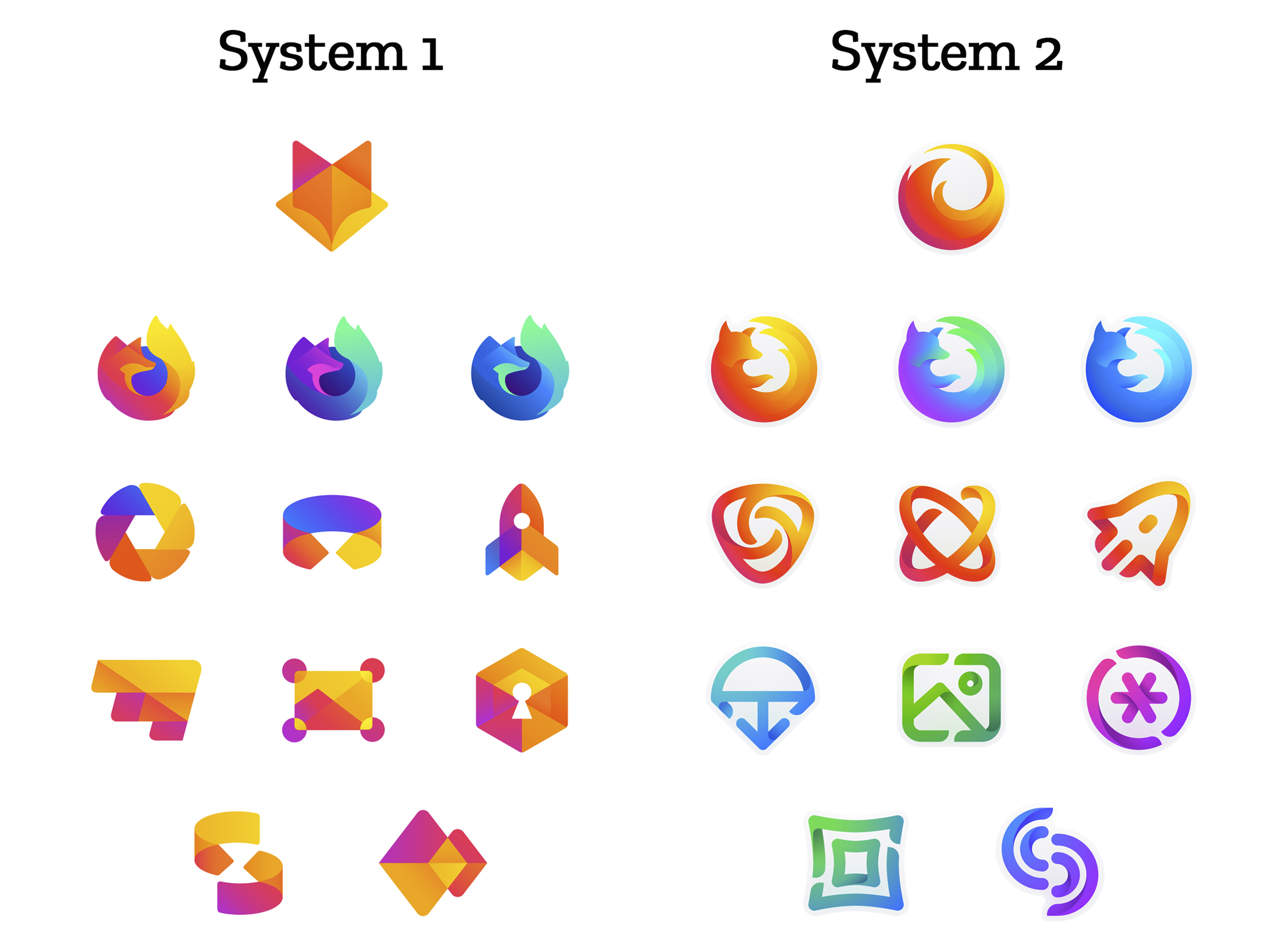
The brand architecture for both systems is made up of four levels.

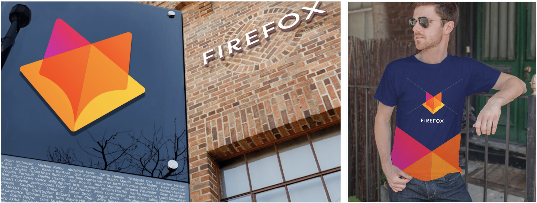
Each system leads with a new Firefox masterbrand icon — an umbrella under which our product lines will live.

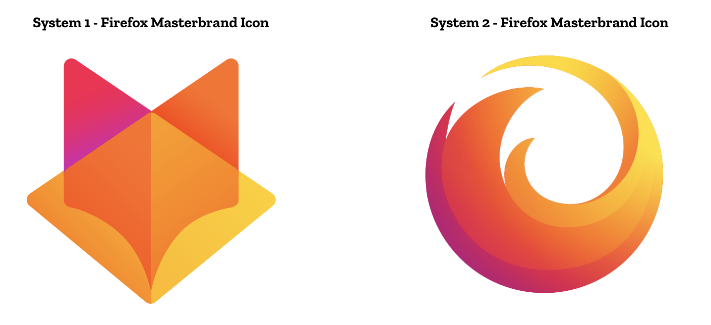
The masterbrand icon will show up in our marketing, at events, in co-branding with partners, and in places like the Google Play store where our products can be found. Who knows? Someday this icon may be what people think of when they hear the word “Firefox.”

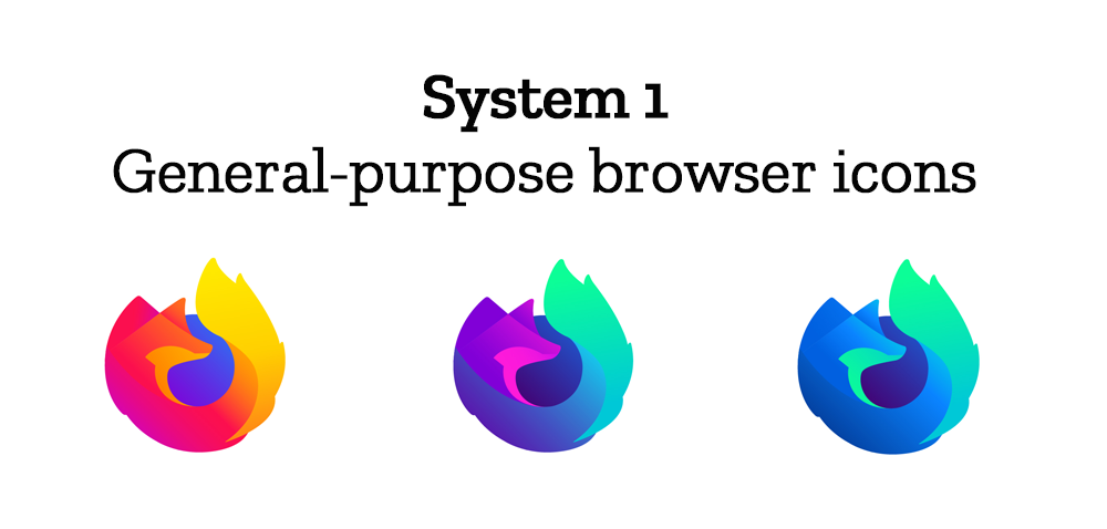
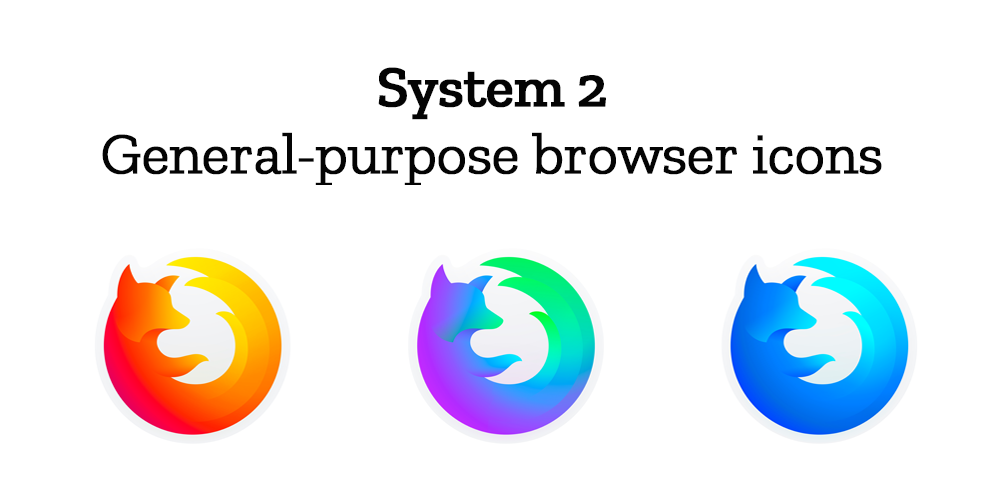
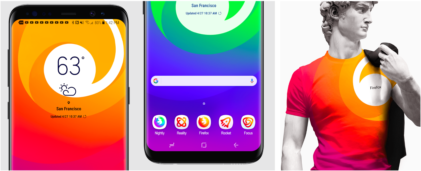
At the general-purpose browser level, we’re proposing to update our Firefox Quantum desktop icon. We continue to simplify and modernize this icon, and people who use Firefox tell us they love it. Firefox Developer Edition and Firefox Nightly are rendered as color variants of the Quantum icon.


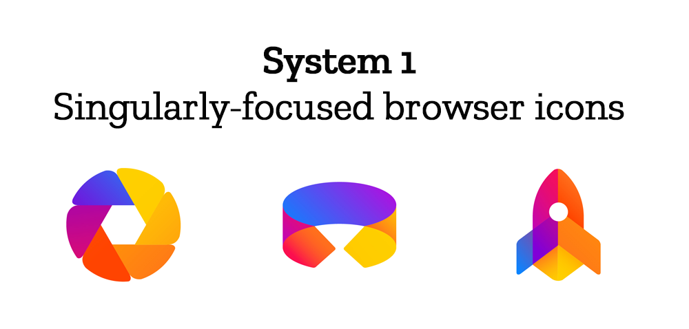
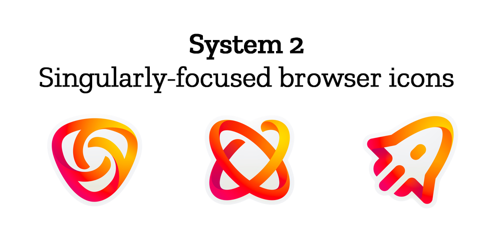
Browsers with a singular focus, such as our Firefox Reality browser for VR applications and our privacy-driven Firefox Focus mobile browser, share a common design approach for their icons. These are meant to relate most directly to the master brand as peers to the Firefox Quantum browser icon.

Finally, the icons for new applications and services signal the unique function of each product. Color and graphic treatment unite them and connect them to the master brand. Each icon shape is one of a kind, allowing people to distinguish among choices seen side by side on a screen.

Still in the works are explorations of typography, graphic patterns, motion, naming, events, partnerships, and other elements of the system that, used together with consistency in the product, will form the total brand experience.

Read along as we refine our final system over the next few months. What we roll out will be based on the feedback we receive here, insights we’re gathering from formal user testing, and our product knowledge and design sensibilities.

With your input, we’ll have a final system that will make a Firefox product recognizable out in the world even if a fox is nowhere in sight. And we’ll deliver a consistent experience from an advertisement to a button on a web page. Thanks for joining us on this new journey.

Madhava Enros, Sr. Director, Firefox User Experience

Tim Murray, Creative Director, Mozilla

2,212 comments on “Evolving the Firefox Brand”

  1. Val Blais wrote on

    System 2 seems more distinct for my aging eyes.

  2. Ken Barbalace wrote on

    I like system one better than system two as it is more visually appealing to my eye and the icons seem more consistent to me across the entire system.

  3. Yusuf Mohamud wrote on

    I really like the design of system 1. The way the colours blend together and the more distinctive styling makes it very aesthetically-pleasing to me. System 2 is nice but it reminds me too much of a sticker.

  4. Jorge wrote on

    I like the fox master icon and the second set of general purpose browser icons.

  5. Johannes wrote on

    I prefer system 2, as the master icon is way more “foxy” andere resembles more Thema current logo than the Others one, that features the foxes head.

    Next, I like the three main browser Icons of system 2. Their shape is more appealing to me.

    However, for the remaining logos I prefer system 1.

    Best, Johannes

  6. Alan wrote on

    System 1 looks so much better!

  7. Arthur Fakhreddine wrote on

    I prefer the first system for 2 reasons

    The icons look much more movers modern

    It stick week with what people think of Firefox, burning orange with shades of blue

    Also I believe that they will be easier to use to create meaning because they are not outline based, the other ones have very thick outlines so it will be complicated to create different shapes.

    I also just find them more beautiful but that’s just my opinion.

  8. Jun You Tan wrote on

    I think the swoosh will forever have a place in my heart and it looks more dynamic and special, with the strong sense of motion. However, that dynamism is lost in the new icons in system 2 with its thinner lines and vastly different shapes that no longer reference the fox. It’s hard to keep the swoosh in new icons for separate services. But overall, I’m more interested in system 2.

  9. Arthur Fakhreddine wrote on

    Also for your animations, if you use this first icon set, then you could use panels that fade and slide into position and change in gradient based on position. I think this is more or less un heard of, and I think will look pretty cool.

  10. Steve Baumann wrote on

    The Masterbrand icons are both interesting in their own way. However, they both seems to loose a little something of the whole. Icon 1 is all fox with no fire. Icon 2 is all fire with no fox. The very first sub icon of either set seems to convey “Firefox” better than either of the two Masters. If you are concerned about having icons for future products, it seems like it would be quite easy to wrap our friendly, flaming fox around a pencil or paint brush (for a creative app), have it holding a camera (for a photo related app), or you could easily attach the flaming bushy tail to any number of objects to convey that the particular app/tool is a Firefox (related) product. In System 1, only the colors seem somewhat related to any Firefox branding, and in System 2, nothing about those icons says “Firefox” to me, in any way, shape or form. They are nice, attractive, well designed icons, to be sure; just a total non-starter in evoking anything in my imagination that would even remotely make me think of my favorite fox.

  11. Bill B wrote on

    I think System 1 is more fresh, state of the art, and fun. At this stage though, the Masterbrand icon for System 2 feels more finalized, or mastered. In music production blending all the instruments and levels so that it sounds like one unit is the mastering process, and System 2’s main logo has that fully-realized effect. All the shapes and colors are blended well enough so that it feels like a single image and logo, whereas System 1 still has the feeling of being separate shapes that haven’t been fully integrated into one logo.

    Some ideas to help mix logo 1 a bit could be to use a slight glassy effect you see in Apples OS, where an overlaying menu you swipe overtop the existing screen blurs and glasses out the screen behind the menu. Either applying that effect to the diamond fox head, or increasing the transparency of the diamond so that the contrast between diamond and ears isn’t so strong could potentially help. Overall, I do prefer the fox head logo and would rather have it on my phone and computer screen.

    Pros for System 1
    It’s playful and fun, and makes me feel creative and like tinkering and exploring the interface.
    I get the sense of people being the priority with this set.

    Cons for System 1
    I wonder if in their simplicity they aren’t communicating a detailed enough icon. The rocket, lock, and photo frame are easy enough to make out, but the others almost seem more like buttons. The learning curve (however small it may be) to learning what icons match to what systems might be slightly higher for System 1. I love this system though, it’s awesome.

    Pros for System 2
    A more clear and direct set of logos, easy to interpret due to more detail. The general purpose fox icons are equally clean and fresh for both systems IMO.

    Cons for System 2
    For whatever reason, the first thing that comes to mind when looking at the new apps and services is mid-2000’s Hp printer design. There’s probably no concrete correlation, but yeah this feels like companion icons to hardware where design is second instead of leading-edge design for a software suite. This set of logos has a slightly dated feel to me, and maybe it’s the more classically corporate look that’s signaling that effect.

    I think both systems can be stretched for new products in the future. A VR icon for when browsers and social media have integrated a sort of social virtual reality could be a good exercise. A mail icon could be done easily enough on both systems as a creative exercise as well.

  12. Broc Seib wrote on

    The master icon from system 1 is superior to system 2. It’s simple and brilliant. However it does depart from what people are used to seeing. But I see that as an opportunity to attract new users, and convey a new product meaning with a strong brand change. Shake it up a bit and get noticed.

    As for the rest of the icons, system 2 seems to communicate their purpose better than system 1. System 2 was smarter about when to use monotone vs multi color, given the context where those icons will be used. System 1 are a little more abstract or a bit muddled in conveying their purpose.

    I am not an expert. That’s just my reaction upon seeing them.

    Nice work done on all icons by their respective authors.

  13. Zebulon McCorkle wrote on

    First impression is that the system 1 masterbrand icon looks very similar to the GitLab logo, that might need to be changed.

  14. Luke Petschauer wrote on

    In general I prefer System 1, with the important exception of its “Firefox Master Brand” icon, which
    looks almost identical to GitLab’s icon and abandons FF’s signature circle icon/branding. I sincerely hope you will not use it! To me, this is hugely important – don’t abandon the FF circle, especially for something so derivative!

    System 1’s “General Purpose Browser Icons” are much better than those in System 2 – to me, an important part of FF’s ethos is that it is a browser for the _world_-wide web. System 2’s icons lack the “earth” circle in the icon, leaving the red panda grasping at thin air–not the sort of imagery that I think should represent FF. Note that this problem is not evident in System 2’s Master Brand icon, where the tail comes around to almost complete the circle.

    System 1’s “Singularly Focused Browser Icons” and System 2’s “Icons for new apps & services” are both more visually appealing than the alternatives, in which the orange and red is overpowering.

    Thank you for sharing your concepts. In the end I prefer a hybrid of the two, but would put maintaining the continuity of the Masterbrand Icon before everything else.

  15. Claudio wrote on

    System 2>

  16. Adam wrote on

    I quite like the system 2 icons as they’re close to the existing Firefox icons that we know and love, while still being modern and fresh-looking.

  17. A. Wilcox wrote on

    System 2 is so much more internally consistent. I don’t like System 1’s design nor colours.

    That said, I feel like some of the shapes of the “new apps and services” from System 1 might work better than the shapes of the System 2 icons for easy recognition.

    I definitely prefer System 2 though.

  18. Thompson wrote on

    No doubt, both are visually interesting, but system set 1 pushes the limits and presents a new group of sleak, not obvious iconography, yet maintaining brand consistency. Amazing! Can’t wait to see it in production!

  19. Keegan wrote on

    The new icons look awesome! I’d probably go with system 2. It’s hard to miss the similarities between the system 1 masterbrand icon and GitLab’s logo

  20. Kevin wrote on

    System 2!

  21. Daniel Forssten wrote on

    Neither system for the “Singularity focused browser icons” are telling me that they are related to Firefox — they could be the logo of any hip startup or sleek mobile app. The same goes for the “Icons for new apps & services” and the Mozilla brand as a whole.

    For me, animals wrapping around an item are recognizably Mozilla products. If you were to branch out the Firefox brand, I would like distinctive elements of the Firefox logo to always be kept, such as the fox’ head and/or thick flames — the color scheme alone is not enough.

  22. franklinovitch wrote on

    I generally prefer the system 1, the colours are more consistent.

    However, its “masterbrand icon” looks A LOT like the one from GitLab.

    Feels really weird.

  23. Sam wrote on

    System 2 is the winner so far. Seems like a great evolution of the current system, and that masterbrand icon retains the recognition of the existing Firefox icon even without the fox head.

    The shading is spot on – it’s beautiful, vibrant and stands out in a sea of mediocre browser icons. System 1 feels less refined, and the more blocky use of colour feels less sophisticated. Looks more like a young startup rather than an established, trusted brand.

    I do, however, feel like the singularly-focused icons need a bit of work. The same icons in System 1 feel slightly more refined and recognisable.

    I also think that the masterbrand icon in System 1 isn’t right. It’s too techy, has lost a lot of personality. Could be for anything really.

  24. kobo wrote on

    overall, the system 1 icon looks better to me except for the browser icon which are ‘cleaner’ on the system 2

    the meaning o some of the icon elude me but tha may be because i don’t know the services. but the lock and email on system 1 are definitely clearer to me that the star and email of system 2

  25. Baratum wrote on

    I really like the system 2/bcus its look good in silluette,

    But it still need improvement

  26. Guillaume Bellemare wrote on

    Definitely system #1. More consistent trough out.

  27. Craig Cole wrote on

    System 2 and not even close. Sleek, clean and new. Love it!!!!

  28. Martin Spamer wrote on

    A triumph of style over substance, the purpose of each is entirely obscured.

  29. Min wrote on

    So… is System 1 intentionally a clone of the GitLab logo? Because it is. I’d seriously consider System 2 for that reason alone.

  30. Anand K wrote on

    I like the System 1 Masterbrand icon; it is highly distinctive.

    However I prefer the System 2 remainder icons.

    If you take S1Master and pair it with S2 browser icon, it visually looks appealing and is easy to say what the product is as well.

    “Oh, Firefox Browser, Firefox Developer Browser, Firefox Focus, etc.”

  31. Siva Swaminathan wrote on

    At an overarching level, I feel that the “fire” (being the emphasized syllable in Firefox) is a more suited center for the brand rather than “fox”. “Fire” also signifying innovation and advancement (almost always with positive connotations) while “fox” seems somewhat limiting from the perspective of future evolution and diversification. It would therefore be good to maintain the “fire” aspects of the branding rather than relegating that to the vaguely warm color scheme.

    The System 1 masterbrand logo reminds me of Gitlab (this will be the case for many techies) and will continue to be a source of confusion, going forward. Also, the singularly focused browser icon in System one looks a lot like the Google Picasa icon ported to this color theme. Coming to the color theme of purple+yellow+etc mishmash, it reminds me a lot of Ubuntu — System 1 icons for new apps/services could so easily be mistaken for Ubuntu branding.

    System 2 masterbrand seems to have more character specific to the Firefox (unlike generic abstracted shapes), and still leaves room for future brand evolution and diversification with the theme of “fire”. The pointy tails in the System 2 browser are most easily associated with speed, which is a great match for all the marketing around Firefox Quantum. That aspect would be good to reinforce, going forward.

    System 2 logos/icons also seem to carry the connotation of being “lean” (system 1 logos seem to connote full/fat, in contrast), but this is a very minor point.

    If sought, I’m happy to offer my feedback through the evolution of this work/process. Feel free to reach out via the email address I’ve provided.

  32. Foo wrote on

    – Why do you need a “masterbrand” ? Won’t having multiple logos for the same thing confuse people more than anything else ?
    – Have you heard of Gitlab ?
    – What’s wrong with the current logo ?

  33. Trouble D Foley wrote on

    And… Focus needs to be a completely different colour. There should be no confusion about which app I’m opening. So, no orange or blue, gimme a different colour.

  34. Roj wrote on

    System 1 please

  35. Benjamin Kerensa wrote on

    All of the designs look awful especially the System 1 which looks like a ripoff of the Gitlab branding.

  36. Greg wrote on

    System 2 for sure.

  37. Karman Miguel wrote on

    This is a tremendous waste of time and resources, and you should be ashamed.

  38. Trouble D Foley wrote on

    The system 1 master icon is far too aggressive and masculine. (Maybe even fascist). I have to look a bit closer. But my initial reaction is… No. No. No.

  39. Nabil wrote on

    Hi , I like most of the work done here but if have to choose by system for each system it would go like this :
    1- Master brand : i would choose system 1 as it has more character and would be instantly recognizable as a fox , system is too close to the browser icon and not close enough as without the fox head it looks like a group of circles with no purpose
    2-general purpose icons : i would also choose system one as i think the blue globe is essential to the Firefox browser brand and it adds contrast and omitting it would be a mistake
    3-Singularily focused browser icons : i would also go with with system 1 as it has more color and character and would be more recognizable.
    4-New Apps and services : I would like if system 1 had the colors of system 2 , as they are more vibrant and distinguishable , and the current color scheme of the system 1 icons look too similar to tell them a part.
    Good Luck.

  40. Matt Rasband wrote on

    The first set looks like GitLab, so in my non designer opinion that seems like a non-starter.

    The second one feels to lose the historic Firefox feel and would need a rebrand within a somewhat short window.

  41. Tyler Louton wrote on

    I personally like the system 1 icons better but I think that the overall firefox logo should be more similar to the browser logo as most people think of firefox as a browser and different logos could become confusing and damage the brand. I do really like the system 1 overall logo but believe that it should have more continuity. I think that the fox logo could look cool in different colorways too. Also that firefox t-shirt with the system 1 logo looks fire.

  42. Sam N wrote on

    System 1 for sure, love the masterbrand logo. System 2 has to much color variation

  43. Bryce Cindrich wrote on

    System 1 for sure.

  44. Bill wrote on

    I like version 2 better.

  45. Matthew Sinclair wrote on

    So i’m Really torn. I prefer system 2 for most things, however I VERY MUCH prefer the System 1 Masterbrand Icon – mostly for the swag possibilities. Also, it’s clearly a fox which is a must imo

  46. Fernando wrote on

    I think the current logo is perfect, but for everything else, system 1 is perfect.

  47. Alex wrote on

    System 2 is amazing !!!!!!!

  48. Lucas Vianna wrote on

    Definetely System 2. Although the apps and browser icons from system 1 are pretty cool, the fluidity of the sytem 2 designs is awesome. Even the gradient, which you might think got a little overused lately, seems new and fresh when added to those sleek curves.

    Elegant, smooth, edgy. The Masterbrand logo on system 2 is a flawless update on the classic, world-wide known, Firefox logo.

    GOD i hope System 2 makes the cut. Seriously.

  49. Joe De Patta wrote on

    Don’t care. I’ll get used to anything you come up with. I’d really like more security with my colorful logos.

  50. Diet_Soda_With_Lime wrote on

    These look horrible and bland. firefox already has an amazing an reconizble icon. i dont get the point of this rebrand. its both a waste of money and resources. stop making horrible decisions and put a real leader in charge.

More comments: 1 2 3 4 5 6 41