Evolving the Firefox Brand

Say “Firefox” and most people think of a web browser on their laptop or phone, period. TL;DR, there’s more to the story now, and our branding needs to evolve.

With the rapid evolution of the internet, people need new tools to make the most of it. So Firefox is creating new types of browsers and a range of new apps and services with the internet as the platform. From easy screen-shotting and file sharing to innovative ways to access the internet using voice and virtual reality, these tools will help people be more efficient, safer, and in control of their time online. Firefox is where purpose meets performance.

Firefox Quantum Browser Icon

As an icon, that fast fox with a flaming tail doesn’t offer enough design tools to represent this entire product family. Recoloring that logo or dissecting the fox could only take us so far. We needed to start from a new place.

A team made up of product and brand designers at Mozilla has begun imagining a new system to embrace all of the Firefox products in the pipeline and those still in the minds of our Emerging Technologies group. Working across traditional silos, we’re designing a system that can guide people smoothly from our marketing to our in-product experiences.

Today, we’re sharing our two design system approaches to ask for your feedback.


How this works.

For those who recall the Open Design process we used to craft our Mozilla brand identity, our approach here will feel familiar:

  • We are not crowdsourcing the answer.
  • There’ll be no voting.
  • No one is being asked to design anything for free.

Living by our open-source values of transparency and participation, we’re reaching out to our community to learn what people think. You can make your views known by commenting on this blog post below.

Extreme caveat: Although the products and projects are real, these design systems are still a work of fiction. Icons are not final. Each individual icon will undergo several rounds of refinement, or may change entirely, between now and their respective product launches. Our focus at this point is on the system.

We’ll be using these criteria to evaluate the work:

  • Do these two systems still feel like Firefox?
  • How visually cohesive is each of them? Does each hold together?
  • Can the design logic of these systems stretch to embrace new products in the future?
  • Do these systems reinforce the speed, safety, reliability, wit, and innovation that Firefox stands for?
  • Do these systems suggest our position as a tech company that puts people over profit?

All the details.

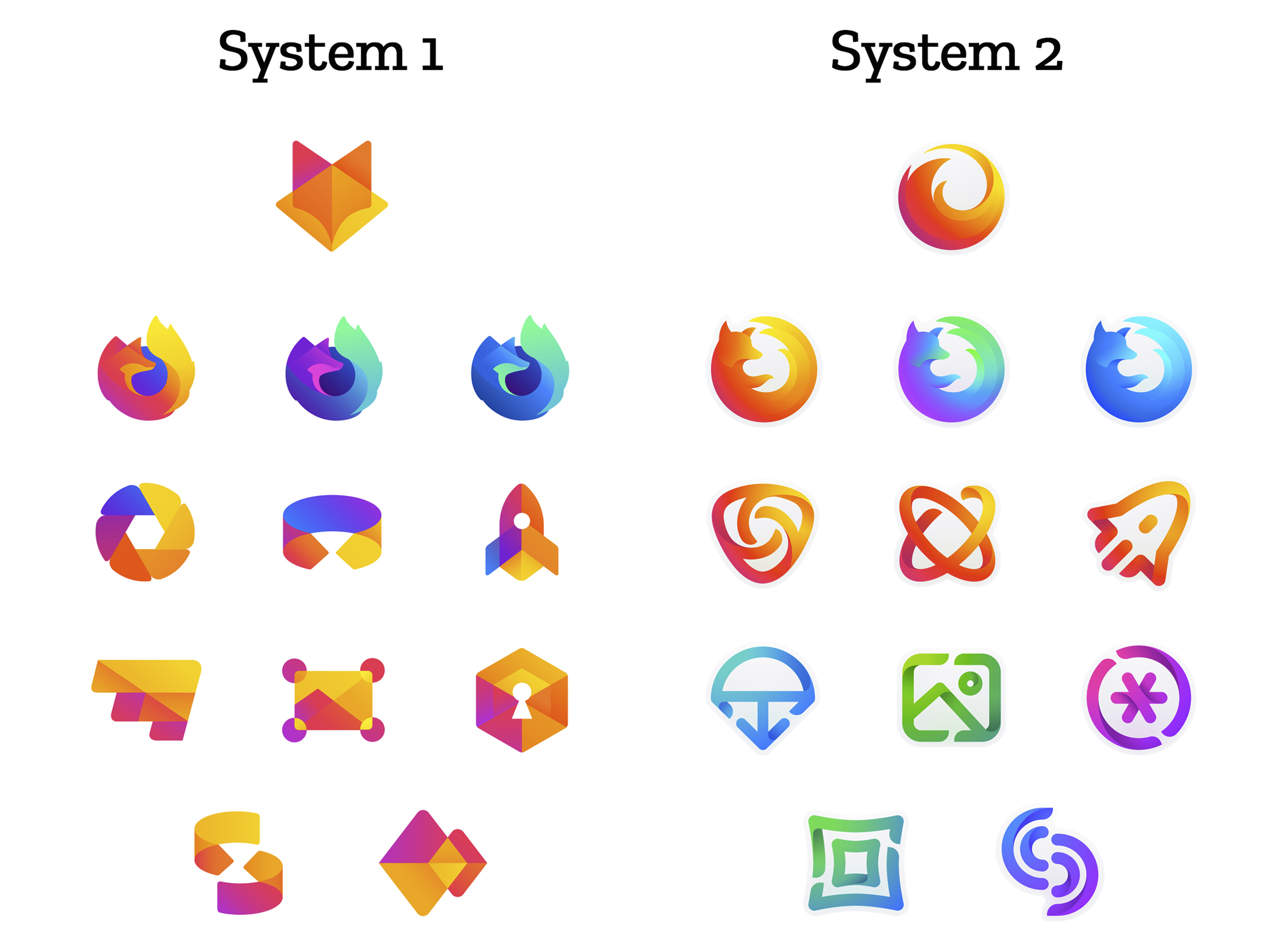
The brand architecture for both systems is made up of four levels.

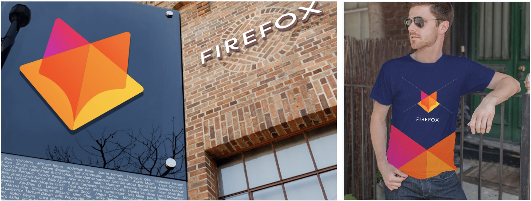
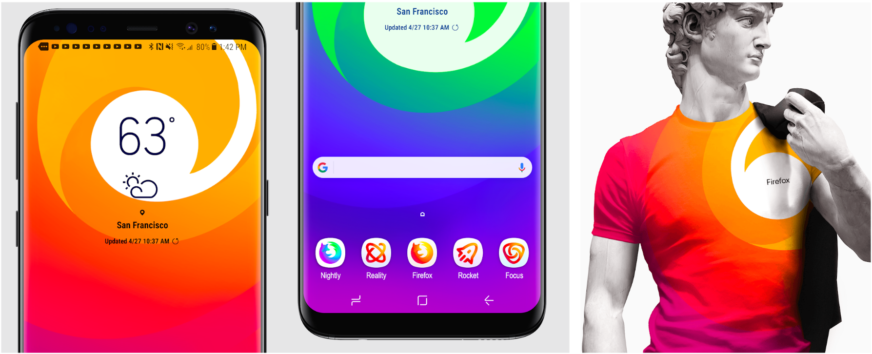
Each system leads with a new Firefox masterbrand icon — an umbrella under which our product lines will live.

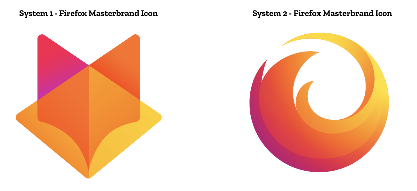
The masterbrand icon will show up in our marketing, at events, in co-branding with partners, and in places like the Google Play store where our products can be found. Who knows? Someday this icon may be what people think of when they hear the word “Firefox.”

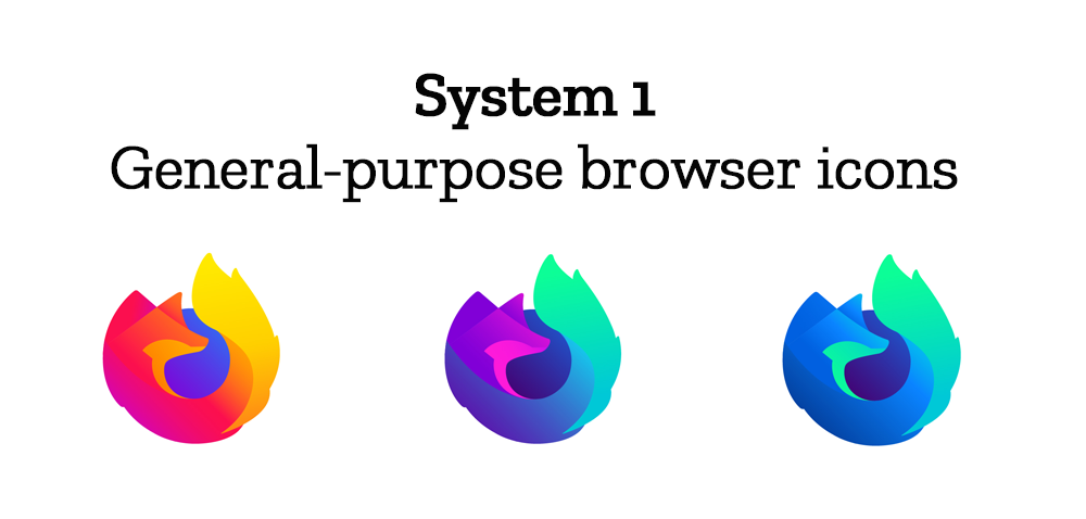
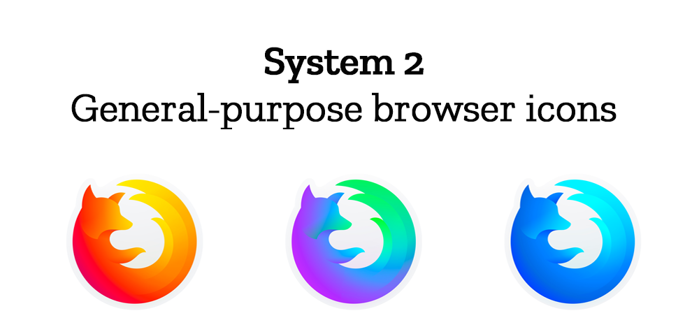
At the general-purpose browser level, we’re proposing to update our Firefox Quantum desktop icon. We continue to simplify and modernize this icon, and people who use Firefox tell us they love it. Firefox Developer Edition and Firefox Nightly are rendered as color variants of the Quantum icon.


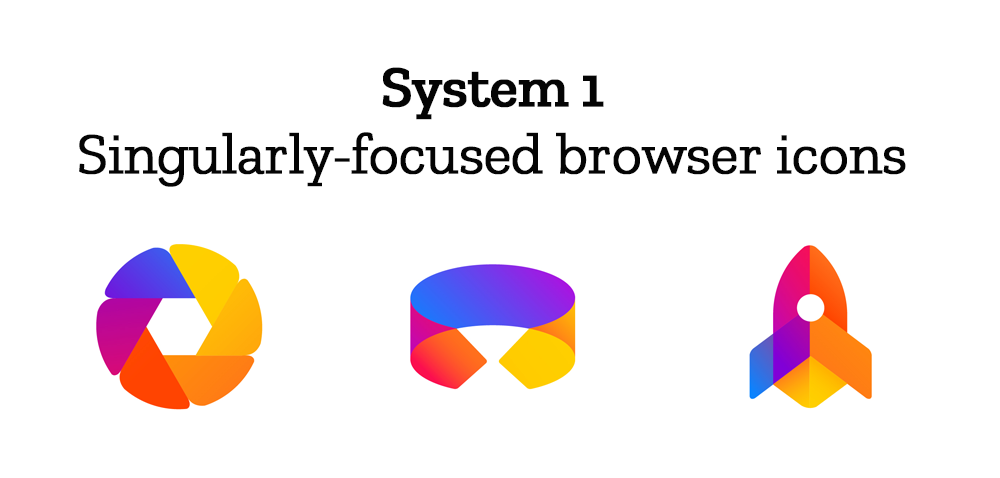
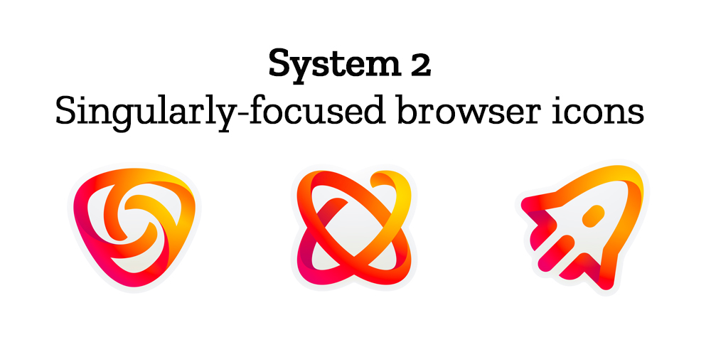
Browsers with a singular focus, such as our Firefox Reality browser for VR applications and our privacy-driven Firefox Focus mobile browser, share a common design approach for their icons. These are meant to relate most directly to the master brand as peers to the Firefox Quantum browser icon.

Finally, the icons for new applications and services signal the unique function of each product. Color and graphic treatment unite them and connect them to the master brand. Each icon shape is one of a kind, allowing people to distinguish among choices seen side by side on a screen.

Still in the works are explorations of typography, graphic patterns, motion, naming, events, partnerships, and other elements of the system that, used together with consistency in the product, will form the total brand experience.

Read along as we refine our final system over the next few months. What we roll out will be based on the feedback we receive here, insights we’re gathering from formal user testing, and our product knowledge and design sensibilities.

With your input, we’ll have a final system that will make a Firefox product recognizable out in the world even if a fox is nowhere in sight. And we’ll deliver a consistent experience from an advertisement to a button on a web page. Thanks for joining us on this new journey.

Madhava Enros, Sr. Director, Firefox User Experience

Tim Murray, Creative Director, Mozilla

2,212 comments on “Evolving the Firefox Brand”

  1. Mark wrote on

    Unless I’m missing info about integration, I think you’re making a mistake with both systems.

    I could go either way with the Masterbrand icons. What I reflexively do not like is the almost immediate falloff in comprehension with the lower-level icons.

    My suggestion would be to choose one of the Masterbrand icons based on community feedback and market testing, then the integrate all of the other icons into that Masterbrand. By which I literally mean superimposing the lower-level icons on the main, company wide rebranding.

    Fortunately, each of the Masterbrand icons presents space in which to do that, so you don’t have to start over. Without some kind of integration, however, I think you will be diluting the value of your new Masterbrand logo, regardless of which one you pick.

  2. higuita wrote on

    Firefox is the browser, do not try to glue other apps to it, even if already included, think in the in the seamonkey and why it was break up in several apps. If people start to see firefox as a bundle of apps, they will complain with bloat and slowdown, even if it is all html.
    Call it browser apps or maybe even better, addons (and allow removal/disable by the user), but they are still loaded via firefox. Have as few icons as possible

    Finally, Firefox icon, style should not be changed, trying to change it will seem again another attempt to “look like chrome” and its “simplified” look

  3. Telkeppe wrote on

    System 1 looks great.. with the exception of the masterbrand icon. It makes no sense to me in System 1. However all the other icons in system 1 are lovely.

    System 2… The icons are beautiful… But are horrible for branding and could easily be confused for other icons.

  4. Sean wrote on

    System 1’s Master logo is a bit too reminiscent of GitLab’s logo. The icons besides that both look good, though System 1 looks slightly better due to the icons being more solid and so easier to distinguish. Besides that, for typography it would be a good idea to stay consistent or at least related to the modern Mozilla typography.

  5. Vinícius wrote on

    I don’t think the “new apps” level of system 2 has visual hints enough to link then to the other levels. Looking at the whole system 2 all together, I can understand the connections, but I don’t believe that if one see one of the lowest level icon alone, he/she will connect it to the rest of the brand family.

    The icons of the system 1, on the other hand, have a consistent and distinctive image as a whole. Colors, lines, concept are obvious and strong enough. I don’t like the general purpose bowsers level of system 1, they could be more geometric to match the other icons of the system. I think the icons of that level in system 2 would work better in system 1 (with the proper adjustments, more sharp lines, less gradient).

  6. Pavale Dres wrote on

    I really dislike System 1’s mater brand icon. It doesn’t really symbolize anything other than current trends. System 2’s icon is closer to the idea of Firefox: empowering the web, and being fast and innovative.

    Although System 1’s Singularly-focused icons are much better and cleaner, the colorfulness of System 2’s icons for new apps and service is a must.

  7. Rendy wrote on

    I think, System 1 indicated no envolved for Firefox, because it have the same colors and design principle with the previous. So Maybe System 2 is the best for me

  8. Abrahim Ladha wrote on

    COLORBLINDNESS

    My colorblindness prevents me from seeing the difference between system 1 general purpose browser icons, the second and third ones which are probably for firefox developer and nightly i suppose. I like the system 1 designs better because of the bushy tails.

  9. DarckCrystale wrote on

    I really like the System 2 and it is at the same time close to your existing brand and different from other brands (system 1 looks like the GitLab brand identity and I find it very confusing).

  10. jim burge wrote on

    Leave the icons as they are. If not System 2 is best.

  11. Miguel wrote on

    I think that system 1 is a drastical change, and maybe that is what we need.

  12. sprocket wrote on

    The Firefox brand is not a collection of apps or an OS. It is the web browser. No one in userland wants to see it change, and changing it up will destroy the brand.

    If anything, what you guys are proposing should be filed under the Mozilla brand, not the Firefox brand.

    Most of the icons proposed are too similar to existing properties. Besides, they all have no meaning to me, besides the Firefox logo.

  13. Foobar wrote on

    All of this work looks like you are designing a brand of children’s toys. Is Mozilla a toy browser? Can adults count on it for professional work?

  14. Ian B wrote on

    System 1 icons all the way. Simple and clean, and the fox-ness is perfect.

  15. SKR Imaging wrote on

    I like system 2 better! Feels more streamlined and yet has the familiarity of Firefox globally identifiable.

  16. Roland wrote on

    Here are a few thoughts:
    Both systems represent a less trustworthy Mozilla; a Firefox browser logo which either drops the planet, or no longer hugs the planet really does not give a positive image.
    The featureless, fox face as masterbrand for system 1 also appears focused on itself. Firefox is about the user; not about Mozilla, so I think that such things should be taken into consideration.

    On the color scheme: Both systems feel too similar to Instagram to me, maybe consider going easier on that?

  17. Aragrev wrote on

    I do not like system 1.
    System 2 is better.

  18. mindoka wrote on

    i’ve been constant ff user from the version 1.

    system 2 looks SO much better.

    if it would look like system 1 then i would rather use edge and never use ff again even if you would offer money for people to do so; even if itd be large amounts of money.

  19. Matthias wrote on

    While the icons look pretty professional and modern, they lack of any emotions. They aren’t friendly nor cute, but look like any other app. To sad as I like the fox and other animals introduced by mozilla…

  20. Dieter wrote on

    I prefer 1 over 2. Although 2 is not bad either.

  21. raton-laveur wrote on

    “our branding needs to evolve.”
    No it doesn’t. It’s just following a flat design trend and is a waste of community’s time and effort.

    Putting this evolution as a choice is akin to pest or cholera, hoping that we’ll drink the Kool-Aid and just not realize that neither “System 1” or “System 2” is a useful evolution.

  22. Chris wrote on

    I recommend changing as little as possible. The firefox icon is easily recognizable and known to about half of mankind. Any massive change (most notably the “System 1 – Firefox Masterbrand Icon” will break this fact and reduce the number of people who can recognize the icon. Since being recognizable is the core feature of any icon, I suggest to not change the icon that much.
    I even find the “General-purpose browser icons” in both systems and the “System 2 – Firefox Masterbrand icon” quite different from current icons and thus not very easily recognizable.

    I’ve seen enough organizations change their icons too much and wasting recognition (is that even a word?) . See the “Coca-Cola vs. Pepsi” comparisons, for example: https://www.canny-creative.com/coca-cola-vs-pepsi-logo-design-case-study/

  23. Dasdingausdemsupf wrote on

    First of all: good work!
    I like System1. For the first time the fox is looking at me, no turning its back on me! I think you should get rid of the back-turning fox clawing the earth completely. I’d prefer the “looking-at-me-fox” as general purpose browser icons…
    And don’t worry about the “not recognizable” argument. Theres only one program with a fox logo. So people see the fox and go like “ah! firefox!” *nod nod

  24. RK at FF wrote on

    Far prefer 2.

    Not a fan of the whole magenta/orange thing.

    I like the crispness of set 2. Also, it fits better with traditional firefox logos, and will be easier to recognize.

  25. Stanislav wrote on

    System 2

  26. Omar wrote on

    More simplicity would be appreciated. less details.

    Generic browser icons:
    I prefer system 2, but would like more purple on the middle fox just like system 1.

    Apps & services:
    Connect split lines in system 2.
    I prefer system 1 services, as they convey the brand more. I would like to see them using less distinctive colors, less lines, and more gradients.

  27. Jürgen wrote on

    Both of the systems are really nice artwork. System 1’s master logo resembled Gitlabs logo too much though. Also the first icon in System 1’s singularly-focused icons reminds me a little of googles picasa software (or a camera lens in general). Especially if I imagine a desaturated version of the logo it may be confused with the picasa logo.
    In conclusion, I favor System 2.

  28. Elvis Nobrega wrote on

    Both systems are awesome, but I think that the masterbrand of system 1 maybe something more round, or more foxy

  29. lara wrote on

    I’m an italian graphic designer and i think that System 1 is much more essential and caracteristic for the brand! it does’t lost his typical look like a fox, instead system 2 is too much complicated according to me. (sorry for my english)

  30. André Santos wrote on

    First of all, it’s nice that a company such as yours is trying to get feedback in such a vital process as this one.

    As for me, I’m not a professional designer (no course on it, and I don’t make money from design) I’m more an amateur designer (I do it for any project I’m envolved with, and I love design. So take my opinion as you will.

    Main logo: Logo 2 is the clear winner. Accepting logo 1 would be a huge mistake, as it is SO EQUAL to GitLab’s. Don’t.
    Above that, Firefox concerning only, the 2nd is much more recognizable as part of the family.

    The browser logos: neither option. The current ones are so much better it would be a shame parting with them. Also, they kind of fit within the 2nd option for design, if the colours are changed a bit. About the 1st option, it’s like you made a worse version of the actual design. The globe is smashed from above, and the fox looks worse. The browser, as the “Piece de resistance” should be mantained as the fox around the globe.

    About the logos, both are alright . But the 2nd option feels more as a long time result, than the first. However, this set is less refined than the first one and should have a better color scheme, adapting some of the blue from the quantum logo (that I think should be kept) and more orange. The icon should be enhanced, because they are difficult to read.

  31. Jimmy Lee wrote on

    Overall I have to say I prefer System 2.

    Feels there’s clearer cohesion between the masterbrand icons and the rest of the icon set.
    The silhouettes of the icons and negative space make it easier to distinguish between them too, especially at smaller sizes.

  32. Sham wrote on

    Great work!

    I love the main icon from System 1 – it’s much more fox-like and creates a strong identity.
    The main disadvantage is it really is near-identical to the GitLab logo, as others have mentioned.

    I like the System 2 icons, but they don’t feel very “firefox”-y.

    IMO the System 2 main icon, and the first System 1 singular focus browser icon, both look too much like generic circle icons. In particular the S1 s-f-browser icon looks too much like Chrome!

    Keep things foxy :-)

    1. Horacio wrote on

      +1 Vote for this.
      Thanks!

  33. Necdet Ali wrote on

    TLDR: I liked System 2 more

    I want to explain my decision by answering the questions asked in the blog post.

    *Do these two systems still feel like Firefox?*
    I think that the “swoosh” master brand icon in System 2 is infinitely more recognizable than the boxy, generic fox head. Even without a fox in it, I can still see old Firefox logo in it.

    *How visually cohesive is each of them? Does each hold together?*
    Icons in System 1 is much more cohesive than of the other. They all share similar design elements: vibrant colors, clean lines and angles, etc. On the other hand, System 2 icons can be separated into two in terms of design. Master icon and browser icons differ from the wireframe look of the rest. However vibrant, neon colors with an off-white shadow looks really nice in my opinion.

    *Can the design logic of these systems stretch to embrace new products in the future?*

    I find both systems to be versatile and open to new designs and products in the future. BUT, the geometric shapes and limited color palette of System 1 may inhibit discernibility of different products.

    *Do these systems reinforce the speed, safety, reliability, wit, and innovation that Firefox stands for?*
    System 1 has a more mature tone to it. I’d associate it with reliability and wit. System 2 on the other hand, can be easily associated with speed and innovation due to its bold color choices and simple shapes. The “swoosh” icon reinforces the idea of speed, too.

    *Do these systems suggest our position as a tech company that puts people over profit?*
    I find this question to be a little abstract, and hard to answer. But if I had to give an answer, I’d say System 2 seems to fit the bill as it invoke friendliness and liveliness.

  34. Daniel wrote on

    Updating the system 1 general-purpose browser icons to have the ears and sticking out paw from system 2 would make it look a lot better in my opinion.

  35. Kselos wrote on

    SYSTEM 2 Icons – loks better and more futuristic.

  36. Katia wrote on

    System 1 :)

  37. User1 wrote on

    System 1 looks too much like Gitlab or even Google / Google Photos – being made of blocks of solid colors.
    I personally like System 2 better, looks more modern and fluent.

  38. Chiara wrote on

    The system 1 follows the trends and will expire quickly, I prefer system 2 without a doubt.

  39. toni-patroni wrote on

    The Firefox logo from group 1 just does not feel like Firefox at all…

    If it’s a ‘must choose’ I’d choose system 2, but honestly I do not like both of them and do not understand why changing at all….
    But in system 2 the Firefox core logo has at least a Firefox feeling, which lacks completely in the first group (system 1)…

    Just please do not change things just for the sake of changing, or because a new designer felt bored. The current Firefox Logo in my 61.0.1 Help window just looks great as is.

  40. Graph_team wrote on

    I prefer system 1.

  41. Celine wrote on

    completely agree with @Ian B :

    System 1 icons all the way. Simple and clean, and the fox-ness is perfect !

  42. Marine wrote on

    I love the system 1

  43. Kimberly Grey wrote on

    Favouring System 1 here. Despite the GitLab similarity, the masterbrand logo feels like It’d still be a much more recognisable mark than the flame/tail/swoosh/spiral combination.

    System 1 also feels like it will last the test of time better. Although the icons of System 2 look pretty good here, I don’t imagine they’d reproduce at smaller sizes well and is perhaps too dependent on the ‘twisting shapes’ theme as to be truly expandable or usable in all situations going forwards—especially, again, as those twists will lose definition as they get smaller.

    That said, the Firefox browser logos from System 2 do look better than in System 1, I think because of the removal of the globe in the middle. It introduces some negative space that gives the icon a clearer silhouette.

  44. Hani wrote on

    System 2 is way better.

  45. Gironce wrote on

    System 2 is simple and more readable, the associated icons are, in my opinion, more quickly identifiable than those of system 1 (and less greedy in ink!). I like the idea of keeping the fox’s tail even if the head design is beautiful.

  46. Lukas wrote on

    I dislike the fox head logo in system 1, everything else is fine.

  47. Pascal wrote on

    System 1 looks too much like Gitlab’s CI – therefore I prefer System 2

  48. Yandrapalli wrote on

    The designs are really good. There are icons that I like in system 1 and 2 and icons I don’t like in either of them. I propose a system 3 where you mix both 1 & 2 icons.

  49. Sviatoslav wrote on

    System 2 better for me

  50. Fabiani wrote on

    I prefer system 1 ;)

More comments: 1 3 4 5 6 7 41