Categories: General

Firefox: The Evolution Of A Brand

Consider the fox. It’s known for being quick, clever, and untamed — attributes easily applied to its mythical cousin, the “Firefox” of browser fame. Well, Firefox has another trait not found in earthly foxes: stretchiness. (Just look how it circumnavigates the globe.) That fabled flexibility now enables Firefox to adapt once again to a changing environment.

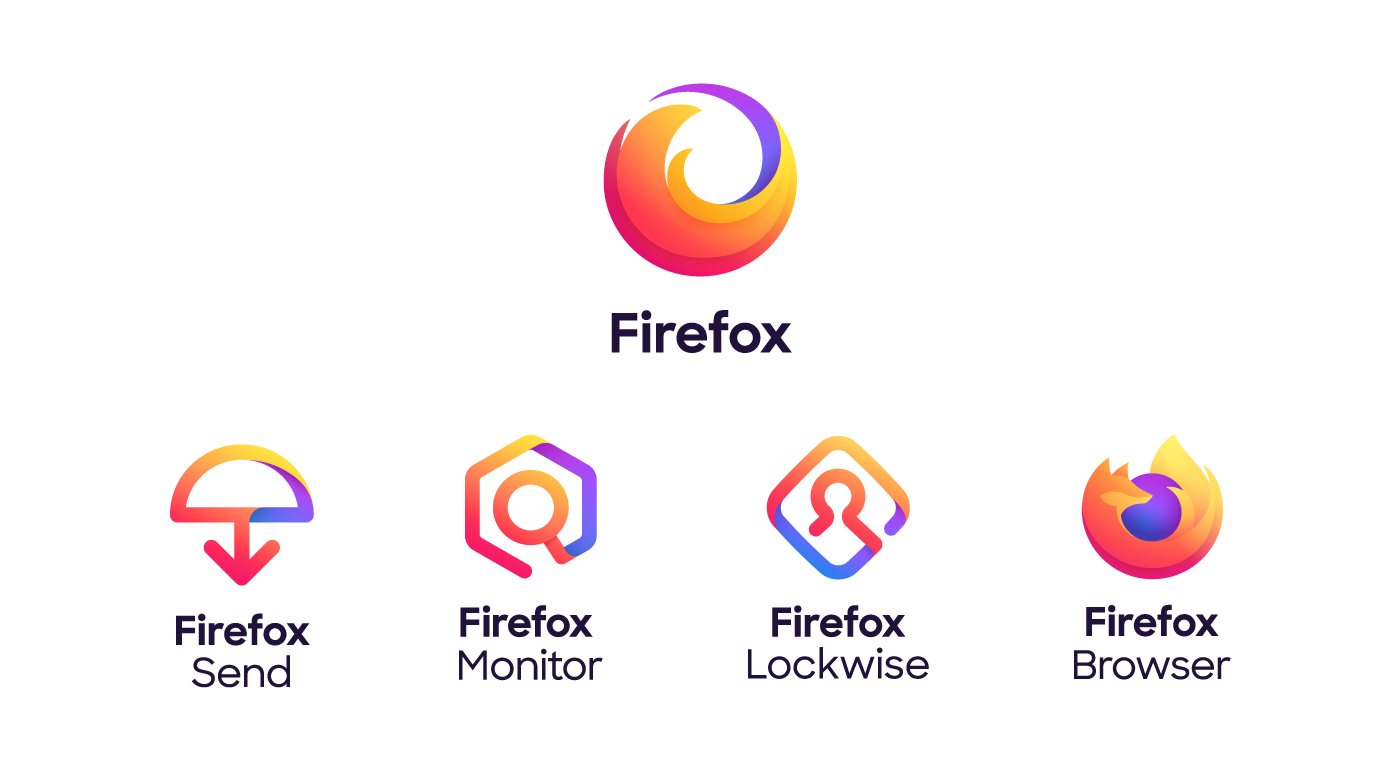
The “Firefox” you’ve always known as a browser is stretching to cover a family of products and services united by putting you and your privacy first. Firefox is a browser AND an encrypted service to send huge files. It’s an easy way to protect your passwords on every device AND an early warning if your email has been part of a data breach. Safe, private, eye-opening. That’s just the beginning of the new Firefox family.

Now Firefox has a new look to support its evolving product line. Today we’re introducing the Firefox parent brand — an icon representing the entire family of products. When you see it, it’s your invitation to join Firefox and gain access to everything we have to offer. That includes the famous Firefox Browser icon  for desktop and mobile, and even that icon is getting an update to be rolled out this fall.

Here’s a peek behind the curtain of how the new brand look was born:

Design beyond identity.
This update is about more than logos. The Firefox design system includes everything we need to make product and web experiences today and long into the future.

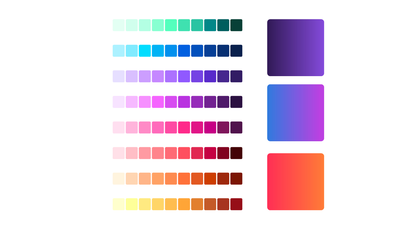
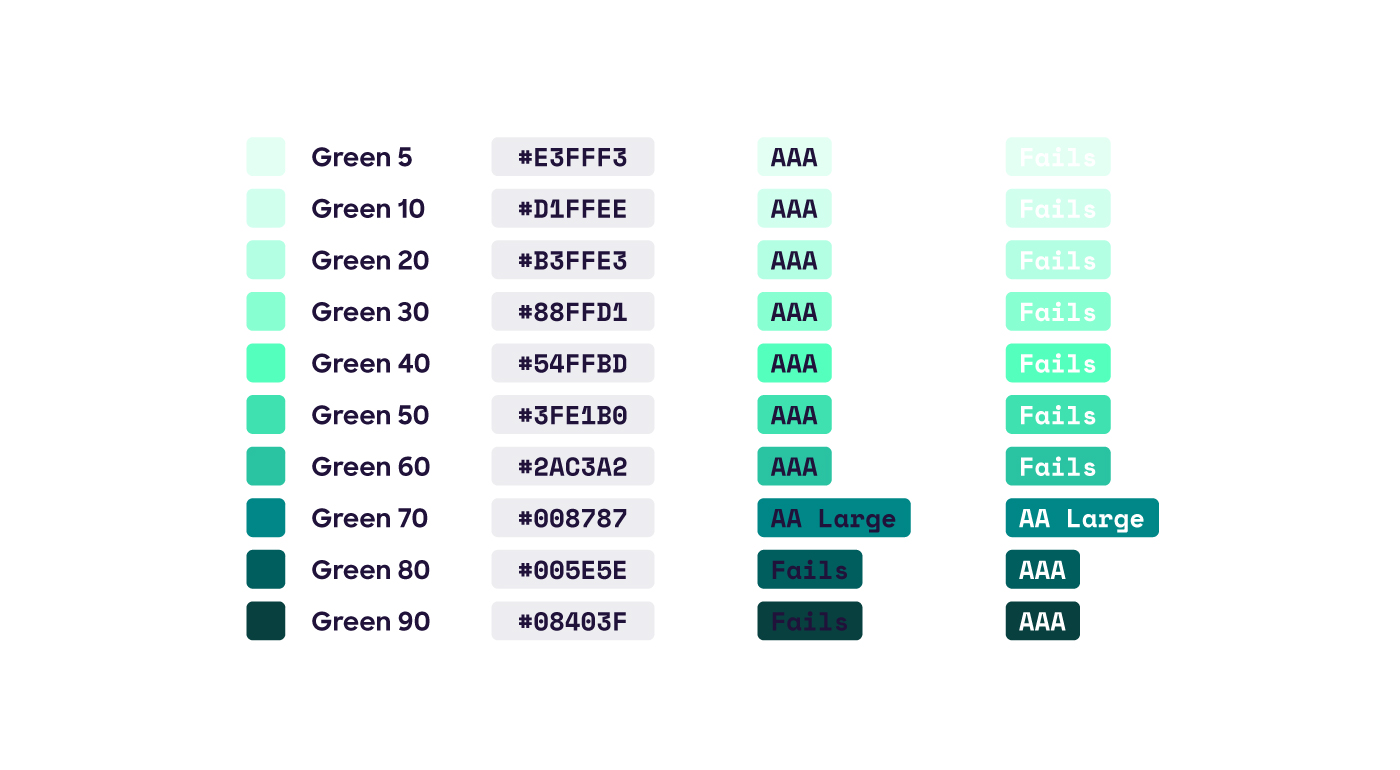
  • A new color palette that expands the range of possibilities and makes distinctive gradients possible.
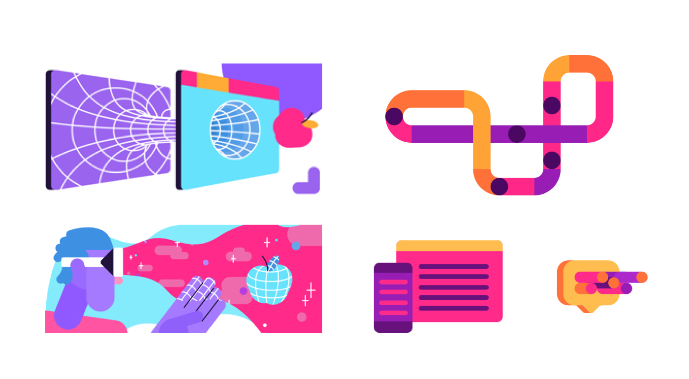
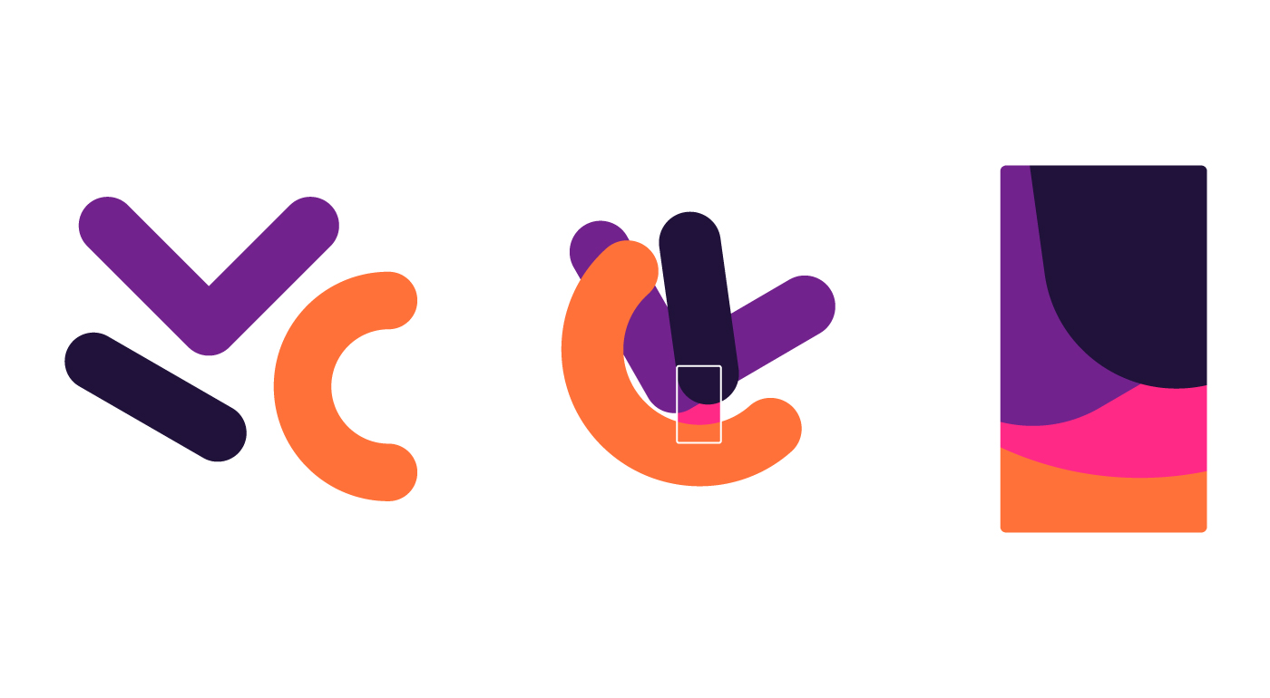
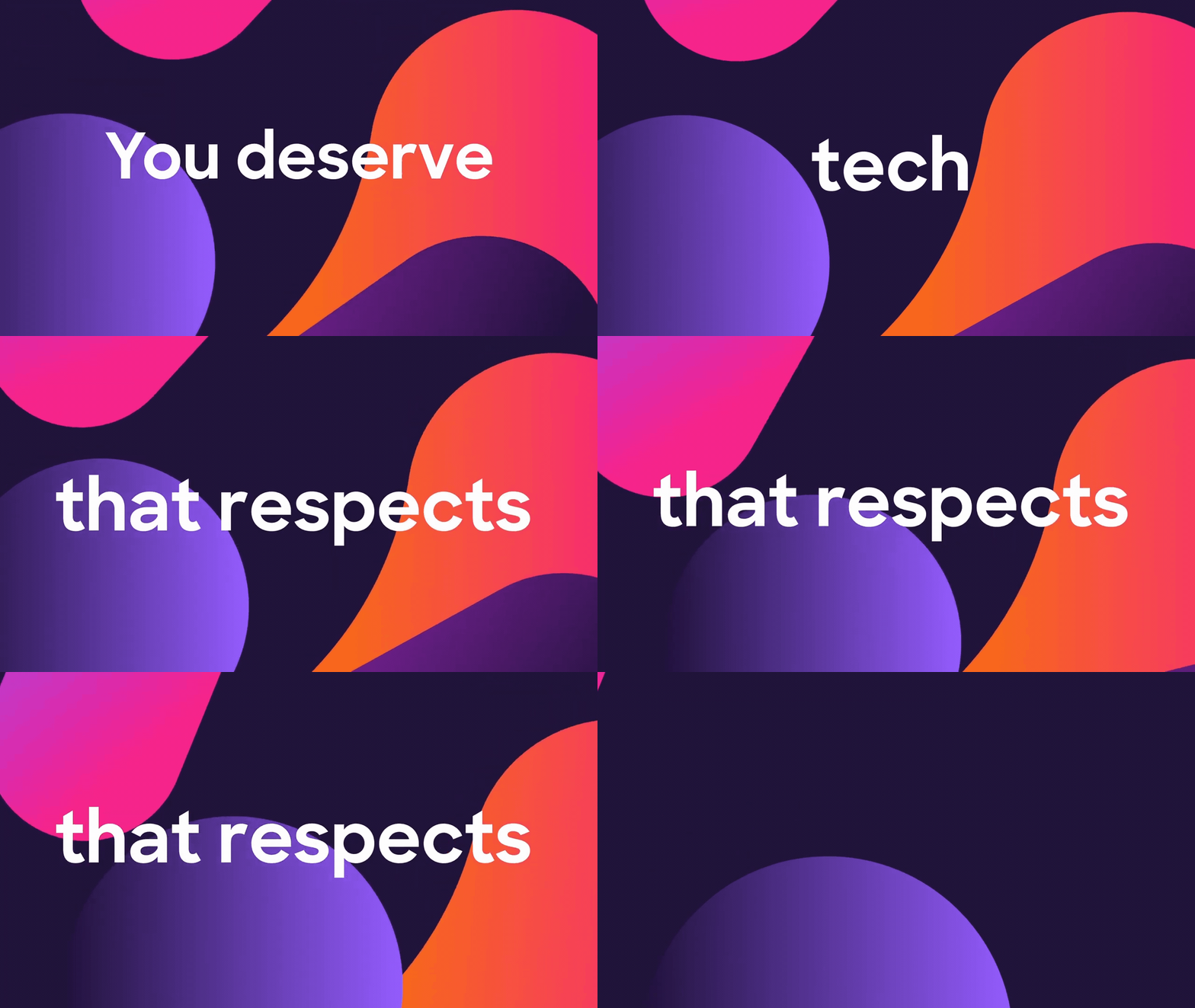
  • A new shape system derived from the geometry of the product logos that makes beautiful background patterns, spot illustrations, motion graphics and pictograms.
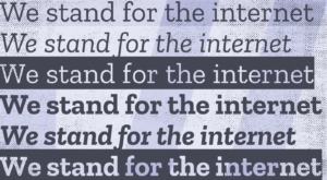
  • A modern typeface for product marks with a rounded feel that echoes our icons.

  • An emphasis on accessible color and type standards to make the brand open to everyone. Button colors signal common actions within products and web experiences.
Meaning beyond design.

Privacy is woven into every Firefox brand experience. With each release, our products will continue to add features that protect you and alert you to risks. Unlike Big Tech companies that claim to offer privacy but still use you and your data, with us you know where you stand. Everything Firefox is backed by our Personal Data Promise: Take Less, Keep It Safe, No Secrets.
The brand system is built on four pillars, present in everything we make and do:

Radical. It’s a radical act to be optimistic about the future of the internet. It’s a radical act to serve others before ourselves. We disrupt the status quo because it’s the right thing to do.

Kind. We want what’s best for the internet and for the world. So we lead by example. Build better products. Start conversations, Partner, collaborate, educate and inform. Our empathy extends to everybody.

Open. Open-minded. Open-hearted. Open source. An open book. We make transparency and a global perspective integral to our brand, speaking many languages and striving to reflect all vantage points.

Opinionated. Our products prove that we are driven by strong convictions. Now we’re giving voice to our point of view. While others can speak only to settings, we ground everything in our ethos.

The end of the beginning

The Firefox brand exploration began more than 18 months ago, and along the way we tapped into many talents. Michael Johnson of Johnson Banks provided early inspiration while working on the Mozilla brand identity. Jon Hicks, the designer behind the original Firefox browser logo, was full of breathtaking design and wise advice. Michael Chu of Ramotion was the driving force behind the new parent brand and system icons.

We worked across internal brand, marketing, and product teams to reach a consistent brand system for our users. Three members of our cross-org team have since moved on to new adventures: Madhava Enros, Yuliya Gorlovetsky, and Vince Joy. Along with Mozilla team members Liza Ruzer, Stephen Horlander, Natalie Linden, and Sean Martell, they formed the core working team.

Finally, we’re grateful to everyone who has commented on this blog with your passionate opinions, critiques, words of encouragement, and unique points of view.

Tell us. We can take it.

As a living brand, Firefox will never be done. It will continue to evolve as we change and the world changes around us. We have to stretch our brand guidelines even further in the months ahead, so we’re interested in hearing your reaction to what we’ve done so far. Feel free to let us know in the comments below. Thanks for being with us on this journey, and please stay tuned for more.
139 comments on “Firefox: The Evolution Of A Brand”

  1. Hugh wrote on

    It’s looking really lovely! I’d like to know more about the typeface in particular. Can we play with it?

    1. Tim Murray wrote on

      Thanks, Hugh. The typeface is not quite ready for playtime yet. Stay tuned to the blog and we’ll let you know.

  2. -dsr- wrote on

    Icons are ridiculously abstract.

    Send: Bail out! Here’s a parachute!

    Monitor: You are lost in a maze, looking for clues.

    Lockwise: Hairpin turn ahead.

    Browser: We have carefully removed all details that make the smudge look like a Firefox; perhaps you need glasses?

  3. Colin Davis wrote on

    You say you’re looking for feedback, so please take this in the spirit of collaboration in which it’s intended.

    Branding everything as “Firefox” is a really bad idea, and will continue to cause you problems over time. Making new icons to blur the line between these services and the FF browser further exacerbates that.

    While I understand that Firefox has a stronger brand than Mozilla, it has a brand as a Web Browser, not a set of generic utilities which happen to use the web.

    This reminds me of all the article about how “Mozilla is going to charge for Firefox” that came out earlier this week, causing people to be afraid to use the browser.

    If instead the articles had said “Mozilla is planning to offer a co-branded Mozilla VPN”, it would have been clearer, and fewer people would have been confused about if the browser cost money.

    Putting everything under the Firefox brand dilutes it to meaninglessness. Please re-consider.

    1. Tim Murray wrote on

      Thanks for the feedback, Colin. It’s good to hear your point of view. Over time, we hope people will come to see Firefox as a family of products, not only a browser. And to be clear, a great, FREE and private-by-default Firefox browser will continue to be central to what we do. Any premium offerings wouldn’t compromise that. But we also recognize that there are consumers who want access to premium offerings, and we can serve those users too without compromising our existing products and services that people love. If you’re interested in learning more about how we’re approaching it, this piece in Fast Company does a good job of explaining it.

      1. ANO wrote on

        Cleaner URL:
        https://www.fastcompany.com/90362208/even-more-evidence-that-firefox-wants-to-be-the-anti-chrome

      2. Ian Thomas wrote on

        If you’re going to let your marketing department abuse the Firefox brand as a family name, then what do we call the browser? “Firefox browser” just feels like it doesn’t have it’s own brand and the person writing has added a clarification because there are two things using the same brand. Elsewhere in these comments you see people writing Firefox (browser).

        Do you have the rights to the Navigator name?

        1. Tim Murray wrote on

          Hi Ian, we do not have rights to “Navigator.” We acknowledge the confusion you’re identifying and are at work on figuring out a solution. Stay tuned, and thanks for writing.

    2. Jesse Salens wrote on

      I agree with Colin here. Firefox is and has been a product unto itself for ages. When people ask if you use Firefox or Chrome, or state “you should switch to Firefox”, they’re implying Firefox the web browser. Trying to bundle in a bunch of additional products under the name seems like it is going to muddy the waters of discussion, especially when trying to discuss it with less technically savvy people.

      The idea of co-branding under the Firefox name seems like it could lead to disparagement of the brand if one of these partners makes a mistake (say my Firefox VPN credentials are compromised and show up on Firefox Monitor).

  4. Nick wrote on

    F-yeah is right! I adore this new branding. It feels fresh, coherent and still just as foxy. Can’t wait to see it roll out (and buy stickers!).

    Hopefully you’ll maintain the logotype next to each icon and try to avoid using the icons alone without text as you launch more Firefox products. It would be good to avoid the kinds of issues that Amazon Web Services has with its watery soup of semi-abstract icons, for example.

    I switched back to Firefox from Chrome recently on the back of everything that Mozilla and the Firefox teams are doing (blocking of fingerprinting and cryptomining! idle tab suspension! focussing on speed! Send! Monitor! Lockwise! Rust!).

    The new look only cements my love for the Firefox brand.

    1. Tim Murray wrote on

      Hooray, so glad you like where we’re headed. Thanks for being along on this journey with us and continuing to use Firefox. Point well taken about using the logotype along with the icons. That’s our plan wherever we can. Cheers ~

  5. Alex wrote on

    The overall Firefox (brand) icon is beautiful. It screams “modern, fast, sleek, web browser.” I would love seeing that as my daily browser icon. I’m disappointed to find out the browser icon is actually different. It doesn’t really have any of those qualities in my opinion.

    I’m not really seeing the motivation behind “promoting” Firefox to be the unifying brand here – why not expand the existing Mozilla brand instead?

    1. Tim Murray wrote on

      The short answer is that Firefox is our product brand. It focuses on fighting for the privacy of the individual online, while Mozilla fights for the internet as a healthy ecosystem. Thanks for letting us know how you feel about the browser icon.

      1. Juan wrote on

        Agree with Alex here. The brand icon is superb, and everything I always wanted… in the browser icon. I’m not sure if the new approach will work, but I’m hoping it does.

        The browser’s new icon is not my favorite. Most browser icons are shaped like a sphere/elliptical, similar to a globe. So did the previous one and the brand one, but the new one feels off-balance, not to mention out of place with the other, more linear icons.

  6. Irvin wrote on

    It looks very “difficult” for the community to use (so far), unlike the Mozilla brand design which is pretty simple and easy to use on any demands.

    Hope we will have a clear guideline and materials to follow.

    1. Tim Murray wrote on

      Hi Irvin, yes let’s talk. Email me?

    2. Hideki L. wrote on

      I have same interest as Irvin, this last few months have been a great improvement and reshape in the Firefox design. And with this news of an official rebrand pronouncement makes me want to collaborate and make use of some new Firefox/Open/Libre digital design guidelines, in some sense like material design was for Google to join more people into a diverse and beautiful application aesthetic. <3

  7. DWW256 wrote on

    Nice new logos! I love the fusion of both systems 1 and 2 from the post last year. Just one question: what is the name of the new font you are using? Can I download it from somewhere?

    Oh yeah, and SVG files for the new logos would also be appreciated. Thanks! :-)

    1. Tim Murray wrote on

      We’re putting the final touches on a brand website. Access to logos is weeks away!

  8. Heather Anderson wrote on

    Super love how all decisions must match up to the FF ethos.

    As a developer, I’ve fashioned my working life around the chrome dev tools. I’ve now redownloaded firefox and am going to make a new effort to try and use both with the intention of using FF for as many new purposes as I can manage.

    Love what you’re doing, and I want to support all your things.

    And LOVE the new design.

    Keep it up!

    Heather

    1. Tim Murray wrote on

      Thanks for the kind comment, Heather. And thanks doubly for your continued dedication to developing with the Firefox browser in mind. Hats off from all of us at Mozilla!

  9. Cassidy wrote on

    All the designs look beautiful. My only suggestion would be to add back the little arm onto the fox, so it looks like it’s hugging the Earth.

  10. Oscar wrote on

    Hi. Excelent job! The new logo is great. How can i work for firefox? I love this brand. Thank u

  11. Rezmason wrote on

    On the one hand, I kind of wish there was more blue. The blue in the old logos connoted trust. But then there’s companies with blue logos that are basically morally bankrupt.

    On the other hand, your gradient is a bit close to Instagram’s. Leaning back towards blue helps differentiate the brands some more, and you might afford going a bit bluer still.

    Overall I think it looks nice.

  12. David wrote on

    Awesome! How can we buy the Radical & … shirt?

  13. Diego Lindner wrote on

    Do I have to work there to get my hands on stickers and those t-shirts? <3
    Sending resume…

  14. Tomáš Zelina wrote on

    I really like the new design system, my only issue is that it in my opinion doesn’t work really well with Mozilla brand system – colorful and playful design with extensive use of gradients versus simple, B&W of Mozilla brand. Seeing them together (like currently on open Design blog homepage) seems a little bit odd to me.

    But otherwise – great job, I think you created a very likeable brand :)

  15. lecroix wrote on

    Sorry,but new browser logo is a disaster. I’d rather see new company logo as a new browser icon. This looks like a kid’s effort to replicate today’s logo. Please,reconsider. As a long term user,this actually hurts me. Been there since the very beginning,never jumped over to chromium train. This is just bad. As much as i try to like it…BAD

    1. Tim Murray wrote on

      Thanks for letting us know how you feel, lecroix, and thanks for staying loyal to Firefox.
      I hope that over time familiarity with the new browser logo may lessen the pain. Hang in there!

      1. PrairieRanger wrote on

        I agree with lecroix, you can use all these new logos for your new programs but please do not change the Firefox logo. This new logo is so bad compared to the last one that it will make many hesitant to use or even have the browser installed because of how it looks. The Firefox logo is a classic part of the brand, and even though it has had quite a few variants throughout the years it always had the same great look. This honestly looks similar to the Chrome logo especially with the Globe being small, the fox head is also very weird looking.

        We appreciate your efforts for trying to make a new corporate look but please, leave the Firefox Browser Logo alone.

  16. Gonzalo wrote on

    I think Firefox main logo is ok. Also Firefox Send, Monitor and Lockwise. But you shouldn’t change Firefox Browser logo, the actual design is just perfect. If you want it to change or evolve, you could just change the color palette of the actual logo. But that new Firefox Browser design is an involution.

    1. Dan wrote on

      This. I like the new colours a lot, but the shape not so much. Feels too free-form, especially up next to the other more geometric icons.

  17. Dan wrote on

    I like all of these except the browser icon. I thought the previous browser icon was perfect tbh, but this new one just feels a bit off. I think it’s because it doesn’t conform to the circle shape as much, and since that circle is smaller and pushed further into the back, the entire logo just feels like it lacks structure and is too free-form. I expressed these concerns, alongside many others, when the rebranding was first announced, but it doesn’t feel like much was done w.r.t the complaints and suggestions about the icon. Please reconsider and maybe aim for a more circular icon like before, but apart from the shape the new colours are pretty neat.

    Also maybe add the tiny leg back. It looks weird without them, like someone amputated the fox. It’s just sorta floating there atm.

    tldr every icon is brilliant except the browser one, which I don’t think I’ll ever get used to

  18. Pianta wrote on

    I believe the browser should have a new specific name, not just Firefox browser. I think this would help to detach the idea that Firefox is only a browser. Other than that, loved the new icons!

  19. Josh Triplett wrote on

    I love the new branding, the new logo and palette, and some of the sample logo treatments and shapes.

    One issue, though: “Take Less, Keep It Safe, No Secrets.” has a few issues. I had two *immediate* negative reactions when reading it. First, “take less” sounds like a command to the person reading it, as though they should take/expect less, not like “Firefox takes less information from you”. And second, “No secrets” similarly sounds ambiguous, as though the user doesn’t have secrets, rather than that Firefox is transparent and doesn’t keep secrets. I really doubt I’m the only person who will read those that way.

    I love the underlying principles, but I feel that there could be a better way to express them.

    1. Tim Murray wrote on

      Thanks for the feedback on the Personal Data Promise, Josh.
      Here’s a blog post that goes into more detail about the meaning of the three parts of the promise.
      Let me know if that changes your opinion and understanding about this aspect of the Firefox brand.
      https://blog.mozilla.org/firefox/firefox-data-privacy-promise/

      1. Josh Triplett wrote on

        I appreciate the link, but that doesn’t help. I already agree with the underlying principles. My point is that as phrased, they *require explanation*. It isn’t self-evident from the phrases themselves, and in fact the phrases themselves can suggest the opposite of your intent.

  20. Sentience wrote on

    The colors are very quite nice, incredible, I’d say, but the logos are a little too bland. I can tell what the functions of the non-Firefox ones are, but I wouldn’t know they were Mozilla products unless you told me, and the Firefox logo is a little too far from the red panda to be enjoyable for me. Tweaking the color of the current Firefox logo would be great.

  21. Gerald wrote on

    In the line-up, Send looks shifted right and down compared to others.

  22. Alexey wrote on

    Thank you for all your hard work on creating this brand! Logos and colors look really fresh, beautiful and consistent.

    The only thing I would suggest is to consider returning the fox’s paw on the Firefox Browser logo. This paw creates an impression that the fox hugs the earth and takes care of it for all of us. I think this small detail is very important: it makes a logo kinder, closer to users and matches well with the brand’s meaning (e.g. “It’s a radical act to serve others before ourselves.”).

  23. John wrote on

    I was kind of scared about the new Firefox (browser) logo, because I really like the present one.

    But the new one is also cool (like the Firefox brand logo).

    Now, about the other services’ logo… I think they don’t fit all that well with brand and browser logos…

    I also didn’t like the idea of “Firefox” as a brand…i get the point and I understand there is no turning back, but like “lockwise” is the name of the product (and not “password manager”), so should “Firefox” be the name of the product (as it is now) and not “browser”.

    The brand should be Mozilla or anything else “not-Firefox”.

    Since my comment won’t change anything, I’ll end up saying I’m liking where it’s going…

    (Now, if only I could get a phone with a FirefoxOS on it… Instead of some Googleish thing… Maybe redox or sel4-based…)

  24. Me wrote on

    I love these new logos.

    Despite what some people can say, I totally support you. This redesign is really welcome and I hope it will convince even more future users.

    Keep up the hard work!

  25. James wrote on

    Looks great in general, but I dunno about the Lockwise logo. It looks more like a profile silhouette than a lock to me.

  26. Kari Linder wrote on

    SO good! I Love the video and the new logo and the intermediary rejected logo! Really cool design process. Props all around.

  27. Vjatsheslav wrote on

    I actually quite enjoy the new look and don’t understand the hate. Everything looks bright, modern and clean. Although, I thought that the new Firefox brand logo was going to be the new browser logo since it’s a lot cleaner. The browser is the flagship product after all.

  28. Lindsey wrote on

    Why is the browser icon so drastically different than the other three?

  29. Cori wrote on

    I love the new colors and the brand logo, but i almost wish the rest of the service icons were *more* abstract? I think you have a great thing going with the weird, bright, and organic shapes (like the attached image), and the ribbon-like service icons just don’t really feel cohesive with that. Maybe I just want the logos to be more approachably weird, to really lean into something less structured (more radical and open? ;).

    Overall, fantastic job from the design team, can’t wait to see how the brand evolves!

  30. leo wrote on

    Maybe evolving the colours seems good, but the firefox browser icon itself seems too much like a water colour drawing. The current one is far more mature and professional

  31. H Arrison wrote on

    I DON’T LIKE THE FIREFOX BROWSER LOGO.
    It’s far too purple. Also, the globe bit is WAY too small. Will you be calling it “Firefox Browser” for now on? Please don’t. The logo is just too different. I’ve grown so accustomed to the orange-and-blue. I don’t like the new typeface either.
    TL;DR In general I just don’t like it. It might make me use Chrome. (jk(maybe))

  32. Kayden wrote on

    As much as I love Firefox, I honestly believe that these changes might cause conflict on what Firefox stands for. The part,
    “The “Firefox” you’ve always known as a browser is stretching to cover a family of products and services” is just not a good idea at all.

    Also the Foxtail is really ugly for the default Mozilla icon compared to the cool fox face one and the new Firefox icon needs more blue

  33. Alex wrote on

    All icons are good except new browser logo. Please keep the old one.

  34. Laurent wrote on

    Overall the logo is nice looking and refreshing but if I had tow complains I would say that the globe looks too small and that the fox should have kept his limbs.

    I enjoyed your video, nice to see what’s going on behind the scenes, go Firefox !

  35. Rye wrote on

    Not a fan of the use of purple here, but the logo’s designs are pretty neat. A paw on the fox would be a nice bonus.

  36. wojtekmaj wrote on

    I like all the icons except for Firefox browser. Looks to me like Firefox icon design reached its peak and it’s time for a downslide. Something is uneasy about the new icon. New proportions? Lack of paw? the fact he no longer sits on a planet, but on a much smaller, radioactive orb?

    To me it lacks this distinct Mozilla look. It looks like a (very good) amateur custom icon, and not something Firefox could actually use as their brand.

  37. Sv wrote on

    The browser is a real logo, but the others proposed feel completely disconnected and do not have the quality and refinement the current logo reflects. Colors are not bad but for me this is not an improvement. This weakens the brand.

  38. ha1zum wrote on

    I still prefer the old blue color instead of purple. Maybe I’d be okay with a much darker purple, but I’m not sure. Somehow the lighter shades of purple looks cheap to me. Also by removing the fox’s hands, it seems to me that the fox is no longer hugging/protecting the world/web anymore :( , just lying there passively.

  39. Summani wrote on

    All logos and colors are lovely, I love it.

    I love updates/changes in the life, and Firefox is a part of my life, so this is exciting.

    I am waiting for the premium Firefox which will be the first and also the first premium product in my life.

    Thanks for all you have done, for our privacy and daily digital lifes.

  40. Shiaubo wrote on

    I love the new logo and design! When will the new design be the formal logo of Firefox browser? I’m really looking forward to that day!

    1. Tim Murray wrote on

      Thanks for writing, Shiaubo. The new Firefox browser icon will appear as part of a product rollout in the fourth quarter of 2019.

  41. John wrote on

    The new logo looks like this one: https://www.vareni.cz/

  42. John wrote on

    Problem with such a abstract logos is they look similar to other such as…

  43. Laurent Simon wrote on

    The Firefox logo looks nice, but the Firefox browser logo justlooks hooorrible

  44. Yattoz wrote on

    It looks nice. I like it.

  45. Tino Didriksen wrote on

    Just no. Firefox is the browser. Mozilla is the brand. Trying to make Firefox the brand is really not a good idea. It smells of Microsoft’s multiple desperate failed attempts to make Windows the brand.

    Keep Firefox strong, separate, and a single (cross-platform) product. Use Mozilla as overall branding.

  46. Dani wrote on

    Please DO NOT change the logo, it’s perfect as it is right now.

  47. Paul Vossiek wrote on

    I love the colors and the gradients, feels really firefoxy and fresh. What I really have a problem with, though, is the new Browser logo. To me the planet is way too small, it looks like a little marble. Also the general shape is oval now, which lets the whole thing look dented.

    How I think the logo could be improved:
    -Bring back the actual planet
    -Add back the fox’s arm, indicating it’s running, not sleeping
    -Make the fox look at earth. In the current version he looks away from the planet, which is really weird considering the “We care about you” stance of Firefox and Mozilla

  48. Zsolt wrote on

    Overall it’s a successful iteration, but the icons don’t follow the main logo and browser logo too much. Also, the inverted lines died off as a logo flourish long ago, why bring it back? Doesn’t serve much purpose other than decoration, which always can be thrown away. It’s a done deal though, funny still how people think that any of this will change after a release :) keep up the good work!

  49. DansLeRuSH wrote on

    I truely love the logo of the “brand”, more modern, efficient and simple. So much so that I wonder why you simply don’t use it as a logo for the browser ? There is the visual reminder of the tail and the re-reading of the historical logo with the new colours showing its limits.

    It’s only my humble opinion, but you owe it to yourself to mark a visual turning point as you have technically done ;)

  50. B Brooks wrote on

    I love this. All of it. It really feels like you all will finally have the tools you need to continue growing and providing new products and services with the visual identity they deserve.

    The colors are cohesive and modern. Using Firefox as an overarching brand has a lot more equity than “Mozilla” and, in my opinion, should allow you to branch out and become more accessible to the average user instead of just the tech savvy.

    The family of products are great – they definitely feel like one cohesive unit. And the Firefox Browser logo feels like a subtle evolution instead of a total rebrand. The typeface is also very nice, it’s simple but stands out.

    You guys absolutely knocked it out of the park with this. Love the video and the time and effort you put into this blog. Would love to see the Brand Bible that comes from this.

More comments:1 2 3