Categories: General

The Future of MDN: A Focus on Web Docs

Building MDN into a world class repository of high quality Web documentation is one of the most valuable things Mozilla has done for Web developers. Now we’re looking to double-down on that work, and solidify MDN as the single best resource for Web docs. To support that effort, we’re starting some updates to the MDN brand and website. In this post I’m going to lay out what to expect, and why we think it’s so important.

MDN’s mission today is to provide developers with the information they need to build things on the open Web. However, when MDN was first started, it didn’t differentiate between Web standards documentation and product documentation for Firefox, Gecko and other Mozilla products. Over time, as Web documentation was expanded on MDN, it became clear that it provided value to a much larger group of developers than our internal product documentation. We have been investing to improve the Web documentation ever since.

Changing the Name

MDN is clearly a web documentation reference, and in no way is it a developer network. We want the name to clearly reflect the purpose and mission of MDN, and so we’re going to be updating it to: MDN Web Docs.

“Mozilla Developer Network” simply isn’t accurate. Furthermore, pretty much no one refers to MDN as “Mozilla Developer Network.” It’s always “MDN.” However, there is a lot of love for the name “MDN” and we don’t want to get rid of all of that, which is why we’re giving it the IBM / KFC treatment and keeping the iconic abbreviation and commonly used name, while no longer using the words that the acronym used to stand for. We’re not getting rid of MDN, we’re being clear about what it is – it’s MDN Web Docs.

We’re already working on what the MDN Web Docs logo will look like when rendered in the system of the new Mozilla brand, and here’s an early look:


Separating Product Documentation

Currently the home page of MDN has links to both web documentation and product documentation (like Firefox, Developer Tools, Add-ons and more), but about 95% of traffic goes to the Web documentation. Additionally, many searches can be confusing because a Web developer looking for something about CSS may end up on a page about XUL, for example CSS Grid vs XUL Grid, and ultimately can’t find the thing they were looking for. We will be splitting out the navigation for the product documentation so that MDN can be fully dedicated to helping people find the Web docs they need. We will also be investigating ways to ensure that search results direct users to exactly what they were looking for without confusing Web and product documentation.

Site Design Refresh

Along with a brand identity refresh, we’ll also be refreshing the site design. You will be able to see as pieces of this get completed, and you can also give feedback as we work over the coming weeks by becoming a beta tester on MDN. We’ll also follow up with future articles once there is some work to share about the new look of the site.

More Content and Features To Help Web Devs

Lastly, but most importantly, we will be working to add more content and features to help Web developers. We’ve already started a couple of experiments like putting examples at the top of the article, and looking at including editable code snippets within the articles. Research has told us that our documentation is excellent and thorough, but often Web developers are looking for quick examples before having to read through extensive articles. Doing more to help developers find faster and more efficient ways to learn from the documentation is a critical area where we hope to improve, and you can expect to see more experiments like this. If you have other ideas about ways that our documentation could be more valuable or easier to use, we’re open to hearing more ideas!
We’re incredibly excited to make MDN officially about Web docs, and to make it more comprehensive and easier to use and learn from for all of the web developers who have come to love it as a resource.

19 comments on “The Future of MDN: A Focus on Web Docs”

  1. Sam wrote on

    Love MDN. Slowly training myself to stop clicking w3 schools links in my search results

    1. Josh wrote on

      You can block them from your search results :)
      Chrome: Personal Blocklist
      Firefox: Hide Unwanted Results of Google Search (I haven’t tested this one)

  2. Ben wrote on

    Thanks! Already a valuable reference, but more and better presented examples will make it even more useful.

  3. Sergio wrote on

    Good idea, but please scrap the logo. It’s hideous.

    1. Ess_Ess wrote on

      Amen!

    2. Wade wrote on

      Thirded

  4. Timothy K wrote on

    Logo is like mine at Blue Ribbon Technologies I know the markets want the dog or whatever pointing towards the heading but think it looks better pointing out. Thanks

    1. Al wrote on

      You mean the dinosaur? hahaha

  5. mdnuser wrote on

    MDN is great!
    I am missing just one feature: Being redirected to english language pages. Automatically. Always. Default. So that I can click on the link to the poor german translation that google tries to force me to use and instead end up where i actually wanted to go (which will never be non-english developer documentation). The german translations are useless, and I do not believe in fixing them because imho they should not exist at all because if manually written, they cannot be consistent across languages. For those not able to understand english well enough, there is machine translation, which is not perfect but consistent.

    1. sd wrote on

      +++

  6. S wrote on

    Good move. I do a lot of offline development and find the offline MDN docsets (browsed with Zeal) extremely useful. But the docsets are created and maintained by third parties rather than Mozilla and therefore have lot of pages missing and broken links. It would be great if MDN offered a indexed/offline version of the docs.

  7. nick wrote on

    I kinda disagree on the whole “MDN is not a network of developers” – it has become a network for developers, with many developers contributing to the documentation, etc. It has this feel about it, even from taking a cursory pass across its pages and content.

    The new basic look of white type reversed out of a black ribbon is extremely non-descript and doesn’t flatter or inspire a unique branding for the organisation. Whereas, the current MDN blue homepage and logo, etc, does brand well. Much better in my sense of the organisation. The new look feels like a major step backwards.

    Why not just improve the existing branding? Update it, improve it. The new look has been done to death a thousand times across a multitude of organisations and products. Graphic designers came up with this look over a decade ago.

    I don’t agree with the horse’s head facing out. Facing in towards the rest of the logo has a nice, subtle effect. Enhancing cohesion in the logo. But, it’s a tiny thing.

    The rest of the logo (courier, really?) is completely uninspiring for me. Not putting enough black space either side of the text make it feel unbalanced, too. Also, black just isn’t a good color in the vibrant developer space. So boring, so passe. So yesterday. Done to death.

    My apologies to the people that came up with the new look, but it just doesn’t say anything about the new Mozilla focus and feels like a big step backwards from the current look. Major disappointment.

    1. Obelix wrote on

      Just some notes:

      Maybe it’s more about not being”just” a network for/of Mozilla developers, but a much more generally used web developers’ network!?

      Dino.

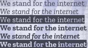
      Not courier, but a custom font called Zilla (https://blog.mozilla.org/opendesign/arrival/)

  8. Axel Rauschmayer wrote on

    I find this new brand a bit clunky. KFC is just “KFC”, not “KFC fast food”.

    How about: “Mozilla Doc Network”? Then the acronym would still be MDN.

    1. Nicolas wrote on

      I feel that it’s rather “Network” than “Developer” that isn’t pertinent here?

      1. Mario wrote on

        Oh that’s an easy fix: Mozilla Developer Nexus!

  9. Madre Deus Nomine wrote on

    The Bible teaches us there are four types of love: the family love, the sexual love, the love between friends, and another one I can’t remember right now… Ah, the divine love! But now there is one more: the love for the name “MDN”.

  10. K3N wrote on

    I think this is a good move. I like the new look, the new typeface, line-spacing, boldness.. easy to read, print. Good job!

    I however DON’T like the political slurriness in the slogan (“branding without walls”). Lets keep the politics OUT regardless of what people think of any countries’ sovereignty and focus on what we are here for, developing awesome stuff. The site has great potential and is already a great resource for docs, but flagging (any) political bias will alienate a large percentage of the user base and is irrelevant to what this site is for: docs. IMO.

  11. Franz-Petar wrote on

    NOT a big fan of those black/white colors now dominating the new design… The original blue/white used for the navbar + much of the site was nicer.

    The mozilla dinosaur is an important part of the mozilla CI imo.
    I really wouldn`t change much about it: The silhouette of the mozilla head is great, and it works in large as well as very small sizes – such as the browser-tab icons. And it IS part of the name after all FCS !

    So … stick to the mozilla head. It’s been there from the very start.

    While I do like the idea behind the “old-school, tiled 90s CGI desktop-wallpaper textures” collage at the top of this:
    “`https://blog.mozilla.org/opendesign/future-mdn-focus-web-docs/ ““
    page,
    and it does have good potential for a design component for the new CI,
    final texture backgrounds need be well chosen …
    Because, even while they could be the work of “Doris the secretary” back in ’97 – tiling together dem Windows95 desktop-bgs in MS-Paint – it can look good (and fitting in a way, too) given the right equilibrium.
    —-
    One thing I absolutely cannot stand though – especially for an organization like mozilla, is the total overuse of this bad photo-imagery, maybe even stock-photos on this site.

    A boringly-repelling, yet still terribly common combo of cheap “mood-images”, laced with mostly half-assed and seemingly insincere marketing claims is showed down our perceptual throats.

    It is exactly this sort of “marketing” that an organization like mozilla/MDN doesn’t need: It carries with it the ‘odor’ of cheap selling ….

    What can be done ?

    Reduce marketing claims to the absolute bare minimum. The less the better!
    And more importantly: get rid of all this “mood-imagery” altogether.
    Mozilla is not Google, so why go down this road which is not you? Especially avoid slide-shows and carousels, if images are not your equity (which they are not).

    Alright, I feel a bit bad for that rant. Did get carried away there a little …
    What i said goes mostly for the new Mozilla start-page:
    “`https://www.mozilla.org/en-US/““
    (which is kinda important)

    After all. Still do prefer the style, but also the visual coherance of the ‘old’ Corporate Design/CI.