
Seven months since setting out to refresh the Mozilla brand experience, we’ve reached the summit. Thousands of emails, hundreds of meetings, dozens of concepts, and three rounds of research later, we have something to share. If you’re just joining this process, you can get oriented here and here.
At the core of this project is the need for Mozilla’s purpose and brand to be better understood by more people. We want to be known as the champions for a healthy Internet. An Internet where we are all free to explore and discover and create and innovate without barriers or limitations. Where power is in the hands of many, not held by few. An Internet where our safety, security and identity are respected.
Today, we believe these principles matter more than ever. And as a not-for-profit organization, we’re uniquely able to build products, technologies, and programs that keep the Internet growing and healthy, with individuals informed and in control of their online lives.
Our brand identity – our logo, our voice, our design – is an important signal of what we believe in and what we do. And because we are so committed to ensuring the Internet is a healthy global public resource, open and accessible to everyone, we’ve designed the language of the Internet into our brand identity.
Today, we’re sharing our new logo and a proposed color palette, language architecture, and imagery approach. Remaining true to our intent to engage with the design and tech community throughout this open design process, we welcome your feedback on these elements as we build out our design guidelines.
Let’s go into a bit more detail on the components of our brand identity system, developed in collaboration with our exceptional London-based design partner johnson banks.
Our logo
Our logo with its nod to URL language reinforces that the Internet is at the heart of Mozilla. We are committed to the original intent of the link as the beginning of an unfiltered, unmediated experience into the rich content of the Internet.
![]()
The font for the wordmark and accompanying copy lines is Zilla. Created for us by Typotheque in the Netherlands, Zilla is free and open to all.
Typotheque was an historic partner to Mozilla. They were the first type-foundry to release Web-based fonts, and Mozilla’s Firefox web browser was an early adopter of Web fonts. We chose to partner with Peter Bilak from Typotheque because of their deep knowledge of localization of fonts, and our commitment to having a font that includes languages beyond English. Prior to partnering with Typotheque, we received concepts and guidance from Anton Koovit and FontSmith.
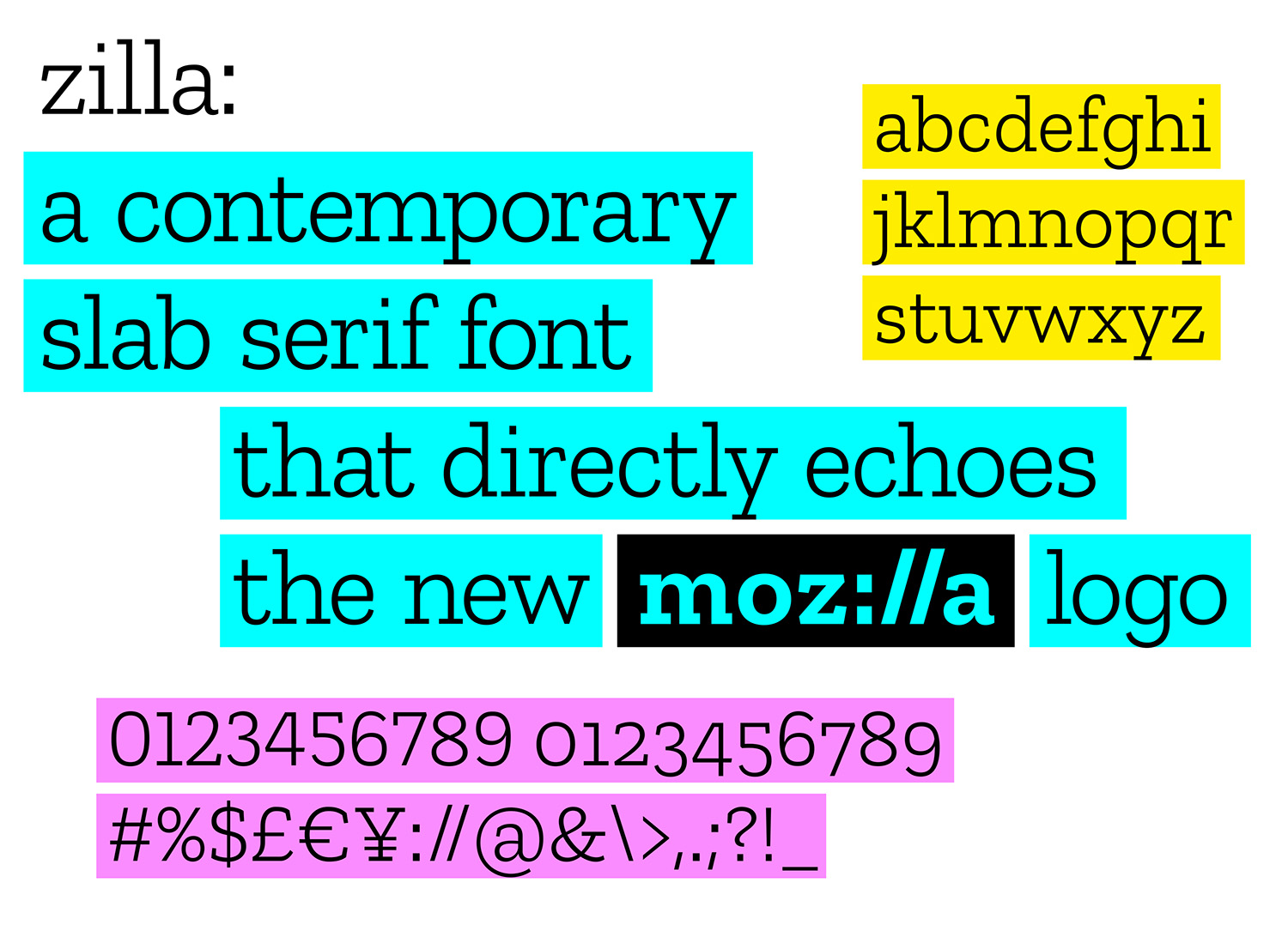
Selected to evoke the Courier font used as the original default in coding, Zilla has a journalistic feel. It bucks the current convention of sans serif fonts. Anyone can create the Mozilla logo by typing and highlighting with the Zilla font, making the logo open and democratic. The black box surrounding the logo is a key building block of the design, and echoes the way we all select type in toolbars and programs.
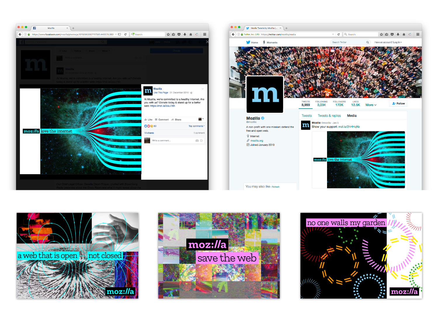
Mozilla comes first in any application of the system, just as the protocol begins any internet journey. Copy lines, colors, and images all flow from that starting point, much like a web journey.
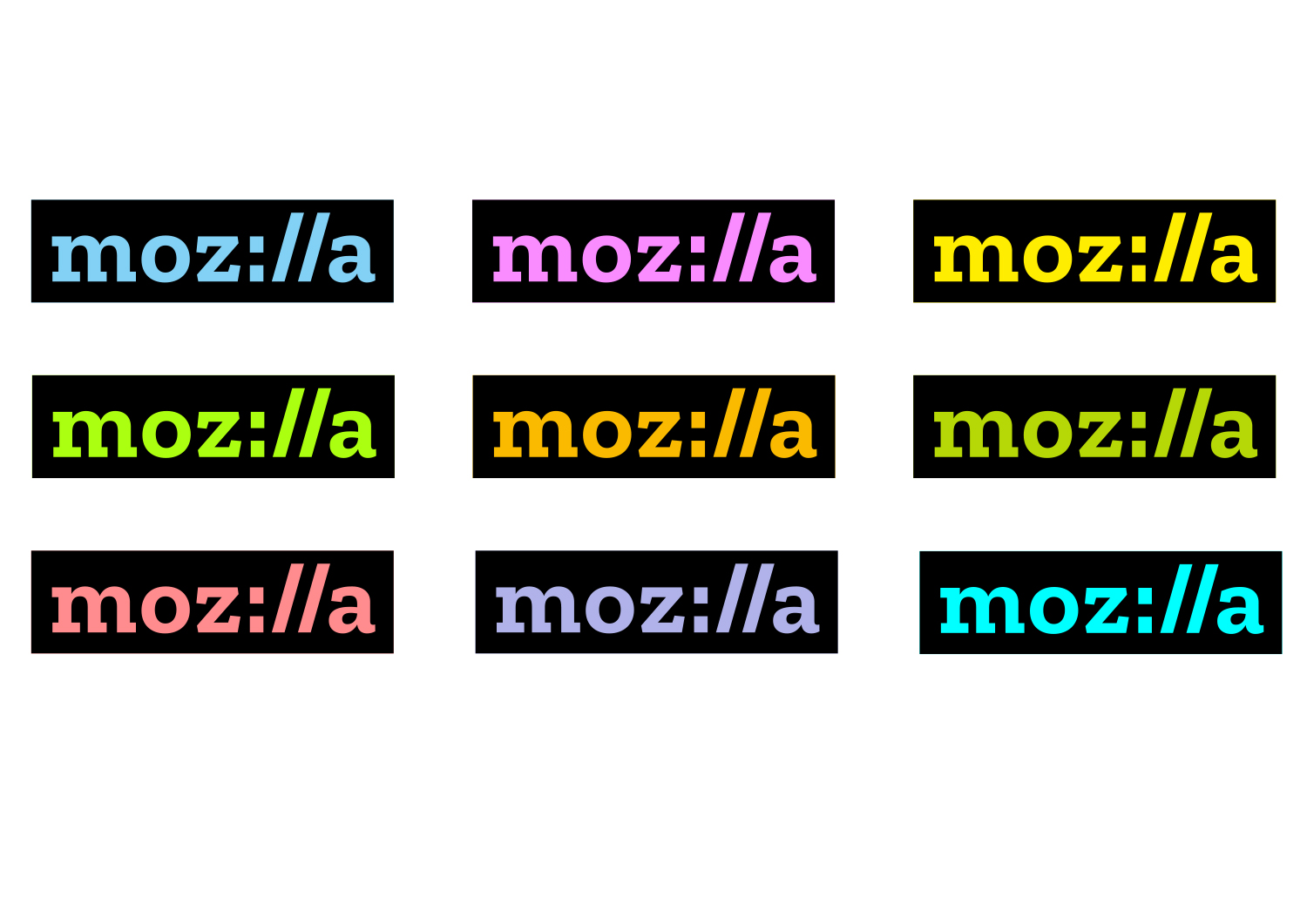
Our color palette
Our color palette, derived from the highlight colors used by Firefox and other web browsers, distinguishes our brand from its contemporaries. Color flows into our logo and changes according to the context in which the logo is used. As we develop our style guide, we’ll define color pairings, intensities, and guidelines.
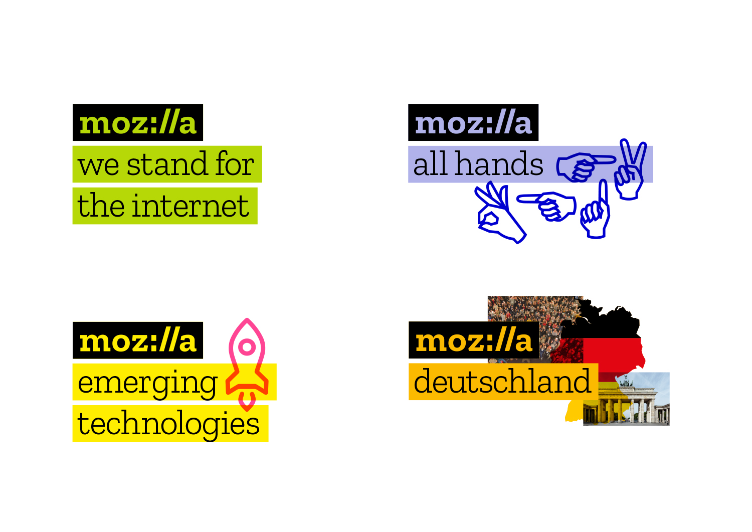
Our language and language architecture
Copy lines to the right or below the logo hold core Mozilla messages. They also hold program, event, and team names — simplifying and unifying a multitude of different Mozilla activities. It will now be easier to know that something is “from” Mozilla and understand how our global initiatives connect and reinforce one another.
The system enables Mozilla volunteer communities across the globe to create their own identity by selecting color and choosing imagery unique to them. Meanwhile the core blocks of our system, bounding boxes and typography, will provide the consistency, making it clear that these communities are part of one Mozilla.
Our Imagery
As we looked at the elements of our brand identity, the concept of one image or icon standing for the whole of Mozilla, and the entirety of the Internet, seemed anachronistic. Since imagery is an important reflection of the diversity and richness of the Internet, however, we’ve made it an important component of our system.
In digital applications, ever-changing imagery represents the unlimited bounty of the online ecosystem. Dynamic imagery allows the identity of Mozilla to evolve with the Internet itself, always fresh and new. Static applications of our identity system include multiple, layered images as if taken as a still frame within a moving digital experience.
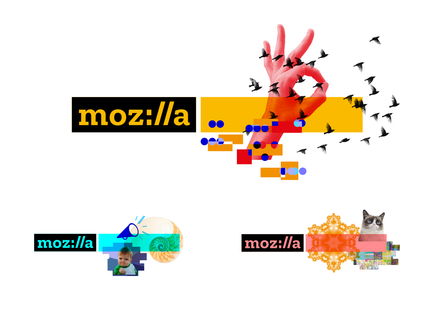
How might it work? We intend to invite artists, designers, and technologists to contribute to an imagery collective, and we’ll code curated GIFs, animations, and still images to flow into mozilla.org and and other digital experiences. Through this open design approach, we will engage new design contributors and communities, and make more imagery available to all under Creative Commons. We’re looking for input from creative communities to help shape and expand this idea.
We will roll out the new brand identity in phases, much as we have with concepts in this open design process, so please be patient with our progress. As we develop our design system, we look forward to hearing your feedback and suggestions using the comments below. You’ve been with us from the start and we’re glad you’re here. We’ll continue to share updates and comments in this space.
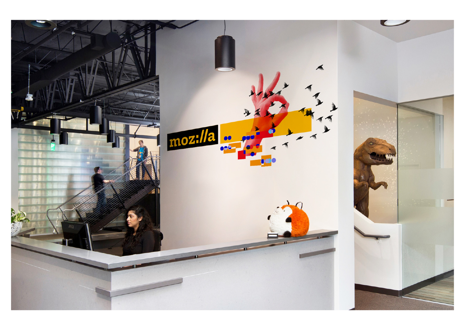
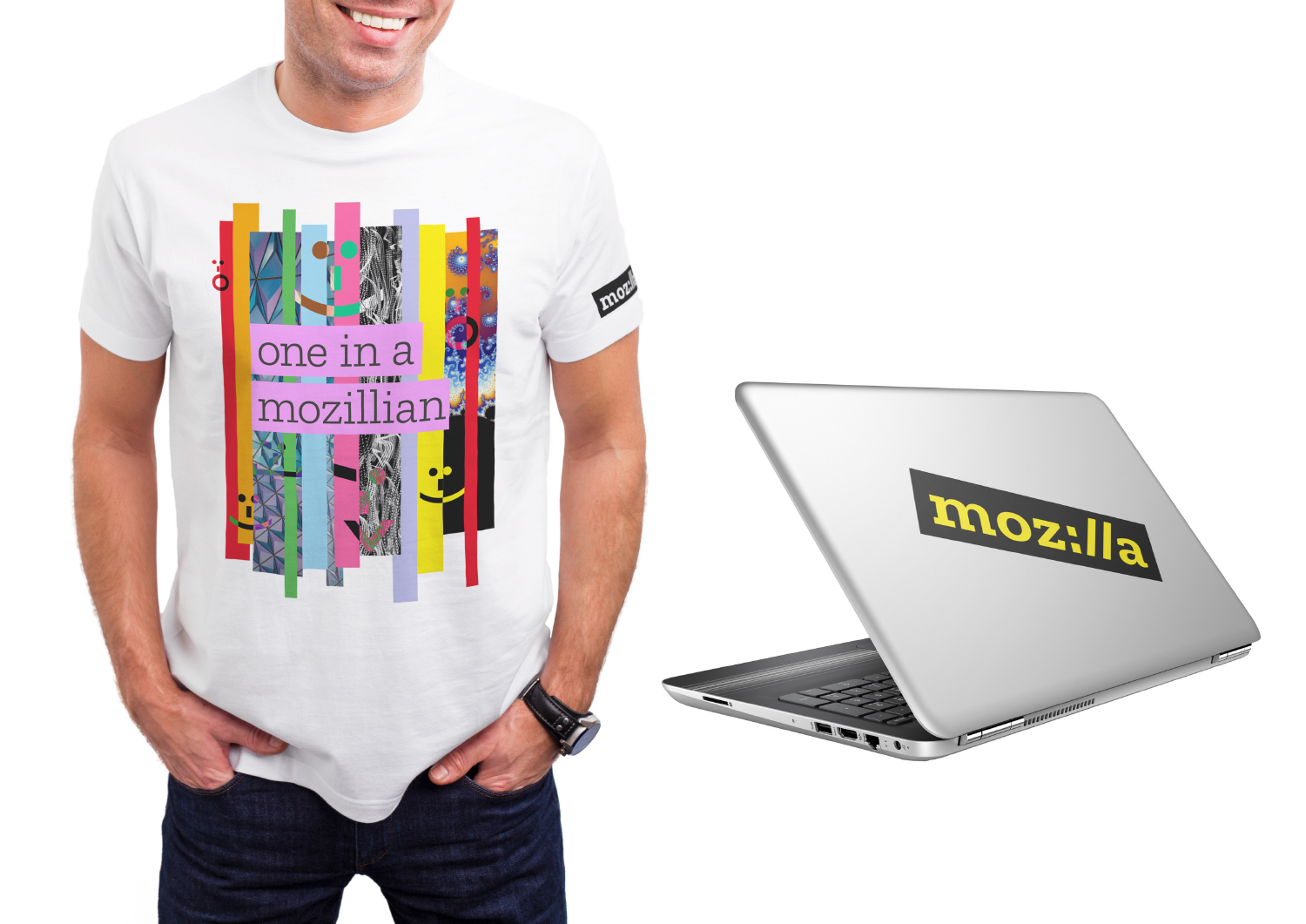
Photo credits
Brandenburg Gate https://commons.wikimedia.org/wiki/File:Berlin_-_0266_-_16052015_-_Brandenburger_Tor.jpg
Iron Filings https://www.flickr.com/photos/oskay/4581194252
LawyersChandigarh wrote on
Oliwier Brzezinski wrote on
Syed Sajid Ahmed wrote on
Chidi Chris Uriel wrote on
San Jai wrote on
HANK wrote on
Tim Murray wrote on
trlkly wrote on
Mr Rithy wrote on
Helga techer wrote on
mynah lortzing wrote on
vera wrote on
Parvez Shaikh wrote on
JEFF TILTON wrote on
odunga fredrick wrote on
George wrote on
ThiruN wrote on
Ali wrote on
Nektarios F. wrote on
Glenn Pryor wrote on
Peter M’menge wrote on
Santosh S Malagi wrote on
LERRY wrote on