Categories: General

Roads not taken

Here, Michael Johnson (MJ), founder of johnson banks, and Tim Murray (TM), Mozilla creative director, have a long-distance conversation about the Mozilla open design process while looking in the rear-view mirror.

TM: We’ve come a long way from our meet-in-the-middle in Boston last August, when my colleague Mary Ellen Muckerman and I first saw a dozen or so brand identity design concepts that had emerged from the studio at johnson banks.

MJ: If I recall, we didn’t have the wall space to put them all up, just one big table – but by the end of the day, we’d gathered around seven broad approaches that had promise. I went back to London and we gave them a good scrubbing to put on public show.

blog-pics-13feb-1

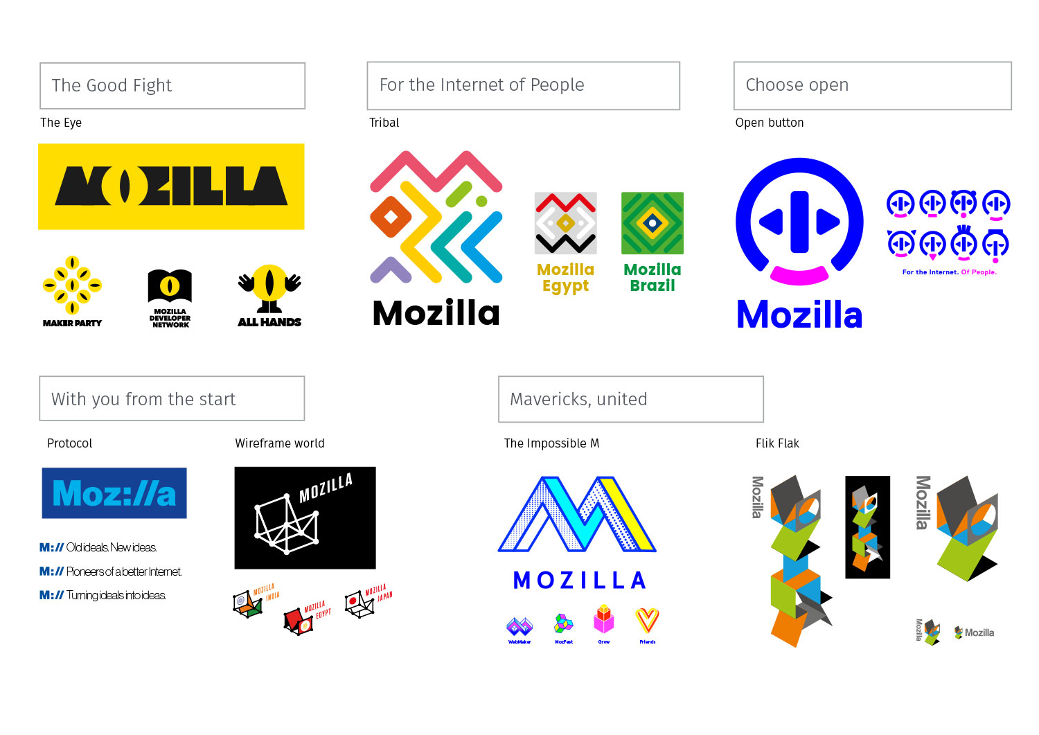
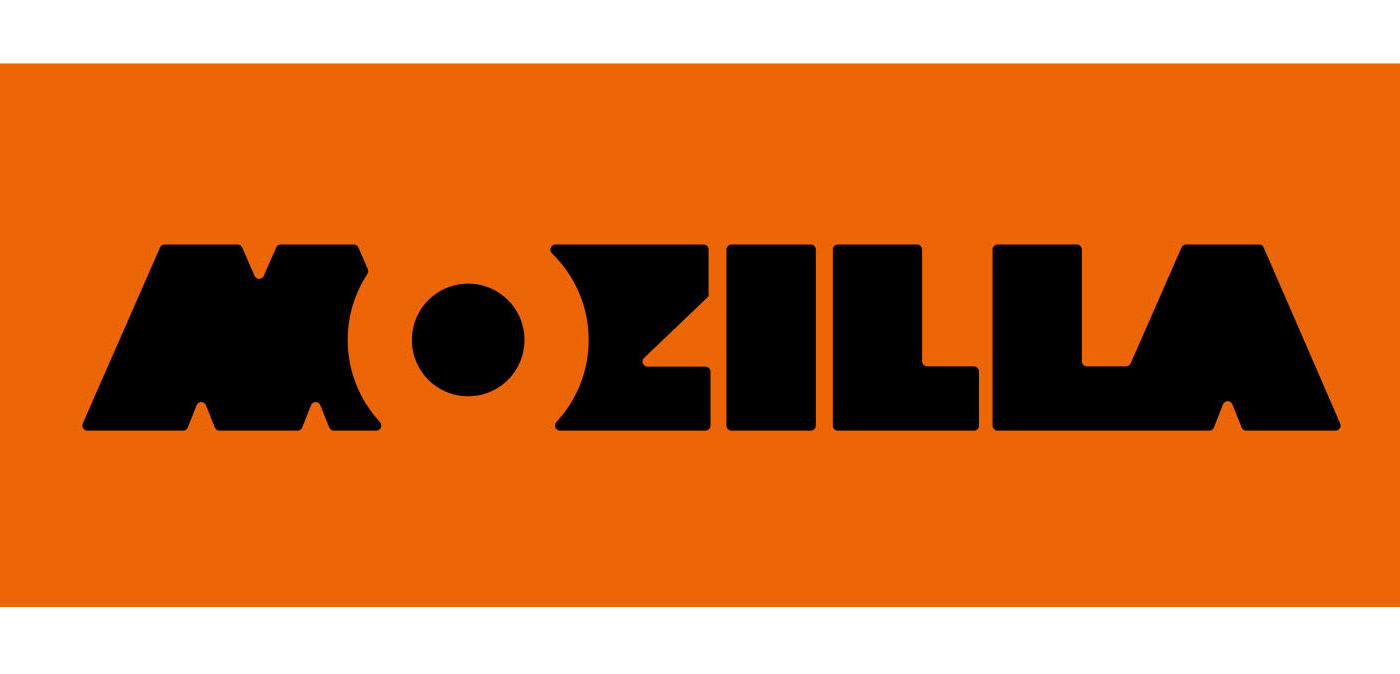
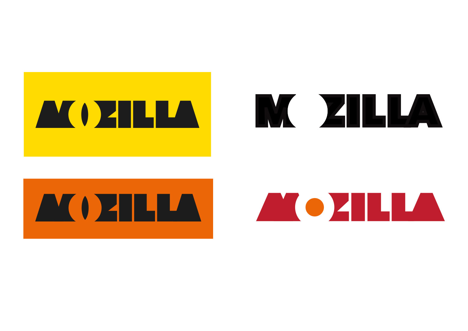
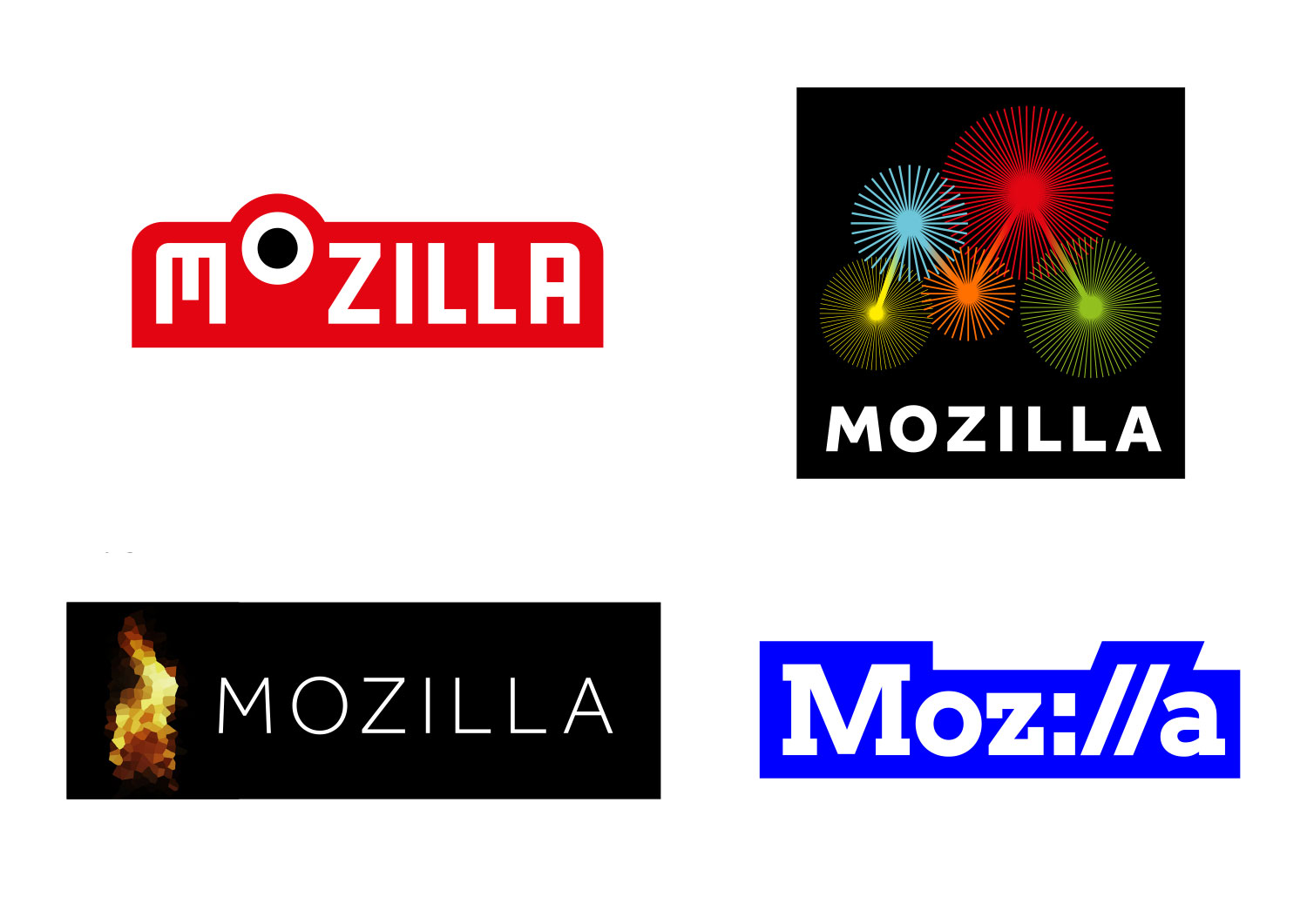
It’s easy to see, in retrospect, certain clear design themes starting to emerge from these earliest concepts. Firstly, the idea of directly picking up on Mozilla’s name in ‘The Eye’ (and in a less overt way in the ‘Flik Flak’). ‘The Eye’ also hinted at the dinosaur-slash-Godzilla iconography that had represented Mozilla at one time. We also see at this stage the earliest, and most minimal version of the ‘Protocol’ idea.

TM: You explored several routes related to code, and ‘Protocol’ was the cleverest. Mary Ellen and I were both drawn to ‘The Eye’ for its suggestion that Mozilla would be opinionated and bold. It had a brutal power, but we were also a bit worried that it was too reminiscent of the Eye of Sauron or Monsters, Inc.

MJ: Logos can be a bit of a Rorschach test, can’t they? Within a few weeks, we’d come to a mutual conclusion as to which of these ideas needed to be left on the wayside, for various reasons. The ‘Open button’, whilst enjoyed by many, seemed to restrict Mozilla too closely to just one area of work. Early presentation favourites such as ‘The Impossible M’ turned out to be just a little too close to other things out in the ether, as did Flik Flak – the value, in a way, of sharing ideas publicly and doing an impromptu IP check with the world. ‘Wireframe World’ was to come back, in a different form in the second round.

TM: This phase was when our brand advisory group, a regular gathering of Mozillians representing different parts of our organization, really came into play. We had developed a list of criteria by which to review the designs – Global Reach, Technical Beauty, Breakthrough Design, Scalability, and Longevity – and the group ranked each of the options. It’s funny to look back on this now, but ‘Protocol’ in its original form received some of the lowest scores.

MJ: One of my sharpest memories of this round of designs, once they became public was how many online commentators critiqued the work for being ‘too trendy’ or said ‘this would work for a gallery not Mozilla’. This was clearly going to be an issue because, rightly or wrongly, it seemed to me that the tech and coding community had set the bar lower than we had expected in terms of design.

TM: A bit harsh there, Michael? It was the tech and coding community that had the most affinity for ‘Protocol’ in the beginning. If it wasn’t for them, we might have let it go early on.

MJ: Ok, that’s a fair point. Well, we also started to glimpse what was to become another recurring theme – despite johnson banks having been at the vanguard of broadening out brands into complete and wide-ranging identity systems, we were going to have to get used to a TL:DR way of seeing/reading that simply judged a route by its logo alone.

TM: Right! And no matter how many times we said that these were early explorations we received feedback that they were too “unpolished.” Meanwhile, others felt that they were too polished, suggesting that this was the final design. We were whipsawed by feedback.

blog-pics-13feb-2

MJ: Whilst to some the second round seemed like a huge jump from the first, to us it was a logical development. All our attempts to develop The Eye had floundered, in truth – but as we did that work, a new way to hint at the name and its heritage had appeared. It was initially nicknamed ‘Chomper’, but was then swiftly renamed ‘Dino 2.0’. We see, of course the second iteration of Protocol, this time with slab-serifs. And two new approaches – Flame and Burst.

blog-pics-13feb-3


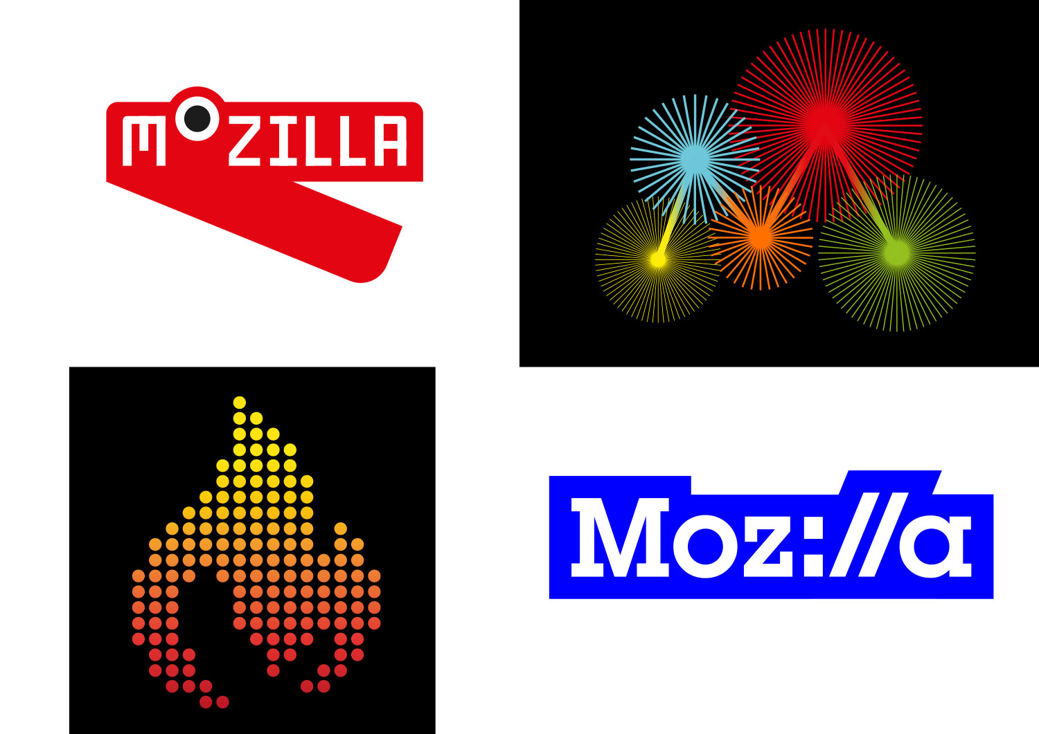
TM: I kind of fell in love with ‘Burst’ and ‘Dino 2.0’ in this round. I loved the idea behind ‘Flame’ — that it represented both our eternal quest to keep the Internet alive and healthy and the warmth of community that’s so important to Mozilla — but not this particular execution. To be fair, we’d asked you to crank it out in a matter of days.

MJ: Well, yes that’s true. With ‘Flame’ we then suffered from too close a comparison to all the other flame logos out in there in the ether, including Tinder. Whoops! ‘Burst’ was, and still is, a very intriguing thought – that we see Mozilla’s work through 5 key nodes and questions, and see the ‘M’ shape that appears as the link between statistical points.

blog-pics-13feb-4

TM: Web developers really rebelled against the moire of Burst, didn’t they? We now had four really distinct directions that we could put into testing and see how people outside of Mozilla (and North America) might feel. The testing targeted both existing and desired audiences, the latter being ‘Conscious Choosers’, a group of people who made decisions based on their personal values.

MJ: We also put these four in front of a design audience in Nashville at the Brand New conference, and of course commentary lit up the Open Design blog. The results in person and on the blogs were pretty conclusive – that Protocol and Dino 2.0 were the clear favourites. But one set of results were a curve ball – that the overall ‘feel’ of Burst was enjoyed by a key group of desired (and not current) supporters.

blog-pics-13feb-5

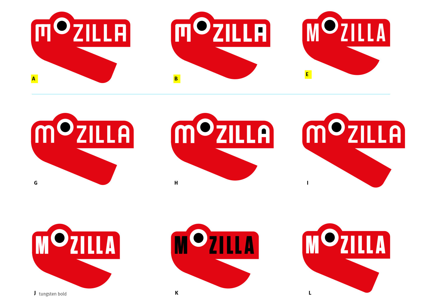
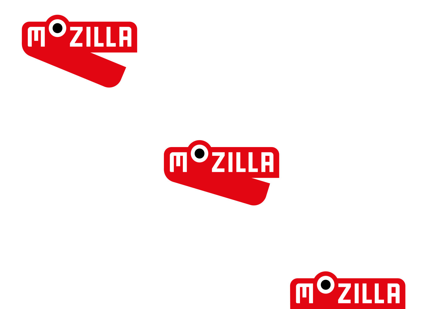
TM: This was a tricky time. ‘Dino’ had many supporters, but just about as many vocal critics. As soon as one person remarked “It looks like a stapler,” the entire audience of blog readers piled on, or so it seemed. At our request, you put the icon through a series of operations that resulted in the loss of his lower jaw. Ouch. Even then, we had to ask, as beloved as this dino character was for its historical reference to the old Mozilla, would it mean anything to newcomers?

blog-pics-13feb-6

MJ: Yes, this was an odd period. For many, it seemed that the joyful and playful side of the idea was just too much ‘fun’ and didn’t chime with the desired gravitas of a famous Internet not-for-profit wanting to amplify its voice, be heard and be taken seriously. Looking back, Dino died a slow and painful death.

TM: Months later, rogue stickers are still turning up of the ‘Dino’ favicon showing just the open jaws without the Mozilla word mark. A sticker seemed to be the perfect vehicle for this design idea. And meanwhile, ‘Protocol’ kept chugging along like a tortoise at the back of the race, always there, never dropping out.

MJ: We entered the autumn period in a slightly odd place. Dino had been effectively trolled out of the game. Burst had, against the odds, researched well, but more for the way it looked than what it was trying to say. And Protocol, the idea that had sat in the background whilst all around it hogged the spotlight, was still there, waiting for its moment. It had always researched well, especially with the coding community, and was a nice reminder of Mozilla’s pioneering spirit with its nod to the http protocol.

TM: To me though, the ‘Protocol’ logo was a bit of a one-trick pony, an inside joke for the coding community that didn’t have as much to offer to the non-tech world. You and I came to the same conclusion at the same time, Michael. We needed to push ‘Protocol’ further, maybe even bring over some of the joy and color of routes such as ‘Burst’ and the fun that ‘Dino’ represented.

blog-pics-13feb-7

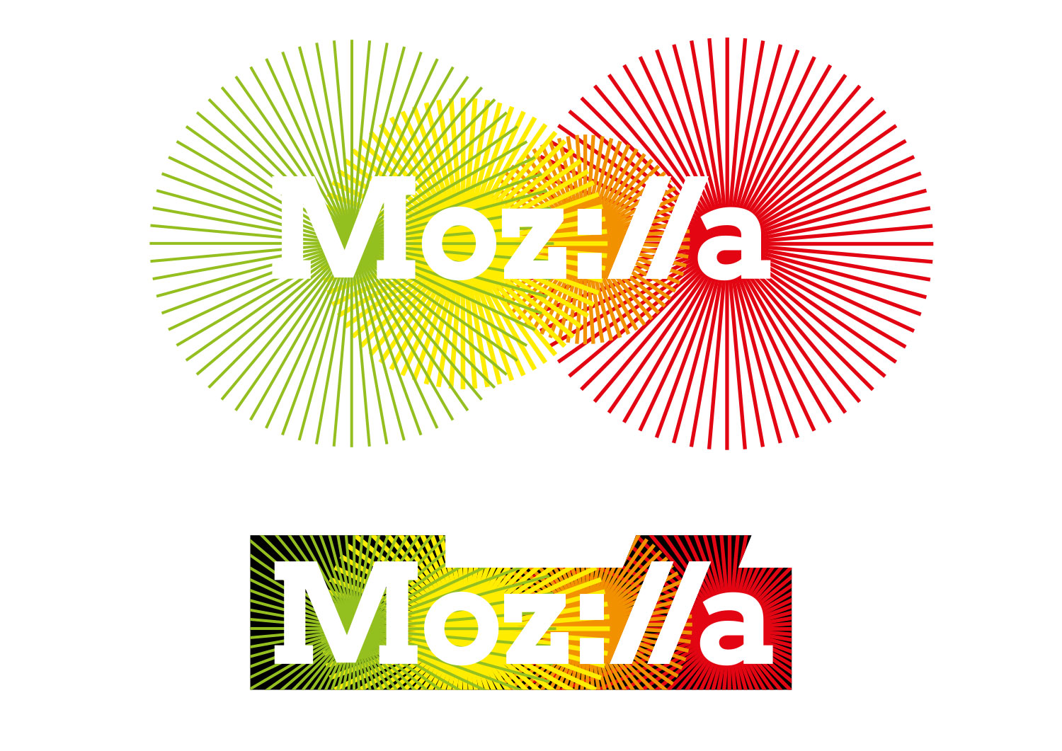
MJ: Our early reboot work wasn’t encouraging. Simply putting the two routes together, such as this, looked exactly like what it is: two routes mashed together. A boardroom compromise to please no-one. But, gradually, some interesting work started to emerge, from different parts of the studio.

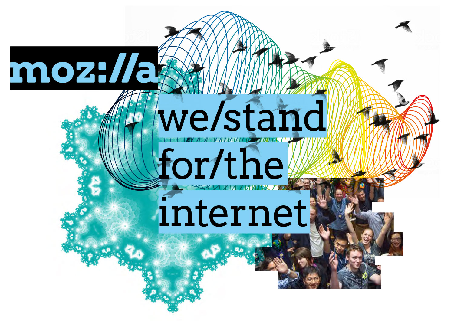
We began to think more about how Mozilla’s key messages could really flow from the Moz://a ‘start’, and started to explore how to use intentionally attention grabbing copy-lines next to the mark, without word spaces, as though written into a URL.

blog-pics-13feb-8

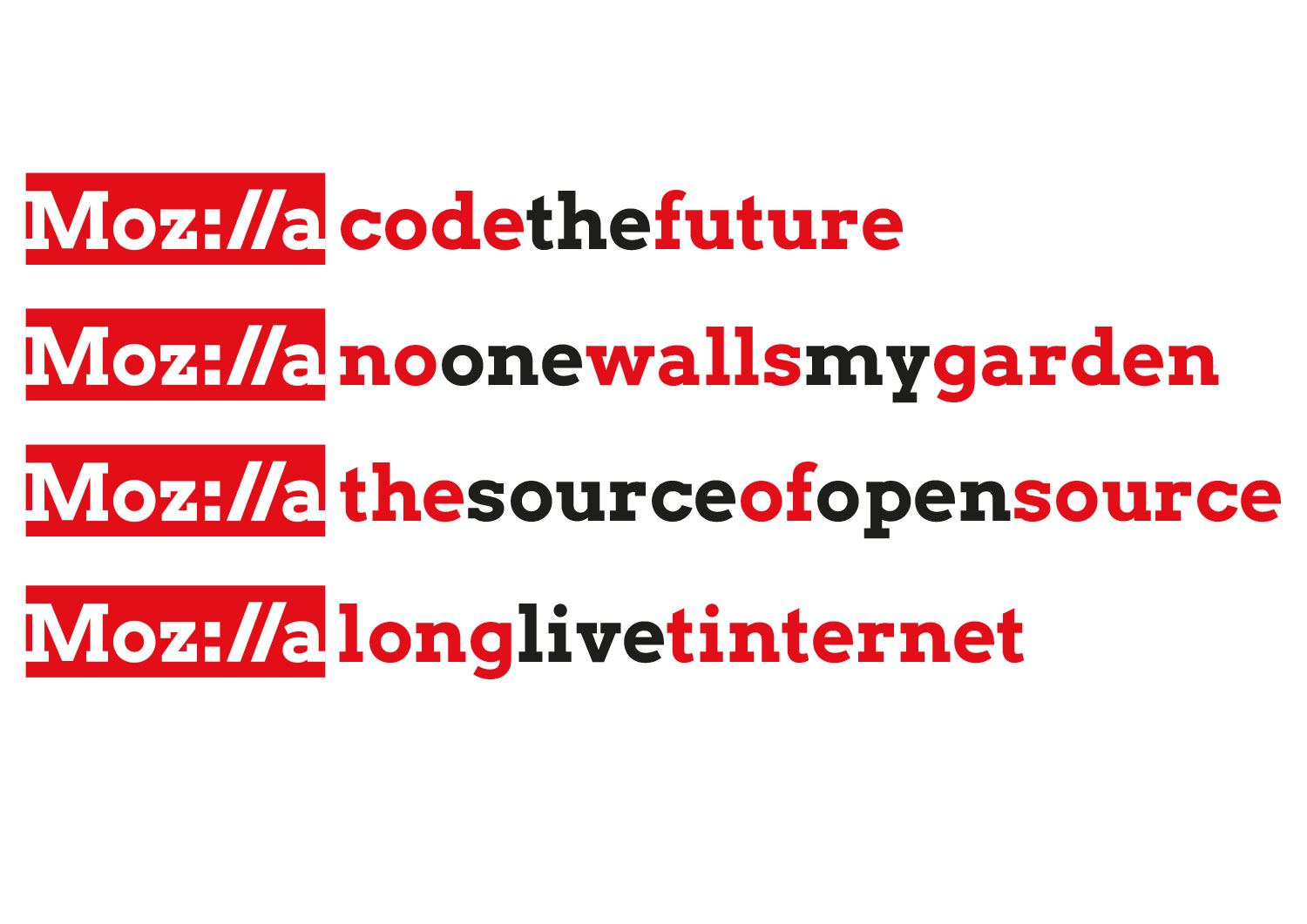
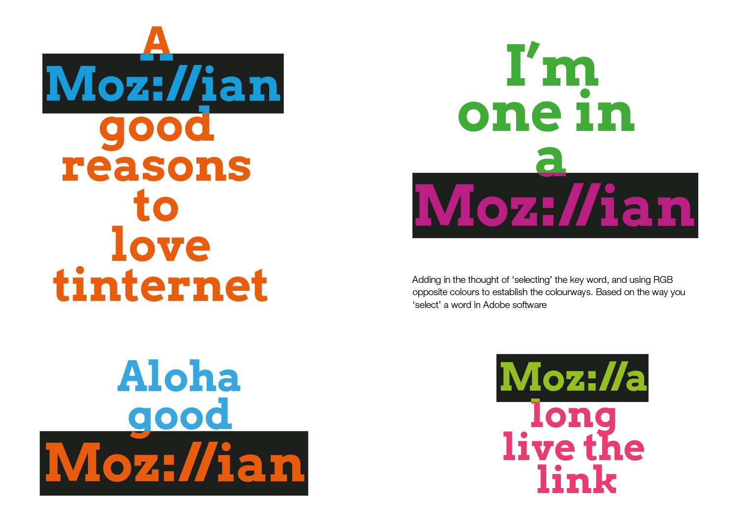
We also experimented with the Mozilla wordmark used more like a ‘selected’ item in a design or editing programme – where that which is selected reverses out from that around it.

blog-pics-13feb-9

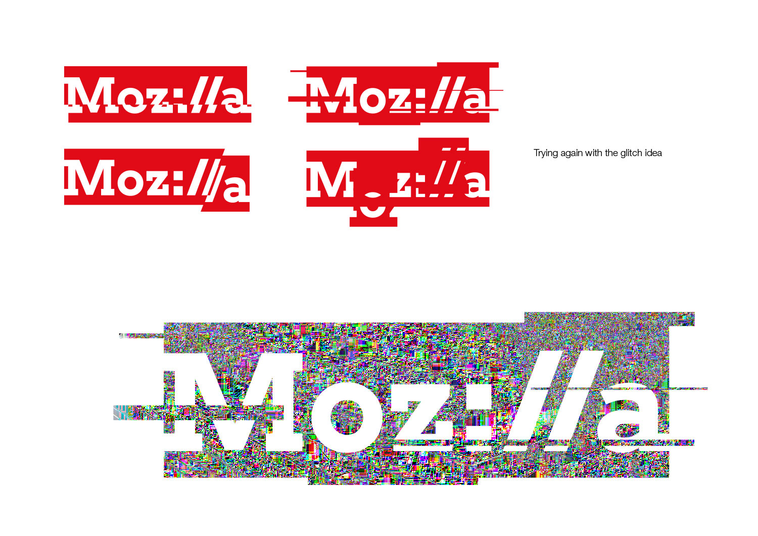
From an image-led perspective, we also began to push the Mozilla mark much further, exploring if it could be shattered, deconstructed or glitched, in so becoming a much more expressive idea.

blog-pics-13feb-10

In parallel, an image-led idea had developed, which placed the Mozilla name at the beginning of an imaginary toolbar, and there followed imagery culled directly from the Internet, in an almost haphazard way.

blog-pics-13feb-11

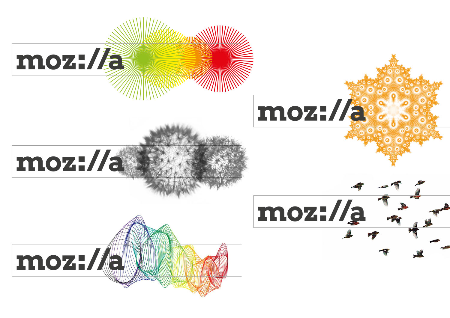
TM: This slide, #19 in the exploratory deck, was the one that really caught our attention. Without losing the ‘moz://a’ idea that coders loved, it added imagery that suggested freedom and exploration which would appeal to a variety of audiences. It was eye-catching. And the thought that this imagery could be ever-changing made me excited by the possibilities for extending our brand as a representation of the wonder of the Internet.

blog-pics-13feb-12


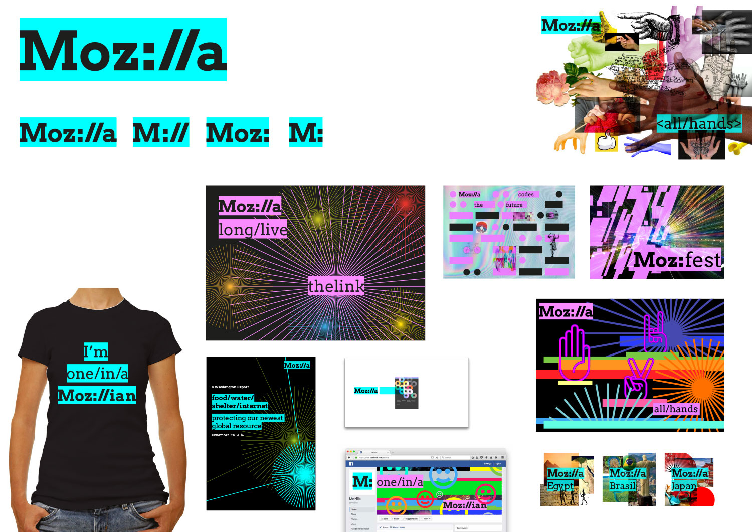
MJ: When we sat back and took stock of this frenetic period of exploration, we realised that we could bring several of these ideas together, and this composite stage was shared with the wider team.

What you see from this, admittedly slightly crude ‘reboot’ of the idea, are the roots of the final route – a dynamic toolkit of words and images, deliberately using bright, neon, early-internet hex colours and crazy collaged imagery. This was really starting to feel like a viable way forward to us.

To be fair, we’d kept Mozilla slightly in the dark for several weeks by this stage. We had retreated to our design ‘bunker’, and weren’t going to come out until we had a reboot of the Protocol idea that we thought was worthy. That took a bit of explaining to the team at Mozilla towers.

TM: That’s a very comic-book image you have of our humble digs, Michael. But you’re right, our almost daily email threads went silent for a few weeks, and we tap-danced a bit back at the office when people asked when we’d see something. It was make or break time from all perspectives. As soon as we saw the new work arrive, we knew we had something great to work with.

blog-pics-13feb-15

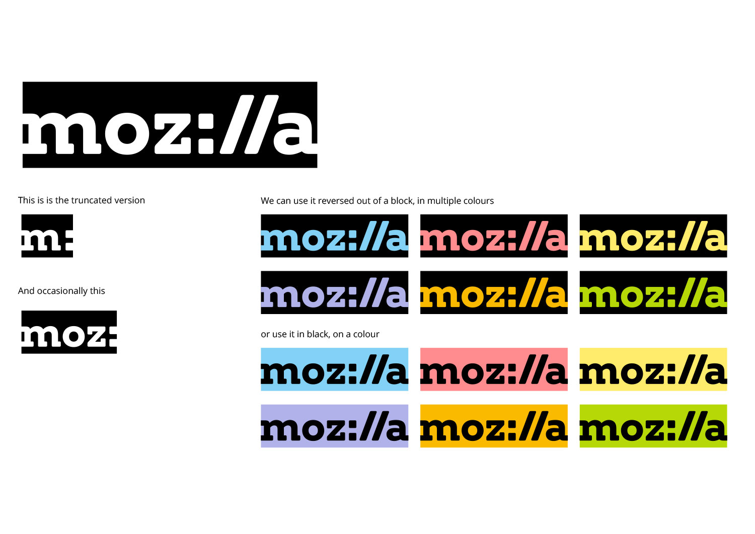
MJ: The good news was that, yes, the Mozilla team were on board with the direction of travel. But, certain amends began almost immediately: we’d realised that stand-out of the logo was much improved if it reversed out of a block, and we started to explore softening the edges of the type-forms. And whilst the crazy image collages were, broadly, enjoyed, it was clear that we were going to need some clear rules on how these would be curated and used.

blog-pics-13feb-16

TM: We had the most disagreement over the palette. We found the initial neon palette to be breathtaking and a fun recollection of the early days of the Internet. On the other hand, it didn’t seem practical for use in the user interface for our web properties, especially when these colors were paired together. And our executive team found the neons to be quite polarizing.

MJ: We were asked to explore a more ‘pastel’ palette, that to our eyes lacked some of the ‘oomph’ of the neons. We’d also started to debate the black bounding box, and whether it should or shouldn’t crop the type on the outer edges. We went back and forwards on these details for a while.

TM: To us, it helped to know that the softer colors picked up directly from the highlight bar in Firefox and other browsers. We liked how distinctive the cropped bounding box looked and grew used to it quickly, but ultimately felt that it created too much tension around the logo.

blog-pics-13feb-17

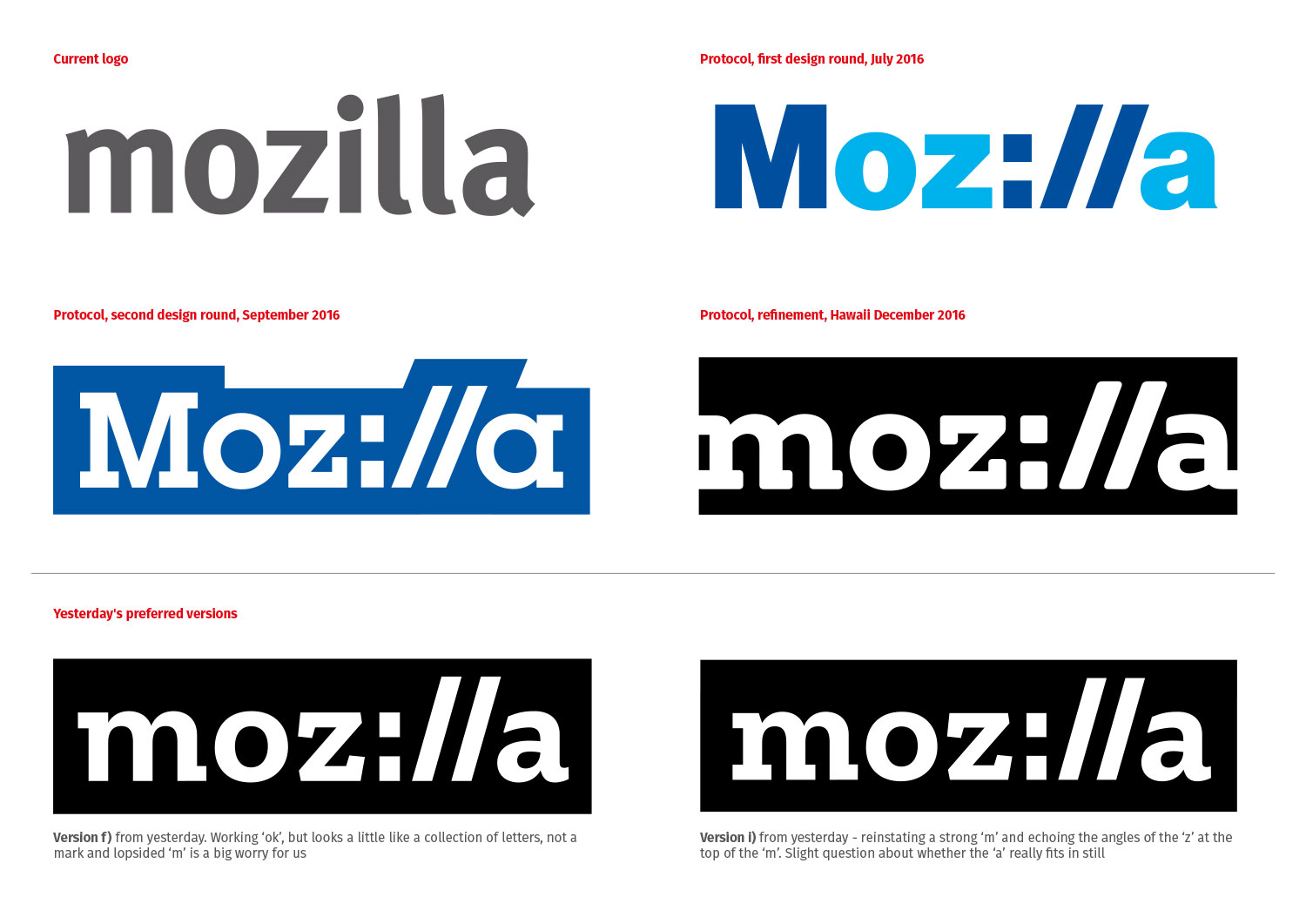
MJ: And as we continued to refine the idea for launch, we also debated the precise typeforms of the logo. In the first stage of the Protocol ‘reboot’ we’d proposed a slab-serif free font called Arvo as the lead font, but as we used it more, we realised many key characters would have to be redrawn.

That started a new search – for a type foundry that could both develop a slab-serif font for Mozilla, and at the same time work on the final letterforms of the logo so there would be harmony between the two. We started discussions with Arvo’s creators, and also with Fontsmith in London, who had helped on some of the crafting of the interim logos and also had some viable typefaces.

TM: Meanwhile a new associate creative director, Yuliya Gorlovetsky, had joined our Mozilla team, and she had distinct ideas about typeface, wordmark, and logo based on her extensive typography experience.

blog-pics-13feb-18

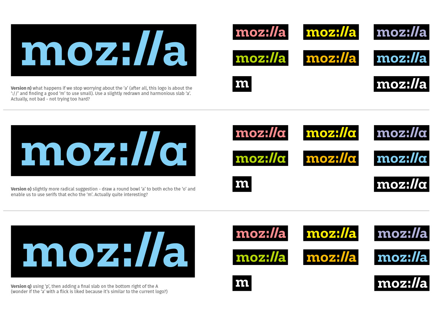
MJ: Finally, after some fairly robust discussions, Typotheque was chosen to do this work, and above and below you can see the journey that the final mark had been on, and the editing process down to the final logo, testing different ways to tackle the key characters, especially the  ‘m’, ‘z’ and ‘a’.

This work, in turn, and after many debates about letterspacing, led to the final logo and its set of first applications.

blog-pics-13feb-19

TM: So here we are. Looking back at this makes it seem a fait accompli somehow, even though we faced setbacks and dead-ends along the way. You always got us over the roadblocks though, Michael, even when you disagreed profoundly with some of our decisions.

MJ: Ha! Well, our job was and is to make sure you stay true to your original intent with this brand, which was to be much bolder, more provocative and to reach new audiences. I’ll admit that I sometimes feared that corporate forces or the online hordes were wearing down the distinctive elements of any of the systems we were proposing.

But, even though the iterative process was occasionally tough, I think it’s worked out for the best and it’s gratifying that an idea that was there from the very first design presentation slowly but surely became the final route.

TM: It’s right for Mozilla. Thanks for being on this journey with us, Michael. Where shall we go next?


34 comments on “Roads not taken”

  1. ray wrote on

    outstanding nothing wrong with change

    1. Mik wrote on

      Hey, I’m a graphic designer and feel really sorry I didn’t take part in the process earlier.
      I’m just jumping in this bath so I didn’t read much of the process so excuse me if my views have already been discussed earlier.
      First, why starting from scratch and why the slab?
      I love your Fira font, why not using it. It could also be turned into a slab, and be used for the identity if it makes sense. It has a very nice look, it looks professional, not as corporate professional but it doesn’t look like a font we find for free on the Internet :) (Yes I know many free fonts look better now, you got the point.)
      I think this logo, even if it has a great potential, doesn’t look very professional, meaning it looks cheap, not refined enough. Even if you want a “punky” look, it doesn’t have to look amateur. I’m sorry for using this confrontation of pro/amateur concepts but I think open source community usually lacks this kind of genius in design you find in modern brands and it shouldn’t be that way. Anyway, i just made a quick image with the Fira font and this concept and I think it would look better, but hey, open process, let’s talk about it. <3 Mozilla

      mozilla

  2. Suresh Benedy wrote on

    Moz://a Way To Visualize Your World

  3. Mik wrote on

    Sorry if my comment sounded a bit harsh, we french people in general are a bit arrogant and I guess I am also by coming here and spit on the logo that have been openly decided to be the new one. I read a bit more about the process now and I guess I just arrived to late. I guess also my view on what looks “professional” is an opinion so I shouldn’t have said it this way. Ah passionate people. I hope I didn’t hurt anyone. <3

  4. charlie wrote on

    this is an outstanding change, I couldn’t of put it better myself!

  5. Kim wrote on

    Fantastic Change!

  6. Mik wrote on

    Just in case…

    mozilla-slab

  7. Teresa wrote on

    Love it! Also, where I may get a T-shirt O:)

  8. John Collins wrote on

    Awesome.

  9. robin wrote on

    I’m so impressed with the quality of design ideas. Its interesting to see how the logo changed and expanded and then returned to simplest form. The design you ended with is solid and good. This is not my field. I checked in to see what’s happening. Keep up the discussion and good work.

  10. Andy wrote on

    Not crazy about the font. Too heavy. Can’t move it. Not quick. Not crisp.

  11. lizzy wrote on

    I am wholly late to the party, but just wanted to give a vote of approval for this. I’ve been using firefox since… 2010ish? and while it took a while to differentiate mozilla and the browser, I was intrigued with the nonprofit and always thought it’d be something I’d like to donate to when I was older.

    I think there is most certainly a place for mozilla among the googles and apples and microsofts, and this re-branding will hopefully confirm that. Your game is the internet. The intangible that leads to the tangible; while competitors are creating as many new and next-big-things as possible, you guys can fill the niche of a company pushing the boundaries of the abstract and dig deeper into the box that others now skim the top off to take elsewhere (apps, AI, VR, cars etc etc). Because who else is focusing solely on the ‘box’ itself? Everyone wants to think outside the box.

    The more that is known and done with the box, the more that can utilized by people to create real things wherever they are at – they won’t need to think right outside the box, they’ll come back to this highly useful box as needed and then create their own shapes to help with employment, agriculture, the environment, social justice, education, and so much more. I hope with this re-brand mozilla can become more visible and appreciated for the role it serves (if I am interpreting correctly). Looking forward to keeping up on where this goes!

  12. aj flak wrote on

    thanks: no flik/ Flak! those of my brethren/sistren who share the surname, I’m sure are relieved… we get enough of it.
    aj flak

  13. sharan wrote on

    seriously ,mozilla without the fox?

    1. Tim Murray wrote on

      The open design process relates to updating the brand identity for Mozilla, the nonprofit champion of a healthy Internet, not Firefox, our open-source web browsers. The fox character lives on in Firefox.

  14. DOVANI wrote on

    Good thing everyone is welcome here, every gender…every age. I am an old lady who likes to share her point of view on sooo many things (as you probably guessed) .So far i rely on Mozilla Firefox for my social online contacts.Not judged because of how i look, or how poor i am… incredible !!! May the almighty god and his son jesus bless you all, my loves !!! These difficult days ask for creativity, new branding and a lot of ‘out-of-the-box ‘ thinking…something i am used to because living on welfare and what life does hand out to me (usual nothing) .Most days i don’t know how to get out of bed because i feel so lethargic and useless… other days – but thats rare- i’m running around doing all tasks life asks of me… – crazy but ahh well… Life has mercy with me, but how long ???

  15. Priyank wrote on

    Couldn’t help but notice that at the end of each blog, the “NEXT” links to the previous post whilst the “PREVIOUS” to the next post on a normal time scale. Is this by design to evoke some thoughts while one finishes with the blog or just 1 issue to fix?

    1. Tim Murray wrote on

      Thanks and good catch, Priyank! Will try to address that.

  16. Katsza wrote on

    Firstly, congratulations. Everyone did a great job. This comment comes from what I saw on the penultimate page about on discussion color choices. You state “Color flows into our logo and changes according to the context in which the logo is used. As we develop our style guide, we’ll define color pairings, intensities, and guidelines.” Good idea, I can get behind that. However, does that mean that everything pink will have lace & kittens and everything blue will have a sporty little baby boy as shown in logos on that page? You worry about being anachronistic, I’d suggest taking the “pink is for girls, blue is for boys” idea under consideration, and applying it sparingly & only when it fits the context in a more modern way. I know, I know, some girls really like pink, some boys dig blue, just something to keep in mind.

    1. Tim Murray wrote on

      Thanks for your comment, Katsza. The pairing between color and imagery will be dynamic in digital applications – meaning that images will be constantly changing. There is no connection between color and specific images, and we had no intention of suggesting a link between color and perceptions of gender. Thanks for pointing out that our images might have suggested otherwise.

  17. Dan Wayne wrote on

    Great idea for rebranding….but as an old coder, the colon makes me break the work up into two words, as in two commands in one line of code. I get “moz la” in my head when I read the word. I may never say the “:” when I read it. Guess I am just getting old, but change is always inevitable. Sounds like you thoroughly thought it through, and of all the logos you looked at, this one is the best. I will always think of you guys as Firefox, and sadly Thunderbird though.

  18. Ryan Hinchcliff wrote on

    As a design student i can appreciate a logo redesign and how much of a back and forth process it is. This idea for the open source is definately a brave and spectacular idea! Open scrutiny the entire way, but having a public opinion about each design step to gauge the overall feel before a final logo is chosen…brilliant!

    I personally like the protocol and the eye logos. I see more diversity with this was as a popout logo / shortened logo / or miniscule logo. Everything that i have learned states that this is the more versatile logo for anything digital or letterhead or poster.

    I think you guys did a great job and i enjoyed reading and watching this whole process. I am sure other companies will try to emulate this idea.

  19. Hair-on-FIRE Commonsense Al wrote on

    with ALL due respect to communication subtleties and nuance,
    hidden persuaders, emoticons and triggers and thousands of other
    buzz/ biz-words, phrases, concepts that you Marketers/ Designers,
    and varied thinkers and tinkerers went to school for, practice,
    spend gazillions of hours on……………
    PLEASE consider that there are gazillions of OTHER people outside
    your industry, specialty, private party behind the curtain THAT
    SIMPLY DON’T CARE ABOUT OR REACT TO ALL THESE CONSIDERATIONS!!
    You can call them……CUSTOMERS!!
    I LOVE YOUR FLAMING FOX for no other reason than……. I DO!!
    You want to ADD to it?……USE IT differently?……FINE!!! but a
    logo like yours is one in a million!! THINK!!!! It is one of a very
    very infinitesimal pile of MEMORABLE marks with PERSONALITY
    and WARMTH!!
    Change for the sake of change is OK FINE…….but don’t throw the
    FOX out with the bathwater of buzz-word jargon and gobblygook!!!!

    1. Tim Murray wrote on

      This blog is about changing the logo for Mozilla, the nonprofit champion for a healthy Internet. It is not about changing the logo for Firefox, our open-source web browers.

  20. Mark Fritch wrote on

    Thanks for posting this information. This hit me in many ways. Some of my personal aspects that were impacted from the proceeding of the design were:
    Educator
    Artist
    The playful-kid-at-heart
    Business person
    Visual and Kinesthetic Learner
    Avid internet user
    A Swede/German nature
    Researcher
    About the only level that you did not impact me was as an antique Volvo nut, a log home builder and a forester. I’d like to have you get on that if you could.
    I do have an idea for you regarding this page, https://blog.mozilla.org/opendesign/roads-not-taken/ , that may be very useful. I had a conversation with a friend who teaches marketing and branding at the university level once. He commented about how he used an ad program for a car dealership in the small town of Sandy, Oregon where I live in teaching his university classes. Suburban Chevrolet had a program based on a “Trunk Monkey” that came with every Chevrolet sold. You can find all of their TV ads on You Tube. They were amazingly creative ads that went viral. They are simply a hoot even if you’re not interested in a Chevy. This leads to my idea. What you’ve resented in this web page, and I’m sure the other pages are as good, could actually be used in a program on marketing, image and product design. I suggest that you put your materials together and in the vein of Mozilla in general, offer it to universities and colleges for their business programs. I think that what you’ve shared here is very clear about the process. This would not only be a nice gift to instructors looking to build their programs, but it would also put Mozilla out into the public domain where it could spread like wildfire. There is nothing like putting a good idea into the hands of a ‘hungry’ college student. I know that there are things that I use to this day that I got from my college courses. They were profound, clear and piercing and there are not that many things that I still use on a daily basis that I learned 45 years ago.

  21. Mark Fritch wrote on

    In moderating my post a few moments ago, I spotted some spelling and punctuation errors. Here is a better text to use.

    Thanks for posting this information. This hit me in many ways. Some of my personal aspects that were impacted from the proceeding of the design were:
    Educator
    Artist
    The playful-kid-at-heart
    Business person
    Visual and Kinesthetic Learner
    Avid internet user
    A Swede/German nature
    Researcher
    About the only level that you did not impact me was as an antique Volvo nut, a log home builder and a forester. I’d like to have you get on that if you could.

    I do have an idea for you regarding this page, https://blog.mozilla.org/opendesign/roads-not-taken/ , that may be very useful. I had a conversation with a friend who teaches marketing and branding at the university level once. He commented about how he uses an ad program for a car dealership in the small town of Sandy, Oregon where I live, in teaching his university classes. Suburban Chevrolet had a program based on the comical concept of a “Trunk Monkey” that came with every Chevrolet sold. You can find all of their TV ads on You Tube. They were amazingly creative ads that went viral. They are simply a hoot even if you’re not interested in a Chevy. This leads to my idea.

    What you’ve presented in this web page, and I’m sure the same is true for your other pages, could actually be used in a program on marketing, image and product design. I suggest that you put your materials together and in the vein of Mozilla in general and offer it to universities and colleges for their business programs. I think that what you’ve shared here is very clear about the process. This would not only be a nice gift to instructors looking to build their programs, but it would also put Mozilla out into the public domain where it could spread like wildfire. There is nothing like putting a good idea into the hands of a ‘hungry-for-knowledge’ college student. I know that there are some very specific things that I use to this day that I got from my college courses. They were profound, clear and piercing. There are still many things that I still use from college, but there are those few that I still use on a daily basis that I learned 45 years ago. I think that what you have here could be one of those things.

  22. gurvinder singh wrote on

    excellent ….it great…. this change is to create mozilla endlessly ..it is natures path.

  23. Jane wrote on

    Good work Mozilla et al.
    Nice approach and good to freshen and spice things up – just wish I had been aware of the process sooner :-)

  24. john Barnes wrote on

    As a Senior citizen, I prefer simple and moderate changes to minimize confusion
    frustration.

  25. Mohit Natani wrote on

    All the logos are really amazing. I am also totally confused which one to accept and reject. This change is required for the brand like Mozilla.

  26. Justin wrote on

    Current logo looks better than any of these. The moz://a one is just terrible, the time it takes to work out its a hack on mozilla is infuriating, please don’t ever use that one.

  27. Scott Richardson wrote on

    Thank you so much for sharing this whole process with us. It’s quite remarkable just how much effort and time goes into something as simple as designing/choosing as a new logo. But then again, I guess “simple” is a relative term. I have to say I liked Protocol from the very beginning. It’s so clever and (again) simple. The effort you put forth in this process shows just how much you care about the Mozilla community and those who love it. So again, thank you.

  28. Krishan wrote on

    It would be awesome to see this change and riveting new mozilla. Really like the new design concepts and the philosophy behind it.

  29. deggimatt wrote on

    I prefer the classic design… the very first one. Am I old ??