Categories: General

Arrival

Seven months since setting out to refresh the Mozilla brand experience, we’ve reached the summit. Thousands of emails, hundreds of meetings, dozens of concepts, and three rounds of research later, we have something to share. If you’re just joining this process, you can get oriented here and here.

At the core of this project is the need for Mozilla’s purpose and brand to be better understood by more people. We want to be known as the champions for a healthy Internet. An Internet where we are all free to explore and discover and create and innovate without barriers or limitations. Where power is in the hands of many, not held by few. An Internet where our safety, security and identity are respected.

Today, we believe these principles matter more than ever. And as a not-for-profit organization, we’re uniquely able to build products, technologies, and programs that keep the Internet growing and healthy, with individuals informed and in control of their online lives.

Our brand identity – our logo, our voice, our design – is an important signal of what we believe in and what we do. And because we are so committed to ensuring the Internet is a healthy global public resource, open and accessible to everyone, we’ve designed the language of the Internet into our brand identity.

Today, we’re sharing our new logo and a proposed color palette, language architecture, and imagery approach. Remaining true to our intent to engage with the design and tech community throughout this open design process, we welcome your feedback on these elements as we build out our design guidelines.

Let’s go into a bit more detail on the components of our brand identity system, developed in collaboration with our exceptional London-based design partner johnson banks.

Our logo

Our logo with its nod to URL language reinforces that the Internet is at the heart of Mozilla. We are committed to the original intent of the link as the beginning of an unfiltered, unmediated experience into the rich content of the Internet.
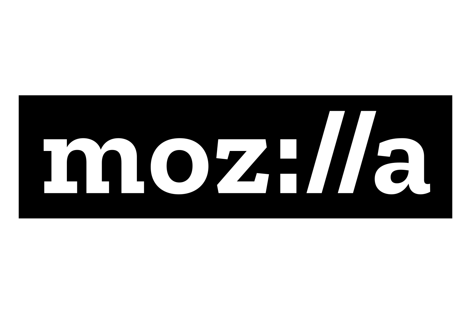
Mozilla-12jan-1500px_logo


The font for the wordmark and accompanying copy lines is Zilla. Created for us by Typotheque in the Netherlands, Zilla is free and open to all.

Typotheque was an historic partner to Mozilla. They were the first type-foundry to release Web-based fonts, and Mozilla’s Firefox web browser was an early adopter of Web fonts. We chose to partner with Peter Bilak from Typotheque because of their deep knowledge of localization of fonts, and our commitment to having a font that includes languages beyond English. Prior to partnering with Typotheque, we received concepts and guidance from Anton Koovit and FontSmith.
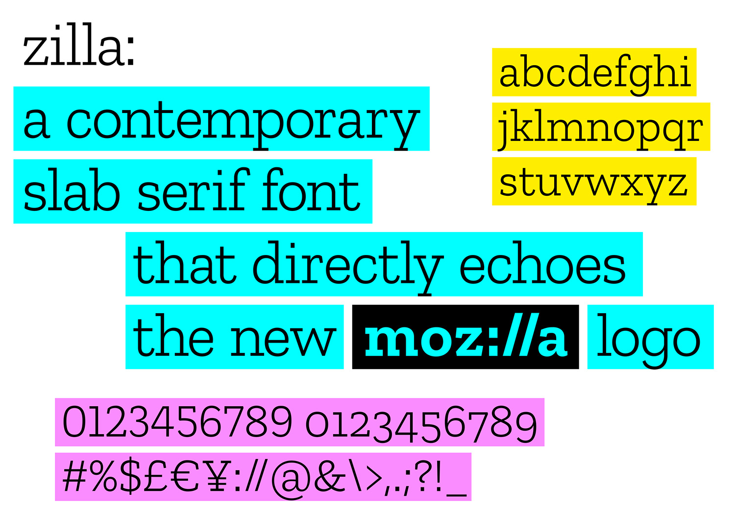
johnsonbanks_Mozilla_zilla_type_2

Selected to evoke the Courier font used as the original default in coding, Zilla has a journalistic feel. It bucks the current convention of sans serif fonts. Anyone can create the Mozilla logo by typing and highlighting with the Zilla font, making the logo open and democratic. The black box surrounding the logo is a key building block of the design, and echoes the way we all select type in toolbars and programs.

Mozilla comes first in any application of the system, just as the protocol begins any internet journey. Copy lines, colors, and images all flow from that starting point, much like a web journey.

Our color palette

Our color palette, derived from the highlight colors used by Firefox and other web browsers, distinguishes our brand from its contemporaries. Color flows into our logo and changes according to the context in which the logo is used. As we develop our style guide, we’ll define color pairings, intensities, and guidelines.
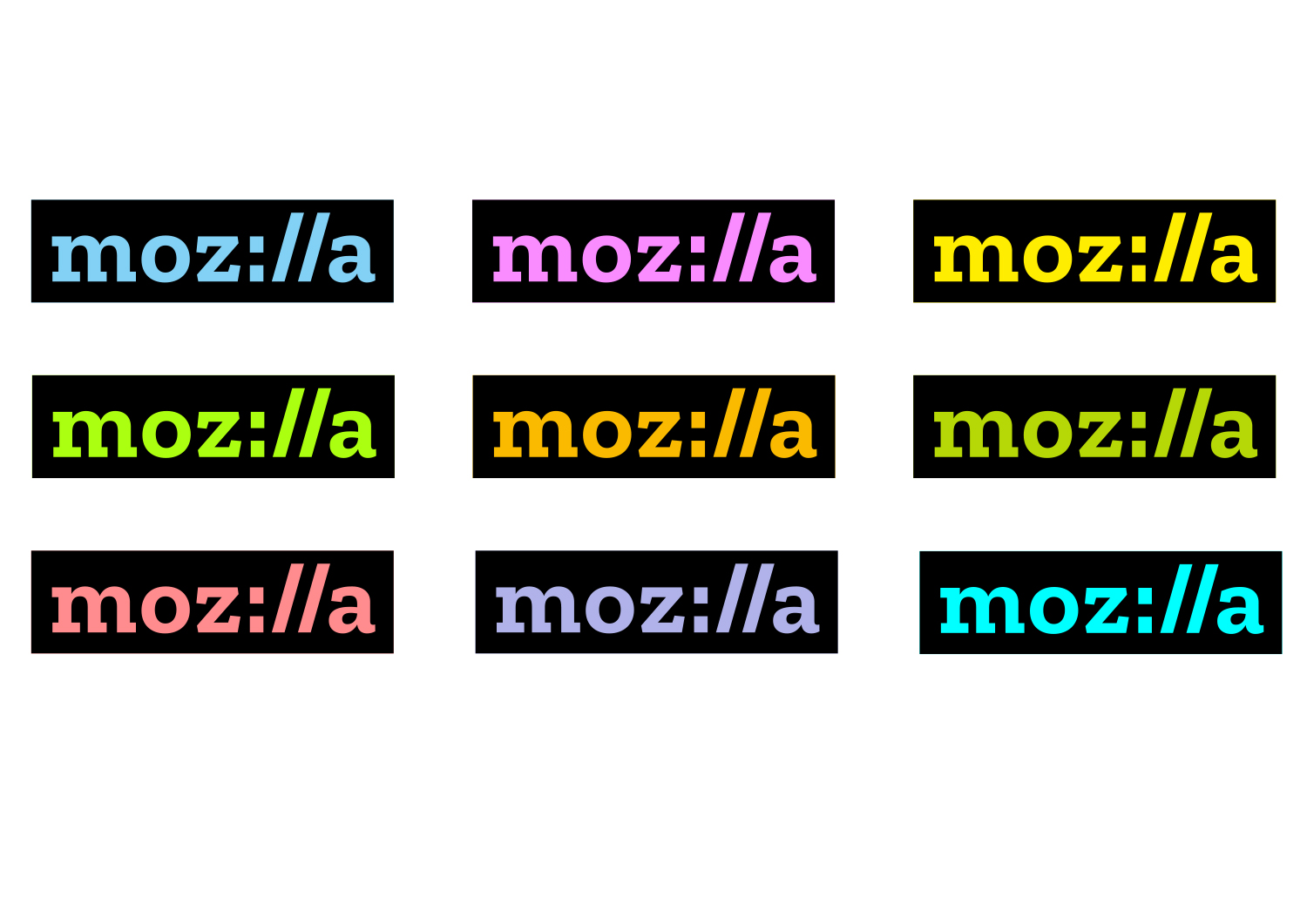
Mozilla-12jan-1500px_color

Our language and language architecture

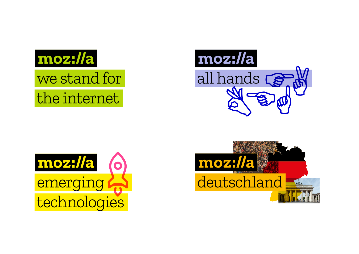
Copy lines to the right or below the logo hold core Mozilla messages.  They also hold program, event, and team names — simplifying and unifying a multitude of different Mozilla activities. It will now be easier to know that something is “from” Mozilla and understand how our global initiatives connect and reinforce one another.

The system enables Mozilla volunteer communities across the globe to create their own identity by selecting color and choosing imagery unique to them. Meanwhile the core blocks of our system, bounding boxes and typography, will provide the consistency, making it clear that these communities are part of one Mozilla.
Mozilla-12jan-1500px_architecture

Our Imagery

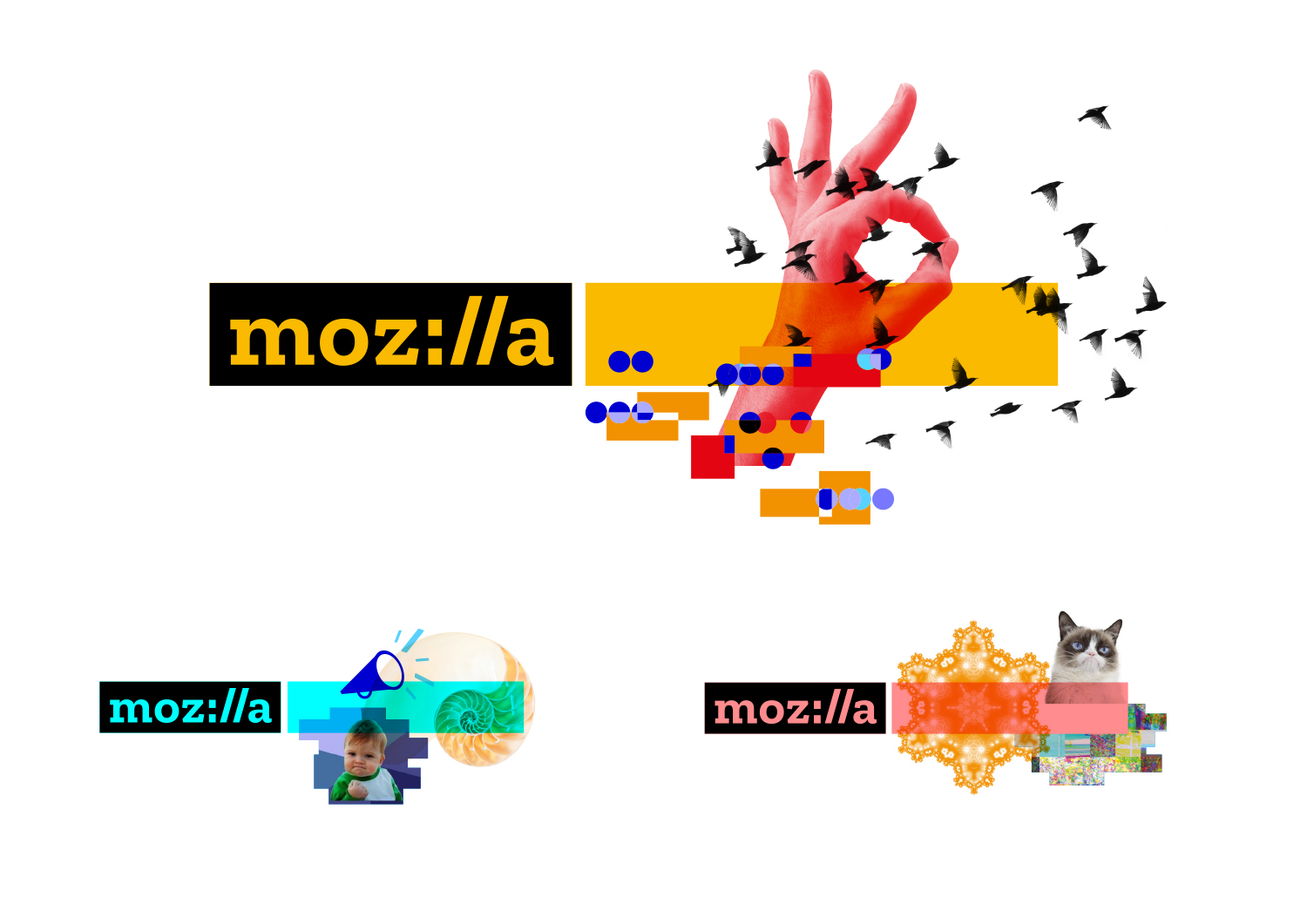
As we looked at the elements of our brand identity, the concept of one image or icon standing for the whole of Mozilla, and the entirety of the Internet, seemed anachronistic. Since imagery is an important reflection of the diversity and richness of the Internet, however, we’ve made it an important component of our system.


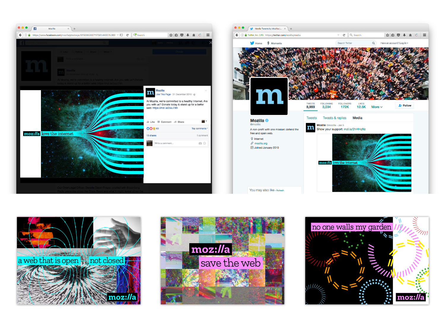
In digital applications, ever-changing imagery represents the unlimited bounty of the online ecosystem. Dynamic imagery allows the identity of Mozilla to evolve with the Internet itself, always fresh and new. Static applications of our identity system include multiple, layered images as if taken as a still frame within a moving digital experience.
Mozilla-12jan-1500px_imagery

How might it work? We intend to invite artists, designers, and technologists to contribute to an imagery collective, and we’ll code curated GIFs, animations, and still images to flow into mozilla.org and and other digital experiences. Through this open design approach, we will engage new design contributors and communities, and make more imagery available to all under Creative Commons. We’re looking for input from creative communities to help shape and expand this idea.
Mozilla-12jan-1500px_apps2


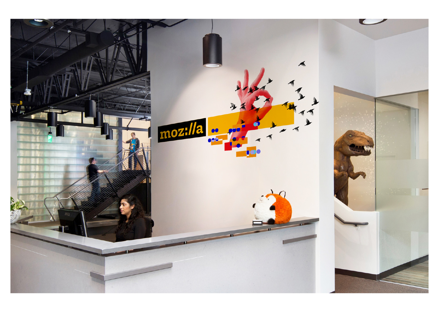
We will roll out the new brand identity in phases, much as we have with concepts in this open design process, so please be patient with our progress. As we develop our design system, we look forward to hearing your feedback and suggestions using the comments below. You’ve been with us from the start and we’re glad you’re here. We’ll continue to share updates and comments in this space.
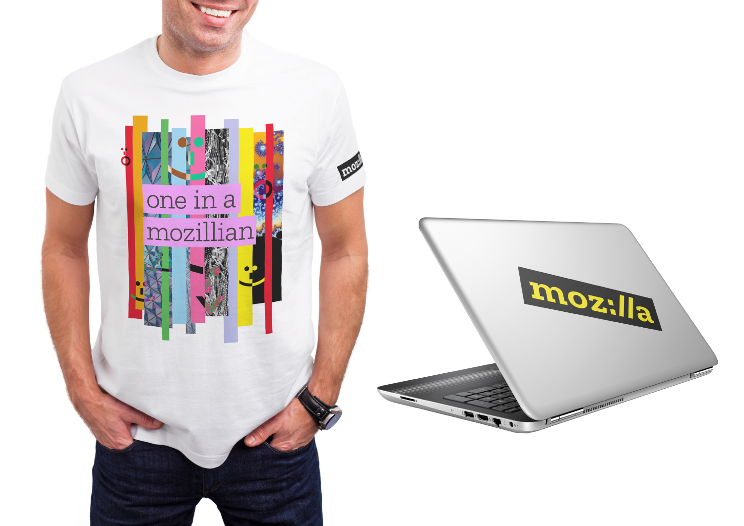
Mozilla-12jan-1500px_environmental

Mozilla-12jan-1500px_apps1


Photo credits
Brandenburg Gate https://commons.wikimedia.org/wiki/File:Berlin_-_0266_-_16052015_-_Brandenburger_Tor.jpg
Iron Filings https://www.flickr.com/photos/oskay/4581194252

240 comments on “Arrival”

  1. Question wrote on

    Where can we download the font?

    1. Tim Murray wrote on

      We’ll be making the font available within the next few weeks.

  2. Rahul Ghosh wrote on

    Awesome. Can’t wait for the new mozilla font to be up.

  3. Alexander wrote on

    I am don’t like new logo. I like old dino, or this new variant(dino eye)

    mozilla-1

  4. Arnaud B. (Mist. GraphX) wrote on

    Hi, great job ! I i’m a long time user of the mozilla products (even if i use Chrome to debug and work with sass ^^) and i was a little bit afraid with the guide lines of Google : flat and uniformed designed. I’m really happy to see a new health in web design, new types, new colors : break and crash this web !! we like you ! Go on !

    Cheers
    Mist.

  5. Mist. wrote on

    Hi,

    i’m not a fan of the ‘:’ replacing the ‘i’ , i’ think for a proper implementation and readability in this logotype you must choose between the ‘ll’ or the ‘:’ > ‘i’ ;-)
    in my opinion.

  6. Seburo wrote on

    Hi

    I really like the new word mark and how flexibly it can be used. With Mozilla having used “earth” type colours for so long, the introduction of a much bolder and brighter palette could take some getting used to, but overall I think that this is a good thing.

    As with quite a few people here, I look forward to downloading the typeface and making sure I adhere to the new brand guidelines. With such opennesses of expression in the examples above, I can appreciate that formulating guidelines will be done with care and should not be rushed.

    A great brand I am looking forwards to seeing more of.

    1. Sally G wrote on

      Actually, I am not thrilled with the palette so far. I like the logo itself, and its flexibility, waiting for refinements before I comment on associated graphics and colors.

  7. Andrew wrote on

    I rather like the Zilla font, but I think it generally looks much nicer at lighter weights than it does in bold.

  8. Martin wrote on

    Really like the new logo on black with colored letters and colored marked subtitles! Great job. Can’t wait for the font.

  9. Vladimir Krstic wrote on

    If Mozilla was art museum, design or fashion magazine, tourism or culture organization this would be great! But, it’s not. Mozilla is a software company at its core and software is keeping it sustainable. For a software company this design direction is a big miss. I literally can’t name one thing in whole direction that is done right.

    From the very start of process I had low expectations, but didn’t thought that we will get this catastrophe. Why I got low expectations? Simply, you choose johnson banks for a partner. They have done some really great work, and exactly this great work can’t recommend them to work for company like Mozilla. Their visions are suitable for completely different fields. Your process was completely philosophical and at no point practical.

    How you plan to incorporate slab serif font into Firefox or MDN or any other product where usability is primary? You don’t of course. Big hole you got there in consistency.

    Protocol :// is indeed clever but is it usable? Mozilla is already having problems with recognition. And as much you have tested its readability and factor of coolness on Mozillians and I guess designers you got it wrong. Biggest share of average folks won’t get it and more importantly will not be able to read it correctly.

    Imagery? I can share you my scrapbooks if you need some of these. Of course if you are opening art museum… Chaos without end, consistency not even on sight. Applicable? Yes, in mass production of random t-shirts.

    Vibrant colors? Yes if you want user to close the tab(with eyes in pain) before he clicks download button. Animate them? This is where ophthalmologists start making real money.

    Sean Martell’s work from few years ago was on good track. This… this misses big time.

  10. Budiman Oktavianus wrote on

    Very Nice <3 , just waiting for the release font..

  11. Josh Anthony wrote on

    Every time I look at the new logo, I think of a concerned face. Ironically, this reflects my feelings about the new logo.
    :/

  12. Martin M. wrote on

    Hey! You used my idea I suggested in one of my commentaries during this process(sort of…i think). Cool. (the idea- make the text transparent so the color shows through the logo – or as you put it “the color flows into the logo”).

    Initial gut reaction is hm.
    It doesn’t grab me, but I’m not totally put off by it either. It feels…oddly comfortable?
    Kind of like it’s always been there, but not really…It looks like it could have a broad application – which in the end is the ultimate goal. And it looks like this will be flexible enough that if certain visual approaches don’t work they can be tweaked and modified as time goes on.

    Coolio – the proof is in the pudding. Application will tell.

    Congrats on a brave journey – opening up to the world to have their (blunt, raw) input requires a thick skin and a caring hand…and I think you have navigated it well.

    Here’s to seeing it in the real world.

  13. T-Khan wrote on

    Horr:b//e

  14. Awais wrote on

    can we download the font?

    1. Tim Murray wrote on

      Soon! We’re working on extending Zilla to multiple weights and languages. Continue to watch this blog for details. Thanks.

  15. Adam wrote on

    Great work – fresh moder logo – good brand for good good purpose.

  16. gabi vallu wrote on

    As a graphic designer I can say: the amazing result of all this long open source rebranding process made me want to work with Mozilla company. :)

    Well done! Keep the good work! (clap clap clap)

  17. KveMot wrote on

    Same logo as jetty? https://eclipse.org/jetty/

    jetty-logo-80x22

  18. Dennis Miano wrote on

    Amazing. Totally love it!

  19. Jurnalweb wrote on

    Aww we love it

  20. Michael “notriddle” Howell wrote on

    Funny that they did a user study, the user study said users preferred Burst, and the final design is almost entirely a variant of Protocol. I get it; the starburst thing was either going to suck, or end up looking too much like the Git logo, but still.

    “A man uses statistics like a drunk uses street lights. For support, not enlightenment.”

  21. César Luis Alvargonzález wrote on

    IMHO the other options were more fresh and original, this one looks really similar to the new cURL logo. Many people will wrongly associate cURL to the Mozilla org.

    good_curl_logo

    1. Tim Murray wrote on

      Hi Cesar, Thanks for your comment, and you’re right there are some similarities between the two identities in their use of protocol language. cURL was identified during the design process, and we believe our expression of the idea is sufficiently different to avoid confusion. The founder of cURL, Daniel Stenberg, a former Mozilla employee and current Mozillian, is really happy with our brand identity. Thanks for being a part of this open design process.

      1. Dr. Denan wrote on

        Tim, I less a fan of Mozilla than I used to be for reasons of memory hoggery and your mainstreaming of your politics (sick to death of politics and looking for political-correctness-free zones), but I’ve been with you folks for ages and am not going to walk away.

        That said, I’ll go forward believing the new Mozilla brand will grow on me. But the memes? Nope. Too trendy and superficially self-important.

        But that’s just my opinion and I wish you success.

  22. Roberto wrote on

    It’s amazing how good ideas travel fast and far, Tim. We designed a logo based on the same concept about a year ago for Molecle a “human-centered coding” agency :D Here’s the story: https://medium.com/nulla-di-personale/mozillas-new-logo-looks-a-lot-like-our-logo-and-we-re-happy-about-that-bc41c8062970#.iqz5qgrz4

    versus2

    1. David Jackson wrote on

      Not really the same concept because mozilla uses the characters as replacements for letters unless the first logo is spelling illmolecle?

  23. Luis wrote on

    This reminds me of MySpace.
    And having company branding identity based on a logo contest…
    Don’t you ever thought about using a good agency or something? And define a proper strategy instead of doing a logo contest like the ones you did in college? This is real life mates.
    What are you targeting? Do you really had to make a huge change? Did you even tested this? You know that having a couple of articles online, hyped for a week, is not going to give you the holy grail in the long run.
    Sorry if i am being harsh, I know the numbers are going down, but sounds like you’re my desperate ex-girlfriend crying for attention.
    If you don’t know how valuable good design is, and don’t know how to implement it in your business culture, I just have to wish you guys the best luck for the future.
    Cheers

  24. Benjamin N. Summerton wrote on

    I really like this design and think it actually looks very engaging, but I wish you’d drop the meme references. I don’t think it adds anything.

  25. Vladimir Krstic wrote on

    If Mozilla was art museum, design or fashion magazine, tourism or culture organization this would be great! But, it’s not. Mozilla is a software company at its core and software is keeping it sustainable. For a software company this design direction is a big miss. I literally can’t name one thing in whole direction that is done right.

    From the very start of process I had low expectations, but didn’t thought that we will get this catastrophe. Why I got low expectations? Simply, you choose johnson banks for a partner. They have done some really great work, and exactly this great work can’t recommend them to work for company like Mozilla. Their visions are suitable for completely different fields. Your process was completely philosophical and at no point practical.

    How you plan to incorporate slab serif font into Firefox or MDN or any other product where usability is primary? You don’t of course. Big hole you got there in consistency.

    Protocol :// is indeed clever but is it usable? Mozilla is already having problems with recognition. And as much you have tested its readability and factor of coolness on Mozillians and I guess designers you got it wrong. Biggest share of average folks won’t get it and more importantly will not be able to read it correctly.

    Imagery? I can share you my scrapbooks if you need some of these. Of course if you are opening art museum… Chaos without end, consistency not even on sight. Applicable? Yes, in mass production of random t-shirts.

    Vibrant colors? Yes if you want user to close the tab(with eyes in pain) before he clicks download button. Animate them? This is where ophthalmologists start making real money.

    Sean Martell’s work from few years ago was on good track. This… this misses big time.

    P.S Try to post my negative critics this time, “open design”.

  26. gorn wrote on

    * I admit that I do not like the logo, although I wish Mozilla success with it.
    * It did not catch my eye by itself and I feel that the combination with different pictures and colors only makes it confusing. It almost feels like, someone is trying to do the best from bad situation, which I do not think is a good result of rebranding process.
    * I would much more liked anything more beautiful.

  27. Martin M. wrote on

    Y’know…it’s growing on me. (It does remind of Wired circa 1999).

    Just remember “New Coke”. :-P (Move quickly if you must).

    But yep…growing on me.

  28. Bruno wrote on

    It was time! But I think it could be improved. Good job!

  29. Rameez Soomro wrote on

    these great innovation and ideas inspired me

  30. Paul wrote on

    Nothing like a new logo to bring the critics out in force! For what it’s worth, I think the logo you chose is the one that best fit your brief. I think you’re quite brave to have exposed what is always a difficult process to the public. And I think it’ll be interesting to see if these colors work, or if they end up being accents and you need to identify a safer and more mainstream primary color.
    Be careful mixing the photos, transparencies, icons and everything else though. There’s a fine line between dynamic imagery and a hot mess.

  31. Martin Scurry wrote on

    Hello Tim

    I’m really happy to see a new health in web design, new types, new colors, break and crash this web !! we like you Mozilla ! Go on ! Have a nice day.

    Thanks
    Regarding Martin

  32. David wrote on

    Loving it. You are doing some great work! Everyone is using mozilla and another browser which I’ ll not name here. Well done. Never had any issue with mozilla.

  33. just a user wrote on

    I really don’t like the new logo. It is confusing. I have been in Internet for 20 years, and that is still confusing. I was thinking: is it an URL or what?

    Down vote for the logo.

  34. just a user wrote on

    Well, just a user again.

    There is some coolness in the logo though. So, not totally bad!

  35. Daniel wrote on

    MMM tasty looks, I dig em. Want them in my moz://a explorer now! haha
    Pretty cool stuff ur doing here, Hope it all goes well. U have my support!

  36. Chris Sky wrote on

    Always been a big fan of the Mozilla foundation since back when I decided to use Firefox 2 over Explorer. I also now use thunderbird for email.
    Keep it us guys, you are doing a great job.

  37. Someone wrote on

    Awesome. The Mozilla logo is still being improved. Love this organization. And what it does. Firefox, Internet Privacy, the list goes on. Keep up the great work!

  38. Dale wrote on

    I really like the new logo idea and also the font. Is the font and logo gonna be on the browser?

  39. Ron T wrote on

    If you have to explain or rationalize the design, is sucks. My last company took a perfectly good logo and made a childish pig with lipstick out of the re-branding. The “C-Suite” got sold a load of carp for a stupid amount of money and they too had to make a video to justify the design. I’m educated as an Industrial Designer, spent lots of time with graphic designers. No mater what you design not everyone will like it, but telling me how cool it is isn’t going to change my mind. It won’t have me singing its praises.

    I liked the comment about the McDonald’s arches best. Everyone knows what that means. The Chevy bow tie. Fonts come and go, color palates are for Interior designers experimenting with color shock value. The logo Icon is what matters.

  40. Waffielz wrote on

    kinda want that shirt, not gonna lie

    ScreenShot2017-01-28at6.52.42AM

  41. Rochelle H. wrote on

    I have an idea for your new logo in case you start over….I’m not an artist so I can’t draw it unfortunately, but try this on for size. Change the Z to a lightning bolt, make the bolt look like it’s striking the words, “We Light the Way” under Mozilla. That’s it….lol. Whatever you guys do, I’m sure it will be great.

  42. Nap wrote on

    Hesitant to chime in but heck I heart Mozilla and have always trusted Firefox back in the days so I do not want to be silent. I would prefer a logo and a name brand. A very strong logo like the “fox.” Change is good but not this kind where the fusion of brand and logo is amiss.

    1. Tim Murray wrote on

      Hi Nap,

      This is the brand identity for Mozilla, the nonprofit champion for a healthy Internet. It’s not a replacement for the Firefox logo.

      Thanks for commenting!

      1. Sally G wrote on

        Tim, I read the comment very differently from the way you did—it seems to me that Nap was asking for a graphic logo that would have the same impact that the fox does for Firefox.

  43. Evangeline T. wrote on

    Comments off the top of my head:

    Never been crazy about the courier font. Looks too much like an old-style typewriter, which I used too many years to find in the least bit attractive, but sometimes old becomes new again and the font will work over time, a favorite.

    I love that the protocol :// really fit the name mozilla to a T. It is just genius; even while I’m not sure if, of itself, it can fill all the gaps you are wanting in a brand. Time will tell.

    Also, not sure if it was intentional, or not, but I read the hand as making the sign of “Ok” as also making the symbol for “zero $$, or FREE” which definitely captures the spirit and intent of Mozilla to begin with. Another stroke of genius! If not, a stroke of my genius to see both things ;)

    What I do not care for AT ALL is the color pallete: To begin with purplish-pink, orange and yellow are hideous colors to combine. I have no doubt that you will achieve what Denny’s Restaurant chain wanted when they chose this color scheme: To get serviced-customers moving out of their restaurants quickly to make room for new customers. These clashing colors, along with hard plastic seats, made people uncomfortable and made them all but run out of their restaurant after having eaten. I don’t think this is Mozilla’s long term goal. I fancy a palette which is more soothing over hours of viewing, and definitely something more pleasing to the eye. Something, perhaps, a bit more neutral without losing vibrancy in the processes.

    Of course, I am but one voice among many. I put in my two cents and look forward to what comes in hopes that it will be a process that continues to evolve and move forward until creators and contributors eventually arrive at the perfect combination of colors and symbols.

  44. Evangeline T. wrote on

    P.S. I do tend to agree that moz://a does kinda look too much like protocol…
    maybe a small change to the : making it look a bit more like an i… and the // looking a little more like itallicized ells would make it easier to see, while still being clever enough to capture the protocol. Perhaps Typotheque could come up with characters that would be “different enough” from the new font, to make it seem less like character code and a bit more differentiated. Anyway, my last 2 cents for today.

    1. Sally G wrote on

      I think the replacement of the letters with symbols work in the logo and in the new font; it does not work in general typography, which is good; we can and should keep typing Mozilla in everyday use.

  45. Evangeline T. wrote on

    My suggestion, not for publication.
    The kernelling of the font totally went askew.
    This is an idea of how this could be made a bit clearer
    with the right font and colors… and obviously done by a graphic designer,
    who is not me. I’m merely a hack.
    But if you offset the :// in such a way, using an altogether different font
    and setting it apart, maybe in a gradient color, the Logo would look
    more pulled together and more cohesive.
    I do believe the use of a separate font would, and in a smaller size than the rest of the name, would make the :ll less prominent. In the same font, it kind of washes away and looks like a protocol within the name and that loses it’s impact!

    mozillalogotemplatesuggestion

  46. UViX wrote on

    its pretty coool!!!!

  47. Andreja Andjic wrote on

    The logo fits perfectly!
    Nice job, and I hate changes, so congrats!

  48. Kim wrote on

    Love it, I would be keen to buy stickers and that tee!

  49. albert sluys wrote on

    ok great

  50. Karen wrote on

    Hey, I have an idea…why not use Comic Sans? It’s one step above slab serif.

More comments: 1 2 3 4