
After the fusillade of recent posts and articles on this open design project, it occurred to me that we hadn’t really shared in detail the issues that Mozilla face. So this piece digs a little deeper into the obstacles and opportunities facing the organization.
Like many, we weren’t completely clear who Mozilla were when they contacted us earlier in the year. Yes, we knew the name and of course we know and use Firefox, but how the two were interrelated wasn’t clear. And the fact that Mozilla is a non-profit? Completely passed us by.
After a brief bit of research, especially within the tech community, we realized that Mozilla was seen by some as a hero of the Internet. They had stood up to ‘Internet Explorer’ (in the days when Microsoft controlled most of the world’s browsing) and were one of the pioneers of ‘open source’. They are a non-profit in an Internet world that is increasingly closed, tracked and monetized.
This is a great back story, and helps explains the residual goodwill that we encounter in virtually every conversation we have. Yet, somewhere along the way, Mozilla’s ‘reason to be’ got a little lost. If your answer to the question ‘why are you here?’ is ‘to keep updating Firefox’, well that’s not much of a response. Especially when Firefox is caught in a browser war with the very powerful and extremely well funded Chrome.
But, there’s no doubt that to the tech community, affection remains – and they would ‘come back’, if encouraged to do so.
Currently, the majority of the world’s population couldn’t give two hoots about who is watching their searches, why those ads keep following them and what a walled garden means, let alone who waters it. But, just as hundreds of thousands choose to read The Guardian on paper and millions in pixels, there’s clearly a segment of the world that does care how they use the Internet, and how the Internet uses them. In simple terms – there’s an audience out there who cares about this stuff, and in a world slowly waking up to online issues, it’s a growing one.
So it’s no great surprise that Mozilla’s team has been looking hard at how they want to verbally define the organization going forward, which led to the seven themes we shared a week ago (and the tweaks we’ve already started to make).
 If that’s the work in progress on the ‘verbal’ definition of Mozilla, what about the visual? Well, from a naming perspective, ‘Mozilla’ is great – it’s short, memorable and, typographically tasty (what with that ‘z’ and all).
![]() What many don’t realize is that the name was a combination of ‘Mosaic killer’ and ‘Godzilla’ (Mosaic being one of the earliest non-open source browsers). For many years its identity was led by a dinosaur, drawn by Shepard Fairey, way before his Obama/Hope fame, and it’s little surprise that Mozilla communities across the world adopted or created variants on the dinosaur/lizard theme with gusto.
What many don’t realize is that the name was a combination of ‘Mosaic killer’ and ‘Godzilla’ (Mosaic being one of the earliest non-open source browsers). For many years its identity was led by a dinosaur, drawn by Shepard Fairey, way before his Obama/Hope fame, and it’s little surprise that Mozilla communities across the world adopted or created variants on the dinosaur/lizard theme with gusto.
 A few years ago, a decision was taken to retire the dinosaur, replaced by a fairly corporate looking design system. Slowly things started to look more neutral and less edgy – which is odd for an organization with some pretty hard hitting things to say.
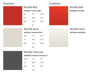
 It had staked most of its visual estate on a grey piece of lower-case type, written in Meta – once described as the ‘Helvetica of the 90s’ – and the feisty edge of Mozilla’s communications and messaging began to lose their punch.
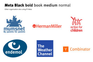 Now, 18 years ago Meta was truly the meta-typeface, and I too used it on everything, just like the rest of the world. But that’s part of the problem – if everyone from Mumsnet to furniture manufacturers and children’s charities use the same typography, you’re not going to stand out.
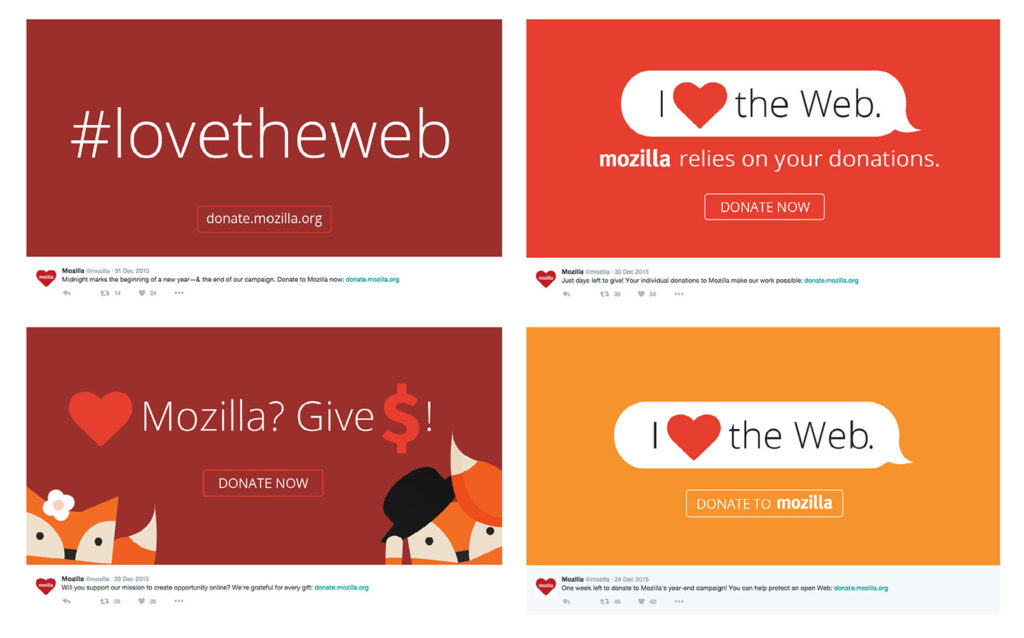
And the lack of an official symbol of any kind is also a handicap. Many digital brands now combine word marks (think of the Twitter and Instagram) with symbols that encapsulate their brands down into tiny icons (Twitter’s bird and Instagram’s camera). These are identity systems that can cope with any environment and every need, writ large on a billboard or battling it out at 48 pixels. The closest Mozilla has come is a red heart (but that might be a little tricky to trademark) and the occasional use of the lowercase ‘m’ from the word mark.
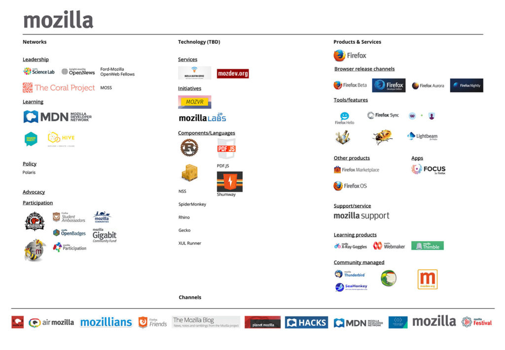 Couple typographic neutrality and the vacuum created by the lack of a symbol with the happy chaos that is the organization’s brand architecture…
 …its sub-brands…
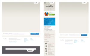
…and a gradient rich house style which is looking a little behind the times.
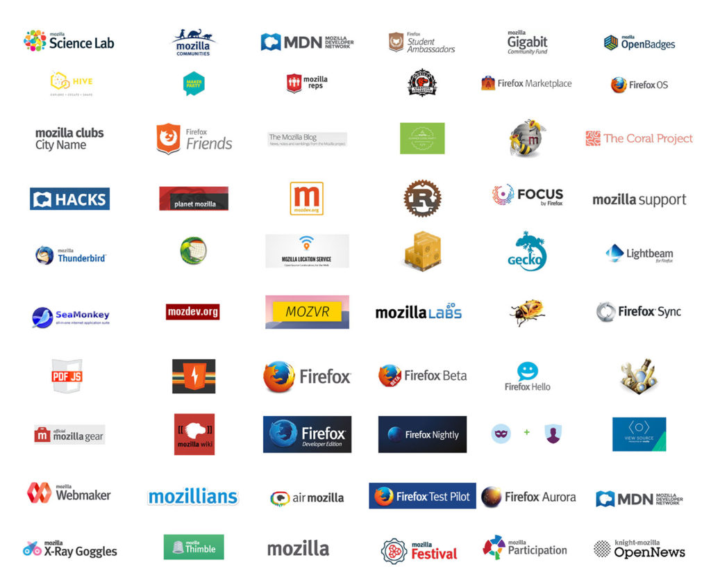
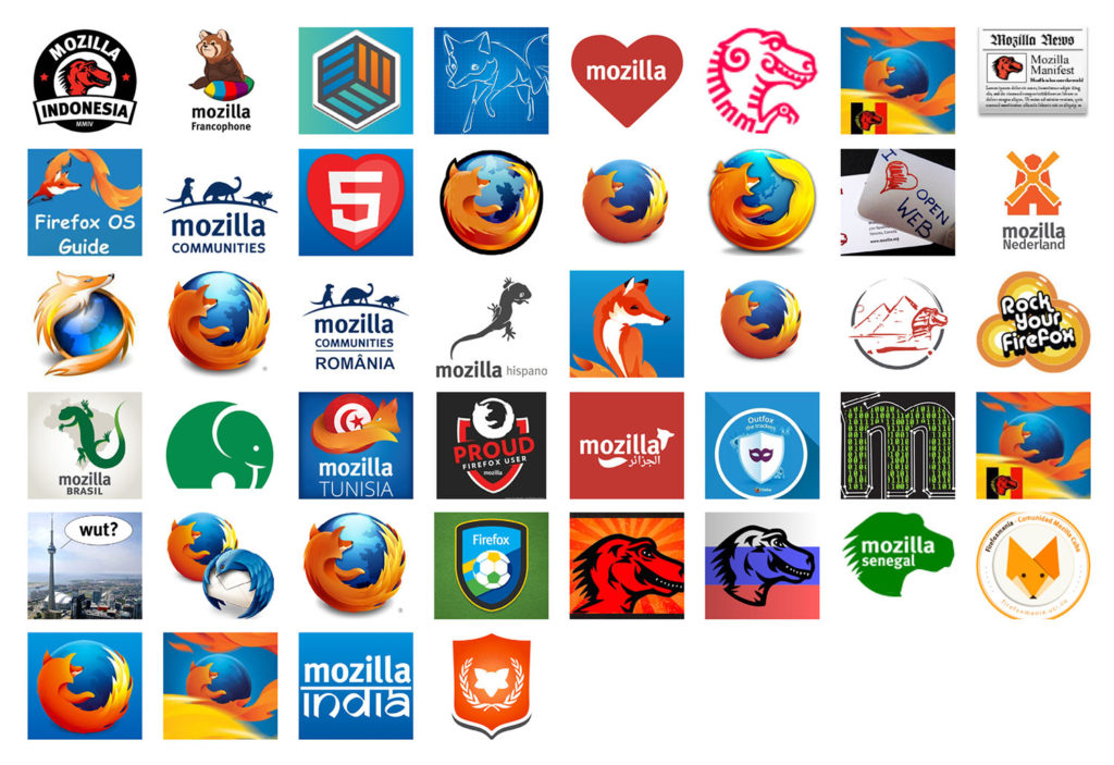 Without any clear branding system and the lack of direction from HQ, community identities began to switch back and forth between dinosaurs, lizards, foxes and, er, elephants. Not their fault, by any means, just the classic behavioral tics of a wide-spread organization struggling to keep its branding
consistent.
You’re hopefully starting to see that something is needed here. What that ‘something’ is? That’s to be decided, and goes hand-in-hand with the verbal narrative work.
Since we’re working at speed, it seems likely that we’ll edit our themes down to two to three directions then start to explore those visually, making sure that we dial up the positivity along the way.
Watch this space.
Edward Allanby wrote on
Tim Murray wrote on
Gervase Markham wrote on