Categories: General

MDN’s new design is in Beta

Change is coming to MDN. In a recent post, we talked about updates to the MDN brand, and this time we want to focus on the upcoming design changes for MDN. MDN started as a repository for all Mozilla documentation, but today MDN’s mission is to provide developers with the information they need to build things on the open Web. We want to more clearly represent that mission in the naming and branding of MDN.

New MDN logo

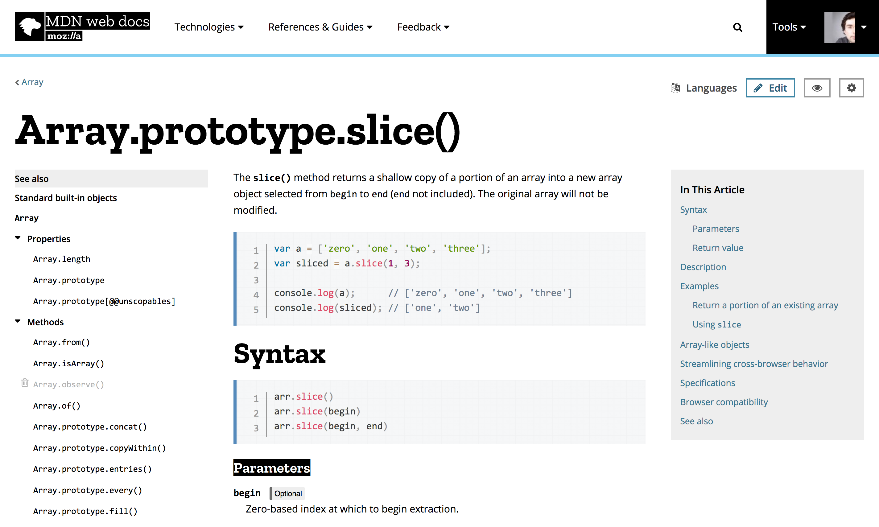
MDN’s switch to new branding reflects an update of Mozilla’s overall brand identity, and we are taking this opportunity to update MDN’s visual design to match Mozilla’s design language and clean new look. For MDN that means bold typography that highlights the structure of the page, more contrast, and a reduction to the essentials. Color in particular is more sparingly used, so that the code highlighting stands out.

Here’s what you can expect from the first phase:

screenshot of new MDN design

New MDN design

The core idea behind MDN’s brand identity change is that MDN is a resources for web developers. We realize that MDN is a critical resource for many web developers and we want to make sure that this update is an upgrade for all users. Instead of one big update, we will make incremental changes to the design in several phases. For the initial launch, we will focus on applying the design language to the header, footer and typography. The second phase will see changes to landing pages such as the web platform, learning area, and MDN start page. The last part of the redesign will cover the article pages themselves, and prepare us for any functional changes we’ve got coming in the future.

Today, we are launching the first phase of the redesign to our beta users. Over the next few weeks we’ll collect feedback, and fix potential issues before releasing it to all MDN users in July. Become a beta tester on MDN and be among the first to see these updates, track the progress, and provide us with feedback to make the whole thing even better for the official launch.

60 comments on “MDN’s new design is in Beta”

  1. ja wrote on

    Ugly, like all mobile-first pages

    1. JeremyRedhead wrote on

      What on earth are you talking about?
      It looks about the same as it does right now, the only notable differences I see are
      * The header is left-aligned, and doesn’t have a link to “Mozilla Docs”
      * The contributors list seems to have moved
      * The overall page design is crisper and in some places brighter
      Otherwise it looks the same.
      Unless you’re referring this blog’s design, in which case I understand what you mean.

    2. Nick wrote on

      IJt’s okay

  2. Anonymous wrote on

    Blueprint-like header is much better. Leave it as is, please.

    1. Stefan wrote on

      Yepp fully agreed. However how about to leave us to choose whichever design we like more in the user’s settings panel so one can switch back and forth between both of them?

    2. Igor wrote on

      I also agree. The new design is distinguished by a great contrast and therefore diverts itself too much attention. The previous design had a less aggressive color scheme and therefore did not distract from the content

  3. Imre wrote on

    Not to be too picky, but the those bold headings look really obtrusive. Just too large and distracting. People come to MDN for the “meat” (code example, descriptions), not for the headings.

    1. JeremyRedhead wrote on

      I agree, they’re a little too distracting. Mozilla should probably make them slightly smaller to compensate.

    2. Shi wrote on

      I agree, too. In general the new design is good, though I liked the original design a little more.
      The headings jump way too much into your face while you read in between them.
      They could be a little less bold and take less space.

  4. Greg K Nicholson wrote on

    @Imre: Bold headings help you find the section you want quickly.

    Also… The dino lives!

    1. Imre wrote on

      I can find things even if they aren’t set to font-weight: 900; The current design uses an elegant thin weight for headings and they fulfill their purpose just as fine without dominating the entire page.

  5. yusuf quadri wrote on

    i don’t like it but it’s not that i hate it but why changing the interface????

    1. Fluorinx wrote on

      Mozilla got a new logo a few month ago, the interface have to correspond with it, I think.

  6. Artemix wrote on

    The current design is way better: it’s simple, clear and LIGHT.

    This design would add a lot of boldness to the website and I fear a lot of additional not-needed contents.

    If you want to re-design the documentation, make the website lighter. Don’t bother with big headers, images etc and go straight to the point.

    http://idlewords.com/talks/website_obesity.htm

  7. Ryan wrote on

    Too bright background and too tiny words!!!

  8. Fitzi wrote on

    A bit too sterile in my eyes. I think the current design has more personality and recognition value.
    I also dislike the extreme contrast.
    The rest is okay, I guess. Pretty standard though, nothing outstanding.

  9. Subfire wrote on

    nice!

  10. Andrew wrote on

    Good day!

    I don’t really like Cyrillic Serif font for headers in russian version. I know it’s hard to find good-reading Serif cyrillic font, but maybe, maybe it’s possible to change it to something more good-looking…

  11. colinq wrote on

    Be modest about the styling and focus more on making a cleaner and clear content would be a good idea :D I don’t really care about webpages that have fancy looking styles, but I do care if I know where it is easy to look for content from a user’s perspective.

  12. Ronique Ricketts wrote on

    I don’t like the Header Image. The new layout is fine. I am suggesting various Themes (especially a dark theme). I think its easier to read documentation at night with dark themes, Its easy on the eyes. I’d also suggest a FAQ for your reference page so I can see some of the common problems other developers encounter when they are using JavaScript Methods.

    () => {“I love JavaScript”}

  13. Yuqing Jiang wrote on

    Chinese version is verrrrrrrrrrrrrrrrry ugly. Hard to translate any thing when I am seeing the page.

  14. fateh youyou wrote on

    input search not nice, design Very beautiful.

  15. jabran wrote on

    i will miss the subtle, almost poetic color scheme of the old one.

  16. Sixnine Me wrote on

    I think….the black logo is a little weird.But i ‘m still looking forward to the final consequence.

  17. Ovidiu wrote on

    Mozilla’s new design language looks like it’s in constant mourning. You have to do something about this black and white theme.
    Mozilla.org looks cluttered and busy. It’s in now way clean as this post suggests. Don’t do this to MDN. At least do something about the black highlighting.
    The current blueprint / paper design of MDN and the cartoon look of the Firefox download page look a lot better.
    Btw, what does the header of this blog represent. Hopefully I’m not too harsh in saying it looks like a mess of colors.

  18. Amrit Pandey wrote on

    Black and White?
    #369 is much better color than #000.

    Pure black and white pains my eyes.

  19. Ovidiu wrote on

    Firefox is indeed better; the new design isn’t. An example is in the attachment.
    Examples of nice pages are the `technology` and `contribute` ones. They have a nice color palette and are pretty clean.
    One is cartoon-like, the other uses translucency. Both look good on mobile and desktop.

  20. Clinton Gallagher ( wrote on

    I tend to agree that a balance for headers and body text has not been achieved yet but I do love the new design. Go forth and tweak…

  21. Roger Hågensen wrote on

    I’d like a Dark Theme. I have that in VS Studio Code, on Youtube. In Purebasic IDE, etc.

    Offering a Light and Dark theme may be smartest. If it’s all CSS based then letting users choose between Light, Dark, Classic should not be an issue.

  22. Gerald wrote on

    I love it! It’s clean, but the logo is too blunt. Make it milder

    1. Gerald wrote on

      and the detail, too sharp

  23. wayne wrote on

    not good

    too bright

    not balanced

    === not beautiful site

  24. Jay wrote on

    i agree i really like the clean blue icon and the all blue homepage. It would be nice if they left the option to pick to choose between the 2 especially since it’s Mozilla the customization gure. The all black looks like everything got bold on it, but it’ll catch on and who knows theyre probably right it probably will keep users more focused on the text, but will it make them love the website and begin to take that journey to learn. We shall see. At the end of the day though they have fantastic resources and have built a great community, an cant thank them enough.

  25. Tommy Gebru wrote on

    I hope they fix the drop down menus on the header/nav

    I remember making an issue or pull-request trying to address this

    If you resize your window and hover for a drop-down menu, you will see that on a smaller viewport, the dropdown actually interferes with the content below it…

    I think this can be fixed by applying a more appropriate border (like 2-3px dotted black or something)around the drop-down menu so that it doesnt look like a glitch :)

    Does anyone else see this?

  26. Eric wrote on

    Well, I hope this Beta doesn’t make it to production.
    As others pointed out, headings are way too large; also the
    black-and-white header is certainly not what appeals to me.

    Of course, the second point is a matter of taste, so YMMV.

    I know from my own experience that after looking at an in-progress
    design for a long time, nearly anything seems to look good, despite it isn’t…

  27. Ramachandran Kaniyur wrote on

    A massive shame to go from a light and fun design to a heavy and dark theme. The (very well-selected) blue will be missed, only replaced by blacks and whites.

    The mobile-first focus is killing off precious screen real-estate for non-mobile users, necessitating unnecessary user interaction. On this article itself, the strange design decision to use a massive font in the first paragraph, paired with the choice to leave massive whitespace margins on the side of the article makes it difficult to read the content.

    People don’t want to scroll unnecessarily, and the increased font size achieves nothing.

  28. Atsu Dominic wrote on

    My opinion:

    1. The design change is too much of a radical shift from the first. The design is not bad, it’s very different.

    2. If the design change is necessary, i think it can be applied dynamically. How?
    -Let users have the option to choose whatever layout they want to view the site in. I don’t think a multiple stylesheet option would be a bad thing, as it gives you the option of trying out other new styles anytime without compromise.

    -logged in users have there preference stored where others can contemplate how they want to view the site.

    my opinion tho.

  29. Mani wrote on

    It’s the same layout but looks much worse. The headings are way too big compared to the text which makes them distracting, meanwhile the body text itself has lost contrast making code and links harder to see.

    Overall this new design has just made things harder to read. Please apply some real UX principles for actual functional improvement or just save the effort and leave the old design.

  30. Andrew wrote on

    Too wide letters (especially in cyrillic).

  31. david wrote on

    i’ve read a lot of documentation on your current site and i don’t think i would have been able to if it was ugly or uncomfortable af. the current design makes reading a very easy chore, if not an enjoyable one sometimes. please don’t mess it with it too much. this high contrast design you’re introducing is so hard on the eyes.

  32. Maulik Desai wrote on

    Its to bright and hard on eyes for a documentation site. The big black headers and fonts look cool for a movement but when you start to read it just to much of eyes.

  33. hui wrote on

    great!

  34. Ido wrote on

    The current one looks better, just because is very unique, pretty clean and soft.

  35. Steve wrote on

    I like the layout, but a few details that I thought could be changed are
    1. The color of the background of the search field
    2. Personally would like to have an option to get a darker them or a charcoal them, because the contrast between the text and the background hurts my eyes sometimes
    3. I don’t like the left/right margins of the top menus links. I think they seem to be floating independently rather than as a chain of links.

    I like the direction it’s going though :)

  36. Behnam Mohammadi wrote on

    very good design

  37. Raymond wrote on

    Thanks

  38. Twily wrote on

    To be honest, current design is way better than this new, ugly design. Please keep current design at least in MDN!!! We coders want simple and clear design in documentation which is easy to browse and read, not mobile first massive elements design. Thank you.

  39. John Christopher wrote on

    Those hard edges seem quite aggressive and the black and white contrast isn’t easy on the eye but I suppose it wouldn’t be that hard to have a different set of CSS to please everyone ?

  40. Guthrie Bowron wrote on

    Compared to what it’s replacing, this looks as though it were designed for tablets, mobile phones, and/or kindergarten attendees; it’s too bold, too mobile-first, and too nannyish.

  41. Jeroen van der Tuin wrote on

    It looks very nice from a design/emotional standpoint but in my opinion the headers are too big and bold. It could pay off to play with more subtle headers and contrast in general.

  42. Matt wrote on

    The white on black sub-sub heading is awful. Please don’t do that.

  43. AWebMan wrote on

    Black and white may do some hurt to our eyes, and sometimes i can’t find which part is useful for me ,if possible, change the different par use some css . that’s all my viewport

  44. Feferes wrote on

    Nice!
    Go on.

  45. Allan wrote on

    The new design is awesome. I like everything, except the background color and font color. The background color is white and the font color is black. The two opposite colors makes the screen too bright and vibrant. This might distract the readers and will hurt their eyes if viewed for considerable amount of time.

  46. Someone wrote on

    I love the new design! Feels more up-to-date with the flatness of it all.

  47. John Bilicki wrote on

    No need to redesign MDN; having any darker color than white such as it is now is a good visual offset of what is part of the header and what is part of the content.

    This blog page though, the noise background banner image is terribly tacky and unprofessional looking.

    Might I recommend instead of new designs focusing efforts on fixing the DOZENS of QUALITY browser bugs reports that I’ve made over the years instead of ignoring them and simply adding more as more standards support are half-implemented?

  48. mike steele wrote on

    Pages that are meant for reference (like MDN) should hold ease of readability higher than any other design quality. Alternating text color & background makes the new design hard to visually parse. Keep the current design.

  49. JP wrote on

    I feel like I just got punched in the face. Way too bright. I feel like I’m looking at something on max contrast values and rather than helping readability it’s making me feel blinded. The weight and the size of the titles are distracting and make it hard to focus on the content. I’m struggling to keep my attention focused on the what I want to read because my attention keeps being brought up and left.

  50. khaled wrote on

    the present theme is more beatiful😊[I am not talking about what future will come with], more user freindly and with richer UX.✔✔
    Mozilla why not open your ayes to look on the modern day designs 🌟🌟🌟
    Or just open source it☄, then choose the best picked by UX designer & readers😊 and I am sure MDN will be better and better….😜😜😜
    what about this black logo!?😠😠

More comments:1 2