Design is the Differentiator.
Firefox is a premium application with a strong and distinct brand. With a recent strong wave of competitive browsers, all with similar features; design and product identity has become the differentiator. When high performance and stability are expected, a smart user experience and an emotional connection to the brand is what drives users to use the product.
Firefox design is focused on a swift, direct mobile experience. Magazine like aesthetic, less emphasis on decoration with greater focus on content and the tools to ease its access. Forms are rendered with a fine balance of organic and geometric shapes to further echo the Firefox brand messaging. Controls and layout are minimal, with emphasis on function. The aesthetic design promotes interaction with clear, direct iconography, rendered with friendly and efficient forms.
The visual design has been carefully crafted to communicate Firefox’s character subtly through a tasteful aesthetic which accents the native design language. However there are areas of the Firefox aesthetic which were designed to further maintain a unique feel.
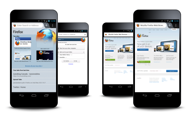
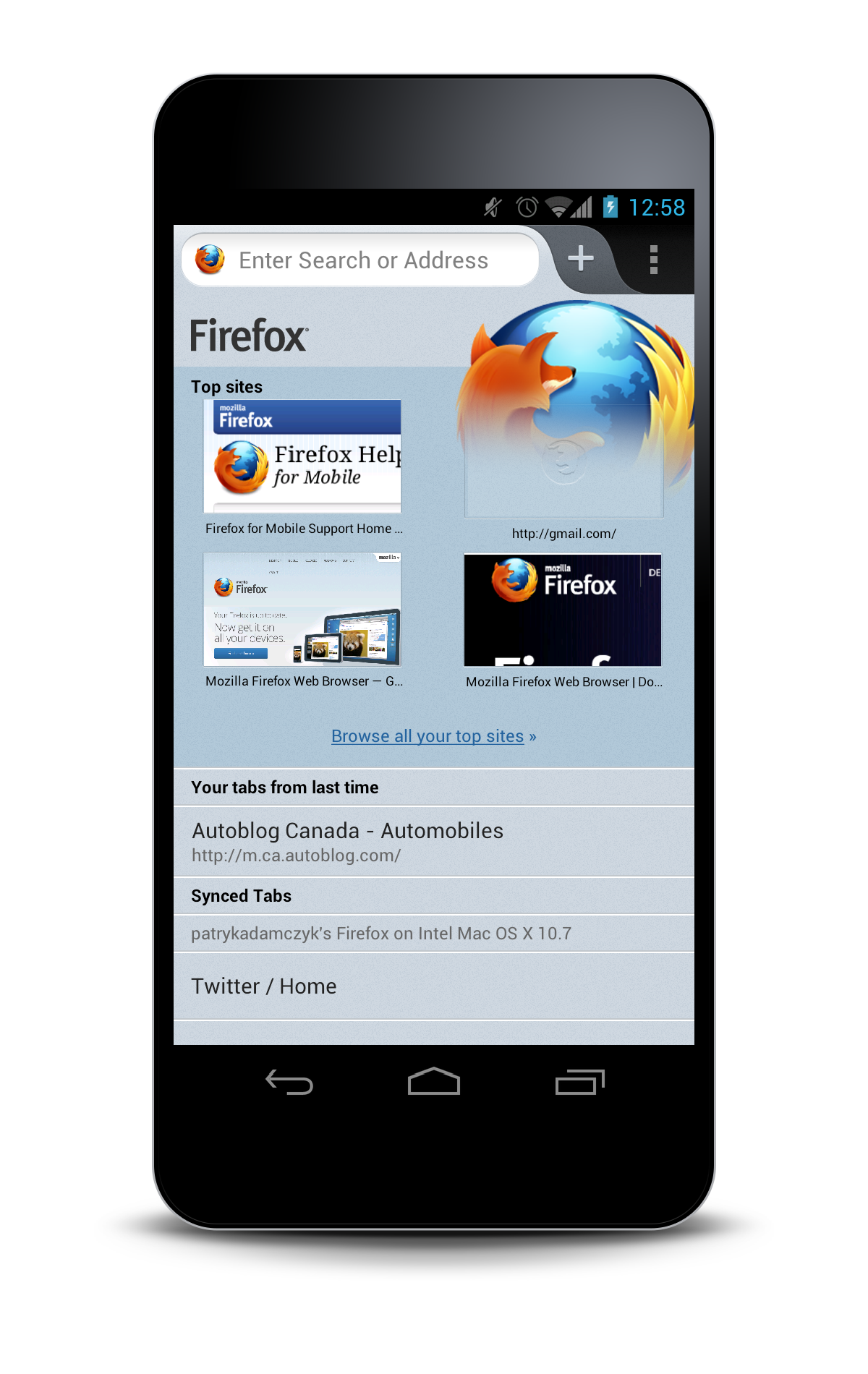
New Start Page & Interface Design
- Colourful layout with large thumbnails (if available).
- Unified curved tab design.
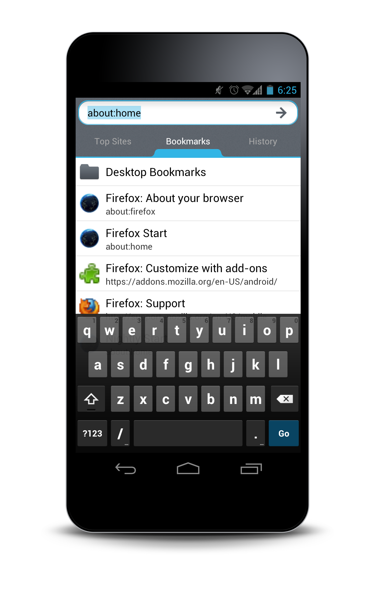
- Awesome Screen data integrated into the start page.
Visual Design Differentiators.
Tab Shape
Fluid and organic, unique to Firefox.
Awesome Screen
Unique to the Firefox experience.
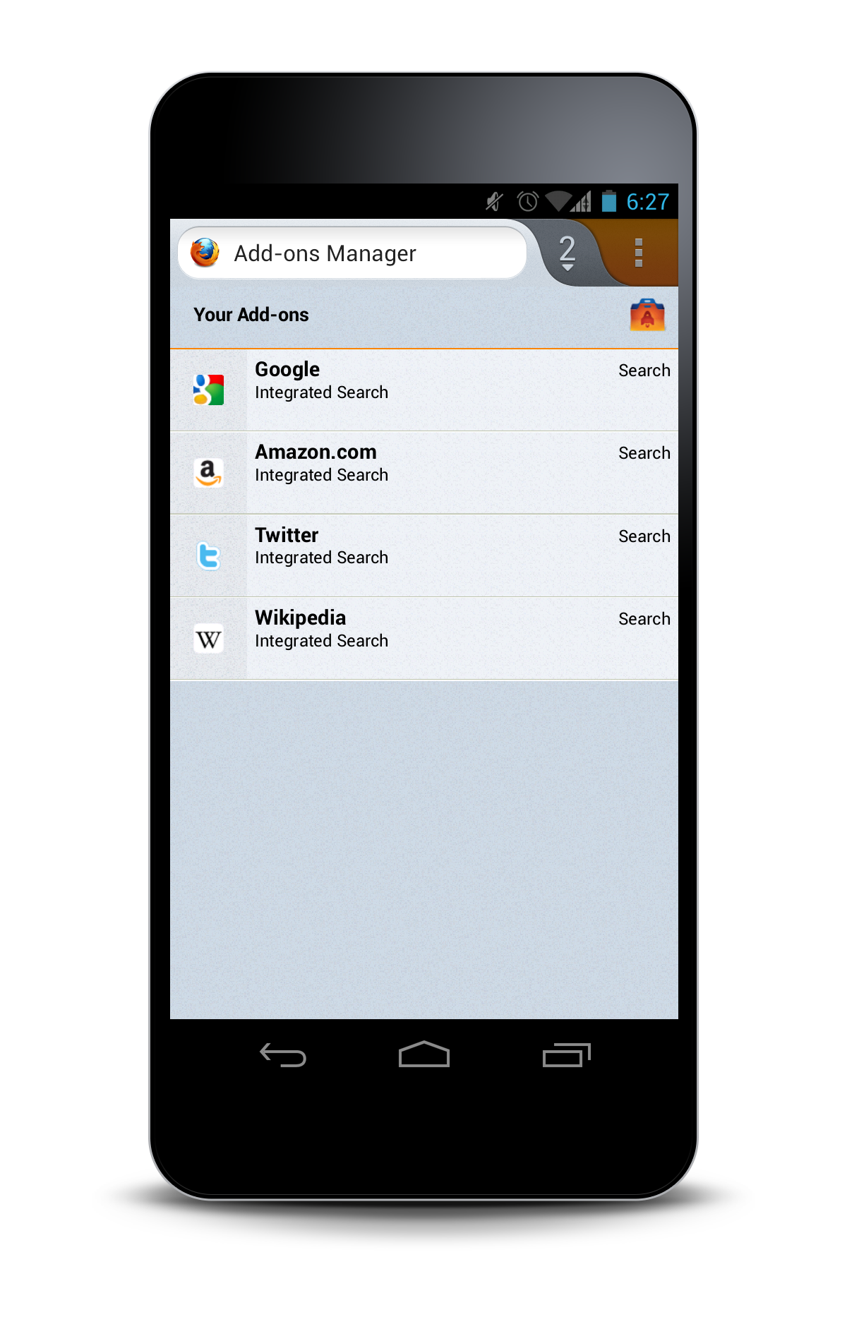
Orange Focus Highlight
- Speaks strongly to the Firefox brand.
- Future plan includes the transitioning of all native (blue in Ice Cream Sandwich) highlights to our Firefox orange.
Consistency and Polish.
Through iteration and testing we have refined the interaction patterns for both phone and tablet use. Resulting in a unified Firefox experience across the Firefox landscape while being conscious of user specific needs on each platform and form factor.
The visual design first seen in the refresh of Firefox Mobile on Android will evolve into the unified style spanning across all devices (phones, tablets, tablet PCs) and on many platforms. Resulting in a purpose-built UI, optimized for portrait and landscape orientations on phones and tablets; while still maintaining a quality and consistent user experience.
Visual Elements.
Layering
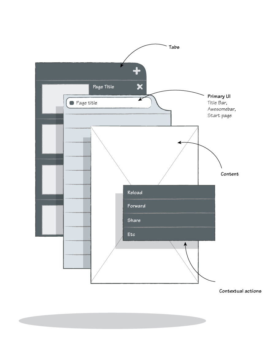
As an advanced web browser, Firefox gives the user various tools and options. These options are hidden behind the web content, invoked with a gesture (swipe). The rendering of these panels is darker appearing as if they are deeper in the Z axis, beneath the core content. The transitions simulate the movement of the view port to reveal more content.
Colour
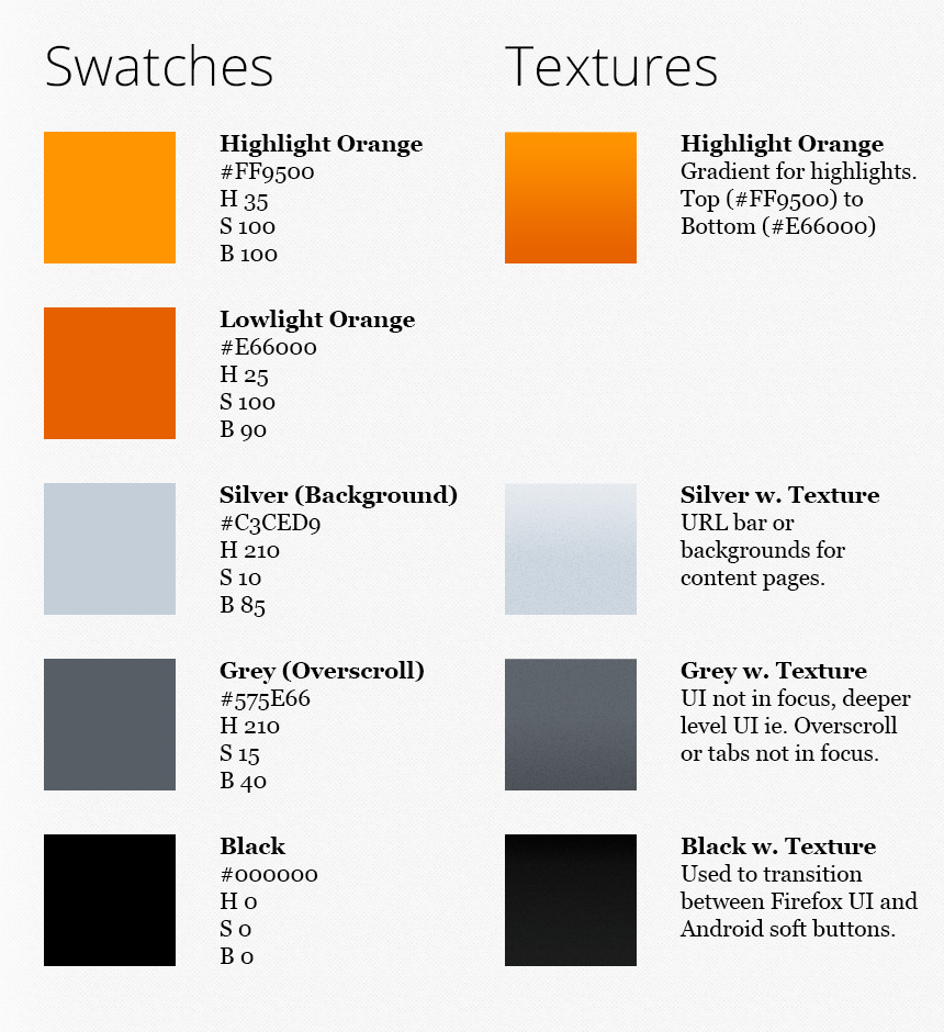
On Android often instances of colour inconsistency exist between the flavours of Android. On many devices you’ll see at least 2 colours used for focus states. On Android 4.x devices you’ll see blue and orange (for legacy apps) while on skinned devices running Android 2.3.X, the user will experience the manufacturer’s brand colour and the native Gingerbread orange.
Aim is for a cohesive user experience on Firefox properties, leading with design that is unique to Firefox and doesn’t depend on manufacturer or Google Android skinning while maintaining familiar interaction elements.
A desaturated blue (silver) acts great as a field colour both for the Firefox logo and various text / media content. Use of a saturated blue over a gray allows for a friendlier experience. The hint of blue in the grays acts as a great high contrast complementary colour when used with the orange highlight.
Texture
Texture / noise has been introduced into the backgrounds for both greater aesthetic interest and reducing banding found in subtle gradients on some lower colour depth screens.
Hints at Interaction.
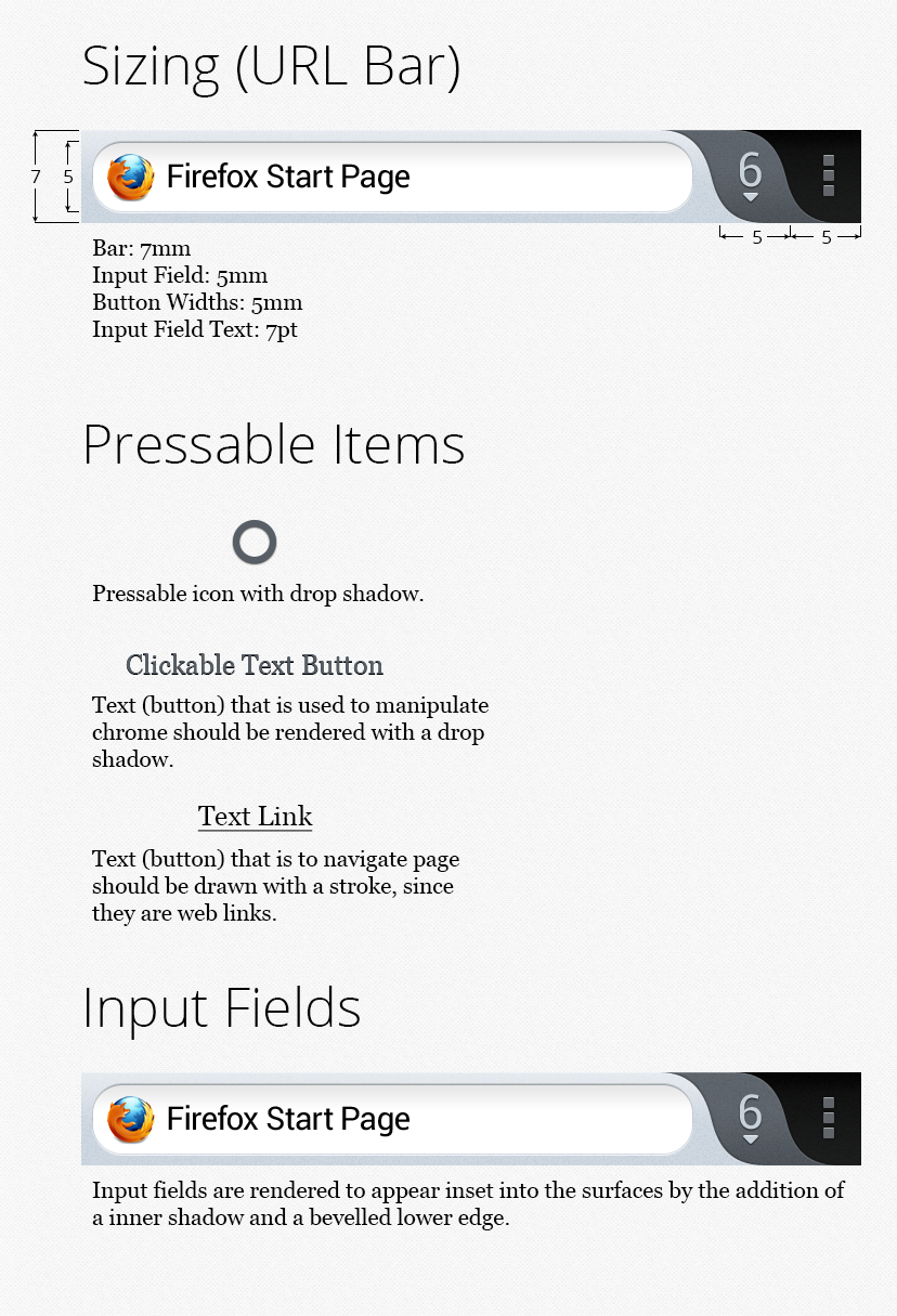
In a touch interface it is expected that everything can be interacted with, but good user experience should guide interaction and not promote trial and error pecking. With subtle lighting effects, touch elements will appear closer to the user on the Z axis and appear more pressable than other items. The reverse effect is applied to input fields, subtly carved into the chrome, hinting that the form can be filled; with text in this case.
Size
Size and spacing is based on physical measurements to optimize for scalability between various form factors. Due to larger real estate tablet can afford for larger touch targets and more easily accessible actions.
Phones
Bar Height: 7 mm
Input Field Height: 5 mm
Button Widths: 5 mm
Input Field Text Height: 7 pt
Tablets
Bar Height: 9 mm
Input Field Height: 7 mm
Button Widths: 9 mm
Input Field Text Height: 9 pt
Forms
All shapes and icons are rendered to have inviting feel to further engage the user:
- Forms are rendered with soft edges
- Corners possess a small radius
- Objects possess realistic shading
Pressable Items
Any item that manipulates chrome should have some 3D styling, rising above the background. This can be accomplished with a drop shadow and / or bevel.
Input Fields
Any item that acts like an input field should be inset in the surface that it is set upon. The design’s aim is to invite the user to interact with the control but not feel it will work like a button since it doesn’t appear that it can be pressed down.
ferongr wrote on
Patryk Adamczyk wrote on
Edd Turtle wrote on
Danny Arar wrote on
Patryk Adamczyk wrote on
Zeeshan wrote on
Jack wrote on
Patryk Adamczyk wrote on
vincent wrote on
Patryk Adamczyk wrote on
Ping from Mozilla Shows Off New Firefox For Android Design | WebProNews on
duola wrote on
Björn Lindahl wrote on
Kosie du Buisson wrote on
Patryk Adamczyk wrote on
SuperPutte wrote on
www.romeapartments.com wrote on
C. Scott Ananian wrote on
Patryk Adamczyk wrote on
Adevarul wrote on
Patryk Adamczyk wrote on
Bushra Tabassum wrote on
Patryk Adamczyk wrote on
Devacharya wrote on
sachi wrote on
abbas wrote on
Patryk Adamczyk wrote on