(Cross-posted on the Labs blog)
The Labs team has been looking at analyzing data in Firefox, sharing a summarized form, and protecting privacy with Mozilla principles. We’ve been designing some prototypes of how to present these concepts to the user, so we would like to share a view of our very experimental mockups to get some of your feedback.
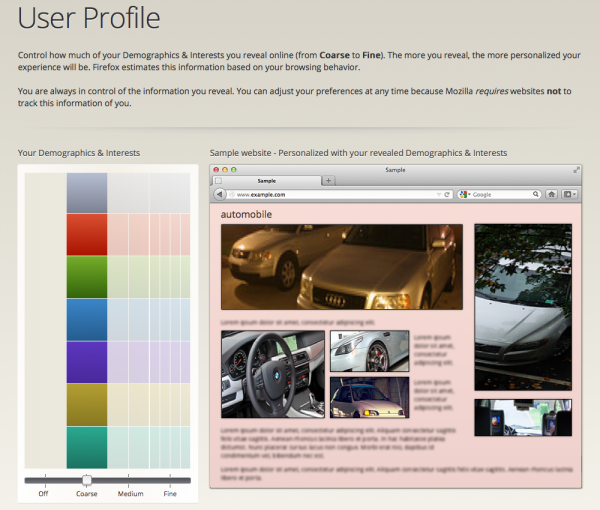
The high level concepts of this dashboard fall into 3 parts:
- Informing users that they’re in control of their data
- Letting users see and control what they share
- Helping users understand the effects of sharing
In later posts, I’ll be going into the details of each of these parts with descriptions of the intended goals of each control, display, etc. Right now, we’ll focus on the overall composition of parts of the dashboard and not get too detailed as the specific text or shapes are preliminary content that will most likely change as we continue.
For the first part at the top, we want to give users a sense of empowerment by providing a description of control over their data. It should be brief yet informative enough so users understand what they’re able to control and sets some expectations of how the data is analyzed from Firefox. We also want to give users a quick peek into how Mozilla protects their data, which gives more control to the user. For each of these pieces, users who do want to learn more should be able to do so.
The second part is on the left side where users see a representation of their analyzed browsing behavior as well as controls to adjust their shared data. We want users to be able to easily understand what amount of data and what type of data is being shared or potentially can be shared. The interface should be simple enough in the common case for the users who want basic changes but potentially also allow for more detailed controls for advanced users.
The last part on the right side is a feedback module to give users a sense of how the web changes as they control their data. We want to help users make an informed decision that they are comfortable with, so this area should lead users to change their settings if they are uncomfortable or want more. For the feedback to be useful, users will need to be able to quickly understand and “consume” what is shown to get an immediate reaction and make a decision.
We would like to get your feedback on these high level parts, so don’t get caught up too much on any particular detail or visualization of this experimental prototype. Below are some initial questions to get you thinking, but feel free to provide other comments:
- Are the three main parts the right combination? Anything missing or unnecessary?
- Do the conceptual parts need to be distinct parts? Can they be combined visually?
- Will users understand the connection/flow from the left control and right feedback?
- How should the parts be organized? One view for each? Composition/arrangement?
- What should be the relative importance? What comes first? Which is larger?
– Aaron Druck on behalf of the Prospector team
