First, a story:
Across the street from our Mountain View office, there is a restaurant my team really love to go for lunch. We like the food, but more importantly, we like the service. Their lunch special includes one salad, one kebab, and one starch, but you can customize your order to whatever you want. If you like salad, you can have two salads and one kebab. Customizing your food may not sound like a big deal, but this kind of personal service is what keeps us coming back there for lunch, because they make us feel that they care.
That restaurant is definitely not the only place where you can customize your experience. I bet you can name a few more. However, when it comes to mobile app stores, you don’t really have the ability to customize your experience. On the homepage of your app store, you only see the content picked by whoever maintains the app store. It’s hard to feel that personal connection. We keep hearing users saying, “I don’t like social apps, but I keep seeing all these social apps!”
The feed
The Firefox Marketplace team is exploring a concept to use “the feed” to provide a customized app store experience, presenting users with content tailored to their interests. One problem with the current app discovery experience is users don’t know what to search for unless they hear something new from their friends. They think they’ll keep seeing the same content when browsing the categories and top charts. With the help of the feed, people don’t have to put effort into finding the content; instead, fresh content will find people. Like that restaurant I mentioned earlier, at Mozilla, we care about our users, and we want them to feel that. Our manifesto says, “Individuals must have the ability to shape their own experiences on the Internet.” We want people to blaze their own path, and we want to let them decide what content they see. The feed will help people discover more relevant content, help developers show their apps to the right audience, and eventually benefit the whole Open Web ecosystem.
So how should we design the feed? After going through user research findings and conducting stakeholder interviews, I came up with 3 design principles for the feed.
Design principle: immerse users in the flow
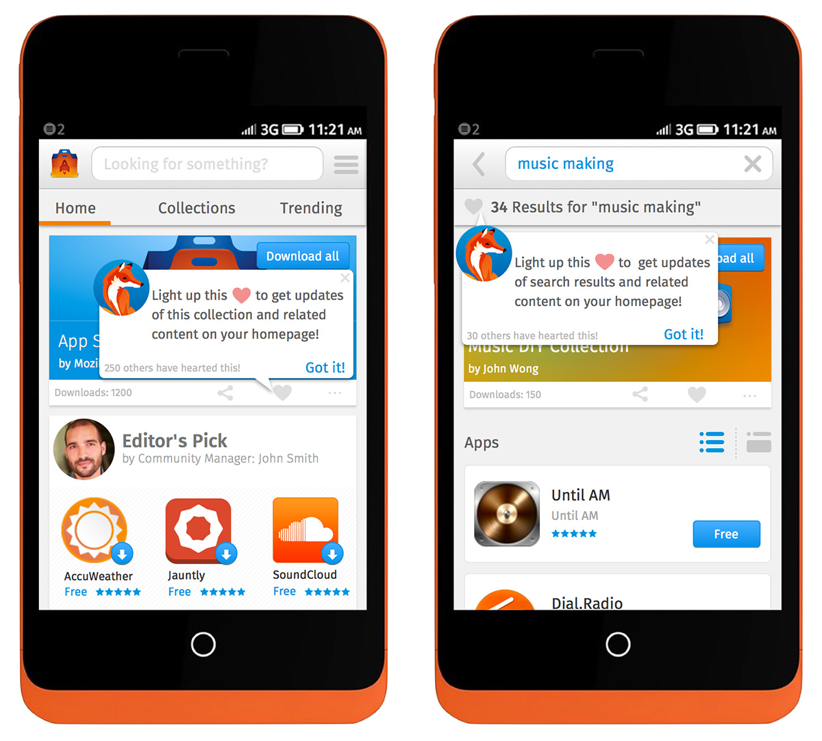
From our user research, we learned most of our users care more about the experience enabled by technology, not technology itself. This is extremely important when designing the interaction for the feed. A lot of other products with feed tend to have a separate section to subscribe. Users need to step away from their current task, find the navigation, update their subscription, and then go back. It’s very heavy on functionalities. But why break the flow? Why should users have to learn how to subscribe and unsubscribe? The only thing they care is the content. (Actually we learned from user testing that the word “subscribe” didn’t even make much sense in this context.) We already know that people search and browse, so why don’t we tap into those existing behaviors? In the feed prototype, if someone sees something they like, they can just tap on the heart to see the updates and related content in the future. It’s that easy.
Design principle: powered by people
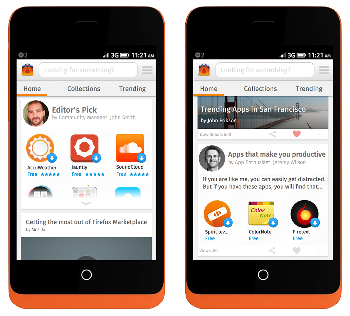
From our user research in South America and Europe, we learned our users value relationships and connections with people. For Mozilla, “Powered by people” is an important differentiator because we have the community all around the world contributing to our products. Eventually the community will curate most of the content in the feed. So how do we reflect our people-powered nature to make the feed more personal? When designing the interface, I deliberately included photos of people. This shows users that it is real people behind the content, not just some machine or algorithm. In addition, showing the number of downloads and views can make people feel like they are a part of something bigger than themselves, and show their impact to the community.
Design principle: provoke positive emotion
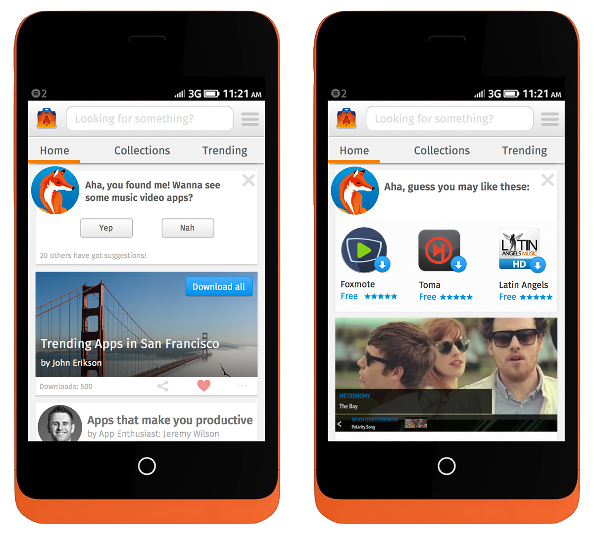
From our user research, we learned user’s engagement with app stores drops over time. One reason is there is no pleasure in using an app store. How can we bake more positive emotions into Marketplace and maintain engagement? By introducing personified characters, we make the conversation more fun and engaging. The micro-copy is also designed to be very whimsical. When users tap on the heart, they see a bouncing animation; it creates a delightful moment. The feed also creates surprise discovery. Users constantly discover diverse content including apps, collections, articles, reviews, videos and more.
Demo video:
https://www.youtube.com/watch?v=SIFwQoyVrzc
User testing:
When we tested our prototype with five users, the experience of customization was well-received. They liked seeing diverse and relevant content. Some terms like “subscribe” didn’t make much sense to most of them. We’ve iterated based on the feedback and continue shaping the experience.
Future steps:
An app store that is completely tailored to your interests may have some drawbacks. You may keep getting the same kind of content within your areas of interest (an echo chamber effect). We continue to work closely with our engineering team to make sure the feed will maintain the experience of discovering things outside of your interests. Right now the feed is not a product. We are planning to do more iteration and testing to provide a better experience for our users, and because Mozilla deeply respects user control and privacy, we are considering making the feed as an opt-in feature.
So, what can you do? I encourage you to think about different content that you can create to contribute to the community. If you are a developer, build more awesome apps. If not, don’t worry. Perhaps think about making an app collection for your friends and family, or whatever content you can come up with. And together we can build a better ecosystem for the Open Web.


David Bialer wrote on
Bryan Quigley wrote on
Andy wrote on
Ariel wrote on