As a UX content strategist at Mozilla, I support not only our browsers, but also stand-alone products like Firefox Monitor. It’s a service that notifies you when you’ve been in a data breach and what steps to take to protect your personal info.
![]()
Designing content for a product that delivers bad news presents unique challenges. Data breaches are personal. They can be stressful. Sometimes the information exposed can be sensitive. How we organize, structure, and surface content in Firefox Monitor matters.
When we had the opportunity to redesign the end-to-end experience, content strategy played a key role. I identified ways our users were struggling with the current site, then worked in collaboration with interaction designer Ryan Gaddis to re-architect and design a new experience. These are a few of the tools and methods I leveraged.
About Firefox Monitor
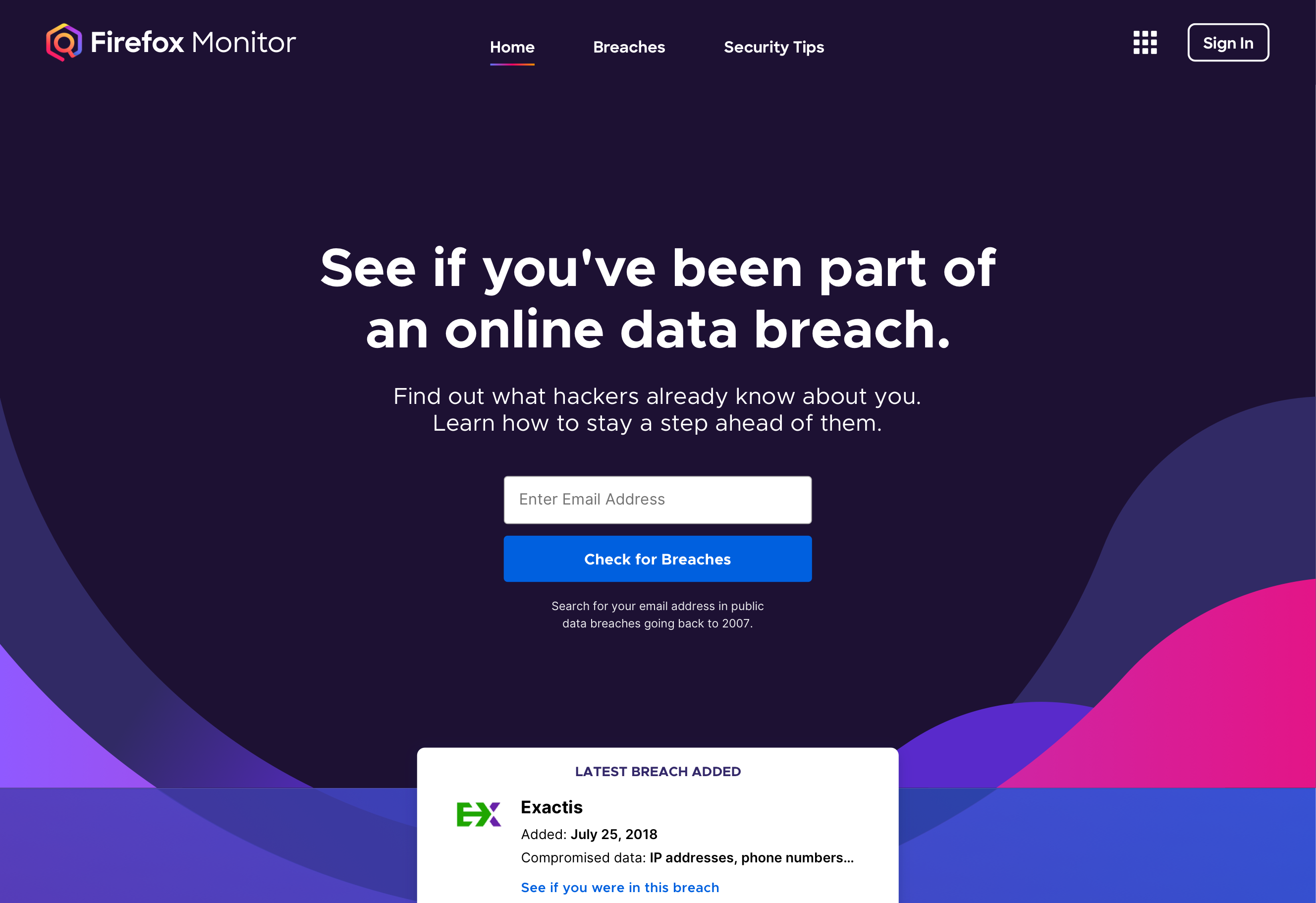
Enter your email address to see if you’ve been part of an online data breach, then sign up for ongoing alerts about new breaches.
The goal of Firefox Monitor is to help people take back control of their personal data so they can protect their digital identity and feel safer online. When we first introduced Monitor to the world, our goal was 10,000 subscribers. Within six weeks, over 200,000 people had signed up.
As subscriptions continued climbing, the constraints of the MVP experience challenged our users and our ability to serve them. The one-page website offered the same generic recommendations to all visitors, regardless of the breach. It was complicated to add new functionality. We sought to create a more flexible platform that would better serve our users and our own business goals.
A year after the redesign launched, Monitor has 8 million subscribers and counting. The website is localized into 34 languages, making it free and accessible to as many people globally as possible.
1. Listen intently to user problems to identify areas for improvement
Users are notified via email when their information appears in a new data breach. Culling through the replies to these emails helped us understand user pain points.
If you’re tasked with improving the user experience of an existing experience, listening to current users’ pain points is a great place to start. You can do this even if you don’t have direct access to those users. I culled through hundreds of user replies to automated emails.
When a data breach becomes public, Monitor alerts affected users via email. People replied to those email alerts with questions, concerns, and comments.
I reviewed these emails and grouped them into themes to identify trends.
- Users weren’t sure what to do to resolve a breach.
- They didn’t recognize the name of the breached site.
- They were confused by the length of time it took to be notified.
- They found language too jargony or confusing.
- They weren’t sure who was responsible for the breach.
These were all helpful inputs to drive the information architecture and content decisions for improving the Firefox Monitor experience. We kept these pain points top of mind, working to ensure that the answers to these questions were proactively provided.
2. Run a usability test to learn what’s tripping people up
In the usability study, participants misunderstood what Monitor did. They thought the service might protect against a variety of threats, such as against viruses, phishing, or unsafe websites.
When you’re immersed in the redesign of an experience, it’s impossible to know how it will be perceived by someone who experiences it for the first time. You simply know too much about how all the plumbing works. Usability testing provides valuable insight to uncover those blind spots.
Yixin Zou, a PhD student at the University of Michigan School of Information, led a usability study on the current experience. I observed all these sessions, taking notes on what could inform content and design improvements.
What mental models about data breaches and privacy did participants have? What were they confused about? In their own words, how did they describe what was happening and how they felt?
For example, we learned that the homepage copy was a bit too broad. Some users wondered if Monitor could protect them from phishing attempts, viruses, or visiting unsafe sites. In response, I tightened the focus on data breaches so people understood exactly what Monitor could do for them.
The redesign reduced the amount of content and clarified the purpose of Firefox Monitor.
3. Re-architect content hierarchy to reduce cognitive load
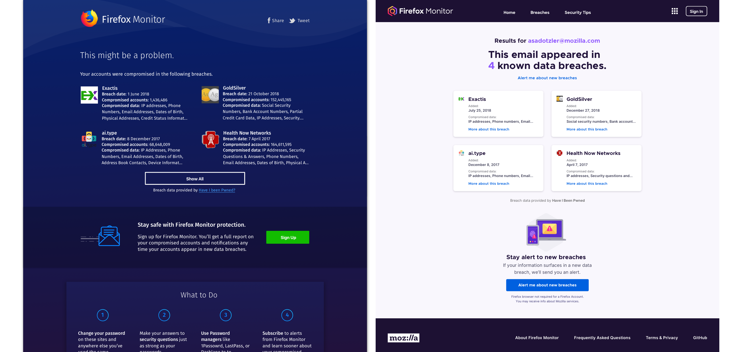
The new experience reduces the cognitive load for users through improved content hierarchy. We also removed less critical content on first view so it would be easier for users to identify which breaches were most concerning to them.
Firefox Monitor delivers stressful news. You may learn that your personal data has been exposed in many breaches. The compromised account might be one you signed up for a decade ago. Or, you may have signed up for an account that has since been sold or acquired by another company you don’t recognize.
As user experience practitioners, it’s our job to consider these stress cases. We can’t eliminate the anxiety of the situation, but we can make the information about it as easy to parse as possible.
Usability testing helped us realize how overwhelming it could be to see a full list of past breaches at once. People didn’t know where to start. There was simply too much information on one screen.
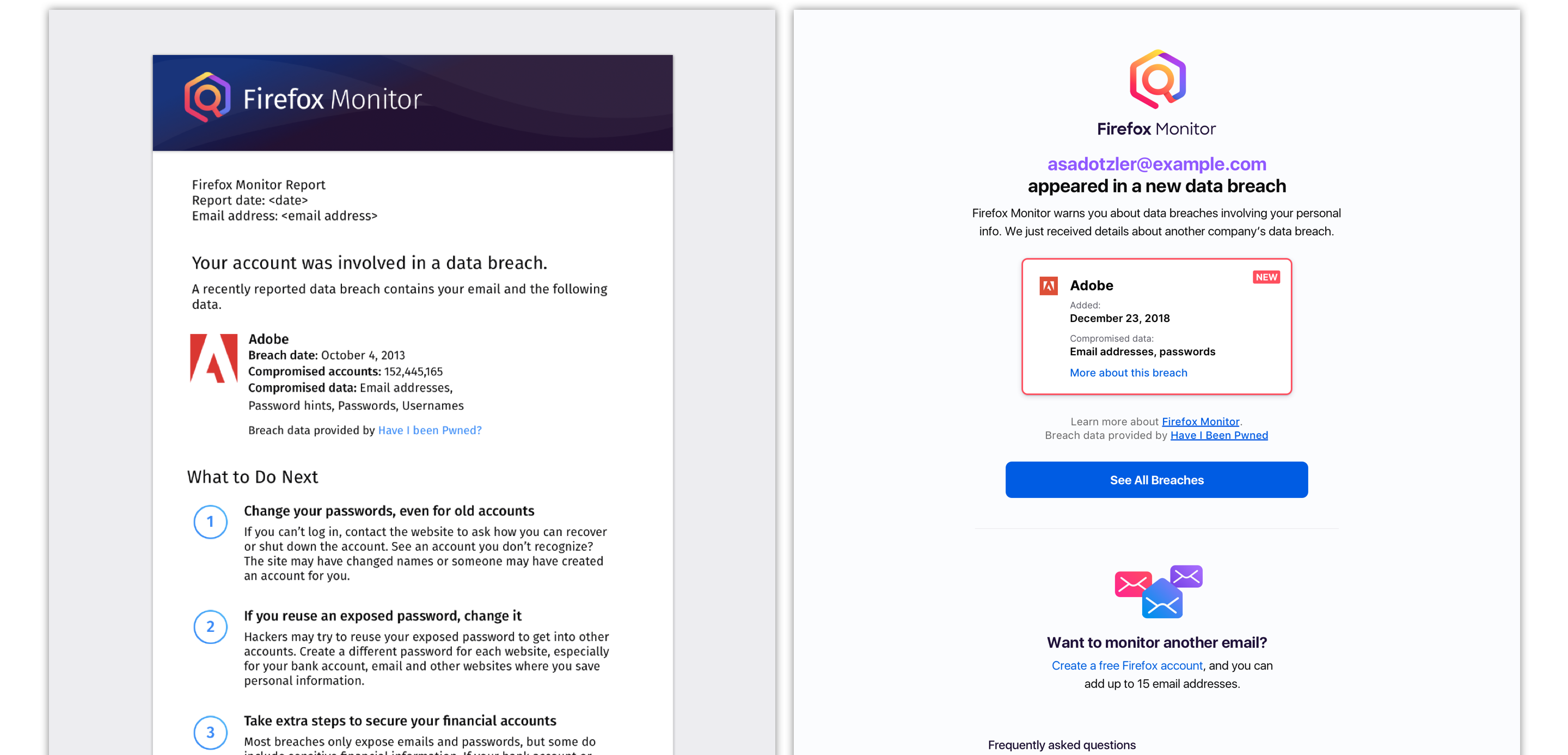
Lead with the most relevant information
Getting to the point is the kindest thing we can do. Since many users check multiple email addresses for breaches, we now lead with the email and number of reported breaches.
Remove total number of compromised accounts
Some breaches affect millions of accounts. Those large numbers added complexity and are not relevant to you. Users are concerned about the impact on their own data — not what happened to millions of other people.
House more detailed information one layer deeper
Some breaches expose dozens of different types of data. When all compromised data for all breaches was displayed on a single page, it was too much to take in. Creating more detailed breach pages allowed us to simplify the report view, making it more scannable and digestible.
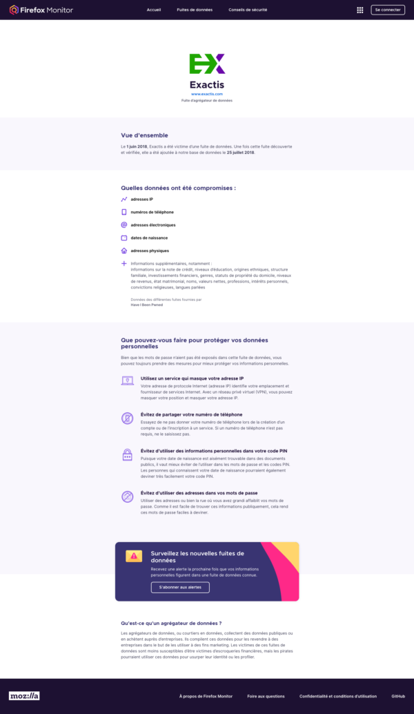
To reduce cognitive load and help users parse information about each breach, we introduced a dedicated page for every single breach.
4. Collaborate with design and engineering to increase impact
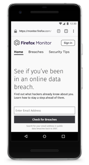
We avoided lorem ipsum and built out mobile-first wireframes with real copy.
Improving the user experience was a collaborative effort. Interaction designer Ryan Gaddis and I worked together to define the messaging goals and user needs. Though each of us brought different skills to the table, we welcomed each other’s feedback to make the end product better. We were able to avoid lorem ipsum throughout the entire design process.
Together, we designed the new mobile-first experience. This encouraged us to keep our design and content focused. Throughout multiple rounds of wireframes, I wrote multiple iterations of copy.
Co-designing in this way also allowed us to execute more quickly. By the time the website was ready for visual application and front-end development, most of the hard content problems had already been solved.
As the wireframes came together, we brought engineering into the conversation. This helped us understand what was feasible from a technical perspective. We were able to make adjustments based on engineering’s early input. The development process moved more quickly because engineering had early visibility into the design and content thinking.
5. Validate the appropriate tone to engage users
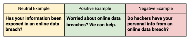
Examples of neutral, positive, and negative variants of tone we tested.
At Firefox, we’re committed to making the web open and accessible to all. We want people to engage with the web, not be scared off by it.
In our privacy and security products, we must call out risks and inform users of threats. But we are thoughtful with our tone. Scare tactics are cheap shots. We don’t take them. Instead, we provide measured facts. We want to earn users’ trust while educating and empowering them to better protect themselves online.
To validate that our tone was appropriate, I worked again with PhD student Yixin Zou to design a tone variants study. I wrote neutral, positive, and negative variants of protective actions Firefox Monitor recommends.
Neutral
→ Showing what the action is about and the high-level steps required to take the action.
→ Does not emphasize benefits or risks.
Positive
→ Empowering, encouraging, friendly.
→ Emphasizing benefits of taking action. Try to make these actions simple and easy.
Negative
→ Forbidding, warning.
→ Emphasizing risks of not taking action. Try to make these actions urgent and necessary.
We discovered that the negative tone did little to improve comprehension or willingness to take action. This validated our current course of action: to be direct, positive, and encouraging.
Here’s an example of what that content looks like in practice on the Monitor site.

These are the steps we recommend users take to keep their personal info safe and to protect their digital identity.
6. Bring legal and localization into the process
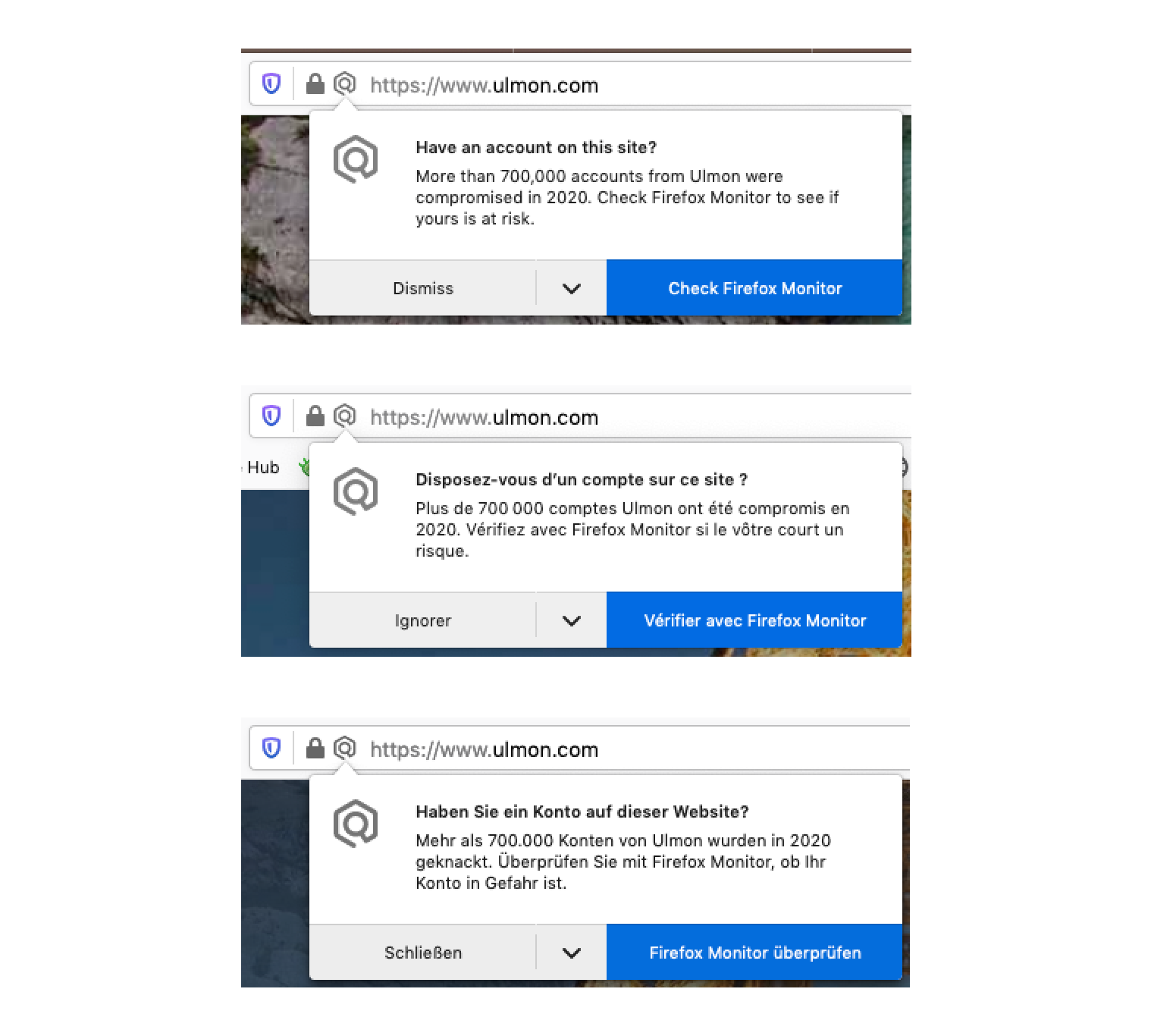
If you visit a site that’s been breached, Firefox will direct you to Monitor to check to see if your information was compromised.
Legal and localization are key partners in the content strategy process. They need to have visibility into the work we do and have the opportunity to provide feedback so we can course-correct if needed.
The privacy and security space presents legal risk. Even though these data breaches are publicly known, companies aren’t always happy to get extra attention from Monitor. We also need to be careful that Monitor doesn’t over-promise its capabilities. Michael Feldman, our in-house product counsel, helps us ensure our content considers legal implications without reading like confusing legalese jargon.
Firefox Monitor is also localized into 34 languages. Our global community of localizers from all over the world help us extend the reach of Firefox Monitor. We strive to avoid US-centric jargon, phrasing, and figures of speech. We work with our localization project manager, Francesco Lodolo, to identify problematic language and sentence construction before it’s sent to localizers.
Wrapping up
Content strategy never works alone. We collaborate cross-functionally to deliver experiences that are useful and appropriate. The words you see on the page are one tangible output, but most of the work is done behind-the-scenes to drive the UX strategy.
The product continues to evolve as we look for more opportunities to help our users protect their online digital selves. To monitor known data breaches for your personal info, head to Firefox Monitor to sign up.
Acknowledgements
Thank you to Tony Cinotto, Luke Crouch, Jennifer Davidson, Peter DeHaan, Michael Feldman, Ryan Gaddis, Michelle Heubusch, Wennie Leung, Francesco Lodolo, Bob Micheletto, Lesley Norton, Cherry Park, Sandy Sage, Joni Savage, Nihanth Subramanya, Philip Walmsley, Yixin Zhou, and the entire Mozilla localization community for your contributions to Firefox Monitor. And thanks to Meridel Walkington for your editing help.
This post was originally published on Medium.