Categories: General

Nearly there

We’ve spent the past two weeks asking people around the world to think about our four refined design directions for the Mozilla brand identity. The results are in and the data may surprise you.

If you’re just joining this process, you can get oriented here and here. Our objective is to refresh our Mozilla logo and related visual assets that support our mission and make it easier for people who don’t know us to get to know us.

A reminder of the factors we’re taking into account in this phase. Data is our friend, but it is only one of several aspects to consider. In addition to the three quantitative surveys—of Mozillians, developers, and our target consumer audience—qualitative and strategic factors play an equal role. These include comments on this blog, constructive conversations with Mozillians, our 5-year strategic plan for Mozilla, and principles of good brand design.

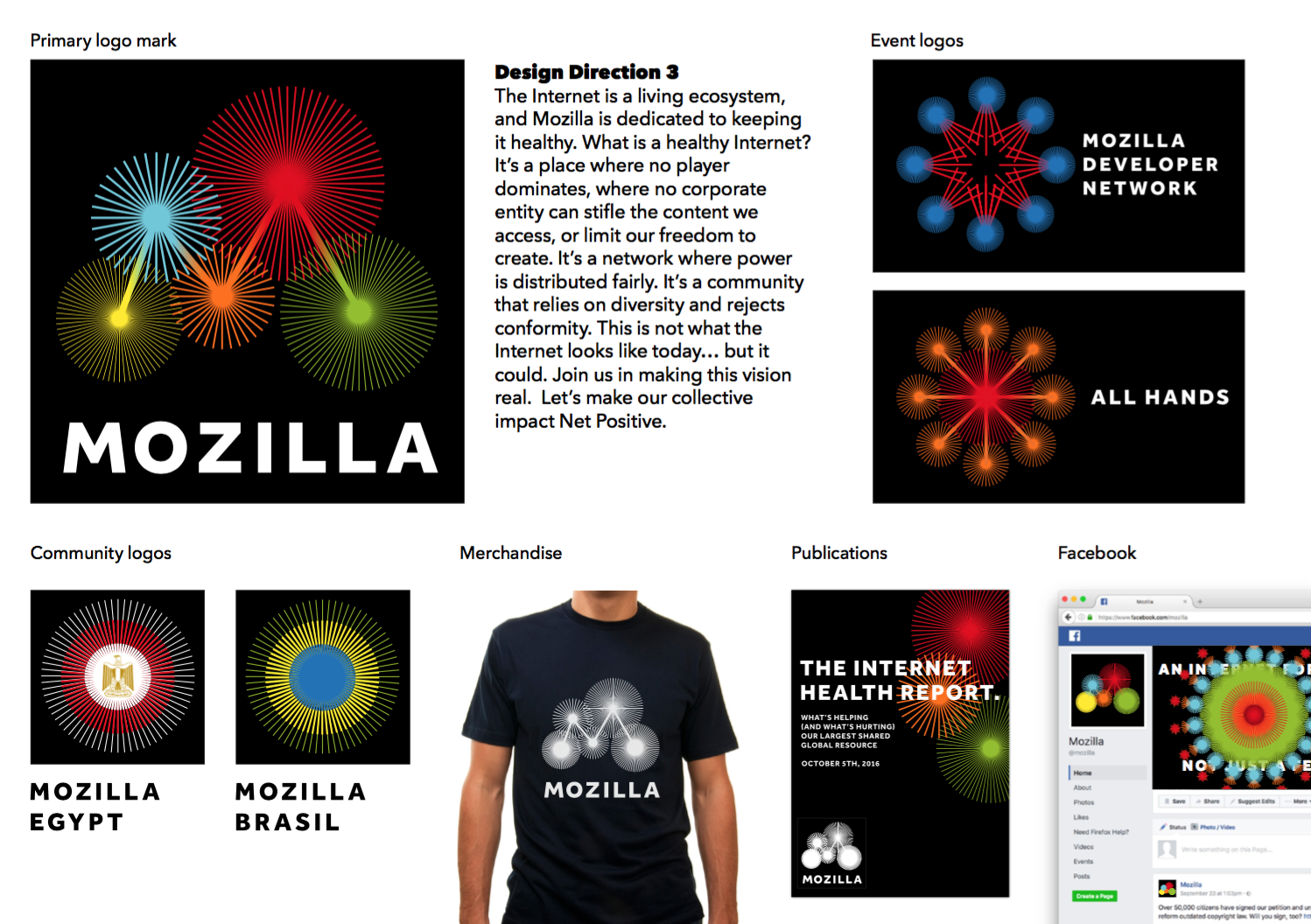
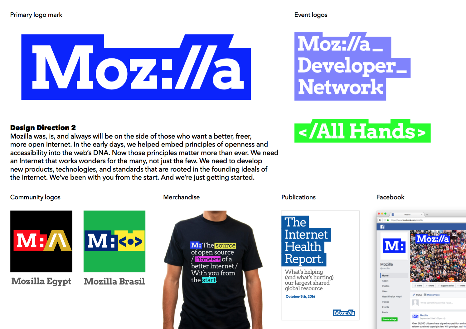
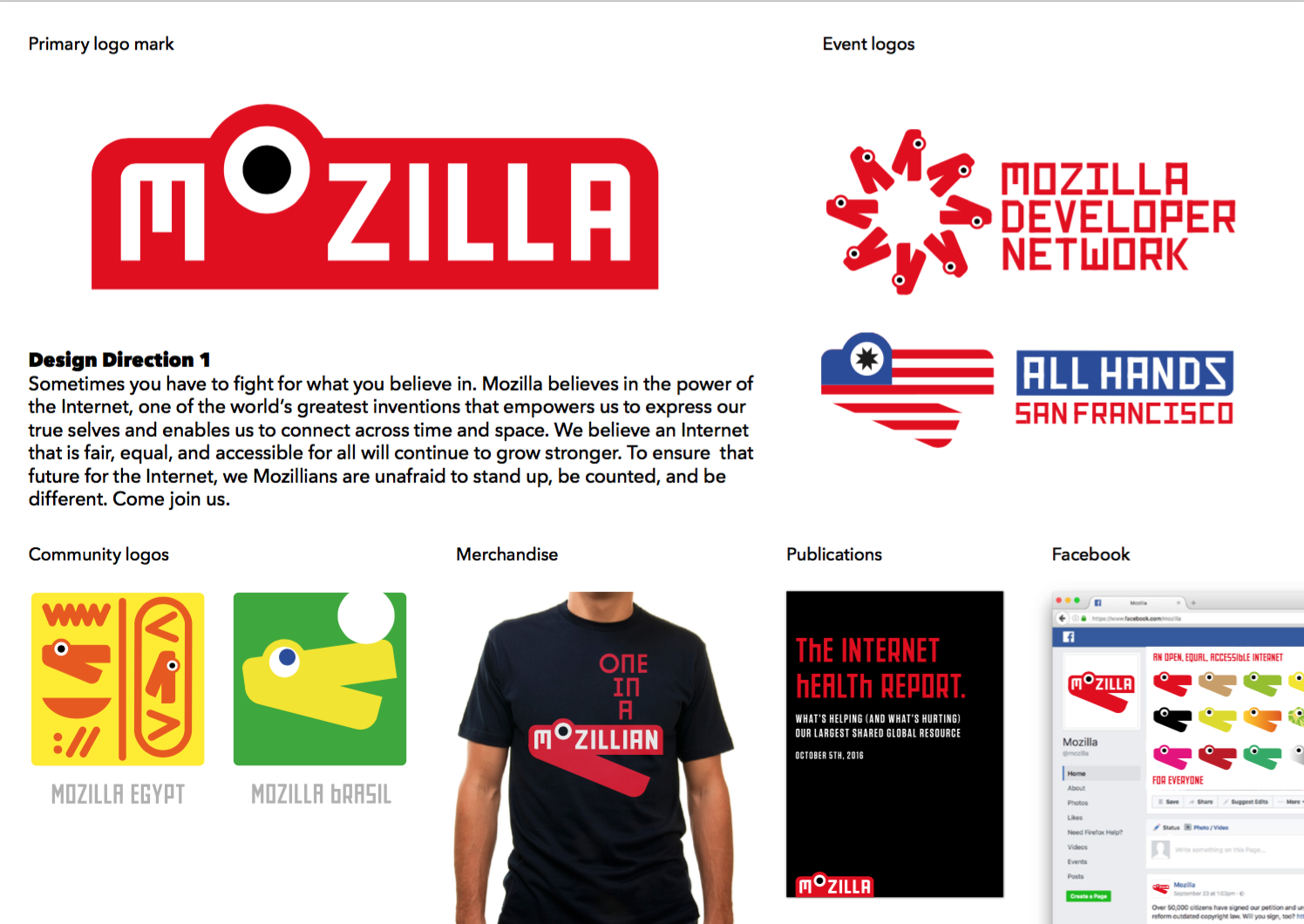
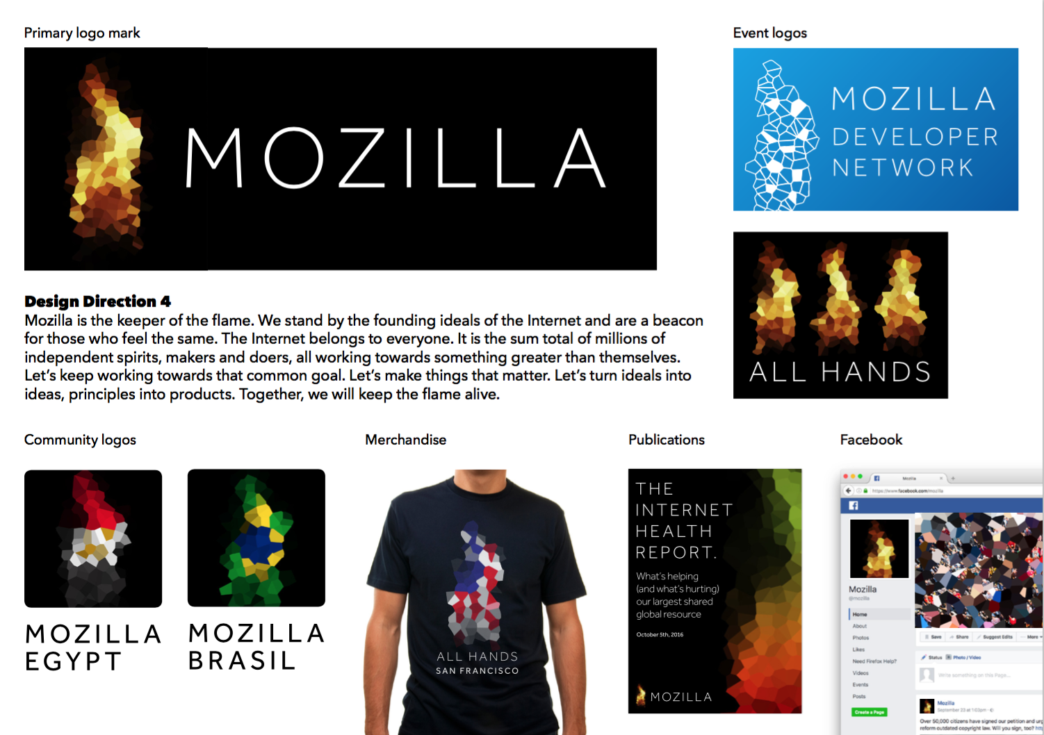
Here is what we showed, along with a motion study, for each direction:
screen-shot-2016-10-19-at-9-51-37-pm

screen-shot-2016-10-19-at-9-51-20-pm

screen-shot-2016-10-19-at-9-51-03-pm

screen-shot-2016-10-19-at-9-50-45-pm


We asked survey respondents to rate these design directions against seven brand attributes. Five of them—Innovative, Activist, Trustworthy, Inclusive/Welcoming, Opinionated—are qualities we’d like Mozilla to be known for in the future. The other two—Unique, Appealing—are qualities required for any new brand identity to be successful.

Mozillians and developers meld minds.

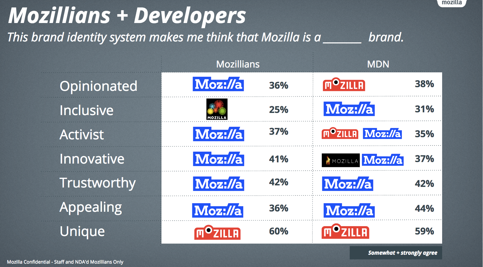
Members of our Mozilla community and the developers surveyed through MDN (the Mozilla Developer Network) overwhelmingly ranked Protocol 2.0 as the best match to our brand attributes. For over 700 developers and 450 Mozillians, Protocol scored highest across 6 of 7 measures. People with a solid understanding of Mozilla feel that a design embedded with the language of the internet reinforces our history and legacy as an Internet pioneer. The link’s role in connecting people to online know-how, opportunity and knowledge is worth preserving and fighting for.
screen-shot-2016-10-19-at-9-56-54-pm

But consumers think differently.

We surveyed people making up our target audience, 400 each in the U.S., U.K., Germany, France, India, Brazil, and Mexico. They are 18- to 34-year-old active citizens who make brand choices based on values, are more tech-savvy than average, and do first-hand research before making decisions (among other factors).

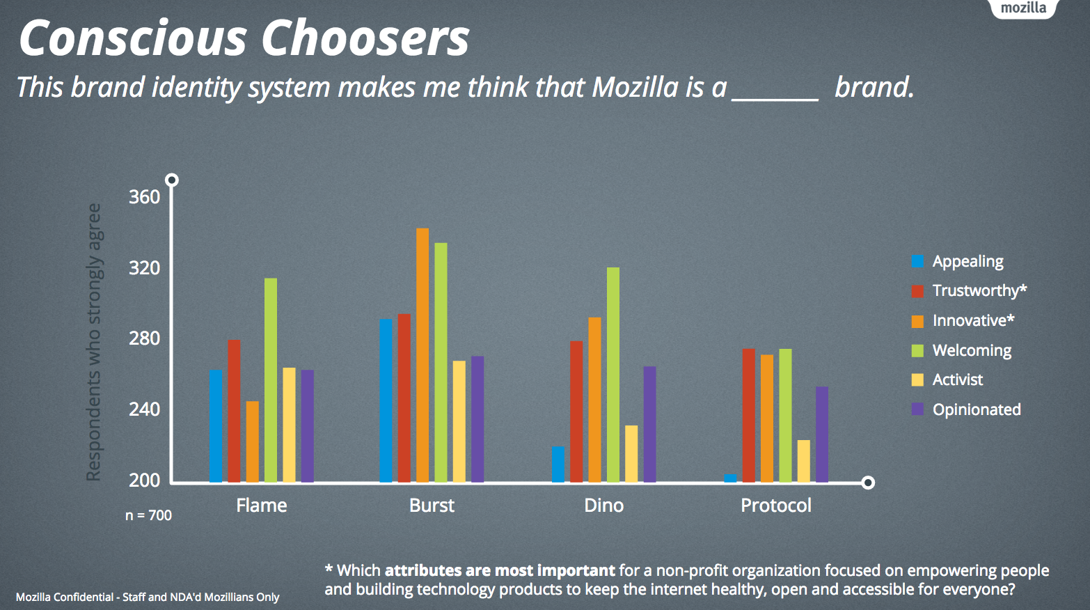
We asked them first to rank order the brand attributes most important for a non-profit organization “focused on empowering people and building technology products to keep the internet healthy, open and accessible for everyone.” They selected Trustworthy and Welcoming as their top attributes. And then we also asked them to evaluate each of the four brand identity design systems against each of the seven brand attributes. For this audience, the design system that best fit these attributes was Burst.
screen-shot-2016-10-19-at-9-57-18-pm

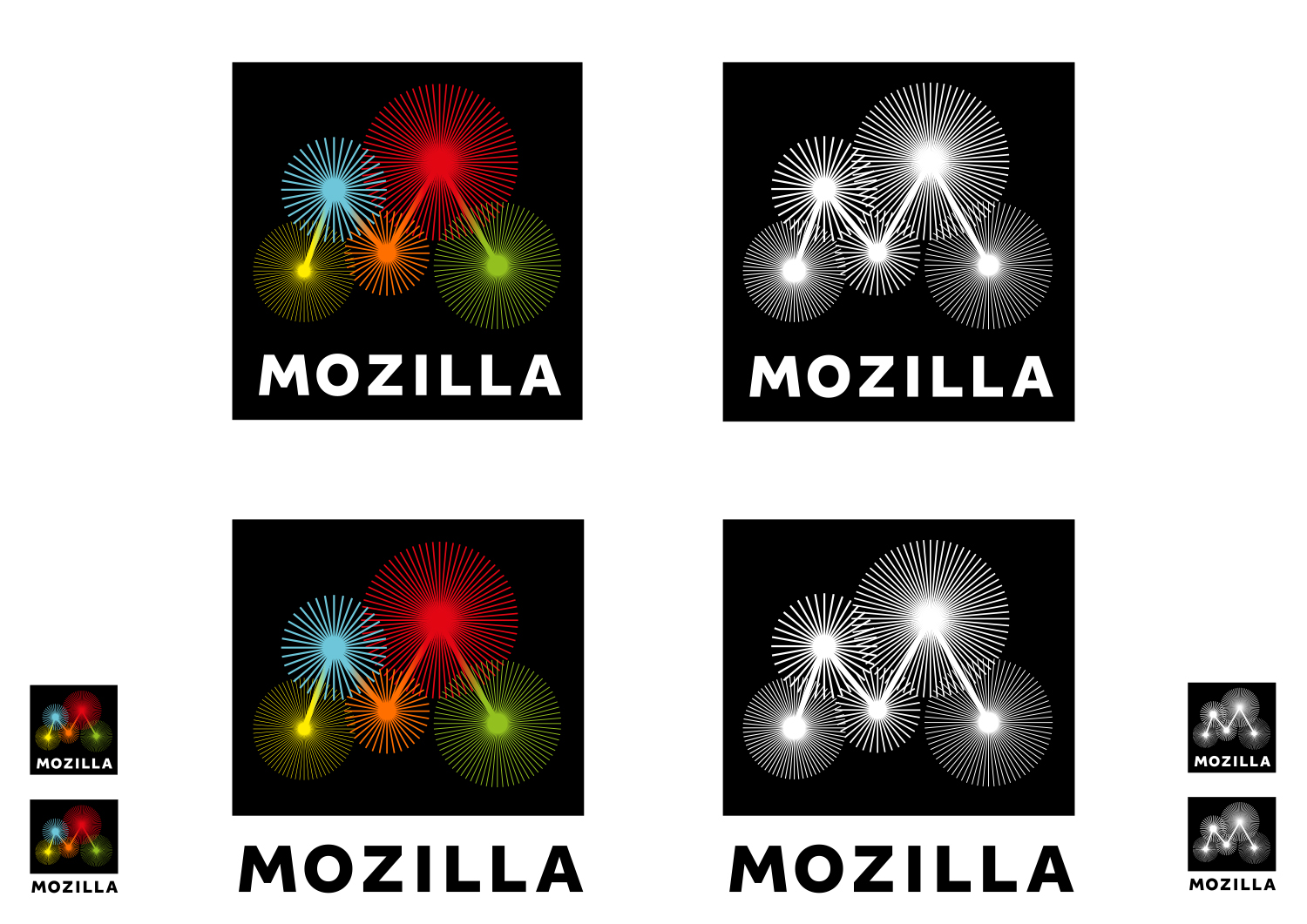
Why would this consumer audience choose Burst? Since this wasn’t a qualitative survey, we don’t know for sure, but we surmise that the colorful design, rounded forms, and suggestion of interconnectedness felt appropriate for an unfamiliar nonprofit. It looks like a logo.
jb_mozilla-sept_b_burst_2

Also of note, Burst’s strategic narrative focused on what an open, healthy Internet feels and acts like, while the strategic narratives for the other design systems led with Mozilla’s role in world. This is a signal that our targeted consumer audience, while they might not be familiar with Mozilla, may share our vision of what the Internet could and should be.

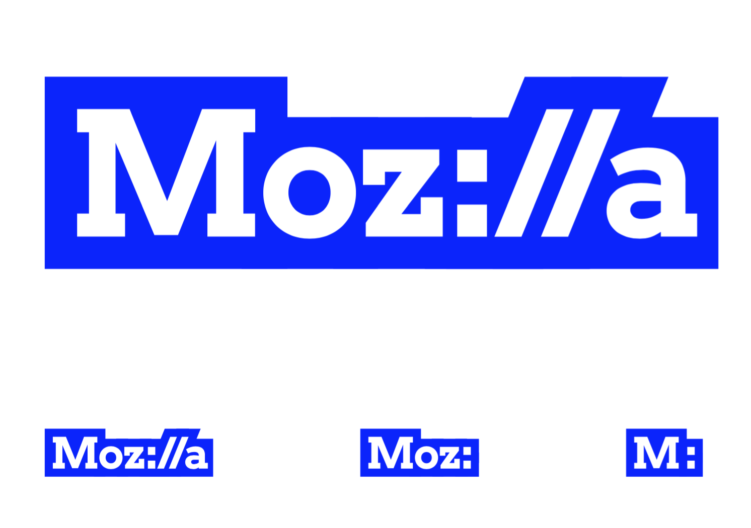
Why didn’t they rank Protocol more highly across the chosen attributes? We can make an educated guess that these consumers found it one dimensional by comparison, and they may have missed the meaning of the :// embedded in the wordmark.
screen-shot-2016-10-19-at-10-24-16-pm

Although Dino 2.0 and Flame had their fans, neither of these design directions sufficiently communicated our desired brand attributes, as proven by the qualitative survey results as well as through conversations with Mozillians and others in the design community. By exploring them, we learned a lot about how to describe and show certain facets of what Mozilla offers to the world. But we will not be pursuing either direction.

Where we go from here.

Both Protocol and Burst have merits and challenges. Protocol is distinctly Mozilla, clearly about the Internet, and it reinforces our mission that the web stay healthy, accessible, and open. But as consumer testing confirmed, it lacks warmth, humor, and humanity. From a design perspective, the visual system surrounding it is too limited.

By comparison, Burst feels fresh, modern, and colorful, and it has great potential in its 3D digital expression. As a result, it represents the Internet as a place of endless, exciting connections and possibilities, an idea reinforced by the strategic narrative. Remove the word “Mozilla,” though, and are there enough cues to suggest that it belongs to us?

Our path forward is to take the strongest aspects of Burst—its greater warmth and dimensionality, its modern feel—and apply them to Protocol. Not to Frankenstein the two together, but to design a new, final direction that builds from both. We believe we can make Protocol more relatable to a non-technical audience, and build out the visual language surrounding it to make it both harder working and more multidimensional.

Long live the link.

What do we say to Protocol’s critics who have voiced concern that Mozilla is hitching itself to an Internet language in decline? We’re doubling down on our belief in the original intent of the Internet—that people should have the ability to explore, discover and connect in an unfiltered, unfettered, unbiased environment. Our mission is dedicated to keeping that possibility alive and well.

For those who are familiar with the Protocol prompt, using the language of the Internet in our brand identity signals our resolve. For the unfamiliar, Protocol will offer an opportunity to start a conversation about who we are and what we believe. The language of the Internet will continue to be as important to building its future as it was in establishing its origin.

We’ll have initial concepts for a new, dare-we-say final design within a few weeks. To move forward, first we’ll be taking a step back. We’ll explore different graphic styles, fonts, colors, motion, and surrounding elements, making use of the design network established by our agency partner johnson banks. In the meantime, tell us what you think.

30 comments on “Nearly there”

  1. Jan Slezak wrote on

    Hi – these logos are not nice … sorry – it looks weird – according in my opinion – the logo should evoke minimalism, simplicity, ergonomy – should be NICE as well as ATTRACTIVE!

    These are not – just my reply.

  2. Mark wrote on

    These are so god-awful.

  3. NONE wrote on

    I’m sorry to say this, but all the design directions are rather terrible. What I wonder though…did you never ask “normal” people what they think of the designs? Because they would have told you in earnest.

  4. Greg K Nicholson wrote on

    I don’t *think* anything. I *feel* disappointed, and sad. I still don’t understand why we’re abandoning our current identity. Yes, the wordmark is mediocre, but that’s not all of our identity.

    Maybe a shift is appropriate now that Mozilla is a company more than a community, but I was still hoping the old Mozilla would come back. I guess not.

    ❝And at last, Mammon slew the beast, whilst the beast’s followers looked on helplessly.❞
    — from The Book of Mozilla, 16:10

    R.I.P, Mozilla. It was fun.

    1. Tim Murray wrote on

      Thanks for writing, Greg. Sorry it’s taken a while to reply. What other visual assets do you consider to be part of the current Mozilla identity?

      Mozilla is both a community and an organization? Getting clearer about what Mozilla stands for and communicating that through our brand identity means we’re honoring and expanding on what’s come before, not subverting it. It will help us continue to invite others into the fold – active contributors, passive followers, and everyone in between. Growth is not the object, and it’s also not the enemy.

      As a fellow Mozillian – probably one who has joined this community more recently than you – I have no control over who belongs. None of us does. We are open to many opinions, ideas, and options, even when we may not agree with them. We would be less without you.

  5. al wrote on

    Shouldn’t you be including the existing logo — or at least “none of the above” — in your surveys, to have a baseline to compare against?

  6. jan wrote on

    Please Guys. Stop this. The concepts are really really bad…

  7. Paul wrote on

    These are awful. Truly awful. And I very much doubt if they work internationally. I can see issues with the bizarre kind of, but not quite, fire one especially.

    What you need is something a bit abstract, cute, fun, and something you can give a story to over time. Something like a dragon perhaps?

  8. Elsseriah wrote on

    If any of these directions were for an event, or side-project, almost any of them would do. Mozilla as a brand, however, needs to be more than any of these can represent. A strong identity for a large organisation needs to be simple enough to be functional and understandable, generic enough that it doesn’t lock the group too tightly into anything, and flexible enough to fit into whatever situation might be needed for it.
    From my view, at least, none of these directions meet any of these criteria.
    I’m really disappointed I didn’t get to participate more fully in this process, because Mozilla is an organisation that I support very heavily and means a lot to me. Still, I hope the designers directly in charge of this take a more critical look at these approaches and work them out more clearly. A few months is tight for a plan to completely rebrand, and I believe more time and thought is needed before a strong identity can be built.
    “If it ‘aint broke, don’t fix it” may be questionable when dealing with many things, but in this case, I feel it applies. The current Mozilla design is achieving the stated goals perfectly fine, and it’s better to stay with something that works fine now, than to make something new that may step backwards.

  9. FWB wrote on

    It’s awesome that you guys are still iterating over concepts. Personally, I wasn’t too fond of the initial concepts that were released but I’m slowly starting gravitate to the newer concepts. Keep up the grind!

    Devin

    1. Michael Comella wrote on

      I also greatly appreciate that the concepts are being iterated on. I love the idea of taking the best elements from one our top testing designs and (carefully! :) seeing how it might fit into another of our top testing designs. Keep up the good work!

  10. Isaac wrote on

    All of these designs lack the quality you’d expect of a logo for an organization of this stature. What you’re doing here is making a mockery of design by crowd sourcing it and the results speak to that. Hire professionals. This is a joke.

  11. Edward Allanby wrote on

    I think the execution of burst needs more work. the lines break up when small and I do not see why it is always contained within a black box. It feels closed. I also think that the bursts need to interact with the type / layout in an intelligent way. A system should be created to house messages that uses the bursts in a way that is still branded but has more flexibility.

    I am also keen to see a brand hierarchy page with burst at the top and Mozilla’s sub brand underneath.

    I cant see what would be salvaged from Protocol – it performed badly under your own testing. I do not think it is as smart as it thinks. For me burst communicates a much bigger intention.

  12. Martin McDonough wrote on

    This looks…odd to me. Why keep Protocol but axe Dino? Dino did better in both the Mozillian and the user study.

    And Burst looks like a nightmare to have as a logo, unless you either want to make a lot of scaled versions, or like Moire effects.

  13. Matt Wilkinson wrote on

    I’m glad you are still exploring these concepts. I was also not a fan of the initial concepts at all. The clear winners of these are Design Direction 3 and 4 with 4 being my favorite. I think the logo should be clear, bold, and professional – with heart. I think 3 and 4 accomplish that.

  14. Felipe wrote on

    I’m found on both Dino and Protocol, they both relate to the company, but I really don’t think Burst and Flame are good options, as a designer I feel both can lead to too many technical issues or lack of impact/identity.

    I’d recommend trying to developing Dino and Protocol further on, maybe try to incorporate aspects of Burst into it since you chose as one of the two ones, but as you said, do not Frankenstein it. And I still like the m:// element, I don’t work with nothing web directly (I design stuff for print) and I liked how it screamed “internet” to me. I think ppl with the minimum knowledge will understand the catch.

    1. Martin McDonough wrote on

      I definitely agree about Burst. I don’t think it will graphically scale very well, in particular.

  15. Miguel Useche wrote on

    I love how the ideas have evolved, now the only logo that I don’t like is the first one because it’s too complex, I love how the rest are cool and I can see the idea behind them.

    This will give a fresh look to Mozilla

  16. Design Thinker wrote on

    As a psychologist and researcher, I examined the latests Designs with my students and from a psychological point of view we think it’s not the best idea to include „ ://“ in the logo because many people who are not familiar with coding interpreted it as a negative facial expression. Such automatic and unconscious judgments can have a strong impact on how people perceive a brand.
    We just wanted to contribute what we found. The open design process is really great and can be seen as a model for many projects to come.

  17. Martin wrote on

    Please, please, please have your agency push the envelope in a 100 directions with this. Such as dropping spokes, fattening them up, have some thicker than others, color variations, etc. There’s still a lot of ways to go with it. Don’t settle for the first idea.

    Burst definitely has potential – seeing it from a zoomed out view I can see the strength of it. But it definitely needs refinement.

    And if iterating produces something radically different than expected, that’s great. Whatever the outcome, it needs to ultimately reflect Mozilla, even if it pulls the rug out from under the feet of us who have been watching this whole process closely.
    All the best.

  18. Chris Jorgensen wrote on

    Does that mean you will stop using the dino as a mascot?

    1. Tim Murray wrote on

      This design process has confirmed that there’s a lot of fondness among Mozillians for the dino as a part of our heritage. Although we won’t lead with it as a representation of Mozilla to the world, the dinosaur will likely still show up as part of our internal communications.

  19. Tim Murray wrote on

    Posting some brand identity ideas here on behalf of contributor Nasim So.

    5

    2

    4

    3

    1

    1. Martin McDonough wrote on

      I like the third, orange one. The other ones seem pretty busy for a base logo, though.

  20. Tim Murray wrote on

    More from Nasim So.

    7

    6

    8

    1. Martin McDonough wrote on

      That first one looks a _lot_ like the GMail logo.

  21. Evren D. wrote on

    I think the Protocol is the most relevant one but you should consider changing that raw blue color. Just for example:

    mozilla

  22. Paul Burke wrote on

    I can’t’ shake the sense that Burst is more of a campaign element than an identity – and not a particularly distinctive one at that. I just don’t think it has the weight to serve as the Mozilla brand’s long-term visual foundation.

    2 cents from a brand strategist; take it for what it’s worth.

  23. Emily Shirtz wrote on

    While the response difference between Mozilla developers and conscious choosers is not abnormal it does an excellent job of displaying the external misunderstanding of who Mozilla is and what they do. Granted, while protocol is not the public’s top choice in design it promotes a greater opportunity to teach and educate those outside the world of the current Mozilla we know. To those who understand and follow Mozilla presently Protocol represents a understandable change to brand identity featuring positive connection to the community and major icons of everyday lives. Protocol also calls for the greater education and incorporation of a larger group of users and individuals who do not associate with or know of Mozilla. Their misunderstanding quite possibly could become a catalyst for users to explore the world of Mozilla, its products, and its opportunities. In itself the logo is creating its own “call and answer” to lead the public to a greater more open web.

    While the public seems to support Burst more it lacks integral character aspect of the brand and mission of Mozilla. In my opinion the public finds comfort and interest in its fun and exciting shape, other than that i’m not sure they understand its implication or if it would elicit any other response from the public other than produce more confusion and blur the direct connection between Mozilla and its products and services.

    In conclusion is it not better to offer up a new identity the begs a question to be answered through interest and the possible misunderstanding in some and a logical progression to those who already understand, compared to a pretty idea?

    We are not “Slaying the Beast” we are educating others and progressing our “Beast” into the new and developing world. If we are not flexible with change we will find ourselves outdated and overlooked. We don’t have to be shine and sugary but we do need to promote a better internet and more educated society. We are not losing an identity, we are evolving into and older more developed being.

  24. J wrote on

    From a design perspective, I think that Dino 2.0 is the best logo.

    The name Mozilla is very unique. It is only one syllable away from Godzilla, which is the only common ‘word’ with a similar sound and so the two are likely to be associated for most people. To try and separate them would be a waste of an opportunity on our part. Why use the ‘-zilla’ suffix if we don’t want to be associated with Godzilla or a dinosaur. This would be like Apple not using an apple for its logo.

    Another reason is that a red dinosaur has represented the Mozilla organization for 18 years since it was founded in 1998, and a green one represented the project before that. It is likely that people still expect a red dinosaur to represent us.

    Possibly another reason is that our products, which are likely the first interaction people will have with us, are almost all represented by animals. Our front-end products, Firefox (our most popular product which is used by hundreds of millions of people) and Thunderbird, are represented by a fox and a bird respectively. While our back-end product, Gecko, is represented by a gecko. Even Servo is represented by a dog in its logo. I think it is reasonable that people expect an organization that represents its products with animals to represent itself with a kind of animal (especially when its name is itself associated with a kind of animal, and yes a dinosaur is a kind of animal).

    However, I strongly believe that our old dinosaur logo is too abstract and that a future logo should include our name in the logo and not as a separable wordmark. (It is impossible to establish what our old logo represents without the word ‘Mozilla’ next to it or prior knowledge).

    As your studies suggest, I believe Protocol 2.0 will intimidate people who don’t understand syntax. They might even recognise the syntax in the logo and associate it with software development, but then wrongly assume that Mozilla is only for people who can develop software (why else would this be featured in our logo). Also, as Design Thinker said, many people will recognise the syntax as an ‘almost sad face’ (ie ?). Do we want to appeal only to people with a knowledge of software development and be associated with a negative emotion.

    Your objective is to “refresh” (i.e. update not replace) the Mozilla brand and “make it easier for people who don’t know us to get to know us” (ie people outside of Mozilla).

    In your first study, you asked people inside of Mozilla to rate these logos against seven brand attributes. Five of them are qualities that you would “like Mozilla to be known for in the future” (ie ‘wanted’ but not ‘needed’). The other two (‘unique’ and ‘appealing’) are qualities that are “required”. These results show that Protocol 2.0 and Dino 2.0 are the most popular logos among people inside of Mozilla. Protocol 2.0 won with an average of 39% while Dino 2.0 won with an average of 52%, and of the two ‘required’ qualities, Protocol 2.0 won with 40% and Dino 2.0 won with 60%. Thus, Protocol 2.0 represents the ‘wanted’ qualities more than the other logos, while Dino 2.0 represents the ‘required’ qualities more than the other logos.

    You also asked people outside of Mozilla that represent our target audience to rank six brand attributes against these logos. They ranked ‘trustworthy’ and ‘welcoming’ as the most important attributes. These results show that Burst was the most ‘welcoming’ and the most ’trustworthy’. Of the four logos, Dino 2.0 was ranked 3rd for ‘appealing’, 2nd for ‘trustworthy’, 2nd for ‘innovative’, 2nd for ‘welcoming’, 3rd for ‘activist’, and 2nd for ‘opinionated’, while Protocol 2.0 was ranked 4th for ‘appealing’, 4th for ‘trustworthy’, 3rd for ‘innovative’, 4th for ‘welcoming’, 4th for ‘activist’, and 4th for ‘opinionated’. Thus, of the two preferred logos of people inside of Mozilla, Dino 2.0 was ranked above Protocol 2.0 for every attribute.

    Your results clearly show that Dino 2.0 is approved by both people inside and outside of Mozilla and best represents the ‘required’ qualities of a brand to be successful and the highest ranked attributes of our target audience.

    From this, I can only suggest that we use Dino 2.0. It’s a good balance between what people both inside and outside of Mozilla believe should represent us and it retains our existing brand without abandoning it (see my attachment).

    Personally, the outline even reminds me of the Australis design, specifically the curved tabs that are used in Firefox, Thunderbird, and the top of every Mozilla webpage. And the bold eye reminds me of symbols often associated with privacy, which we are well known for.

    Regards.

    Untitled2