Firefox Heatmap Study 2012 – Results Are In!

Heatmapping User Actions

A few weeks ago, Test Pilot released a study called “Firefox Desktop Heatmap 2012.” This is a update of a study that was done in 2010 to measure how frequently our users interact with various elements in the Firefox desktop interface. The study ran for one week and we received data from over 215,000 users.

Heatmaps highlight mismatches between UI prominence and feature desirability.  As part of the Australis redesign, this study was designed around these questions:

  • What features do people use in the current layout?
  • What awesome Firefox features are people missing, because the UI doesn’t make them prominent, attractive, or understandable?
  • What features are too prominent given their usage?

Mapping the Browser Window

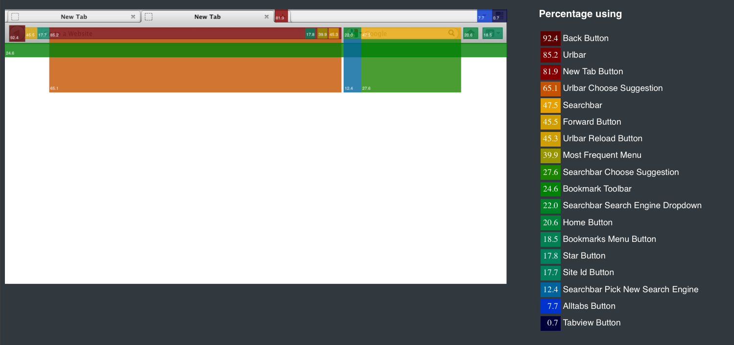
The heatmap below shows the percentage of users (all OSX, and Windows users with menubar enabled) who clicked on each browser element least once.

Heatmap for Firefox Desktop – For Users with Menubar Shown

Searchbars, Urlbars, Search Suggestions Are Frequently Used

Many people use the urlbar (82%) and the searchbar (46%) — 27% use search suggestions, and 60% use urlbar completions.  A forthcoming article will explore how people use each, and how they overlap.

Users Use Multiple Search Engines

Many more people click on the “Searchbar Search Engine Dropdown” (the menu that lets you change the search engine for searches in the search bar) (21%), than actually change their search engine (11%).

Why might this be?

  • Users could be dissatisfied with the searching options we provide for them and choose to stick with their original search engine.
  • Users might click on the button accidentally when meaning to go to the search bar.

We have timestamps for every action performed, so we could approximate what percentage of users clicked the menu by accident, if we assume this would be a very fast click. If this is a high percentage, then this is the wrong location for such a menu. If it turns out that users are dissatisfied with the options for search, we need to either rethink what search engines are displayed by default in this dropdown, educate users on how to add their own search engines to this menu, or restructure the way we present the search results from each search engine. (We will perform this analysis if there is interest.)

Low Panorama Usage

Of the major window elements, the least used was Panorama (the “Tabview button”), which displays tab groups (0.7%). If the users who click on the Panorama button are, indeed, utilizing Panorama heavily (which we could discover by looking at frequency of usage), a good revision might be to turn Panorama into a option that can be toggled on and off easily, or an add-on. It is also possible that users simply don’t know what Panorama is, since the button to view tab groups is shut off by default.

Bookmarks are Exposed Multiple Ways, with No Clear ‘Best’ Interface

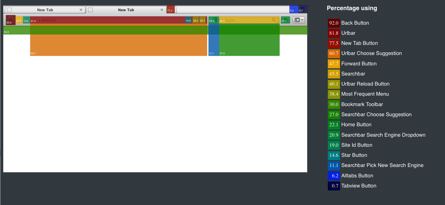
For completeness, here is the heatmap for the same elements for those users with the menu bar disabled:

Heatmap for Firefox Desktop – Menubar Hidden

We can see that the numbers are very similar to those in the previous heatmap, with the exception of the Bookmarks Menu Button (always shown on OS X, but on Windows only when the menu bar is hidden). This button is relatively popular (19%).

Bookmarks are overdue for simplification and redesign.  As explored in the next section, there is no obvious “right” answer to how to expose Bookmark functions, and different people seem to use different access points.  If the users who were clicking on “Bookmark This Page” in the menu were only doing so because the menu bar was enabled and this menu button was not available, maybe we should think about keeping this button always shown. We need to see if there is a preference for the menu bar or the desktop button when both the bookmark menu bar and menus are available (this is only true in OS X). If there is a strong preference for the shortcut button, perhaps the bookmarks menu should disappear altogether.

Exploring the Menu Bar

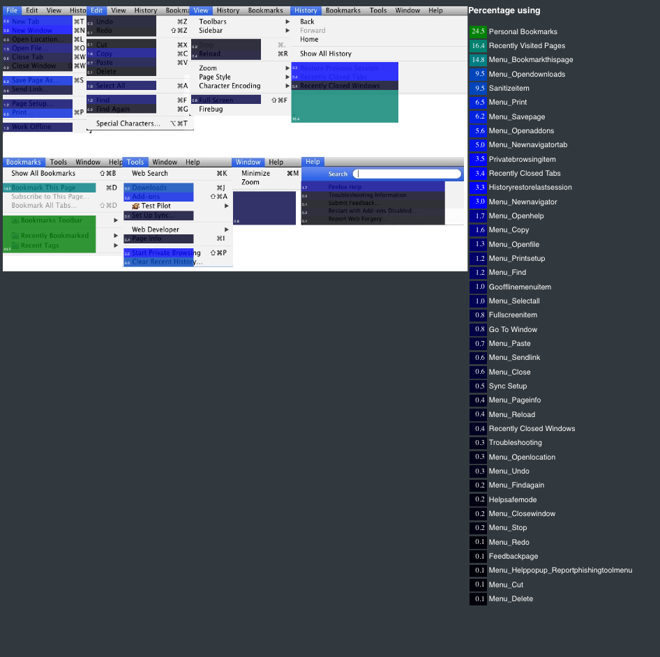
This heatmap summarizes the percentage of users (OSX and Windows users with visible menu bar) in the study who clicked on various menu items at least once during the study:

Heatmap for Menu Options of Firefox Desktop

The menu items used by the most people were:

  • Personal Bookmarks (25%)
  • Recently Visited Pages (16%)
  • Bookmark this Page (15%)
  • Open Downloads (10%)
  • Clear Browser History (10%)
  • Print (7%)
  • Save page (6%)
  • Open Addons (6%)
  • Open New Tab (5%)

Using Menus instead of Browser Chrome

Two of these items –  “Bookmark This Page” and “Open New Tab” – have shortcuts buttons in the browser window. Why are users not using these always visible shortcuts, which are arguably more accessible than the menus? There are two immediate hypotheses that come to mind: users only click on the menu options infrequently, and generally use the shortcut buttons, or there are users that only use the menu, and prefer not to use shortcut buttons at all.

By looking at the frequency with which these options are used, and not just the percentage of users that utilize each option, we can gain more insight into these possibilities. If a nontrivial percentage of users never use these shortcuts and are still using their menu equivalents frequently, we should turn to either a survey or interview approach to find out why. It might turn out that the shortcut buttons are not clear enough, in which case we’ll have to turn to education about using these features or clarifying the UI itself. If users simply prefer using the menu items, we need to discover why this is.

For the rest of these higher-frequency items, if we added shortcut buttons, would this benefit the user, or merely clutter up the space? Would more users know about these options if we added a shortcut button? Unfortunately, there is no way to determine the answers to these questions with the current set of data we have amassed. We would need to do some A/B testing or interviewing to see what the impact of such buttons would be. If only a small percentage of users (>2%) would use such desktop buttons with a consistently high frequency (maybe more than once a day, for example), a good route would be to develop an addon to add these buttons to the main browser window. If such an addon is successful, it would indicate that this is a feature that could be integrated into Firefox.

Rethinking the Help Menu

Looking at specific menus suggests other simplifications. Of people using the help menu, most only click on the generic “Firefox Help” item.   Are users so satisfied with “Firefox Help” that they don’t need to click on these other menu items? Or do they only go to the “Help” menu when they need exactly that – help – and not expect to find categories such as “Submit Feedback” there?  If users are getting help through external sources that are inferior to what the Firefox help system can offer, then the UI needs to be clarified to encourage users to use this system.  Promoting “Reset Profile” into this menu might also improve access to that feature.

Usage Patterns are Stable From 2010

It’s also interesting to compare the results from this heatmap to the study that was done in 2010. The percentage of users that used the searchbar at all dropped from 61% to 47.5%, and the Select Search Engine Menu went from 32% to 22%. This might reflect changes in how people search on the web in general.  Are users more likely to search by typing into the urlbar than the searchbar now? Do they follow links more often than they do searches? Not much has changed in the Firefox interface in the last two years to discourage searching in the searchbar, so a change in user behavior remains the most likely explanation for this shift. However, the previous study was done with a different demographic – Test Pilot users of two years ago – so it’s possible that this accounts for some of the discrepancy. It is still worth considering a Test Pilot study where we track not just usage of the urlbar, but how often searches are performed as opposed to urls entered. A high volume of searches would indicate that we could move away from having a search bar at all.

Future Research

With preliminary research like a heatmap, sometimes more questions are raised than answered. But the questions that we get that come directly from user data are the ones that, when answered, can give us some of the most valuable insights about Mozilla products. To recap, the following are some of the takeaways that we can get from the heatmap and some of the actions we should now pursue.

  • See how often users are performing searches with the searchbar as opposed to the urlbar, and how this has changed over time.
  • Figure out why users are using menus instead of toolbar buttons. See if we can characterize this group.
  • De-emphasize Panorama to an addon, unless a usability study can be done that demonstrates enthusiasm for it once users know of its existence.
  • Discover why users aren’t using the help menu and figure out how to get users help when they need it.
  • Examine user Bookmark feature entry points and evaluate plans for unifying them.
  • Determine why search engine dropdown menu is clicked and then think about its position near the search bar and/or the search options that are enabled.

Have any other ideas about the data? Leave them in the comments below!

(authors: Ilana Segall, Gregg Lind)
32 comments on “Firefox Heatmap Study 2012 – Results Are In!”

  1. DSU wrote on

    I don’t see a real mystery about the ““Firefox Help item”. Troubleshooting and Safemode would only be used if the user had a bit of troubleshooting knowledge already or if they were asked to do so by someone giving support. Submit Feedback won’t be something anyone is likely to use a lot and Report Web Forgery means that A) someone ran into one and B) they noticed.

  2. Tim wrote on

    Another reason for the low usage of the Panorama button, could be that those that actually use it, are power users who use keyboard shortcuts anyway. Are keyboard shortcuts considered anywhere in these heatmaps, actually?

    1. Tim wrote on

      Oh, and btw: while I do use the awesome bar for quick searches now and then, I’d still hate to see the search bar go, even though I do use it less and use the awesome bar more. It’s very powerful in a way the awesome bar just can’t provide. Just a remark that those declining numbers don’t directly mean the search bar is becoming useless :)

  3. avih wrote on

    One possible explanation for using the Bookmarks menu more than the button, is that it’s possible that the menu item is just easier to hit, due to its size and/or position. I think that’s the reason why I use it exclusively for items which are not at my bookmarks toolbar.

  4. David wrote on

    How do accessibility tools fit into the picture (if at all)? Do they ‘click’ buttons or menu items, or are they not reflected at all in this data?

  5. omeringen wrote on

    “”It is also possible that users simply don’t know what Panorama is, since the button to view tab groups is shut off by default.””

    Of course it is ! Bring back the “all tabs” icon which includes panaroma.

  6. Heraldo wrote on

    Considering that the New Tab button is one of the most used buttons, it was really a big mistake IMHO to remove the possibility to open new tabs by clicking on empty space on the tab bar, now mouse users must hunt a moving target, which the New Tab button is.

    https://bugzilla.mozilla.org/show_bug.cgi?id=575248

    1. Peter Lairo wrote on

      +1

      But then again, I rarely need a BLANK new tab. I usually need a new tab from a link on a page i want to keep open.

    2. Ryan Gannon wrote on

      @Heraldo
      Agreed. It’s one of the features that I love about Opera.

  7. Paul wrote on

    Please keep the bookmark menu. I stongly dislike extra bars and icons (like home and bookmarks).

  8. Srap wrote on

    Panorama should remain, as it is the only way to manage tabs. It might need some plus features, but overall, I find it to be far more convenient than Opera’s solution. I did a simple search for the term ‘Panorama’ on Bugzilla, and it showed a lot of results, including many requests. Fixing some of these (along with the more serious bugfixes) might give a good second-start for it.

    About bookmarking: some people might happen to drag the tab on the bookmarks toolbar or the folder, so this also might take a few usages from the ‘Bookmark this page’ button.

  9. Hanno Schlichting wrote on

    It might be interesting to compare the sizes of the UI elements (what percentage of the UI they take) and the usage percentage values.

    Making the back button larger a while back was rather obvious. Probably something similar would apply to the “new tab” button – maybe just adding 1em whitespace padding to each side of the plus icon.

    But maybe there’s other UI elements where the size/usage ratio is non-optimal.

  10. Matthew Miller wrote on

    Looks like the back button could use some love. This is why I argued long ago that making the right-click menu always a context menu and not putting “back” as the top option was not really optimal — people use “back” a lot, and there should be efficient ways to get to it quickly without moving to a small button way up in the corner. I use a mouse gestures plugin, but that requires the user to basically learn a new type of user interface — probably a non-starter. I wonder if a large back bar all along the left side of the window would be valuable? With typical wide-screen monitors these days, that’s the direction in which there’s real-estate to spare….

  11. Matthew Miller wrote on

    Like this, maybe, but more visible: https://addons.mozilla.org/en-US/firefox/addon/milewideback/?src=search (does not work with current firefox, alas)

  12. Lee_Dailey wrote on

    howdy y’all,

    there is one section where you appear to miss the entire concept. this …
    “Users Use Multiple Search Engines”

    your reasons don’t even approach the best reason [from my point of view] for having more than one search engine. that reason is to use the appropriate search engine for the current search. one uses …
    – the google engine for general searches
    – the amazon engine for amazon or general shopping searches
    – the wikipedia engine for knowledge searches

    the two ideas you listed seem to miss the point entirely. [*grin*]

    in any case, this article is nifty reading! thank you for posting it.

    take care,
    lee

  13. Michael wrote on

    “Promoting “Reset Profile” into this menu might also improve access to that feature.”

    Seems like a rather dangerous feature to have direct access to. People shouldn’t be blowing away their profiles before they have tried other things (and if they’re not using, for example, restart without addons, anyway…)

    A usability study on Panorama seems a bit of an odd idea. There are a whole bunch of things that need fixing in Panorama, some of which were in the original design and some of which were known bugs before it first shipped. Since it shipped in a basically unfinished state, it’s been mostly abandoned. Not much point doing usability studies into things if there are no resources to implement the results…

  14. Emanuel Hoogeveen wrote on

    “A high volume of searches would indicate that we could move away from having a search bar at all.”
    I tried this for a while, turning off the search bar entirely using the Customize Toolbar window, but I found that the address bar behaves differently in some vital cases. For instance I often use Google as a scientific calculator, and the search bar allows me to quickly Google the result of a formula in a new tab (by middle clicking the magnifying glass). But this doesn’t always work from the address bar – Firefox will try to interpret some searches as (invalid) webpages, and this seems to happen fairly frequently when the search contains numbers or the division operator (IIRC).

  15. and wrote on

    Be careful when interpreting such numbers.

    For example with regards to the bookmark star-icon in the urlbar, every single time I have used that button it have been a mistake. I.e. I have newer used it to bookmark a page, but have hit it few times when aiming for e.g. the reload button. So a high number of uses could just be a lot of bad aimers.

    A similar thing goes for the urlbar dropdown-arrow. I noticed that I previously often hit it when starting Firefox or switching to the Firefox window. This was not because I was looking for a site, but out of habit or procrastination. It got so bad that I caught myself using the dropdown-arrow when using other peoples browser, which is just an awful invasion of privacy. Since the button doesn’t seem to have any legitimate use-case I had to remove it using tip I found to edit the userChrome.css (I just checked Chrome and it have no such button). So a high number of uses of this button could just be a large amount of wasted time (even if people didn’t hit the button by accident, as such)

    I bookmark by dragging the site by the favicon from the urlbar to the bookmarks bar. This action probably opens the “site id button” even though I have no intention of using/viewing the “site info hanger”.

    The high number of uses of the “Searchbar Search Engine Dropdown” could be people that want to go the the google site and therefor hit the google logo (or whatever search engine they have as the default) not realizing that it is a dropdown not a bookmark/link. On that note, how many people, that have opened that dropdown, chooses the same search engine that was already chosen (perhaps thinking that this would send them to the google site).

    I never use the searchbar myself since it isn’t cleared automatically (and it is bothersome and easy to forget to do it manually), so you latest search is always shown to whomever that walks by.

    It doesn’t seem odd that most only use the generic help button. The submenu is hard to discover and hard to hit.

    Have people figured out that the firefox-button opens a menu at all? E.g. by comparing with the 2010 numbers (wasn’t that before the firefox-button) or with the people that have the menu visible (which is the default when upgrading, I think, so probably not a deliberate choice) are people still finding the menu items?

  16. Roland Taylor wrote on

    Why was Linux not considered?

    I’m going to call Mozilla out on this. Too many aspects where Linux is being abandoned by Mozilla.

  17. Henri Sivonen wrote on

    Was keyboard shortcut for new bookmark studied vs. menu item vs. toolbar item?

  18. Dan wrote on

    Isn’t the Panorama button hidden by default? Obviously it’s not going to be clicked much if it isn’t actually visible most of the time.

  19. SmI wrote on

    concerning your question why some users prefer to use menu item instead of shortcuts.

    Go one step backward and try to look at it from the opposite side.

    At work for most users a web browser is a tool needed for every day work, but it’s not essential. You usually rely on a bunch of specialized tools for Business logic, simulations etc…

    Most of these tools are heavy weight and connected through huge tool chains. Some parts of these tool chains are rather new while other parts date way back to the eighties. The same applies to their user interface.

    Just imagine you use 80% of your workday these specialized tools and just 20% the browser. So you will interact with your browser the in same way you use your specialized tool. Because in average it’s faster.

    I recently had to work with a “top notch tool”, but it’s roots dated back to the eighties so that it used other shortcuts for copy and paste due to historic reasons. After some days working with this tool I ended up using always the “wrong” shortcut for copy and paste in all other programs. At the end I found myself using the menu bar. I assume because this way worked in both worlds. And getting away such a habit is not easy.

    I guess the same applies the menu bars. If you usually have to use the menu bar to access commands, then it’s easier and faster for you to use the menu bar instead of some kind of shortcut.

    That’s why I think a program’s UI should blend seamlessly into the operating system UI. Instead of reinventing the UI again and again. Especially if you keep in mind at work a web browser one tool within many others and definitely not the most important one…

  20. Steve Fink wrote on

    My personal, biased, uninformed opinion of low Panorama usage: it’s little used because it’s not very useful yet. It feels like it’s on the threshold, but it needs a tiny bit more to actually be worth using.

    I might use it if there were an “open this group in a new window” option. I recently experimented with trying to use tab groups by moving all of my tbpl and tbpl-related tabs into a separate group. It was great until the first time I opened a tab from an email or chatzilla; then it was suddenly awful because my categorization became impure and I had to look through both sets of tabs to find stuff. I also wanted to sometimes have tbpl open at the same time as something else. Both of these would be been fixed by opening up tbpl in a different window but making the original window the default container for externally opened tabs. (Well, not opening up my tbpl group by default, but making it an option. I don’t want it open all the time.)

    Or make Panorama useful for pruning unwanted tabs. We don’t have any good way to do that now, and it doesn’t seem like the worst place to put it.

    Or make tab groups convertible to and from toplevel bookmark folders.

    I might even like it if tab groups were more like tab tags, so groups weren’t necessarily disjoint. I would have a bugzilla group, but some of my open bugs might also be in a task-specific group.

    Anyway, my point is that it may be a little unfair to punt Panorama off to an add-on when it hasn’t really been given a chance yet, since it’s missing some functionality that would allow to be part of a meaningful workflow.

    What *are* the use cases where the current implementation makes sense, anyway?

  21. Manuel Strehl wrote on

    About the Panorama usage: I’m in no way surprised, that this feature is used so little. I’d call myself a Firefox power user, and I needed some 4 months or more after introducing panorama, before I even encountered it. Then, for another time I didn’t know what to do with it.

    Now I think it’s one of the most valuable additions to Firefox in the recent years. This way to organize sets of open tabs helps tremendously, when you use the browser, e.g., for several customers or projects at once. I think it’d be a huge step backwards to move it to a plugin.

    On contrary it should be made more prominent on a place, where it would naturally fit: The bookmark management: If you could use the bookmarks as kind of persistence layer for Panorama groups, i.e, store and reactivate them (where groups map to something like bookmark folders or active bookmarks like for RSS feeds), Panorama could move most naturally in the view of people.

  22. Paul wrote on

    I would like to see easier access to “Recently Closed Tabs” to make it easier to re-open a tab I closed accidentally or needed to go back to. If this were easier I’d probably be more likely to close tabs more often (and not have so many open all the time). It seems like a pretty popular menu option from the heat maps. Maybe take them out of their sub-menu so that they are at the same level as recently visited sites (as in Chrome’s implementation).

    And/or let “undo” reopen a tab if the last thing you did was close one.

  23. Paul wrote on

    Top of my wish list for Panorama: a way to select multiple tabs (preferably by clicking and dragging a rectangle, or at least shift-click) and then drag them to a new group. I gave up on it when I got tired of dragging one tab at a time into a new group.

  24. Juan Eladio wrote on

    About Panorama: Maybe it wasn’t advertised enough outside the Firefox community. Maybe it could be linked from the new Home page and the New Tab page and more people will notice this feature.

  25. eashwar wrote on

    Hello UX team of mozilla firefox,

    i would like to give some suggestions,

    1) Double Touch(double click) in the tabs accidentally close my window. (this will happen to many laptop users using the touch pad for clicking)

    2) Have Some Options to lock the HomePage change setting, so that when installing other software cant change my home page.

    3)some times i close even after users close their browser the firefox.exe keeps running, and cant start the firefox again. they have to go to the TASK MANAGER >> Processes >> and end the firefox.exe and start again.

    4) option to bring the HISTORY of browsing tab to tool bar

    5) my design would be like this for action bar dropdown, when i click the action bar’s drop down menu, FOX has top pages. the last list field can be 3 column with recent, yesterday, all

    6) user may bookmark many website, there can be options to resize the bookmark tabs.

    7) when i asked the users to try the make all possible views of the menu bar, Navigation toolbar, and Bookmark toolbar

    i found,
    1) view of menubar, for old people is really a problem.(mu point of view a very closed design is not good, have some reasonable space between menu element, forget the fitts law in this design )
    2) when the one user hide the NAV bar, tried to retrieve it he was annoyed by clicking many placed in the bookmark bar, and the title bar to find the sub menu. finally she found by right clicking in the Add-on bar( it is complex to have a to come-out with suggestion for this probem, but will give some soon )

    8) NAV BAR

    the home button position can be to the left of the back button or between address bar and search bar.
    app center is not necessary, a drag and burst to remove(like the MAC dock) option will give more good user experience
    downloads button is important so can be added to the Nav bars right corner
    when we resize the window, priority of the shrink should be for extra buttons with access from a down facing arrow

    —————————————————-end——————————————-
    love testing, apply usability…..
    i am a just a intern, if any of the above information is not a good practice please forgive me.

    with all love to FireFox and team,
    eashwar raghunathan
    eashwar.ceo@gmail.com

  26. Ping from How to Turn on Do Not Track in Your Browser « News Worldwide on

    […] Firefox Heatmap Study 2012 – Results Are In! (mozilla.org) Share this:RedditTwitterFacebookStumbleUponDiggEmailPrintLike this:LikeBe the first to like this. […]

  27. Another grumpy Linux user wrote on

    Panorama – invaluable.
    It replaced any and all “morning coffee” addons/bookmark lists for me.
    Grouping a hundred pages kept open all the time wouldn’t otherwise really be possible and handy like it now is, with panorama.
    Thank you for this.

    Problem with it is the same as it was with RSS icon.
    “Normal” users just don’t know about it, don’t know how to find it, how to use it and what to gain from it. Removing RSS icon from address bar was dumb and guaranteed that 90% of those normal users will never ever encounter it at all anymore. Could as well be 99%.

    Every person who I’ve shown how to effectively use RSS with Google Reader and Panorama on Firefox has wondered why they never knew about those before – some say it’s too compicated even when they agree it would save them a lot of time.

    They say the same about my UX/GUI modifications, bookmarklet-heavy usage too and refuse to understand that setting it up (about:config, userC*.css etc) is a one-time push, then can be used anywhere for years to come.. sigh.

    But don’t go making decisions based on simple opt-in UX data like this. It will miss power users and common almost completely – being an example of this since I never took part in any of those, maybe I’ve clicked them away or didn’t happen to use Aurora at that time.

    Educate the users.
    Show how it’s better and faster for them.
    Keep it clear that Firefox is about choice and customability – others really don’t give that possibility. (This includes that you don’t go removing power users’ main features…)

  28. Grumpy Linux user wrote on

    Panorama – invaluable.
    It replaced any and all “morning coffee” addons/bookmark lists for me.
    Grouping a hundred pages kept open all the time wouldn’t otherwise really be possible and handy like it now is, with panorama.
    Thank you for this.

    Problem with it is the same as it was with RSS icon.
    “Normal” users just don’t know about it, don’t know how to find it, how to use it and what to gain from it. Removing RSS icon from address bar was dumb and guaranteed that 90% of those normal users will never ever encounter it at all anymore. Could as well be 99%.

    Every person who I’ve shown how to effectively use RSS with Google Reader and Panorama on Firefox has wondered why they never knew about those before – some say it’s too compicated even when they agree it would save them a lot of time.

    They say the same about my UX/GUI modifications, bookmarklet-heavy usage too and refuse to understand that setting it up (about:config, userC*.css etc) is a one-time push, then can be used anywhere for years to come.. sigh.

    But don’t go making decisions based on simple opt-in UX data like this. It will miss power users and common almost completely – being an example of this since I never took part in any of those, maybe I’ve clicked them away or didn’t happen to use Aurora at that time.

    Educate the users.
    Show how it’s better and faster for them.
    Keep it clear that Firefox is about choice and customability – others really don’t give that possibility. (This includes that you don’t go removing power users’ main features…)

  29. www.canilnackicao.com.br wrote on

    Hurrah, that’s what I was exploring for, what a material! existing here at this website, thanks admin of this web site.