Visualizing the Future of Bookmarks

How do you save pages for later? That’s of the questions that user researchers at Mozilla have been investigating recently (see findings by Brian, Ilana, and Diane).

As a user experience design and engineering intern, I spent a good portion of this summer beginning to re-envision the latter part of that process: how do you access what you’ve saved? After all, what’s the use of saving something if it’s just going to collect dust in a list of hundreds of other things you’ve saved?

My research and design process began with a peek at Firefox’s existing Tab Groups feature and eventually moved into Bookmarks territory. I assessed Firefox’s current Bookmarks and History manager, whose interface hasn’t seen significant updates in a while. I looked at services like Pinterest, Tumblr, and Readability, which provide their own takes on the bookmarking paradigm. I made a hypothesis that the popularity of these services is a result of not just appealing social media features but also interfaces that take advantage of modern advances in usability.

Eventually, I found interface inspiration from a surprising source: the album grid and album list views in iTunes! The hardest obstacle in designing an interface for bookmarks is the sheer amount of information to represent in a clear and concise way. I listen to music pretty constantly while working, and one day, it occurred to me that music managers have to tackle a very similar problem and have some decent solutions that could inform this project.

While doing all this research, I generated plenty of ideas about bookmarks as well as paper wireframe designs. Then I took all this research and design to the code stage. The result is an experimental prototype called Mozaic that, while in no way complete or perfect, I hope will help inspire the future of browser bookmarks.
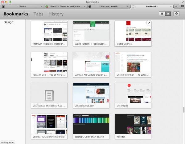
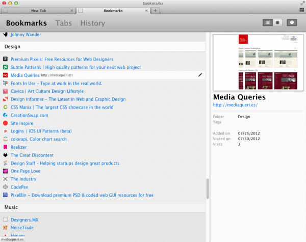
A few features of Mozaic:

  • a visual thumbnail view of pages
  • a more traditional list view with site icons
  • single page layout instead of a folder hierarchy sidebar
  • contained within the browser window instead of a separate window
  • “sticky scroll” group headers that remain visible as you scroll
  • …and it shows bookmarks, tab groups, and history

If you’d like to find out more about the process of designing Mozaic, you can watch my presentation (at 24:30) or view the slides.

Or if you’d like to dive in and give it a try, you can! Although Mozaic is intended as a design prototype, it ended up as a decently functional add-on, so if you’re running certain cutting-edge versions of Firefox (compatibility is unfortunately a little unpredictable), you can try it out today! If you do, please comment below and let me know what you think.

10 comments on “Visualizing the Future of Bookmarks”

  1. Robert Kaiser wrote on

    As a personal opinion, those tiles take up way too much space for what I want with bookmarks. I want a hierarchical list available in the browser UI from which I can select the right item out of the hierarchy of my personal grouping and open it in open a new tab – for some often-visited pages I actually want items for that even faster than in that hierarchical list, and that’s what I have the bookmarks toolbar for.
    I find all the thumbnail stuff pretty distracting, I don’t even like it for mobile tabs very much, but I know it’s what is modern nowadays.

  2. Brad wrote on

    I think there will always be a place for the list/folders view (iTunes has it, too), but a Pinterest-esque grid view might be a great addition.

    Some thoughts based on the Pinterest comparison:
    – Being able to see a short descriptive blurb beneath each thumbnail would help remind the user why they bookmarked it in the first place
    – It would be great if we could bookmark not just webpages, but pictures and articles (and products?). Clicking the thumbnail of a bookmarked picture might only bring up the full-size image, with an option to continue on to the source page for that image.

    1. Bob Montgomery wrote on

      I second the ‘vast amounts of wasted screen space’ comment.
      That also was my knee-jerk reaction.

      I use tree-style tabs, because the widescreen aspect ratio of most displays has plenty of ‘extra’ room on the left/right page margins where more information can be presented more readably than on a single line along the top of a page.

      But IMHO, developers should never assume claim to screen real-estate. Putting all tabs and command-bar headers into closeable drawers, even being able to fold sections of displayed pages origami-style, into invisibility… anything to present only information the user wants to see.. and nothing else.

      If I was listening to music, staring at a page of album covers might not be a bad thing.
      Safari similarly has a panovision-theater like page of top sites… In reality, Pandora is up under Safari now, hidden behind this window where it can play without instruding on my other activities. It’s window is shrunk down to the minimum necessary for me to be able to reach the ‘I’m still listening button.. I won’t say more. Skype insists on taking up lots of screen space displaying contacts & etc. Sure they’re important.. but do I want them in my face all the time? no.

      Finally, the absoloute most critical desirable characteristic of bookmarks and browser tabs and open windows would be for them all to be seamless, and effortlessly maintain continuity across periods of time when the browser has to be killed because of some memory leak or black-hole website encounter. The ‘Restore Session’ tab is a bit of a pain. Even though it is convenient, a more modeless / seamless way of moving tabs among browser windows and a ‘storehouse’ (viz. bookmarks), and tools for ‘organizing’ the collection(s) of tabs/bookmarks in the storehouse in many, many ways, not only as thumbnails and lists… I usually just dump weblocs into the finder, which implies some categorical hierarchy, and I have a ‘check this later’ tab where bookmarks of stuff I find interesting just piles up. I’ve given up trying to organized hundreds and hundreds of bookmarks in any sort of even hierarchical collapsible -expandable view. It’s just impossible, a scrolling dragging dropping nightmare.

      User experience is paramount, but the UX design center shouldn’t be about someone who has only ever visited five sites. Browsers have absolutely become the center of the computing experience. End-user control of presentation of representation should be as flexible and impactful as Smalltalk or the first bit-mapped display – and adapted/able
      to being driven as easily with a single thumb or a gaze, or a series of keyboard shortcuts as with a mouse or trackball.

  3. Andrei wrote on

    This won’t work for all.

    I see many people who don’t use toolbar (or bookmarks at all) – they either a) visit only 1-2 sites ever, or b) type text in the universal address field and hope that something will show up (from history, search etc).
    They won’t use grid with thumbnails or any other format for the same reason they don’t use toolbar – they just don’t care and they don’t want to complicate their routine and habits.

    Other people do use bookmark toolbar and they a lot more bookmarks than 1-2. I personally have 1822 at this moment and I’m not even a power user or dedicated internet data miner. This is just 3-4 years of active internet usage.
    Both grid view and list view will be almost unusable for me (if they’ll even won’t and don’t crash browser).

    You can only target this feature for some group in between the two above, and even then you’ll need really good performance and usability.

  4. Sirocco wrote on

    I, too, find the tiles to be a distraction. Bookmark management has been poor in Firefox for a long time now. If I may be so bold as to offer a few suggestions, what I suspect needs to happen is making three actions silky smooth regardless of user intent:

    1. Assigning a bookmark.
    2. Returning to a bookmark.
    3. Erasing a bookmark.

    Firefox has had some brilliant moments. The “open all in tabs” option, for example, is outstanding when you have multiple sites you visit on a regular basis. But there needs to be a quickly accessible way to add and remove a site from your bookmarks without having to get into the bookmarks management screen, or rely on a hotkey. Right-click on the address bar? An ADD/DROP button on the taskbar?

    Some bookmarks will be permanent, others temporary. I see movement toward the latter without regard for shoring up the former.

  5. Ping from Mozilla’s Mozaic to Bring Thumbnail View of Bookmarks to Firefox | My Blog on

    […] concept inspired from album gird and album list views in iTunes and is still in development. Mozilla may integrate […]

  6. Sean B. Palmer wrote on

    I’m a user who has always avoided bookmarking. This design won’t entice me to bookmark pages, and I’ve been thinking about what might. I don’t bookmark because bookmarking is not conducive to finding the pages that I want to find again later on. In other words, I don’t tend to bookmark a reasonable set of pages that I want to find again later on.

    If you’re doing UX work on bookmarking, then, you need to investigate the fundamental question of what sites users want to rediscover. Bookmarks cover those sites that the user can’t remember themselves, so the most popular and useful sites would not be included.

    My own makeshift analysis of this question is that there is nothing that can adequately characterise this set of sites, because the mechanisms behind wanting to rediscover sites are very chaotic—for me as a single user example. The most common experience is that an idea from a webpage comes up in a conversation with a friend, and I want to cite a source.

    Rather than bookmarking, then, I would rather have better search tools for finding pages within my entire search history. Something like Google Web History, but for my entire browser history. If Google can do it for the web, then Mozilla should be able to do it for the extremely small subset of the web that the user browses.

  7. BYK wrote on

    I wish this was integrated with the existing Panorama features. It looks lovely!

  8. Paul Tiseo wrote on

    I have to agree with the trend in the two previous posts. What I want, when bookmarking, is to grab an “understanding” of the site/link. So, I’m probably one of the few. I don’t care for screenshots, and I am not pinning the way the site looks on one day, because sites change anyways.

    Here’s what I normally do now in FF. I go to a site or a given page. It’s interesting and worth saving for future use. I click on the star, click on it again to get the real dialog, classify it in one of many hierarchical folders (which are limiting; it’s the WEB dagnit!), fill in tags (why? it’s not really used very well) and move on. When I want to go back, I can only hope to find it in the folder I think it should be found in. (HIERARCHICAL bookmarks for the WEB?!?)

    Ideally, I want to bookmark a URL, and have my browser index the content plus any tags I may want to add. I want a UI that allows me to put in a word and find URLs with that word or similar words. I want a display (webby-like, think http://www.visualthesaurus.com/) that shows me other, related bookmarks by proximity search (ie. having lots of the same words).

    If it can map (at my discretion) other people’s maps, that could be cool. But, bookmarking is not social for me. I am not trying to say “Hey guize! Look watta found!” I am actually trying to gather a knowledge base for myself. (But, it’ be nice to know if others seem to have the same “word mush” implying they may have found things interesting to me.)

    Dang! Got myself all fired up. Maybe I should mod FF! :)

    That aside, as a long-time FF user, thanks for your efforts on modernizing bookmarks in FF.

  9. Blutin wrote on

    “single page layout instead of a folder hierarchy sidebar”
    Please, to keep a folder hierarchy for whose who have a lot of bookmarks.
    Personally, I have more than 3000.

    Single page layout may be interesting as a search result.
    In that case, what could be improved is the ability to sort the search result : by folder hierarchy, by name, by date of creation, date of update, date of last visit, tags…