Firefox’s Redesigned Preferences Feel More like the Web

Another great Firefox improvement is releasing soon!

Firefox’s Preferences, until now, have required navigation through a cumbersome floating window where it’s nearly impossible to find what you’re looking for. This window is a classic example of a common software problem: settings are slowly added onto the interface as new functionality is introduced, and eventually it sags under the weight.

The mess that is current Firefox Preferences

The mess that is current Firefox Preferences

Until now, that is!

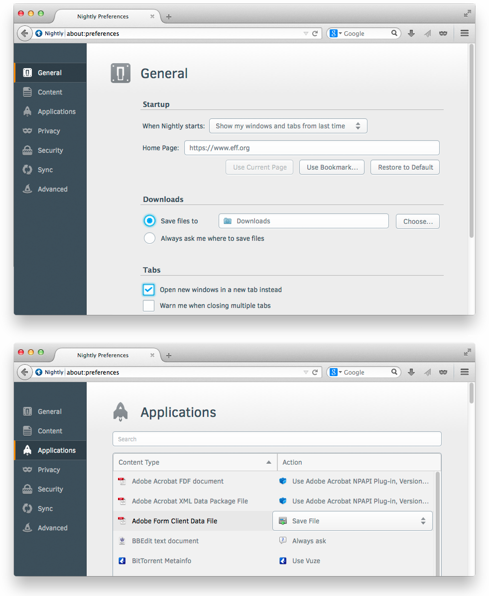
The Firefox UX team is excited to announce that brand new, beautiful Preferences are now the default in Firefox nightlies and will soon be in release Firefox. In this redesign, the interface is visually consistent, the information architecture is improved, and the whole thing is rendered in content space rather than as a separate window.

Firefox’s new in-content preferences

Why is it important that Preferences are in the content space rather than a separate window?

  1. Consistency across devices. By using the content space, we no longer have to rely on the ability of a device to draw separate windows and dialogs. This is particularly important on tablets and phones, where window management is more difficult. Now, users of mobile Firefox will see a familiar interface when move to desktop Firefox, and vice versa.
  2. Consistency across operating systems. Windows, OSX, and Linux all create windows and dialogs differently, which means the user’s experience with Preferences was different depending on the OS. Now, as we draw this interface within Firefox, we can make it look and feel identical across systems.
  3. Consistency with the web. Ultimately, the browser is a doorway to the rest of the web. For the browser to behave like a dialog-heavy desktop application rather than the web itself was jarringly anachronistic. Beneficially, rendering like a website also means users won’t need to find and manage a separate window in addition to their open tabs.
  4. Space to grow. Not being bounded by a small, floating window means we can create richer customization experiences. The Add-ons manager has already  moved to content space, and we’ve been able to explore richer use cases as a result. Similarly, expect to see innovative customization experiments as well as the usual Firefox settings.

And before you ask, yes, the next step is absolutely a search field in Preferences to summon the exact setting you’re looking for. This is needed particularly so users won’t have to “learn” our interface, but can instead focus on their task.

A special thank you goes to Senior Visual Designer Michael Maslaney, who’s been spearheading Project Chameleon, the style guide behind this redesign. Another thank you goes to MSU students Owen Carpenter, Joe Chan, Jon Rietveld, and Devan Sayles for creating the award-winning first version of Firefox’s in-content Preferences in May 2012.

12 comments on “Firefox’s Redesigned Preferences Feel More like the Web”

  1. Disgruntled Desktop User wrote on

    Great, more idiotic “consistent across all devices” nonsense…

    I highly doubt you’ll be willing to publish this, but I’m still going to type it out, in the hope that one of you might read it, which seems to be more than you ever do with the feedback page…

    People are SICK of the glossy changes you are making, desktop users want a desktop suitable application! Not a crossover for all devices!

    Stop with the “one size fits all” approach, one size never fits all, and quit with the constant cloning of of the styles used in android and chrome!

    You think that we can’t see the blatant rip of of the styles?!

    Get a design team with some original ideas, or go back to the classic look. You’re failing your users, and therefore failing yourselves.

  2. Antonio Rodríguez wrote on

    This change makes a lot of sense for mobile versions, but there is no good reason to push this to desktop versions. What I fear is yet another case of “let’s cut preferences nobody seems to use”, which, sadly, has been too frequent in the recent history of Firefox. Our once beloved browser is becoming less customizable each time, and that gives power users more reasons to migrate to the dumbed-down browser of Google: Firefox is becoming more and more a clone of Chrome, sailing away from its unique starts.

    Remember that today, given all the marketing of Google, most of the people that use Firefox and stay away from Chrome are recommended by us power users. You would do the right thing if you took us into account. Really.

    1. Dorian Grosch wrote on

      I can only emphasize this. Please don’t dumb down Firefox, visual redesign is ok, as long as the feature of customizability of Firefox won’t get lost during the process.

  3. Mike wrote on

    This unfortunately will be used as yet another excuse to remove preferences that power users overwhelmingly tend to rely on.

    As the commenter above noted, this is unnecessary on desktop Firefox. It appears yet again an attempt to optimize Firefox for tablet usage, when in reality there is no reason to do so for software that runs on the desktop.

  4. RobM wrote on

    Yet another lame idea from the firefox UI team. I’m sure this looks good on a mobile device but moving away from using OS-appropriate UI design for things like this just makes it harder for people to use.

    I wish I could get a job where it was mandatory to show up to work blind drunk every day. I say that because it’s the only way I can square some of your recent design choices with reality.

  5. Cody wrote on

    Yea, if you could go ahead and stop becoming more and more like Google Chrome, that would be great. All I have seen out of Mozilla Firefox lately is basically a port of the Chrome UI to Firefox.

  6. Please stop wrote on

    I agree with Antonio, you’re diluting the reasons that I use firefox and I have currently switched to waterfox.
    “Consistency across devices” you seriously need to ditch this whole concept, it is not required or desired. Desktop and tablet/phone are two completely different platforms with different requirements from the end user. By unifying interfaces you’re actually making things worse for both platforms. I don’t need loads of options on my phone and want full customizability on my desktop.
    If I liked the look of Chrome I’d be using it instead of spending my time writing a message hoping that someone at mozilla will see it and see sense.

    You are killing your product.

  7. Smylers wrote on

    A much bigger preferences window, with the subsections listed in column down the left? Hmmm, looks vaguely familiar.

    Ah yes, here’s Netscape Navigator in 1997:
    http://compnetworking.about.com/library/graphics/ns4_advanced_preferences.jpg

    1. Jennifer Morrow wrote on

      Not too different! Directories on the left and content on the right is a pretty common design pattern for applications.

  8. finally wrote on

    sweet, finally.

    really looking forward to that.
    and if you give the “power users” all the features they treasure, you will not only make the browser easier to use for non technophiles, but also appeal to people like me and my peers, who value a sleek and minimalistic UI/UX.

    1. Jennifer Morrow wrote on

      Thanks for the feedback! This is certainly what we hope to do. :)

  9. Surya wrote on

    OK, I can see why not everyone is happy but I like it. And this integration has been announced years ago. The only thing that surprises me is that it took so long to implement.