This post focuses on design principles and solutions that accompanies our other post about design process for the Australis update experience. – Zhenshuo Fang and Holly Habstritt Gaal, Mozilla UX
Introducing change is always hard, especially for software like Firefox that has been around for 10 years, and has technical legacy as well as UI legacy. The Firefox design and engineering teams recently introduced a redesign of Firefox we call Australis, that includes several visual improvements as well as new features that we believe benefit our users. Even though we blogged, tweeted and talked about it in various places, the majority of our users will find out about the new design the moment they update Firefox. While the interface is intuitive for new users, it still represents change for users who have learned and gotten used to the existing UI.
To introduce Australis to our existing Firefox users, a group from different teams started a project called “onboarding” to create an update experience along side Australis. The goal of this update experience is to help existing users get familiar with the new interface faster, gain interest in using more features, and answer their questions about the “why” behind the design. Here I will share with you some design principles and lessons we learned through the process of designing the update experience for Australis.
1. If you don’t want people to skip it, don’t design it like a webpage
The Banner Blindness study shows that people ignore what looks like an advertisement on a web page. We found through usability testing that the same holds true when users update their browser: they will ignore and not interact with what looks like a typical landing page. Since existing users have seen the update page so many times and the information on that page is not always relevant to their current task, ignoring the page has become a habit no matter whether the information on the page is interesting or not. Therefore in this new version of the update experience, we designed the web page so that it is minimal and only contains one welcome message to reassure that the user has updated to a new version of Firefox. This allows users to focus on the other key information we want to deliver in a “door hanger” information bubble.
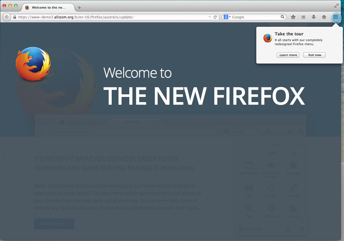
The web page users see when they update Firefox
2. Minimal Interruption for users
In contrast to new users who just downloaded Firefox, the challenge of designing an update experience for existing users is that they already have a task in mind when opening the browser and do not want to be interrupted. Instead of making every user go through a tour upon update, we decided to use a door hanger information bubble as a minimal barrier to tell existing users only one key thing about the new design: the location of the newly redesigned menu button. For users who are interested in learning more, the ”Let’s go” button will take them through an interactive tour of the new interface. For users who do not have time at the moment, they can choose “Not Now”, but by then, they should already know about the new menu and where to find it.
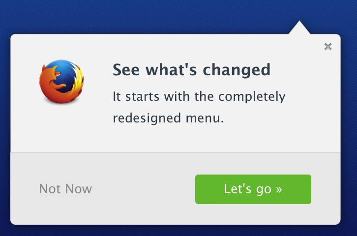
The door hanger bubble hanging off the menu button
3. Show, don’t tell
Show, don’t tell is a writing technique as well as an important design principle. The traditional way of introducing features in a product is using a web page with screenshots or pointing arrows that point out where a feature is. But if the browser is already open, why show yet another screenshot of the browser to talk about it? The most interesting and challenging thing about the update experience from both a design and technical perspective is that the website and browser can now talk to each other to provide a connected and immersive experience. This means that when talking about a specific feature or task in the web page, we can now highlight directly the controls in the browser interface to show users where that feature is. Users can also interact with the feature while learning about it. Through usability testing, we found that showing a feature in the browser also help users recall it afterwards, which resulted in more feature use after taking the tour.
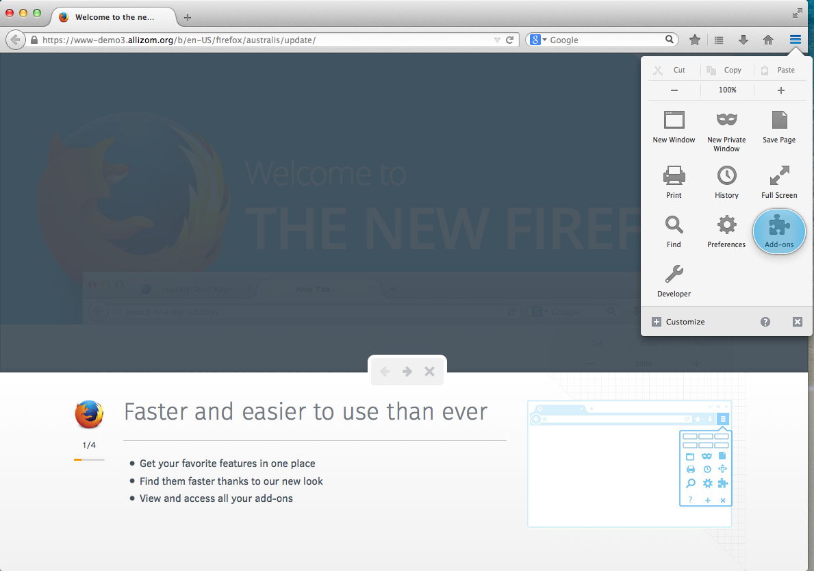
The step showcasing Add-ons in the tour
4. Serendipity
“Exuberant” and “Finely Crafted” are two key Firefox Design Values we always refer to when designing for Firefox. Other than making the update experience interactive, We also tried to add a little bit fun into it. After all, the tour should not feel like a dry lecture but a fun journey. For example, the highlight of a feature can change randomly every time you open the tour. Or if you close the panel in the middle of the tour, the “next” arrow will rotate into an “up” arrow and dock the tour at the bottom of the window. We are also experimenting different visual design and tone of the copy to make the experience as human and joyful as possible.
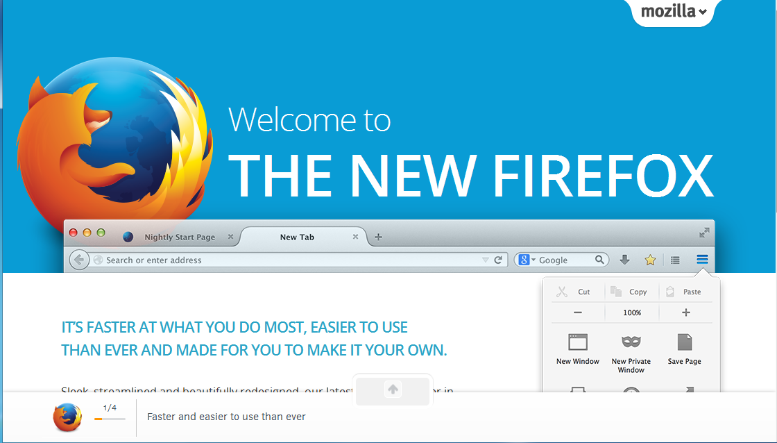
Docking the tour at the bottom of the page
5. ABT (always be testing)
Just like any other design, no one can get it right at the first time. That’s why we need to always be testing and keep improving. For this particular project, we used various methods to validate our assumptions and evaluate the design throughout the process. We gathered qualitative data early on through in-person interview and remote usability testing, as well as quantitative data in different release channels to measure our success.
The update experience landed in Firefox Aurora with Australis and an improved version of Sync. While we keep iterating on the design as well as other features in Aurora, try it out and let us know if you have any suggestions. The onboarding team is also working on an “unboxing” experience for new users who just downloaded Firefox. Stay tuned for more awesomeness!
tom jones wrote on
Zhenshuo Fang wrote on
Scott wrote on
rrayborn wrote on
Singularity Utopia wrote on
Charvin wrote on