Categories: General

Design Route A: The Eye

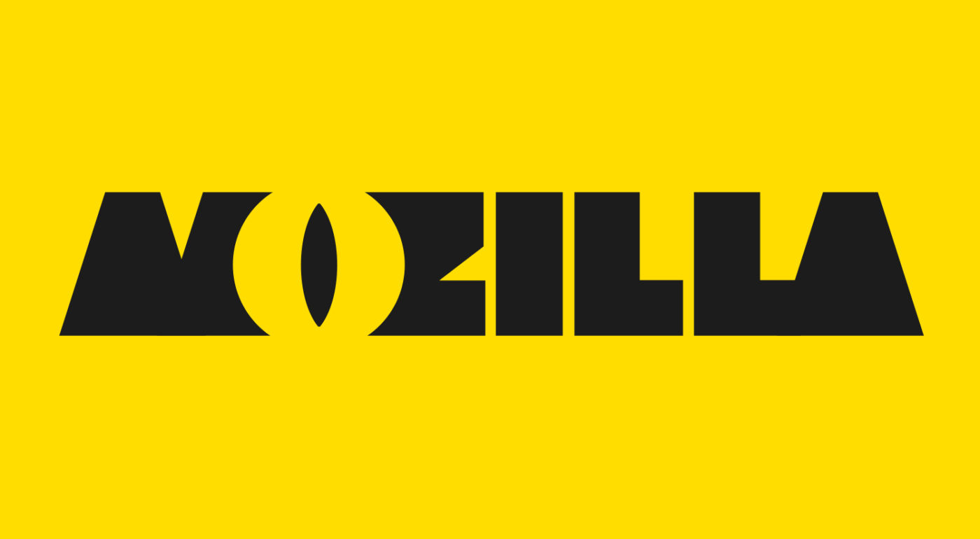
Even though Mozilla’s old Shepherd Fairey-designed dinosaur head logo is only used internally, not externally, there’s still a lot of love in the community for all things ‘Dino’. And there’s no escaping that the name of the company ends with “zilla.” What if we could find a way to use just part of a reptile in a dynamic new design?

This design stems from the narrative pathway known as The Good Fight.

The Good Fight

Sometimes you have to fight for what you believe in.
Mozilla believes in an open, equal, accessible Internet – for everyone.
One that makes us active creators, not passive receivers.
One that works for the benefit of the many, not the few.
We’re ready to take a stand, link arms with others who share our view of the future, and provide tools and opportunities for those who need them.
You can wish for a better web, and a better world.
Or you can get involved and make it happen.

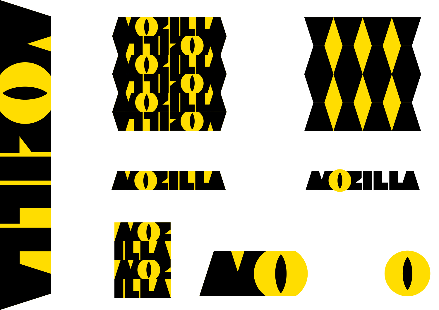
Click on the first image below to see how the logo might animate:

jb_Mozilla_design_pres_edit_3.key

jb_Mozilla_design_pres_edit_3.key

jb_Mozilla_design_pres_edit_3.key

jb_Mozilla_design_pres_edit_3.key

jb_Mozilla_design_pres_edit_3.key

jb_Mozilla_design_pres_edit_3.key

158 comments on “Design Route A: The Eye”

  1. Michael Sharp wrote on

    Love the imagination, but a bit Hollywood entertainment for a SF tech company. (I’m having fun BTW)

    1. Tim Murray wrote on

      That’s what we’re here for: you, having fun.

    2. tony wrote on

      This one is great, easily my favorite of all the options show thus far.

      1. Mike wrote on

        Also my favorite so far.

  2. Andre Williams wrote on

    I love love love the throwback here but I feel like this one sends off the wrong signals.

    Not only is it a little too similar to the design of Disney character Bill Cipher (which I’m sure was unintentional) but it also gives off a “big brother” feel. For a company focused on privacy, especially in this day in age where it’s such a huge concern, having a big, intimidating eye in your logo probably isn’t the best idea.

    1. Tim Murray wrote on

      Andre, I’m curious if a change in perspective might shift your opinion of The Eye? What if Mozilla were “watching out for you online.”?

      1. David wrote on

        First impressions are everything, Tim. This logo sends a creepy big brother message faster than any tag line can correct. Given the widespread fear of “they’re watching me”, the mind will attribute meaning to this without your help.

        1. Sebastian wrote on

          I’m definitely with Andre and David on this one.

          1. art guerrilla wrote on

            me too-ism x 2…
            the FIRST image that came to my mind, was Sauron’s all-seeing eye…
            AND, further, the idea that a disembodied eye with cat-like (godzilla, if you must) pupils is looking out for me, in a warning/danger yellow/black, and is supposed to make me warn and fuzzy, um, no, just no…
            further, kind of a tad ambitious to expect a new logo to advance all five aspirations (what, no ‘world peace’ ?) ALSO, the little throwaway line about being suitable for all types of media/purposes, etc is kind of an important factor; and -as you have shown- variations would have to be generated for various purposes -website vs letterhead vs videos vs business cards vs packaging vs…- and may vary substantially from the original -which they like- and the variation -which they don’t-, or vice versa…

          2. Joshua Grosso wrote on

            That was the exact first vibe I got from it. I understood the intention, but I can’t shake the “we see everything” feeling….

          3. Alexandre Abraham wrote on

            The same. Evil big brother feeling + Monsters Inc rip off.

      2. Ross wrote on

        Personally, having a giant eyeball staring me down doesn’t make me think “looking out for you.” I agree with Andre, and a few others in this thread who think of Bill Cipher, Sauron, Big Brother, an internet predator, or other things that want to eat/harm me, instead of safety.

        Eye contact like this is intense and more often than not, is threatening. Think of the last time someone other than a love interest made intense and unwavering eye contact with you. How did it feel? Probably like they were sizing up their prey, or wanting a fight.

        If the eyeball was looking slightly the other way and not aggressively engaging with the audience, perhaps this would be less intense.

        1. Ross wrote on

          Also, this shade of yellow is the color of caution signs, traffic lights, and fire. Black is the color of seriousness, death, and the night. Together, they are probably exacerbating the threatening feel of the logo…

    2. Brendan Saunders wrote on

      Gotta agree that the “big brother” impression was the first one I got here as well.

      It looks like the “Eye of Sauron” which also doesn’t convey the right messaging about the brand.

      1. Terry Eck wrote on

        This! First thing I thought of was Sauron. Not a good first impression.

    3. Sarah K wrote on

      I thought Bill Cipher too. (Which I will point out online conspiracy nuts automatically associate with illuminati)
      The color combo is also part of the issue as it screams “Caution” or “Crime Scene- Do not enter” tape.
      Over all, it was a fun concept to include the dino… but, at the same time people don’t much like being stared at.

    4. mg wrote on

      agree, with the big brother aspect.

  3. Dustin J. MItchell wrote on

    I can’t get behind this — the typeface is difficult to read, the color combination is jarring, and the eye shape is both creepy and oddly zygotic. The tilings of the logo look like posterized illustrations of broken glass.

  4. Joe wrote on

    I worry about the Sauron or Big-brother vibes from the big eye, and the color-scheme mixed with the ‘first vowel’ highlight gives off a distinct Caterpillar Inc. feeling.

    1. Dmitri GOOSENS wrote on

      > I worry about the Sauron or Big-brother vibes from the big eye

      That’s exactly what I felt…
      And that’s more or less exactly what M:// is not

      dGo-social

      1. thomas browne wrote on

        yeah but “M//” is like a mashup of all the other “friendly” corporate logos out there, IE blue helvetica, and we all know that behind the docile, offend-nobody look of these logos, there’s sharp-elbowed, monopolistic corporation, intent on deceiving you. I actually think that subconsciously, that’s the risk with “M//”.

        Not to mention that a primary stated objective of the re branding is to communicate that Mozilla is more than just Firefox, and the URL play in M// does exactly the opposite of that.

  5. Michael Kaply wrote on

    I like the throwback idea, but I just think this feels too much like a “Sauron” eye.
    It doesn’t have enough of the dinosaur to convey that this is a dinosaur eye.
    It feels too Monsters Inc. as well.

  6. Jason Hunt wrote on

    Monsters Inc.
    ID centred around the O – as in Opera.

  7. Pratyush Gupta wrote on

    Interesting play of letters, but can’t get the Eye of Sauron out of my head.

  8. joe mama besser wrote on

    too ominous.
    overall the concept sends a negative message of either a demonic, unapproachable beast or big brother overlord watching your every move. probably not the best connotations.
    also, as previously ,mentioned, focusing on th ‘o’ as the typographic device and extractable element is a branding misstep.

  9. Nicholas wrote on

    An browser with a reptilian eye logo? This is the browser “THEY” want you to use! Conspiracy theorist fodder.

  10. B. wrote on

    Immediatly had the feeling of being watched all the time, like an all-seeing-eye. A privacy concern, I guess we don’t want that.

  11. Gillian Kayne wrote on

    Wow — this is SO wrong. Seriously — if AirBnB had issues with their new brand — this is going to bring out a world of pain.

    It’s less eye and more ‘lady bits’

    Steer well clear of this route unless you want a LOT of vagina references.

    1. Pacifica wrote on

      Huh I was at first going with lizard people and thinking the open button was a sexuality reference but now that you mention it… ah yeah probably not the best silhouette. At least there is an animal reference and personalises the company. Perhaps not the best animal references though.

  12. Mike Martino wrote on

    This one personally attracted my attention right off the bat vs. the others. I’m a sucker to thin lettering which is why my choice here surprises me.

    I especially like the playful concept of the “eye” incorporation on the “o”.

    I’ve read the above comments and notice some people have correlated the eye or design style with Monsters Inc. or the Opera web browser, but ideally recognition is good, in my opinion, period. And almost every design will somehow be relate-able in someones eyes to something of previous creation – it’s inevitable.

    I’d love to see some variations of this exact logo altered. Looking forward to the next step!

  13. Colin Hall wrote on

    Certainly a bold concept. It immediately grabs attention. But in being so bold and perhaps monolithic, it starts to feel a little too aggressive to me. Staring is an inherently confrontational act, and it also carries a lot of negative connotations (surveillance a la 1984, Sauron, etc. that people have mentioned). While I’m not a fan of the whole “reminds me of ____” comments because everything can remind anyone of anything based on experience, it’s hard to get around that idea of discomfort when someone stares at you. That one is pretty universal. I’m just not sure it strikes the right tone for the company.

    While trying to hold on to your history is a good thing, this feels so drastically different that I’m not sure people would make that connection. There just isn’t enough of that equity retained. For instance, once the eye gets broken out into the character with the hands, it loses the context it once had and becomes something else entirely.

    I applaud the stones behind this one. Perhaps with some tweaks to the applications or perhaps the color palette (I’d also like to see more integration between the harsh angles of the letters and the circular eye), this could be a really unexpected solution.

  14. Halleh Tidaback wrote on

    The black and yellow scream ‘warning’ or ‘caution’ to me. I think that may be why its giving off a Big Brother or Sauron feeling. What if the color was one that conveyed safety/security/helpfulness instead?

    I love it when the eye gets playful and is used in the extended marks. It feels human and silly. I’d lean into this approachability. It makes me connect, relate to and like the brand by personifying the eye.

    The diamond pattern feels like its gone too far. I see where it comes from but seems to distract.

    I think the extended branding will be critical in making this an approachable and ‘Mozilla feeling’ option. The complimentary type will need to be friendly and inclusive, the color much more inviting, and I’d even explore softening some of the harsh corners overall (just to see how it feels).

    I do love that this speaks to the origin of the Mozilla name (mosaic and Godzilla) in both the patterns and the eye.

  15. Mike Wazowski wrote on

    Hey….it’s Mike Wazowski….from Monster’s Inc….me, Sully and the rest of the guys at the compnay are pretty unhappy about you ripping off our intellectual property….we don’t want to get all legal on yo ass, but if you go ahead with this we can guarantee we’ll scare your kids every night until your begging for a decent nights sleep…you have been warned…

    Regards,

    Mike “Evil Eye” Wazowki

  16. iArafath wrote on

    Actually the best concept out of all the designs. It screams Mozilla, Godzilla and all the big movie monsters out there. And I wan to be right behind it. Perfect!

    The textures are interesting but I think it can be worked on. Icons specially all hands it seems like it’s loosing the monster concept. If I were you guys I would stick to the huge monster concept all the way. Why not a destroyed Mozilla headquarters for maker party?

    It works great as a faviconb and reduced logo too.

    Have more fun with it, let it loose!

  17. Allen Meyer wrote on

    I love brand mascots and this has so much personality, BUT, the whole conversation is going to be about that O. Is it an evil eye? Is if the Eye of Sauron? Is it big brother? Godzilla? It’s Mozilla: Watching out for you.

    Let me just say, sometimes a little controversy is a good thing.

  18. Timur Uzel wrote on

    Looks like Monsters inc.

  19. PLC wrote on

    Maybe a little to close Opera’s logo.

  20. Manon wrote on

    I like the history aroung the eye but I have an huge issue with the colours, too Batman or biohazard. They scream danger because of the second.
    I also find the font difficult to read.
    The facebook pages with “Mozilla Brasi” are nice with the colours and I really like the paterns on those pages.

  21. Sara wrote on

    This is the one! ?

  22. Bouv wrote on

    Typography and eye looks like Monsters, Inc movie.
    But eye only feel like I’m always spy by Mozilla web browser.

    These two different color (black and yellow) is too agressive for my eyes, and it’s difficult to clearly read “MOZILLA”.
    For me it’s clearly not the best design.

  23. nicolas wrote on

    I like how it reminds of Mozilla, the dinosaur. I like how ‘alternative’ it feels, a little like how Mozilla was looking in the late nineties, but without the soviet constructivism favour. The yellow-black palette is a classic but always working one for the activism note, even if it will take some time to associate it as Mozilla.

    I’m not talking about details in the execution, because it’s probably not very relevant at this point in the project.

    However it looks evil. At best as a wild animal, at worse like a Big Brother-like entity. Which is the whole opposite of what Mozilla is. I’m not sure this is the best option.

  24. Bart wrote on

    Reminds me of Opera

  25. Saige Fraiha wrote on

    At first I found myself wondering if this is what a firefox’s eye looks like. Eventually it dawned on me that this isn’t just the browsers logo, but there is a strong connection for me and many others between the Firefox and Mozilla.

    All the comments about big brother meets Disney are true, however out of all the directions presented this is the strongest one.

    Play on your ‘zilla’. Have fun. Your community wants to wear fun things and do fun things on the net.

    I find the yellow black is alot like a police perimeter. Perhaps a change from black to white and a brighter firey orange would help the image out and leverage existing brand identity connections. Multi colored logos are very happening right now, I’d say even for the next 5-10 years.

  26. Darío Pérez wrote on

    I came to the site and I couldn’t not to associate this proposal with Mozilla. As a tech user I loved it because it transmits much of Mozilla, but even so it doesn’t fit. I feel it needs a bit of humanity.

  27. Vanessa J wrote on

    I know this might be a little far fetched, but the logo makes me think of something that has to do with animation instead of what it’s supposed to.

    Also the O looks like an eye, doesn’t make me feel at ease with using a browser that constantly reminds me it’s “seeing” everything i’m doing.

  28. Zoraida wrote on

    It does look like surveillance… That makes it feel not approachable.

  29. Bea wrote on

    My advice: drop it
    You’ve got better proposals

  30. Abdi wrote on

    This design is the exact opposite of openness and inclusiveness. The eye, already has certain connotations in the global psyche, whether it be the eye of Sauron, the all seeing eye, the anti-christ, the one-world-order etc. I believe this design, even though cheeky, sends the wrong message – that of being watched. This is the last thing I’d like to associate with Mozilla. The colours are also garish and harsh.

    This might be to the liking of a western teen: it’s edgy, funky and colourful. But it’s also harsh, childish, immature and not in keeping with openness and the maturity required to stand up to the clean-cut and universal appeal being fostered by the likes of google.

    all-seeing-eye

    1. Tim Murray wrote on

      Thanks for sharing your thoughts on The Eye and the use of eye iconography through history, Abdi.

  31. Victoria Black wrote on

    Despite all the “eye”, “watching”,”monster” thing – I like this one. It uses the strongest contrast of all- black and yellow, and illustrates the image that I always had in my mind when I was pronouncing Mozilla/Godzilla. It just feels right.

  32. M wrote on

    The eye feels creepy to me, reptilian, predatorial, in a bad way. I feel watched, not proteced. The yellow is not bad.

  33. John Adams wrote on

    Sorry, this is a non-starter for me because it looks way too big-brother-is-watchingish to the extent it is quite sinister.

  34. Erika wrote on

    Screams out “danger”/”caution.
    Color scheme reminds me of old Yellow Pages branding.
    Unpleasant to the eye.

  35. Lisandro Lorea wrote on

    This one looks extremely threatening. “Mozilla is watching you” is what it seems to be saying. The one for the maker party is kinda creepy.

    Compare this to the Monters Inc logo which is similar but has a round pupil. It makes a huge difference.

    I know about the history of Mozilla but most people don’t and they will just see a very threatening lizard eye looking at them.

  36. CP wrote on

    This design makes me think Mozilla is watching me! I use FF for *privacy* :|

  37. PS wrote on

    All these ideas look horrible. but by far this is the worst.

    Looks like a cross between MonstersINC and Sauron from the Hobbit, but illegible.

  38. christina wrote on

    Strong. Dynamic. Energetic. Bold. Fun. I love it.

  39. offbeatonpurpose wrote on

    I’m kind of with Abdi about the eye of Sauron take however, I also got the impression of a lock and key. “Mozilla unlocks the web while offering a level of privacy unrivaled by others.”

  40. Walter Milliken wrote on

    One of the best ones in my opinion — the name is clear and understandable, and it conveys “zilla” very well. My only problem with it is the implications of the eye: “Hey, we’re watching you” is what it says to me. Not sure that’s the message you want to convey; that’s much more Google’s thing…

  41. Jon D. wrote on

    Love it, probably my second favorite after the :// design. Love the colors, love the playful tone (though I can see why some people think it’s maybe a little too playful), love the checkerboard branding.
    The eye did not make me associate the logo with surveillance or Big Brother, it achieved it’s intent; the first thought it invoked in me was lizard/godzilla. Never even thought of any possible surveillance connotation until reading comments here.

  42. Jesse Wilson wrote on

    Fun! ❤

  43. Liam wrote on

    Besides the whole Great Eye of Sauron. The shirt with an eye reminds me of Monsters Inc. and not Mozilla.
    The yellow reminds me of danger, radiation, etc.
    Black and yellow together remind me of a generic gas/petrol company.

  44. Liam wrote on

    If you don’t get the attachment, I circled the top middle image from your second graphic.

    It just looks like bunch of chains. I know there is a word Mozilla somewhere in there but with the look of chains and the Great Eye, I just can’t get past the filling that the big brother wants me in chains.

    20160820_205733

  45. Jack Wrenn wrote on

    This branding has so much personality. I like how the tagline ‘Looking out for you’ carries so well across so much of what Mozilla does. This is the design I want on a t-shirt, on a sticker on my laptop, etc. It lends itself to cute mascots you want to root for. It’s bold. It’s beautiful. It demands attention. It refuses to be forgotten.

    This looks as evil as “Mozilla” sounds. Which is to say: very little. Like a little spooky, *maybe*? Definitely not an insurmountable amount. A momentary shock is a small price to pay for exciting and memorable iconography.

    This design knocks it out of the park.

  46. Jeremiah wrote on

    This is my least favorite proposal. It evokes a bad association with Norton AntiVirus. https://upload.wikimedia.org/wikipedia/commons/6/6d/Norton_av_logo.png

  47. Matthew Brooks wrote on

    As other have said here, my first impression is ‘big brother’ or ‘The Eye of Sauron’. While I like the idea that Mozilla is watching out for privacy interests, I think that the message may be lost in the pervasive symbolism that the eye brings with it.

    As for the marketing aspect, looking through the proposed items that may end up on the market, I can’t help but see something that looks as though it came right out of Monsters, Inc. Mozilla is a serious player in the industry and I can’t help but think that this particular logo will detract from the intended message.

  48. Margo Cerno wrote on

    This is badass. As a brand it reminds me of MUGATU and Aku from Samurai Jack.

  49. Anant wrote on

    Really like the idea, but I feel like it seems too much like an evil corporation in a movie. Almost a big-brother like implication with the eye looking over you. I think some of the other designs are much more suited to the Mozilla brand

  50. Andrew A Tatge wrote on

    I like the “Good Fight” origin of this direction. It’s powerful and bold.
    On the other hand, I agree that the yellow (before anything else) made me feel wary of Mozilla. Rather than think I had found my champion/comrade to fight the good fight, I thought: “Caution, monstrous things, keep at a distance”.

    I like the reptilian letterforms, especially given the origins, though the eye is loaded with meanings that others have remarked on. Surveillance wasn’t my first thought, but it is easy to arrive at.

    I’m not sure how I’d resolve animality/monstrousness with user advocacy. Making the beast unyielding while also non-threatening for users is a doozy. Other intellectual property (Monster.com, Monsters inc.) might eliminate greens, purples, and blues.
    Are there other ways to convey unyielding solidarity or perseverance?
    Is something red and constructivist a too on the nose or similar for a rebrand?

    To be honest I had somewhat forgotten that Mozilla’s red dinosaur until reading this brief, as well as the “-zilla” connotations.

    I’d be interested in seeing other ways ferocity or animality could be played up without the eye, or a cautioning yellow.

    P.S. Fire ants? I guess that doesn’t jive with -zilla. Nevermind.

More comments:1 2 3