Categories: General

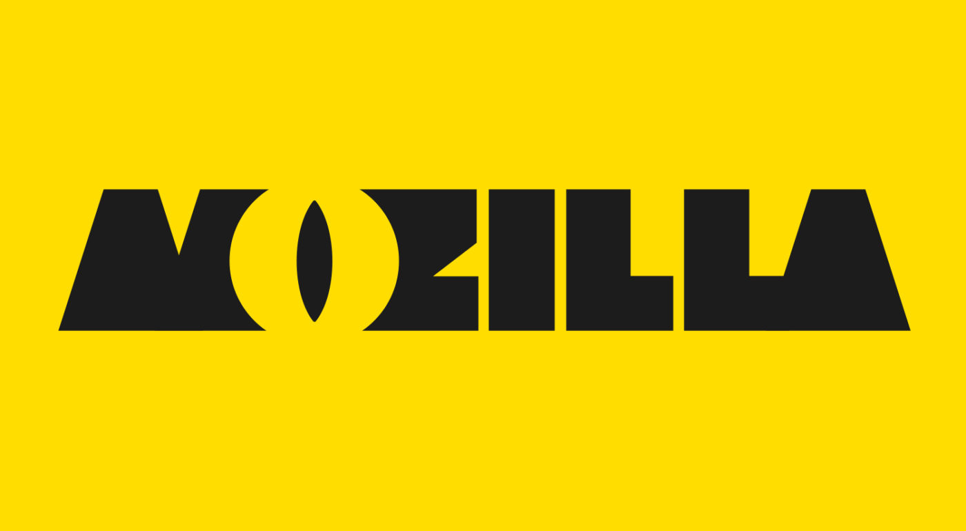
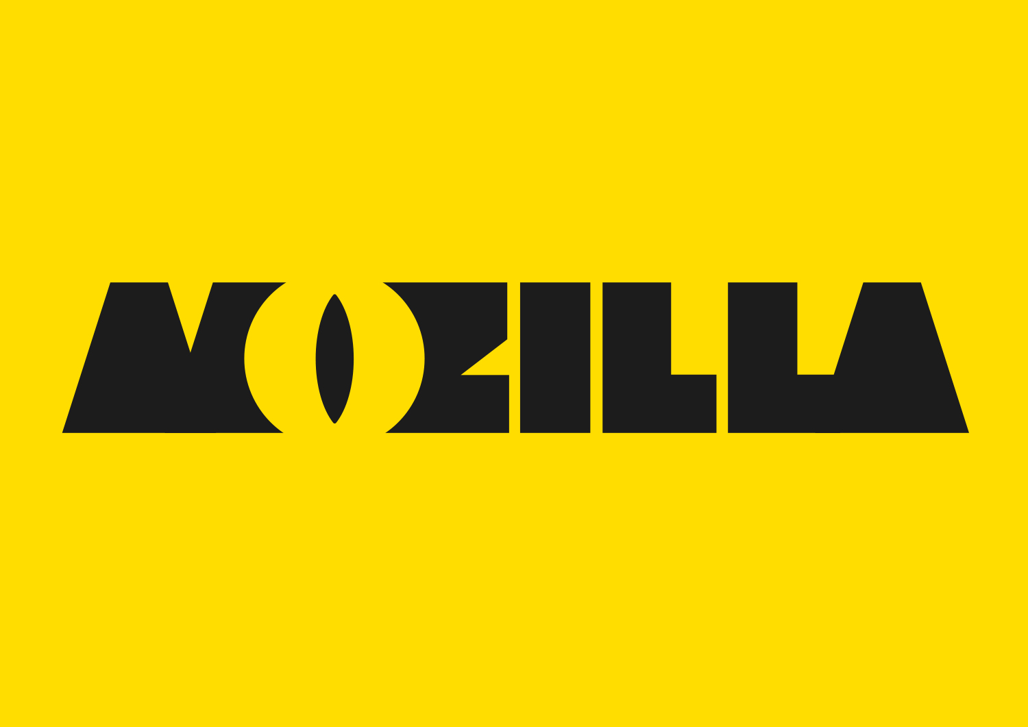
Design Route A: The Eye

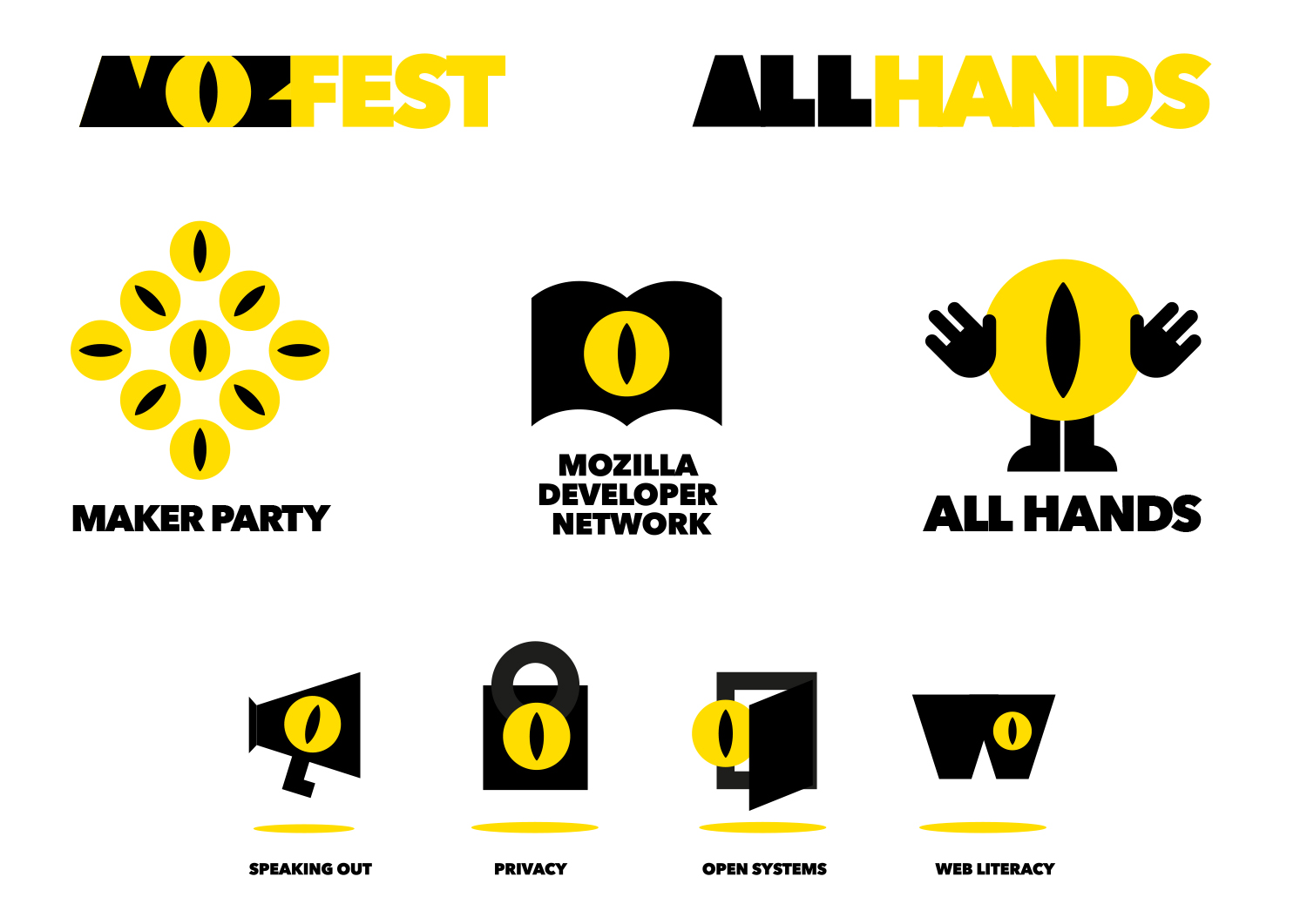
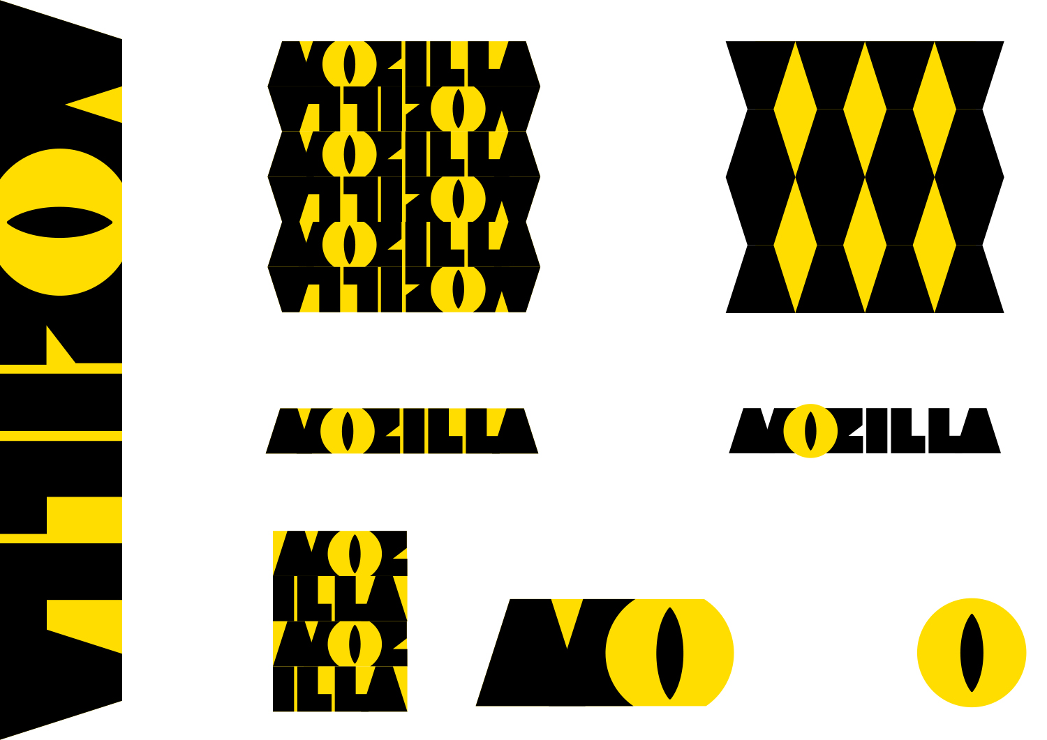
Even though Mozilla’s old Shepherd Fairey-designed dinosaur head logo is only used internally, not externally, there’s still a lot of love in the community for all things ‘Dino’. And there’s no escaping that the name of the company ends with “zilla.” What if we could find a way to use just part of a reptile in a dynamic new design?

This design stems from the narrative pathway known as The Good Fight.

The Good Fight

Sometimes you have to fight for what you believe in.
Mozilla believes in an open, equal, accessible Internet – for everyone.
One that makes us active creators, not passive receivers.
One that works for the benefit of the many, not the few.
We’re ready to take a stand, link arms with others who share our view of the future, and provide tools and opportunities for those who need them.
You can wish for a better web, and a better world.
Or you can get involved and make it happen.

Click on the first image below to see how the logo might animate:
jb_Mozilla_design_pres_edit_3.key

jb_Mozilla_design_pres_edit_3.key

jb_Mozilla_design_pres_edit_3.key

jb_Mozilla_design_pres_edit_3.key

jb_Mozilla_design_pres_edit_3.key

jb_Mozilla_design_pres_edit_3.key

158 comments on “Design Route A: The Eye”

  1. Kris wrote on

    This just is too similar too the iconography and color scheme of two right-wing parties in Belgium: Vlaams Belang and NVA. Please stay very far away from this.

  2. Jack wrote on

    Blue instead of yellow would be less frightening and more eye-pleasing. This design is by far the most iconic and simple design which makes it the best, but the color scheme of black and yellow is too much like CAT and other construction companies. Blue, white, and black would be much more likeable and easy on the eyes.

  3. c lopez wrote on

    This is the less ugly, but I’m pretty sure you need to stay away from the big eye watching everything idea.

  4. Tiber wrote on

    Mozilla is watching you! Bad! Modify the M or the Z, stay far far away from the O.

  5. 455man wrote on

    I like this the best. The Z after the eye looks like a dino’s mouth, which I guess must have been the intent : )

  6. Lluc Sumoy wrote on

    Awesome design, has some fun just like the foundation monster, but the “O” letter recalls Opera. For most people, Mozilla is either “M”, or the old navigator “N” (for nostalgic pioneers only)

  7. Enrique Peña Hernando wrote on

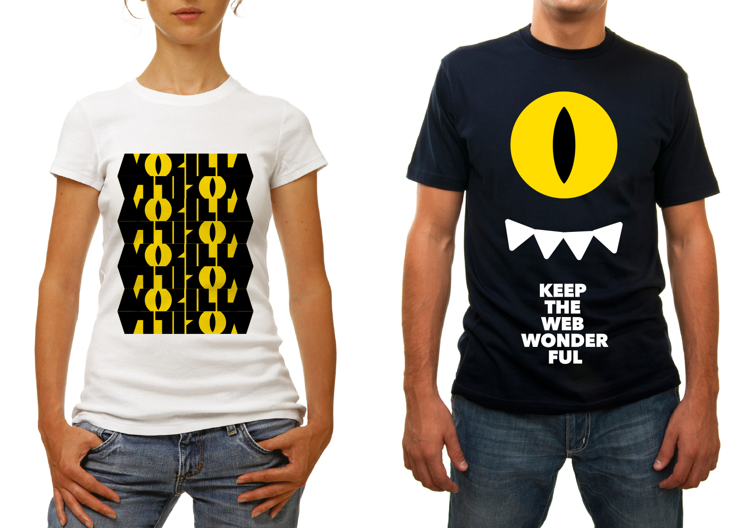
    It’s the best of the Seven proposals. I would buy that T-shirts!

  8. Ruedas wrote on

    Commented on the main post already but since it was about this design, I’ll put it here too. This design projects confidence, and more importantly competence. It’s simple, direct, bold. It’s the opposite of sprawling, the opposite of ineffectual. (Which, if it wasn’t clear in my earlier comment, are two pieces of baggage Mozilla needs to shed. Shed… like an outgrown reptile skin!) The opposite of the governing-board-meeting-at-the-local-food-co-op vibe that plagues all the other 6 designs. (Trying to please everyone and offend no one – and winding up accomplishing nothing. I’ve been to those meetings.) And it has a Godzilla reference to boot. More Godzilla please. Mo’zilla. Is it bad-ass? YES IT IS. Do you want Mozilla to be more bad-ass, more focused, more effective? I sure do.

    The reptilian eye is really scaring people huh? A random perfectly-nice person piloting their SUV down a street is way more scary to me and poses the far greater danger. Yellow and black means caution, does it? Sure, to people who spend their lives obeying signs. Just think of it as a vagina then.

    The guy who “surveils” you is going to arrive at your doorstep sporting a lizard eye? No, he will sneak in using a smiling, friendly-looking Google Doodle. Mozilla has already erred by trying to out-Google Google when they need to be not just an alternative Google but the anti-Google. (Let Facebook out-Google Google.)

    This logo would make people take notice and re-think Mozilla. As being focused and competent and having some cojones. People doing right are the ones who SHOULD be bold.

  9. darkblackcorner wrote on

    +1 on all the Sauron/Big Brother comments.
    However, I do love the typography used here!

  10. thomas browne wrote on

    I love this look which reminds me of socialist Brutalist architecture and in my opinion, captures the mood of the world at the moment, and the anti-corporate feeling which I feel is an intrinsic part of the Mozilla brand.

    I love the complete lack of any blue, which is default choice of all corporations, and is an intrinsic part of Twitter, Facebook, Google, and Microsoft, not to mention 50% of hedge funds. Hard black on strong yellow also harks to construction themes, you know, Caterpillar, Komatsu, etc, which suggests hard, honest, work, not pushing financial numbers around.

    The thick lettering is a wonderful contrast to the current fad of super-thin typography, and in which IMO is going to look very dated very fast. As the iphone sinks, so will its themes. This is definitely a standout, forward looking, new-definition design language for the FUTURE, not the past. Contrast that with the “safe space” -style ethnic theme also on display which in my opinion is the worst on display, closely followed by the origami which is soooo 2014.

    The only question is the eye. I like it a lot, but many will say it reminds them of big brother. When it blinks, I think it actually looks quite friendly, like a wink, and that’s good, but it will face some controversy. Perhaps it needs to be shown that it’s a “who watches the watchmen” kind of eye in which case it would be great.

    Best best logo I have seen like, for years.

  11. geptrizol wrote on

    I agree it’s threatening – not only because the Eye, which has been discussed in detail, but also because the bold font and color choice reminds me of Caterpillar. Which is fine if you want everyone to think you make big, heavy, and slow stuff.

  12. Márcio Ramos wrote on

    I love this design, and it was the first to catch my eye. No pun intended.

    I don’t care about the color, but I think this is the best logo that can go monochromatic, which is very important in several applications.

    Since it is open for refinement, I believe this is the best logo so far!! Love the inspiration which brings out the “zilla” part in Mozilla!

  13. Redmess wrote on

    I think this logo feels rather monolithic and lumbering in its current form. Perhaps if the letters had a bit more texture to them, they wouldn’t feel so massive. This could also tie in to the dinosaur theme.

  14. Blokhead wrote on

    First impression looks fun and ‘eye’catching(!)
    But afterwards I just can’t help to relate to Monster Inc. – big M + big eye… Sorry :p
    And then I have a second thought – suddenly linked to the ‘Night Safari’… Might be the combination of yellow + black, which are the colours of NG, or the wildlife….
    Anyway, FUN would be the keyword. I love how versatile it is, especially the application of the striking yellow eye’s icon (!)

  15. kz wrote on

    My first impression of this logo is that is is very hard on the eyes and difficult to read. The emphasis on the “eye” is very disconcerting. When I saw some of the subsidiary logos that emphasized only the eye, I simply gave up on even trying to improve on it. A logo in all its variations should clearly identify the company even to the uninitiated. This logo abjectly fails tht test.

  16. Hardy Cherry wrote on

    My first thought:
    Mozilla, now a division of Monsters Incorporated.
    Second thought:
    Mozilla, spying on you for an open web.
    Of all the designs though, I like this the best if the o were fixed so it looked like an o instead of a spy eye or a monsters inc logo.

  17. Jarrod wrote on

    The first impression with the color scheme makes me think of a construction company.
    The eye looks like a flesh light. There will be comparisons to female anatomy.
    The variants of the design are too busy and the readability of the font is very poor.
    The eye will draw criticism in regard to privacy or Mozilla watching customer’s browsing.
    Others in this comments have more eloquently expressed many of the design’s many other downfalls.

    1. jgreenspan wrote on

      Thanks for sharing your thoughts, Jarrod.

  18. Naylan wrote on

    OK, this reinforce the pun Mozilla/Godzilla. But the pun is already in the name, this logo doesn’t convey anything more than what is in the name. For those who don’t know what Mozilla is, this logo doesn’t help them.

    Furthermore, I find this logo aggressive. I’m not sure this is a feeling you want to convey.

  19. Mike Thompson wrote on

    I like it. Maybe the yellow a bit too intense? What if it was green?

  20. Declan wrote on

    In the US, black and yellow are use to denote things that require caution – for example, black and yellow is the color of the tape strung around crime scenes.
    Not something I would associate with Mozilla – crime scene, caution tape, stay clear, do not approach, don’t go near…….
    It’s also hard discern the actual words – at first glance it looked like morilla to me.

  21. Thomas van Diepen wrote on

    This one is too simple and has no depth. Does not do Mozilla right.

    1. Thomas van Diepen wrote on

      I now see the Godzilla association and I like it :)

  22. JP wrote on

    Don’t use this eye. It reminds one of the Eye of Sauron, or worse yet, the front of an Ford Edsel.

  23. Walter Tizzano wrote on

    This is by far the best design among the proposed ones: it’s smart, captivating and simple enough but still very recognisable.

  24. rugk wrote on

    In contrast to others I don’t think the eye is so bad – at least I have not associated it with Sauron or so before reading the comments (now I do, damn… ;-) ).
    However I think I have seen this color scheme – black and yellow for another NGO already. Just don’t know where…

  25. Paco Núñez wrote on

    Too “flashy” also, i can’t really read “mozilla” anywhere

  26. Silvio de Leon wrote on

    It looks like Caterpillar company colors, how about experimenting with a different combination of colors, like red, black and green for the eye. Or the original colors orange, yellow and blue.

  27. Jorge A Vazquez wrote on

    While this one may feel like a ‘right fit’ because of the internal use of the dinosaur, because Mozilla sounds like Godzilla, or because you believe you are fighting the good fight, it really is not. The colors are wrong because Mozilla has more to do with foxes than it does with bees. Let’s not forget Symantec beat you to the ugly yellows years ago. The eye is wrong, are you watching what I am doing while I am using your apps? Creepy! And the whole throwback concept doesn’t do much for an Internet company, does it? This logo is only saying “We are yellow, old, and creepy!” Yay! That’s just the kind of company I’ve been waiting for since the beginning of the Internets.

  28. Satrio wrote on

    Lovely concept, but the M ZILLA type is too blocky, illegible, and distracting you from the O-eye. Also if one sees a browser with that O-icon, one might think it’s an Opera bootleg. (I know it’s Mozilla brand and not necessarily Firefox icon, but I guess it worths mentioning.) I’d rate it #3.

  29. lehasb wrote on

    In my opinion, garish and angular, but ultimately that’s a branding decision. More identifiable than all the abstract geometric options.

  30. Hagen Mahnke wrote on

    My first impression was definitely the Eye of Sauron and being watched. A good look for the NSA, not for Mozilla.

  31. Alison wrote on

    I’m not a big fan of yellow and black. Design concept is sound, though.

  32. Charlie wrote on

    I love the more whimsical nature of this logo, but the green and yellow is kind of harsh for me. Friendlier monster-tones, please! :)

  33. Rob wrote on

    Easily my favourite! It has more character than any of the other choices, and is the only one for me that makes a clear connection with the past and with the name.

  34. Blake Gonzales wrote on

    this reminds me of the movie monster’s inc. makes mozilla look like it’s for kids. Not impressive

  35. Jürgen A. Erhard wrote on

    Hard to read. I like the ref to the big lizard, but… that’s about all I like here. Too block, too “brutalist”.

    Also… black and yellow. Bees? Thinking of Kill Bill too. That rhombus-design is also very bavarian. :D

  36. brendan wrote on

    my favorite of all the options. bold and uncomplicated.

  37. Gabriel Barbosa de Carvalho wrote on

    I liked the concept of art that just because it reminds me of the eye velociraptor jurassic park or even the godzilla.
    As for the idea that “you are being filmed,” I do not believe in bad impression, for me it is something for people who believe in conspiracy theory.
    Returning the art of logo, even enjoying it, I think it still needs some adjustments and improvements, but for an initial draft, has started well.

    tumblr_midpwyNZxx1r1n5pqo1_500

  38. Sherman Wang wrote on

    The font isn’t really intelligible, and the eye is an immediate turn-off — I agree with others completely on it invoking the Eye of Sauron more than anything else. Sure, after seeing it in different contexts beyond the main Mozilla logo it takes on a bit of playfulness, but I doubt most people can get beyond the feeling of “big brother”.

  39. The Watson wrote on

    First thought was the all seeing eye, then the teeth & I thought Monsters Inc. Mozilla Monster has been lurking since the birth of the internet. I would say this is my second choice. Everyone can relate to an eye & a creature… Colors are decent…

  40. Andy wrote on

    To be perfectly honest – I really do not like any of the design choices. Some seem too modern/Picasso esque, others feel like a child would have drawn them, and as noted for the ‘eye’, I too think it is ‘Big Brotherish’. While modernizing a brand in a Windows 10 world is unfortunately a ‘must do’, perhaps such a radical shift is not the best course of action (Windows 8 Start ring a bell?). Maybe a more polished/updated current logo would be in order. That way, it retains its familiarity with established users/contributors while still having the ability to draw new interest. If I had any artistic ability, I could perhaps better show you what I mean, but sadly I do not. Thank you Mozilla for all of your efforts and products (Personally that would be Firefox and Thunderbird) that have made a positive impact on the web and others.

  41. Tobias wrote on

    The eye is nice and recognizable. Would no doubt make for a great movie poster. The animation would also work well as a splash screen (but who wants to have those anymore?).
    For everything else, I am not so sure, though. The black and yellow color theme just doesn’t work everywhere.

  42. Muhammad Abdullah wrote on

    The main text looks “OK” but why there is an O? It looks like Opera browser logo or an O with an Aligator eye.

  43. Alex Ng wrote on

    Better the eye than nothing but it could be a little more dino and less typo. Not only am I emotionally attached to the old tyra but the new designs reflect poorly what mozilla stand for me…whatever. When deviantart change its fella for a symbol, I was totally supportive because the colors where still dA, the symbol is really well thoight. IMHO.

  44. Scott wrote on

    Already feels a little dated and a little too quirky/rugged. Reminds me of something I would see for a line of mountain bike gear.

  45. Cory Koski wrote on

    Big Brother, Iluminati, Sauron, Godzilla… I’m not a fan of this logo because I don’t think of Mozilla as a beast.

  46. Endyl wrote on

    This would be my second favourite, if not for the much mentioned ominous eye impression. The tiled versions look a bit too busy. If these two aspects can be improved, this can be a great choice.
    Color theme variations would be interesting to see, if this makes the next round.

  47. Nathan Demick wrote on

    Within the nerd community, first thought is “Eye of Sauron.” Outside, I’m not sure the “O” provides any sort of meaning. I think the mental gymnastics to derive “Mozilla -> Godzilla -> Monster Eye” are too strenuous. Black and yellow are frequently considered “warning” colors, with negative emotional connotations.

  48. Stephen Robinson wrote on

    It has personality but personally just makes me think of spying.

  49. Michael wrote on

    So I went from the bottom up and ended on thsi final logo. This guy nailed it”First impressions are everything, Tim. This logo sends a creepy big brother message faster than any tag line can correct. Given the widespread fear of “they’re watching me”, the mind will attribute meaning to this without your help.” It’s lord of the rings in 2d, big brother. there is too strong of a subconscious emotional connection to being the prey and the reptile hunting you.

  50. Eric Shepherd wrote on

    This is an interesting notion, but the color is too much. Having a logo like this (and the site design color choices this would force) would be blinding when trying to read a page, especially if we wound up having to go this way on MDN. Reading docs for hours on end with that yellow would give me a headache. :)

    1. Eric Shepherd wrote on

      I forgot to say: also, the eyeball imagery all by itself as used on the icons and such is a little creepy. :)

More comments: 1 2 3