Categories: General

Design Route A: The Eye

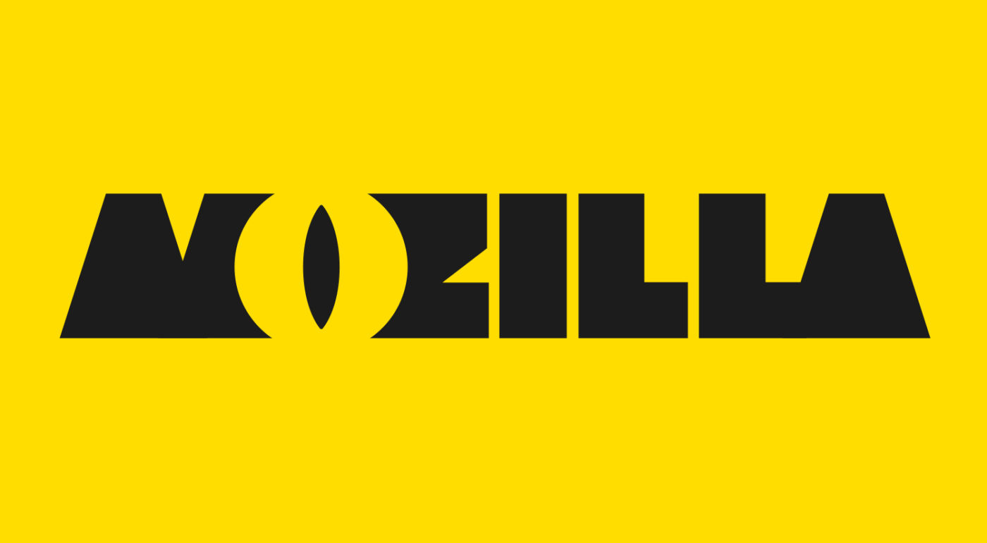
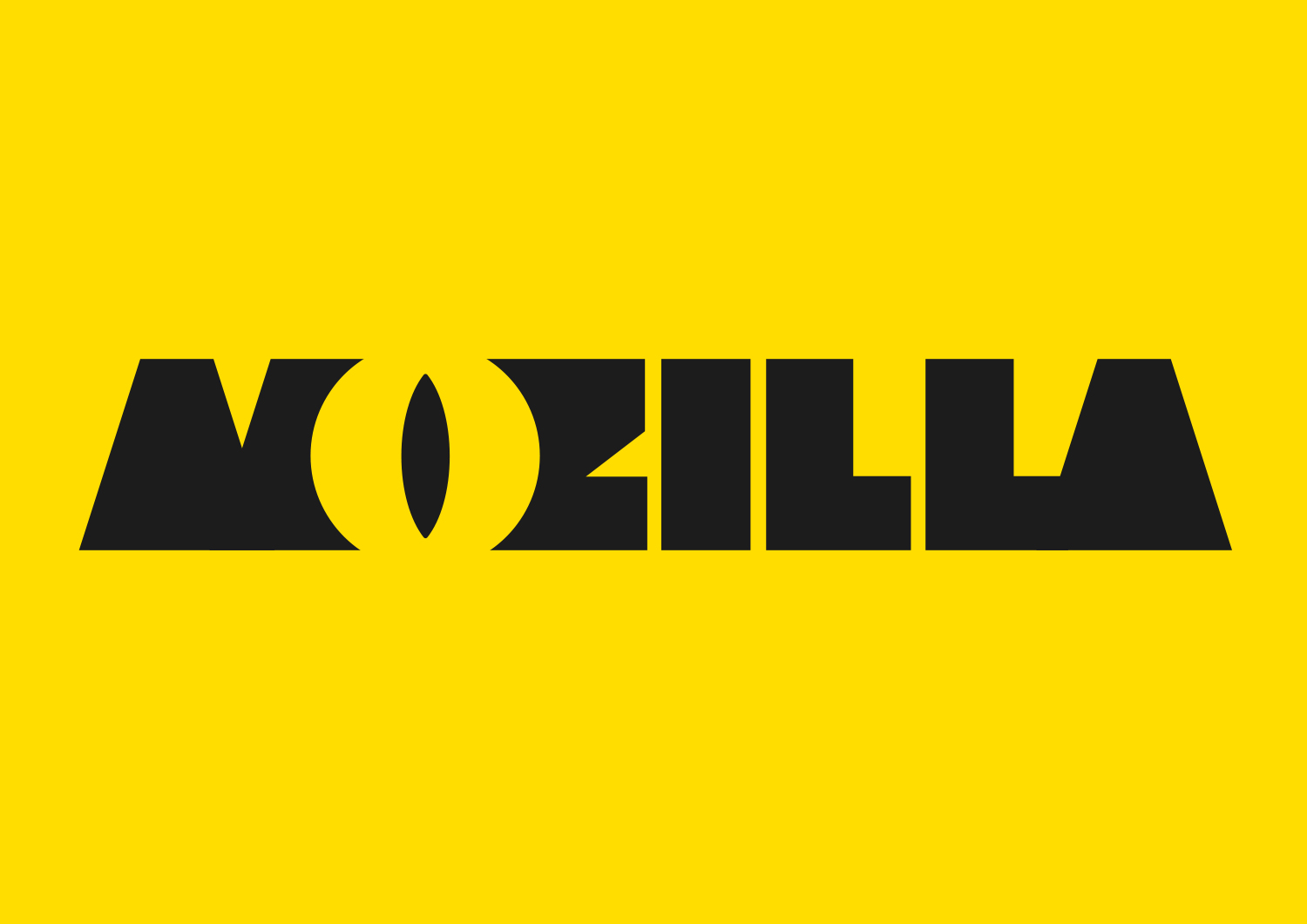
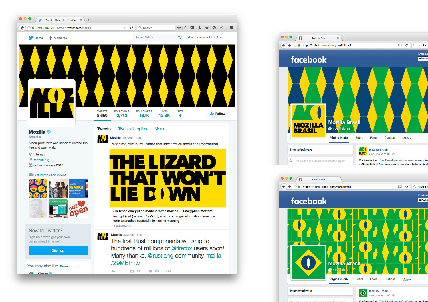
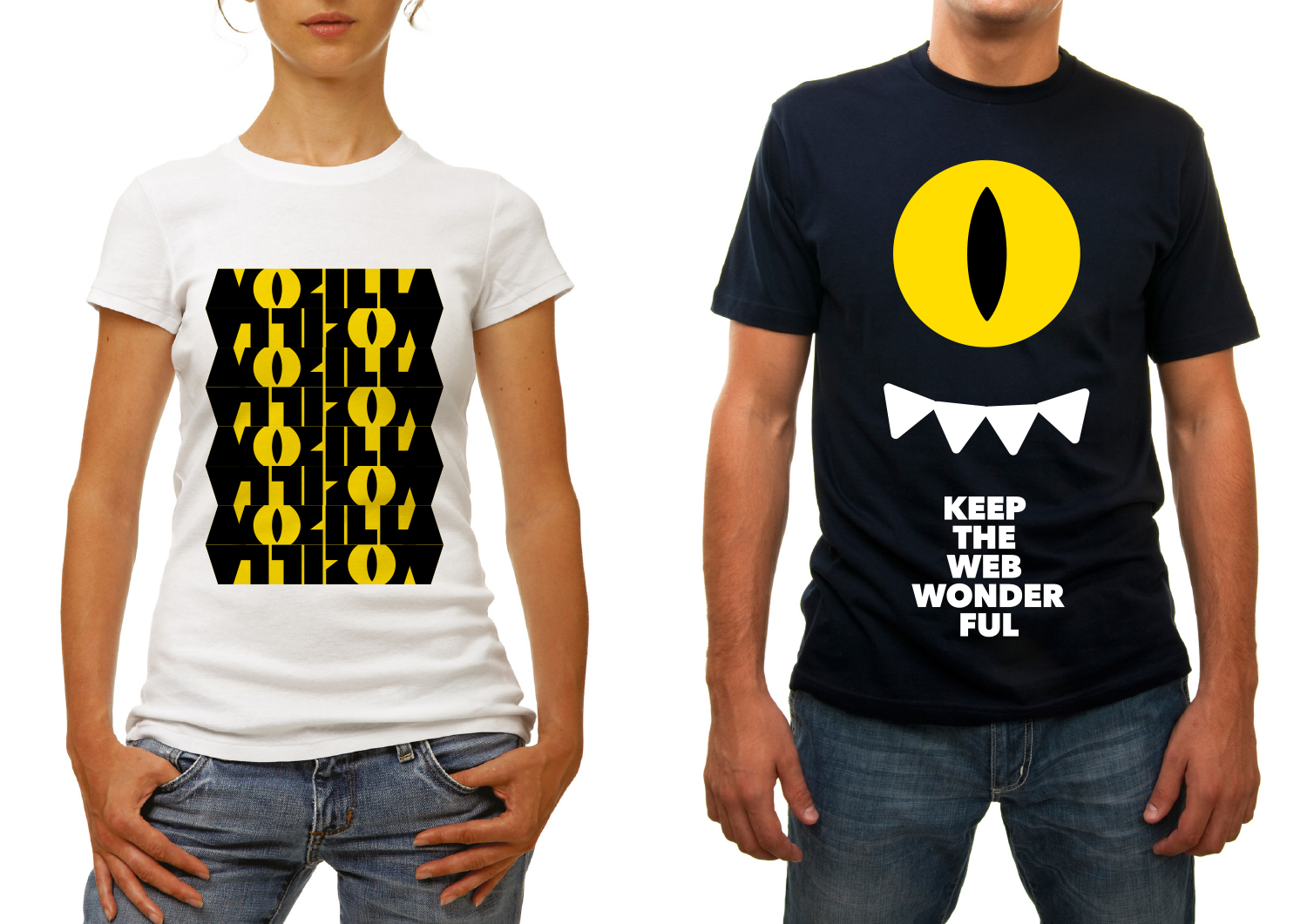
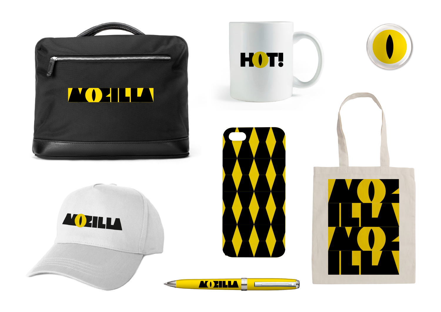
Even though Mozilla’s old Shepherd Fairey-designed dinosaur head logo is only used internally, not externally, there’s still a lot of love in the community for all things ‘Dino’. And there’s no escaping that the name of the company ends with “zilla.” What if we could find a way to use just part of a reptile in a dynamic new design?

This design stems from the narrative pathway known as The Good Fight.

The Good Fight

Sometimes you have to fight for what you believe in.
Mozilla believes in an open, equal, accessible Internet – for everyone.
One that makes us active creators, not passive receivers.
One that works for the benefit of the many, not the few.
We’re ready to take a stand, link arms with others who share our view of the future, and provide tools and opportunities for those who need them.
You can wish for a better web, and a better world.
Or you can get involved and make it happen.

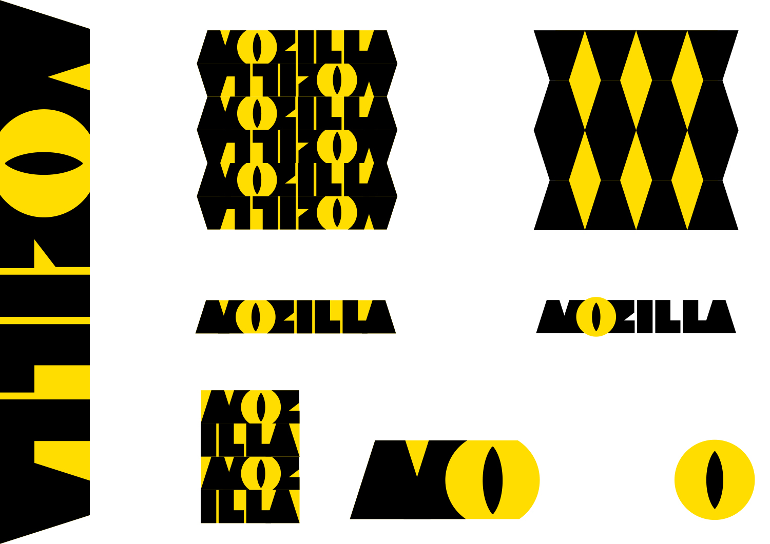
Click on the first image below to see how the logo might animate:

jb_Mozilla_design_pres_edit_3.key

jb_Mozilla_design_pres_edit_3.key

jb_Mozilla_design_pres_edit_3.key

jb_Mozilla_design_pres_edit_3.key

jb_Mozilla_design_pres_edit_3.key

jb_Mozilla_design_pres_edit_3.key

158 comments on “Design Route A: The Eye”

  1. Rick Colby wrote on

    I like the clever use of negative space to create the reptilian eye, and I like that the mark is bold and solid, but it feels more like a logo for a game or an energy drink. I agree with other comments that the black and yellow looks too bee-like. And when you pull the eye out (ugh, sorry) for use in the overall system, it loses its effectiveness and looks like the company name should start with “O”.

  2. Shea wrote on

    I love the concept here, but I think it would be hard to integrate gracefully across platforms and some of the elements seem forced to me (i.e. the eye + hand + legs graphic).

  3. Shirley Dulcey wrote on

    It feels a bit too mean to me. And the eye looks too much like Opera’s O.

  4. Kelley Lueck wrote on

    The O reminds me of the Old Opera logo

  5. Bob wrote on

    This is the best of the bunch, but I am not too excited about any of them.

  6. mike wrote on

    Far too creepy for a friendly all ages browser.

    1. Tim Murray wrote on

      Hi Mike, Thanks for participating in this review. This is a design exercise for Mozilla, the nonprofit that champions the Internet as a global public resource accessible to all. Mozilla is not a browser; it MAKES an open-source web browser, Firefox, but that’s not where our story ends. Mozilla contributes to a more equitable Internet and to the knowledge of its users through things like our encryption campaign, our advocacy toward updated copyright laws in Europe, and our promotion of web education in parts of the world just coming online. To learn more about Mozilla, please visit https://mozilla.org. Thanks again for joining this conversation.

  7. Uy Le wrote on

    I love the Saul Bass vibes I’m getting on this, but on branding strategy terms, it has a sinister look. Reptilian eyes are not my favorite images to associate to a brand like Mozilla. Might be cool and quirky at first glance, but just pure Big Brother evil in the long run for me.

  8. HergotH wrote on

    1) looks like opera
    2) You DEFINITELY do not want “I see all” sauron impression when thinking about private and NSA/GOOGLE unspoiled browser.
    3) black-yellow is okay-ish but the eye… the eye man. Dont.

  9. Woolf wrote on

    The design is effective, but doesn’t match what Mozilla should inspire.
    It reminds of the Eye of Sauron and its evil ambition.
    Black and yellow don’t inspire a friendly feeling (don’t forget the community all over the world: employees, contributors, volunteers, users, children, teenagers, adults, etc.).
    It also evoques female sexual organ.
    None of the seven design should become Mozilla future logo. Where is the former Tyrannosaurus —strong and beautiful design, you might have capitalized on it—? I thought it would be a reinterpretation of it.
    The dinosaur allowed personification and projection into Mozilla brand. How will the wide and varied Mozilla community identify itself to a logo that doesn’t inpire any feeling? (I don’t mean this black shape and in a yellow circle.) Firefox logo is an animal, missed–Thunderbird logo is an animal; Gecko and B2G OS logos are an animal; Firefox logo inspired the Fox mascot for Mozilla Foundation branding. Popular Mailchimp logo is an animal. If you wish the community to feel close to Mozilla brand, don’t forget the emotions.

  10. Felipe Cotta wrote on

    Horrível,
    Na verdade os outros modelos também são, deviam abrir sugestões dos próprios usuários.

  11. Hyrum wrote on

    This definitely stands out, but can be pretty jarring. The contrast is harsh, the eye is clever and there are some pretty good opportunities for swag with the eye.

    That being said, other comments about Orwellian overtones, industrial, overbearing, all-seeing eye, etc. are pretty spot on. Eye of Sauron, dominating/looming industrial visage (makes me think back to the towering, looming apocalyptic industrial buildings of Samurai Jack) and oddly enough, IKEA, make me really not like it.

    Nothing about it makes me think open internet, collaboration, or anything even tech related. Seeing a shirt, mug, etc. like that would be a first impression of a monster cartoon or clever blurb about monsters.

  12. Mark wrote on

    the primary logo is a winner, the secondaries not so much as the colors are a little overpowering at that level – are they really required?. the evil eye connotations sound like a beat up. the vast majority already know that mozilla is generally on the side of the angels and only want easily identifiable branding, not something out of an IQ test like some of the others. seriously does anyone ever consider the ‘underlying concepts’ of a brand. still looking forward to the day when I pass a truck with ‘bob’s trucking company’ on the side instead of ‘universal logistics solutions’ or similar claptrap

  13. cripkd wrote on

    http://www.motan.ro/images/centrale-termice-motan.png
    Motan mean tomcat in Romanian and that’s a household gas-based heater company.

  14. Erica wrote on

    I really like the idea of playing with the reptilian sound of ‘Mozilla’ and incorporating a reptilian eye. I think this is my favorite logo, because it’s bold, very recognizable, and fun. Furthermore, the eye is really easy to play around with and incorporate into other things. The color scheme is also very simple, and much more versatile than some of the other logos (like the impossible M). I think this is also the most memorable!

  15. Dave Akash wrote on

    This LOGO will not make sense in colors. Its not cool on eyes. The main LOGO is still ok but the remaining are worst to see. Other designs are not so great to have it internationally. May be changing in colors can do good but still need more designs on the GREAT Mozilla Foundation.

  16. The Ozz wrote on

    Wow. A stylized O-centered design. Probably no one did that one before… oh wait.

    https://www-static-blogs.operacdn.com/multi/wp-content/uploads/sites/2/2015/09/opera-new-logo-brand-identity-portal-to-web.jpg

  17. Nico wrote on

    Strong, fun and disruptive. A very good design

  18. Smeikx wrote on

    – bold, strong
    – timeless
    – lacking friendliness, openness, connectedness
    – negative associations: big brother, a watching eye (see other comments)
    – patterns look too aggressive and confusing

  19. Graham wrote on

    Looks like the branding for a magazine, not a web browser / tech company

  20. Ramzi Ibrahim wrote on

    Nicely developed identity; however, it reminds me of so many other brands for it to be uniquely Mozilla. It’s a mix of CAT and Monsters Inc.

    It’s playful, in a kiddish way, although the colors are ‘grown up colors’. So it doesn’t actually give a youthful energy. Just a funny one.

    It doesn’t give out a digital technology vibe. It’s more of a traditional company (maybe a bit playful) vibe.

    And the Eye is a bit risky. It doesn’t convey your stated mission, and looks more like big brother is watching you. It might have to do with it being a cat’s eye, which is very observant and a bit sinister. Maybe another eye shape (rotated perhaps like Paul Rand’s IBM) would be softer. However, I doubt that it will totally lose its big brother connotation.

    The pattern is gets a bit chaotic around the edges.

    Overall, the eye takes over the identity, and it doesn’t show that you based it on the “zilla” thing and being playful.

  21. Pedro Phillipe wrote on

    Possível alterações com o ponto do “i” e também fazendo aparecer o “M’ e o “a”.

    mozi

  22. Pedro Phillipe wrote on

    MOZI – Um jeito pessoal de abreviar o Mozilla e também um forma amigável de chamar alguém! Eu gosto mesmo é do MOZI! :)

    mozi2

  23. OSuKaRu wrote on

    This is my favorite so far. It’s fun and recognizable. My vote for this one

  24. GJ wrote on

    I like this one a lot.

  25. Rafael Ar wrote on

    Excelente

  26. Jules wrote on

    I just love it. But maybe the font isn’t as readable as I would want a logo’s font to be.

  27. Martin Häcker wrote on

    I love it. It catches you immediately with allures to Saurons Eye, but also with the Dino that is behind Mozilla for all the time.

    I think that given the Dino theme that Mozilla has going, people will get used to this Icon – and I like the fact that the ‘All seeing eye’ aspect is a constant warning what the Internet can be if we are not ever watchful (pun intended).

    Nobody will look past this.

  28. Kumar McMillan wrote on

    Very powerful and I love the imagery. Highlighting the ‘O’ also focuses on ‘open’.

  29. Richard D. Owens wrote on

    The best. Just change the yellow to a light green.

  30. Sam wrote on

    When I see this logo I think caution tape and sharp edges. Not to mention the big dilated eye. I don’t see “open” in this logo, if anything I see “keep out”.
    Like others have said, the eye gives off less of a “your pal looking out for you” impression than a “big brother is watching you” one.
    Not friendly, inviting, or open. Not a good fit for Mozilla.
    [Also that eye with hands and feet is a bit creepy]

  31. Teradyne Ezeri wrote on

    When I first saw this design, I thought “Illuminati” or “Big Brother”. With an additional branding message putting it into context, it would help to reduce that feeling, but using it as a logo would be rather creepy. For a brand’s design base as a whole, it feels very “Kill Bill”-esque, and I’m not sure that’s really a message you want to send.

    I’ll admit, the design has grown on me, but first impressions are everything. This one would definitely need some work. Maybe a shield-shaped eye or something, but the rounded eye on its own isn’t going to win hearts.

  32. J. White wrote on

    Well this could work, it reminds me too much of Monsters Inc.

  33. Seburo wrote on

    Hi

    I am really glad to see the designers showing an appreciation for Mozilla’s heritage. I do think that the use of the eye does send the wrong message and do not think that that comments about Sauron are unfair. That said, if this design was further expanded with more lizard related elements, it could be worth another look.

  34. Wesley wrote on

    First off, I’d like to say that whoever came up with this design did a great job.However, I feel that we should automatically rule out The Eye concept and here’s why. Although it’s very nice looking, having an eyeball on the logo often is associated with spying or tracking of some sort. If you have that in the logo, being associated with tracking is too negative and goes against the mission that Mozilla is trying to support.

  35. Jenn Anderson wrote on

    I love it. The mark as a whole feels like a “mozilla,” playful yet bold and strong. I hear you guys about the Sauron connotation, but since the eye is part of a mark reading “Mozilla,” I think it works. I do think the “dino” connotation gets lost in some of the extensions, however. I wouldn’t be so quick to make it all about the eye.

    I agree that the yellow and black feels a little harsh–kind of “Stanley Tools.” How about a nice lizard green?

More comments: 1 2 3