Security messages are very hard to get right, but it’s very important that you do. The world of internet security is increasingly complex and scary for the layperson. While in-house security experts play a key role in identifying the threats, it’s up to UX designers and writers to communicate those threats in ways that enlighten and empower users to make more informed decisions.
We’re still learning what works and what doesn’t in the world of security messages, but there are some key insights from recent studies from the field at large. We had a chance to implement some of those recommendations, as well as learnings from our own in-house research, in a recent project to overhaul Firefox’s most common security certificate warning messages.
Background
Websites prove their identity via security certificates (i.e., www.example.com is in fact www.example.com, and here’s the documentation to show it). When you try to visit any website, your browser will review the certificate’s authenticity. If everything checks out, you can safely proceed to the site.
If something doesn’t check out, you’ll see a security warning. 3% of Firefox users encounter a security certificate message on a daily basis. Nearly all users who see a security message see one of five different message types. So, it’s important that these messages are clear, accurate, and effective in educating and empowering users to make the informed (ideally, safer) choice.
These error messages previously included some vague, technical jargon nestled within a dated design. Given their prevalence, and Firefox’s commitment to user agency and safety, the UX and security team partnered up to make improvements. Using findings from external and in-house research, UX Designer Bram Pitoyo and I collaborated on new copy and design.
Old vs. New Designs
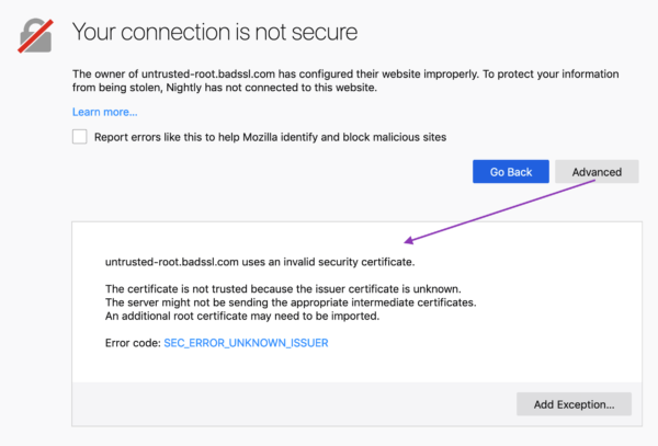
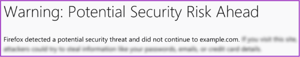
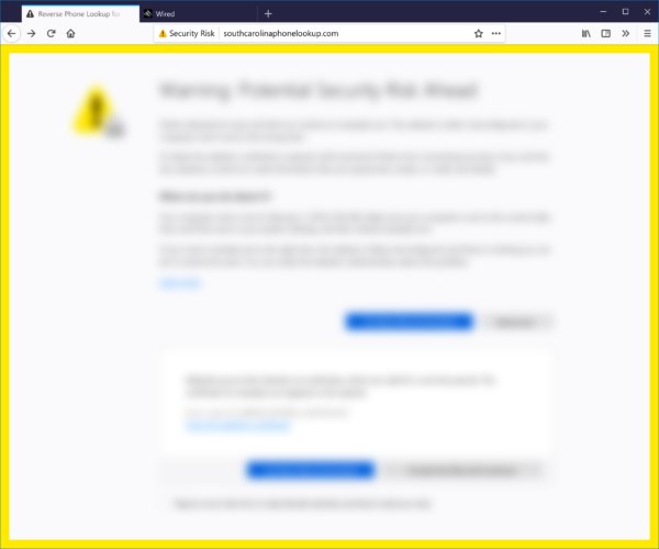
Example of an old Firefox security certificate message
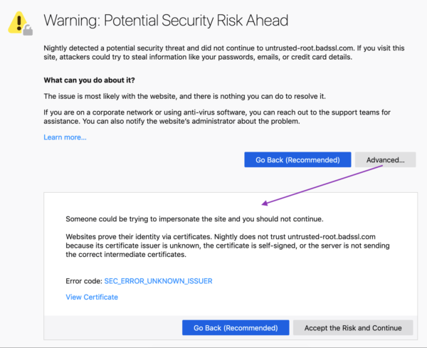
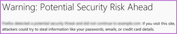
Example of a new Firefox security message
Goals
Business goals:
- User safety: Prevent users from visiting potentially unsafe sites.
- User retention: Keep Firefox users who encounter these errors from switching to another browser.
User experience goals:
- Comprehension: The user understands the situation and can make an informed decision.
- Adherence: The user makes the informed, pro-safety choice. In the case of security warnings, this means the user does not proceed to a potentially unsafe site, especially if the user does not fully understand the situation and implications at hand.(1)
Results
We met our goals, as illustrated by three different studies:
1. A qualitative usability study (remote, unmoderated on usertesting.com) of a first draft of redesigned and re-written error pages. The study evaluated the comprehensibility, utility, and tone of the new pages. Our internal user researcher, Francis Djabri, tested those messages with eight participants and we made adjustments based on the results.
2. A quantitative survey comparing Firefox’s new error pages, Firefox’s current error pages, and Chrome’s current comparative pages. This was a paid panel study that asked users about the source of message, how they felt about the message, and what actions they would take as a result of the message. Here’s a snapshot of the results:
When presented with the redesigned error message, we saw a 22 – 50% decrease in users stating they would attempt to ignore the warning message.
When presented with the redesigned error message, we saw a 29 – 60% decrease in users stating they would attempt to access the website via another browser. (Only 4.7 – 8.5 % of users who saw the new Firefox message said they would try another browser, in contrast to 10 – 11.3% of users who saw a Chrome message).
(Source: Firefox Strategy & Insights, Tyler Downer, November 2018 Survey Highlights)
3. A live study comparing the new and old security messages with Firefox users confirmed that the new messages did not significantly impact usage or retention in a negative way. This gave us the green light to go-live with the redesigned pages for all users.
How we did it:
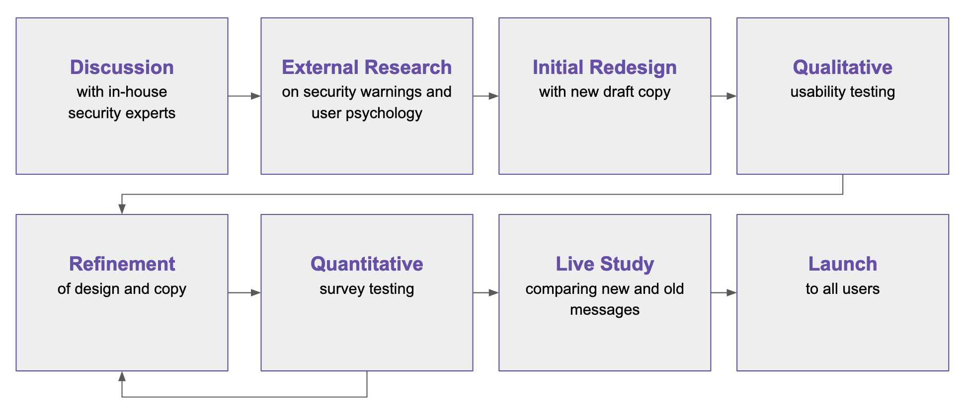
The process of creating new security messages
In this blog post, I identify the eight design and content tips—based on outside research and our own— for creating more successful security warning messages.
Content & Design Tips
1. Avoid technical jargon, and choose your words carefully
Unless your particular users are more technical, it’s generally good practice to avoid technical terms—they aren’t helpful or accessible for the general population. Words like “security credentials,” “encrypted,” and even “certificate” are too abstract and thus ineffective in achieving user understanding.(2)
It’s hard to avoid some of these terms entirely, but when you do use them, explain what they mean. In our new messages, we don’t use the technical term, “security certificates,” but we do use the term “certificates.” On first usage, however, we explain what “certificate” means in plain language:
![]()
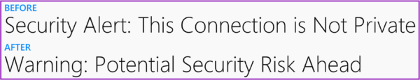
Some seemingly common terms can also be problematic. Our own user study showed that the term, “connection,” confused people. They thought, mistakenly, that the cause of the issue was a bad internet connection, rather than a bad certificate.(3) So, we avoid the term in our final heading copy:
2. Keep copy concise and scannable…because people are “cognitive misers”
When confronted with decisions online, we all tend to be “cognitive misers.” To minimize mental effort, we make “quick decisions based on learned rules and heuristics.” This efficiency-driven decision making isn’t foolproof, but it gets the job done. It means, however, that we cut corners when consuming content and considering outcomes.(4)
Knowing this, we kept our messages short and scannable.
- Since people tend to read in an F-shaped pattern, we served up our most important content in the prime real estate of the heading and upper left-hand corner of the page.
- We used bolded headings and short paragraphs so the reader can find and consume the most important information quickly and easily. Employing headers and prioritizing content into a hierarchy in this way also makes your content more accessible:
We also streamlined the decision-making process with opinionated design and progressive disclosure (read on below).
3. Employ opinionated design, to an appropriate degree
“Safety is an abstract concept. When evaluating alternatives in making a decision, outcomes that are abstract in nature tend to be less persuasive than outcomes that are concrete.” — Ryan West, “The Psychology of Security”
When users encounter a security warning, they can’t immediately access content or complete a task. Between the two options—proceed and access the desired content, or retreat to avoid some potential and ambiguous threat—the former provides a more immediate and tangible award. And people like rewards.(5)
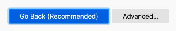
Knowing that safety may be the less appealing option, we employed opinionated design. We encourage users to make the safer choice by giving it a design advantage as the “clear default choice.”(6) At the same time, we have to be careful that we aren’t being a big brother browser. If users want to proceed, and take the risk, that’s their choice (and in some cases, the informed user can do so knowing they are actually safe from the particular certificate error at hand). It might be tempting to add ten click-throughs and obscure the unsafe choice, but we don’t want to frustrate people in the process. And, the efficacy of additional hurdles depends on how difficult those hurdles are.(7)
Striving for balance, we:
- Made the pro-safety choice the most prominent and accessible. The blue button pops against the gray background, and contains text to indicate it is indeed the “recommended” course of action. The color blue is also often used in traffic signals to indicate guidance and direction, which is fitting for the desired pro-safety path.
- In contrast, the “Advanced…” button is a muted gray, and, after selecting this button, the user is presented with one last barrier. That barrier is additional content explaining the risk. It’s followed by the button to continue to the site in a muted gray with the foreboding text, “Accept the risk…” We used the word “risk” intentionally to capture the user’s attention and be clear that they are putting themselves in a potentially precarious position.
4. Communicate the risk, and make it tangible
In addition to “safety” being an abstract concept, users tend to believe that they won’t be the ones to fall prey to the potential threat (i.e., those kind of things happen to other people…they won’t happen to me).(8) And, save for our more tech-savvy users, the general population might not care what particular certificate error is taking place and its associated details.
So, we needed to make the risk as concrete as possible, and communicate it in more personal terms. We did the following:
- Use the word “Warning” in our header to capture the user’s attention.
- Explain the risk in terms of real potential outcomes. The old message simply said, “To protect your information from being stolen…” Our new message is much more explicit, including examples of what was at risk of being stolen. Google Chrome employs similarly concrete wording.
- Communicate the risk early in your content hierarchy—in our case, this meant the first paragraph (rather than burying it under the “Advanced” section).
5. Practice progressive disclosure
While the general population might not need or want to know the technical details, you should provide them for the users that do…in the right place.
Users rarely click on links like “Learn more” and “More Information.”(9) Our own usability study confirmed this, as half of the participants did not notice or feel compelled to select the “Advanced” button.(10) So, we privileged content that is more broadly accessible and immediately important on our first screen, but provided more detail and technical information on the second half of the screen, or behind the “Advanced” button. Knowing users aren’t likely to click on “Advanced,” we moved any information that was more important, such as content about what action the user could take, to the first screen.
The “Advanced” section thus serves as a form of progressive disclosure. We avoided cluttering up our main screen with technical detail, while preserving a less obtrusive place for that information for the users who want it.
6. Be transparent (no one likes the internet browser who cried wolf)
In the case of security errors, we don’t know for sure if the issue at hand is the result of an attack, or simply a misconfigured site. Hackers could be hijacking the site to steal credit card information…or a site may just not have its security certificate credentials in order, for example.
When there is chance of attack, communicate the potential risk, but be transparent about the uncertainty. Our messages employ language like “potential” and “attackers could,” and we acknowledge when there are two potential causes for the error (the former unsafe, the latter safe):
The website is either misconfigured or your computer clock is set to the wrong time.
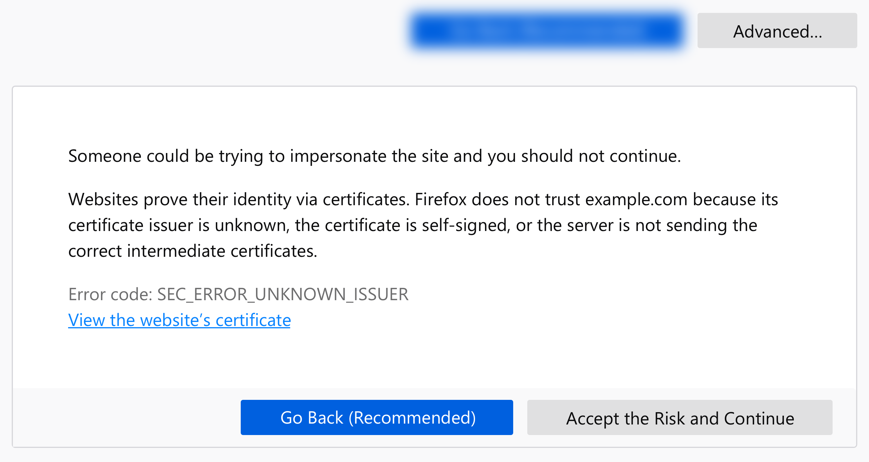
Explain why you don’t trust a site, and offer the ability to learn more in a support article:
Websites prove their identity via certificates. Firefox does not trust example.com because its certificate issuer is unknown, the certificate is self-signed, or the server is not sending the correct intermediate certificates. Learn more about this error
A participant in our usability study shared his appreciation for this kind of transparency:
“I’m not frustrated, I’m enlightened. Often software tries to summarize things; they think the user doesn’t need to know, and they’ll just say something a bit vague. As a user, I would prefer it to say ‘this is what we think and this is how we determined it.’ ”
— Participant from a usability study on redesigned error messages (User Research Firefox UX, Francis Djabri, 2018)
7. Choose imagery and color carefully
Illustration, iconography, and color treatment are important communication tools to accompany the copy. Visual cues can be even “louder” than words and so it’s critical to choose these carefully.
We wanted users to understand the risk at hand but we didn’t want to overstate the risk so that browsing feels like a dangerous act. We also wanted users to know and feel that Firefox was protecting them from potential threats.
Some warning messages employ more dramatic imagery like masked eyes, a robber, or police officer, but their efficacy is disputed.(11) Regardless, that sort of explicit imagery may best be reserved for instances in which we know the danger to be imminent, which was not our case.
The imagery must also be on brand and consistent with your design system. At Firefox, we don’t use human illustration within the product—we use whimsical critters. Critters would not be an appropriate choice for error messages communicating a threat. So, we decided to use iconography that telegraphs risk or danger.
We also selected color scaled according to threat level. At Firefox, yellow is a warning and red signifies an error or threat. We used a larger yellow icon for our messages as there is a potential risk but the risk is not guaranteed. We also added a yellow border as an additional deterrent for messages in which the user had the option to proceed to the unsafe site (this isn’t always the case).
Example of a yellow border around one of the new error messages.
8. Make it human
Any good UX copy uses language that sounds and feels human, and that’s an explicit guiding principle in Firefox’s own Voice and Tone guidelines. By “human,” I mean language that’s natural and accessible.
If the context is right, you can go a bit farther and have some fun. One of our five error messages did not actually involve risk to the user—the user simply needed to adjust her clock. In this case, Communication Design Lead, Sean Martell, thought it appropriate to create an “Old Timey Berror” illustration. People in our study responded well… we even got a giggle:
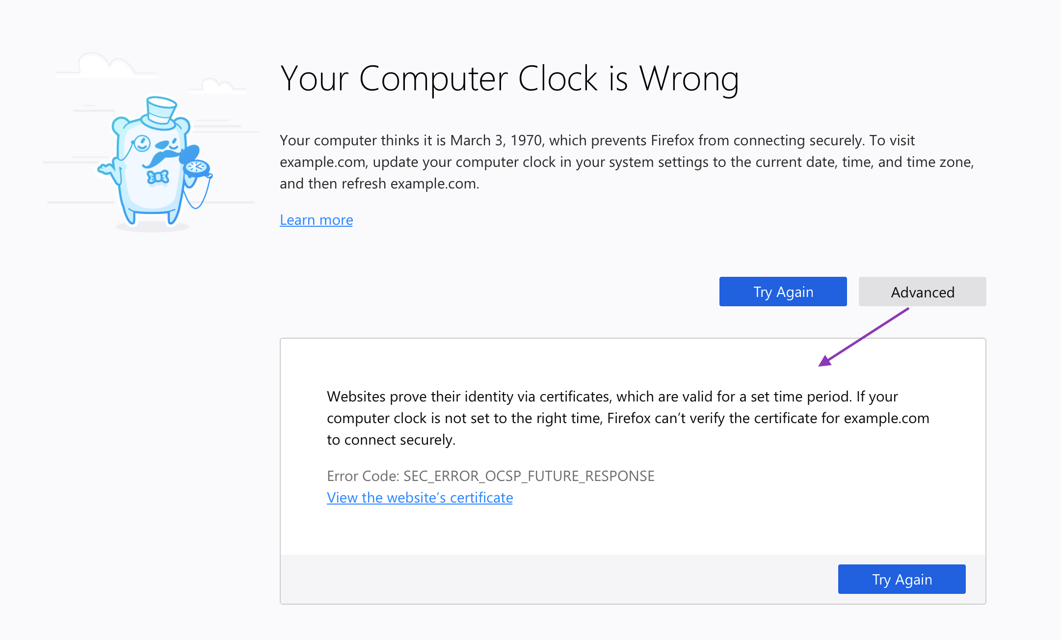
New clock-related error message
Conclusion
The field of security messaging is challenging on many levels, but there are things we can do as designers and content strategists to help users navigate this minefield. Given the amount of frustration error messages can cause a user, and the risk these obstructions pose to business outcomes like retention, it’s worth the time and consideration to get these oft-neglected messages right…or, at least, better.
Thank you
Special thanks to my colleagues: Bram Pitoyo for designing the messages and being an excellent thought partner throughout, Johann Hofmann and Dana Keeler for their patience and security expertise, and Romain Testard and Tony Cinotto for their mad PM skills. Thank you to Sharon Bautista, Betsy Mikel, and Michelle Heubusch for reviewing an earlier draft of this post.
References
- “Improving SSL Warnings: Comprehension and Adherence”
- “Alice in Warningland: A Large-Scale Field Study of Browser Security Warning Effectiveness”
- “The Psychology of Security”
- Introduction & Keynote : Web Privacy and Security: The User Experience
- “At Scale With Google Chrome’s SSL Warning (2014)”
Footnotes
- Adrienne Porter Felt et al., “Improving SSL Warnings: Comprehension and Adherence.”(Philadelphia: Google, 2015).
- Ibid.
- User Research, Firefox UX, Francis Djabri, 2018.
- West, Ryan. “The Psychology of Security.” Communications of the ACM 51, no. 4 (April 2008): 34-40. doi:10.1145/1330311.1330320.
- West, Ryan. “The Psychology of Security.” Communications of the ACM 51, no. 4 (April 2008): 34-40. doi:10.1145/1330311.1330320.
- Adrienne Porter Felt et al., “Experimenting At Scale With Google Chrome’s SSL Warning.” (Toronto: CHI2014, April 26 – May 01 2014). https://dl.acm.org/citation.cfm?doid=2556288.2557292
- Ibid.
- West, Ryan. “The Psychology of Security.” Communications of the ACM 51, no. 4 (April 2008): 34-40. doi:10.1145/1330311.1330320.
- Devdatta Akhawe and Adrienne Porter Felt, “Alice in Warningland: A Large-Scale Field Study of Browser Security Warning Effectiveness.” Semantic Scholar, 2015.
- User Research, Firefox UX, Francis Djabri, 2018.
- Devdatta Akhawe and Adrienne Porter Felt, “Alice in Warningland: A Large-Scale Field Study of Browser Security Warning Effectiveness.” Semantic Scholar, 2015.