Categories: General

Design Route D: Protocol

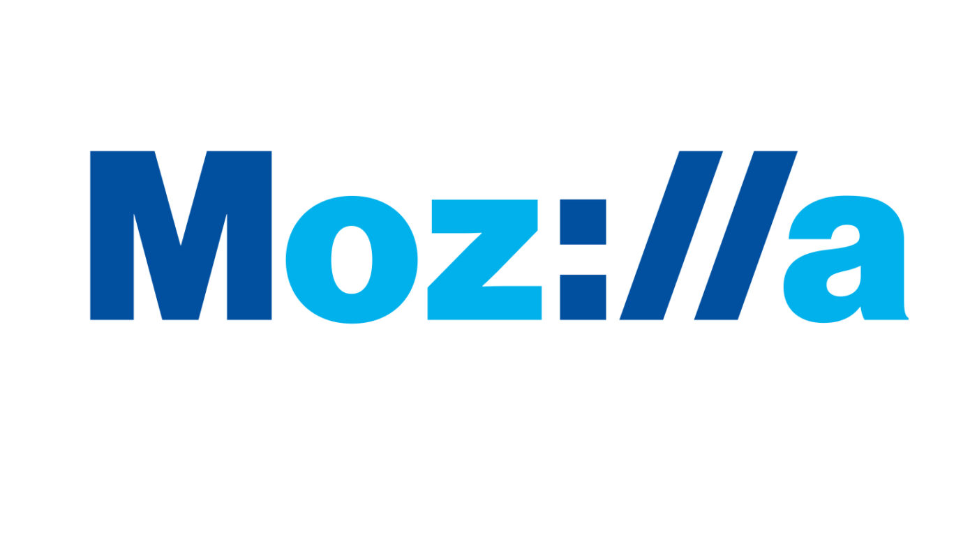
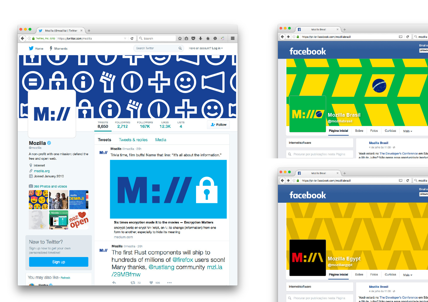
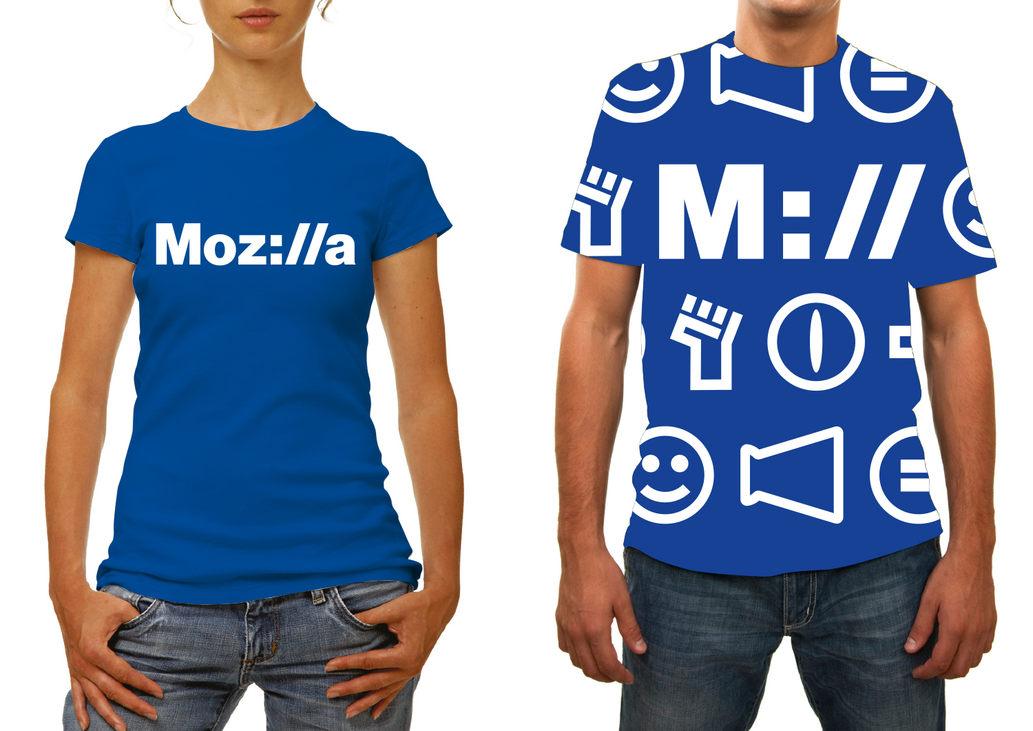
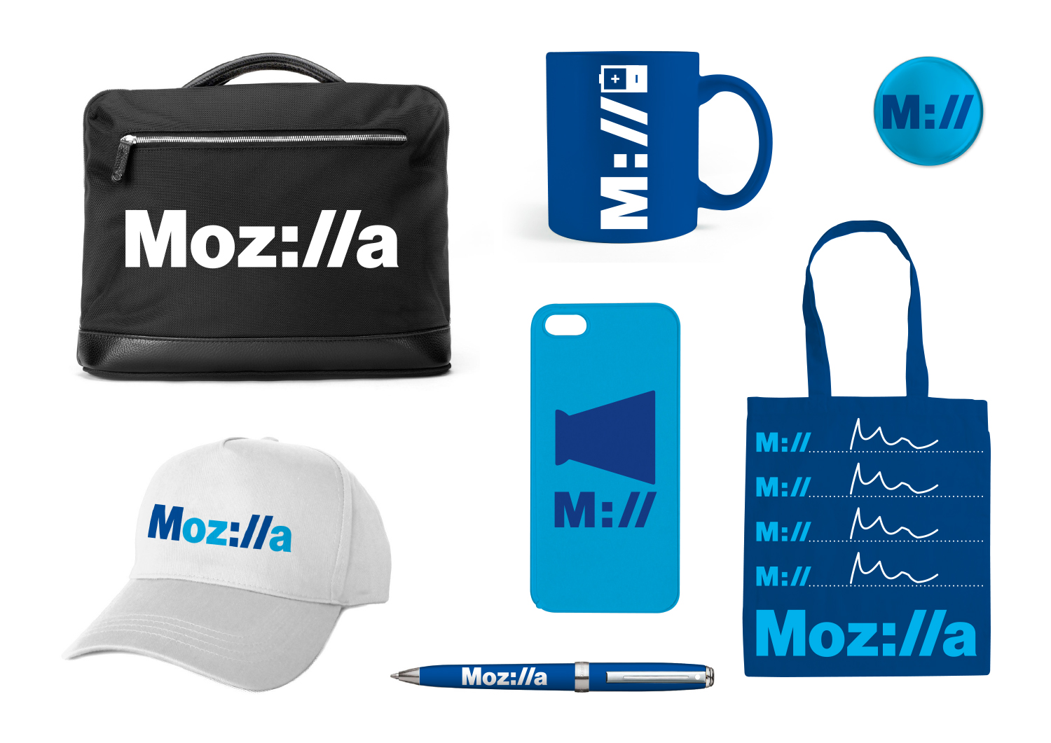
If we want to show that Mozilla is at the core of the internet, and has been for a long time, how do we show that it’s a fundamental building block of what we know, see and use every day? Perhaps the answer is staring us in the face, at the top of every browser…

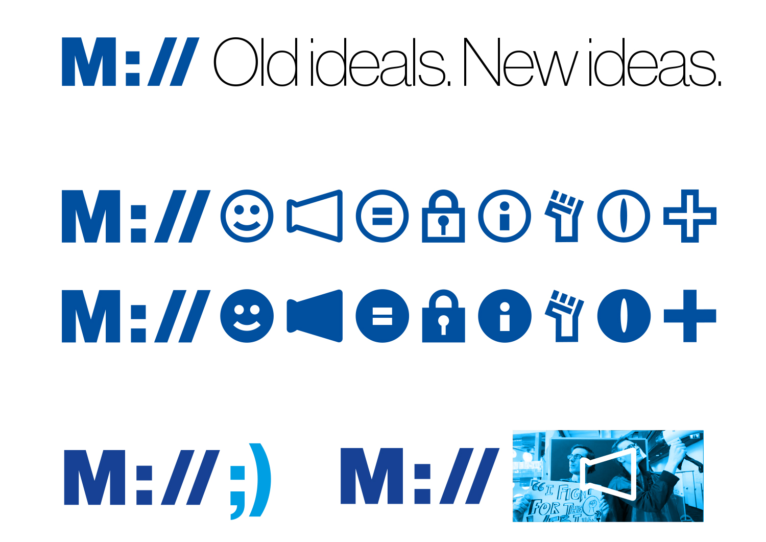
This design direction stems from the narrative theme called With You from the Start.

With you from the start.

Mozilla was, is, and always will be on the side of those who want a better, freer, more open Internet. In the early days, we were among those helping to embed principles of openness and accessibility into the web’s DNA. Now those principles matter more than ever. We need an Internet that works wonders for the many, not just the few. We need to stand by the founding ideals of the Internet, and carry them forward into new products, platforms, conversations, and great ideas. We’ve been with you from the start. And we’re just getting started.

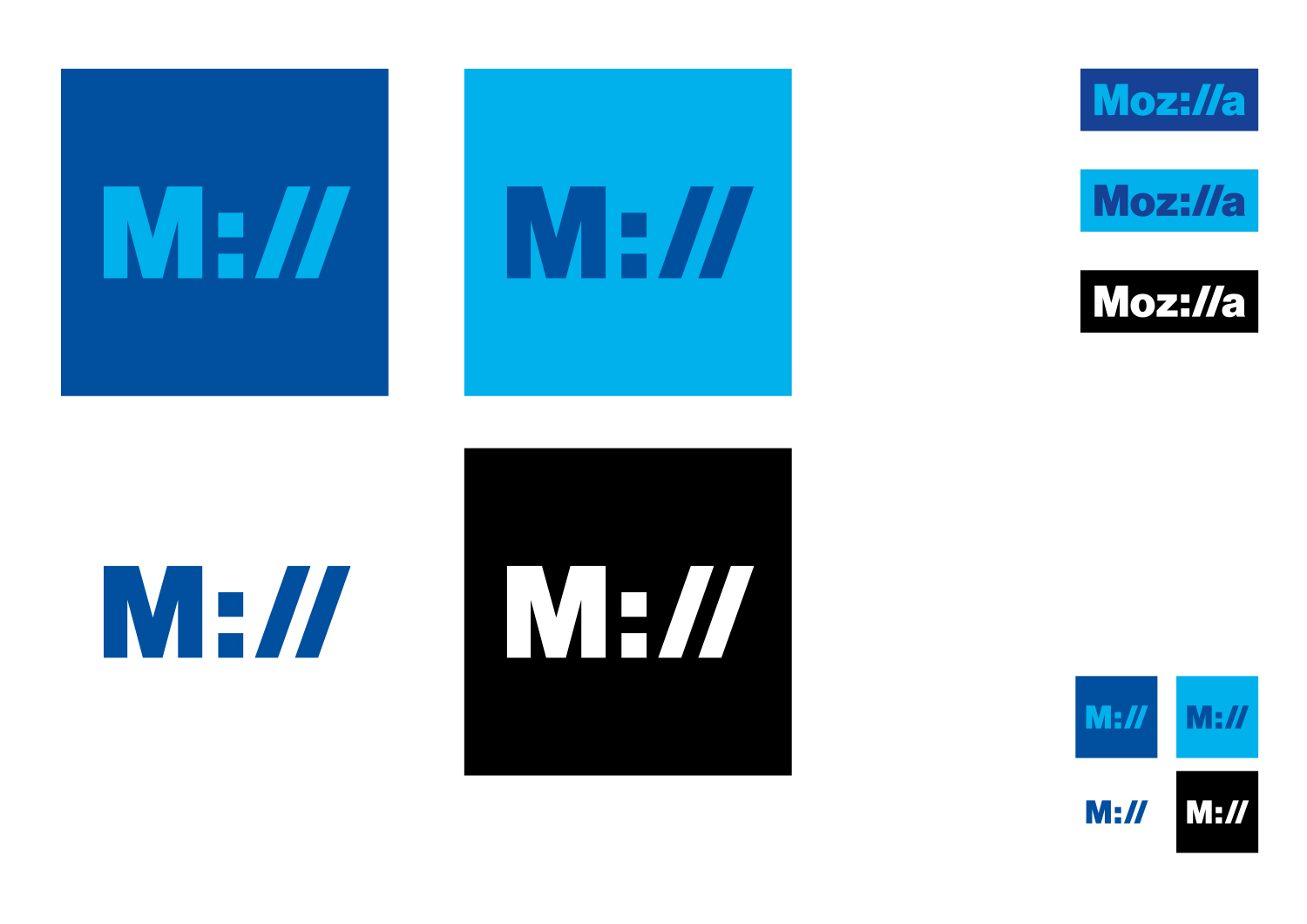
Click the first image below to see how this logo might animate:

jb_Mozilla_design_pres_edit_3.keyjb_Mozilla_design_pres_edit_3.keyjb_Mozilla_design_pres_edit_3.keyjb_Mozilla_design_pres_edit_3.keyjb_Mozilla_design_pres_edit_3.keyjb_Mozilla_design_pres_edit_3.key

332 comments on “Design Route D: Protocol”

  1. hanes wrote on

    I like the Moz://a best; it looks good and has clear reference to the to the internet.
    Maybe you want to rename ‘about:’ pages to ‘Moz://’ :)

    The one with the Raptile Eye and the first one are also good

  2. Nikola Kostic wrote on

    Protocol could be perfect. It just needs custom made letters for the logotype (certainly not Helvetica). And you could re-think the color scheme.

  3. Francisco Hernandez wrote on

    I love this logo

  4. Romina wrote on

    It’s the one that will perdure over the years because it’s not following any trend. Love the symbol, I think most of the people will understand it. Maybe the color needs a little bit of the old Mozilla, what about orange? The application it’s amazing, super simple. I think you only need to touch the type a little to make it more personal. Hope this will be the next face of Mozilla. Greetings from Argentina, sorry for my bad english, hope you can understand :)

    1. Romina wrote on

      *endure :)

  5. Charles Erdman wrote on

    I believe this is your strongest bet.
    As your corporate identity, you will need it to do so much for you.
    It will need to age well and not represent a certain time, but transcend trends.
    It will need to scale across screen sizes and mediums – how does it look on video, letterhead, a watch UI, etc.
    It will need to be international and communicate an essence that cannot be mistaken for another.
    It will need to hold together as you translate it’s core elements to find playful variations.
    It will need to ground people’s understanding of the larger goals of Mozilla.
    Of all the concepts this logo does the above.
    My only criticism is that it feels unfinished. The ability to morph this with color and combined elements could be pushed in order to test its flexibility.

  6. Martin Häcker wrote on

    A bit plain – but oh boy do I like the url / command line feel of this logo. Old school and techy. Thats what Mozilla represents to me.

  7. Felipe wrote on

    Of all the proposed logos, this is the best logo, represents faithfully the Internet and communicating the sources of Mozilla (Netscape, which is has shaped what we acquaintances today as the Internet), if I could have voted in it this is the logo I give my voice.

  8. Kumar McMillan wrote on

    This looks nice but I don’t think it will stand the test of time. Tim Berners Lee proclaimed in a 2009 interview that the double slash was a mistake in the URL protocol because it serves no purpose and can be removed. I think it will be removed in the future.

  9. Teradyne Ezeri wrote on

    THIS feels like a representation of Mozilla. The “://” is part of the web itself through the URIs—even though they constantly get hidden in the URL bar in Firefox unless you turn off the “trimurls” option. Regardless, this feel more contextual to the brand, and I really like the idea. I just wish you would show more of the project logos and such using this design, like Webmaker and SUMO.

    That said, it still doesn’t convey “community” on its own. It sadly feels more like a corporate logo that IBM would have chosen—and I say that despite me adoring this idea. I just wish it were more about the people of the web, and not _just_ the web.

  10. J. White wrote on

    This is one and only winner that I see IF you have to change your logo and not just refresh what you have.

  11. Victoria B wrote on

    Who even uses protocol slashes nowadays??
    Don’t even get me started about how boring this visual universe is. It lacks flexibility.

  12. Seburo wrote on

    Hi

    I really like this one. In its long form it is clever, in its short form it is a logo, and can be used as a statement with the addition of a slogan or a project name.

    It is flexible in its application and would work well in a range of colours (far too much blue in the concepts shown). Even with the logo, it could be used in body text to refer to M:// (crumbs, I am using it already!), or even as a shortened web link in marketing materials.

    For those that do not know us, it links well with what we do and the products and services we produce. For those that do know us, it screams out “give it your best shot – we are making the web better!”.

    The logo has its casual use in its short form, but even that works well in a more corporate sense. It will work well on the printed page, but also on branded material. I also like the typewritten build effect for videos – looks great.

    The best of the bunch and one that I (as a contributor) can identify with and would be proud to use. I look forwards to it being a sticker on my laptop soon. :-)

  13. Evan Pavlica wrote on

    This feels like the best option being considered. Though a bit on the plain side, it indicates Mozilla’s mission without being too busy or obnoxious. The simple shapes should also make this logo easily extensible for special uses. While the other logos are quite interesting, I don’t think they are as realistically useable as this one.

  14. Daniela (Breitbart) Britton wrote on

    I like the Protocol option! How could I not – what can be a better, more flattering compliment than being imitated by Mozilla, a pioneer of the Internet? Read more here: http://factwellsolutions.com/en/newsroom/open-letter-to-mozilla/ We’re with you, Mozilla. Even before the start.

    Factwelllogo

    1. Tim Murray wrote on

      Thanks for letting us know about the coincidence, Daniela. It’s a point of celebration that the Internet is old enough know for the symbols of its origin to be rediscovered by designers and made fresh again. Congratulations on ending up with a brand identity that’s right for you. Please stay tuned as our initial design directions continue to be refined.

  15. Farzad wrote on

    I absolutely love it, my most favourite logo M:z//a

  16. Wesley wrote on

    Probably the best concept listed. The only difficulty that I can see with this one is the absence of a logo. It is very hard to make a wordmark into a square image for favicons and things like that. I don’t like the M:// square image that was provided because it will be difficult to get people to associate M:// with Mozilla.
    Another thing that I would like to see in this logo is the Mozilla red. It has been a key part of the Mozilla brand, so I would love to see it retained.

  17. joe miller wrote on

    very nice typographic idea which speaks to the roots and basics of the business. slight problems of misdirection by secondary words “oz” and “Mill” in the long and short versions, which could be solved by reducing to even fewer characters in the short version such as “M:” “M//” or even “//”, and different color breaks in the long version.

  18. camilla wrote on

    This is my top pick.

More comments: 1 4 5 6