Categories: General

Design Route D: Protocol

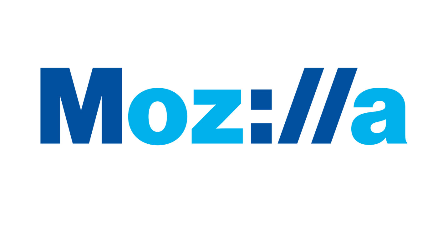
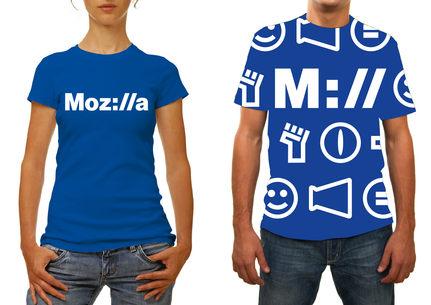
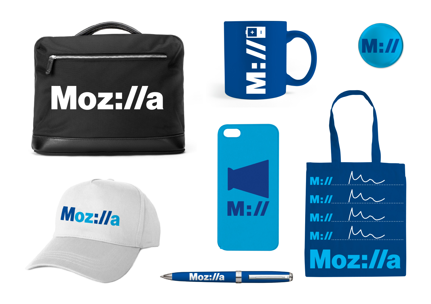
If we want to show that Mozilla is at the core of the internet, and has been for a long time, how do we show that it’s a fundamental building block of what we know, see and use every day? Perhaps the answer is staring us in the face, at the top of every browser…

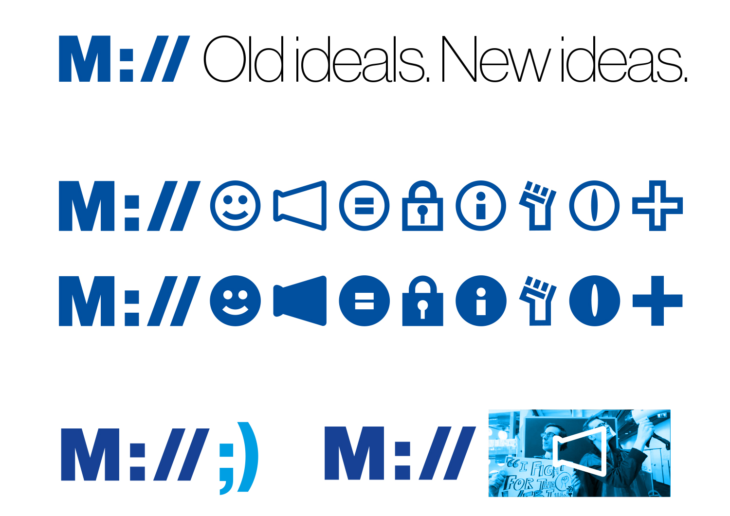
This design direction stems from the narrative theme called With You from the Start.

With you from the start.

Mozilla was, is, and always will be on the side of those who want a better, freer, more open Internet. In the early days, we were among those helping to embed principles of openness and accessibility into the web’s DNA. Now those principles matter more than ever. We need an Internet that works wonders for the many, not just the few. We need to stand by the founding ideals of the Internet, and carry them forward into new products, platforms, conversations, and great ideas. We’ve been with you from the start. And we’re just getting started.

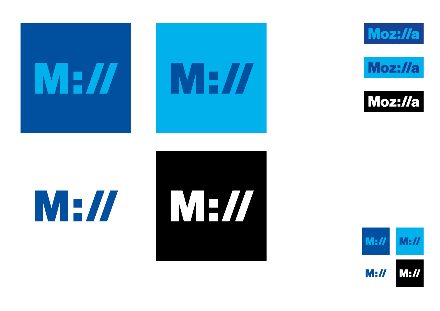
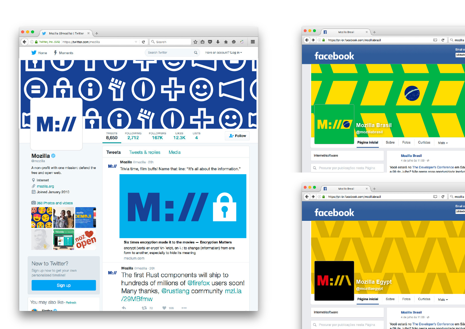
Click the first image below to see how this logo might animate:

jb_Mozilla_design_pres_edit_3.keyjb_Mozilla_design_pres_edit_3.keyjb_Mozilla_design_pres_edit_3.keyjb_Mozilla_design_pres_edit_3.keyjb_Mozilla_design_pres_edit_3.keyjb_Mozilla_design_pres_edit_3.key

332 comments on “Design Route D: Protocol”

  1. Rob Kellett wrote on

    Easily my favorite. Love the colors, love the integration of the protocol delimiter, and most of all I love the legibility. I think it’s great to treat Mozilla like a protocol to anything. It delivers a clear and positive message.

    1. Keith J. Grant wrote on

      I totally agree. It’s great at every size, in all variations. Great color scheme (unlike many of the other logos). Simple but conveys a lot.

      1. Dennis Ring wrote on

        “Simple but conveys a lot.”
        I couldn’t have said it better!

        1. Clément V wrote on

          Yes. it’s by far too my favourite logo, we can clearly see Mozilla’s domain : The WEB, and PROTOCOLS.

          The colors are very clear unlike other logos, and it’s good ! Because they’re easy to remember for everyone, and the logo with the “protocol” shows that Mozilla was built by geeks, for geeks.

        2. roan wrote on

          reminds me of the exxon mobil logo and shows me “big corporation”. great idea but the type is a bit intimidating.

          Unknown

    2. Darío Pérez wrote on

      I agree, Rob. The best by far!

    3. John Adams wrote on

      My favorite as well. Clear with historic references.

      One thought, there are an awful lot of blue logos out there… would it work in a different color palette? Although blue is appropriate as it could reference hyperlinks which were historically blue by default.

    4. Carl wrote on

      I agree. Some of those other logos are the stuff of nightmares.

    5. Anant wrote on

      Love this one as well. May seem a bit more oldschool, but I think this is the most professional and simplistic logo so far.

    6. Redmess wrote on

      I agree, this is my favorite out of these choices as well. The colors are a bit on the cold side, though.

    7. Zoltan Hawryluk wrote on

      This is actually the only one that I like. The design says “web” right in the logo. If your target is supposed to be techies, that may work, but the question I ask is if it does speak to the non-technical, if that is what you are aiming for. Would they “get it”?

      1. jgreenspan wrote on

        Thanks, Zoltan for your input. It’s a great question, one we’re hoping to answer through testing with our next round of concepts.

      2. Murray J Brown wrote on

        Hi Zed! This is the only one that I like, too. I think your question is just as applicable to the other logos. While non-techies may not quite ‘get’ the significance of the underlying motif of this logo, I’m not sure what they might get from the others; I don’t know that I can intuitively make sense of them.

    8. Jay wrote on

      My favorite except the colors do not say Mozilla to me. Blue has always been Internet Explorer. I would use a red/orange color.

      1. Clément V wrote on

        Yeah but the blue could say too that Mozilla is here … while IE is dead. So it could be a “win” symbol.

    9. vChris wrote on

      100% agree

    10. Joel Mielke wrote on

      Agreed.

    11. Julian I. wrote on

      This I can’t agree more, and I’d be thrilled to see this awesome design as the new Mozilla Logo!

  2. Abendstern wrote on

    This design I like better, the others see me out too colorful.
    Top design

    1. Tim Murray wrote on

      Thanks for letting us know, Abendstern.

      1. TeslApple_Guy wrote on

        In my opinion, I think yellow and orange with a hint of red conveys Mozilla better.

        1. Daniel C wrote on

          I agree exactly. This logo is my second favourite behind Design B. I think it has a lot of promise and adaptability, it just needs warmer colours that connect it to previous logos. Perhaps the cool palette could be reserved for special or alternative builds or products, in the same vein as the iceweasel or waterfox logos.

  3. Emilie Nouveau wrote on

    I feel like this logo concept is the most connected to the current Mozilla brand, but I’m not sure about the extra branding elements. The thick line widths and monochrome color palette feel harsh and cold which I think is far from how Mozilla would like to be perceived.

    1. Tim Murray wrote on

      Thanks, Emilie for your feedback on the design specifics of Protocol and your thoughts on how Mozilla would like to be perceived.

  4. Michael Sharp wrote on

    Conceptually strong, but it falls short in execution. I love the idea, but its coming across gimmicky and dated. Not my fav.

    1. Tim Murray wrote on

      Thanks for giving it a look-see, Sharpie. Point well taken.

  5. Andre Williams wrote on

    Absolutely love this one. It comes off as modern but could easily be from the earlier days of the internet. Readable, snazzy, and emphasizes Mozilla’s internet presence while also giving a fun shoutout to web developers.

    Very strong conceptually and design-wise.

    1. Tim Murray wrote on

      Thanks for your comment, Andre.

  6. Nathan Misner wrote on

    Easily my favorite design. I love the “Mozilla as a protocol” concept, and it’s the only design that clearly is the logo for an internet company, as opposed to a modern art museum or something.

  7. Lazarus Cobb wrote on

    Yep this is the one. Ive always been one to know good logos and the number one most important thing a good logo needs is to be memorable and relavent. out of all those this is the one that sticks in my memory. This design sticks out from everything else as being distinct and memorable because of its simplicity and similarity to the existing mozzila logo as well as the inclusion the :// alluding to its close relationship to web writing/coding and functionaity communities of the internet itself. The others are pretty but this one is the most relevant.

  8. Lazarus Cobb wrote on

    Oh one little thing upon review. Play with the font. currently looks too much like exxon mobil logo font. Moz://a and M:// are super catchy in many fonts and open up lots of new hashtag and twitter options.

  9. Phil Gyford wrote on

    I like the Moz://a idea, but don’t understand why the shortened M:// version isn’t then read as “Mill”. Why have t-shirts etc that say Mill on them?

    1. Halleh Tidaback wrote on

      I agree with this comment. M:// doesn’t seem to read as intended.

      1. David wrote on

        Don’t agreed. The M:// is in a different color on the main logo, so we easily indentify the short one, in my opinion. :)

    2. Charles Penzien wrote on

      I see the logic behind the M:// version, and I think it’s pretty genius. We see Moz://a as the company name and appreciate the fact that it includes the protocol symbols as letters. If they’re actually treated as protocol symbols in the shortened version, though, it’s just the first letter as *the* protocol. So it’s not Mill, it’s the M (for Mozilla) protocol.

      This one is definitely *my* favorite, too.

    3. scull7 wrote on

      I disagree, I can see the m:// as an allusion to all that moz://a encompasses. The m:// protocol! m://web, m://advocacy, m://opensource, etc.

      1. Laura Powers wrote on

        Agreed

    4. Michael McNally wrote on

      Because of the way the slashes lean forward, the M:// t-shirt visually reminded me an old KISS t-shirt from the 70’s.
      Join the Mozilla Army!

      As others have mentioned, this logo could use more color variety. Otherwise, by far the best of the lot.

  10. VannTIle Ianito wrote on

    This one is the logo Mozilla should have for one specific reason – it’s the only one which looks connected to programing. Even some of the others are more unique, this has the advantage of versatility, and it can easily work monocolored. And is one of the few which really gets remembered by an average user, from my opinion.

  11. Dustin J. Mitchell wrote on

    I like incorporating the “://” — it pretty clearly says “Mozilla is in the heart of the Internet”. I also like the flexibility of the text following “//”. Beyond that, I think that the visual language could be varied quite a bit, as a way of individualizing. Historically, branding has been run with an iron fist: thou shalt, thou shalt not. And that is at odds with the big-tent design of the organization. Maybe broaden the palette a little, and the available typefaces (that M looks like it’s a 100-ton dinosaur!).

    I do *not* like “old ideals”. I don’t think “old” should be the lede on our tagline.

    1. Aurelia wrote on

      +1000 to this response.

      1. David wrote on

        Yep +1

    2. CP wrote on

      +1 on these thoughts

      IMHO, this one’s the best of the bunch – Especially since *all* of the others seem childish and even garish. This one is mature but modern.

      1. robert wrote on

        +1
        this one is the best of them, the others do not seem like they ‘belong’ to the Mozilla brand

    3. Alleya wrote on

      Yes!! This logo made me evoke the Netscape and the early net days, when one had to type the address at the bar. The animation moved me. Also, the other logos look kinda amateurish and this is an association Mozilla certainly doesn’t need. The idea of “open source” should not be equivalent to “limited”, “beta”, “basic”, “amateurish”. Good work!

  12. Sam wrote on

    Very strong, smart concept I love how it positions Mozilla at both the start of and the middle of the internet, both then and now. The code based visual shorthand is a universal language and should be around for a few years yet so there shouldn’t be a problem with translation or longevity.

    Execution wise I think the font could be looked at – Helvetica!??! There’s got to something better and less pervasive than that. The colours also need some work to move away from the cold reflex bluey-ness give a more ‘Bouyant’ and ‘Gutsy’ look to tie into those brand keywords. The colours from The Connector brand could be repurposed with this brand and look great.

  13. Naiyer Asif wrote on

    The Protocol is the best of all, in my opinion.

    The Eye looks creepy to me. The Connector, the Open Button and Flik Flak are too abstract to instantly reflect a Mozilla identity.

    The closest that comes to be second favorite is Wireframe World. But it’s colorful counterparts look weird (no pun intended).

    The Protocol’s unique M:// instantly associates it with web. I think the younger population would love it for being unapologetically “techie”. I would love to see it in all Mozilla colors (and not just blue and white and blue). On small screens and thumbnails, the signature M:// is always there which effectively emphasizes a Mozilla identity.

    1. Giulia R wrote on

      I totally agree, love this one except for the colors.

  14. Jason Hunt wrote on

    Definitely the least retro, and probably my favourite.
    The font looks a bit ‘petrol’ (gas) – maybe something more modern and/or softer?

  15. Milena wrote on

    Guys, this reminds me of an insurance company logo. Rather bland and static to my eye.
    MasterCard has recently completed the similar exercise.
    I will comment on some of the other designs that I think are more suitable for what in my opinion Mozilla is.

  16. Michael Kaply wrote on

    I really like the concept here, but I think it falls in the “easy to identify with a small icon”

    Also, i don’t see a lot of the use of this branding for other things within Mozilla which makes me wonder if that was difficult to do.

    The focus here seems to be on font and typeface, which doesn’t translate well.

    That being said, I think this idea in combination with one of the other logos would make for a great wordmark.

  17. Pratyush Gupta wrote on

    I like this for it’s simplicity and relevance.

    One drawback is that the shorthand logo looks very similar to the Mashable logo. Might want to rethink that or try another colour variation.

  18. Carlos El Halabi wrote on

    This one is great. I didn’t like at first, but after seeing how nice it plays with what Mozilla is I really feel more coherent than the others.

  19. Muhammad Abdullah wrote on

    This logo is my favorite; I think it’s perfect for Mozilla. It’s straightforward and colorful. But the only thing in the square logo is that it does not look great and doesn’t show what the company is. The “M” resembles Mashable’s logo (i attached the file). Otherwise, colors and everything is great :)

    toedit

  20. joe mama besser wrote on

    the ‘://’ feels like internet of the past, not future-facing enough. does anyone even type those characters anymore? they’re baked in and have lost the relevance they once had.
    i echo the misstep of the shorthand reading as ‘Mill’ – you can’t present ‘://’ to be character standins in the full wordmark then expect viewers to revert thinking of them as part of a url/directory statement. it’s asking too much, getting greedy, and subvert the clever nature of the core concept.

  21. joe mama besser wrote on

    :// = double meh

  22. Halleh Tidaback wrote on

    The :// reference screams web, which is great in communicating Mozilla’s solid history, but what about the future? Is there longevity in leaning into these characters, or will they be too irrelevant to a younger generation? (CDs to a teenager)

    The wordmark is clever and appreciated for that, but the rest of the branding seems safe. I’d lean into the fact that the mark is so solid and explore pushing the rest of the branding. What happens when more texture or color is incorporated?

    Also, the ‘old ideals’ tagline could be improved. The sentiment is nice, but the word “old” is off-putting and doesn’t feel on the side of innovation.

  23. Antriksh Yadav wrote on

    This is my favorite by a huge margin (Wireframe comes second IMO).

    It looks professional, and at the same time looks good on merchandising. Someone mentioned that it’s hard to read, but I disagree. The “Moz” and “//” parts instantly remind me of “Mozilla” especially because it’s already a globally recognized company name. In fact, this one is significantly more readable than a lot of other concepts.

  24. Allen Meyer wrote on

    I understand folks really like this direction, and it is a solid concept but,
    I’m worried that it’s reference to the “://” won’t mean anything to people in the near future. The font choice reinforces a retro feeling. Does it embrace the future?

    1. CP wrote on

      I see many similar comments in this thread, and I just don’t agree. URL protocols (and, thus, the “://”) are never going away. Browsers have been and may continue to de-emphasize this section of the URL, yes – but by integrating it into their logo, Mozilla is letting the world know that they’ll never forget what the Internet really is at its core. They’ll bear the torch for us all, as it were…

      1. AS wrote on

        Agreed. People might not use them that much, but there will always be protocols other than HTTP.

  25. Steve C wrote on

    Yeah, Protocol for me. Mozilla isn’t just about a browser, it’s about a platform and an ecology of technologies. The Protocol design makes that inclusive. Further, as the brand gets out there, “M://” is a good advertisement, a good way to access things like the about: pages, or even used as a complete namespace for all things “Mozilla.”

  26. Olaoluwa Jesubanjo wrote on

    This one is my favourite. I love this, and I feel it easily captures the Mozilla brand.

  27. nicolas wrote on

    The ‘ill’→‘://’ idea is clever!
    But isn’t it too ‘tech’ for Mozilla? It seems to me it should be about people above all, not computers. Also URIs, and particularly their scheme part, are becoming less and less visible nowadays.
    Moreover, the blues feel uninspired, like a generic sad company. Same with the Helvetica (or similar) typeface.
    The same idea with a different style (bolder colours? nice geometric letterforms? affiliated graphic system?) could grow on me, but for now it just looks like a little and clever character-swapping idea without anything more conceptually or visually to make it into a strong identity.

  28. Leo wrote on

    Microsoft

    1. Pohl, Svenja wrote on

      Funny but to easy. Just my second facourit so for when nothing is going better

  29. Bart wrote on

    I like the simplicity.
    I like how :// fits.
    I like how you create an instantly recognizable abbrevation M://

    I’m not sure about the light- and dark blue within the same word though.
    And there’s a slight risk people will start writing Moz://a everywhere.

    1. scull7 wrote on

      From a branding perspective; isn’t people writing moz://a everywhere kind of the point?

  30. George P. wrote on

    My favorite. I can easily see the M:// being instantly recognisable in a short time. I like the slightly retro feeling, but its also about the present and the future. Good Job.

  31. Philippe Jaconelli wrote on

    I consider your logo Protocol as the most interesting. It makes efficiency reference to the Mozilla brand story and its involvement in success growth of Internet through simply the minimalist expression of Internet protocol. It allows a lot of graphic opportunities for future.
    A color less standard than “basic blue”, less waited, more visible and more original may be a way to dig. Congratulation from France ! ;)

  32. Dmitri GOOSENS wrote on

    this one…
    definitely

  33. Saige Fraiha wrote on

    It’s the best in terms of clever typography.

    Not modern at all however. The color palette is putting me to sleep, and the short version of the logo reads “mill”.

    This could go either way, if you can resolve the boringness you can use phrases like “m://enium” or any other mill word to create a futurist campaign. Without some kind of extra suggestion I think, “internet windmill”.

    This is my second favorite, but it’s going to need more pizzaz.

    1. NOne wrote on

      I think this is my favorite, but it’s not saying much. The :// seems to emphasize all the wrong things about the web– it’s a historic artifact really. As others have pointed out, no one really types it any more.

      Also, it relies on the similarities between “://” and the English-language characters “ill” — if this logo were phonetically transcribed to other languages, it wouldn’t work.

      I guess it’s too clever for its own good. The Mozilla logo should be fun and simple, and iconic and translate into all languages.

  34. Eloi wrote on

    You have to appreciate the simplicity of it. At the same time might be the least distinct. Doesn’t stick out as much as brand, at first sight. The whole graphic identity system would need to be widely developed to see how it would differentiate from competition.

  35. David wrote on

    Really cool! It’s a logo to inspire a generation.
    M://

  36. Hugo Nex wrote on

    Simple but powerful.. I love it!.
    It’s same like to actual Mozilla logo, so, is easy to recognize it.

  37. Yesid wrote on

    Creo que con los logos preseleccionados (y enfatizando en este) pasa algo similar que con Pied Piper, si reunes un grupo de ingenieros y aficionados a la tecnología estos logos tienen mucho sentido. Para el 90% restante será como “y el botón de descarga?”

  38. candice wrote on

    reminds me of paypal

  39. Shae wrote on

    Very simple but clever design. It does feel right for an internet company like Mozilla. Execution needs a little work (changing the font or using different colors).

  40. Vanessa J wrote on

    This logo is the one that is most memorable to me. It won’t die out anytime soon. I feel like the colours maybe could be a little more vibrant?
    I know that blue is a safe colour, it works, but i’d like to see a different shade maybe.

  41. April wrote on

    I like this one! The others are confusing and one almost looks like Mediums’ new logo. I also love that you transformed the “ill” into “://” So awesome!

  42. Zoraida wrote on

    Great logo, but it plays too secure. It feels old.

  43. Jull Weber wrote on

    By far the BEST one. It’s techie, accessible, mutable, fun, and in the right direction. All the other ones are too designer-y. I would stay away from the big icons blue and white print because it reminds me too much of Facebook. The fact that it can have different color variations and designs makes it a winner. Just like the Melbourne M which is incredible for how variable it can be. How about using those red and oranges Mozilla is known for? Two thumbs up.

  44. Bea wrote on

    Great idea. Clear message. Simple design.
    This one is good :)
    Maybe too serious? I would try other colors…

  45. Michael Cordover wrote on

    I love the full width “Moz://a”. Beautiful, clever, instantly internetty. But I think the M:// variants lack a little … depth, perhaps? To be honest I blame a lot of that on the typeface; and I’m not sure you could change that without losing the beauty of Moz://a. The M://[glyph] variants are the best of them, I think.

    1. Adam wrote on

      This sums up my thoughts.
      Moz://a is clever and looks great!

      The M:// is either Mill or something else that does not flow.

      a little more work on the short logo and you will nail it!

  46. W. Zhang wrote on

    Doesn’t stand out, but a safe choice since it will blend in anywhere.

  47. RoundDuckMan wrote on

    Looks good, the best, considering it fits Mozilla’s web focus. Maybe the color can be different (red?) but considering the monochromatic nature, the color can change depending on mood/site/blah.

    1. Tim Murray wrote on

      Thanks for being a part of this, RoundDuckMan.

  48. Anando wrote on

    My favorite and with scaling possibilities

  49. groovecoder wrote on

    This is by far my favorite. Combines classic fundamental internet tech with modern design aesthetic. And it’s so hack-able. Can add any number of tokens after moz://a.privacy moz://a.developers etc. and can easily color coordinate the word Mark to indicate countries and communities. And it’s readable and technical without be overly abstract.

  50. Kaloyan Petrov wrote on

    Easily my favorite. This concept is just so “Mozilla”, easily recognizable, easy to remember and so powerful visually even without any colors or custom fonts. It just works on so many levels:
    Moz://a
    M://

    Wow, congrats to this approach, totally in love with it!

    Not sure about the exact colors and additional elements, they could get some refinement. But that’s the strongest concept to my understanding. The 2 cents of a tech junkie, designer by degree and web developer professionally.

More comments:1 2 3 6