Categories: General

Design Route D: Protocol

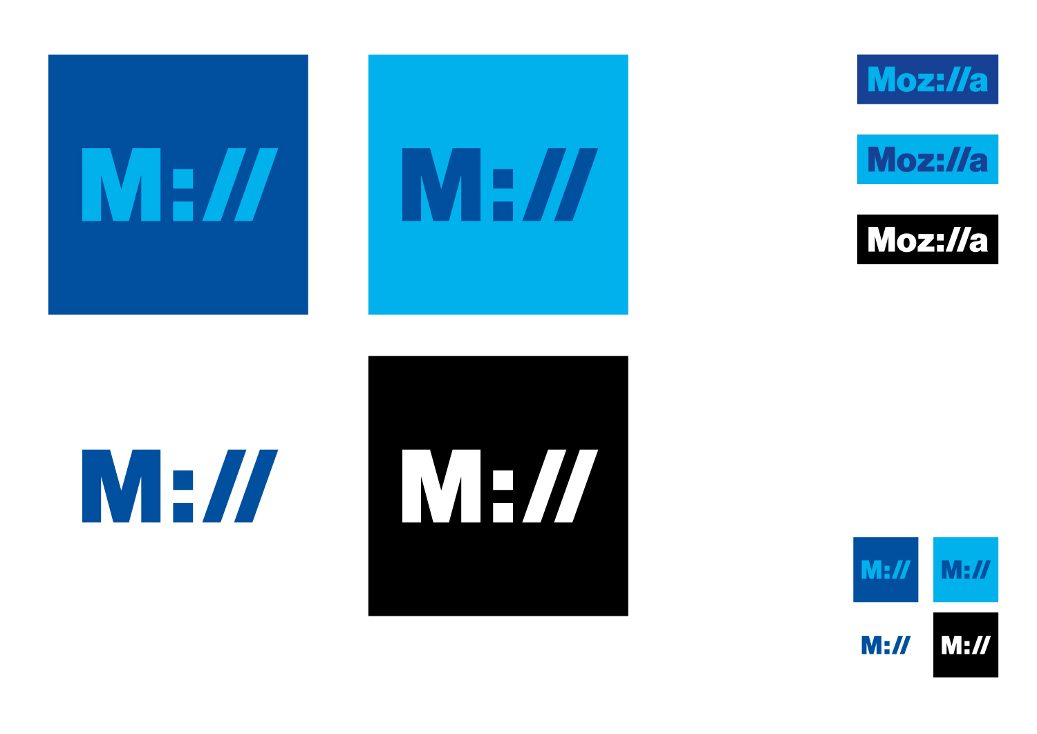
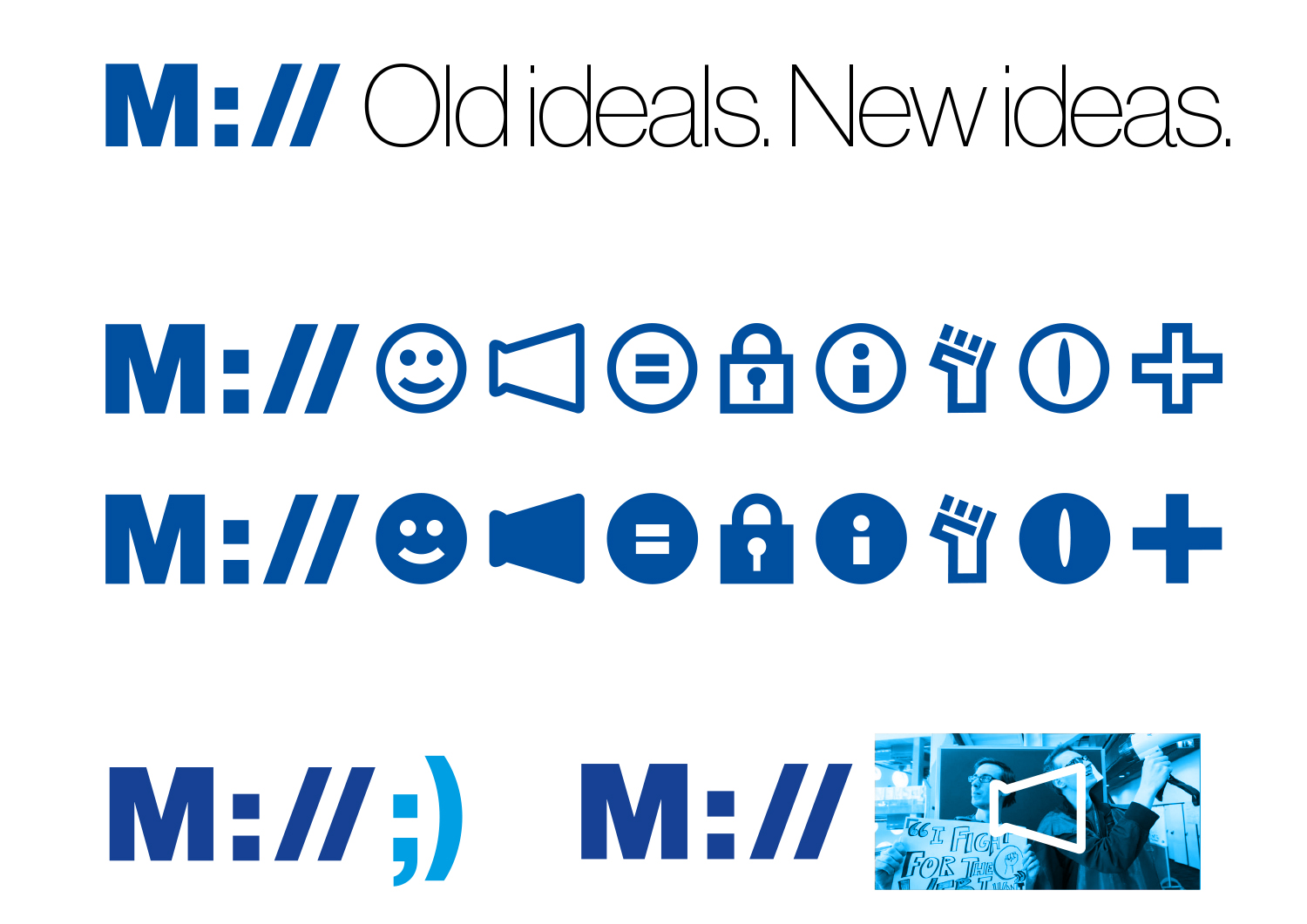
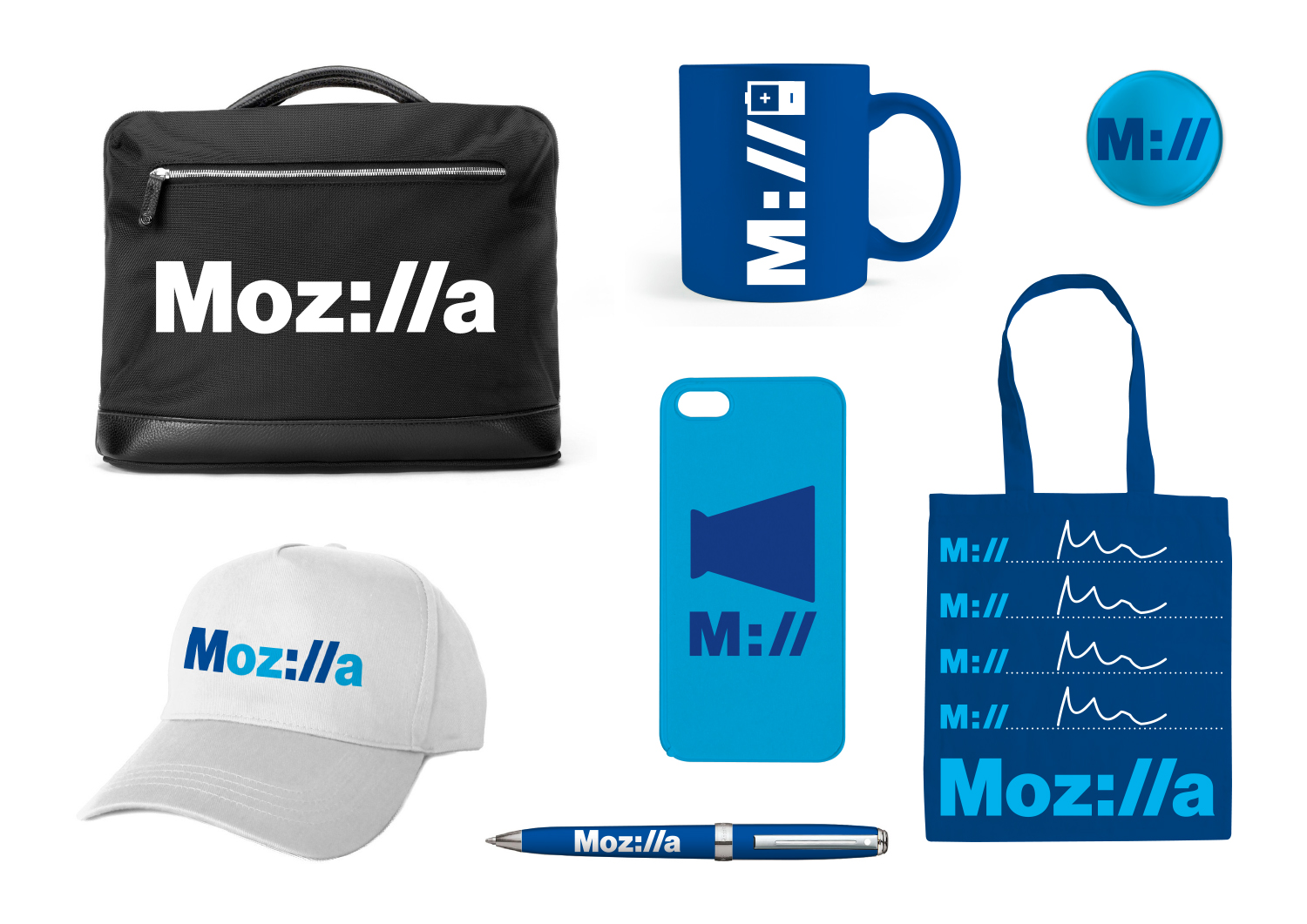
If we want to show that Mozilla is at the core of the internet, and has been for a long time, how do we show that it’s a fundamental building block of what we know, see and use every day? Perhaps the answer is staring us in the face, at the top of every browser…

This design direction stems from the narrative theme called With You from the Start.

With you from the start.

Mozilla was, is, and always will be on the side of those who want a better, freer, more open Internet. In the early days, we were among those helping to embed principles of openness and accessibility into the web’s DNA. Now those principles matter more than ever. We need an Internet that works wonders for the many, not just the few. We need to stand by the founding ideals of the Internet, and carry them forward into new products, platforms, conversations, and great ideas. We’ve been with you from the start. And we’re just getting started.

Click the first image below to see how this logo might animate:

jb_Mozilla_design_pres_edit_3.keyjb_Mozilla_design_pres_edit_3.keyjb_Mozilla_design_pres_edit_3.keyjb_Mozilla_design_pres_edit_3.keyjb_Mozilla_design_pres_edit_3.keyjb_Mozilla_design_pres_edit_3.key

332 comments on “Design Route D: Protocol”

  1. Prcek wrote on

    From my point of view this is the only acceptable one of those seven.
    * Not over-colored – in fact I’m conservative and feel comfortable with blue+white
    * Simple but readable
    * I’m not genius, but still I can understand “Internet” reference

    Not 100% sure about Mill variant.

  2. yannis wrote on

    as a brand designer this the very best logo/direction for mozilla.
    what brilliance using ://
    with this branding you own the internet,,,,yes some of the other directions may be more colourful or have a more modern typeface but thats not the essence of great branding.
    You are missing the point if you believe colour and weird shapes makes a brand…just think of how many logotypes have been designed in the past five years and have been forgotten,
    Mozilla, stick to your knitting…this logo has a great story…the story of the internet.
    cheers
    extremely well done

  3. Stephanie wrote on

    This one by far best reflects the Mozilla brand personality over the other options. The simpler the better IMO.

    Immediately, “://” communicates the company’s purpose. I think questioning whether it will stand the test of time is smart because the proxy is often hidden to reduce clutter in browsers and marketing collateral; however, while it’s often being left out, it will always be fundamental to the digital world.

    I would keep exploring typography and color. Blue is always a winner but consider complimentary colors for a stronger visual impact.

    The animation concept is weak.

  4. Reinhart Previano wrote on

    This Moz://a branding can also work with
    Product Branding Suggestions:
    Moz://Firefox
    Moz://Webmaker
    Moz://Discourse
    Moz://Arella (Seriously?)
    Moz://Principles
    Moz://Popcorn
    Moz://Blogs
    Events:
    Moz://@CES (Moz at CES and/or Mozilla CES)
    Moz://@View Source
    Moz://Fest
    M://All Hands
    Contributors:
    M://Me
    M://John Doe
    Local Communities:
    Moz://India
    Moz://China (or M://中国)

  5. Omaru-San wrote on

    The best!! simplicity and programming creations

  6. Shelby Jueden wrote on

    I really like how this one conveys the more developer centric nature of Mozzila compared to other companies. MDN, Firefox Developer Version, Open Source, Gecko/Servo, add-ons from the start, etc. Mozzila has always been a developer company for me who really supports their users with great tools and resources.

    I don’t feel that it is too far form what non developer users would be interested in. The typing animations are excellent and something I think the majority of people can relate to.

    I’m not in love with the color scheme. I like the blue colors, but that’s because everyone does. There are so many blue logos and brand identities that it would be a shame to see Mozilla absolved into that. Red and white while still not terribly original is more unique. It also retains some of the original brand which makes the difference less jarring to those not accustomed to change. Blue and white feels soft and uneventful while red and white feels sharp and interesting.

  7. Sl wrote on

    Clear winner.
    I like the protocol, simple colors.

    Maybe a different font..

  8. random4 wrote on

    I like this version a lot, however the idea has already been used for the cURL project, which disqualifies this route IMHO: https://daniel.haxx.se/blog/2016/05/27/a-new-curl-logo/

  9. numinit wrote on

    This is my favorite. IMO, a worthwhile refinement might be making the `://` stand out more as `ill` for the general public.

    Otherwise, “M://” is instantly recognizable. Great design.

  10. Camden Narzt wrote on

    The full Moz://a logo is by far the best one, I agree with others that M:// is a bit too short and might get mistaken. But I’d love to see more ideas like Moz://a as the rest just don’t speak to me at all.

  11. Esteban wrote on

    It’s modern. The other designs are more abstract, and , well, in my opinion, this mean the change, the modernity, some new. A new look. I don’t, I think that.

  12. Victoria Black wrote on

    This one’s connection with internet/browser world is undeniable and to the point. I love the concept, and the adapted to different countries versions, as the plain blue one is just too calm and boring .

  13. Daniel Stenberg wrote on

    Just because nobody else mentioned it so far: the new curl logo uses a lot of this ://-idea. See https://daniel.haxx.se/blog/2016/05/27/a-new-curl-logo/ or https://daniel.haxx.se/blog/wp-content/uploads/2016/04/good_curl_logo.png for the logo image.

    (Then again, as the main curl author I’m also a Mozilla employee so there’s a distinct connection already… =)

    good_curl_logo

  14. Alexandre wrote on

    +1 for this one. I like the protocol delimiter inside. Variations such as M:// are nice too, and the colours can easily be changed, which is good for future evolutions of the branding.

  15. Luis Cara Fiol wrote on

    I ? M://
    ;)

  16. strtrkn wrote on

    This one is my favorite. I love the simplicity of the design.

    1. jgreenspan wrote on

      Thanks for your input, strtkn.

  17. M wrote on

    I’m ambivalent. The colors are a bit dull and the overall design feels a little enterprisey and dated. I worry most people won’t appreciate the :// or the value/meaning of a protocol, although the ‘moz’ protocol idea is cool. Perhaps it will feel unfriendly or inaccessible to many people? The :// may easily become forgotten or invisible in a few years; are newer Web users even aware of it?

    1. Kris wrote on

      I agree with this. Techies will get the reference just fine, but to the vast majority of people it will just look weird.

  18. Noah wrote on

    The M:// is a neat gimmick, and easily comprehensible by most, but the typeface is out-dated, and colours generic. It does not seem like an upgrade. It’s a crowd-pleaser that doesn’t aim far enough.

  19. Santiago wrote on

    This is the best one and the right option without any doubts, The other ones do not represent Mozilla, this fully does.

  20. Manu Poletti wrote on

    Like this one best, it’s clean, makes a point but not too obscure.

  21. Daniel H. wrote on

    Absolutely love the full version of this. Looks fantastic and the color scheme is wonderful. But the short hand version will be read by everyone as ‘mill’ :p So, if it’s going to be shortened it might need some work, but overall I think Moz://a definitely looks the best and has the best feel.

  22. Lisandro Lorea wrote on

    I really like this one. I think is the best. I’m not sure about the colors. Blue and blue makes it look a bit sad and one of the blues is almost “facebook blue”.

    I’d like to palette options but otherwise I think this by far the best design. It immediately tells you what Mozilla is.

    jb_Mozilla_design_pres_edit_3.key

    1. thomas browne wrote on

      your colour scheme lifts this otherwise awfully boring, as you correctly state “facebook blue” logo, by miles. I could live with your version, though helvetica, sigh, yet again…

    2. Edward Allanby wrote on

      Agree!

    3. Edward Allanby wrote on

      I get it and admit it is clever but I think this route has too narrow a focus. At worst it is a typographic gimmick with one punch line. And we will suffer that same line every single time we interact with Mozilla – Im already over the joke

      Also – Perhaps a personal bias but I think concentrating on the backend is wrong. To me, the most valuable thing about the internet is what it can do not how it is made.

    4. Mike Thompson wrote on

      Right! Facebook blue! Make it Godzilla green!

  23. Mozillafan wrote on

    This is by far the best design! Modern professional but still a “geeky” twist. I love it! Would definitely buy the t-shirt and promote the brand

  24. christina wrote on

    Clear. Clean. Sharp. says “Internet”. Solid.

  25. Nik B. wrote on

    The good: this logo is easily my favorite, at least when “Mozilla” is spelled out in full. From all the options, I like this best: it’s clean, crisp and easy to read; it’s uncomplicated but has visual depth. It just gets the point across: “Mozilla”.

    The bad: the M:// styling doesn’t do much for me. It doesn’t read as “Mozilla” and only “works” if you’ve already seen the full logo and notice that this is the same logo, but with the lighter-colored characters dropped out. The “old ideas. new ideas” bit feels gimmicky, as do all the fancy and largely unintelligible emojis.

    1. Rick wrote on

      Agreed, the emoji is a bit much. Maybe it’s a generation gap between me and the millennials, but I find them a barrier to communication. Much like Egyptian hieroglyphics, I would need a Rosetta Stone. I like how the M:// screams internet and that’s what it’s all about.

      This one is my favorite

  26. Jeff Smith wrote on

    By far the best of the bunch. I like how its modern but also shows its roots.

    A user since Phoenix/Firebird ;-)

  27. Ev wrote on

    This is the one. End of story. All the others are subpar in comparison.

  28. Warwick wrote on

    I think this is by far the best.

  29. Jon D. wrote on

    Easily my favorite of the whole bunch. Concisely encapsulates what Mozilla is all about as a company, very pleasing to the eye and versatile. Very professional looking, without being too serious or stodgy. I love the colors, were it not for the fact that those shades of blue are widely associated with Microsoft Internet Explorer. Maybe substitute one of those shades of blue with Firefox Orange? Or maybe a call back to your roots with the original black/red?

  30. Walter Milliken wrote on

    This is probably my second choice among the seven. It’s clear and legible, and not overly complex. My only negative on this one relates to the fact that it’s backward-looking. Given the trend in removing boilerplate elements from URL boxes these days, how many people will know what the “://” means? On the other hand, this is probably neutral for people who don’t understand it, and may appeal to us early net geeks, sort of like the secret handshake of the web’s old-timers….

  31. Thresher wrote on

    Maybe I’m getting too old, but this is the only design that resonated with me. It has the right amount of geek, while still being completely legible to the non-geek. And I like that it has a smaller logo built-in: M://!

  32. dinah wrote on

    My favorite of the choices, feels modern, suites Mozilla well and could be versatile. I’m not a huge fan of the colors though.

  33. art inghram wrote on

    Brilliant. So simple and meaningful.

  34. Stephen So wrote on

    This is by far the best design. It is quite a smart use of the protocol and demonstrates that Mozilla has been there from the beginnings of the Internet that we know today. It also highlights Mozilla’s technically innovative side. The colours are good too. The others are just too colourful and amateurish, a bit too similar to G00gle. It’s not too abstract and you don’t need to think, turn your head upside down, or down a scotch to see what company’s logo it is. I hope this one is selected.

  35. Mike wrote on

    I think @Phil Gyford’s point in an earlier comment about the :// not being clear enough on whether it is a “colon slash slash” or “ill” in different scenarios is definately a concern here. It also screams “HEY, HEY, THIS IS COMPUTERS… COMPUTERS. DID I SAY COMPUTERS?”

    Having said that, i’m not a fan of concentrating on gimicks in wordmark logos (as the replacement of ill with :// is here.)

    Also sidenote, kinda reminded me of the recentish curl logo ‘redesign’ with the “curl://” although obviously not refined itself as a logo, but comes accross as a more straightforward less gimicky use of the :// to me.

  36. Sysau wrote on

    Love it

  37. Jeremiah Lee wrote on

    Moz://a is a strong base concept.

    I don’t understand why some letters are light blue and others dark blue in the two-toned logotype. The abbreviated M:// looks like the word “Mill”. The tagline and webdings are weak.

  38. Smoobly Renfrew wrote on

    Classy, understated, clever, simple, sophisticated. The only one that resonates. My hat’s off to whomever designed this.

  39. Geoff wrote on

    The only thing I don’t like about masquerading as a protocol is that it has the potential for adverse side-effects. My first thought would be searching for “moz://a” exactly as written. I’m not sure the special characters will be recognized by most search engines and you may be mistaken for moz.com, for example.

  40. Jeffery wrote on

    This one has my vote.

  41. Brad wrote on

    The one that grabbed me was the eye logo, but not for the right reasons. This logo is by far the most usable and least controversial, but it is boring. All the others look like some abstract artist was let loose and to me that’s not good. This logo is an 8/10.

  42. C.S. Loberg wrote on

    This is the only other one other than the global one to have any chance at succeeding. And I’m not really sure I need this over your current logo at all. I still like the one I have. Sorry, Mozilla, but this isn’t going to suddenly bring in millions of new customers. You can’t compete against the search engine of the day.

    1. Tim Murray wrote on

      Thanks for being a part of this review process, C.S. We currently have a limited toolkit of creative assets to communicate about Mozilla. The word mark “mozilla” that we use today is not sufficient for modern communication. Mozilla makes Firefox, the open-source web browser, and does so much more as a nonprofit championing the health of the Internet. If you have the time, please have a look at this post: https://blog.mozilla.org/opendesign/now-were-talking/ and read earlier posts on why we’re doing this work. Thanks again!

  43. Margo Cerno wrote on

    The strongest candidate visually. Bounce the “Old Ideas” bit, otherwise the slogan will be burdened by western cultural sensibilities about old age.

  44. Noam Tamim wrote on

    This is an awesome design. I’m a huge fan.
    But I’m a geek, using Firefox since it was called Firebird, v0.8, as my default browser.
    Still, I think it also looks modern and many non geeks can like it, even without understanding the protocol reference.
    When scaling, I think the prefix should be moz://, not m://. It makes sure everyone understand it’s mozilla, not a Windows-style drive letter. And of course, moz is Mozilla’s vendor prefix!

    1. Denis Bredelet wrote on

      Totally agree, it should be Moz:// not M://.

      The latter even looks boring so I don’t see the attraction. Try with just :// in the square and place the Mozilla M somewhere else it might work. And never use the “M://” text in marketing materials, it looks like a drive letter in Windows.

      The font and colours are unimaginative but that is not what bother me the most.

  45. Richie Cotton wrote on

    A few commenters have mentioned that they perceive the only-blue color scheme as cold or boring. It could be made more lively if you mixed blue and orange; this provides brand continuity since it matches the current Firefox logo.

    jb_Mozilla_D_protocol_1-1-rjc

    1. rugk wrote on

      Yeah, blue & orange looks nice!

    2. Richie Cotton wrote on

      Further refinements:

      – Helvetica is boring; some more thought on the font is needed. After playing around for a while, I opted for Linette semi-bold, then I realigned the slashes for vertical centre-alignment.
      https://www.myfonts.com/fonts/jcfonts/linotte/semi-bold

      – URLs are mostly lower case, so a lower case “m” seems suitable.

      jb_Mozilla_D_protocol_1-1-rjc

  46. Tim in Colorado wrote on

    This one has my vote. None of the others really work for me. The on/off button is closest, but it doesn’t scream internet history like this one does.

  47. jetpks wrote on

    Definitely visually appealing, but symbols in the branding will cause tons of hard to track down issues in every code-related place this is put. How many url parsers will treat moz://a as a url? Probably all of them since it’s to spec.

    People just discovering, or rediscovering the brand may only know Moz://a as a link that always takes you to the dinosaur page in chrome…

    grep -r Moz:\/\/a . # kinda loses its flair
    mkdir moz://a # not on any modern filesystem

    Plus, now that you don’t have a single brand name that works everywhere, you have two brand names: Mozilla and Moz://a. Like Ømq and zeromq. Or is it 0mq?

  48. Lluc Sumoy wrote on

    This logo clearly outstands the rest. It feels modern and professional, very identifiable, refreshing, positive… It reflects the core mission of the organization, and can be easily used in the short format everywhere.
    The other logos look just like a students competition, and would age too fast. IMHO this one will last as a solid brand for years.

  49. Frank wrote on

    In my view this is the only design that connects to what Mozilla _is_. The other designs carry no such message. They are aesthetically pleasing but would function for any number of companies.

    Beyond that it’s calm, clever, and I quite like the “M://”.

  50. Doug wrote on

    This is by far my favourite design.
    The :// could be toned down a bit. For example, using an italic lower case L instead of a forward slash helps a bit. Also, the : could be stylised a bit more so as to look closer to an i.

    I also really like the lowercase m that the logo currently uses, so mocked the following up:

    moz

    1. rugk wrote on

      Yeah, I like this idea. Maybe a bit to thick the “ll”s though.

More comments: 1 2 3 4 6