Categories: General

Design Route D: Protocol

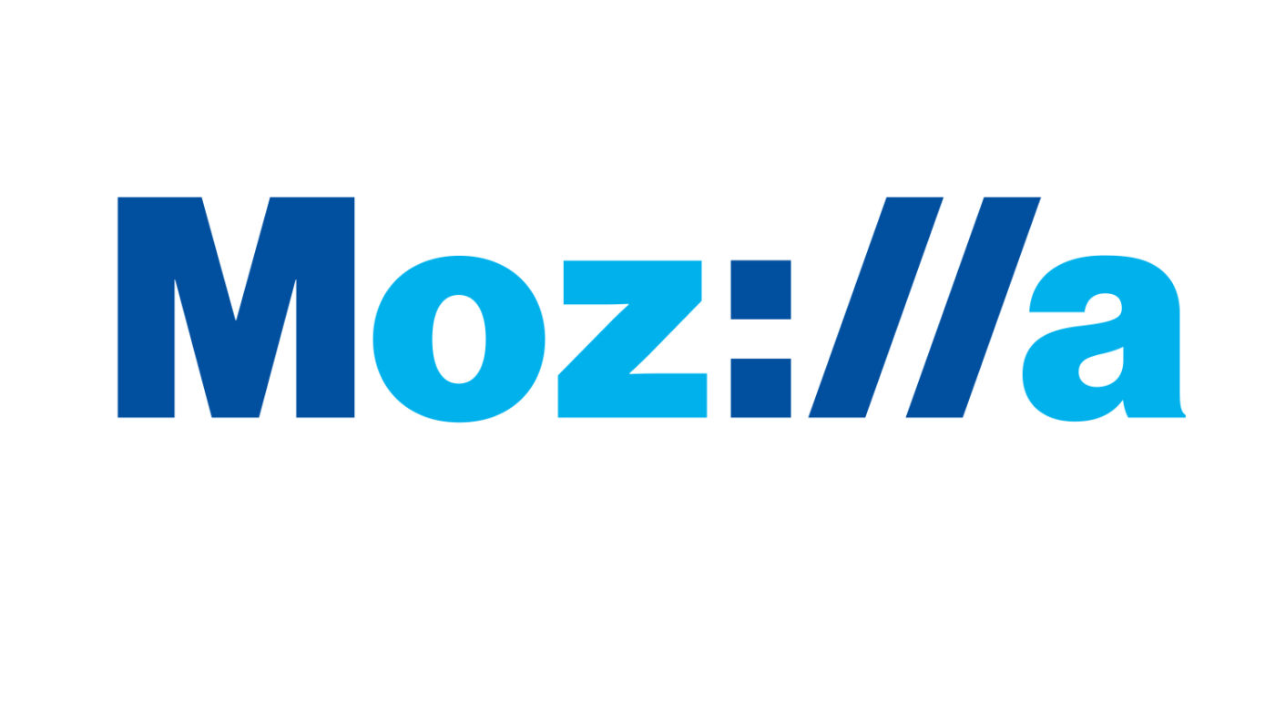
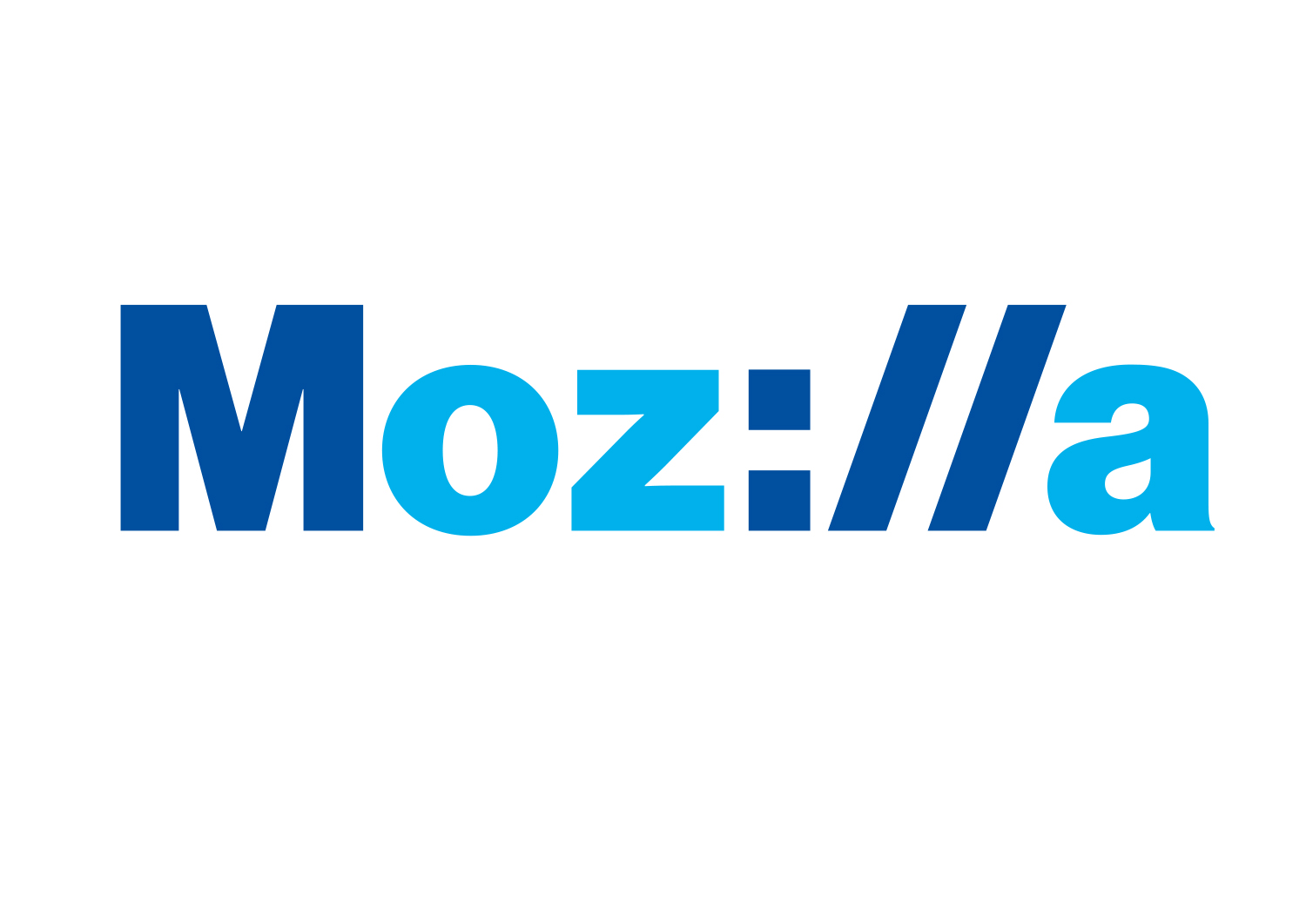
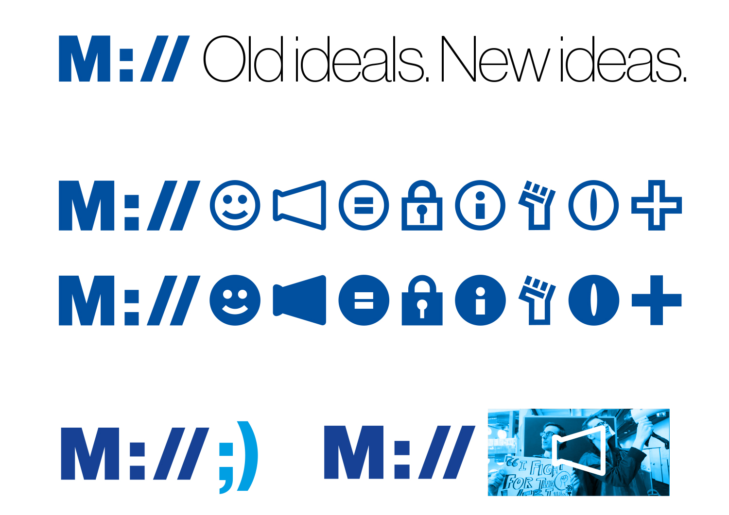
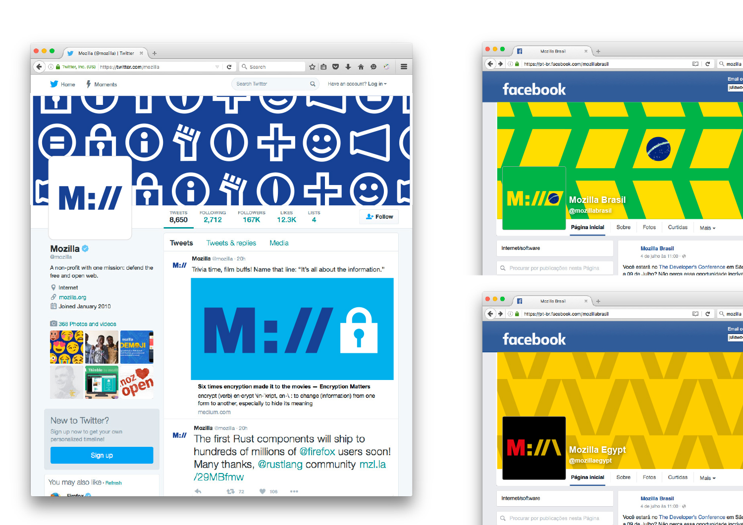
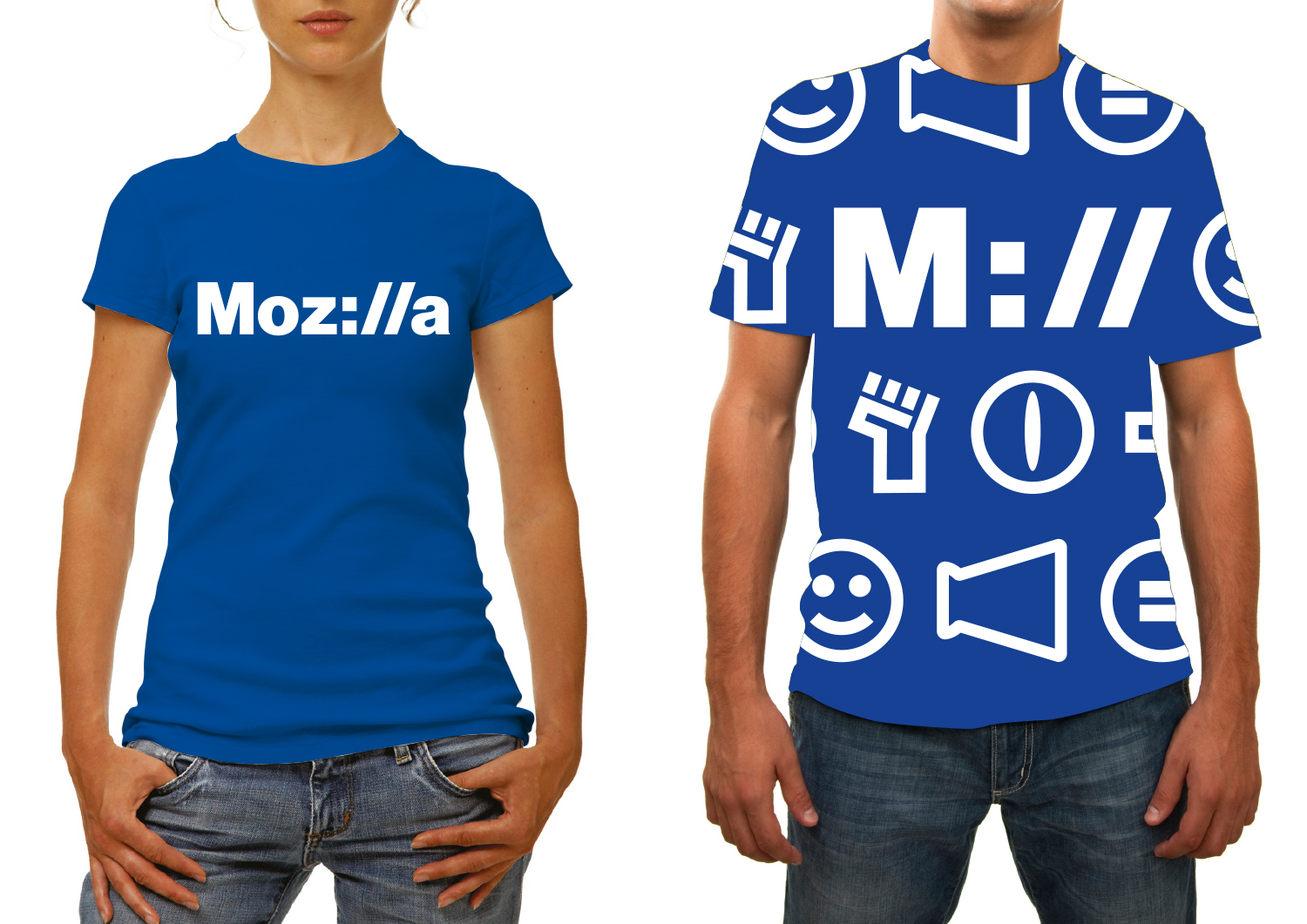
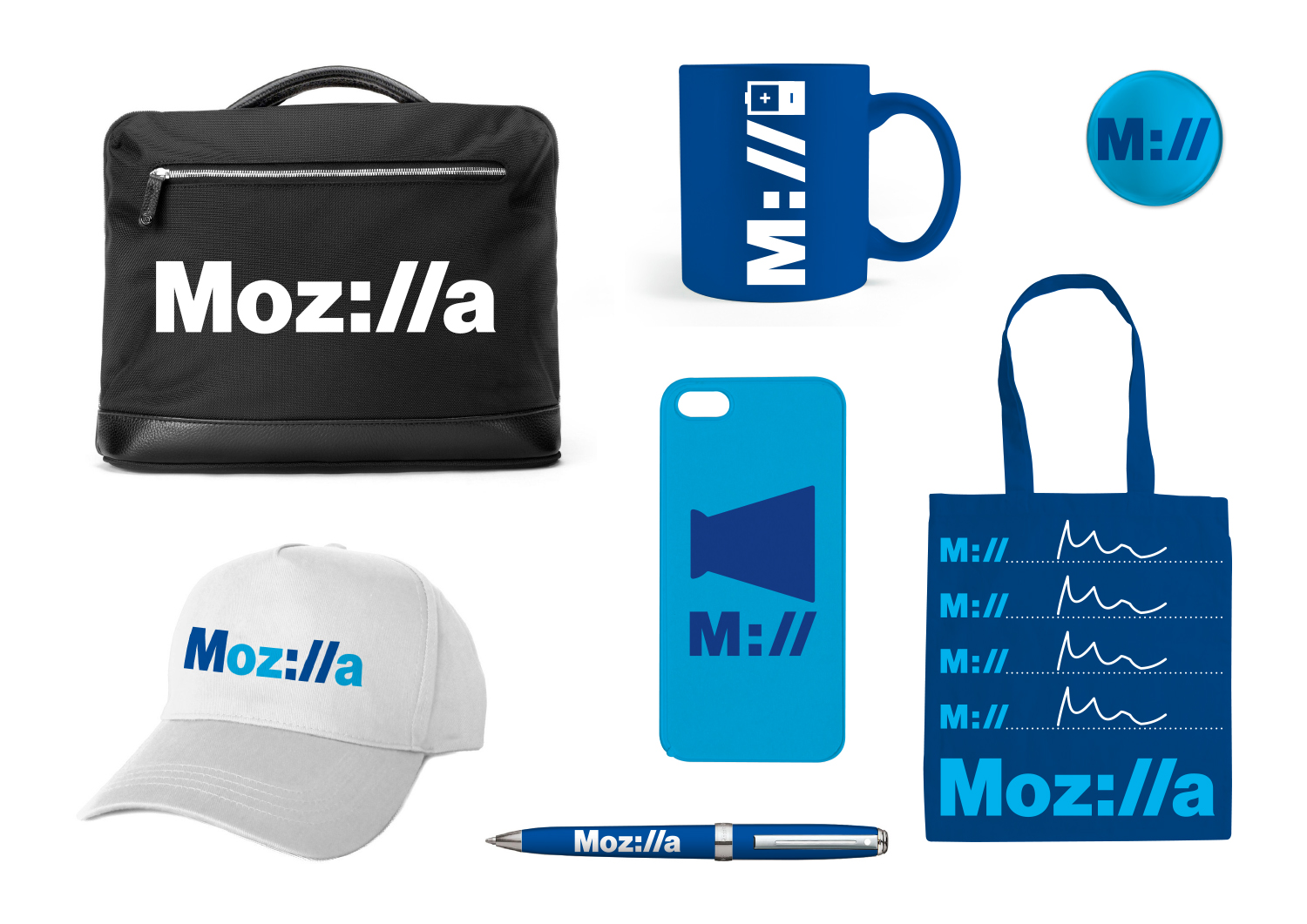
If we want to show that Mozilla is at the core of the internet, and has been for a long time, how do we show that it’s a fundamental building block of what we know, see and use every day? Perhaps the answer is staring us in the face, at the top of every browser…

This design direction stems from the narrative theme called With You from the Start.

With you from the start.

Mozilla was, is, and always will be on the side of those who want a better, freer, more open Internet. In the early days, we were among those helping to embed principles of openness and accessibility into the web’s DNA. Now those principles matter more than ever. We need an Internet that works wonders for the many, not just the few. We need to stand by the founding ideals of the Internet, and carry them forward into new products, platforms, conversations, and great ideas. We’ve been with you from the start. And we’re just getting started.

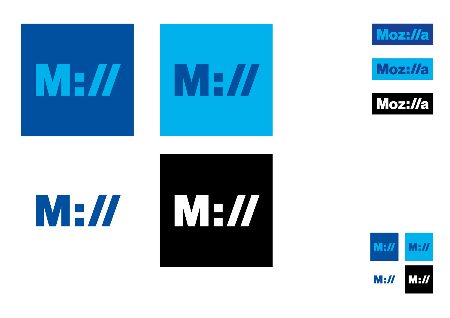
Click the first image below to see how this logo might animate:

jb_Mozilla_design_pres_edit_3.keyjb_Mozilla_design_pres_edit_3.keyjb_Mozilla_design_pres_edit_3.keyjb_Mozilla_design_pres_edit_3.keyjb_Mozilla_design_pres_edit_3.keyjb_Mozilla_design_pres_edit_3.key

332 comments on “Design Route D: Protocol”

  1. thomas browne wrote on

    No no no. This is a complete snooze. Facebook blue + Twitter blue in the logo? No differentiation from these two untrustworthy monopolists. Helvetica? Again? There will come a time when the 15-year obsession with this font will start to wither. That time is now.

    A URL “ll”? I thought Mozilla was trying to show it was more than the browser?

    I’m not surprised that this is getting the most comments, because it’s the most neutral, obvious, familiar, and frankly boring, logo. It’s a “I’m a paid up member of the herd” logo and I dislike its tragic lack of differentiation or adventurous spirit.

  2. leon wrote on

    If i had to, I’d pick this one, but…
    – “http://” is being omitted in modern browsers, non techy users won’t get the hint
    – it confuses regarding the spelling (do I google for “moz://a” now?)
    – the colors look very cold, I think it does not embrace “community”
    – the font not very expressive, so the logo does not stand out and is not so recognizable
    – What I think is a very bad Idea in all designs, is breaking the color scheme for variants of the logo.

  3. Adam wrote on

    The blue and Helvetica make me think “generic corporate logo”. Kind of a boring logo. Reminds me of Microsoft’s previous logo.

    microsoft-blue-logo1

    1. Arakun wrote on

      My thought exactly. The :// part is clever but the choice of font and colour screams 90s tech company.

      Intel_old_logo.svg_

      1. jgreenspan wrote on

        Thanks for your input, Arakun.

  4. Mike Johnson wrote on

    As others have stated, this is clearly the best of the bunch. I stand by what I said on some of the others though. This is asking to choose from a lot of bad choices. I’m sure these all hold meaning to Mozilla, but I don’t like any of them. You need cleaner and simpler, and less gaudy. You should target simple and sophisticated…for the sophisticated browser. They’re not good.

    My issues with this one, while it is not garish and overly harsh like the others is that it is almost too dated.

    You need something cleaner and more modern. Less is more. Pick this if you must, but if you can.. scrap them all.

    I could do what many have done and go into specifics about what this one or that one says to me or reminds me of, but that misses my larger point that first impression, gut response is not positive for what are undefined cerebral responses and feelings.

  5. Márcio Ramos wrote on

    Right alongside the “Eye”, this is one of my favorite designs.

    It displays a clever use of typography to deliver the “internet” nature of Mozilla. It can also easily go monochrome, which is always useful. I believe that it would be best to go all black and ditch the blue – there’s already too much blue on the internet, and I’d encourage you to choose another color if you don’t want to go black monochrome.

    Maybe you could choose another font, and make the space between characters tighter, but that’s just a small suggestion.

  6. Olli wrote on

    This will win, and I think it’s a pity. This will win because people are so safety oriented, and not because it would be the best option.

    As a designer, I can admit it has successfully applied minimalism/ swiss style / flat design on Mozilla logo. But what makes you to remember it? To differentiate it from a neighborhood laundry service, or from debt collection agency’s website, or from your local one-man-and-van web design agency? Nothing. It doesn’t create identity.

    Although I’m a minimalist by heart, I think the flat design/ minimalism wave is doing harm for design. It’s making everything look the same, especially in the hands of engineers/MBAs/coders and other non-art-background people.

    1. Zed wrote on

      Yearh I’m also wary of minimalism in design. But I think it’s done pretty well here since they have a pretty solid idea behind it i.e. moz as practically an internet protocol (albeit technically not). As communicative design, I think it does its job best out of all the presented logos _despite_ its minimalism.

  7. Ryan J. McDonough wrote on

    Hands down my favorite and most aligned with the Mozilla brand.

  8. MotoTech wrote on

    My favorite. The rest look a bit CGA (4 color … Late 80’s).

    1. Rudolf wrote on

      You’re totally right!

  9. La Perra Verde wrote on

    My favorite, the most nerd.

  10. Ahmed wrote on

    Of all 7 main logos, I like this one the best. It’s simple, easy on the eye and might I say likable! However, the supplemental logos are a bit lacking in both style and creativity. They still need a lot of work to match the other ones.

  11. Adam wrote on

    Among all the choices this one speaks to the image I have of Mozilla directly and with a clear message.

  12. Rudolf wrote on

    This Logo is really great. It combines integrity and the feeling of digital innovation. This Logo have to win!

  13. Robert Kaiser wrote on

    This is easily the idea I like best so far, very awesome idea to tie our logo to “the Internet” as URLs with “://” in it are what people identify with “the Internet” very probably.

    That said, the font face doesn’t look really right for Mozilla and the color scheme does neither. I’d prefer working our “traditional” red and gray colors from the Mozilla branding into this. But this idea has a lot of promise in my eyes, worth more exploration for sure!

  14. Cathal Mooney wrote on

    Definitely my favourite. Please don’t use the yellow & black one!!!

  15. Yann Esposito wrote on

    This is by far my favorite. Simple and efficient. Once saw never forgotten.

  16. Naylan wrote on

    This is the only logo that gives a idea of what Mozilla is, for someone who doesn’t know it. Even for a non-techie, It clearly shows the magic stuff at the beginning of some links, so Mozilla should be related to the web. A techie would grasp the meaning even faster.

    Bonus: it’s intelligible! Just on this point it’s also the best logo.

    I’m not so fond of the font, but that something that can be worked on later.

  17. Charilaos Tilaveridis wrote on

    Look no more, that’s the one.

  18. Doc Billingsley wrote on

    Definitely my favorite. It’s abstract enough to (hopefully) please the designers, but practical and legible enough to appeal to the uncultured masses (like me).

  19. James wrote on

    This one is weirdly retro and will be confusing and alienating to non-technical users. Many browsers are moving toward hiding the protocol from users, and hardly anyone will ever be typing “://” these days.

  20. Zed wrote on

    clear, distinctive, very legible, and acknowledges the role that Moz has had in shaping the internet of today. Best by far; +1.

  21. Jarrod wrote on

    This is by far the best. As many have stated, change the color to something other than Facebook blue. The green or orange variants people posted were nice. Also using different colors for different products would be nice.

    I’d move away from the webdings/wingdings/pseudo emojis. They don’t work conceptually or visually. Please loose the “eye” icon as it kinda looks like a flesh light.

    The ability to add type after the :// is huge, especially in foreign markets where you can use the local language.
    In general for the text following the :// I would use a lighter variation of the font.

  22. Thomas van Diepen wrote on

    This one is too cheasy to be the symbol for an internet company.

  23. JP wrote on

    I really like this one: “Pioneers to a better internet.” And put it surrounded by the outline of a UFO. Reddit readers will resonate with it.

  24. rugk wrote on

    This is my favourite. Maybe the reason is that it is a bit for the geeks (which we should keep in mind as most commenters here might also be fit in this criteria), but anyway I like it. And everyone (okay, nearly everyone) knows the “://” from the URL.
    This shows Mozilla’s connection to the internet. And it is of course okay all around the world.

    However I think that the colons are a bit boring. I mean you should stay serious and don’t use neon colours, but some other colours would be nice. And I think one blue could stay there.

    Maybe the “community” character is a bit missing in this logo, but I don’t know how this could be changed.

  25. Paco Núñez wrote on

    :// is hands down the best idea for the logo

  26. Scott wrote on

    Favorite, easily as well.

  27. Random Paul wrote on

    I like this one also. Unfortunately it’s not 2010 anymore. Would of been cool.

  28. Chris wrote on

    Has potential but so many problems.
    First don’t change the colour inside the word. It makes the “oz” “a” stand out more than the rest. Just use the one colour.
    Secondly, Get rid of all those symbols. They look completely out of place, and just looks like you’ve typed random characters into Wingdings. That male shirt gives me a headache looking at it!

  29. Jack Donaghy wrote on

    Out of all the proposed logos, this is the only one I like. The others are just far too complex for a corporate logo. This one is nice and simple, and as others have said, it makes a clear and clever reference to Mozilla’s technological focus.

  30. ElecBoy wrote on

    +1 This is it.

  31. James wrote on

    I really love the concept on this one. The execution is pretty boring, though. The animation, font, and colors remind me of 90s startup company logos.

  32. Jep wrote on

    This is the only concept which identifies mozilla.

  33. Aaron wrote on

    This one, please! The :// is what Mozilla is all about to so many people.

  34. Jorge A Vazquez wrote on

    Now this one. This one is pure genius. It says it all without saying much at all. Gotta love how that colon and the slashes just fit so well. This logo doesn’t just say Mozilla is an internet company. It says Mozilla is THE internet company. Simple. Bold. Effective. Excellent work.

  35. Parijat wrote on

    Easily my favourite. Simple, elegant and I somehow instantly connect it with the emotion I feel when I think about Mozilla

  36. Satrio wrote on

    Another one with interesting—and fitting—concept, but can do better in its execution. I particularly think it would do better with a thinner and less generic typeface. My #4.

  37. Stijn wrote on

    I like the idea, however I don’t like the animated logo and the color scheme could use something more ‘fresh’.
    I think the animated logo could do better if it ended with and expansion, going from M:// to the full Moz://a in the end.

  38. William Nkandala wrote on

    This is clearly a winner! It’s instantly recognisable and has clear hints of the evolution of the mozilla brand in it’s www world.

  39. Enrico wrote on

    This is for sure my favourite concept! I like the idea, it tells much about Mozilla, it’s simple and easily adaptable to various contexts.
    I think the execution is somewhat lacking. It’s quite anonymous, both because of the colours and the font.
    As for the colours, I would try adding some Firefox’s orange (either alongside the blue or not): it immediately reminds me of Firefox and it’s less abused than blue.
    I guess few fonts are suit to this job, still it would be nice to try with something different than Arial. What about a modified version of Fira Sans (with lowercase ‘M’, and square colon)? Also, why don’t put it in an address bar? I made a quick mock-up to see how it would be…

    design-idea

    1. Andy wrote on

      I agree with the idea of relating the letterforms to Fira Sans. Fira is the strongest branding component, and a real advantage for the whole ecosystem. For sure explore many color options, but make the whole system work in the absence of color too.

  40. lehasb wrote on

    I like it, but it seems less catchy than I would have expected for Mozilla’s redesign.

  41. Lola wrote on

    This is my favorite. Simple, and blue…

  42. Manuel Borges wrote on

    Definitly this one.

  43. Fábio Gaspar Ferreira wrote on

    My favorite also, I think that it is very original.

  44. Hagen Mahnke wrote on

    Easily readable and the only candidate that’s not terrible in one way or another. Use this one or start from scratch ;)

  45. Yashveer Ramparsad wrote on

    Definitely the better and least “loud” design wise. The others somehow seemed too vulgar to look at. They were either too striking or hurt my eyes with the color arrays!
    This is more visually appealing, and soft. One of the items that was suggested to consider, was whether this would stand the test of time. This logo seems timeless, could last forever, easily recognizable!

    Definitely voting for this

  46. Lunatic Sentinel wrote on

    Perfect – Captures the essence of computing from the early DOS days to the present. It says it all as concisely as possible and with style. It really speaks to all the geeks out there.

  47. Martin Kiss wrote on

    I like this logo mainly for its flexibility for building links. All apps I use recognize Moz://a as a valid URL and try to open it. Your apps could handle these URLs and present relevant inforrmation. Imagine this URL “Moz://a-Firefox” opening some landing page for Firefox.

    1. jgreenspan wrote on

      Very cool point, Martin, thanks!

  48. JCGVannier wrote on

    Definitely my favorite.
    This is not another hipped company that will die with his brief success. Don’t go for a messy logo. Over the years, Mozilla have been fighting for an open, structured and standardized internet. Keep it clean, keep it simple, straight to the point like you’ve always been.

  49. Max wrote on

    This one is the best by far! Go Moz://a!

  50. Alison wrote on

    This one makes me smile and definitely connects me to Mozilla and the internet. I do like the colors, but it could optionally be brighter as well.

More comments: 1 2 3 4 5 6