Categories: General

Design Route D: Protocol

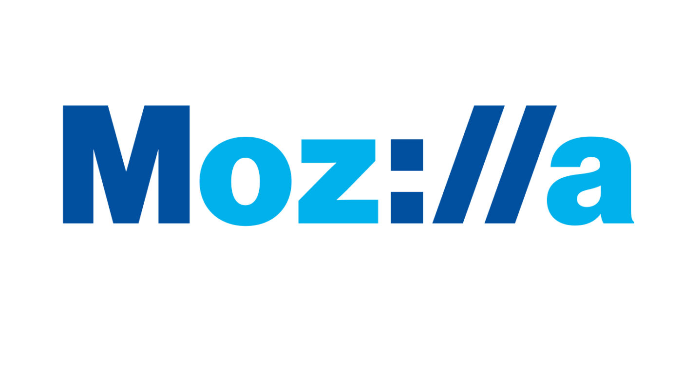
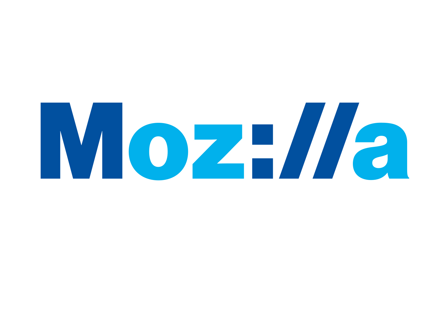
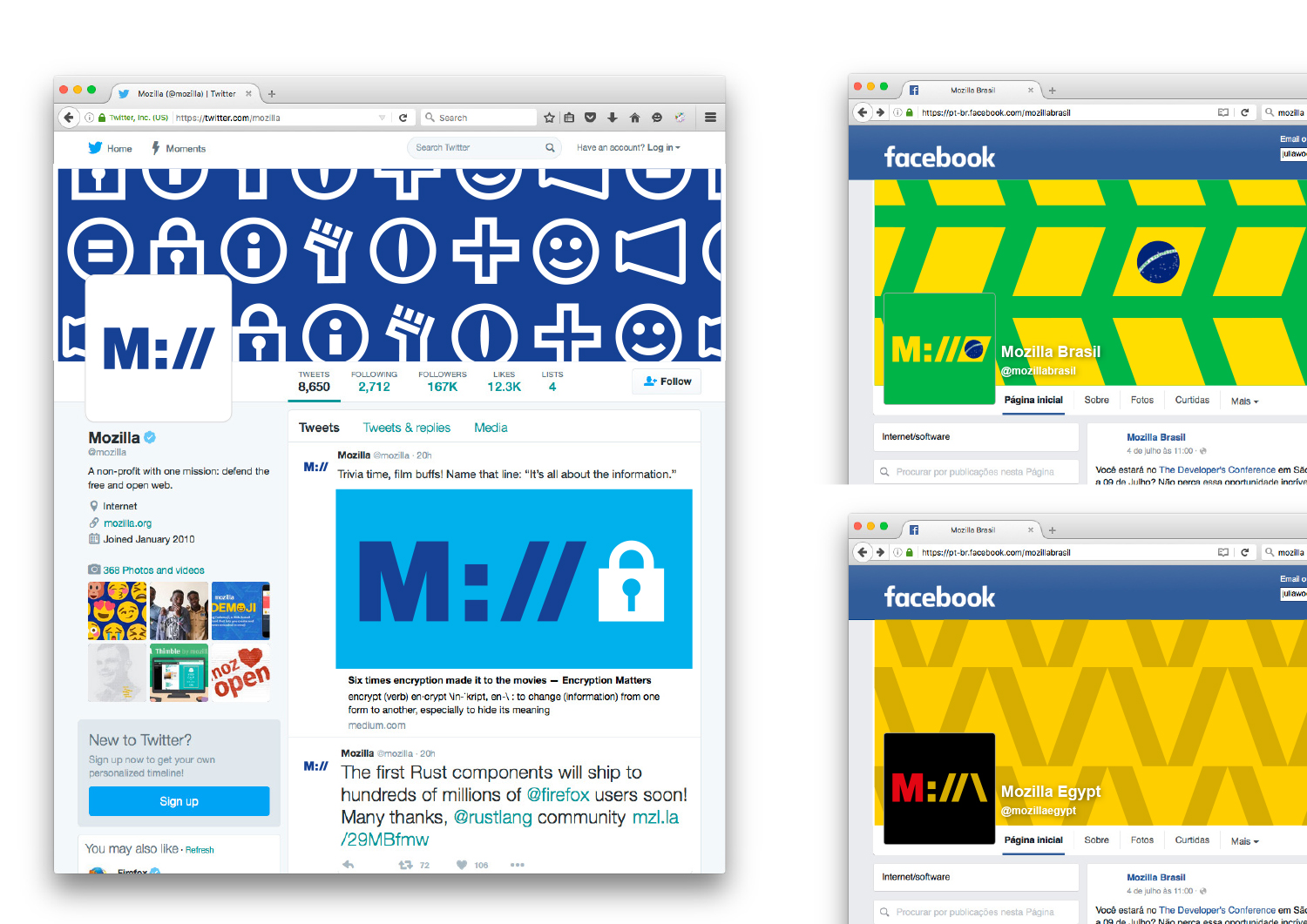
If we want to show that Mozilla is at the core of the internet, and has been for a long time, how do we show that it’s a fundamental building block of what we know, see and use every day? Perhaps the answer is staring us in the face, at the top of every browser…

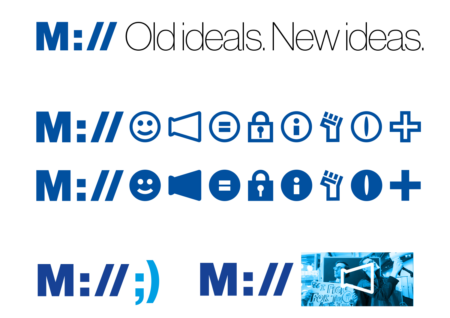
This design direction stems from the narrative theme called With You from the Start.

With you from the start.

Mozilla was, is, and always will be on the side of those who want a better, freer, more open Internet. In the early days, we were among those helping to embed principles of openness and accessibility into the web’s DNA. Now those principles matter more than ever. We need an Internet that works wonders for the many, not just the few. We need to stand by the founding ideals of the Internet, and carry them forward into new products, platforms, conversations, and great ideas. We’ve been with you from the start. And we’re just getting started.

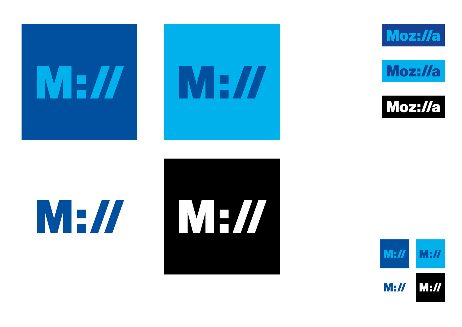
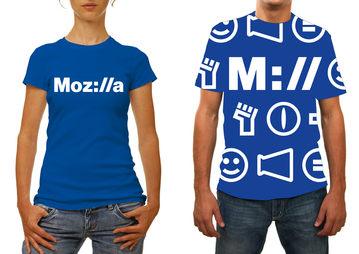
Click the first image below to see how this logo might animate:

jb_Mozilla_design_pres_edit_3.keyjb_Mozilla_design_pres_edit_3.keyjb_Mozilla_design_pres_edit_3.keyjb_Mozilla_design_pres_edit_3.keyjb_Mozilla_design_pres_edit_3.keyjb_Mozilla_design_pres_edit_3.key

332 comments on “Design Route D: Protocol”

  1. Calvin Walton wrote on

    Of all the logo proposals given, this is the one that I … dislike least?
    The Moz://a idea is quite clever, but putting it in blue with such a basic-looking font makes it boring. To me, the color “red” is one of the strongest Mozilla brand associations. I would love to see this logo move to red or warm colors to evoke the passion of the people who work on this project. There is certainly also some room to play with typefaces (something similar to Fira maybe?) to make it a bit more playful and less corporate.

    text4136

    1. jgreenspan wrote on

      Thanks, Calvin, thanks for thinking through the color impact of our existing red.

  2. Konrad wrote on

    SImply the best among the others. It is an instant link to the core of the identity of what Mozilla is in my opinion – an icon of the web, the free web, an invention and ongoing organization of people concerned about true idea of the web. Thank You.

  3. Homayoon Azimi wrote on

    Your current logo is nice; but if you want to change it try this one. It’s cool awesome.

  4. k3nt wrote on

    This text and idea work well to convey the backbones of mozilla. The programming. How about refining and combining another which appears progressive and vibrate, a future forward energy..
    <img src="https://blog.mozilla.org/opendesign/files/2016/08/jb_Mozilla_B_connector_2.jpg&quot;

    1. jgreenspan wrote on

      Interesting idea, K3nt, thanks very much for thinking through this with us.

  5. Sander wrote on

    With apologies for the negativity: I’ve been a part of the Mozilla community since 2001, and care deeply about the mission and the history. This is the only design I don’t hate with a passion, the only design which still feels _somewhat_ like Mozilla.
    It still isn’t the right design. Too geeky, not enough dinosaur / constructivism. But at least I wouldn’t shudder too much each time I’d encounter it.

  6. Tom wrote on

    This is by far my favorite. Clean, simple, forward-looking, easy to understand.

  7. Andrew Huff wrote on

    I like this one best, although A) I think it would look better in one color vs. two, and B) by the full logo’s logic, the shortened M:// would read “Mill.”

  8. TheTechnoToast Ltd wrote on

    This one, easily the best. That :// makes the overall design incredibly unique, and it’s just awesome.

  9. AProviste wrote on

    by far the most elegant and most recognisable one…

    browser, iot, devices, technology, protocols… Mozilla in my mind is tight to internet,
    and it has been for ages…

  10. ddurst wrote on

    Three things about this one:

    1) it is the only one that is easily readable, the only one that could be considered an extension/evolution of the existing mark. That’s good. I know a lot of people will say that it relies too much on the font.

    2) The “clever” factor is a bit too much. I know lots of folks like it (they get it), but it leaves out those who don’t (and those who won’t) and the legibility/scannability suffers as a result. That may not seem like a big deal, but keep in mind that aside from Apple, we are largely going to be compared to other wordmarks.

    3) There is a boldness to this — in terms of its simplicity and its layout — that makes a statement that the others confusingly stumble on. We should have an opinion and be a presence. This should emit confidence, fearlessness, and determination. That’s our presence.

    Clearly, I don’t like the others (at all), for a variety of reasons. This is the only one that seems close. Caveat: I do believe that our current brand identity needs to evolve into this one, not recreate it wholesale. There’s nothing wrong with the dinosaur itself, nothing wrong with the red itself. In order to connect the past to the present, we need to not shed the entire skin; this is the only one that has any potential of doing that.

  11. Ervin Kosch wrote on

    Definitely the bets of the bunch. Most of the other ones are so abstract that you can barely tell that they stand for Mozilla. The other ones have such eye burning colors that I would never want to use your product. My only change would be a very subdued gradiant to make it pop.

  12. Scott E wrote on

    This one hits home. Simple, timeless, easily tag-able, quickly recognizable

  13. David wrote on

    At first I thought the :// might look more “dev friendly” than “final user friendly” but that’s not true, everybody knows at least http://.
    But then if most people think http:// when they see Moz://a it means most people will still think about Firefox rather than other products.
    Integrating the :// clearly indicate something (computer, tech, internet, software, …) about Mozilla without compromizing on readability and simplicity, I think other logos are ways too flashy or complex, but this one’s blue variant is too much like facebook colors!
    The yellow eye logo is also readable but yellow and black look really “politics” colors to me and I don’t like that it’s not friendly at all.
    The open button idea is nice, focusing on people is friendly indeed but colors are also… too much? it’s like https://www.newmanity.com/ trying new colors because nobody used it before but I think the final result isn’t sober enough to reach maximum audience.
    I don’t really like all other logos except if Mozilla wants to start working on contemporary art or experimental software design or something like that (but flik flak colors are nice ! :)

  14. Nathan wrote on

    I like this design the most, but the the color scheme when fully written out instantly makes me think Internet Explorer.

  15. Eamonn Kearns wrote on

    By far my favourite.
    Not only by virtue of being the least gaudy, but by being pleasant.

  16. Foz wrote on

    Pretty much perfect.

  17. Thomas Levesque wrote on

    I really like this one, it’s one of my favorites with option B.

    My only reservation is that while it appeals to geeks like myself, it probably won’t mean as much to the less tech-savvy people (the average internet user knows nothing about protocols)

  18. Jesse Johnson wrote on

    Neat idea, but the :// is too obscure and confusing to read.

  19. MW Jones wrote on

    This one is the only one that comes even close to the potential of being a brand. It’s clean.. it’s easy to understand what it is.. and it’s quickly modular for many applications. By far this is the best of the bunch “as is” – this is ready to launch today I’d say.

  20. Cailyn wrote on

    By far, this one is more on brand than the others in the running. The designs that use neon seem much to modern and a little less professional than this.

    I love the take on adding a portion of a url within the logo, I think a lot of people can appreciate that. It says something without even knowing what the brand is at first; it’s quirky, its smart. The colour palette is also great, and makes the most sense for the brand and service it is.

  21. Blake Gonzales wrote on

    Love this design. My favorite of the bunch. Simple, elegant, recognizable.

  22. Greg Searle wrote on

    Perfect. This relays Mozilla’s technical background and expertise, while being a completely readable logo. Very clever and simple. Non-technical people will still find the logo appealing.

  23. Zachary Stuckmann wrote on

    I see the appeal of this option.
    Unfortunately I’m not convinced that the :// reference will reach everyone, and that’s the big visual “sell” in this case. It directly describes the tech focus of Mozilla by referencing a web address, but is that part of Mozillas Brand & Vision? To BE a tech company? I know WHAT Mozilla is, but WHO Mozilla is, is a much more interesting question to answer visually.
    I would not choose this option because it lacks the forward-thinking and innovative attitude that I believe Mozilla should be proud to share.

  24. Jeffrey Paul wrote on

    Love the protocol reference, clearly my fave.

  25. Nile wrote on

    Head and shoulders better than the rest. Pleasant colors, clean design, clever without being cutesy. Looks professional.

  26. Paul Johanson wrote on

    This is my favourite by far. The rest of them are either too obscure or remind me a lot of other company’s logos.

  27. Robert wrote on

    The best one. Clean letters with eye-catching colors for all the people. Protocol for geeks reflecting Mozilla’s role on the Internet. Looking forward to see it on M:// site :-)

  28. The Watson wrote on

    A runner up to the eye. Very relatable as it oozes internet. Could even start a craze /trend. That is the feeling I get! The new about:?

  29. Max Cmt wrote on

    I think this one is by far the best.

    Simple, easy to read and related to its purpose.

  30. Victor Bottacco wrote on

    This is not only my favorite logo but the only one I really like.
    It is simple. It is clean. It has a lot of meaning embedded in it, not only for the techie but also for the regular user.
    Colors are not important, as this logo can use any color combination or B&W without losing any meaning or expressivity.

  31. Gervase Markham wrote on

    I like this one the best, but (perhaps echoing others):

    * Protocol identifiers don’t use capitals. moz://a looks much more like a URL than Moz://a, and our current branding uses a lower-case m anyway, so it’s consistent. We could even use the same or a similar font as we use now – why not? A great opportunity for a rebranding with some continuity.

    * The colour of the letters “moz” should therefore be all the same

    * As Mike Kaply said, how about red for the “moz” and “a”, and black for the “://”?

    * We should experiment with hacking the font to make the “//” a bit more vertical, thereby both hinting at the “://” protocol separator, but also making the wordmark easier to read as text.

    * We should also experiment with non-square colon dots; extending both vertically might make it a bit more “i”-like.

    * We could make the URL “moz://a” work in Firefox to take you to the Mozilla website, or an easter egg, or somewhere cool.

    Gerv

  32. François Bouchet wrote on

    Definitely the best one of the options available: readable yet smartly geeky! As mentioned previously, I also think it would be worth experimenting with different colors as I mentally associate Mozilla with warmer orange/red shades.

  33. Clément Daste wrote on

    How can simplicity be so cool and relevant? This route is by far the best for me. It fits perfectly with the idea of internet core communication and online protocole basics.

    The logo works well, but I would say that the applications need more work as they look like a boring telecommunication company stuff for the moment. Exploring a new colors palette would be great as well, maybe using a more “Modzilla color style” code (Red-Orange-Grey-Black) would be interesting?

    Great job guys, look forward to seeing the final one!
    Good luck :)

  34. Sebastian wrote on

    From all options I like this one the most. I agree to what most of the other people said in favor of this. What I find especially great is that I can actually *type* the logo as pure ASCII. Moz://a works in text-only environments which I find a huge benefit for any logo.

  35. Pacifica wrote on

    Going with quite a few other responses. This is the best play on the network so far. Tending more towards the developer market (using colours and font similar to other companies). So while it is safe and in the comfort zone of comparability perhaps to distinguish it better a different font could be used and variation on colour choice. Colours have quite strong reactions for people, especially those with headaches, (yellow for urgency & pain, orange for warmth, red for passion, purple for prestige, blue for calm, turquoise for contemplation, green for nature & particularly easy on the eye etc). The effect of colours on the eye is not gospel as many people have different visual capabilities (black&blue vs. white&gold dress is an interesting example). So while the lizard eye was catchy at first and the rainbows and fluros of the other logos could be fun to glance at the eyes quite often tend to strain in pain from staring at them or trying to read them. especially with mixed patterns which produce the optical blurs and scotoma normally related to such designs. This would be the one I would tend towards, however the Escher M was also a good reference.

  36. Ferit wrote on

    One of my favourites.

    Not because of the clear Technical aspect but it is shows more what Mozilla is: a Tech company.

    I also like the colors, the shirts. It has less noise and clear colors, easy to read “Mozilla”.

  37. Tobias wrote on

    Hm, it seems many people like this one, but I am struggling to find anything nice to say about it. Color theme and letters reminds me a lot of logos from large cooperations, and not fun ones. May be a bank? In fact the slash “/” can be found in the Deutsche Bank logo (https://www.db.com).
    The double slash in web site addresses may be iconic, but it was also a big blunder to make it mandatory in the first place (I think its inventor said he regrets it). Modern web browsers do good in hiding it.
    I would like Mozilla to be easily distinguishable from banks and insurance companies.

  38. Martin Krejčí wrote on

    This is the only logo I like. Others are too modern so nobody will understand them or too old so they are not looking good in this times. I like the :// as ill – good work! But I think that the emoji/unicode characters are looking old – maybe it should be lighter and thin.

  39. DerDot wrote on

    I completely agree with Zachary Stuckmann. I think there is a good reason why the protocol part in urls is grayed out (https) or completely removed (http) in the url bar in Firefox, as this is information the normal user doesn’t care about. I think a logo like this might appeal to the more tech-savvy part of the user base, but I think Mozilla should reflect on who they want to address (tech-savvy people are sold on Firefox anyway ;)).

  40. Shareej wrote on

    This is the one! It should be the next logo

  41. Cory Koski wrote on

    Out of all of the designs, this is my favourite. It has the least cognitive load to discern, it’s modern, clever, and minimalistic. Modern because it’s design and font don’t feel like I’m peering into a previous decade. Clever because of the play with the :// and how that it signals “Internet” with it’s roots in the web. Minimalistic because it uses very little flourish and flare to convey the ideas it’s set out to do.

    I would like to see this logo rendered in different fonts as well. I feel the font should not be the final choice. The visual is compelling as a design, and to see additional fonts applied would be useful and potentially rewarding during the selection process.

  42. Jeremy Gooch wrote on

    This one is my favorite of all the choices. It’s a bit too much blue, so adding a nice compliment like yellow/orange might give it a really clean presentation.

  43. Scott wrote on

    This is one of the two that I think could have the longest shelf life. Props to whomever was observant enough to notice “://” in the name – simple and clever.

    I think that typeface is the right choice. Most of the other suggestions are too trendy. I also agree with the cap M. You only need the one hook to make a connection to the web. Don’t need to hit people over the head with it. Cap M keeps it a little more subtle and shows more strength in the name.

  44. Jiad wrote on

    My favourite out of the lot! It looks cleverly designed, and able to stand the test of time (and design trends).

    I don’t think only the techies will get the ://, surely most internet users recognise it.

  45. Tony Meulemans wrote on

    Of the 7 proposed, this is the only one that made me think “Yep. I get it.”

  46. Leo wrote on

    This one is my second favorite.

  47. Randy Tayler wrote on

    Spectacular. Just frickin’ superb.

  48. Hillary Sousa wrote on

    I really like the design, but I think the current pallete for Mozilla would work better. Maybe if the lighter blue became a light orange, it’d look really good.

    Also, I don’t understand why the short version for Moz://a is M://. For me, it reads Mill, which has nothing to do with the word Mozilla.

  49. Endyl wrote on

    This is by far the best!

    It screams Mozilla and Internet. Looks simple, to the point and modern while displaying a strong, obvious connection to its historic origins. In its simplicity lies a great potential for being the most versatile. With the icons it can incorporate bits from the other designs (like the eye, with much less ominousness). With alternate color palettes it can gain color- and youthfulness, while still looking great in monochrome as well. With all this versatility it can also transorm into fun and playful versions. Also this is the most legible, recognizable version (in any reasonable size), and can also be represented in plain old ASCII in a way that still conveys the brand identity strongly.

    The merchandise also looks great, I would love to wear and/or use them :)

    I think this version incorporates everything that is Mozilla for me. Simply the best.

  50. José Guilherme Picolo wrote on

    This is my favorite!

More comments: 1 2 3 4 5 6