Categories: General

Design Route D: Protocol

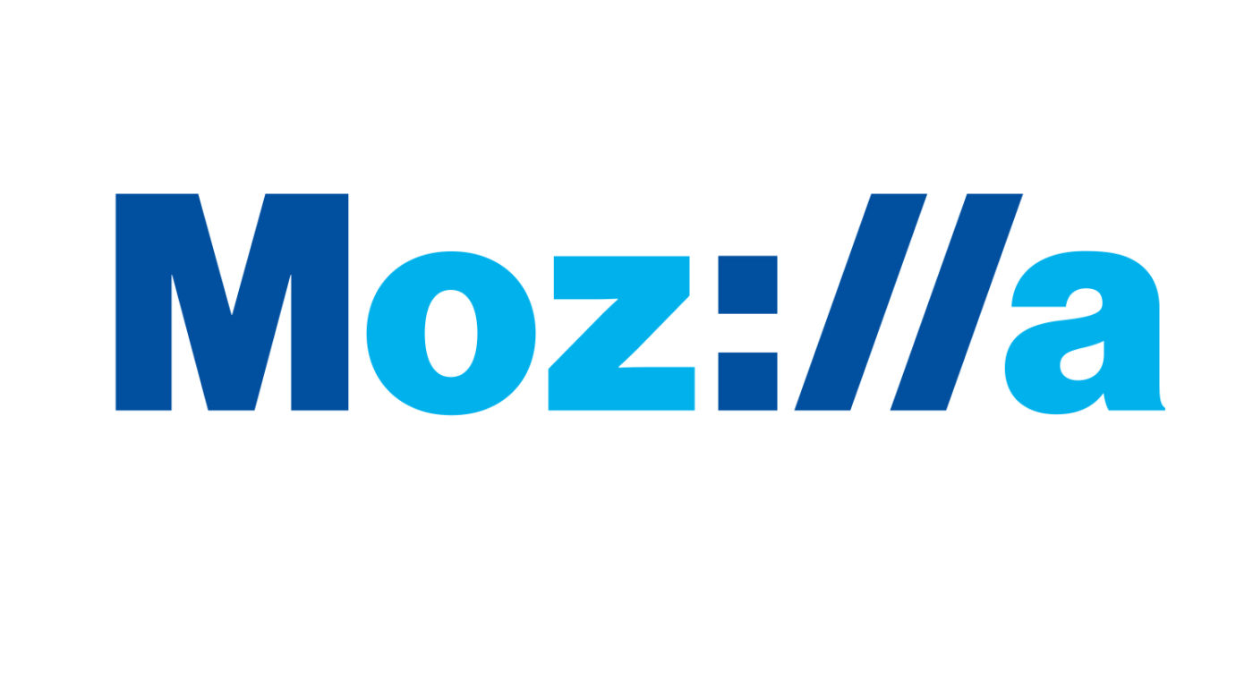
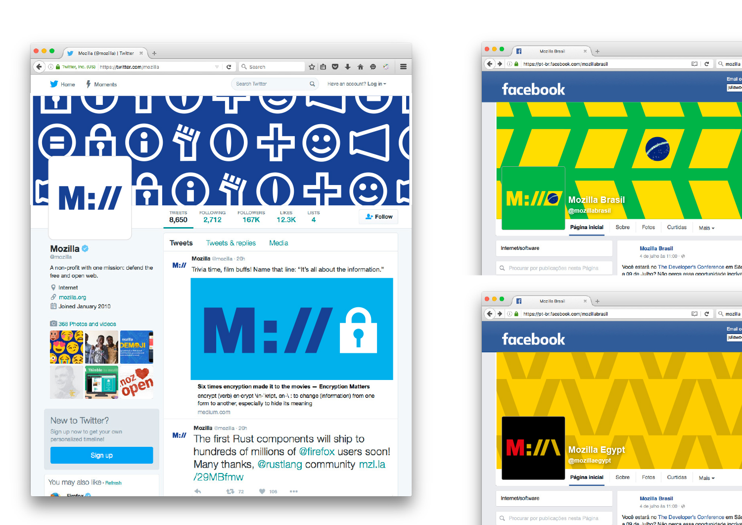
If we want to show that Mozilla is at the core of the internet, and has been for a long time, how do we show that it’s a fundamental building block of what we know, see and use every day? Perhaps the answer is staring us in the face, at the top of every browser…

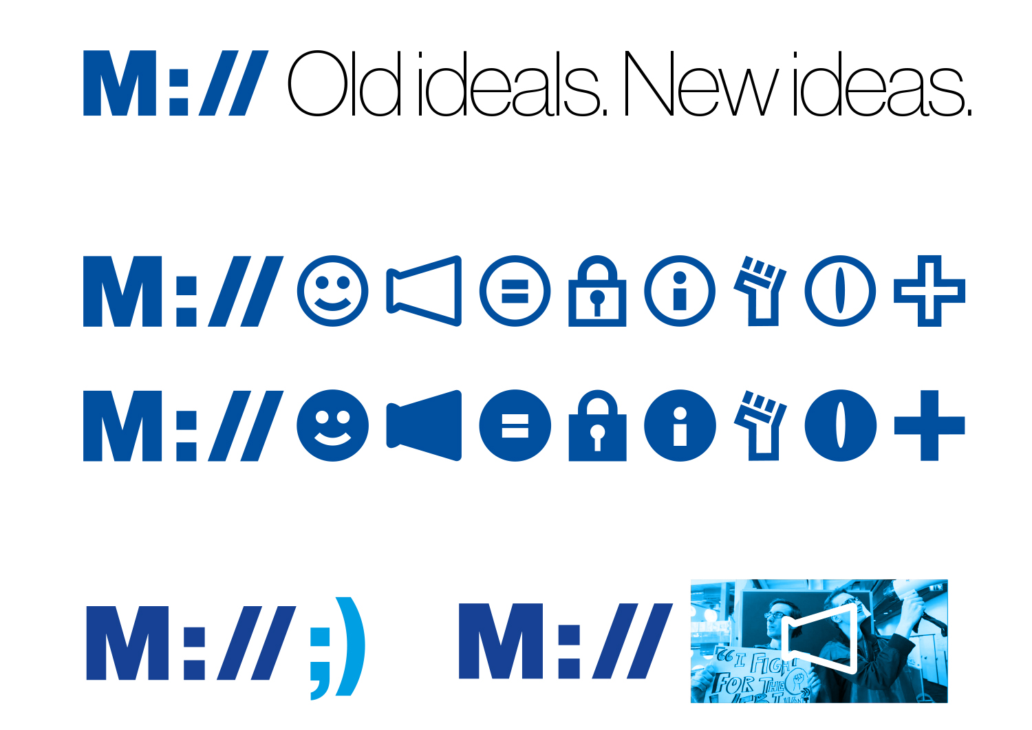
This design direction stems from the narrative theme called With You from the Start.

With you from the start.

Mozilla was, is, and always will be on the side of those who want a better, freer, more open Internet. In the early days, we were among those helping to embed principles of openness and accessibility into the web’s DNA. Now those principles matter more than ever. We need an Internet that works wonders for the many, not just the few. We need to stand by the founding ideals of the Internet, and carry them forward into new products, platforms, conversations, and great ideas. We’ve been with you from the start. And we’re just getting started.

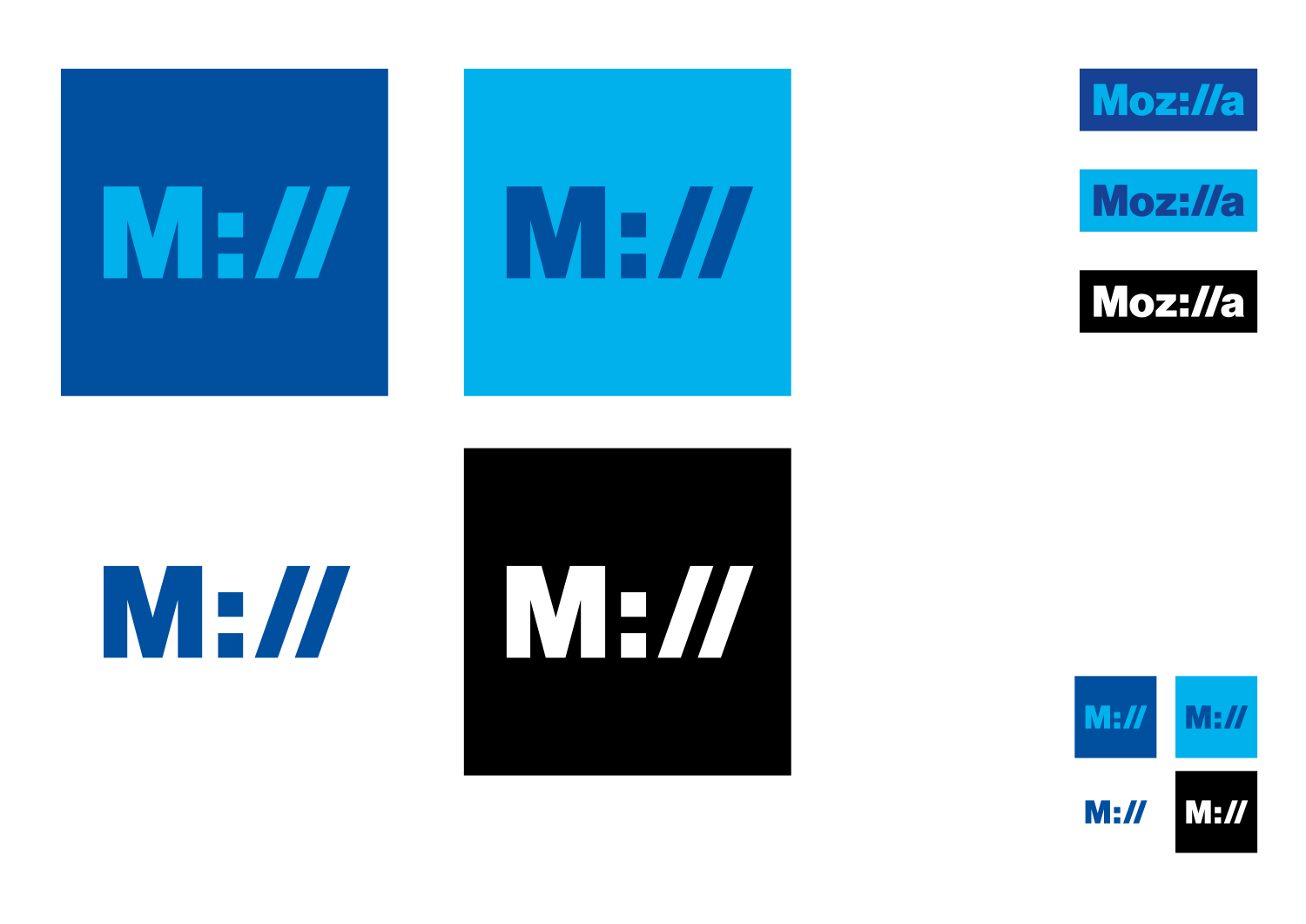
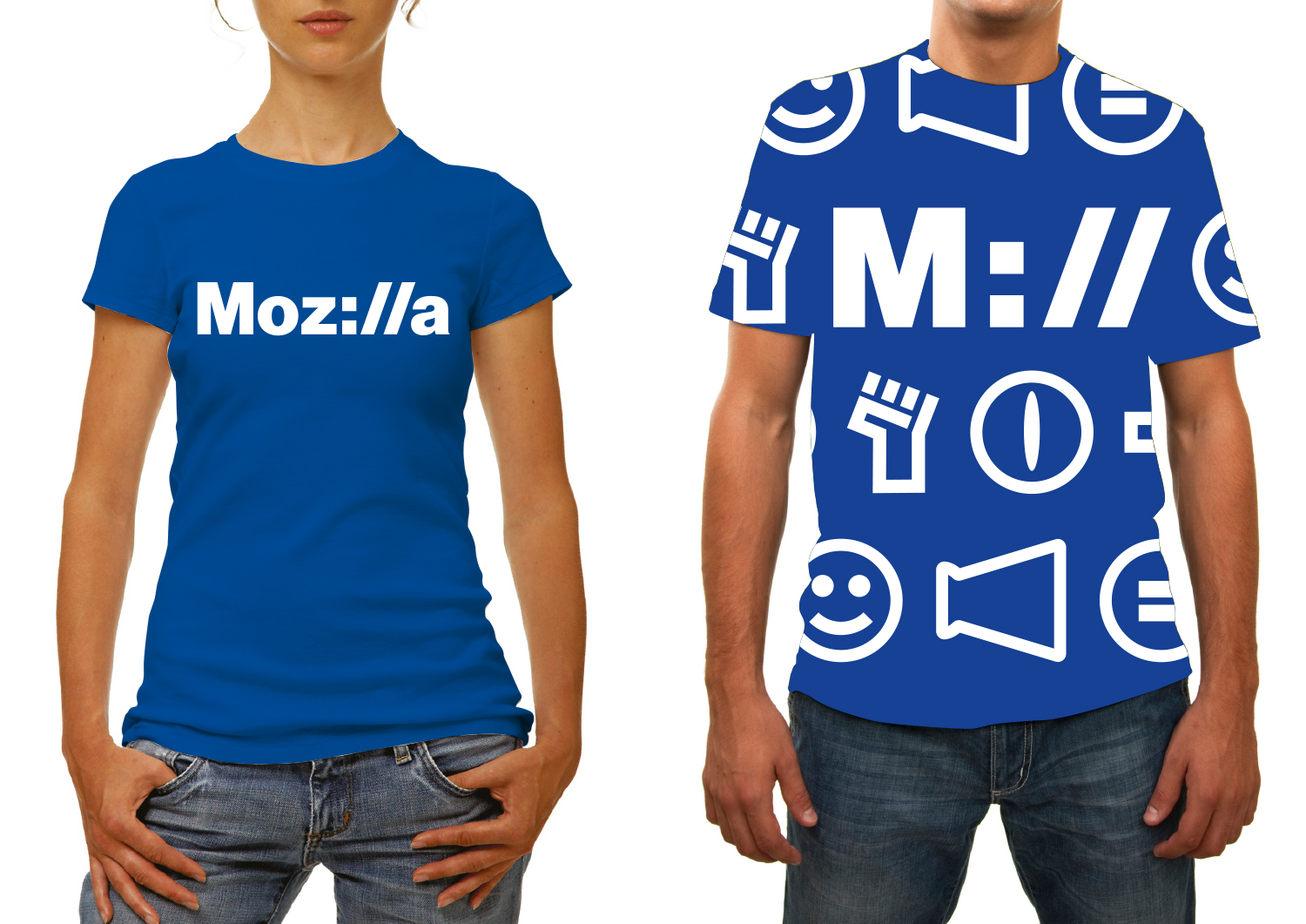
Click the first image below to see how this logo might animate:

jb_Mozilla_design_pres_edit_3.keyjb_Mozilla_design_pres_edit_3.keyjb_Mozilla_design_pres_edit_3.keyjb_Mozilla_design_pres_edit_3.keyjb_Mozilla_design_pres_edit_3.keyjb_Mozilla_design_pres_edit_3.key

332 comments on “Design Route D: Protocol”

  1. David Jones wrote on

    What are ‘Mill’ and ‘oza’?

    How many of your millions of users care what the protocol symbols are? I’m sure your engineers love it. Your users are not your engineers.

  2. Thamiris Vicente wrote on

    I think this is the one. It’s simple, clean and easy to recognize.

  3. Nathan Demick wrote on

    Love this one, though worried the “://” might be a bit opaque for non-technical people. I agree with the many other comments to switch to a warmer, friendlier color.

  4. Kamil Markiewka wrote on

    Great concept, poorly made. Just need refinement :)

  5. Michael wrote on

    It is the favorite in minimalism, simplicity and cleverness. It does look like Mashable colors and you cannot deny or ignore the emotionally negative impact this logo will have on people in a subconscious manner. Without the “http” you are opening yourself up to a bunch of memes :/ it looks like the face of dissatisfaction, however clever it may be. Web people know the :// but the new age millenials of today have everything in apps and are using computers less- calm down, I love computers. Everything is moving mobile or table or pro super tablet, kids are doing more hints on their phone, with apps. This homage to coding and we development is incredibly clever, but it’s social imprint is dwindled by the ever increasing popularity of emojis that look like “:/” Meh. This logo literally had the word “meh” in it, as clever as I absolutely admit it is.

  6. Michael wrote on

    This logo literally says “meh” in it. The emoji :/ is literally translated as “meh” to millenials. whether we are able to look past the cleverness or not, on a subconscious level, the emoji dominates the http:// reference.

  7. Eric Shepherd wrote on

    This one I genuinely like. I think the colors could be tweaked some (I feel pretty strongly that the colors we have traditionally used should be represented somehow), but in general this is a pretty good design. It actually has something to do with Mozilla, and feels like it ties our past and future together neatly.

    I don’t *love* this design, but it’s easily the best or at least one of the better ones proposed.

  8. Nolan wrote on

    Color scheme is simple. The characters used make the logo stand out without going over the top. Most liked by far.

  9. Michael wrote on

    i had to post this just to emphasize the stark emotional contrast.

    mozilla-2

  10. Rick Colby wrote on

    I like the simplicity of this one and the use of the protocol in the letters of the company name, yet it doesn’t feel gimmicky. It feels more like a company logo that will be around awhile. I think it works better in one color, though. I don’t like the “oz” and “a” being different colors. I know you’re trying to emphasize “M://” but the light blue letters are the ones that jump out first. I also don’t think “M://” works by itself because, as others have mentioned, it looks like “Mill”.

    I think it would work better in a different color. The blue is too reminiscent of other companies and seems too safe a choice. The overall system is a bit boring and I’m not fond of these particular icons. It’s not as fun as some of the other concepts. I guess I’d rather have this logo on my business card, but Design Route B on a t-shirt. If there was a way to combine the seriousness of this logo with the playfulness of some of the other concepts, it would work better.

  11. Michael wrote on

    my feeble attempts to visually dissolve the ” :/ “

  12. Michael wrote on

    mozilla-3

  13. mike wrote on

    It looks like a clean professional design. Icons are better than text for international community compatibility across languages. Logo has meaning combines the name with the url entry. I’d give it a plus one.

  14. Ashley wrote on

    Best out of the set. The most versatile and consistent. Projects what the company is.

  15. Jason wrote on

    This is just genius! So clever!! Whoever came up with it has a great mind.

  16. Greymont wrote on

    Easily my favorite.

  17. Judah wrote on

    I think that this mutation stands outs out particularly well as it speaks directly to to Mozilla does it connects us to the inter-contentedness of the web using a protocol via a web browser. I’m certain this has mentioned already, just thought I’d add my +1 :)

  18. Uy Le wrote on

    Definitely one of the most viable choice. It’s subtle and ownable. In terms of design, the typography can definitely be elevated to a more unique type treatment. Executions can also be pushed beyond just icons. My only one concern is the ‘://’ used in the logotype. It’s definitely a nod to the industry Mozilla is operating in, but it feels a bit ‘theoretical’ and ‘nerdy’, rather than ‘creative’ and innovative.

    What if one day in the future, the ‘://’ becomes a obsolete antiquity of the past Internet?

  19. pedrovidal wrote on

    pick this! pls…

  20. Rikky Sixx wrote on

    BOOOOOOOOORIIIIING!!!!

  21. Mark wrote on

    Love this one. It’s perfect. Simple, easy to recognize, and clearly indicates what it is and what its about, even when condensed. The lowercase idea further up in the comments is pretty keen.

  22. Hyrum wrote on

    Definitely don’t have anything really negative with this one when compared to others. It’s clever, it’s different/new from whatever you have now (“mozilla” is the branding on mozilla.org?). I hope you’re not paying 10s-100s of thousands for it, but definitely better than the other options in that I don’t think of a different company when seeing it out of the corner of my eye. Power button = Intel, Eye = Monsters Inc., Eye of Sauron, etc.

  23. bengil wrote on

    the best. a bit geeky (!?). clear.

  24. João Munhoz wrote on

    This is the most creative concept. It’s my 4th favorite design. The :// fits perfectly with the name Mozilla. It doesn’t look like a ‘double meh’ for me, I really loved the idea. But the font bothers me, I think is a little bit serious. The darker/lighter color use is also amazing for the concept, but maybe these shades of blue aren’t the best, at least for this font. I loved the flag use! Isn’t it to hard to adapt for every flag in the world? Maybe not all may fit perfectly, as in the example. I really hope they fit, because it’s one of the best flag uses.

  25. David wrote on

    I like it, some of the others look like a mess of lines and symbols rather than a cohesive design. Though I’m not crazy about the colors, or the colon and back slashes it makes it look a little incomplete. The darker shade of blue is reminiscent of Facebook. Mozilla is mostly known for the Firefox web browser. Why not try incorporating its color scheme into the logo. I feel like the contrast of the darker blue with Firefox’s orange would really make it pop, and give it a more playful, and youthful appearance. The monochrome blue color scheme has become such an overused one, its to safe. adding another color especially one that is a complimentary to blue would be beneficial to the overall design.

  26. Ezlev wrote on

    this logo is very clever. I enjoy it. i think that it would make a great new website in addition to a new logo.

  27. h.j.liquor wrote on

    the BEST :)

  28. findyourcatarsis wrote on

    The best in my opinion, Mozilla is one with the Internet.

  29. Ishara Ruchiranga wrote on

    This is my favorite one… pick this.

  30. Simon Koopmann wrote on

    Also my favourite. Great Work!

  31. Ali wrote on

    Love it

  32. Jason wrote on

    My “favorite” of the bunch. At least this one makes playful use of the text in a purpose-driven way. It’s also very legible and straightforward, and carries over a “legacy” part of the internet. It’s not feeling very inspired, but at least you would know the name of the company and not have a seizure induced like some of the other needlessly busy logo options. It’s very very safe. Might want to consider why a rebranding is even necessary? I don’t think most companies with a recognizable logo need to rebrand at all. Seems like a waste of time and money. What does the research really say about the lasting impact of a rebrand vs the cost of the design and roll out? (let’s find real research on this). My own company (a social-service nonprofit) just paid a forture to rebrand and ended up with the most generically useless logo that replaced a nearly 100 year old highly recognizable one. Might have been better to have an update on the old logo rather than scrap it. Might not apply here, due to the young age of Mozilla, but the point is that what’s wrong with the old text?

  33. Gthin wrote on

    Only this one option that makes a little bit of sense. Typography is bad, it doesn’t reflect an identity/character but the idea is good. Colors look dull and boring. Also looks similar to Google I/O. M:// is too nerdy.

  34. enio wrote on

    certainly this is the best one

  35. Eric Penn wrote on

    It’s the most coherent logo out of the bunch, but I don’t think a URL focused logo is really forward thinking. The internet is far more than the browser to most users. Younger users especially experience the internet more through mobile apps than webpages. As many others have already said, the color and font choice are also uninspiring.

  36. Joshua k Brown wrote on

    This one!

  37. Carlo De Intinis wrote on

    Easily scalable, very clear, customizable in many ways and with many color schemes, clean and minimalistic. This seems the best one.

  38. Stefano wrote on

    Fichissimo!

  39. Federico wrote on

    Excuse me for my english, I am spanish-speaker.

    I think PROTOCOL is the best option because its ‘protocol’ basic concept uses the essentials ‘internet characters’ (slash and two points) that, among others, makes reachable any information within internet.
    I think these elements would make easy for the ordinary people (not programmers and IT proffesionals) to link it to the ‘internet universe’.
    It is highly functional because it is a text based logo, and for me that makes it easier to read and (visually) remember than an image-text based logo.

    THE EYE: makes me think about a ‘big brother eye’ or a big directory … ‘I am your big yellow pages’
    THE CONNECTOR: it seems too rigid and brings me to an artisan weaving.
    OPEN BUTTON: I link it to a household appliance brand. I think is rather naif.
    THE IMPOSSIBLE M: it is more related to architecture-engineering field. Too rigid for the fluency and always changing software and IT industries.
    FLIK FLAK: it is like folded paper toy, may be too ‘kinder garden’?

    Well, that is basically what I think.
    Thanks for let us give our point of view.
    Congrats!

  40. Phil H. wrote on

    As many others have already commented, the M:// is really, really clever and has an iconic quality to me. I also don’t think that it’s not accessible enough to non-techies. It places Mozilla very straight to where it belongs to. So the best one presented here.

    Don’t want to mix up the concepts, but I like the idea of adapting the colors of design route G on this one. Might give it a smarter, less technical notion and open it up a bit.

  41. So wrote on

    This one is by far my favorite ! Totally in line with Mozilla as a brand.

  42. Vahid wrote on

    Simply the best!

  43. b1cudo wrote on

    My favorite! Clean, fast to understand and creative! I can imagine this logo in Mozilla browser soon and it’s amazing! <3

  44. Graham Swartzell wrote on

    I get why this design is such a contender, but man do I hope this isn’t the winner (at least not in its current form).
    Credit where it’s due, this is the cleanest design by far and the :// is a clever idea. But what is the price of these two merits?
    A) Even if the :// proves to work in the future of the internet, this only feels applicable with Mozilla being “that company that makes Firefox”. Protocol has no variants for Mozfest, or Maker Party, or Open systems, or even national branches; it just has tacked on emoji. This is symptomatic of the greater problem that Protocol has no versatility.

    B) The design language of clean, minimal text with non-threatening colors is marketing convention at its finest. The problem with that is it gives the impression of Mozilla being conventional and corporate. Sure, acting professional is a reasonable thing, but Mozilla isn’t about being another tech company. To me Mozilla stands as a guardian of what the internet was meant to be, and a symbol of how non-profits can impact our everyday lives. Also, anything that reminds me of HP Enterprise’s non-logo is a black mark in my book.

    C) It’s BORING, I’m looking at the shirt samples and the first thing I think is, “I cannot imagine people actually wanting to buy this”. Even entrenched brands from Pepsi to Microsoft have some degree of visual pizazz in their marketing.

  45. Smeikx wrote on

    – It makes Mozilla appear cold and technical — I’d rather think of a nice, friendly, open-hearted Mozilla.
    – The colours strongly remind my of PayPal.

  46. Graham wrote on

    By far the best option – clear, and actually ties to the function of the product.

    But might be a little confusing as being a protocol, rather than stylised as one.

  47. Karl wrote on

    If I had to decide: I’m not sure if it is the perfect one, but in my eyes it has to be like this: clear and simple.

  48. Pierre Obrecht wrote on

    le meilleur, sans conteste.

  49. Ramzi Ibrahim wrote on

    M:// is very interesting. Not many brands can have the chance to incorporate it into their identity. So, it’s a REALLY good observation, and concept out of it is good as well.

    However, it could’ve developed much better than this. Everything about it from typeface to colour palette is just old and cold. Even Facebook who use blue as their corporate colour are more playful than this (maybe it’s because they worked on their typography).

    The visual language can be so much more.

    Great idea. Not so great execution. Very “take me serious, I’m on the internet”, 90’s identity.

    The idea is probably my favourite or 2nd favourite alongside The Connector, but the latter is such a joy to see. This one, not so much.

  50. Pedro Phillipe wrote on

    Este é o melhor de todos! Acho que a grande maioria compartilha da mesma opinião! É mais simples, segue o padrão da marca atual, não deixando tudo pra trás, isso é importante! Pois é uma empresa fidelizada, não pode perder sua essência já consolidada no mundo! Essa marca mantém a essência e moderniza. As outras logos confunde um pouco algumas pessoas. Se o foco é conectar a todos, a logo precisa transparecer isso, algo que compreensível de cara! Uma pergunta: Porque o “oz” e o “a” ficam em um tom diferente, mais claro das demais?

More comments: 1 3 4 5 6