Categories: General

Design Route B: The Connector

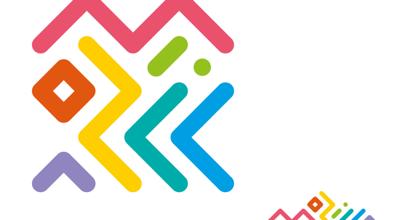
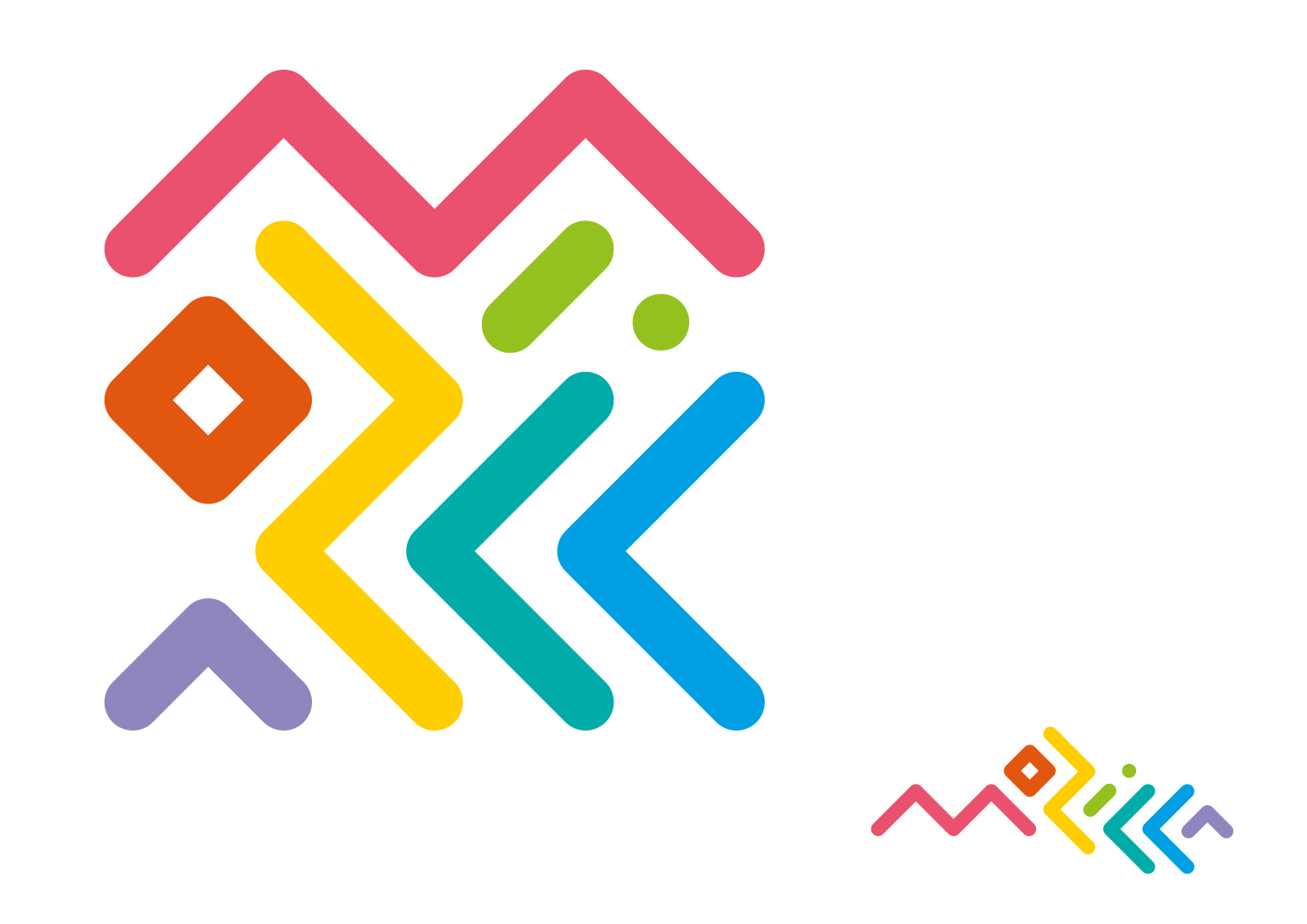
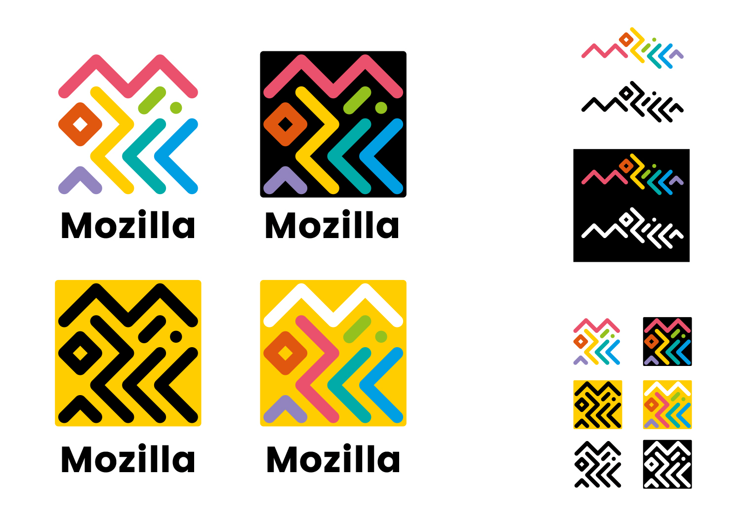
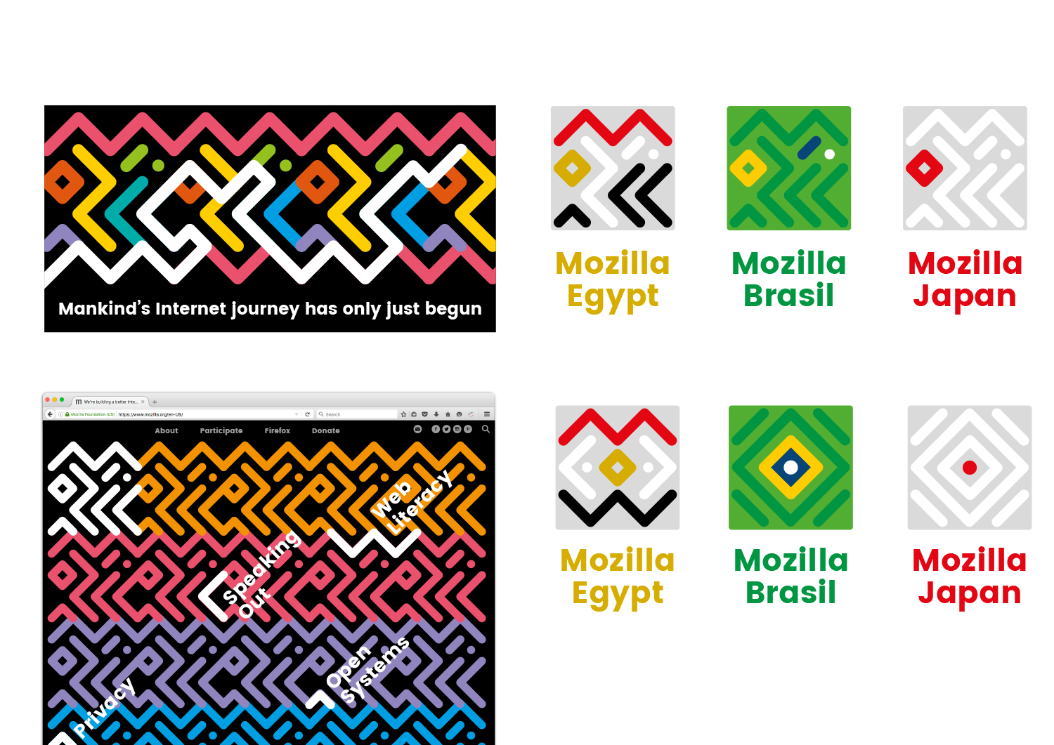
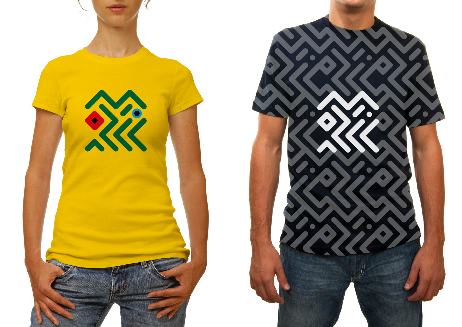
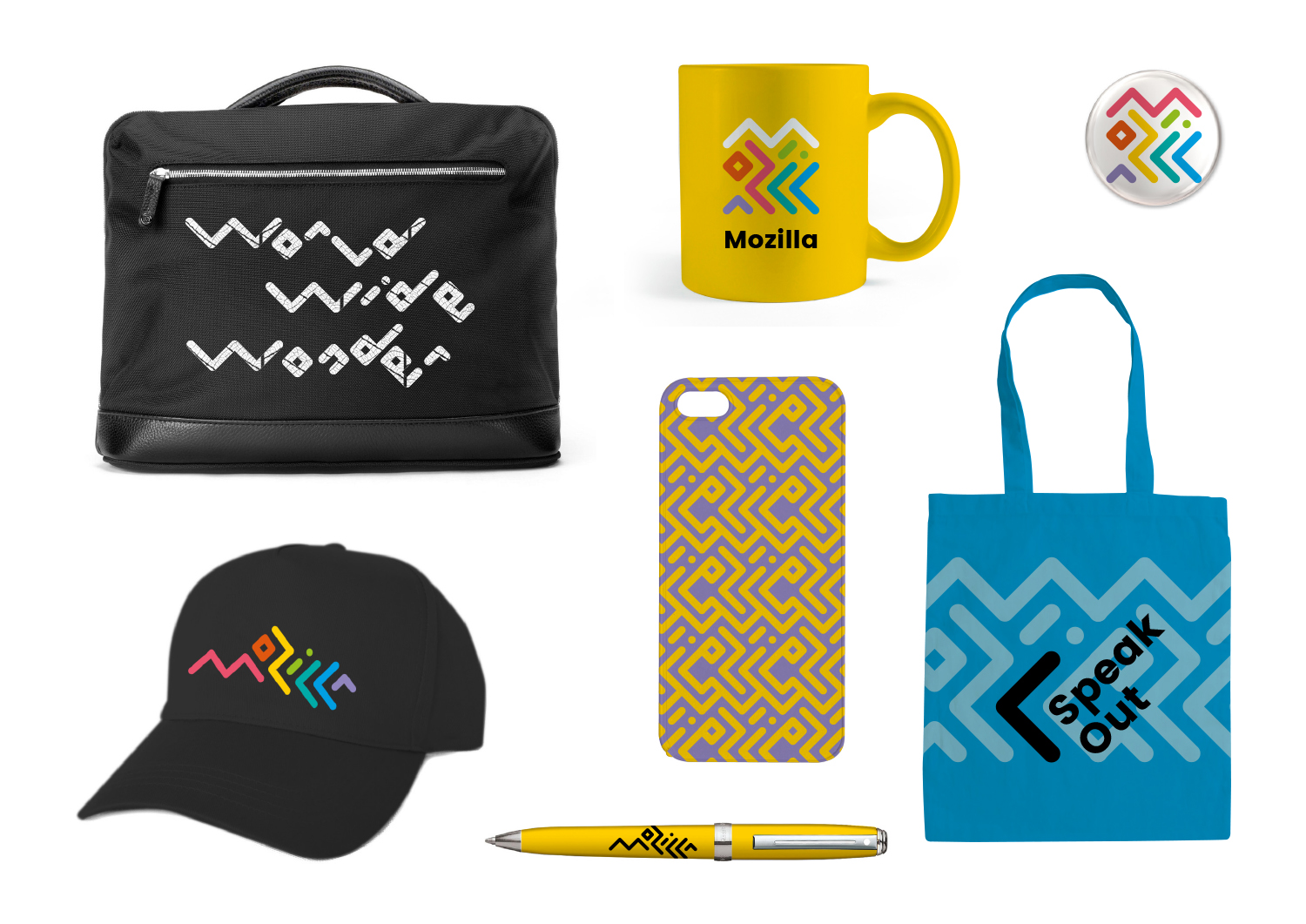
Typographic experiments with the ‘Mozilla’ name led to this route – where the letters are intertwined around each other to create two interrelated marks, inspired by circuitry and tribal patterns.

This design direction stems from the narrative called Mozilla. For the Internet of People.

Mozilla. For the Internet of People

Mozilla believes that the Internet should work for people – and the best way to achieve that is to give people the power to shape the Internet. At its best, the Internet is humanity’s greatest invention. It has the ability to connect human minds and free human potential on a scale never seen before. But we need to keep it open, always. We need to distribute power widely, not divide it narrowly. We need to build bridges, not walls. e future of the Internet is amazing, as long as it remains the Internet of People.

Click the first image below to see how this logo might animate:

jb_Mozilla_design_pres_edit_3.keyjb_Mozilla_design_pres_edit_3.keyjb_Mozilla_design_pres_edit_3.keyjb_Mozilla_design_pres_edit_3.keyjb_Mozilla_design_pres_edit_3.keyjb_Mozilla_design_pres_edit_3.key

181 comments on “Design Route B: The Connector”

  1. William Boyle wrote on

    I like this one. Shows some artistic inspiration. The rest are either ugly, or uninspired.

  2. C.S. Loberg wrote on

    I feel like this logo is flexible. I honestly do not like many of these logos whatsoever. Out of all of them I would deem this one possibly acceptable, but in no way would I change my firefox to this label. it does not identify your company at all FFS.

    I would keep the old one. I’m sorry, but this isn’t going to work well for a lot of people. Half of these logos remind me of amateur designs that wouldn’t pass the 1st draft test at many companies. I’m not even going to waste my time on the other ones they are so terrible.

    A lot of these logos remind me of the huge fail that Corsair went about in redoing their logo to some rambunctious slut tattoo look-alike. What happened? People hated it. It drove away customers. So they rebalanced the old, classy design and made it even better after that, and that is what they will use for years going forward.

    This one…. if you can maybe simplify it a bit more and make it so the logo adapts well to different countries I could see this being a winner. But you need taste, and you will be making a lot of logos for each country. It will take the most work. But it’s the only one here that is even remotely feasible to me.

    You guys could learn a lot from Corsair’s huge mistakes in creating a new logo. It can honestly kill your business if you are not careful. A few of these logos are absolutely demoralizing for current customers. As in I would immediately get a download add-on to change the logo if you used these logos for Firefox.

    1. C.S. Loberg wrote on

      I will say the only other logo I think that works is the programming related geek logo. It’s smooth. But I have no idea why I want that over the current one. It’s true that either that or this one are your only chances.

    2. Tim Murray wrote on

      Hi C.S., These are creative concepts for a brand refresh for Mozilla, the nonprofit parent of the Firefox web browser. You are not alone in conflating the two. These are not suggested replacements for the Firefox logo. Thanks for sharing our thoughts on the design work. Please continue to let us know what you think.

  3. Andrew A Tatge wrote on

    Anecdotally, but importantly, this is the only design that made me smile instinctively (well, to be more specific, it was when I saw the “Maker Party” icon).

    It seems highly adaptable—new letterforms or icons can easily be built or modified from these patterns. Whether you add on or reduce the main logo in a particular context, the core metaphors of playfulness and adaptability (i.e. tinkering, maker–spaces and experimentation) hold up. The simplicity of these components, more than other directions’, invites experimentation—even when in relatively stolid configurations.

    Slight caveat: All the above was about the squarish configurations. I have two reservations about writing “Mozilla” out horizontally as is:
    1) I see a person that is falling and hitting their head on a mountain, or sleeping on a rock. I know. I may have too much free time on my hands.
    2) The uneven baseline unsettles me. As I get to the end of the word I feel like I’m about to slide out of my chair. Is there a way to keep this zaniness or proportions without having fall hard into the lower right?

  4. Joseph A Borg wrote on

    This is by far the best of the lot. It’s different and memorable. It’s a unique signature that also serves as a texture. Brilliant work that can go very far.

  5. James Bemus wrote on

    Yep, this one says ‘fun’. I don’t think of fun when I use IE. Google is kinda fun, in an overlord kind of way. Mozilla has always been the browser of the proletariat, and a fun logo sets well in differentiating it from the overreaching competitors.

  6. Charlie wrote on

    This one would definitely have to be my favourite, it’s abstract but with meaning and is attention grabbing for anyone who doesn’t already know what it signifies

  7. Herr Hugo wrote on

    Your design isn´t bad – “Maker Party” is very well.

    Mr. Hugo from Gods own Germany

  8. Bruno PIRON wrote on

    I love this logo I just have a problem with the area safe

    safemozillalogoBzone

  9. kz wrote on

    Way too busy. Difficult to identify the company it represents.

  10. Eric wrote on

    Somehow on the black baseball hat, the contrast and arrangement suddenly becomes recognizable enough to satisfy me. The others just don’t click as a logo for me, although I like the playfulness.

  11. George Bishop wrote on

    Really like this one and the way it can be jumbled about and used as a pattern too. But does anyone else see an angry face in the logo at first glance?

  12. Jarrod wrote on

    The design isn’t bad, but it doesn’t really fit the company. Color wise it seems like it is trying to be too much like Google or Slack.
    This logo doesn’t seem like it will scale across products or various sizes.
    The design feels like it will not survive the test of time.
    With this design I almost feel like you would be better off with a functional QR code with the Mozilla M in the middle. Then add color as needed.

  13. Naylan wrote on

    Look! Mozilla is making toys for kids! Or candies. Or something like that.
    At least that’s the impression this logo gives to someone who doesn’t know what Mozilla is.
    It’s cute, but not intelligible and it gives the wrong message.

  14. Jonas wrote on

    I like this one most of all, but prefer the “ordered” version, where you can read the name. The quadratic one is to cryptic. If you need an quadratic icon for something, I would just cut out the red M and the orange o from the “ordered” version of the logo.

  15. Robert Kaiser wrote on

    It’s very iconic and has a bit of an IDIC (infinite diversity in infinite combinations) feeling to it. I like the pattern styles you can get into with this. Takes a while to even find out it says “Mozilla” but it’s more important to feel unique. The split “i” is a bit weird and I dislike how the left-to-right “Mozilla” feels like it’s going down all the way, I don’t think “Mozilla” should imply going downwards. The concept is an interesting train of thought for sure, though, and the diversity of colors if nice as well.

  16. Josh wrote on

    If you really want to keep the ‘wordmark’ branding then this set has the most potential but it’s still far from right.

    You can’t combine the abstract design of the lettering with so many different colours. Google manages to to this by having absolutely crystal clear typography but the square arrangement is just not clear enough and the horizontal version exposes how the lettering is WAY too stylised to be clear.

    The multi colour also feels like a bit of a copy of Google’s brand so you have to be very careful that Mozilla’s brand isn’t diluted by using something similar.

    If you look around at wordmarks they are lead by typography. Think of Disney, NASA, Coca Cola, FedEx, Ebay, Subway, Visa, Facebook, Ubuntu, Panasonic, CNN, Kellogs, Canon etc etc. The list is endless but they’re all lead by typography and the colour scheme is supporting act. I’d say FAR more effort needs to be put into the typography of this design if it is to be successful.

    On a positive note there is absolutely MASSIVE potential here. It’s a modern, striking idea that speaks to the core values of Mozilla. It’s actually quite exciting to think of how good this design could be. It’s far more impactful, deep and subtle than the blunt simplicity of the ‘zilla eye’ or the inward geek naval gazing of the m:// design. And the others don’t bare mention as they’re not even contenders.

    Done correctly the square letter arrangement has the potential to become very iconic (in the true sense of the word). That in turn will support the other country specific designs you’ve proposed above.

    If this design could be iterated and refined you are likely onto a winner that could be pretty transformative for the brand but there is a very fine line to walk to get there.

  17. James wrote on

    In my opinion, this is the best of a generally really atrocious set of designs.

    This is way too busy, and too many colors, but if you could somehow strip it down, and pick just one or two colors, it might not be terrible. At least it looks modern and international, instead of all the other awkward, dated options.

  18. rugk wrote on

    IMHO it is a bit too childish. I only can recognize Mozilla with “Mozilla” written below.
    Otherwise it is funny and has many colors, which is okay, but the logo should still be serious as Mozilla is not just about fun. Mozilla has serious aims and the logo should be quite serious too.

    I just could not see the “M” in the lines there…

  19. sergi wrote on

    very nice logo to represent the diversity and inclusivity and openness of mozilla. Much better option than others which feel too techie. This is the best logo to build an international community around it.

    Maybe could be simplified a little bit? sure, but it’s on the good path for the rebranding!

  20. Paco Núñez wrote on

    Confusing i think

  21. Satrio wrote on

    It’s definitely unique, fun, fresh, and my #1 favorite… as a logogram. One must tread carefully with its type form and any accompanying typography though.

  22. Niels de leeuw wrote on

    Love this logo and the possibilities to do localized versions without too much problems. Its a fun fresh and intriguing. Love how its not at once visible that it spells mozilla in it. Would be nice to use different color schemes for different products or company parts.

    1. jgreenspan wrote on

      Thanks for your input, Niels.

  23. lehasb wrote on

    Nice idea, nothing in the logo without the text links it directly to Mozilla.

  24. Joe wrote on

    This one is the most vibrant and modern by far. Really good work, looks professional.

  25. Denis Bredelet wrote on

    I think this fails to evoke the inspiration of “tribal patterns”. It is too regular, to artificial with its perfect angles and rounded edges.

    The “Maker Party” version does better. It is quite nice.

    The standard square version could be simplified to keep only “moz” it would be more legible and look better.

    I hope you can infuse some more “play” in this one it could be the favourite!

  26. Alison wrote on

    This one looks lovely, but was definitely hard to process mentally, because it seemed so different than I would expect for a technology company. I thought it seemed more in-line for a museum logo, something that specifically targeted the “inspired by tribal patterns” – I only saw that, not circuitry.

  27. Jonathan Baker wrote on

    This world is in desperate need of color and this particular logo pushes the Mozilla brand to just that direction: a different, exciting, fun enterprise that despite fitting in a standard square canvas, is full of connections and divisions that complete each other internally and exposes this publicly as their vision for the future.

  28. tecman wrote on

    Being a traditionalist and long-time Mozilla user before Firefox ever existed, I find the wireframe model the one that I was instinctively drawn to. And wanting to vote/comment for. But I kept coming back to the connector, literally being drawn back to it, first with my eyes, and then with my heart.

    It speaks joy, life, beauty in a way the others don’t and in ways that the graffiti of New York City in the ’80s spoke to me. And I love the linear spell-out most of all.

    1. jgreenspan wrote on

      Thanks so much for your comments, Tecman.

      1. tecman wrote on

        :)

  29. k3nt wrote on

    I like the energy of this one. It seems both creative and progressive. However, the strength of Mozilla seems lost in the wishy washy font. The history and successes of Mozilla is not reflected in the font. In the refinement stage I think the word Mozilla should be made more solid, strong, crisp and clear. A harder, tighter edge to the font. And find an element to tie the font to the graphic image. I also think the colors should be slightly muted, a little less primary. Maybe look at funky colors from 80s and early 90s hiphop. Tone it down a little, but keep it bold and graphic.

  30. Kadri-Ann wrote on

    I like this one the most. It’s flat and playable. Also the patterns look like these are ethnic and that makes it suitable to represent mozilla community. The national flags are cool concept that has been added to the design.

  31. Thomas Levesque wrote on

    Nice one! I love the colors, and the many possible variations. One of my favorites with option D.

  32. Dan Tarbill wrote on

    I like it. It’s my favorite…by far!

    1. jgreenspan wrote on

      Thanks for taking part in the project, Dan!

  33. Jesse Johnson wrote on

    Of all the options, this is the only one that seems to have the potential to usurp the current logo. To make it practical, first and foremost it needs to be made more legible and compact. If you can’t immediately identify a b&w high contrast version of a company logo from a great distance (such as you can with the Amazon logo), it is no go.

    This logo needs allot of work, but it is the only option that seems worth exploring. If this design doesn’t pan out, please shelve the logo change and revisit it next year or so with a new batch of designs.

  34. Blake Gonzales wrote on

    Too abstract for wide acceptance and recognition.

  35. Jesse Johnson wrote on

    If you can’t immediately identify a b&w high contrast version of a company logo from a great distance (such as you can with the Amazon logo), it is no go. Not sure if it is possible to make this logo past that test, but I hope so because it is the only option that seems capable of surpassing the current Mozilla logo and giving the company a new image.

  36. Aleksej wrote on

    It might take extra mental resources to find the actual text wherever this pattern is used?

    1. Aleksej wrote on

      Huh, I hadn’t noticed that the jumble of lines itself was text.

  37. Zachary Stuckmann wrote on

    This is a fantastic presentation.

    The illegibility, which seems to be a big issue for others, is truly not an issue. A logo doesn’t need to be read as long as it’s recognized. While I feel like the vibe of this logo reeks of “Olympics”, if used properly within a well-conceptualized brand it could really create a unique and modern experience for us as users by being active and integrated throughout all products and applications, as opposed to just being a stamp or a character that lives in a little logo bubble.

    I believe it could use some attention on the color end of things. It works particularly well when it’s monochromatic, or has 2-3 colors (for example the yellow t-shirt design shown above). Structurally, it’s already very complex, and the complexity of a wide spectrum of colors does make it visually noisy as some people have pointed out already. Maybe it exists “color-less” unless called upon or animated?

    This one has my vote for the final choice.

  38. Jürgen A. Erhard wrote on

    Messy mess of messiness.

    Also made me think “Browsers Я Us”.

    Not a fan.

  39. Richard wrote on

    Would resonate best around the world?
    I don’t claim to have enough cultural knowledge to give feedback on this.
    Has the potential to show off modern digital technology?
    I don’t really see how any logo does.
    Is most scalable to a variety of Mozilla products, programs, and messages?
    Jumbled mess can be a lot of things I guess, but I don’t see it conveying messages well.
    Would stand the test of time (well…let’s say 5-10 years)?
    Some call this bold, I think it’s trendy and won’t stand the test of time.
    Would make people take notice and rethink Mozilla?
    Probably, but not necessarily in the way wanted. Looking at the logo it makes me think children’s charity logo not a tech org logo.

  40. Alexandre Abraham wrote on

    The one I disgust less from all the propositions… T-shirts look awesome!

  41. Hans Schoener wrote on

    This one is definitely my favorite! I like the idea, to use the elements of the logo for “Privacy”, “Open Systems”, etc.

  42. am vidales wrote on

    Me gusta el actual
    Pero si se ha de cambiar, me gusta este porque para mi, es el mas bonito
    Gracias y suerte

  43. BoB Architektonidis wrote on

    My favorite…but. if it be combined with “the protocol” So the caption under it is written like Moz://a , it would be the best of both worlds, and the possibilities are endless. You can make the colors eye catching or simple. With the protocol caption it would never be missleading and keep the tradition nostalgia. But it allwayz be fun and ajustable to the events that will come…

  44. Pacifica wrote on

    It certainly does remind me of Australian art. I even have coasters that use the same style. Would I be able to clearly read it… not really. Without the text nearby the message gets dispersed in the mashup. Hmm perhaps reducing the conflicting side logos, (e.g. all hands provokes a painful response), and simplifying the colour sceme would make it look more coherent. Unless you are really going for the rainbow dash/bright look. That colour scheme has been reserved for a particularly large worldwide community so there may be a little confusion at first.

  45. Tobias wrote on

    Personally this is my favorite. It also works well in all variations and for all purposes. It is not very legible, but if people find out after a year that the logo can actually be read, that wouldn’t be too bad, either. Maybe it is a bit too artsy for the masses?

  46. María del Rosario Fiore wrote on

    Creo que de todas las propuestas de Identidad esta es la mejor resuelta, es muy dinámica y sobre todo se puede sintetizar muy bien los iconos de los conceptos como Privacidad, Web Open, etc. como así también en todos los productos de promoción.
    I think of all proposals Visua Identity this is the best resolved, is very dynamic and above all can be summarized very well the icons of concepts such as Privacy, Web Open, etc. as well as in all promotional products.

  47. Martin wrote on

    So much potential – but falls into the category of almost but not quite. Perhaps thickening the lines, making things a bit stubbier, and not relying as much on the 45degree angle…

    Seems a little too kiddy.

    These types of logos initially are fun to create, but then you walk into odd roadblocks due to the angles. Maybe that’s part of the challenge. Perhaps combo-ing this somehow with your other tinker toy logo?

  48. Lucas wrote on

    Funny one. I believe it provides the best choices for variations. From the ones presented, I’d choose this one – it gave me the idea of a lightweight and simple company.

  49. Claus Bobjerg Juul wrote on

    Something is missing, ohh I know, it’s the Dragon like creature, just like firefox has it’s fox, Mozilla, needs to have it’s MOdified Godzilla.

  50. Phillip wrote on

    Like this. Keep it simple. For some reason I feel like it needs a line/swoosh under it.

More comments: 1 2 3 4