Categories: General

Design Route B: The Connector

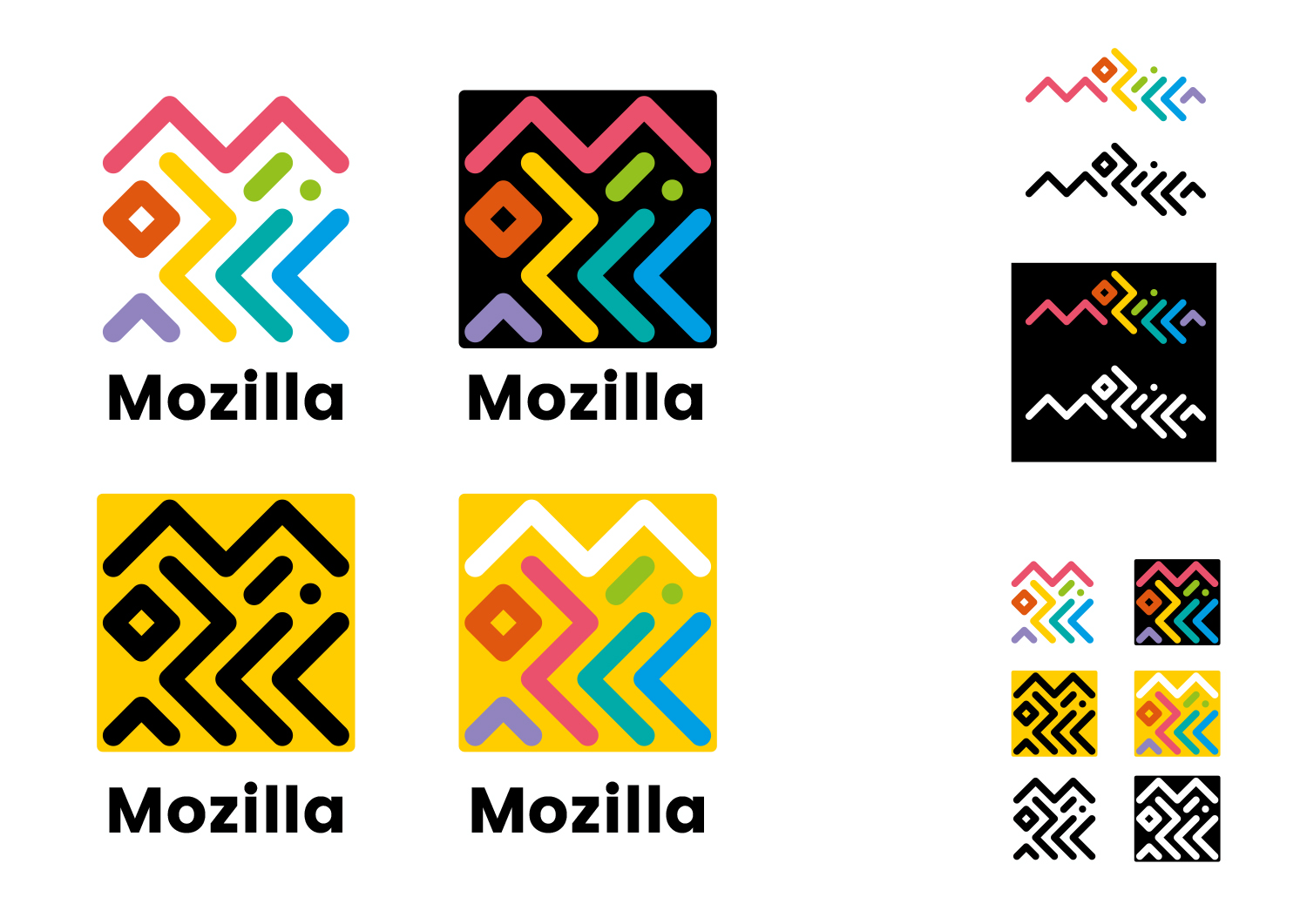
Typographic experiments with the ‘Mozilla’ name led to this route – where the letters are intertwined around each other to create two interrelated marks, inspired by circuitry and tribal patterns.

This design direction stems from the narrative called Mozilla. For the Internet of People.

Mozilla. For the Internet of People

Mozilla believes that the Internet should work for people – and the best way to achieve that is to give people the power to shape the Internet. At its best, the Internet is humanity’s greatest invention. It has the ability to connect human minds and free human potential on a scale never seen before. But we need to keep it open, always. We need to distribute power widely, not divide it narrowly. We need to build bridges, not walls. e future of the Internet is amazing, as long as it remains the Internet of People.

Click the first image below to see how this logo might animate:

jb_Mozilla_design_pres_edit_3.keyjb_Mozilla_design_pres_edit_3.keyjb_Mozilla_design_pres_edit_3.keyjb_Mozilla_design_pres_edit_3.keyjb_Mozilla_design_pres_edit_3.keyjb_Mozilla_design_pres_edit_3.key

181 comments on “Design Route B: The Connector”

  1. Rob Kellett wrote on

    This one’s just a mess of lines. It’s illegible, visually noisy, and has too many colors. I like how vibrant and “fun” it is, but I feel like I’d get a headache by staring at it too long.

    1. Tim Murray wrote on

      Thanks for weighing in on this one, Rob.

      1. roan wrote on

        its a logo that is super fun vibrant and a cool fresh take for the companies new logo. definitely my favorite. Almost has that olympics logo vibe to it, and not in a bad way.

    2. Eloi wrote on

      I actually love the complexity and flexibility of this one, yet keeping it all perfectly harmonized and in-brand. Plus it feels fun and different for a tech company. Not bad, not bad at all…

      1. Redmess wrote on

        I like it too, but the larger designs can be visually too busy at times, and legibility is very low.

      2. Stefan Pisslinger wrote on

        I also love it and think this is the best from the 7 concepts.
        I also like the color and it´s fun – but maybe the typography needs to be switched because it´s a bit hard to read.

      3. Ana Paula wrote on

        I totally agree. It’s colourful, fun, versatile, and a bit unexpected. I love how it can be translated into other ideas by rearranging and using colors. My favourite one, I believe.

    3. candice wrote on

      i agree, it is so messy. my eyes don’t know what to do

    4. Leo wrote on

      I agree. You need a more serious logo.

  2. Marie-Pierre Bauduin wrote on

    Memorable, even in icons, significant, fast recognition is a must!

  3. Gustavo Silva wrote on

    This one’s my favorite. It represents diversity and has the potential to be recognizable at a glance even at small sizes (like on a phone). It’s nice that it’s not restricted to a single color, so it can be changed to represent different countries and subprojects while keeping the line structure and thus its recognition. And the fact that the lines hide the word “Mozilla” in plain sight can be a sort of easter egg which gives it that special touch (like the FedEx logo).

    1. Tim Murray wrote on

      Thanks for contributing your thoughts to this process, Gustavo, and for identifying your favorite. Your point about our logo needing to be recognizable in a small space is worth remembering.

    2. emmaedeh wrote on

      I like this too, i hope this gets the final pick

    3. Tuuli Aalto-Nyyssönen wrote on

      This one is also my favorite! It’s true what you said (Gustavo Silvo) about it being recognizable. This one (for me) was the first design to pop out from the set of different designs. I think it is also fun and sort of “compassionate” (don’t quite know how to describe the feeling in words). It makes you want to join. It’s like a vivid town square full of different colors and people.

  4. Andre Williams wrote on

    This design is very flexible but the issue here is that it’s hard to decipher and might not even be recognizable at first glance if the colors are changed. To most people it’d likely look like a mess of lines.

    I love the flexibility design-wise, but it’d also be very inflexible display-wise– how would you render something so thin and intricate on a low-res monitor, on phones with a low ppi, or on small icons?

    The colors are also fun but are likely a bit too flashy and distracting and kind of contribute to the confusing nature of the design.

    1. Tim Murray wrote on

      Thanks for the detailed feedback on this one, Andre, and the reminder about accessibility.

  5. Ross wrote on

    I think this one is my favourite, and after the refinement step it would be perfect. The logo by itself is playful enough without needing all the colours, so with a little less playfulness it would strike a better balance.
    I think this one would stand the test of time better than some of the others.

  6. Michael Kaply wrote on

    I really like the concept behind this logo, especially the flexibility for different designs while maintaining the original feel.

    I wish the original colors of the logo were a little more of a throwback to old school (although I like the dino green). Maybe some hard red and some Firefox orange.

    And I think the overall image can be tweaked to make it a little more obvious that it says Mozilla (bit not too obvious).

    1. Jayantseraph wrote on

      I believe the colors should be tweaked to.
      Each color should more or less represent the products.. Mozilla Red, Firefox orange, thunderbird blue, so on…

      This concept is far better than the rest

  7. Gillian Kayne wrote on

    Can’t quite believe how much of a rip off this is… poor show.

    If you used it — Kate Moross would have a good case to sue you.

    ScreenShot2016-08-18at17.31.04

    1. Timur Uzel wrote on

      Can you really sue over that? It looks more like inspiration to me

    2. Pohl, Svenja wrote on

      My favourit

    3. Jürgen A. Erhard wrote on

      Now, for bonus points, find this proposed “logo” on the right. :D

  8. Sara Kubik wrote on

    It looks like an African-designed QR code. I agree with the other commenters who say this is hard to decipher. Just looks like lines and that quilt design shown above,

  9. Greg wrote on

    This is definitely my favourite. It feels like the first 90s-influenced logo I’ve seen yet, so you’ll probably be ahead of the curve choosing this one. The animation could use a little more life, though.

    Quality work overall!

  10. Halleh Tidaback wrote on

    This conveys a sense of exploration and inclusiveness to me. Movement, color, texture and a lighthearted feel, I really enjoy this concept. I feel the square lockup as well as the written out ‘Mozilla’ work and I like that the square translates well for common digital uses. (However the versions that are enclosed in a solid shape don’t work well for me.)

    Its technical yet friendly. Needs refinement in type, etc. But I think you’re onto something here!

  11. Erick wrote on

    The beauty of logo design is that there is bound to be resistance. This design is out of the design box and breaks all the rules. It doesn’t have to be easy to decipher. Logo design is a form of art. Yes the logo needs some refinement but apart from the rest this is a winner

  12. AT wrote on

    Best one for sure! Love it.

  13. Timur Uzel wrote on

    My favorite if it was easier to read. Think about new web developers who don’t know what Mozilla is

  14. Sophie Gallay wrote on

    Easy to memorize and to recognize, also easy to decline into different ggraphics and colors depending on its use. Easthetic enough for corporate by products
    But also graphic, fun, almost in motion.

    1. Jürgen A. Erhard wrote on

      A mess of lines (and that’s basically all that someone who doesn’t know what it’s supposed to be will see) isn’t easy to recognize, I can assure you.

  15. Christophe wrote on

    For me the best one. This logo can take different forms : modern, ethnic, abstract… It works with or without colours. It’s easily recognizable.

  16. Bouv wrote on

    I really like it today, but not sure this design will still be cool in 5 years.
    And not easy to quickly know that logo is Mozilla.

    But you should keep the idea that one shape is representative to one Mozilla guide line (like shown on different pictures)

  17. nicolas wrote on

    This one may be one of my favourite. It’s colourful and still bold, feels quite like what Mozilla is to me, and leads to a full identity system and not just a logo.

    Of course the monogram isn’t legible as such, and would always have to be doubled by the wordmark in applications where the Foundation is a main point. Maybe there should also be a simpler symbol, such as just an M build with this.

    I’m not talking about details in the execution, because it’s probably not very relevant at this point in the project.

    I can really see this becoming Mozilla’s brand language, and be ever evolving for years.

    On a side note, there could be a little web app to make new logos/visuals for projects/communities using the system, with a tool to connect the dots of a grid and choose the lines colours from a palette.

  18. Silent Joe wrote on

    Agree with the comment above, a logo don’t need to be “deciphered”, it need to be recognizable, memorable, positive, stimulating, encouraging…

    This one is the only one on the list which attracted my eye AND my mind. All the others are so ugly that i can’t imagine how the Mozilla committee could have validated these “things” !

    All the concepts presented look interesting, but what if the visual results aren’t in harmony with the words, the promises ?

    That is the real, deep problem of these other concepts : I could like the idea of openness, the “with you from the start” (what i’d could call the “geek” concept), the “wireframe” (that i callled the “skeletton” logo), the “impossible M” (i called that “the most ugly M of the Universe”), the “amusing” (hemmm… the first thought which came to me was “embarrassing”) Flik-Flak concept and, i’ve kept the – very best – for the end : the “the eye” concept.

    I’m pretty sure Sauron could really love this concept… if he’d not be a fictional character from J.R.R Tolkien. It could also be declined in flag for the Kingdom of Mordor… Or a good titling for an horror film / series… But I’m not sure it applies to an open source browser, sorry !

  19. Bart wrote on

    I really like this one, because you can play with it so much.
    I’m not sure it NEEDS to be deciphered, as it will often be used in conjunction with the text “mozilla” (you may want to spend some time selecting an appropriate font. The example font is fine, but not neccesarily the best.

    I like the Kate Moross-work Gillian Kayne found. I had never seen it before, and it does strike a resemblance. I don’t know if the logo was inspired by this work, probably not. I wouldn’t let it stop me.

  20. Silent Joe wrote on

    P.S. : This logo can be refined (and simplified) in keeping only the letter “M” – repeated with different orientations, and with less colors – in other words, you could fill a square surface with several “M” imbricated the same way as it is presented here.

  21. George P. wrote on

    The logo is great in its own right and I love the multicultural feeling it resonates. Having said all that, i think a logo should represent the moto “one image represents a thousand words”, and in this case i have doubts whether it represents what mozilla actually does as a company/institution etc. In a few words, it does not represent the company “at first glance”.

  22. Saige Fraiha wrote on

    This one’s a dud. Illegible, not unique enough to make an impression, and old fashioned. Very 80s. Could work for an art gallery logo, but wouldn’t survive the web.

  23. David wrote on

    This one is more pop, I like it. It could easily fit many design with a bit of work, I think.

  24. Conlin Durbin wrote on

    This reminds me a lot of a museum logo. I definitely like logos like this (MIT’s logos come to mind: https://www.media.mit.edu/). If this were to be a bit more refined, I think there is a really solid concept here.

    For some reason, this design looks much more “nonprofit” than “tech company” to me (which is a good thing), but still manages to invoke a techy, circuit board feel.

  25. Shae wrote on

    Too many colors, too many lines. Messy. Very artistic and creative feel, easy to associate with an art related company but not with a web browser. Looks more like an ethnical pattern or decoration than a brand.

  26. Connor Norvell wrote on

    This one is my favorite definitely. conveys the fun approach to coding and design mozilla has always had. I love it

  27. Wuilmer Bolívar wrote on

    No doubt this is my favorite one, compared to the others this is bolder, more colorful, customizable, with infinite possibilities for its design, it is durable over time, is easy to adapt to any product and / or service.

    Surely one is my favorite.

    Wuilmer

  28. Zoraida wrote on

    I have an old 80’s graphic design book where this logo would fit perfectly.

  29. W. Zhang wrote on

    This one stands out the most. Looks like an alien or indigenous language. The tiled logo looks nice, even if undecipherable.

  30. Daniel wrote on

    I like this one the most! The other seem like designed by somebody who has no graphic feeling, sorry, but that is how I perceive them. The color on this one remind me of Olympics and or a Gay Parade, so I will definitely prefer a B&W version of it (like one shown on the T-shirt).. thats cool. But the bright colors and white background provide air and lightness.. thats good. Please, please, choose this one! :-)

  31. ADR wrote on

    This one has legs and is a very interesting direction to consider. It reminds me of logos from the halcyon days of early web technology—most notably, the NeXT logo. There’s a real feeling of lineage, of pointing to antecedents like that wonderful Paul Rand logo. I like that it references the shared history without leaning on the esoteric (as the M:// logo does).

  32. Victoria Black wrote on

    I find this one quite messy. The idea of “fun” is not getting through, the eye gets stuck with the multitude of colours and shapes, trying hard to figure out what is happening. The dynamic types of logos are indeed very trendy now, but the dynamics of this one get to the point of not knowing what was the starting point.
    I do agree that the logo needs to be recognizable at the first glance, so was the London 2012 Olympics logo, but that did not change the fact that it was awful and easy to misinterpret logo.
    With all that being said, I do not see this logo as a browser one, especially for Mozilla.

  33. Tristan wrote on

    I like this one the most. It looks nice with good colors, has good symbolism, and is generally unique.

  34. John Adams wrote on

    Way too hard to decipher. A good logo allows the identity to be immediately obvious (Apple, Shell) or is something that is or has become associated with the brand e.g. Microsoft’s stylized Windows logo.

    While I acknowledge it is indeed colorful and eye-catching I question whether that is a good thing in a logo. Most highly regarded logos aren’t and in fact the evolution of some well know logos has been from the multi-colored to single colors e.g. Apple’s rainbow version to the current and Microsoft’s Windows logo to the current.

  35. M wrote on

    This one looks like it would be hard to recognize or remember because there’s nothing that stands out in the pile of lines. I like the idea of lots of colours, but maybe it’s too much like Google? When I see this logo I think eclectic, diverse, fun, celebration but nothing specific to Mozilla comes to mind.

  36. Lisandro Lorea wrote on

    This one almost belongs in /r/fellowkids and the one that sould spell Mozilla, if you didn’t tell me ahead, it kinda looks like a guy swimming.

    It reminds me of the really ugly London Olympics logo.

    It does look cool as a pattern for t-shirts and other merchandise but I think it fails as a company logo. It attempts to be minimalistic but it is too “noisy” at the same time due to the amount of disconnected strokes.

  37. Erika wrote on

    This has the same kind of ugly, messy, 80s-like look of the London 2012 Olympics logo (and is why I hated that one). I think it is both hard to decipher and too unfocused to be able to rely on visual recognition cues. It’s a mess.

  38. christina wrote on

    Playful. Cheerful. Ambiguous. Amorphous.

  39. offbeatonpurpose wrote on

    I like the fun of this one. The comments got me to think/asking, Why the fox in the original firefox logo? Why the fire? How can those elements – both the reasoning and the design pieces be incorporated? What if you took these “lines” and let JavaScript “draw” them into Mozilla? and the fox?

    1. Tim Murray wrote on

      Hi Offbeatonpurpose, These are not concepts for a redesign of the Firefox logo. They are design concepts for Mozilla, which makes Firefox and does a great deal more, from teaching about the Web globally to fighting for net neutrality. Thanks for joining this conversation about the designs. If you’d like to learn more, have a look at https://blog.mozilla.org/opendesign/now-were-talking/ and some of the earlier blog posts covering the purpose of this brand work. Thanks for joining the conversation.

  40. Jon D. wrote on

    I’m not a fan of this one. Don’t like the choice of colors, don’t like how it looks like just a bunch of random squiggles. I think it works much better in the horizontal format like on the hat and pen (where you can actually recognize it as stylized lettering) rather than the square format. If you tossed the square version and made the horizontal version your primary presentation, and changed the colors to something a bit less preschool I think I’d like it.

  41. Walter Milliken wrote on

    I think this is my favorite from an artistic viewpoint. It seems much more diverse and forward-looking than the other options. It gives me the impression of a “world-wide” logo. I much prefer the unpacked version, though. The packed square version is just visual noise to me: pretty, abstract, but conveys nothing. It might do after people become used to the new branding style, but I wouldn’t use it as the primary brand identifier to start with. My other complaint about it is that it may be a bit too visually complex.

  42. Mike wrote on

    This is my favourite out of all of them and works best as an overall identity (alhtough, still has a lot of refinement and

    ‘Responsive identity’ is kind of all the rage now, and I guess this logo has the potential to do some cool stuff with that, (a few examples of other rebrands that come to mind in relation to this particular option are the ‘Whitney’, ‘MIT Media’ Lab’s recent Pentagram redesign)

    I think it NEEDS the ‘Mozilla’ wordmark though, which is removed in a lot of the examples to be swapped out for other text. The abstract logo is not enough on its own. I think the ‘Mozilla’ wordmark needs to become the anchor of the logo and everything else builds ‘responsively’ around it. And in this case the wordmark needs a real rework and refinement.

  43. Mary E Rudis wrote on

    First impression: too abstract. A logo should immediately make a person think of the brand. However, that said, this is by far my favorite over the others because it speaks to the diversity that represents a global community – of people and of ideas, and global connectedness that the “internet” allows. The other logos were too reminiscent of the nerdiness that too often is associated with tech companies ( :// <– puh-lease), and is a turn off (note: a symbol for on/off has the word "off" in it)… as in… "put off"… lends itself to jokes and ridicule from those of us who don't code for a living. The "eye" was too retro – makes me think you are more interested in looking back than forward. As a card-carrying member of the maker community, this one gives me LOTS of ideas to play with…. 3-D printed shapes used a building blocks, for example…

  44. Tom G wrote on

    This is not my favorite, but it is in the top 3. I love the playfulness of it. Major bonus points for that. You do have to take off a few points though because of It’s complexity, which makes it more of a code for people that know it, and almost, as mentioned by others, undecipherable. Kind of ‘cliquish’ as a result. Nice try. Make it easier to read but keep the feel.

  45. Rylan Corral wrote on

    I personally think that this would look great on pretty much everything. If I saw this on a t shirt I would buy it because it’s a pretty unique and modern design . It’s definitely a lot better than the eye one that looks like the monsters Inc logo

  46. MikeK wrote on

    This one’s my favorite. I like animation too. Analogy with a printed circuit/tribal patters is great. Colors are lively.

  47. Margo Cerno wrote on

    This is really busy. You get this when you mix mushrooms and a hardcore game of snake.

  48. Jeremiah Lee wrote on

    This feels like a host city’s bid for the Olympics. It somewhat reminds me of London 2012’s and Sydney 2000’s event logo variations. I’m not so much a fan.

  49. Han Fei-Tzu wrote on

    What, are you trying to rip off Google’s color scheme?

  50. Anant wrote on

    Think this logo deign is easily the best. It adds a visual identity to the brand that it’s playful and human; furthermore, it’s unique and easily identifiable. The possibilities are endless as to how the design could be incorporated into Mozilla’s brand. If I could give any suggestions, I would say that I much rather like the non-square version where the letters are some-what side by side because for the square version it takes a few moments to decipher and realize that it says Mozilla. Simplicity is key after all!

More comments:1 2 3 4