Categories: General

Design Route B: The Connector

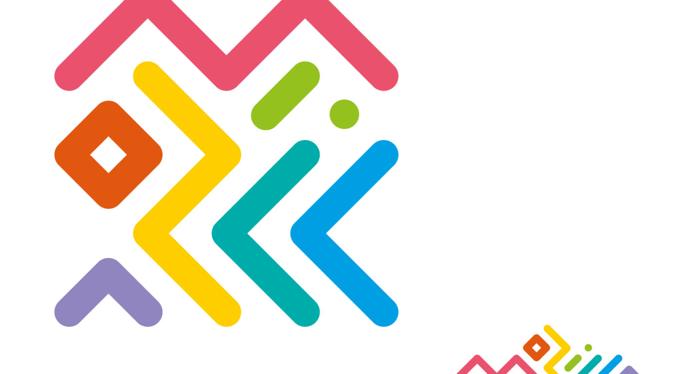
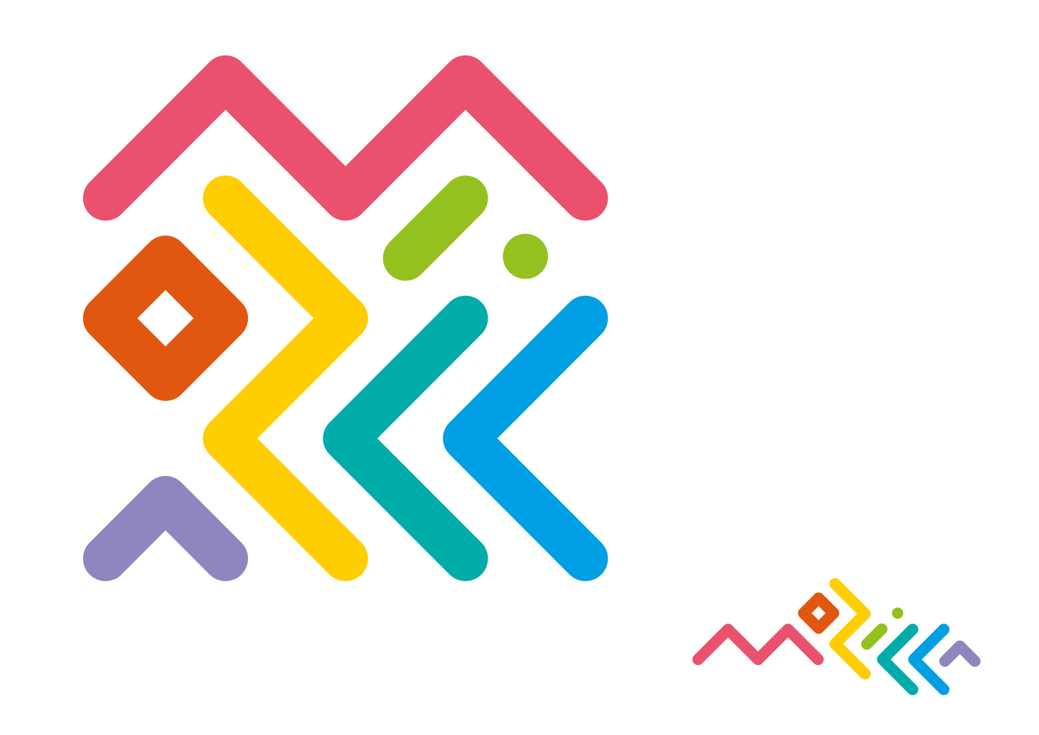
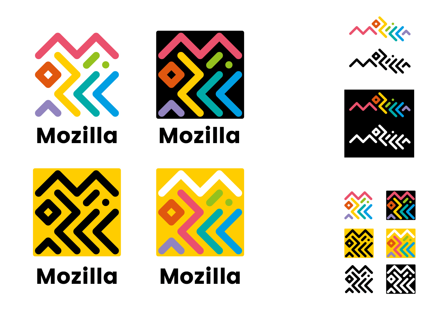
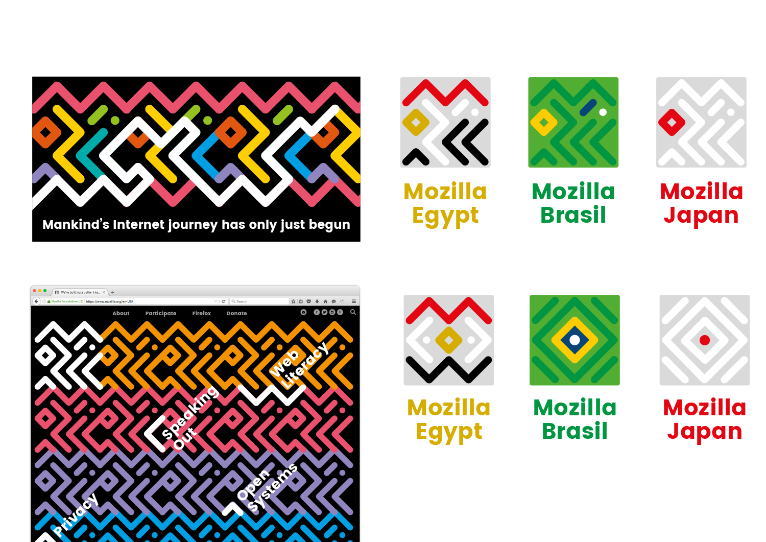
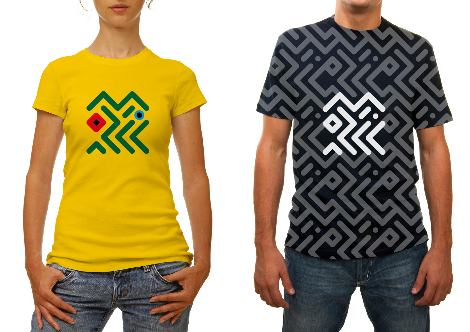
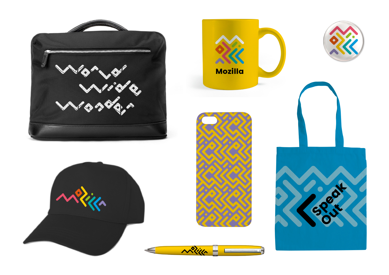
Typographic experiments with the ‘Mozilla’ name led to this route – where the letters are intertwined around each other to create two interrelated marks, inspired by circuitry and tribal patterns.

This design direction stems from the narrative called Mozilla. For the Internet of People.

Mozilla. For the Internet of People

Mozilla believes that the Internet should work for people – and the best way to achieve that is to give people the power to shape the Internet. At its best, the Internet is humanity’s greatest invention. It has the ability to connect human minds and free human potential on a scale never seen before. But we need to keep it open, always. We need to distribute power widely, not divide it narrowly. We need to build bridges, not walls. e future of the Internet is amazing, as long as it remains the Internet of People.

Click the first image below to see how this logo might animate:

jb_Mozilla_design_pres_edit_3.keyjb_Mozilla_design_pres_edit_3.keyjb_Mozilla_design_pres_edit_3.keyjb_Mozilla_design_pres_edit_3.keyjb_Mozilla_design_pres_edit_3.keyjb_Mozilla_design_pres_edit_3.key

181 comments on “Design Route B: The Connector”

  1. Scott wrote on

    I agree that the icons and other elements need to be resolved/refined further. But, this is probably the one I am leaning towards. Not even taking into account the flag versions, this has a more international feel to me. It has an Olympic quality to it that I find appealing and is one of the few that I don’t think will feel old in 5-10 years.

  2. Andre Myrlonn wrote on

    This is my favourite! I love how it can interact with the pattern and create a playful identity without being too legible and obvious. The colour scheme is a bit childish, and I would prefer to see it using more daring colours. Love the single coloured version though! You don’t need legibility to create a brand identity. It is easy however play too much on the lettering concept and include it in every aspect of the branding. It would be nice to see examples of how it works together with stricter typography and imagery, especially for the web. This has the potential to be really great, in my opinion it just needs to be crisper, more precise, and possibly more obscure.

  3. Endyl wrote on

    First I thought this is too illegible and chaotic, but after looking at the variations and the animation, I came to like it. Not my favourite, but a strong contender. With its abstractness comes great versatility and manages to overcome obscureness (which ruins the wireframe world option). It’s modern, fun, colorful and Mozilla-y.

  4. Wil T. wrote on

    I get the feeling that while initially jolting to the viewers of the font, they will come to know and love it. It has versatilty and can be morphed in and out of coherence based on the function of the application or idea that Mozilla is offering to the community. The global branding of this one is stronger than most and could help to expand your reach among the tech community overseas. I also see the opportunity to play with color and structure with this font in a way the others simply lack.

  5. Rob Harrigan wrote on

    I think this is the strongest design direction. From a branding perspective you’ve set yourself up with an extensive library to pull from and it feels far superior in execution compared to the others.

    I echo some of the other concerns around legibility and accessibility, and I would like to see it applied to digital implementations for the in-situ comps — it’s exclusion makes me have some reservations about its applicability for a digital first extension.

    Address those through a continued evolution of this option. Worry less how it animates and make sure it works as a system.

    I’m very curious how the open-source design execution works out. Takes a lot of mettle to pursue that option.

  6. Nathan Demick wrote on

    This one jumped out at me, even though the company name is hard to decipher within the logo. Gives off a bit of a Memphis Milano vibe; very retro, which I like. The animation concept is the best out of all the potential designs.

  7. Ross wrote on

    As a designer, I can enjoy the conceptual ties to circuitry and to traditional tribal art, and appreciate that the icon can be altered for use in other countries.

    Although, using tribal art is culturally appropriating, and the design recalls tacky 90s patterns (remember Rocko’s Modern Life?). It’s also extremely cluttered for an icon, doesn’t immediately make one think of circuitry, is hard to read, and looks quite childish. Have you thought of how will it look on someone’s desktop with their wallpaper? This one loses the visual impact of your FireFox icon, while doing little to help your brand. Further, this design is ripped off the Post-Modernist period which therefore can’t possibly stand the test of time, especially for a high-tech company, since Post-Modernism is already a thing of the past.

  8. Michael wrote on

    Great color choice, fantastic spacing and cohesiveness, not a logo. It’s just a visual headache and will not be scalable, it’s too busy and looses it’s heart when monochromatic. You need a defining icon

  9. Nicolas wrote on

    I’m a fan of the “Flat name” version (Below)of this design it’s still fun but far more legible.

    The squared off logo’s feel like they need Mozilla written underneath or they won’t have the same brand recognition as, say, Facebook’s “F”.

    ScreenShot2016-08-23at11.54.48AM

  10. Eric Shepherd wrote on

    I have to agree with folks who feel this is basically just a jumble of lines. I mean, I see the “Mozilla” there in at least some of the renderings, but it’s not easy, and I worry that confusing imagery like this won’t help us gain recognition for the logo. I do like the idea of something with fairly simple lines and the like, but this one is just too abstract.

  11. Nolan wrote on

    Disliked. It is abstract and I didn’t even realize what it spelled until afterwards. This logo is not going to stick with people.

  12. David wrote on

    By far the best of the lot! Vibrant, adaptable, pop looking. Brings to mind a vibrant, youthful organization.

    1. David E. wrote on

      100% agree.

  13. Rick Colby wrote on

    I like the flexibility and whimsicality when used for collateral, wearables, etc. but it’s too busy and visually confusing for a lasting mark. It feels a bit dated too.

  14. Kelley Lueck wrote on

    Love this concept , but do not like the main colouring scheme. Resembles the Google colour idea just with a different pallet .

  15. Cosmin wrote on

    This “lines” design looks original, while most of the others are, sorry to say it, ugly. It also has the highest potential to generate patterns corresponding to an entire family of logos with a common phylosophy.
    Are you going to organize a popularity contest on the designs ?

  16. mike wrote on

    This logo has a fun youthful African feel to it. You can change the colours to the country or colour template style. The shapes have a deeper meaning. Could easily create other logos from the same “font” pattern. To some it looks messy but its full of art not cold design.

  17. Uy Le wrote on

    Although the funkiness of this option is undeniable, it might be trying a bit too hard to convey personality. It rubs me off the wrong way. I think it looks more like a Kids Olympics logo, rather than a brand like Mozilla.

  18. David E. wrote on

    I agree. I actually really like it. I like the variety of bright colors as well as the initial ambiguity of what it represents/spells. This design schema is BY FAR my favorite of the seven. No question.

  19. Hyrum wrote on

    80’s paper cup? Party confetti? most people aren’t going to look long enough to puzzle it out. Makes me want to look away with how loud it feels.

  20. Patricia Stark wrote on

    From a non-designer perspective: I simply like it – it’s fresh, unique and seems to offer many possibilities through different channels. Go for it :)

  21. Justin McKissick wrote on

    Applicable to several countries and cultures (as has been shown) is what makes this the strongest concept, really serving the global online community Mozilla has created. It has the patterns and colors all figured out, just a little more refinement on the main logomark – the lines alone are not enough to make people think “Mozilla” unless accompanied by the word itself. This concept is by far the closest to completion though.

  22. Joe Stewart wrote on

    This is the best one. I wouldn’t write the word “Mozilla” under it in the black type tho – let the mark live – it already says the name.

  23. João Munhoz wrote on

    Reminds me of the 90’s, but modern at the same time! I think it’s my favorite! The colors are amazing, and the logo made me feel happy, in the horizontal and the box form. The font isn’t round as the symbol, but it isn’t a problem, I’ve loved the font too. But maybe in the box logo, the symbol should be a little more distant from the borders (except on the Maker Party logo). And I don’t think the flag use is nice, it should be reviewed, or we could just keep the Mozilla logo with the color change for the flags.

  24. Julio Nico wrote on

    THE BEST! IT’S THE BEST!

  25. Daniel C wrote on

    This one immediately jumped out as my favourite. The other options all feel too retro or too geek. This one is modern – and importantly for today’s world – completely adaptable for all forms of online and print media. The ‘square’ version is perfect for icons, while the ‘unrolled’ version works as a masthead logo. I also love the concepts where it integrates into a larger, more muted background pattern – this gives infinite possibilities, not just for T-shirts but also page design. Yes the rainbow palette does have a bit of Olympics/hippy feel to it which makes it hard to convey the sense of a serious business-minded enterprise, but I feel the colours can be tweaked to mitigate this. Most of the iconic logos (Google, Microsoft, ebay) stop at 4 colours, and there’s good reason for that. I would love to see this design taken further.

  26. Peder Brand wrote on

    This is the most interesting of all the proposals. Being more graphics then typography it’s global potential is far greater. I also really like that it challenges the viewer to a certain degree. Rather then one streamlined, optimized experience (friction is being removed from every facet of our world everyday, especially in tech), it reads as a riddel that u don’t “have” to solve. It has a nice balance between individual parts and whole enabling multiple configurations.

    I think the strongest point for me is that it implies an alternate logic, that is not obvious but slightly recess…

  27. jan wrote on

    Absolutely love this one! Even though it’s kind of a nod to late-80’s/early 90’s logos, it’s very fresh and different from most logos you see today. I’m afraid the community will vote for a more traditional logo, but this definitely has my vote!

  28. Victoria wrote on

    I like this one. And if to work at it a b bit more and probably make it a bit more minimalistic to reduce visual noise, it would be perfect.

  29. Gthin wrote on

    Keep this logo for the next Olympics or some island nation’s tourism branding. Colorful and vibrant but not for Mozilla.

  30. th wrote on

    curious, i like it. it looks kind of tribal.

  31. Sue wrote on

    Intriguing enough to make me want to click on it. Like that it animates into the “Mozilla” word, like the colors. Adaptable across the many uses you show with variations.

  32. Patrice S wrote on

    stylisation réussie du nom Mozilla … qui ne saute pas tout de suite aux yeux
    gai, coloré, ethnique
    je veux le tee-shirt jaune !

  33. Jenna wrote on

    This one is by far the most lasting of them all. It is doing it’s own thing. While I don’t agree with all of the applications in the above examples, as some of them hurt the eyes, I do believe this one it the strongest. It looks like it was inspired by Keith Haring’s work. Its so iconic.

  34. Vivek Vasudevan wrote on

    Hey, honestly I like this one better. It has the flexibility. And of course, fun. Among all the others, this is relatively friendly. Okay, the use of multiple colours may be distracting for some people, but its definitely not a reason to ditch it. Colours are fun, and even it holds its identity in monochrome. My vote.

  35. Val Kalinic wrote on

    I love this one. It is a great logo – fun, distinctive, iconic. Hope you choose it to represent you.

  36. val Kalinic wrote on

    Keep in mind – all the reasons why people are complaining are exactly the sign you need that this can become iconic. Or you can go for one of the other options, safe and bland.

  37. Murilo wrote on

    Gostei muito deste logo, acredito que seja o mais livre e aberto de todos os que vi.

  38. Smeikx wrote on

    – confusing, visually exhausting
    – possible associations: complicated, complex, toys, children
    – although the colours are friendly and inviting, the lines make me feel uncomfortable

  39. Graham wrote on

    Clever. But too clever. And awful on the eye.

  40. Ramzi Ibrahim wrote on

    This is really cool. If you go ahead with this, the brand will have an identity that’s unlike any other. Love the logotype.

    Not instantly legible maybe, but it is readable if someone looks at it for more than 5 seconds. And it’s attractive enough that people will actually look at it for more than 5 seconds :P

    Maybe the margin-size can be more in the square options of the logotype. So that it compliments the negative spaces in the logo.

    The adaptations, especially the country ones are super. The ideal ones (ie privacy etc..) are a bit banal, but the potential is obvious.

    Be careful that once they placed as a pattern, and doodles are being done over them, that the doodles don’t kill the negative spaces, but work across them.

    Maybe you can check Arabic Square Kufic Type patterns for reference to how negative spaces can be kept intact.

    Awesome work! My favourite.

  41. Brad Pettengill wrote on

    Far and way the best design among the seven. Fresh, innovative, evokes/suggests diversity, digital fingerprint, chip circuitry, pathways, labyrinth, and spells out Mozilla once you spend enough time with it. I’ve been designing logos professionally since 1980, and this is a winner: it will present well around the world, it is a symbol that transcends language while spelling out Mozilla, but with a subtle nod to the characters in languages other than English; by its technical, colorful geometric nature it will it will be able to show off modern digital technology superbly; it will absolutely stand the test of time; and it puts a fresh face on the brand, I believe it would tell the brand story well and position it among or above the industry leaders.

    The other designs are, with all due respect, off-target, amateurish, derivative or just plain ugly. This applies to their concept, structure and color scheme.

    My opinion of each design, in order of how they are shown:
    1. Ugly. Derivative or rip off of World PBS channel with shapes and colors. Also makes me think: clunky, amateurish type handling, African Safari / primitive tribal, wild cat eye stalking me…
    2. Winner
    3. Maybe has potential, but hate the garish colors, and who cares about products’ universal operational iconography anymore? Boring. Seen it done hundreds of times.
    4. Meh. As wordmarks go, it’s clever, like the colors and classic typography, but as the signature image to tell your brand’s story, it fails. Too plain, too “coding is cool”, or “hey look, our logo suggests a URL”…again, meh. Also not fresh, distinctive or modern.
    5. Cool, I like this second best, but it totally rips off Microsoft’s Zune MP3 player (the logo was done by JDK, a company I used to work for) and it’s not as attractive with this black color scheme. And you know how Zune turned out. Also rips off Melbourne Australia’s identity, but not nearly as beautiful.
    6. Horrid. Ugh. Looks like an amateur played around in some paint program or Adobe Illustrator in 1987. Slightly clever as an exploration of the m shape, but do we need to conjure up visuals synonymous with the retro sensibilities of Roy Lichtenstein, MC Escher and the days of early laser printers and visible halftone dots? Not for a forward moving brand.
    7. WTF. A logo? Clever but way too obscure. Colors are too hipster organic. Also suggests house of cards, unstable, precarious, contrived.

    Thanks for the opportunity to rant. I spend my days poring through logo design books and online logo showcases when researching a new identity. I am passionate about logo design and I really like option 2. The explorations of how it would be treated on shirts, swag, sub brands, the different color schemes, the animation, etc. are proof of its versatility, adaptability and it stays fresh in each iteration. The rest are garbage. Odd that there is such a chasm between these options.

  42. Grzegorz wrote on

    This one is the best, but the old one is better ;)

  43. Aastha Vijay wrote on

    I personally found only the “Mozilla” type text worth praising, although we’re not looking out for typefaces or typography but rather a “LOGO” as a whole, because we already have a “WORD MARK”.

  44. Morrissey Illa wrote on

    I really like the idea, but I’m afraid the concept would be just completely worthless at the smallest needed icon level. If you can’t scale the essence of your logo down as small as it needs to be able go, then your design fails.

    But of all the designs this is still easily my favorite.

  45. Teradyne Ezeri wrote on

    This design language is very…80s. In fact, it feels like someone threw “Saved by the Bell” into a blender, and turned it into paint. I like it from an aesthetics standpoint, and it’d be nice to use for the websites, but for branding? It really doesn’t show anything about Mozilla’s core ideals (other than the current Firefox code base being a mess).

  46. Cai N. wrote on

    This is definitely my favourite out of all the other concepts so far. Primarily because I feel like the others crucially miss some sort of mark in terms of what they focus on or what emotions they convey, especially on the feeling of openness or their capacity to carry messages with a positive and/or emotive tone.

    I feel that this one has the most capacity to engage with people who might not otherwise know who Mozilla is too; there feels like a very inviting nature about it – it’s not static, it’s not uniform and it’s comprised of many different parts. It feels like a very apt metaphor for values of openness and the internet. This system allows for a lot of flexibility to take the branding beyond the main logo, while maintaining some sort of underlying visual concept that allows the organisation to be consistent and recognised.

    I also like the fact that it doesn’t emphasise technology as much compared to other ideas – not that technology is important or not important to Mozilla, but because I think that to focus on technology can carry risks and miss more important points of an organisation. Because technology is invisible to so many people, making it a big focus risks seeming businessy or developer-centric, and it avoids opportunities to convey what I think would be the more distinctive, emotive and engaging aspects of an organisation, which is the use of the technology itself. So I like how this concept has this geometric structure can convey a sense of technology, but as more of a nod or contextual detail rather than giving technology itself a theme entirely on it’s own or a central focus.

    The Memphis-esque rainbow colour scheme for the default logo is definitely not going to stand the test of time, but that is something that can easily change. I’m not entirely certain about how other aesthetic aspects would stand the test of time but I think it’s basics – the use of interlocking geometric shapes it’s a very good starting point, and the geometric simplicity certainly helps lend it to possibilities to develop in the future as needs and design trends change.

    Like others have said, I’m concerned about the recognisability of the the current compact/square logo at a distance. For me, it’s not simply because the lines create too much detail, just the lack of a distinctive overall silhouette/form. There possibly needs to be something to visually stabilise it so it avoids looking just like an isolated part of a tessellating pattern.

  47. J. White wrote on

    No. This is too abstract. It doesn’t pass the “Grandmother Test” – if your Grandmother sees it and says “what is that”? then it’s not getting it’s point across.

  48. C. Arrien wrote on

    Like this one the best. It is flexible, colorful, active, modular.

  49. Seburo wrote on

    Hi

    Whilst I initially felt this one did look a bit 1980’s pop music video, it is starting to grow on me. I do like the project variations that just use one element and would be interested in seeing more mock ups of this concept possibly with a different colour mix (a little less florescent) and losing the rounded ends to the elements (try straight cut offs..?).

    I like the flexibility, but this concept could almost be too flexible, with a challenge trying to make sure that people use the right number of elements of the logo and in the right order.

  50. Araceli wrote on

    Memorable, flexible, poco legible. Me gusta su aspecto ochentoso.

More comments: 1 2 3 4