This is the presentation I gave at MozCamp Warsaw earlier this month. Many people have been asking for it, so it made sense to create a post about it, and give a bit more context the slides.
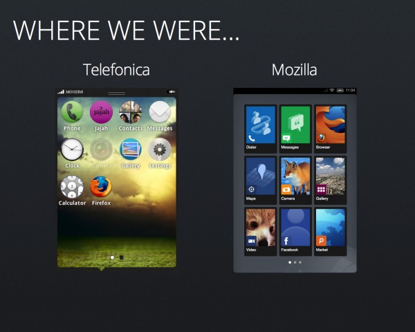
Rewind to MWC 2012…
It all started like a “skunks works” project, we had a few people working on many parts… I was contributing a few hours a week, and Josh Carpenter @joshcarpenter was tasked on penning the entire UX with the Visual Design in about a week for the MWC demo, which is a near impossible feat! But our showing at MWC was success…
Since both of our teams were small and had strengths in different areas it only made sense to partner up for v.1 of the OS.
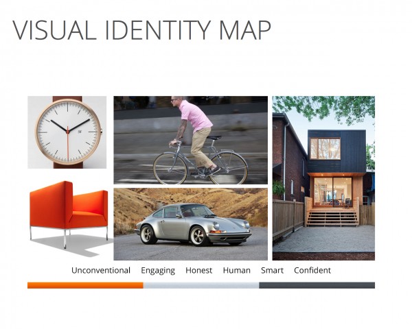
At this point (April 2012) with this new partnership I wanted to create a realignment of the visual design. (At the time this identity map made sense but as we proceed forward, it will be refined post v.1). Working with the UX team on where we want to take the visual design of all our products the following themes emerged:
- Shapes which are Bold, Geometric but with hints of organic softness.
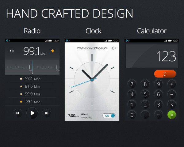
- UI that communicates a sense of handcrafted design.
- Design that is minimal, effective and intuitive but doesn’t feel soulless; has warmth.
Much like various versions of Firefox, the overall concept here is premium and of quality, but not because its expensive. Good quality design should be accessible to masses much like our products. Our strong focus is on high quality and distinctive design in the marketplace.
Design Philosophy (DNA)
Common elements in every application:
- Familiar Layout
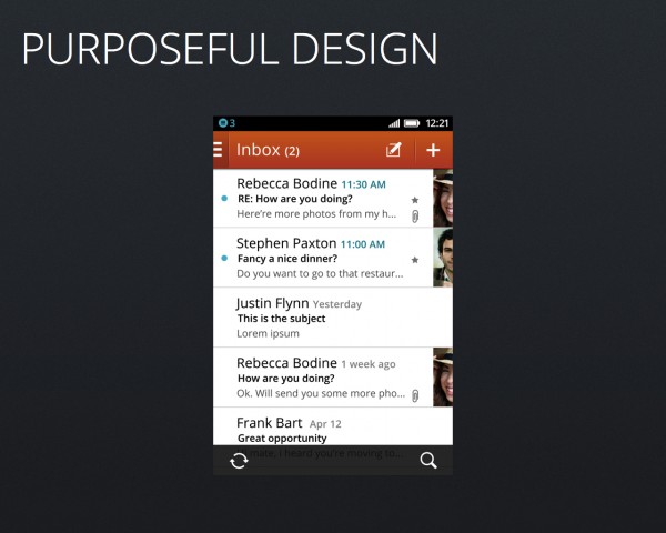
- Top Header which contains a backward navigation button (back, cancel or menu) on the left side of the screen, screen title to show the user where they are (left justified) and up to 2 action buttons often allowing for forward progression within the application
- Bottom Toolbar containing up to 5 action icons
- Magazine Like Layout: emphasis on typography and we wanted to make each app like it was type set by a human so we opted to go for a strong left alignment rather than mindlessly center aligning everything. This magazine like layout translates to images as well, many of them are strategically cropped to best suit their purpose in the application.
- Bold Colour to better appeal to our launch audience through the communication of warmth and confidence.
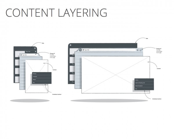
(Diagram thanks to Ian Barlow @ibarlow). Layering of content has been a comment UI element sense in Firefox for Mobile, we’re bring this element into Firefox OS in full force.
Content for user consumption is on the top level, settings are always found beneath.
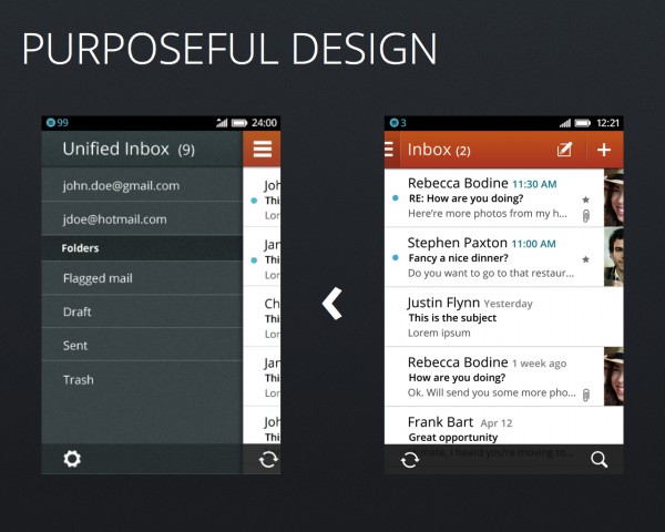
You can see how the header navigation and layering of visual design come together in this example. The user presses the menu button on the top left hand corner, the menu slides out from beneath the content. Since the menu doesn’t progress the user further in the app it slides from the left.
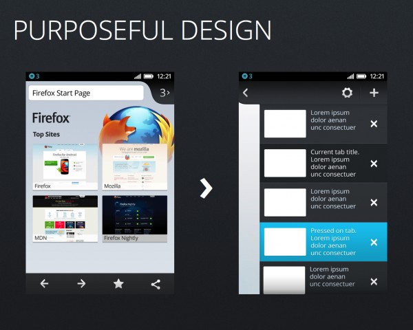
In the Firefox browser example the tabs are more of a menu, so they are depicted beneath the content since they allow the user to progress forward in the app, they slide out from the right.
These left <> right transitions create a natural path for discoverability.
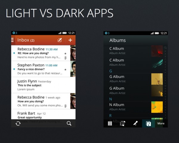
Many applications have a distinct character visually catered to their use, with a list layout, focused on quick triage of content.
- Productivity applications create a sense of an office; bright with an emphasis on typographic content.
- Media applications create a more theatric (dark) experience with emphasis on graphical content rather than text.
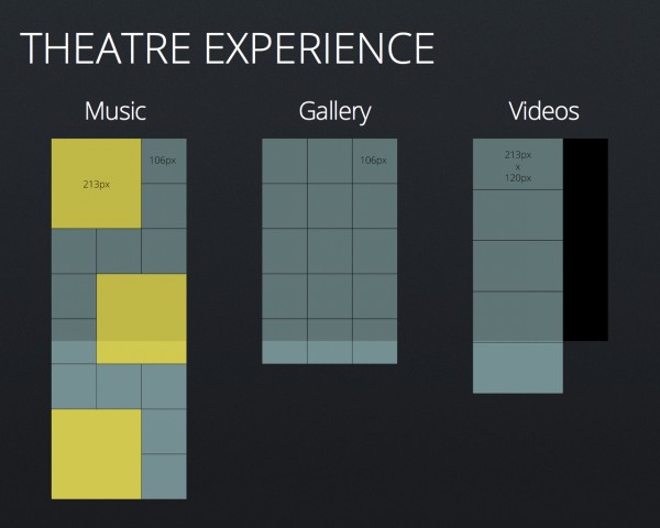
Media content varies per application, so aim here was to create a foundational grid which would work with each content type.
Our media applications have the following characteristics…
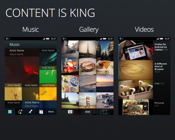
- Content is King while chrome is a distraction therefore, it is minimized.
- Asymmetrical layout (left alignment)
- Limited, if any skeuomorphic textures and graphic effects as they are deemed a distraction
- Any elements non essential for communication should be secondary
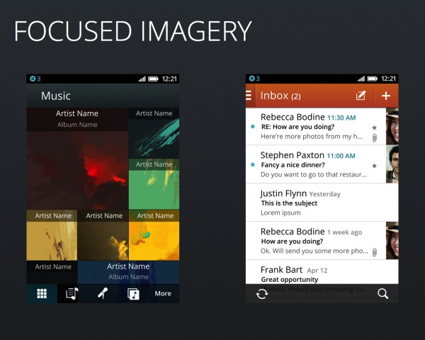
The aim of imagery is to add value not clutter. Rather than having a gray note graphic for missing album art, we created custom painting inspired placeholders for missing album art. In the productivity apps rather than having a missing contact image silhouette icon which creates noise (where emphasis should be on typography), no contact graphic appears.
Apps outside of the core media and productivity suite have distinct identities. Our aim was to balance sophistication with the approachability skeuomorphic design brings, textures are subtle and forms are stylized. A variety in bright highlight colours bring warmth and soul to each application.
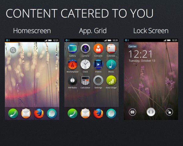
For v.1 our feature set had to be focused… but we felt wallpapers and allowing users to customize them was something that we had to include. The user has access to their full app grid or can live on the homescreen, their wallpaper (most likely being of their favorite person(s) or place) in full view.
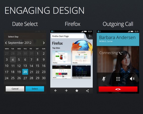
Examples of various Firefox OS elements. Strong emphasis on Typography
Familiarity (Firefox browser similar to Android version), Iconic Shapes but most importantly variety.
Iconography
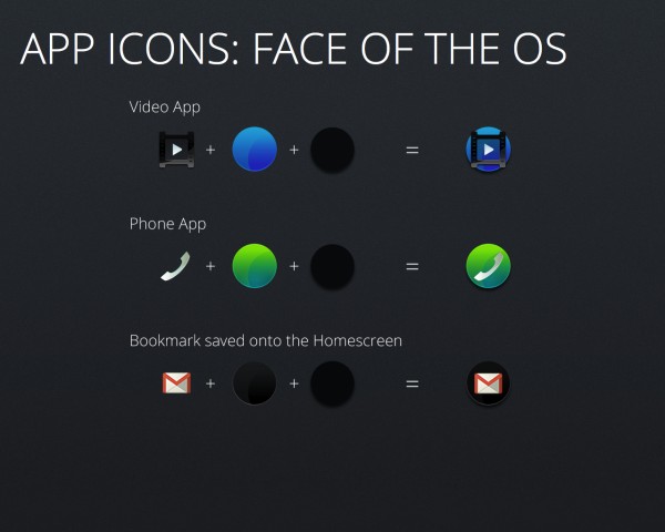
Peter La @ArtofPeterLa came up with this concept for the application icons: “Free the Web.” The icons would placed on a plate but some of them would break out to enforce the concept. We initially thought about using a square plate but the circle form created a unique opportunity to own a shape not common on any major OS, this would give Firefox a more distinct appearance.
We use a variety of plates, with certain colours suited better for certain application types:
- phone related: green
- media related: blue
- productivity related: orange
- settings and utilities: gray
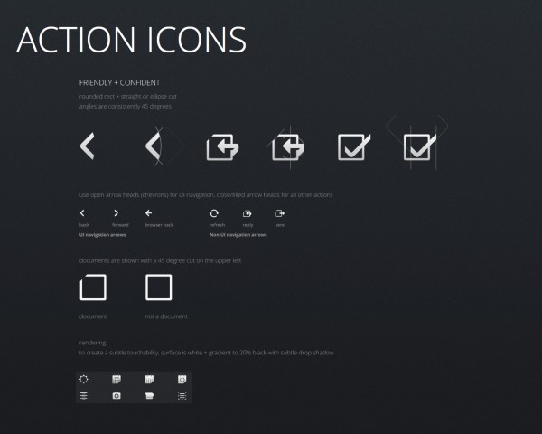
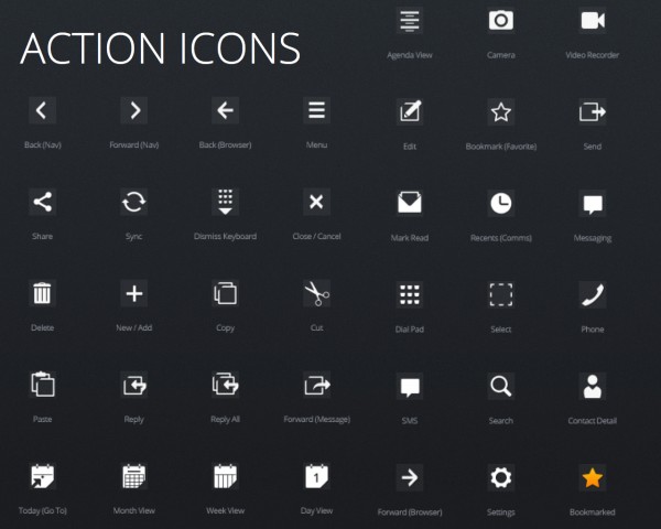
The overall concept for the action icons revolved around Friendly + Confident
- Mature Forms with emphasis on confidence through selective cropping
- Curvature should be small (tight) to communicate a sense of polish and approachability, but not overt to appear childish or cartoony
- Geometric curvature is favored over organic, but the ideal would have mixture of two (geometric without feeling stiff)
Currently we have over 100 icon metaphors…
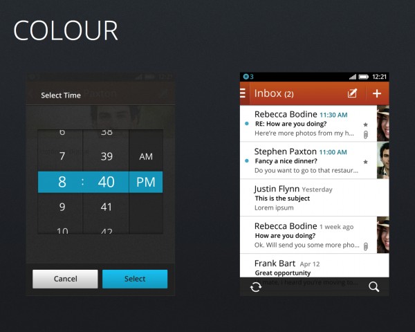
Colour has always been an important part of Firefox, especially the colour orange. We tried various concepts of application but in the end using only orange as a high colour did not work, so it has been reserved as an accent with its heaviest use in the productivity applications’ header. We used blue as highlight colour instead for the following reasons:
- Complements the Firefox orange beautifully
- The majority of the human population prefer blue
There was also an opportunity to speak to the partnership with Telefonica by choosing a blue hue which aligns to their brand colour.
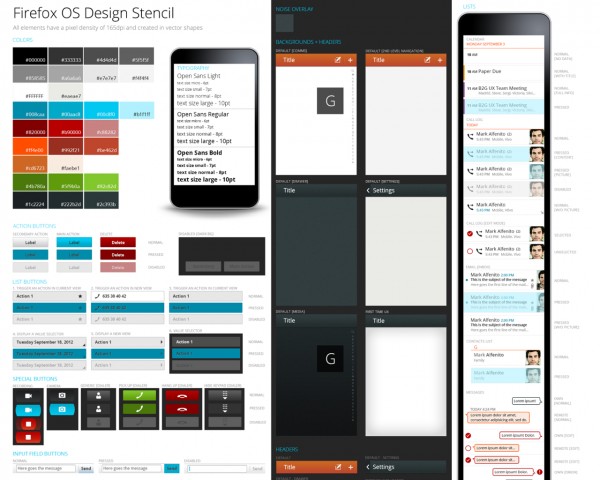
YES! All will be converted to CSS in one common library. We expect to support the developer & design community with a robust set of building blocks which will be released sometime before the OS goes to market and will be found on our new style guide website: http://www.mozilla.org/en-US/styleguide/
Typography
This is the Firefox logo, it uses Meta (like much of Mozilla’s brand) which was designed over 2 decades ago by Erik Spiekermann who intended it to be a “complete antithesis of Helvetica,” which he found “boring and bland. Meta as great as it is, was designed for a print environment and due to licensing restrictions can not be freely distributed…
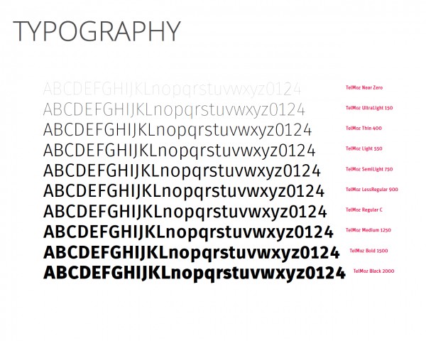
A few of our friends at Telefonica worked with Erik in the past which lead to an opportunity to work with him again on a typeface for the Firefox OS. So, it only made sense to create a digitally evolved version of our favorite typeface with increased legibility at small sizes and a more contemporary feel. More information on this project will come in the near future for now, above is a sample…
Sound Design
During the MozCamp presentation I played some samples, since then those have been revised, so a preview of the suite will be seen in a future blog post. However I can speak about the overall art direction which revolves around 3 themes a contemporary baseline inline with the overall visual theme of the OS and 2 variations on it. The first variation is much more relaxed, casual and soothing to contrast with its polar opposite, a sound theme that is direct, loud and more on the professional side.
Coerv wrote on