Categories: General

Now for the fun part of Mozilla’s logo design.

On our open logo design journey together, we’ve arrived at an inflection point. Today our effort—equal parts open crit, performance art piece, and sociology experiment—takes its logical next step, moving from words to visuals. A roomful of reviewers lean forward in their chairs, ready to weigh in on what we’ve done so far. Or so we hope.

We’re ready. The work with our agency partner, johnson banks, has great breadth and substantial depth for first-round concepts (possibly owing to our rocket-fast timeline). Our initial response to the work has, we hope, helped make it stronger and more nuanced. We’ve jumped off this cliff together, holding hands and bracing for the splash.

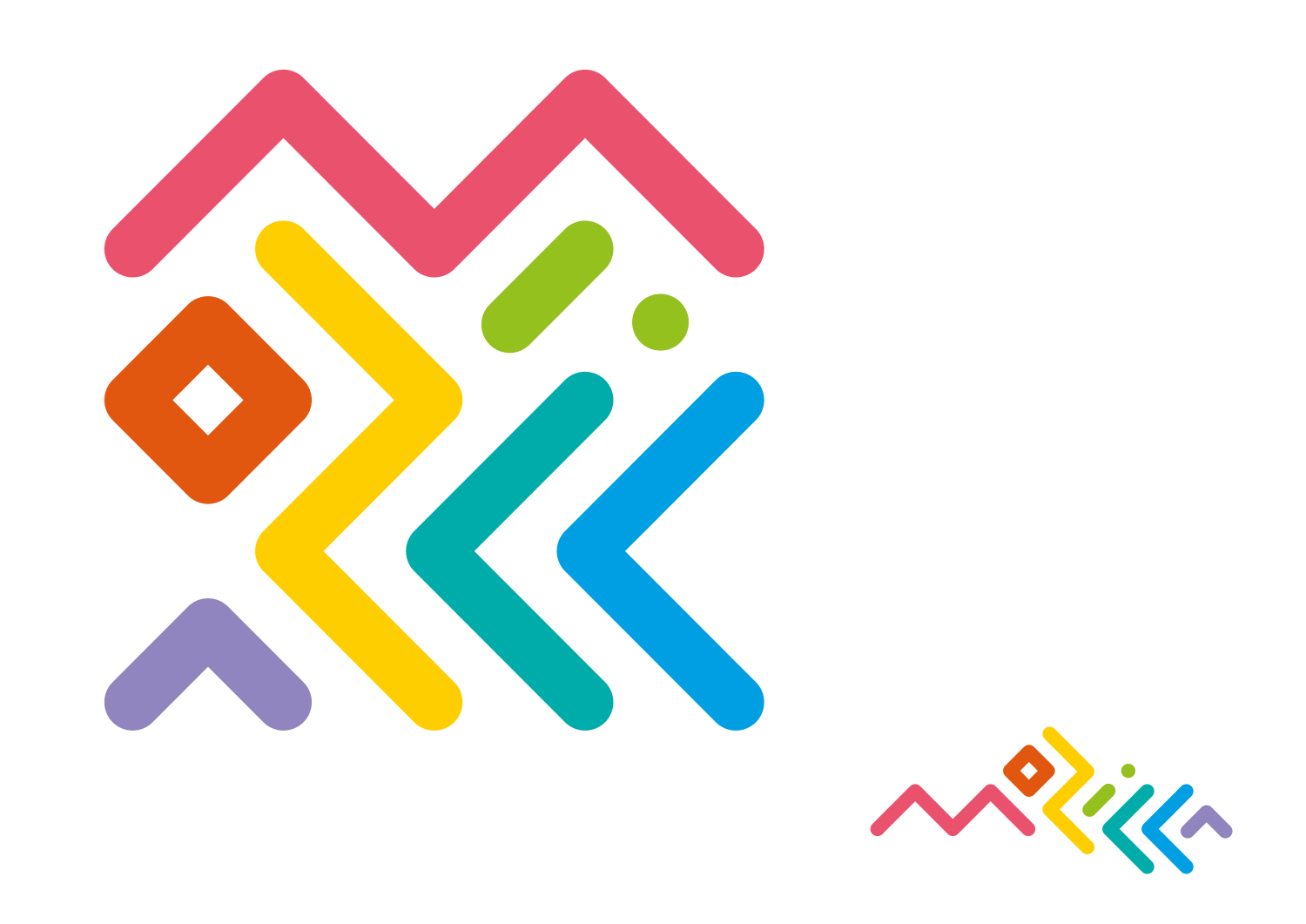
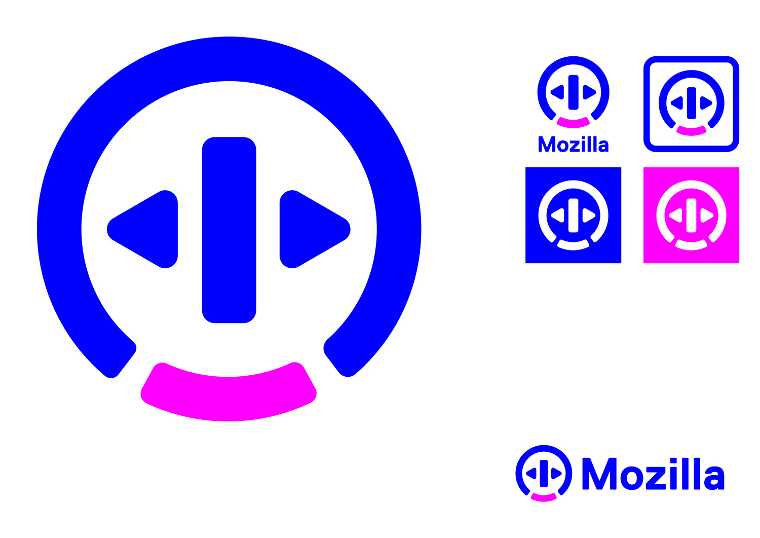
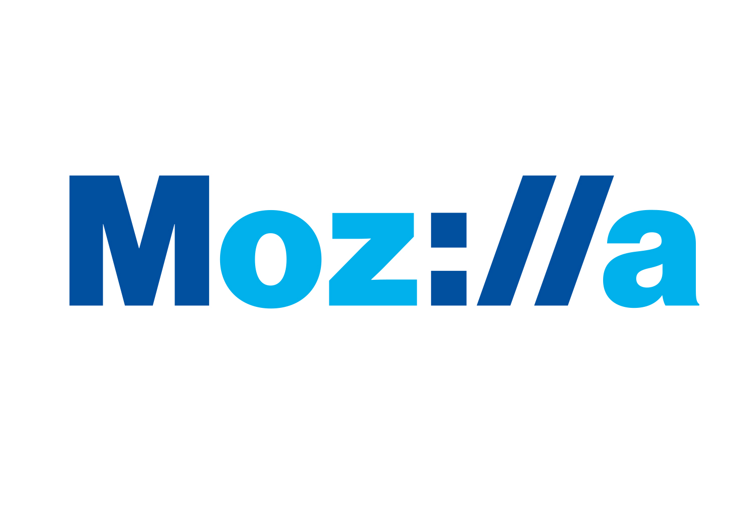
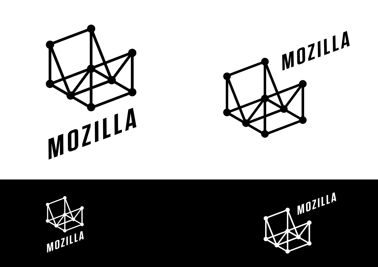
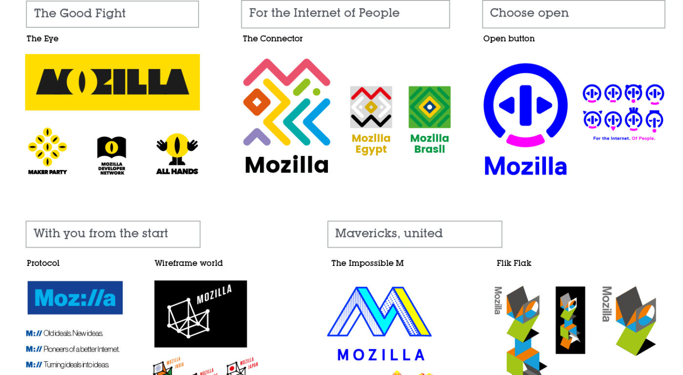
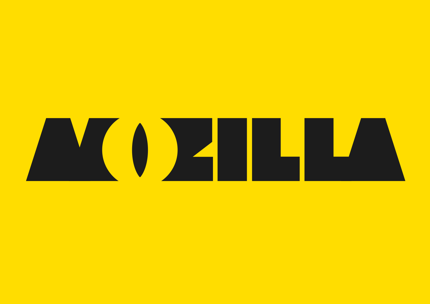
Each of the seven concepts we’re sharing today leads with and emphasizes a particular facet of the Mozilla story. From paying homage to our paleotechnic origins to rendering us as part of an ever-expanding digital ecosystem, from highlighting our global community ethos to giving us a lift from the quotidian elevator open button, the concepts express ideas about Mozilla in clever and unexpected ways.

There are no duds in the mix. The hard part will be deciding among them, and this is a good problem to have.

We have our opinions about these paths forward, our early favorites among the field. But for now we’re going to sit quietly and listen to what the voices from the concentric rings of our community—Mozillians, Mozilla fans, designers, technologists, and beyond—have to say in response about them.

Tag, you’re it.

Here’s what we’d like you to do, if you’re up for it. Have a look at the seven options and tell us what you think. To make comments about an individual direction and to see its full system, click on its image below.

Which of these initial visual expressions best captures what Mozilla means to you? Which will best help us tell our story to a youthful, values-driven audience? Which brings to life the Mozilla personality: Gutsy, Independent, Buoyant, For Good?

If you want to drill down a level, also consider which design idea:

  • Would resonate best around the world?
  • Has the potential to show off modern digital technology?
  • Is most scalable to a variety of Mozilla products, programs, and messages?
  • Would stand the test of time (well…let’s say 5-10 years)?
  • Would make people take notice and rethink Mozilla?

This is how we’ve been evaluating each concept internally over the past week or so. It’s the framework we’ll use as we share the work for qualitative and quantitative feedback from our key audiences.

How you deliver your feedback is up to you: writing comments on the blog, uploading a sketch or a mark-up, shooting a carpool karaoke video….bring it on. We’ll be taking feedback on this phase of work for roughly the next two weeks.

If you’re new to this blog, a few reminders about what we’re not doing. We are not crowdsourcing the final design, nor will there be voting. We are not asking designers to work on spec. We welcome all feedback but make no promise to act on it all (even if such a thing were possible).

From here, we’ll reduce these seven concepts to three, which we’ll refine further based partially on feedback from people like you, partially on what our design instincts tell us, and very much on what we need our brand identity to communicate to the world. These three concepts will go through a round of consumer testing and live critique in mid-September, and we’ll share the results here. We’re on track to have a final direction by the end of September.

We trust that openness will prevail over secrecy and that we’ll all learn something in the end. Thanks for tagging along.
jb_Mozilla_design_pres_edit_3.keyjb_Mozilla_design_pres_edit_3.keyjb_Mozilla_design_pres_edit_3.keyjb_Mozilla_design_pres_edit_3.keyjb_Mozilla_design_pres_edit_3.keyjb_Mozilla_design_pres_edit_3.keyjb_Mozilla_design_pres_edit_3.key

583 comments on “Now for the fun part of Mozilla’s logo design.”

  1. Hardy Cherry wrote on

    Your current Mozilla, word logo isn’t broken, perhaps it would be better to not fix it at all. All of these logo ideas are just so weird. By the time people start associating Mozilla and Firefox with one of these ideas you will be ready for another change. Microsoft, Apple, Google and Adobe, among others, have had the same or nearly the same logo for years, and years, maybe with minor tweaks. These changes are complete overhuals that will hurt branding and recognizability instead of helping it. The current lowercase mozilla logo with the firefox iconography has already stood the test of time with minor tweaks, why would you want to break that by doing something so different?

    1. Tim Murray wrote on

      Hi Hardy, thanks for contributing your comment. You are not alone in believing that this is a design exercise to replace the Firefox logo, so apologies for any confusion we may have caused here. We are working here on the Mozilla brand to create visual assets (such as a core icon) that will allow us to communicate in a more modern way and make our mission accessible to more people globally. You’re correct in pointing out that brands evolve and change to reflect the work they do in the world and to attract new followers. In our case, we don’t have enough to work with, and even though Mozilla is well known, it is not understood. Earlier blog posts on this site will hopefully help explain why we are engaged in this work. For a quick review, please see here: https://blog.mozilla.org/opendesign/now-were-talking/ Thanks again!

  2. BH wrote on

    Leave the old one as the image for Firefox/Mozilla. This new stuff is for the birds and a few other things. The old trade mark is what people will look for when they are looking for the download, not some new junk that some techie wants to put as a splash screen.

    1. Tim Murray wrote on

      Hi BH, thanks for contributing your thoughts to this review. This design exploration is for Mozilla, the nonprofit behind the open-source web browser Firefox. It is not a replacement for Firefox. Mozilla believes the Internet is a global public resource accessible and open to all. To learn more about Mozilla, if you have a chance please visit: https://www.mozilla.org. Thanks.

  3. Hervé costa wrote on

    I found the connector logo the one seems to me the most appealing. It’s possible to reconize easyly any options made from, it’s colorful and soft lines. Any feeling about our “hardshape” society. It’s look more something about the feeling of giving who stand better within the community.
    (bad english, isn’t it ?)

    1. Tim Murray wrote on

      Thanks, Herve. Completely understandable, and thank you for being a part of this review process.

  4. Robert de Forest wrote on

    You’ll want to take a look at the comments over at Ars Technica:

    http://arstechnica.com/business/2016/08/mozilla-is-changing-its-lookand-asking-the-internet-for-feedback/?comments=1

    As mentioned by Matt above, the comment by Zaskar about gradual transitions is particularly strong.

    My own impression is that most of the brands you have presented have obvious derivations which they reflect more strongly than Mozilla as an organization or its illustrious history. The Eye belongs to Pixar. The Connector is a deconstructed subway map. Open Button is a power button. Protocol is a URL (the most relevant of all of them, but still coat-tailing at best). The Impossible M comes from Escher. The two whose origins are not obvious to me (Wireframe, Flik Flak) are both too complex and too clever.

    The most successful brands are the simple ones: McDonald’s Golden Arches, Volkswagon’s badge, Amazon’s smile. A good brand is not a brain teaser. It isn’t showing off how clever you are. It is easy to draw, easy to recognize and easy to defend as a trademark.

    Even the old Netscape “dawn of N” was too complicated and too generic at the same time.

    My recommendations:

    Stop trying to say something with your brand other than “Mozilla”. For that matter, “Mozilla” is already your brand. Just develop that. Maybe, _maybe_, consider shortening it and stylizing the M or the Z, but if you do, be careful not to tread too close to Zillo.

    Consider the color-blind and the cost of printing color vs monotone. If your brand depends on color it will fail.

    Avoid references to other things (eye of Sauron, power button, Escher). It risks confusion and makes the trademark harder to defend.

    Your brand should not require explanation.

    Your brand should be timeless. “Retro” is not good.

  5. Ditrich Schmidt wrote on

    I preferr the Moz://a!! This is genious!!

  6. Amir Farsi wrote on

    Hi.
    I think protocol is the best logo for Mozilla. This will help people to more think about internet protocols and what is http:// ?

  7. FF MozUzer wrote on

    Re,
    Like Sam, seems that my image did not get attached, though I do not know why. So I have uploaded it elsewhere:

    https://framapic.org/gallery#dNIAbgDd5C02/TSjnJhxOTSm0.png

  8. Haomin Yuan wrote on

    I’m usually cautious when it comes to giving design feedback w/o any background information, as feedback should always come w/ understanding of the concept. This is especially true for branding. However, since these are being presented as is, here are some of my opinions.

    1) The eye.
    As many have pointed out, there are various associations w/ the eye. The way it’s depicted, it’s usually associated with something monstrous. When paired with the font, it becomes a bit more childish. So I see the design is more suited for a children’s publishing company, that creates interactive experiences for kids.

    2) The connector.
    This by far seems the most flexible system. The square variation is difficult to read, but that is fixed by the 2nd form that spreads the letter forms out. The ability to create patterns, and changing colors adds to the flexibility. The style doesn’t tie it to any particular era, or industry. The country variations becomes interesting, and can allow the brand to speak to region specific consumers.

    3) Open button.
    There is probably a story behind the shapes chosen for the button, but it’s a bit difficult to understand as is. The attempt to create a character’s face out of the motif seems slightly force, but it can be fun. However, the trend of creating specific characters as representations have sort of faded in the past couple of years, and seems to mostly relegates itself to the telecommunication companies. So the design can become dated quickly, and may not be industry aligned.

    4) Protocol.
    The :// is conceptually relevant, and easily understood for people who are familiar with the internet, or computer languages. However, the type choice, font weight, and the coloring all scream 90’s big corporate tech company, like Microsoft and IBM. It distances itself from the casual consumer. It can make a suitable logo if “corporate” is the concept. The M:// motif also comes of as authoritarian, as if Mozilla is giving off commands. While the text in black is kerned way too tightly.

    5) Wireframe.
    Wireframes have been used a lot in recent years for tech business, especially for social media related ones. Some can be seen as variations of an overall branding language, like Medium’s new branding. So there’s a sense of familiarity. However, “draping” the wireframes with flags seems to be a disconnect with a concept that is not really apparent. Condensed fonts also oscillate between on trend and being dated.

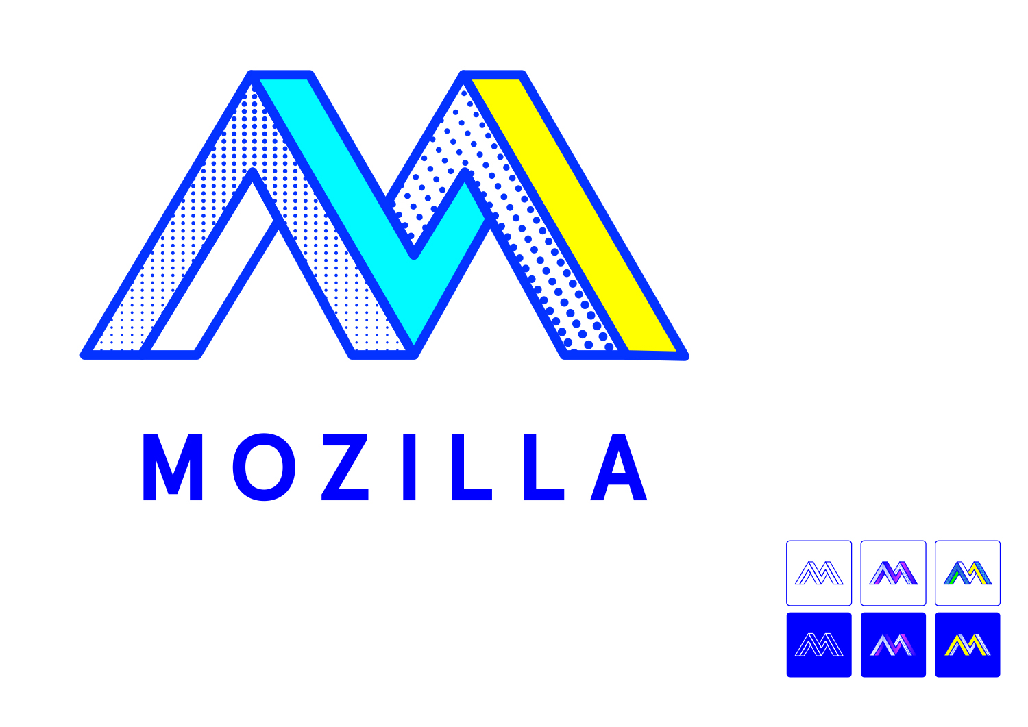
    6) Impossible M.
    This is playing heavily on nostalgia by harkening back to the 90’s MTV era, which doesn’t necessarily fit a company that is trying to be a leader in technology. While that trend is making a come back recently, like all fads, it can fade quickly. The brand also doesn’t seem to match the audience it’s trying to appeal to, nor does it really seem to match the identity of Mozilla, unless there’s a major business shift.

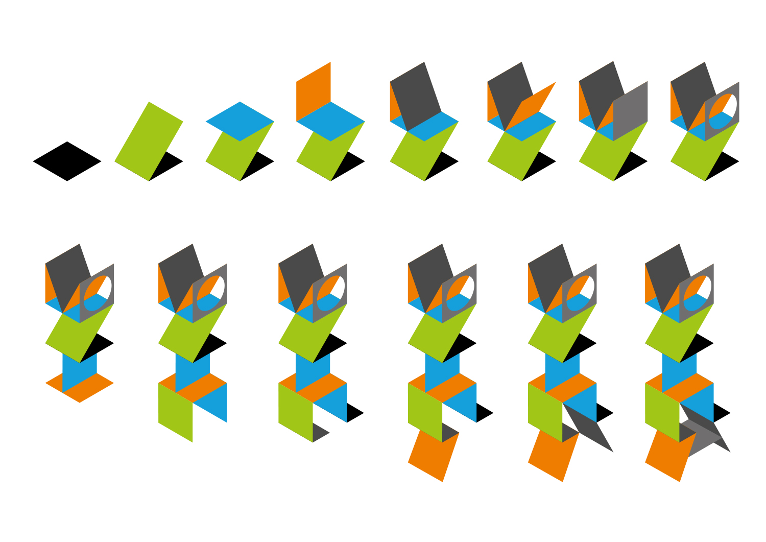
    7) Flik flak.
    This is very reminiscent of branding for art schools from the 2000’s. It is difficult to understand its connection to mozilla’s brand. It is also a bit difficult to read. Not necessarily on trend, doesn’t seem to be on brand, and not really innovative.

    In general, majority of the logos seem more on trend than on brand. 2, 3 and 4 seem workable if more refinement is put in. The connector seems to be the most flexible system. Understanding the brand story for each might make one stand out a lot more than the others.

    1. Tim Murray wrote on

      Hi Haomin, If you have not had a chance, please click into each logo to find a blog post related to each. Background information can be found on previous posts on this site. For more information on why Mozilla is engaging in this work, please see: https://blog.mozilla.org/opendesign/now-were-talking/ Thanks for being a part of this open design process.

  9. Caroline wrote on

    I love the color and patterns The Connector can make. However, it has low legibility and gets messy fast. This is great for patterns and products, but not so great for people trying to understand who you are.

    Protocol, Moz://a is my second favorite and the most successful based on the goals you have outlined. It’s is scalable, instantly speaks to what you’re all about and is still eye catching.

  10. Doc Billingsley wrote on

    +1 for Protocol.

    All of the others leave a bad taste… my wife just pointed out that the ‘Eye’ could also be interpreted as a very different body part. Once you see it, you can’t un-see it.

    Open Button looks very, very familiar but I can’t put my finger on what other brand I’ve seen using a similar look.

    Also just a practical note: it would help if each of the larger designs were labeled with their name. I have to scroll back up to the top to see what each one is called; why not add captions?

  11. Tom wrote on

    Wireframe and Moz://a are the only two that look remotely professional, imho.

  12. Enrico wrote on

    If I had to pick one it would be the wireframe one. To be sincere, I don’t like any of these new logos :/

    1. jgreenspan wrote on

      Thanks for your thoughts, Enrico. Hope to hear your thoughts on the revised concepts in September.

  13. Gwarsbane wrote on

    To be honest I don’t like any of them much.

    The one that I dislike the least would be Moz://a. But its too close in color to facebook.

  14. Janne Koschinski wrote on

    I really like the moz://a design, although I think it could benefit from a different color scheme, closer to the original mozilla color scheme.

    I did a quick mockup in about a minute to illustrate that (a design agency could always obviously improve on that): https://dl.kuschku.de/images/Mozilla_Foundation_logo_redesign.svg.png (SVG version at https://dl.kuschku.de/images/Mozilla_Foundation_logo_redesign.svg )

  15. Rodrigo Portillo wrote on

    Its not a good idea.
    People who use Mozilla is not designers. Most of them, who really cares, is coders and specif developers. Other users just dont care. Designers prefer use Safari or Chrome, even caus it use Webkit.
    Now you guys are asking to coders and common users to decide wich is the better design? Its not make any sense. A good design is not about taste or preferences. A good design is about function and use.

    1. Tim Murray wrote on

      Thanks for your recommendation and insight into developers and Firefox, Rodrigo. This design exercise is for Mozilla, the nonprofit organization that makes the Firefox open-source web browser. It’s not a replacement logo for Firefox. At Mozilla, we believe the Internet is a global public resource that should be accessible to everyone, and work to keep the Internet healthy for all. Firefox is one of the ways we work to keep the Internet a level playing field. As time allows, have a look at some of the earlier blog posts on this site to learn why we are applying open source principles of transparency and participation to this brand initiative for Mozilla. Thanks for being a part of this effort.

  16. hipunk wrote on

    I read about a third of all these comments here, but now I’m just going to give my opinion without reading the rest. That’s just too much.

    First of all: Never change a running system.
    Is there a particular reason why you see the need for a rebranding?
    This brings me immediately to the “Protocol”: It kind of resembles the old logo the most, while adding some new touch to it, even with a hint of what mozilla is and was about. Nevertheless it is not a complete start from the beginning. However, as some people already pointed out, it has the sad smiley face :/ in it. If you’d really go for this one, I suggest making it green instead of blue. Blue always represents a cold feeling, while green gives a relaxing vibe to the eye.

    Now for the rest of the concepts. To be fair I don’t really like any of them that much, they always try to overdo stuff. Look at the logos of the most succesful entities on the IT market right now: Google changed from serif to non serif, to make it even simpler and easier to read. Same for Microsoft, the old stylized logo was exchanged for a new more lean looking one. The Apple logo went from Newton sitting under a tree to a simple one colored Apple and the term “Apple” with no additional styling to it. Other succesful things on the web, like reddit, tumblr or yahoo do the same, they reduce instead of adding to it. They are even written in lowercase, just like the current mozilla logo. And it’s successful that way..

    “The Eye”. Well, nobody want’s the evil eye or Sauron watching him surf all the naughty websights, am I right? Also it looks like a vagina. A company for pussies? Excuse me, but it came to mind. I see no connection between the rest of the “The Eye” logos to mozilla – in fact I see Ubuntu because of the coffee beans.

    “The Connector”. The slogan “Mozilla” beneath it is quite perfect. Simple, one colored, mozilla just written big now. Mozilla. The a is perfect in this one. The logo above it is having too much color and seems too wild. I see no connection between the logo and mozilla.

    “Open Button”. This reminds me of goatse. Please do not pick this. And don’t search for goatse if you don’t know what it is, trust me on that one. Also blue and pink don’t really mix that well. I see no connection between this logo and mozilla. It kind of looks like a power button, not like a logo for a browser maker.

    “Protocol”. Make it green instead of blue and we can talk. I like the approach of having possibilities with the M://, e.g. M://Firefox Phone or M://Firefox. Maybe mix this one with the Connector one? Especially the a needs to be changed in this one. The connection between mozilla and this one is evident. Have you tried making one with round : and the a round circular o and a (the a which is also to be found in “The Connector”), so that the dots of the : can fit into the a and o? In german there is a saying “Das ist das A und O” (it kind of means, “That it important”). It would be quite fitting.

    “Wireframe world”. Is the web 3D? I don’t think so and I’ve seen a lot. So why wireframes? Also overdoing stuff for no reason. No connection to be seen with mozilla.

    “The Impossible M”. Looks like MTV or a construction companies logo. The impossible meh. It’s also not timeless.

    “Flik Flak”. I like it, but it is way too much. There is a connection to be seen, but it takes quite a lot of time to recognize it.

    I hope you consider what I said, although I’m a bit late to the party here, I am a proud FF user for a very very long time now and I even call a firefox phone my own.
    I’m sure you guys will figure it out, but don’t overdo something that hasn’t to be done at all!

  17. Quentin wrote on

    Moz://a is the best choice here, but i’m not sure its the right choice for the foundation.

  18. Optical Illusion wrote on

    The Eye: It makes me think of Bill Cipher or some other evil-kind.
    Protocol: Unless you are a programmer this doesn’t mean much since urls are removing the http:// from links or just auto filled in. That and regular users on the internet (which makes most of the people) are not going to understand it.
    All the others are optical illusion that make my vision blur, except for ‘Open Button’ which pulses while blurring into a circle.

  19. Bernat Nacente wrote on

    – The Eye: Hard to read, the “all hands” mascot is more like a cartoon tv mascot. It’s a no^3 for me.
    – The Connector: Lots of colours which is nice, colourful logos are attracting to people but It’s too complicated. It should be simpler.
    – Open Button: So 90’s but not a in a good way. Only 2 colours and “neon-like” ones. And I don’t get the meaning of the logo, if it has any. Also a no^3.
    – Protocol: Clear logo, “subtitles” are hard to read, space the letters a little ;). But too geeky. Nice, professional but too geeky maybe. If target is geek, it’s perfect though.
    – Wireframe world: It’s like a logo for an exhibition from MOMA about contemporaneous design. I don’t think it’s a logo for a browser/app/computer foundation. I love it but not for this.
    – The Impossible M: Typo is kinda meh. Electric blue is not the best choice (like Open Button) and the different density dots, left ones merging into one another. And it’s M? Or AVI? Or AVAI? Or ALAI? No^2.
    – Flik Flak: Great legilibity, great choice of colours (bright, saturated but not too much). But… what the duck is that thing? A building? A playground? Card castle? Too complicated.

    The perfect combination for me: The simplicity and specially the typo from Wireframe world, the colours from Flik Flak or reduced number of colours of The Connector.

    Hope it helps.

    1. Simon wrote on

      Yeah, good call on Wireframe. Aesthetically, it’s the best of the lot by a mile – but it’s the wrong logo for the job. You’re right… it’s a logo for an art gallery, not for an internet foundation…

  20. GG wrote on

    This is all very ditsy. It seems like you’re trying to become something you’re not. But you can’t make mozilla innovative by choosing an innovative logo. All this effort is for naught.

    If you must waste your time, I suggest taking the high road and making the “Foundation” of Mozilla Foundation more prominent. You can’t beat em and you can’t join em, so just be you.

  21. Luke wrote on

    Tim,

    Senior designer here. The second one is by far the best. It’s fun, warm, dynamic, open and fluid. It stands for the heart and ‘why’ of Mozilla. Many of the others represent the the ‘what’ and will date very quickly.

    A lot of comments for the m:// option but this is because of the distorted tech focussed reader base. Again this is a very superficial and kitschy ‘diagram’, it doesn’t surprise me people like it as it triggers their ego because they get it. That is not good enough reasoning to use it.

    Again, go with the second. Be bold.

  22. Wei wrote on

    All the logos choices so far are not friendly, and will likely turn off your users. You should do something more similar to the Firefox for the Mozilla logo which is an example of something quite a bit friendlier.

  23. Tony wrote on

    I will put my hat in the ring, and say Wireframe World stands out for me. Stylistically it is cool. Further, it allows flexibility to evolve in the future through the simple line and node diagrams.

    The Eye looks great, but i will defer to previous comments about privacy issues…

    The Connector reminds me of an ‘olympic’ or ‘world cup’ brand. However, i like how it is staggered and doesnt read as a world on the first pass. Maybe something can be done on the colours?

    Of the rest, Protocol and open button are boring, and the impossible M looks like it will date very quickly. Flik Flak is cool, but it is too hard to read.

    Overall, Wireframe World wins it for me.

  24. Jarvis Cochrane wrote on

    Of the seven options, I only find ‘The Eye’ and ‘Protocol’ appealing. The rest are, to my sensibilities, more or less unintelligible and and examples of the worst kind of echo-chamber corporate marketing design fetishism.

    For reference, I’ve just looked up the current mozilla.org site, and I actually like the current branding. But, of course, you’re running with the current fashion for design-heavy content-light pages, so it’s pretty, but takes ages to load and doesn’t tell me anything.

    Personally, I’m looking forward for the day when the pendulum of fashion swings away from designers and back to users.

  25. Salman wrote on

    I will go with the “for the internet of the people”. It looks elegant and the flags designed from it are pretty interesting concept and I believe it has unlimited possibilities to be utilized in different ways.

  26. Tejashree Morje wrote on

    Moz:lla is the coolest. Some of the other logos are too complex.

  27. yohann nizon wrote on

    M:// is the best :)

  28. UserNotFound wrote on

    Moz:lla (Protocol) is the absolute best of all ! Already lovin’ it

  29. Göröcs Lajos Zsolt wrote on

    I think the 1st and the 3rd (Moz://a) is the best and most imaginative designs of the Mozilla’s Creative Team. Those designs are powerful.

    jb_Mozilla_design_pres_edit_3.key

    jb_Mozilla_design_pres_edit_3.key

  30. Onur Morruk wrote on

    For me The First one (The Eye) The Good fight Looks pretty nice

    Best regards to everyone

  31. Sebastian Bengtsson wrote on

    Moz://a is the only one I can reproduce from memory 5 minutes later. But it needs polishing to not look like sub-branding for IBM.

  32. Ricardo Silva Cordeiro wrote on

    The “Moz://a” is the best idea, needs improvement regarding the typography to be more contemporary and friendly. And then further develop the coordinated image. The color palete isn’t working also, too muted, think more in the lines of a new generation/energetic/display color (being careful to not exagerate on saturation).

    The lizzard eye logo looks cool… but for a new pixar movie :) Besides it wouldn’t stand the test of time.

  33. Jay Hughes wrote on

    These are fabricated logos that mean more in limited numbers of cultures.

    Animals, i.e. the Fire Fox, has more universal appeal as it denotes a member of Nature’s domain.

    Why is there any need to change a universally known logo to one devised in Britain, is beyond me. The UK has a particularly narrow cultural spectrum.

    Just leave well enough alone, and keep on improving one of the InterNet’s best browsers.

    1. jgreenspan wrote on

      Thanks for your input, Jay. You bring up a good point that any brand identity needs to be universally appealing regardless of cultural understanding. Your comment also underlines the confusion between Mozilla and Firefox–this brand identity is for Mozilla. There’s more about how we got here and why we’re working on this here: https://blog.mozilla.org/opendesign/creative-strategy-on-view/

  34. Yegabebar wrote on

    Hello,

    I think the best proposal here is the Moz://a, which is not so hard to understand if you use your brain more than five seconds. it may be a bit hard to understand for the elders, but young people will understand so it can make your logo look fresher than before.

    The design based on the eye is totally badass in my opinion, (I love this idea) but some people can see it as an evil, big brother thing as it was already said. Moreover, the black/yellow colors are too flashy.

  35. romain wrote on

    Quick feedback on the concepts:
    Flik Flak is beautiful but hard to read.
    The Eye has kind of Big Brother thing.. that eye lokking at the user.
    For the rest, IMO, seem a bit oldschool, not modern.

    Wireframe World and Protocol are the best ones.

  36. Arkeen wrote on

    Moz://a is by far the best, the idea is great and it is readable, but the font/colros should be changed. Others seems way too old and have no real personnality :
    – The ‘O’ of the “the eye” remind me of Opera or, as I said below, an evil eye. Colors are caterpillar-like and ugly, just like the font.
    – The “connector” inspire me nothing at all (who said “modern art” ?)
    – The “Open button” really, really make me think of a household appliance brand. Flashy colors are ulgy.
    – The wireframe is kinda cool, but hardly readable, and what is the link with mozilla ?
    – The “impossible M” looks like a poor Wordart from the 90’s, and again, do not inspire anything.
    – And the “flik flak” one would eventually be okay if it was readable and if mozilla was an architectural company.

  37. Andre Zlatin wrote on

    Let me give you my ratings to these designs in numbers 1 to 10, as well as my opinion and points for improvement:
    The Connector (6/10) looks too much like the logo of radio station Galgalatz (see image below), maybe you should make it more hollow or have no curve at the edges or folds, or make any changes to differentiate it, otherwise you would seem to be a copycat. Otherwise, it needs more substance. Maybe a bit of three-dimensionality in certain design elements, and a less confusing frontpage.
    Protocol (9/10) is simple which is good, however the font choice is pretty bad, the logo needs to have a more modern font.
    Choose Open (8/10) seems like a good option, however it has a poor color choice. I would recommend refraining from “harsh” colors and combinations of such as they strain the eye, and I would also recommend to make the logo not curvy at the edges of it’s elements, that way it’ll look more modern and pleasing to the eye.
    Wireframe (5/10) is not memorable at all, since it has no substance. You need to be careful with wireframe logos because it gives off an impression of a generic company, also the circles between the lines seem to be unnecessary.
    The Impossible M (7/10) needs certain changes that will make it as modern as needed, for example, make the logo more flat and less based on outlines.
    Flik Flak (6/10) is bad, because it is diagonal, and a logo needs to fit for our displays and writing patterns, the small MZ version is more than enough. Either way, it’s too much like Cartoon Network so it needs colors that aren’t childish.
    The Eye (5/10) speaks surveillance too much, and just looks ridiculous, it’s a logo that feels too “fat” and “Opera”-esque. It has substance but it proves to be a copycat and invoke the incorrect feelings. Maybe change the colors or make it less “fat”.

    1997

    1. jgreenspan wrote on

      Thanks very much, Andre, for your thoughtful review of the work. We hadn’t seen the radio station logo before–thanks for sharing.

  38. Spencer Schutz wrote on

    Moz://a is the only one that resonates with me as a designer and consumer.

    I think you could even lose the : and just use the // and it would still work

  39. anthony camp wrote on

    I hate to say it but none of these work there is elements in some that do, and others which are great but not for you, but all in all, they seem to borrow too much from elsewhere

    I have ether seen these designs before or something way too similar

    On my opinion, there is no one that completely matches the goal.

    The eye : I don’t like it. its a common design mistake from the 2000’s It is way too heavy, the same concept has been used for Security and Anti Virus Marketing and, like other comments, the eye mostly makes me think of 1984 and mass control oh and the god damn eye of sauron “and the you can not clearly read the name” and this why other company’s stopped using it before

    black and yellow a two colour combo used most for “caution” should never be used unless your a security / maintenance related field – noted use – Norton and JCB and “Free Kevin” Stickers circa 2000

    Connector : the idea is good I like it, very late 90s with the use of colour and almost cyber tribal style, but no one will get it, you will get annoyed in professional meetings
    when they don’t get it, and may opt to change it after adoption “but if you do not care and do not adopt the habit of explaining the link lines are actually letters” then its a winner just keep the base concept logo with plain text Mozilla “the one you can actually read” and discard the rest and discard the customized one per country as that is pointless “a unneeded expense with no actual benefit”

    Open button : this one is quite good in the fact it is a simple, graphic and easily recognizable logo design. the only catch is you cant use it, the design has been used before or at least too close for comfort, ” button faces” most peeps didn’t even see it also the colour scheme is not a good mix ether

    the Open button graphic has been used or bares incredible resemblance to graphics used in video games, specifically comes to mind “hard reset” or “Prey” at least three cyberpunk video game, or some of the designs by Designer Republic, and those like myself fond of the cyberpunk style but we can at least make them instantly recognizable right now it is not, the choice of colours are the same used for gender rights activists, and a medical brand “as well as one i rather not mention”, and these colours are not good on lighter coloured websites getting printed and finally the colour blind may have issue

    if a logo cant work in black and white and not be mistaken for something else, avoid it

    Protocol : This one concept has been done on and off for over a decade, add a unique symbol at the end change to white and light grey, then it becomes usable and unique again, in its current form its boring, difficult for colour blind to see difficult to be printed and not original

    Wireframe: again a good idea thats been used before bad implementation bad font
    choice, – could be salvaged the variation with flags “again pointless” and does not convey unity

    Impossible M : again a design concept that seems to take too much design inspiration from elsewhere, I would remove the colours and effects on the side and only keep the lines. In the declination’s add a simple polygonial shaded gradient effect,
    remove these blinky dots and colours as these are the exact ones used again elsewhere and resembles a fashion brand or from one of the promotional videos seen on MTV “neon blue, royal blue and canary yellow” and again not that font

    Flik flak : extremely poor implementation not readable and too confusing it would only be useful as a fold out with spaces animation intro so you can actually see the characters, in a after effects animation, so not worth trying to fix this design, it would need massively reworked and even then “its been done before”

    In general, I think you should focus on a less is more principle with a simple graphic logo with a set of simple recognized mozilla colour scheme and maintain the original font, as most of these jump too far from that and no longer become recognized by the brand

    Also, in most of the cases, the logo variations per country changes too much the logo. I would avoid it.

    I created a minor quick edit for example if you wish help we would be happy to

    bgh

  40. Warner Young wrote on

    I like the Moz://a one best. Yes, it’s geeky, but it’s relatively readable and isn’t too busy. The busier a logo, the worse, IMHO.

  41. Douglas Tofoli wrote on

    I liked the Protocol. A logo which could also be expressed by text. “Moz://a”. Without saying that the “i” and “ll” was pretty creative.

  42. Richard Newman (:rnewman) wrote on

    Thanks for soliciting feedback. I know that design reviews require courage, and open reviews more so, so lots of respect due for that!

    Brief thoughts on each:

    The Eye:
    – Visually strong.
    – Hard to read as a result!
    – Aggressive and tiring; triggers lizard-brain fear/disgust centers (particularly in multiple, as in the Maker Party logo).

    The Connector:
    – Reminiscent of the terrible London 2012 Olympics logo.
    – Color opportunities are interesting, but ultimately lead to a total lack of coherence; this ends up as a plain wordmark with some angled squiggles above, which is nothing.

    Open Button:
    – Probably the weakest of the bunch. The colors are honestly painful.
    – Text shows off the difficulty of kerning and weighting “Mozilla”.
    – The icon itself is just confusing. Meaningless until the other examples show it to be a face, and then it looks emotionless and sad.

    Protocol:
    – This seems to be getting positive opinions from folks, but to me it seems trite and a little amateurish.
    – You’ll either get it, and raise your eyebrows at the bad pun making it into the logo of such a large organization, or you won’t get it and it just looks like a telco’s bad wordmark from 1994.

    Wireframe world:
    – One of the better offerings, IMO.
    – Visually strong, simple enough to use as a logo when it matters, works vertically and horizontally.
    – Doesn’t try too hard to evoke very abstract concepts.

    Impossible M:
    – I like the concept of the impossible M, like the abstractness.
    – I hate the mid blue. It evokes unstyled HTML and bad Excel infographics. Mozilla has been around for a while; slightly more muted colors wouldn’t go amiss.
    – Would like to see this explored more, particularly around width and the use of uprights instead of slants.
    – Reminds me very much of Monogem’s logo, which I feel is very strong: http://www.monogem.com/

    Flik Flak:
    – The agency partner ran out of good ideas at 6, didn’t they? I can’t find anything to redeem this at all.
    – Visually cluttered yet uninteresting, hard to use, hard to scale.
    – Can you imagine someone drawing this on a napkin from memory?

  43. Stephanie Hobson wrote on

    I’m sorry I don’t have time to do these designs and the feedback justice but I will write out a few thoughts here and hope that some feedback is better than no feedback:

    Eye:
    Doesn’t seem as extensible as the others, doesn’t speak to modern tech, not very approachable.

    The Connector:
    Don’t like Mozilla logo but love this as a design system. Great potential for scale-ability. Bold, fun, and friendly. Would love to see more iterations on this one.

    Open button:
    Doesn’t look like a button, doesn’t say open. Faces all look unhappy. Not as scale-able as other options. Possibly my dislike of the colour scheme is overwhelming my other feelings :P

    Protocol:
    My heart wants this one (with different typography) but I don’t think it speaks to a non-tech audience. Protocol is disappearing from the address bar in the browser, I don’t think many will understand this concept – but it sure does speak to me personally.

    Wireframe:
    Would like to see more iterations on this concept. I don’t like the dot and line combo because it fades into the background (lines are too thin?). I do like the privacy logo and the flags with the solid sides. This seems like a really flexible set of design tools, I’d like to see it refined.

    Impossible M:
    The “M” says 80s TV production studio to me, I feel like I’ve seen it somewhere before. It looks bold in black and white from a distance. I like many of the project logos. The optical illusion is a neat concept. I’d like to see this iterated on – especially the colour pallet which gives me a bit of a headache.

    Flik Flak:
    Too busy, too sharp, not techy, not very welcoming, feels forced, doesn’t scale well.

  44. Alx MAX wrote on

    I can’t imagine a world without the Firefox browser and given its long history in the browser landscape I think Moz://a is one of the best logos. I also like the [lizard] eye logo. As Megan Geuss said on Ars Technica, “it’s the -zilla in Mozilla”.

  45. Anar wrote on

    Please make it more SIMPLE as much you can! Neither protocols are used, nor open-source browser features, nor convertible features, addon modules are interesting for your users. 99% of users like and use Mozilla, because it is FAST, LIGHTWEIGHT, NEEDS LESS MEMORY and EASY to install! Think please, about the majority, how would they see and understand Mozilla. Unfortunately, none of mentioned logos show those features.

    I would suggest you the following concept:
    Train, Railway Wagons – using the letter “M”, but in hyperspeed style.
    Combination of Colours Blue-Green: Blue is for free(-dom), lightweight, cool and fast. Green is for easy and relax. You may find attached just a sample of the concept. It is very draft and should be developed.

    Regards

    m

  46. Need No Name wrote on

    I’m leaning strongly toward protocol (“Moz://a”). It’s concise, quickly recognisable by people familiar with the brand, informative to those who aren’t, looks good, and is clever (cleverness seems to be something all the designs are aiming for in some way). The others each have some of those strengths, but I think the word “Moz://a” nails them all.

  47. Michael Kedl wrote on

    The Protocol one is the nicest of the official new choices. I like the colors and the “idea”. But M:// really reminds me of DOS and old things for some reason (and not really in a good way).

    Looking at the page again I prefer the existing white on red mozilla all lower case and the font choice at the top of the page over any of the official new choices.

  48. TheMrMelc wrote on

    The Connector is really cool cause like the new Android logo (during device boot), it can draw almost all letters with this kind of animations. It is clearly my favorite one.

  49. Eric B wrote on

    Not sure why people are comparing these to Firefox when it is replacing the Mozilla parent logo. https://www.mozilla.org/en-US/styleguide/identity/mozilla/branding/

    Protocol seems like a nice evolution although the lowercase “m” in your current logotype has a bit of brand recognition. Not sure why you would change that.

    1. jgreenspan wrote on

      Thanks, Eric, for your thoughtful input. The conflation with Firefox definitely underlines that we have an opportunity to communicate all the things Mozilla does aside from making Firefox. It also drives home the need a memorable brand identity for Mozilla.

  50. nort wrote on

    All the designs look ok on their own but, except the open button, they feel “recyclable”. Like if they don’t get picked up for Mozilla they will be used for something else. Just change the letters.

    The open button idea e is nice but it’s not originally designed. Looks like a generic stock icon. Also those raw blue and magenta are just too much to handle for the eye on a screen. This blue makes me think of the blue screen of death.

    These logos feel like they have been designed for a print edition/merchandising and not for digital supports.

    I see three basic issues that are not being addressed :

    Colours have cultural, social and psychological connotations. It silly to use colour just for visual effects.

    As much as you want to convey a message with your logo. A logo is not a conceptual art piece. Once the logo is installed, nobody is going to go read what you meant.

    Spelling the word “Mozilla” in your logo. You’ve said it yourself. You don’t have an icon, you do have a name. Make an icon, not a stylised word.

    1. jgreenspan wrote on

      Thanks very much for your thoughtful review, Nort.

More comments: 1 3 4 5 6 7 9