Categories: General

Now for the fun part of Mozilla’s logo design.

On our open logo design journey together, we’ve arrived at an inflection point. Today our effort—equal parts open crit, performance art piece, and sociology experiment—takes its logical next step, moving from words to visuals. A roomful of reviewers lean forward in their chairs, ready to weigh in on what we’ve done so far. Or so we hope.

We’re ready. The work with our agency partner, johnson banks, has great breadth and substantial depth for first-round concepts (possibly owing to our rocket-fast timeline). Our initial response to the work has, we hope, helped make it stronger and more nuanced. We’ve jumped off this cliff together, holding hands and bracing for the splash.

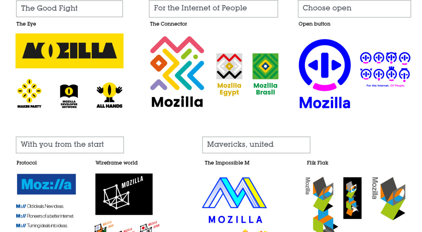
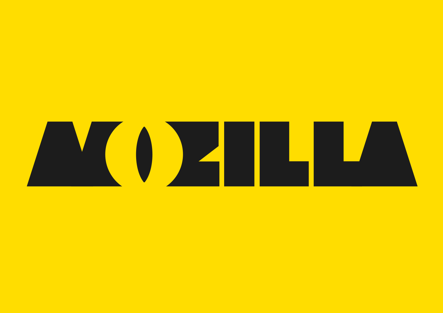
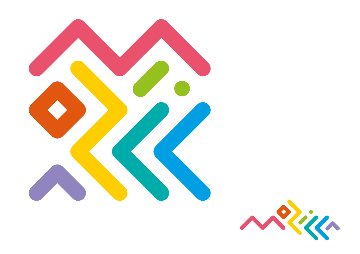
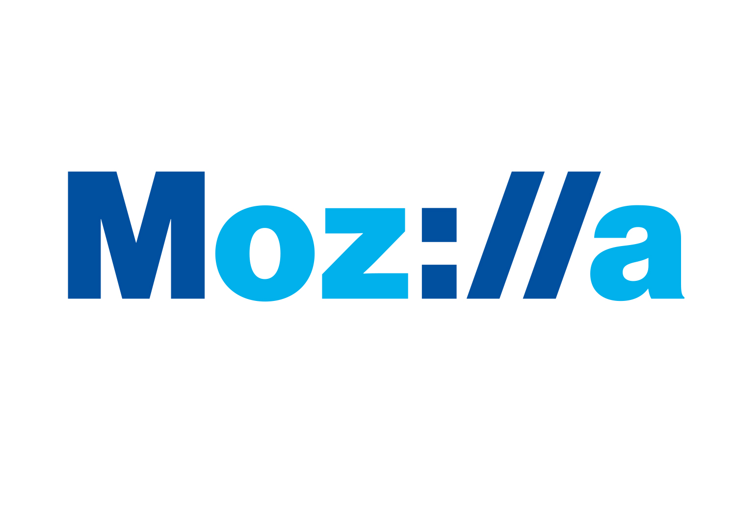
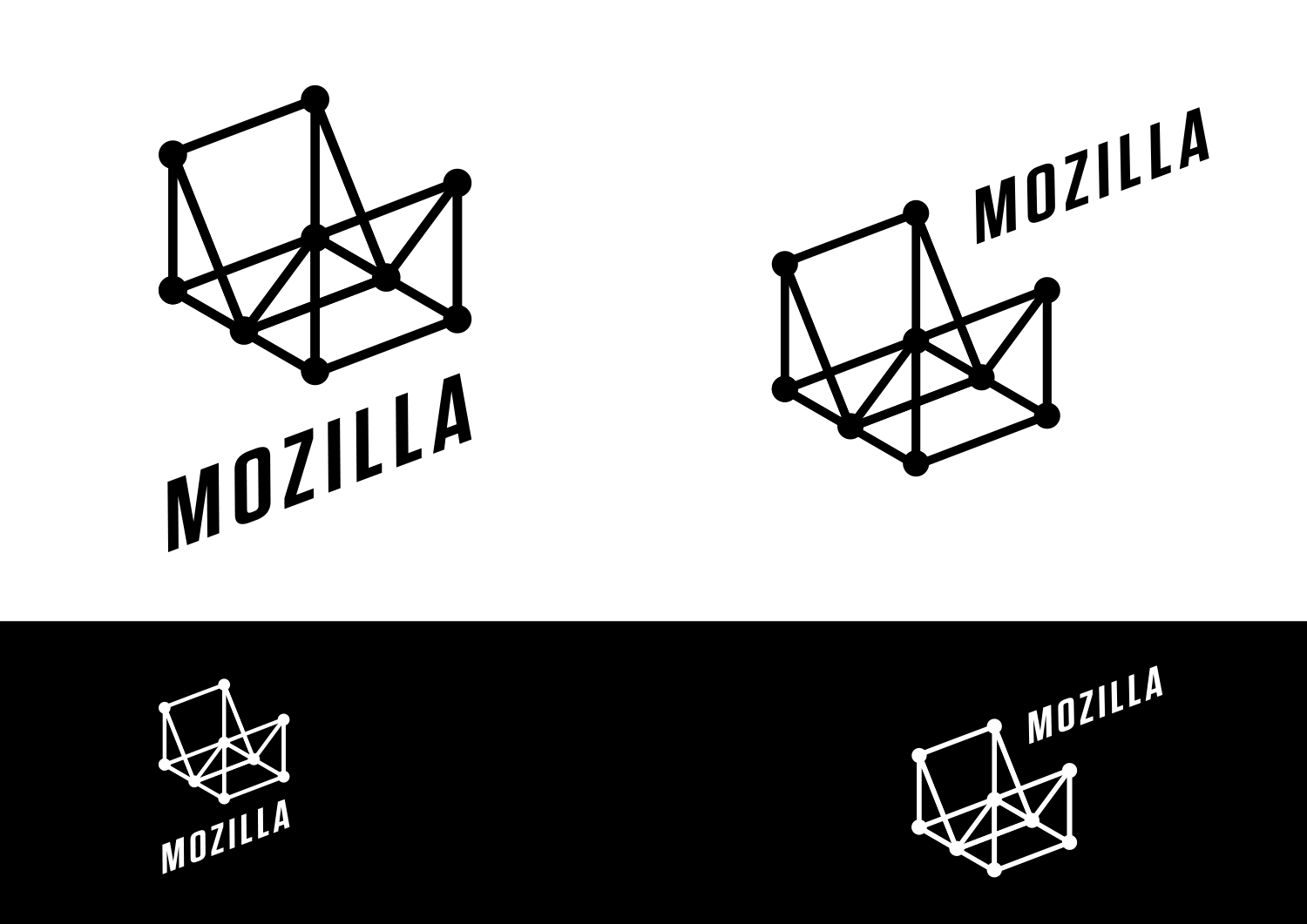
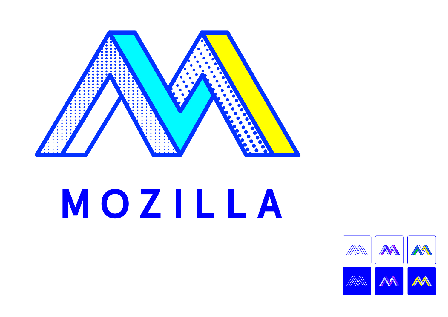
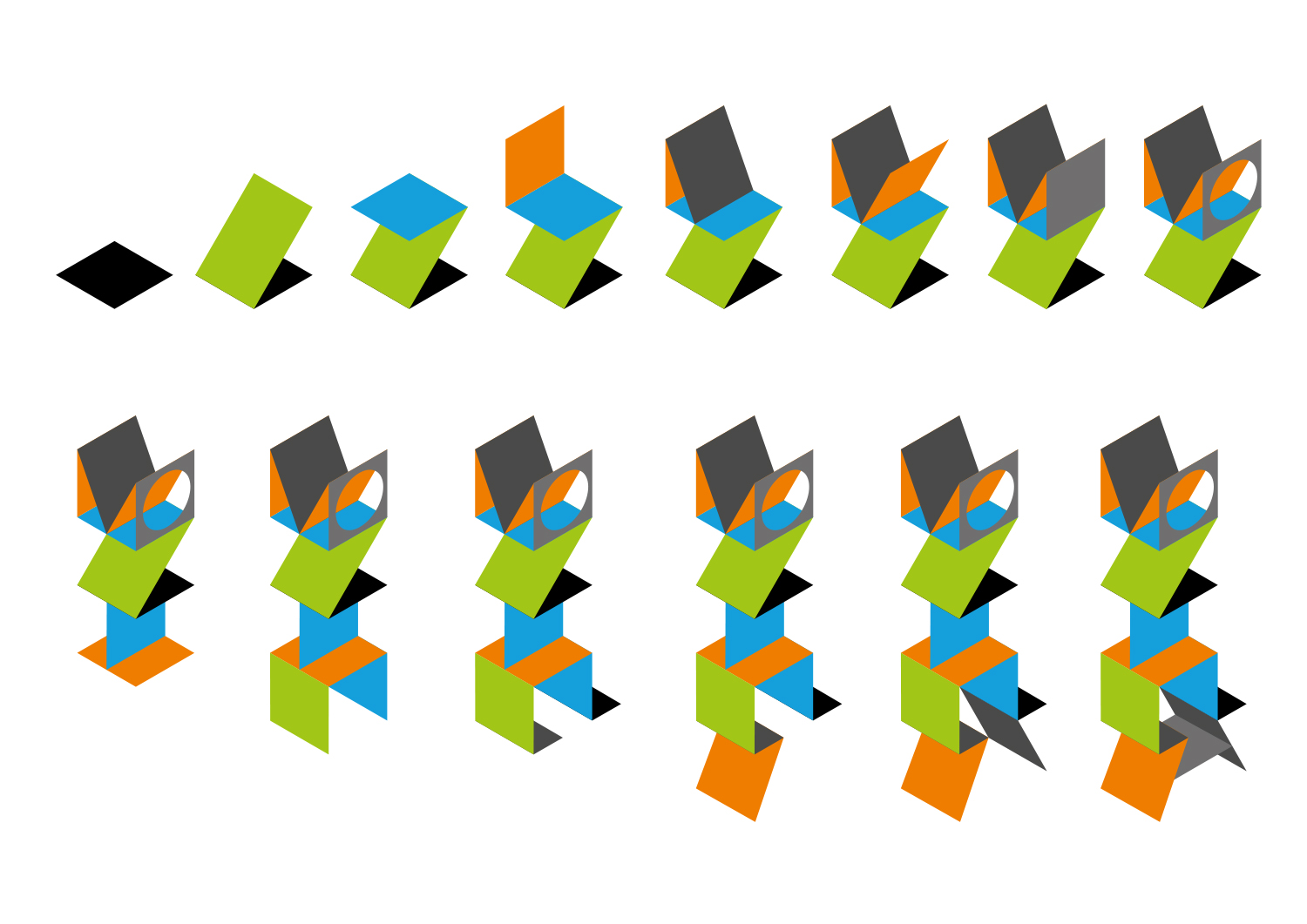
Each of the seven concepts we’re sharing today leads with and emphasizes a particular facet of the Mozilla story. From paying homage to our paleotechnic origins to rendering us as part of an ever-expanding digital ecosystem, from highlighting our global community ethos to giving us a lift from the quotidian elevator open button, the concepts express ideas about Mozilla in clever and unexpected ways.

There are no duds in the mix. The hard part will be deciding among them, and this is a good problem to have.

We have our opinions about these paths forward, our early favorites among the field. But for now we’re going to sit quietly and listen to what the voices from the concentric rings of our community—Mozillians, Mozilla fans, designers, technologists, and beyond—have to say in response about them.

Tag, you’re it.

Here’s what we’d like you to do, if you’re up for it. Have a look at the seven options and tell us what you think. To make comments about an individual direction and to see its full system, click on its image below.

Which of these initial visual expressions best captures what Mozilla means to you? Which will best help us tell our story to a youthful, values-driven audience? Which brings to life the Mozilla personality: Gutsy, Independent, Buoyant, For Good?

If you want to drill down a level, also consider which design idea:

  • Would resonate best around the world?
  • Has the potential to show off modern digital technology?
  • Is most scalable to a variety of Mozilla products, programs, and messages?
  • Would stand the test of time (well…let’s say 5-10 years)?
  • Would make people take notice and rethink Mozilla?

This is how we’ve been evaluating each concept internally over the past week or so. It’s the framework we’ll use as we share the work for qualitative and quantitative feedback from our key audiences.

How you deliver your feedback is up to you: writing comments on the blog, uploading a sketch or a mark-up, shooting a carpool karaoke video….bring it on. We’ll be taking feedback on this phase of work for roughly the next two weeks.

If you’re new to this blog, a few reminders about what we’re not doing. We are not crowdsourcing the final design, nor will there be voting. We are not asking designers to work on spec. We welcome all feedback but make no promise to act on it all (even if such a thing were possible).

From here, we’ll reduce these seven concepts to three, which we’ll refine further based partially on feedback from people like you, partially on what our design instincts tell us, and very much on what we need our brand identity to communicate to the world. These three concepts will go through a round of consumer testing and live critique in mid-September, and we’ll share the results here. We’re on track to have a final direction by the end of September.

We trust that openness will prevail over secrecy and that we’ll all learn something in the end. Thanks for tagging along.

jb_Mozilla_design_pres_edit_3.keyjb_Mozilla_design_pres_edit_3.keyjb_Mozilla_design_pres_edit_3.keyjb_Mozilla_design_pres_edit_3.keyjb_Mozilla_design_pres_edit_3.keyjb_Mozilla_design_pres_edit_3.keyjb_Mozilla_design_pres_edit_3.key

583 comments on “Now for the fun part of Mozilla’s logo design.”

  1. Rob wrote on

    I also feel the samples are all underwhelming. None of these feel iconic, or representative of an established online entity of the level of importance of Mozilla. The Moz://a one is certainly the best, but only in the sense of being the least terrible. The “O” version either looks like an eye or a uh.. well, part of the female anatomy. The rest are just too busy and confusing.

  2. Remi Guillemette wrote on

    Sorry but the only one I find cool is Moz://a. But I don’t think you should count my vote because for most people (excluding geek and webdev like me) the :// does not mean anything…
    I find the others too abstract to mean anything or (sorry) too ugly. The eye is also a really bad idea in this age of absolutely surveillance…

  3. David Tjia wrote on

    Great work guys! I love all of them in context of branding only, but by far it lacks a lot in technology aspect or maybe in reflecting Mozilla’s vision and mission.

    The Eye, the moment I looked at it, it was too imposing. It has really strong presence, but it just doesn’t fit with Mozilla. And I’m sure, a lot of people will have said it looks like LOTR Sauron eye icon, so please stay away from it.

    The Connector feels like the previous London Olympic logo. At first I just can’t read whatever you are trying to convry through it, it just looks like a person is swimming to me. But after some time looking at it, I understood it, but it could give people wrong impressions just like I did.

    Open Button feels normal to me. It could work with less ornaments and thinner lines. But right now the brand just gave me an impressions that you guys are working in medical field.

    The Protocol is the one has the best concept among all. You might want to try Mozi//a. It has better composition right now it is too disturbing when I looked at it. One thing concern me is that it lacks personality of Mozilla.

    Wireframe has nice concept. Though I doubt 3D is the best approach for you guys. Maybe you want to try 2D looks and taking wireframe of your homepage of Mozilla and use it as your icon. And change the looks of the wireframe because right now it is too ‘classy’.

    Impossible M rubs a wrong impression to me. It has retro looks with half-tone patterns. You might want try another looks by deleting all the patterns and change the M with a bit of serif looks such as Garamond or Georgia. But for the future I would say please just stay away from this if you able to.

    Flik – Flok is really bad to me personally and my eyes are hurting. It looks overly complicated and it is like your first ever concept before designing everything else and you think it could work so decided to put it among the final concept list.

    Yeah that’s my opinion. Other seasoned designers might be better in giving opinion, but if I have to say something, those above is my opinion. I would love to see more of concepta because right now it is too early too decide. You could get something better in the future but you might not. Bear in mind that the branding will becomes the looks of your company for 5 – 10 years to the future like.you said and I feel like you really should lenghtened time schedule to decide everything.

    Please forgive me for any misspeling. Great work guys!

  4. EZmonkey wrote on

    As a person in the design field, I’ve been curious to see how this was going to play out. My feeling here is that all of these pieces are unrefined conceptually and aesthetically. They seem far from being representative of a professional and largely recognized organization.

    I believe it has to do with the fact that you are making designers do something that should take time at a “rocket-fast timeline”, forcing them to just crank out the first thing that comes to mind.

    Also, it is weird to me that on the first round suddenly we are seeing digital renditions of concepts, that might even try to pass off as a finished product, with examples of logo’s on t shirts and such. I mean the logo’s even already animate. How is that a first round? How is this considered a consideration of a route when it seems all fixed? It seems completely counterproductive for the design firm to have put in so much work for animation and mock ups on so many concepts, when in the end one only gets one brand identity. Like 90% of the stuff here for show is guaranteed to be in the trash bin. That is the wrong allocation of time,. They should have not bothered with all the fancy show off stuff, and focused on the real deep conceptual place at this early stage.

    I would have thought an open design process would have started with conceptual directions and multiple sketches for each way of thinking. I don’t know who is deciding on how the process is to be open, but whether it’s open or not, the process used here to come up with a brand seems a bit whack.

    1. Tim Murray wrote on

      Thanks EZ, for sharing your perspective as a designer. It’s good to hear from you.

      When we entered into this open design process, we stated that we didn’t how it would proceed or turn out. To our knowledge, this kind of brand refresh has never been done at this scale before. We’ve learned in this phase of showing initial work that it can be challenging for people to assess. To some, it looks like final design. To others such as yourself, it looks like ideation spread thinly in too many directions.

      We need to show enough work to prove that a concept will extend across the many facets of Mozilla, but not go too far in refining the design in any one direction. There’s no rule book to follow in finding the right balance.

      You’re right in pinpointing that our timeline for this work is fast, and that the proof of concept is seven times what it would be for a single direction. We are also doing this in the open, which requires another level of communication not found in a typical brand assignment. It’s a Herculean task and one that johnson banks has taken on with good humor while producing inspiring work.

      These are initial, first-round concepts. Even though each direction is shown in an extended fashion to prove that it can work across a variety of programs, communities, and products, refinement in the designs are still to come. When the story of this open design process is written, we’re hopeful that the design community will benefit from this experiment as much as Mozilla will.

      Thanks again for joining us for this review. Please stay tuned and continue to give us your feedback.

  5. Bryan wrote on

    I like the use of colors in B The Connector, but it’s too difficult to read. If the design could be made easier to read, I would like this one for how fun and warm it feels.

    Route D seems pretty neutral and I think everyone could be able to read it.

    I’m in camp B and D.

  6. Alex Keybl wrote on

    I’ll focus on Moz://a because (as others have suggested) it’s the only concept that isn’t incredibly generic/busy/ugly. And honestly the Eye of Sauron logo is just a ridiculous idea, and doesn’t represent Mozilla’s values at all. Probably grounds for finding a new design agency.

    While Moz://a is definitely the best concept, why would you ever want a logo that harkens back to the past so heavily? It’s been years since you’ve been required to type :// into the address bar. Feels like it’s dated, confusing and inaccessible all at the same time.

    Back to the drawing board guys, sorry.

  7. Luca Barbato wrote on

    M:// seems the best by far.

    The impossible M has potential as long you do not use textured dot fill. It make the whole thing feel 70’s comic.

    The eye is just scary (and full yellow is in itself terrible for logos), by far the worst.

    The rest really doesn’t seem to leave much impression.

  8. Anthony Thompson wrote on

    Um, they’re all kind of awful. If you held a gun to my head and made me pick one, I’d have to say the “Protocol” one (Moz://a), but I think it’s too esoteric for most people, and in a world where some browsers are trying to hide the http(s):// part of a URL, it might soon be unrecognizable. But it *is* the best looking one in a bad bunch. (Sorry, telling it like I see it.)

  9. Name Here wrote on

    So, after 18 years Mozilla has decided to throw away all the equity and brand recognition they’ve built up for… what? One of these designs? Does it have to be one of these new ones? I like the current brand.

    I like the fire fox.

    Stop wasting money on things that don’t matter.

    1. Tim Murray wrote on

      Hi Name Here, This is not a redesign of the Firefox logo. Mozilla does much more than make the Firefox open-source web browser. As time allows, please have a look at this https://blog.mozilla.org/opendesign/now-were-talking/ and read more about why we are engaged in this work on earlier blog posts on this site. Thanks for letting us know your thoughts.

  10. Weather wrote on

    The open button reminds me too much of a standard digital interface on Sky TV. I love protocol because of it’s immediate code reference but it may only express your brand to particular people and not be universal enough.

    My own style would be impossible M but for you, mozilla, I like flik flak. It’s super flexible, modern and easy to see how it could be used in other engaging ways.

    The eye would be my runner up and is another fun contender with lots of application potential. The reason it’s a runner up for me is because of Moz foundation. While it’s iconic and references the Moz dino, the eye is too “all seeing eye” to be non aggressive. Flik flak while less referential is more modern and more fun.

  11. Samuel Herschbein wrote on

    If it ain’t broke, don’t fix it. The current logo is fine and everyone knows who it denotes.
    IMHO a waste of time and money. Corporate masturbation: it doesn’t add a value, but makes the people involved feel good.

    1. The Internet wrote on

      Well you know – people who can’t code or produce anything actually useful need to explain their presence in the company somehow – how about a logo redesign, or new stationary, or email footer update.

  12. Anon wrote on

    I’m not very fond of them, to be honest. For some reason many of them (C and D especially) make me think “oil company”, not a good thing. I think the fonts on A and D are too heavy and blocky, and C and F are too simple. I think the font in the current mozilla logo is good and I wouldn’t stray too far from it. If I had to pick favorites, I would choose E and G. I like E’s font better than the others, and I the wireframe idea could possibly look alright if modified, but I didn’t like any of the variations of it shown. G is the best in my opinion, I think the colors and design need some tweaking but I think it shows the most promise and that sort of style has the most potential.

  13. Dear God Please No wrote on

    Please do not use any of those, those are ugly. They have nothing to do with Mozilla and what Mozilla is. Big disconnect for me.

  14. Michael wrote on

    As far as I can tell, people primarily focus on the software that Mozilla produces, rather than on the organization itself. I don’t see a new logo changing that, and I don’t understand how a new logo is supposed to address the serious problem of declining desktop market share for Firefox, Mozilla’s main product. Not to mention low market share for Firefox on mobile. This logo design process makes me question the priorities of the Mozilla Foundation.

  15. Tom D. wrote on

    NONE OF THEM!

    1) They are a total disconnect from your current logo. If any one saw any of the new logos on there own, they would not have a CLUE what they represent.

    2) There is also a complete disconnect from the product/service you are providing. Conceptually, what do any of your new logos have to with the concept of ‘web browsing’?

    You should start over by coming up with variations of the current logos or by visualizing the concept of browsing.

    1. Tim Murray wrote on

      Thanks for sharing your thoughts, Tom. You are not alone in thinking that Mozilla is a web browser. While Mozilla makes Firefox, the open-source web browser, it does so much more. Mozilla is a nonprofit that promotes an open, free and accessible internet through technology and networks of people as well as products. From being a leading advocate for net neutrality in legislatures and courts to teaching the web in communities throughout the world, it champions a healthy internet for everyone. This post may help explain why we’re engaged in this work: https://blog.mozilla.org/opendesign/now-were-talking/ And please have a look at the earliest posts on this blog for more information. Many thanks for being a part of this conversation about Mozilla.

  16. Richard Bell wrote on

    I think Mozilla’s current branding looks just fine but if I was to pick from these options I’d probably go with Option C, the open button, I find it to be aesthetically pleasing. I do find the protocol from option D intriguing, I’d kind of like to see what Option C looks like with that incorporated but I can see how it might give a technologically inclined people only image

  17. Steve wrote on

    The Eye – This one falls into a couple traps. The yellow and black color scheme has long indicated danger, or necessary caution. This in itself kills it, but the Eye of Sauron really drives home the forbidding feeling of it. Not a good idea.

    The Connector – Looks like an Olympics logo. Attempts to be trendy at the cost of readability, yet manages to remain unremarkable.

    Open Button – A decent idea, but the current iteration comes across as the kind of thing you would see on the side of a plastics manufacturing plant.

    Protocol – The best of the bunch at this phase. Not too complicated, and neatly references what the company is about. The font is perhaps a notch too generic, but it doesn’t need much dolling up to reach a usable state.

    Wireframe World – An interesting concept, but ruined in it’s current state by an absolute lack of artistic balance. Both versions feel wonky in a very off-putting manner.

    The Impossible M – This one strongly resembles a VGA graphic from the mid 80’s. Imagery reminiscent of 30 year old technology is not what I would use to represent a modern company.

    Flik Flak – This one also attempts to be trendy, this time at an extreme cost to readability. The eye does not flow naturally through the lettering, and gets caught in the angles and margins instead. It is an excellent example of how not to use a modern art style in a company logo.

  18. Ed “The Dick” Critic wrote on

    Lizard Eye looks bold, a little tongue in cheek, it reminded me of the older (original?) Mozilla logo with the dinosaur head. But having looked at the full blog post, it just doesn’t portray the right feel for Mozilla, because it actually can look clumsy, and sometimes lazy, because all there is are a bunch of thick black lines, patterns and yellow.

    Protocol’s typographic treatment looks bland, predictable, the idea looks like it took a few minutes of doodling and not much thought went into it, especially the rendering, a commenter posted a mono spaced version here and that looks so much cooler. But this fact remains, the colon is forced to be an i, when it is in fact a colon. Let me make an example, what if I tell you this `i` is meant to be a colon? As in, My favorite colori red. Yes, it is the same thing, you may wishfully want it to be different, but a colon is not an i. Your company name is then Moz:lla. I’m using Moz:lla Firefox. And, oh you write code do you, oh so does Google, Facebook, Twitter, Apple, Microsoft, everybody writes code, and there is no such thing as the M protocol, stop making shit up.

    The Connector is a mess, it is fussy, forced, too abstract, and if someone doesn’t know it’s supposed to be “Mozilla”, they can’t read that. The way the sub groups are done looks like a bunch of random lines thrown around.

    Wireframe world looks like you are a 90s company, and you’ve never had the budget to change your logo since.

    Impossible M should have been rejected before this stage, it doesn’t do anything and it’s ugly, it’s just an M that has been dicked around too much. If you are a designer and you shop this to a client, I think they might actually be cross with you.

    The Open Button / smiley. Trying too hard to be fun, funny and losing sight of the larger picture. It’s ugly, complicated, too fussy, difficult to distinguish between them, and no one would care to.

    FlikFlak, seeing the whole picture of the branding strategy, this feels a little bit like Google (before Alphabet), but it is incomprehensible, too abstract, too fussy and complicated. But this looks the best among all of them. But you should reject this as well for your own sake.

    No amount of random netizen feedback is going to give you the solid answer you need, because while people can tell you what they like and don’t, no one can generate the full brand vision you really need to proceed. And btw, your current logo is better than all of these combined.

  19. Andrew wrote on

    I have used Firefox for over fifteen years. I am a Mozilla fan.

    NONE of these proposed designs are better than what you have now — none of them. Your current logo doesn’t need replacing. I much enjoy the current Mozilla logo, it’s very nice.

    What Mozilla should be concentrating on right now is not rebranding, but making Firefox and Thunderbird as good as they can be. And if Thunderbird is going to a good home outside of Mozilla, send it off in style.

    Loyal Thunderbird users are still waiting for a decent address book, native contact sync with Exchange servers, CardDav support, and other features. And a mobile version of Thunderbird for Android would be a nice thing to have sometime in the future.

  20. Taldren wrote on

    Moz://a is the only one that i’d consider a worthy entry. The rest are horrible, in my honest opinion.

  21. Kris Haamer wrote on

    I love the connector. Other’s are just meh.

  22. Adam wrote on

    I have already made some comments in response to others, but I would like to add further in the other options.

    Open internet, flik pik and internet if the people and the dots and lines one are all to abstract. They don’t seem to communicate anything about the brand or who Mozilla are. If picked to me they would be a wasted opportunity.

    The plain M looks to over simplistic and dated. It is not a strong character in the way it is represented.

    Previously I have commented about the Monster eye and also the Moz://a. Options they are by far my favourites, but it really depends in how Mozilla is going to expand over the next few years. If all you are going push is the browser, then the Moz://a makes the most sense. But with thunderbird as well, the eye makes a much better all encompassing brand.

    I know the eye has some links with LOTR, but but that reorientation is different, as it is in fire. I can see the option above as a proper lizard eye or in the word Mozilla, which is a clear distinction.

  23. Jack wrote on

    Take the Protocol color scheme (or blue, black, and white), put it on the Eye logo, and you have a winner.

    Connector is too messy. Button reminds me of ’90s tech company logos, particularly Motorola. Protocol is not legible enough. Wireframe has a disconnect between the logo and the name. Impossible M doesn’t stand out, it just looks like an M. Flick Flack has aspect ratio issues and it’s too complicated.

  24. Jack wrote on

    Inverse colors

    out

  25. Sergio Durán wrote on

    Interesting desition to change your logo, I suggest you going with the Moz://a one but maybe with your red lizard made in material or pure flat design, could be amazing :)

  26. Gobelpepitai wrote on

    None of these represent mozilla to me. I like the idea of a dinosaur logo though.

  27. DK wrote on

    Wireframe concept is the best so far. Wireframe kinda looks like a graph, which is schematic representation of networks.

    1. Opera
    2. I just don’t get it. Are we talking about an internet company or a rug manufacture?
    3. Too primitive. Even pathetic. Looks like this one has been thrown on the table during mind storming session and due to a lack of good concepts, they decided to present it without thinking it through.
    5. Been used a lot during the past decade or two.
    6. Can anyone read it without explanation?

    1. DK wrote on

      missed the one in a circle. Looks very oldschool. 90’s or something.
      3. → M://
      5. → impossible M
      6. → Origami?

  28. leonardo wrote on

    Please just use MDN’s logo: https://developer.cdn.mozilla.net/static/img/opengraph-logo.dc4e08e2f6af.png

  29. Bruno Vázquez-Dodero wrote on

    Sorry for my english speaking at first. I’m form Spain.

    Protocol (which i see is the most commented one) would make a perfect rebranding to be the most boring brand in the world. Even the color doesn’t say nothing but a Facebook lookalike.

    My little contribution is a question: Does the rebranding pursues to be liked into the Mozilla geek community? Or does it pursues to be more likeable to people that are not now in the community?

    The actual Mozilla community choosing means making it more specific, more geek, more for the fans, more narrow…

    I like a lot the idea of “The Connector” playing with colors and shapes in different versions for each country and other logos. But i don’t know if it would make the perfect logo. If i would have to vote now among these options, it would be “The Connector”

  30. John Huston wrote on

    The eye design reminds me of a coffee brand, the connector and flik flak are too complicated. Open button and the impossible M are old fashion. Wireframe world is ok but not so clever, so the protocol is the best of all for me but not good enough. I think you should stay with your current logo.

    1. jgreenspan wrote on

      Thanks for your input, John.

  31. AliNR wrote on

    The Open Button

  32. Reece wrote on

    I vote for Moz://a. It’s actually related to the “things” the Mozilla foundation produces. It’s sleek and professional while clearly conveying the org it is representing.

    The Eye: Looks like The Eye of Sauron has conquered Charlie Brown’s t-shirt, and it’s staring angrily at me.

    The Connector, Flik Flak, and Open Button are too abstract.

    Impossible M is retro and does not meet the criteria of being modern.

  33. C. wrote on

    Like many others I feel like Eye and Protocol are the best of the chosen 7 logos, the other ones are too abstract and don’t have much recognition value, at least for me. They look like one-off art projects or website design, not a recognizable company logos.

    However, I don’t see the point in chosing a new logo for Mozilla. The new ones (including Protocol and Eye) are less readable due to font sizing and abstract letter design (“o” & “ill”). The old font is very recognizable, doesn’t require contrasting colours or background colour to make it work. Keep it simple please.

  34. Xel wrote on

    They all feel… Either soulless or amateurish. They look like generic company logo #74020. Or in case of last ones – make no sense.

    The only one worth of mention is Moz://a – which is still not good, but at least it is clever.
    Seriously – go back do drawing board, preferably internal.

  35. Blerb wrote on

    I kinda don’t like any of them. Why not make something simple like Moz://a behind tail of firefox? http://cdn.geckoandfly.com/wp-content/uploads/2009/06/FFX_05_THE_LEAP.jpg
    That would look neat and simple and certainly warmer than any of those.

    1. Mary Ellen Muckerman wrote on

      Bierb, thanks for your input. Our research has shown that people don’t distinguish Mozilla and Firefox from each other, and we think it’s important that each brand have its own identity so we’re known for the breadth of our work. So one of our main goals is to create a set of visual assets for Mozilla that ultimately feel related to Firefox, but also distinct from it. Appreciate the reference to the Firefox imagery.

  36. leon wrote on

    I hope there is a chance for more logo candidates.

    The Eye:
    + This is the only strong logo in the pack
    + it has bold colors
    + an expressive font and
    + clear color scheme.
    + it’s a word-brand thing
    – It looks aged to me
    – it’s not very readable
    – the eye looks a bit sauron-like (maybe some cuteness might help)
    – it looks like an ad campaign to me. This is what bothers me the most, but is hard to pin down. I think the yellow as a background is too strong, the smaller variants on white are much more neutral.

    The connector:
    – logo and brand-name separated
    – no consistent color scheme
    – A logo has to do it’s work quickly, the riddle of the letters will go unnoticed where it counts, it’s more like a gravatar now.
    – reminds me of public transport seat patterns

    Open button:
    – the colors hurt my eyes. It looks cheap to me, would be nice for a phone subscription.
    – I don’t get what it’s supposed to be. Something about the power button?
    – round logos are not the easiest to incorporate in to design

    Protocol:
    + simple, and therefore with less of the mistakes of the others
    – “http://” is being omitted in modern browsers, non techy users won’t get the hint
    – it confuses regarding the spelling (do I google for “moz://a” now?)
    – the colors look very cold, I think it does not embrace “community”
    – the font not very expressive, so the logo does not stand out and is not so recognizable
    – What I think is a very bad Idea in all designs, is breaking the color scheme for variants of the logo.

    Wireframe:
    + I personally like the look
    + actually with a strong enough aesthetic to pull of the variants
    – looks like for nerds only
    – looks very aged
    – not too recognizable
    – difficult to incorporate in to designs with that warped perspective

    Impossible M:
    + actually has a unique mood to it
    – a bit cold
    – gimmicky, but if it’s just the M, not the variants that might be ok.
    – apart from the gimmick little consistency in the variants, though I would prefer a little less color to make it look less like an Ikea Keith Haring image.

    Flik Flak:
    – unreadable
    – funky colors
    – not very recognizable
    – my least favorite

    1. leon wrote on

      whops, this half sentence was supposed to go with the Wireframe:

      ” I would prefer a little less color to make it look less like an Ikea Keith Haring image.

  37. Joe P wrote on

    Now that there are so many browser options and Chrome and Edge advertise so heavily, protocol is important. It reinforces the idea that Firefox/Mozilla is a browser to the less geeky who will need to consider our alternative.

    Moz://a is obviously a browser. You might be surprised how many people don’t know Firefox is a browser when I tell them I use it and not Chrome.

  38. YUKI “Piro” Hiroshi wrote on

    I think the second route https://blog.mozilla.org/opendesign/design-route-b-the-connector/ seems better than others. The “eye” reminds me that someone monitors me. The face like icon seems less natty. Moz://a seems too geekish. The wireframe seems too complex in Z-dimension. The impossible M seems antique illustration. The last one has too complex silhouette and too many colors.

    But I chose the second route as a passively better one. I hope that more better plan appears, with more simple silhouette (which can be drawn with just one color, for color-blind people) and more positive impression…

  39. m.Amin wrote on

    i am a firefox fan and use this
    just Moz://a
    it is best and show your work then use this logo

  40. Rob L. wrote on

    First and foremost: Marketing design-by-committee rarely, if ever, works. This has been proven time and time again. Also, it seems like these new logos are all *too* drastically different from what you use currently. “What feels right” to me here is to have it be more of a gradual change – but still a distinctive move forward. Don’t go for show-stopper – you’ll just confuse people, especially people who know little or nothing about what Mozilla is/does.

    Second, and this is much more subjective, but most of those design concepts are flat out unacceptable in my mind. Some are borderline “WTF?” — what’s with the MC Esher meets Timothy Leary one? Wow. The only one that’s even remotely close to decent is the ‘ Moz://a ‘ one, but in that one the colors are … *shivers*

    1. Mary Ellen Muckerman wrote on

      Rob L., thanks for weighing in. We agree that marketing design-by-committee is not the right way to go, and rarely produces the best end product. But we do believe that being transparent and participatory is. All of these comments are helping inform the next step as we start to narrow in on and refine fewer options. So we appreciate your contribution!

  41. Denis Savenko wrote on

    Don’t like any. It’s not mozilla. But if we should choose from this – m:// is better. But i don’t like color, like Facebook on t-shirt. But concept is the best.

  42. FF MozUzer wrote on

    Hi,
    In order of my preference :
    1/ Protocol – I love “://” !
    2/ The Eye
    3/ The Open Button

    I have mixed “The Eye” with MozLizard (cf : PNG attached), but I’m not very good with The Gimp (or Inkscape) to add “://” instead of “ILL”. If someone can do this and clean my mixed draft, new logo will be perfect for me ! :)

    (Sorry for my bad english, i’m french)
    NB : XCF is here for 60 days >>> https://frama.link/DraftMozLogo
    or directly here
    >>> https://framadrop.org/r/I2HYIseJMg#N0Ge2kxp83GYZ34AgVXIJaSsUFaCAiXoCMr59sPjkR8=

  43. FF MozUzer wrote on

    Re,
    About “The Eye”, Mozilla IS dangerous, but not for his community !
    Is dangerous for closed source project, not innovative enterprise, malicious standard, etc. because the lizard protect his users/community. ;)

  44. AK wrote on

    All of these are trying very hard but end up falling short. Your current design is *much* better, stick with it. Not every change is for the better.
    Otherwise, keep up the good work.

  45. J L wrote on

    A logo should instantly say who you are.
    Those ideas do not recall to me what you were, nor suggest where you are going.
    Sorry to say.

  46. Barry Johnson wrote on

    Thoughts on the designs, in order of preference (although a basic rank ordering does not convey the enormous gaps in preference).
    Protocol design – Easily the best of the group for a brand identity, I would largely echo the positive comments already written. One note: the “M://” execution looks good, but would worry people unfamiliar with brand will read as “Mill”
    Wireframe – Could grow on me.
    Flik-Flak – The very basic “MOZ” part works pretty well. The unfolded “Mozilla” does not, IMHO – would be fun on an annual report maybe, but feels very busy for a mark.
    The Eye – its flaws are well-described in numerous other comments. Having said that, I actually like the ideas & look in many ways, just not for this application. It is kind of cute – reminds me of Monsters, Inc. – I could see the germ of this idea, with some different execution, being a strong candidate.
    Open Button is not bad, but feels like the submissions one gets on (e.g.) 99 Designs, when designers will just throw some stock work against the wall. While the circular mark is interesting enough and can be adapted in different ways, it could be stuck on to almost any other brand just as easily – nothing unique about it.
    Connector – Cute, colors fine. Reminds me of the poorly-received London 2012 Olympics logo. Also the clever alternate configs are probably not terribly practical/useful as you’ll end up with more chance of conflicts with existing marks the more permutations you play with).
    Impossible M – I know there is no accounting for taste, so I’ll just say I find it remarkably unpleasant. I understand some people thinking it would look great on a t-shirt, I could see that. Most other applications? I am less sure. The alternate executions are largely quite weak as well.

  47. Guillaume Carrier wrote on

    Yes, definately, Moz://a is the best logo!

    You can even type it on your keyboard with normal characters, that’s cool!

    [http] :// has been with the web since day one, and it’s going to be with us for a foreseeable future.

  48. Hans Andersen wrote on

    The eye of sauron is no good. The elevator door button is no good. The Bauhaus letter sandwich is no good. The rainbow letter carpet is no good. The etch-a-scratch is no good. The Midwest 80’s construction co. M is no good. Actually they are all no good except the moz://a which is pretty smart.

  49. Steve Dupuis wrote on

    I like the Moz://a protocol graphic. For me, its why I use XFCE for my desktop software – clean with no clutter – an attempt to reduce unnecessary distraction.
    The products produced by Mozilla could have their logos placed underneath the main graphic – Firefox, Thunderbird et al for each.

  50. Jonathan Pritchard wrote on

    Hi Mozilla. The only one I think out of the bunch is possible is the Protocol one. However I do like the Lizard connection to the Mozilla dinosaur, but agree with others comments about the yellow/black and reptile eye being reminiscent of something not altruistic but negative.

    I really would like to see simpler designs and concepts. I think many of the others do not stand out and are in fact too nerdy. Not accessible.

More comments: 1 2 3 4 5 6 9