Categories: General

Now for the fun part of Mozilla’s logo design.

On our open logo design journey together, we’ve arrived at an inflection point. Today our effort—equal parts open crit, performance art piece, and sociology experiment—takes its logical next step, moving from words to visuals. A roomful of reviewers lean forward in their chairs, ready to weigh in on what we’ve done so far. Or so we hope.

We’re ready. The work with our agency partner, johnson banks, has great breadth and substantial depth for first-round concepts (possibly owing to our rocket-fast timeline). Our initial response to the work has, we hope, helped make it stronger and more nuanced. We’ve jumped off this cliff together, holding hands and bracing for the splash.

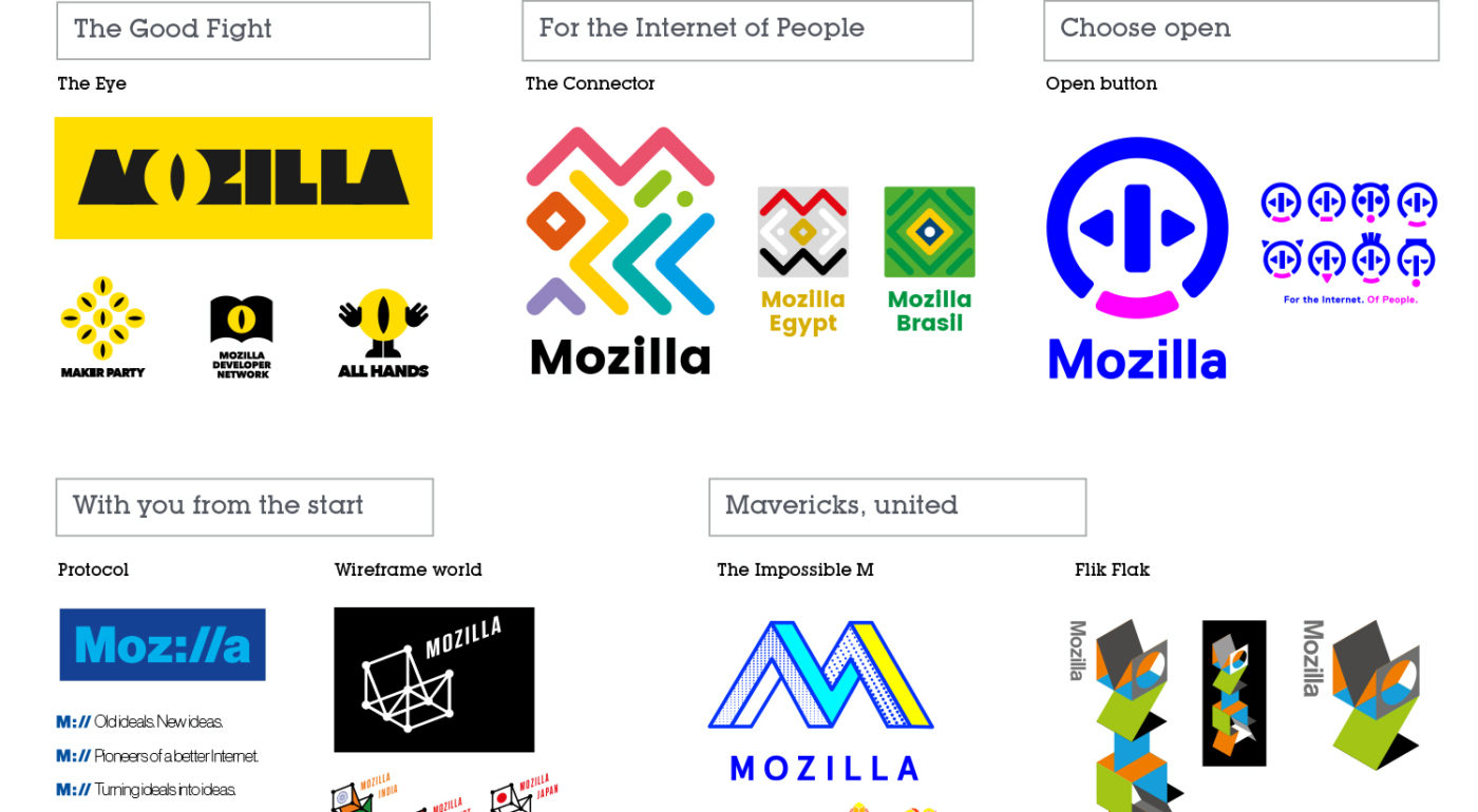
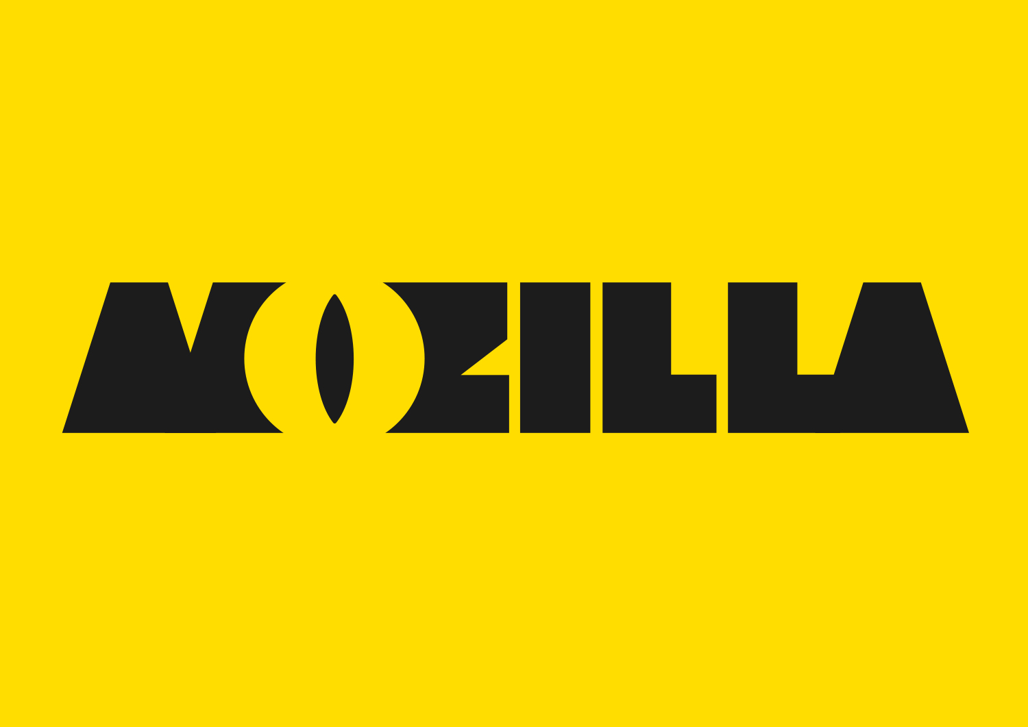
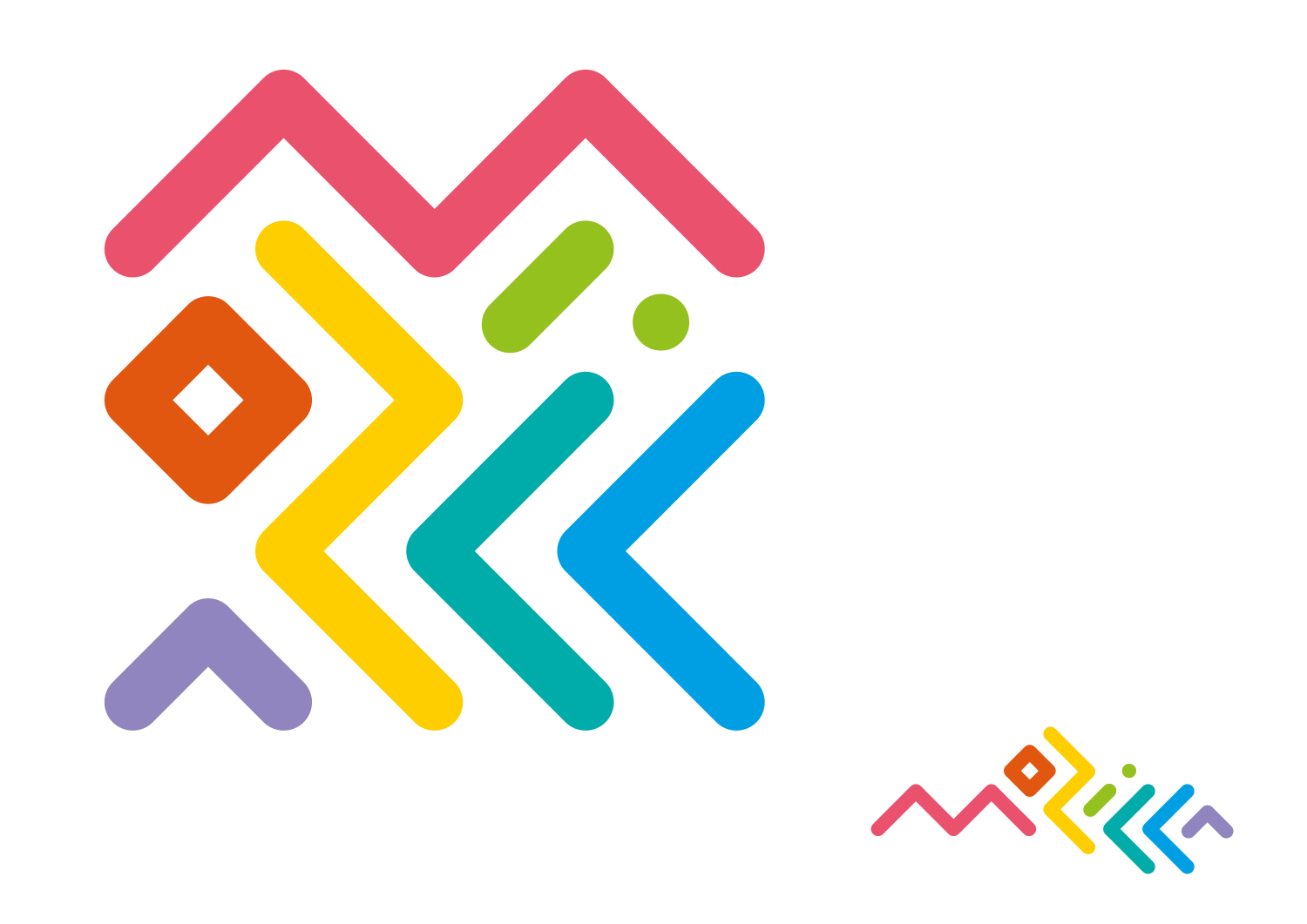
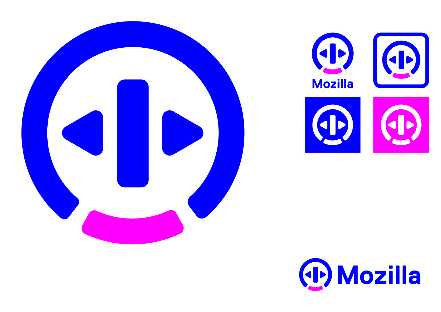
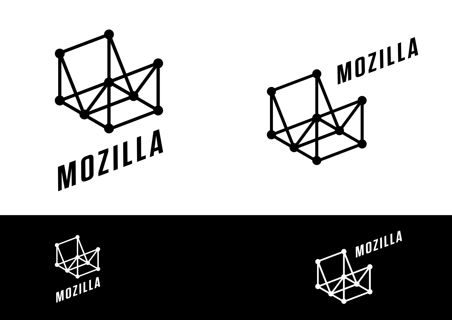
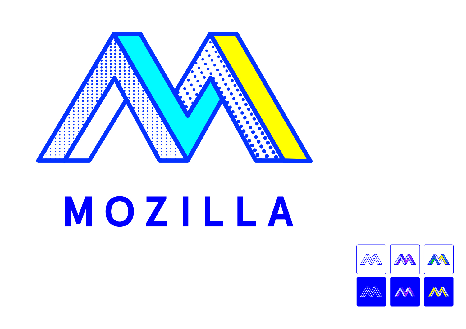
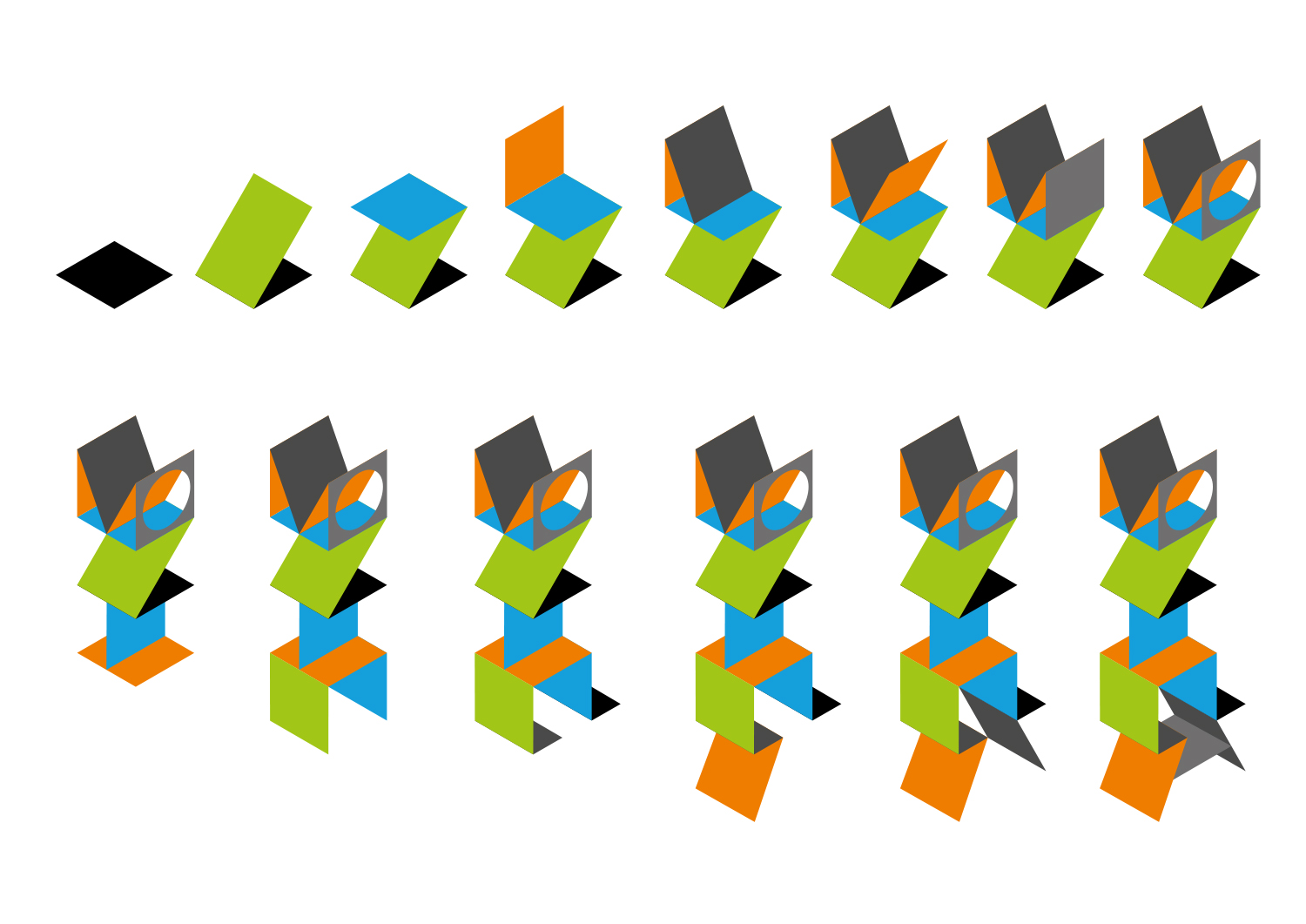
Each of the seven concepts we’re sharing today leads with and emphasizes a particular facet of the Mozilla story. From paying homage to our paleotechnic origins to rendering us as part of an ever-expanding digital ecosystem, from highlighting our global community ethos to giving us a lift from the quotidian elevator open button, the concepts express ideas about Mozilla in clever and unexpected ways.

There are no duds in the mix. The hard part will be deciding among them, and this is a good problem to have.

We have our opinions about these paths forward, our early favorites among the field. But for now we’re going to sit quietly and listen to what the voices from the concentric rings of our community—Mozillians, Mozilla fans, designers, technologists, and beyond—have to say in response about them.

Tag, you’re it.

Here’s what we’d like you to do, if you’re up for it. Have a look at the seven options and tell us what you think. To make comments about an individual direction and to see its full system, click on its image below.

Which of these initial visual expressions best captures what Mozilla means to you? Which will best help us tell our story to a youthful, values-driven audience? Which brings to life the Mozilla personality: Gutsy, Independent, Buoyant, For Good?

If you want to drill down a level, also consider which design idea:

  • Would resonate best around the world?
  • Has the potential to show off modern digital technology?
  • Is most scalable to a variety of Mozilla products, programs, and messages?
  • Would stand the test of time (well…let’s say 5-10 years)?
  • Would make people take notice and rethink Mozilla?

This is how we’ve been evaluating each concept internally over the past week or so. It’s the framework we’ll use as we share the work for qualitative and quantitative feedback from our key audiences.

How you deliver your feedback is up to you: writing comments on the blog, uploading a sketch or a mark-up, shooting a carpool karaoke video….bring it on. We’ll be taking feedback on this phase of work for roughly the next two weeks.

If you’re new to this blog, a few reminders about what we’re not doing. We are not crowdsourcing the final design, nor will there be voting. We are not asking designers to work on spec. We welcome all feedback but make no promise to act on it all (even if such a thing were possible).

From here, we’ll reduce these seven concepts to three, which we’ll refine further based partially on feedback from people like you, partially on what our design instincts tell us, and very much on what we need our brand identity to communicate to the world. These three concepts will go through a round of consumer testing and live critique in mid-September, and we’ll share the results here. We’re on track to have a final direction by the end of September.

We trust that openness will prevail over secrecy and that we’ll all learn something in the end. Thanks for tagging along.

jb_Mozilla_design_pres_edit_3.keyjb_Mozilla_design_pres_edit_3.keyjb_Mozilla_design_pres_edit_3.keyjb_Mozilla_design_pres_edit_3.keyjb_Mozilla_design_pres_edit_3.keyjb_Mozilla_design_pres_edit_3.keyjb_Mozilla_design_pres_edit_3.key

583 comments on “Now for the fun part of Mozilla’s logo design.”

  1. Fabio wrote on

    Oh my… they look pretty terrible in my opinion. Protocol and Flik-Flak are the less terrible. Flik-Flak is colorful and happy, but it’s quite confusing, Protocol is a brilliant idea, even though someone could not understand what it means. If I must take one, I’d vote for Protocol.
    Stay away from The Eye, it’s intimidating.

  2. nate wrote on

    Protocol if it must change. Keep it simple

  3. hamidpanahi wrote on

    Hi
    Continued designed logos.

    5

    6

    7

    8

    9

  4. hamidpanahi wrote on

    Hi
    I call from IRAN.

    18

    19

    22

    21

    22-1

  5. Firefox Anonymous wrote on

    I have mixed feelings about those new mozilla’s identities: “Mozilla is… something weird”?

    What do you thing about something simple? An open door to the world wide web? Not sure, I’m not a designer… Or something like a web forming letter “M” on top of earth globe? Mozilla is still about transparent community-based open web, that has not changed, right?

  6. bhamtown wrote on

    Out of all the logos presented above, Moz://a is the best.

  7. ijoe wrote on

    I’ll probably only be parroting what other have said above (don’t have time to read every single comment) but, random input from a random internet user:
    1. The eye logo probably stays the most true to the old dino head icon, may be a little too aggressive looking. If was being used in FF it would make a nice SSL cert warning splash page.
    2. Doesn’t scale down to a 16×16 tab icon at all, too abstract, color overload etc.
    3. Simple, but doesn’t obviously reflect the company from what I can see (is there an ‘M’ in there, or something else?). Maybe looks a little to much like a power on/off button icon.
    4. Probably the least polarizing of all of them, good simple neutral look. It’s kinda boring but not likely to result in excessive complaining. The minor geek reference is good.
    5. Unique, but again, probably doesn’t scale down very well. If this is used, the wire frame portions facing away from the viewer should be a lighter shade to make it less flat and jumbled.
    6. Another ‘generic’ option that isn’t going to cause major problems but also isn’t that interesting. I’d go with the :// icon before this one.
    7. Would look really cool unfolding itself in a gif animation but otherwise fails every practicality and versatility test a logo would normally be subjected to.

    I’d probably just go with the Moz://a option, or otherwise rework the zilla eye into some other forms and pick the one that looks the least like a surveillance company/Eye of Sauron.

    1. jgreenspan wrote on

      Thanks, ijoe, for taking the time to review–looking forwawrd to hearing your thoughts on the next round of designs in September. Wanted to clarify that this project is focused on Mozilla’s brand identity. To your point, we’ve been working through how the identity will play with our products and projects.

  8. Matrix Akira wrote on

    Moz://a is the best but none of them are really good for a logo change.

    i dont think they are good for mozilla.

    i would start over.

  9. Jarrod wrote on

    Before you move ahead, I suggest you reevaluate what it is you want to say as a company. The various rationales for each logo presented thus far, show Mozilla lacks a unified vision or understanding of the message that needs to be conveyed. This is reinforced by the number of people commenting on how each logo doesn’t “feel” like Mozilla. That core message, that core brand hasn’t been defined yet.

    To get on the right track, first examine the Vision for Mozilla and what it you do. You don’t have to do it here, but i would gather a team of people and answer the following questions:
    ○ What do you want people to think and feel about Mozilla?
    ○ How do you want people to interact with your company and products?
    ○ What is Mozilla’s goal?
    ○ What does Mozilla really do?
    ○ What is Mozilla to the consumer?
    ○ What is Mozilla compared to the competition?
    ○ How should Mozilla make people feel?
    ○ What aspects of Mozilla matter to your Ideal Customer?
    ○ Who is the Ideal Customer/User for Mozilla?
    ○ What aspects of Mozilla do you want to push/emphasis?
    ○ What is the message?

    Take what you get from answering those questions and then narrow down that information over and over until you are left with a few words that encapsulate Mozilla. Do NOT try to be funny, clever, witty, smart, arrogant, demure, or lie when answering the above questions and refining them into a few words. Be honest and frank.

    The one to three words you come up with to describe Mozilla should be at the center of the brand. The brand then needs to be at the center of every decision Mozilla makes. If it doesn’t fit the brand it doesn’t fit Mozilla.

    From the brand, every logo/identity you then create should be a reflection of that core. The various takes on the core idea may be wildly different in the creative phase, but they should all be speaking to the same brand.

    Hope that helps.

    1. Michael Sheldon Reed wrote on

      I am a graphic designer and old-time Firefox user. This comment is the best I have seen on this forum.

      Mozilla guys, if the branding firm you hired didn’t suggest all of this to you BEFORE submitting ideas, fire them now.

      Know who you are before you try to explain it to your target audience, and by extension, the public, because that’s what brand identity is supposed to do.

  10. Ismo Hääväräinen wrote on

    1. HAIL SAURON!
    2. WTF is that supposed to be? Some tribal tattoo on funny mushrooms?
    3. Would be okay if Mozilla was a media player, but it isn’t.
    4. Easily the best of the bunch.
    5. Would be okay if Mozilla was a vector graphics editor or CAD, but again it’s not.
    6. Well… at least it’ll work on Windows95 with no video driver and 16 colors.
    7. Wut?!

  11. Cochonou wrote on

    The eye is probably my favorite. It shows a lot of potential, is a very striking and memorable image, keeps the Mozilla dinosaur heritage, and leads to many interesting variations. However, it still needs to be worked on: the coloring and font are probably too agressive. It would probably be easy to suppress the “sauron eye” effect if you avoid giving a yellow/orange color to the eye.

  12. Yanov Cutajar wrote on

    Definitely the Moz://a one. The rest seem to be trying way too hard.

  13. Greg wrote on

    Sorry, but none of them…
    Moz://a is fun, but not good enough to represent Mozilla.

    Please don’t do it wrong !

  14. William wrote on

    It’s really bad design. Guys, don’t do it. Don’t kill us.

  15. Shanike De Silva wrote on

    I wouldn’t say i “dislike” any of the designs. But i don’t like them either. There’s no oomph in any of these logos.

  16. Alexis Paul Bertolini wrote on

    Moz://a is the only logo than can be seamlessly transferred to text (ASCII) and by far the only one that has a connection with what mozilla actually is.

  17. Benjamin Christine wrote on

    Not sure if any of the above say that mozilla is an established business. Almost feel a little startupy and trendy, no feeling of longevity.

  18. Dan wrote on

    “The Eye”: might be the better one for me, although I can understand the confusion with the eye of Sauron and surveillance. However, people that know a bit about Mozilla and its fight for privacy can easily dismiss this idea. I think user “Jack” on this page had a neat idea to change the colors. It actually removes the “warning/danger/caution” connotation, and is more relaxing to look at.

    “The Connector”: kind of cool, but difficult to read. Good for people who like to think outside the box, but could be hard to identify for the average Joe. Although, I particularly like variations created by user Anthony Camp on this page (particularly the left ones with the neurons). Maybe that the key for this one is to not let the logo speak for itself, but to leave the name of Mozilla next to it.

    “Open button”: looks awfully similar to WampServer’s logo and colors. Hardly evokes anything close to Mozilla for me.

    “Protocol”: the play with :// is fun, and I think everyone can relate with it (understand the reference to http://), but overall this one looks very close to Facebook’s logo. Maybe change the typo and/or the colors? The blue on blue looks quite outdated for me.

    “Wireframe world”: don’t know how to say it, but it doesn’t work for me. I don’t like looking at it. Maybe because of the black and white? The difficulty to see the “M”? The too simple structure? Anyway, it doesn’t evoke something good or pleasant, for me.

    “The Impossible M”: overall, I think all of these logos look quite old and do not inspire “coolness” (something you could expect from a change of logo, and also something Mozilla needs). But this one takes the cake! Was it designed on Windows 3.1? I can imagine that it was deliberately designed to look old, but why? Also, I think it resembles one of the previous logos of another brand (can’t put my finger on it though).

    “Flik Flak”: very hard to read for me (more than The Connector). Also, it would be more suitable for a parcel distribution company, IKEA or a company specialized in making and selling origami.

    To me, most of these logos look a bit outdated, to the exception of The Eye, The Connector and Protocol. Was that something Mozilla wanted? If yes, then go for it! I can’t understand why, but I’m no marketing/advertisement expert. If Mozilla wanted something new, I would advise refining the Eye, the Connector and Protocol designs, in terms of fonts and colors (and maybe some other tweaks).

    Anyway, I think this exercise is a really good idea from Mozilla, a good thing for the brand and for the community! I know that you only submitted these designs for comments, but you should also pay close attention to the designs made by other commentators, some of them are really cool.

  19. Leandro wrote on

    I think that The Eye logo with those same colors and fitted into a full dinosaur face would be epic. Maybe even too epic to be mozilla’s logo though: I can’t help actually hearing some hunting music playing inside my head imagining that!

  20. Radin wrote on

    The Moz://a one is the best!

  21. Mathieu D. wrote on

    Hello all,

    Maybe all these logos represent a big effort to think about mozilla and its goals,

    But, sincerely, I’m not sure there is a good one,

    And if I have to choose only one, I agree with some of us, saying the coolest could be moz://a.
    Not because of its meaning (protocol ? protocol of web… ?), but because it’s the better logo in his shape : not ugly color, and a readable logo (for techies only ?).

    It’s hard to represent what mozilla is, because mozilla represent a way of thinking the web, as an open web, a respect of individual privacy / security, an open source movement, …

    The question for me is : does mozilla need to change its branding ?

    Because the actual one seems better than all these actuals proposals ?

    I don’t have the answer… but, personnaly, I think I would’nt change ‘mozilla’ logo, just maybe add a symbol representing the main idea of mozilla ?
    Promote an open web, secure, for everyone.

    And I think, yes, it could be a good idea, to distinct Mozilla & Firefox logo :
    Firefox is clearly identifiable by his red panda.
    Mozilla was identifiable by his dinosaur… but, it’s meaning something ‘old’, and… extinct… so maybe change this to another symbol, clearly identifiable, just to be able to say : that’s Mozilla, the one who promote the open web ! & that’s Firefox, the browser that let you in control of your web surfing !

    Hope it will help…

  22. Jamal wrote on

    +90 for Moz://a

    Simple and minimalist :)

  23. sebastien wrote on

    None of the above. I have a lot of trouble finding any one attractive. The stories behind are nice, but I feel a bit cheated when I see the result.
    A is too scary

    B, E and G are too complex and hard to read
    C I can’t really find words for

    D is the least bad, but maybe too geeky
    F is not a serious proposition

  24. Smidge wrote on

    Disclaimer: I originally wanted to include a lot of swearing, but then I stopped looking at The Connector & Flik Flak and tried to offer something a bit more constructive instead.

    Having had a look through the options my overall impression is that most of these designs are pretty abstract and a bit complicated – they make for awesome posters and t shirts and ad campaigns but they’re not necessarily iconic.

    If you’re talking replacing the Mozilla wordmark and ingraining the new branding that deeply into your DNA I think that the Protocol design is the cleanest, simplest, most iconic in its current form, while making a fun statement about your culture. Perhaps it resonates more with tech-geeks than with all people though.

    2nd place in my estimation goes to the Open Button design, which I could see perhaps used as a wordmark with the open button element in place of the ‘o’ in Mozilla for instance. It does feel a bit sterile however, like an insurance company logo – it’s a bit corporate.

    I agree wholeheartedly with comments I’ve seen that The Eye as a design can have a negative connotation. Perhaps this could be softened somehow without losing the lizard eye effect – for instance I had a more positive response to the eye element used in the context of a monster face in the ‘keep the web wonderful’ t-shirt. Perhaps if this design incorporated more elements of a godzilla/monster face it would better represent the -zilla rather than a panopticon environment / all-seeing eye. The shape of the wordmark in this design is already shaped somewhat like the snout of a beast and perhaps this could be emphasized, teeth or nostrils added et cetera. The more I think about this design, the more I feel that it has the best potential for improvement and the boldest/most iconic colour scheme.

    I actively dislike the remaining designs. I feel strongly that they’re overly abstracted, cluttered, and complicated. Wireframe World looks like a fantastic landing page for a website, Flik Flak looks awesome on a t-shirt, The Connector would be an on-fleek print on a pair of leggings, and the Impossible M looks music-festival-poster trendy. I’d hate to see any of them with the level of frequency that I see the Mozilla wordmark (this is the most friendly way I could think to word my reaction to these ones).

    Thanks for the chance to throw feedback at this, and good luck.

  25. Gervase Markham wrote on

    One very important consideration, which I hope the brand team are taking into account, is that the logo chosen doesn’t just represent Mozilla to the world, it’s also a brand for the community, in the way the Firefox logo isn’t. Which means that if a lot of Mozillians think “boy, that’s ugly” or “our logo is embarrassing”, it may have a significant negative effect on people’s willingness to identify as Mozillians. (And it means people will try their utmost to use alternative or older branding, thereby defeating the point. See what happened when they tried to ‘deprecate’ the dinosaur.) So my key hope for the new logo is not that it scores half a percentage point higher on some consumer acceptability metric, but that our community _like_ it and feel “yes, I’m happy having that represent me and what I do”. So my comments come from that perspective.

    * Route A: I like the eye, but I wonder if yellow and black is the right colour combo.
    * Route B: far too clever for its own good.
    * Route C: I don’t see how this is particularly a Mozilla logo, as opposed to any other company.
    * Route D: I like this one the best. It’s clever, but still obvious what the word says. It’s got the right mix of geeky and approachable.
    * Route E: I really didn’t see this as an M until the blurb explained it. Again, not seeing how this logo is particularly Mozilla rather than any other company.
    * Route F: The idea of using various impossible/Escher designs as different logos is really interesting, but you’ve made it hard for it to be appealing by choosing some truly horrible colours :-| So it’s difficult to judge.
    * Route G: well maybe, but I’m not convinced.

    Not sure if the colours are up for discussion – I hope so – but I’d prefer a red/black(/yellow/orange) logo like our previous one. Gives some visual continuity with the dino.

  26. Simon wrote on

    I like the m:// approach. It’s techy, it’s nerdy and makes you look twice. At least at the start, then you get it an it’s invisible again. That’s good.

    I’d keep the current Mozilla font though. The Mozilla wordmark is already a brand in itself. Would be a shame to lose that.

    mozilla-2

  27. Ferenc Szabo wrote on

    Last attempt as a simple logo

    mozlogo

  28. hamidpanahi wrote on

    Hi
    replace logo

    999999999

  29. Bill wrote on

    “With you from the start” is the obvious choice. The others are stretching.

    The colors enhance the Mozilla story, which is what colors should do; however, in keeping with the “nature” of the internet/web they could/should change with the season.

    jb_Mozilla_design_pres_edit_3.key

    1. Bill wrote on

      I also like how it can be shorthanded to M://

  30. DT wrote on

    What about this concept?

    Mozilla

    1. Christoph Walz wrote on

      Rather close to: http://www.prosiebensat1.de/bundles/front/img/brand.svg

  31. X-Raym wrote on

    These are nice illustrations, with interesting symbolic representation, but not really nice logos for branding. Too much details maybe…

    The moz://a is modern and cool, but what myspace proves with their my_, is that it is not that a good idea to replace letters by symbols in a main logo. That’s why their rollback.

    I would have love seen something more related to the Dinosaur and mostly to the mythological aspect of The Book of Mozilla.
    https://www.mozilla.org/en-US/book/
    https://en.wikipedia.org/wiki/The_Book_of_Mozilla

    These apocalyptic prophecies leaves place to a powerful imagery full of beast, fire, etc, that could be perfect for branding.

  32. ayla wrote on

    This people were creating logo for the London’s Olympics? The “clarity” is the same :/

  33. User Firefox wrote on

    Moz://a is the best.

  34. Muhammad Abdullah wrote on

    I am loving this one :-D

    mozillanewlogo

  35. JohnB wrote on

    All of the logo’s are ugly.

    As for the company motto, perhaps: “Mozilla – now with corporate wankspeak.”

    Just keep it simple guys, something an art student could whip together in 5 minutes and which actually looks cool.

    Don’t rebrand Mozilla in a way that makes the company look like a bunch of robotic humanoids – spouting pre-scripted corporate slogans – that just gives the image of yet another disingenuous company, smiling to your face while lying to you and picking your pocket.

    Don’t go full-on-corporate with the rebranding.

    1. disappointment wrote on

      “something an art student could whip together in 5 minutes and which actually looks cool.”

      There is no good graphics of any kind, neither minimalist logos nor complex illustrations, that an art student could “whip together in 5 minutes” with any kind of refinement.

      It think this developer & engineer mindset that art and design is something you can “whip together in 5 minutes” is one of the reasons why this Mozilla’s identity design open source project is kind of doomed. No design project (or an art project with a client) can succeed, if the client doesn’t appreciate the work and the process that is done.

      Most developers and especially engineers who don’t code, if they were put doing a visual design project and demanded good results from them, would be totally mindblown about the amount of work and iteration and thinking that it takes to do for example an identity to a company. It’s strange that nobody says “yeah you could whip together the process flowchart in 5 minutes” for engineers, but as a designer it’s not a rare case to hear that kind of bs.

  36. Karel Súkup wrote on

    It is true, The Connector is really good! But I think, Moz://a is the best one.

  37. Kaz wrote on

    I agree with some of other commenters.
    The Eye is cool and keeps theme from old dinosaur head logo, but I an eye could be associated with invigilation, all seeing eye and stuff.
    The Protocol is IMO the best one but as mentioned earlier it could be to geeky for most people and unreadable.
    I’ll vote for Open Button (maybe with some changed colors? – I’ll change pink to orange and the blue to some brighter shade ). It’s simple, yet customizable and catchy and most readable from other projects.

  38. Ben Francis wrote on

    My first impression is that I don’t prefer any of the concepts here to our existing wordmark, but I understand we need a stronger visual identity.

    The two I like the most are probably The Connector and Protocol, but here’s some feedback on each:

    The Eye

    Black and yellow looks like hazard tape, the lizard eye is creepy and reminiscent of the Eye of Sauron. The male T-shirt design shows how it could be softened to be a bit more friendly and fun looking, but as others have said it just looks like Monsters Inc. How would this be scaled down to a favicon? The eyeball on its own is just creepy.

    The Connector

    I like the tribal/circuitry direction of this. It’s very versatile and feels fresh. Again, I don’t think this would scale down well to favicon size, the typeface of the accompanying text is boring and the visual design stretched out into individual letters on the baseball cap design isn’t very readable. I think the logo would actually work better in conjunction with the Meta Bold typeface of our existing wordmark, or the similar Fira Sans (bold) typeface we had made. I’d say overall this is my favourite design direction of the ones presented here.

    Open Button

    First, I don’t like the colours. They’re too close to Flickr’s colours. Second, it took me a while to get that this was referencing lift (elevator) doors. My first impressions were of some kind of media controls, which would fit more with an audio/video related business. The animations are cute but don’t really make me think of the Internet. I much prefer the all-white logo on the t-shirt design, that actually looks pretty cool, but I’m not sure people will get it.

    Protocol

    This really appeals to my nerdy side and I think it’s quite clever. I think the wordmark works better in one colour for simplicty. I wonder how this will scale down to favicon size, that seems challenging. There’s not much graphical design going on here. My concern is that it might be too nerdy, and that for a lot of people it will just difficult to read.

    Wireframe World

    The animation is pretty cool but doesn’t seem very related to the actual logo design. I really dislike the wordmark with this. I think this design direction is a bit clunky and for me more associated with physics (molecules) than the Internet.

    The Impossible M

    I don’t like the graphics, the typography, or the colours. It’s very 80s/retro, but not in a good way.

    Flik Flak

    I quite like the concept and the visuals of this, it makes me think of building in VR. I’m just not sure it works well as a logo. It takes up too much space and is a bit messy.

    Overall I’d say The Connector is my favourite as a design direction, but I don’t think we’re there yet.

    When we get branding right I think we do it really well. I loved the unleashed Fox designs for Firefox OS and I think our Firefox branding is very strong. At the moment I don’t feel like any of these concepts live up to that standard and actually I prefer our existing wordmark to all of these. I’d really like to see some other proposals before picking one of these concepts to refine. I’d be interested to see some proposals from visual designers inside Mozilla who know first hand what it feels like to be part of Mozilla.

  39. Andrew Trapp wrote on

    In the interest of balance, full feedback on all 7:
    The Eye
    -Kinda creepy (especially the all hands)
    -Too much of a “Sauron” vibe, which should probably be avoided
    -That arrangement of black and yellow indicates “danger” or “caution”

    The Connector
    -Very clever how the lines spell out Mozilla
    -I like the different community/country logos
    -Whimsical and exciting

    Open button
    -Kinda looks like a sad robot
    -“Open” is not something I think of when I see the logo

    Protocol
    -Appropriately nerdy
    -Like the colors
    -Plenty of opportunity to utilize it for things
    -Might be too simple
    -Design might get old quick

    Wireframe World
    -Hard to tell it’s an ‘M’ at first glance

    The Impossible M
    -Looking at it for too long makes my head hurt

    Flik Flak
    -Little confusing
    -Kinda takes away from the technology aspect of Mozilla
    -The angle of the different sub-logos can make them difficult to read

    My overall opinion would be a blend of Connector and Protocol. Protocol for the more techie side of things, Connector for the community branding. The biggest advantage both of them have to me is that they both say “I represent Mozilla”. I look at them, and I get the same impressions and feelings that I get when I see Dino, the Firefox, or even the Thunderbird. That’s important to me, and that’s why I like those two the best.

  40. Tiago Henrique wrote on

    “The Eye” is the best!

  41. Ivan Tottene wrote on

    Hi, good morning everyone.
    My opinion: The option “With yout from the start”
    [PROTOCOL] is the best option.
    It translates the purpose of the group in the web.

  42. Martin wrote on

    I get it. Throw some really bad ones out there, get those dropped…and then whittle down.
    -Eye of sauron no go.
    -Flik Flak – see that stemming out of the wireframe…a little too clever. Visually cool. Unreadable.
    -Open Button – a really sad gas station logo?
    -Protocol: – potential but bland.

    Someone said it before – you have some ideas within each that are ok, but as a cohesive whole are missing the fullness of Mozilla. There has always been a bold sort of throwback to pop art as evidenced by the old lizard logo (tyrannosaur?) – the strong black outline with the punchy red…why not now take that to the logical Roy Lichenstein-ian (via Jack Kirby) conclusion? (Actually, Jack Kirby’s stuff could be a fantastic inspiration here. His “technology” visuals are evoked in “The Connector”. Look up his “New Gods” comics.)

    What to do at this point? Combine the pop art sensibilities (i.e. the moire or comic dots) of the “Impossible M” with the colors (though slightly more subdued – or less “regional feeling”) and design elements of “The Connector”, and then further combine it with the design system of “Wireframe” (though tweaked so it doesn’t look like other peoples stuff) which would then allow you to build all sorts of shapes for whatever needs promoting.

    The possibilities could be endless. And the storytelling that could come out of a “comic” sensibility…toss in some Scott McCloud theory mixed with tech and the world’s your oyster.

    Just a thought.

  43. hamidpanahi wrote on

    Hi

    iran

  44. Marek Holly wrote on

    Ok, I’ll just leave it here.

    mozillalogo_comp

  45. Pelusa wrote on

    Most of the options seem to have a focus on aesthetics rather than functionality. Basing the visual identity of a big organization in graphic fads will lead mostly to a bad decision.

    Regardless of that, option B seems the best to me. Apart from its great system, it feels neutral, warm and fun (values that the current Fox has), but at the same time brings new flavour. The weird writing makes it interesting and yet completely recognizable.

  46. Pacifica wrote on

    Any chance since the previous design mascot was a dinosaur the next one could have evolved to say a bird, (as we have evidence many did evolve bird like features). Also since this is a rebranding how about a connotation for Mozilla reborn. Now what would be a bird reborn. Oh a phoenix. Wings=connectivity, outreach, open, fire=spirit & passion. It can be clearly differentiated from the ‘fox and thunderbird projects, yet show a connection to those existing/past tools. New mascot please? Like many Japanese companies it helps personalise it, people associate more of a connection to it so are more likely to give it the attitude of an approachable company. Since you are going open that would be an important feature (welcoming newcomers and having those who trust you now support you).

  47. PABLO PETZEN wrote on

    The Open are the best of then, but hey guys you can do better than this!
    Mozilla had such amazing logos like Firefox and Thunderbird.

  48. Leandro Rossa wrote on

    From a Art Director point of view:
    – Moz://a is absurdly simply. If I’d choose, it would be that one.
    – The isometric wireframe is also good and scalable.

    – The Eye: keeps the mozilla dinosaur, but won’t tell anything about internet at all.
    – The connector: interesting use, but looks like something from Olympics
    – Open Button: nice comcept and shape, but it might get outdated soon.
    – Impossible M: Meh
    – Flik Flak: What?

  49. Yaroslav wrote on

    The Connector and The Protocol are my two faves.

    The Connector can be worked into anything (as was shown with regional logos, think how much you can do with this marketing-wise?), and the lines making the letters can be remembered easily.

    The Connector needs some work with the font (too corporate), but other than that, this is the best simple choice logo and would bode well along with Google, Microsoft, Facebook, Amazon, etc.

  50. Stan K. wrote on

    Hello, as someone who has majored in management and has a particular love for marketing I will provide my own take on this.

    First of all, before choosing, you have to consider two factors, obviously the aesthetic one, but just as important is the way the new logo will position the Mozilla brand, both by itself and in comparison to it’s major competitors.

    I will start with the “Good Fight” one. Well, I am not a fan of it from a design perspective, it’s just too “rough”. I think that in a browser market dominated by big corporations, Mozilla should try to project a friendly and approachable image to contrast the image of the big silicon valley mega-billion corp of competitors.

    This logo does not to this. It’s rough, bold and, so to say, attackive. Additionally, in a market dominated by privacy concerns regarding competitors like Google and Microsoft, I don’t think an eye in the logo sends the right message. Do not underestimate the subconscious effect that particular shapes can have. Eye is just connected in most people’s subconscious to concepts like surveillance, Orwell, tv shows et cetera. Even if you do recognise consciously that Mozilla has no relationship to these things, the subconscious effect is still there somewhere silently affecting your judgement.

    The Choose open option is also not one I would recommend, as it is simply difficult to get the intended message without having already been introduced to the thought process behind it. In contrast, at least for me it has that “boring and sterile” look that fits with a financial institution, risk management and insurance instead of technological innovation, openness and user friendliness. Case in point, the first thing it brought to my mind when I saw it was the Allianz logo. It’s simply too… bland and unclear.

    The With you from the start series suffer from the same problem of not transferring it’s message without prior knowledge of the thought process behind it’s design. Most people will just see it as a random, “geeky” logo. This perception is usually accompanied by a sense of complexity and technicality, which is not what you should be after for a mass market product intended for people with different backgrounds and computer use skills like a browser.

    The Impossible M one is simply, in my mind, devoid of a particular message, it is, so to say, empty. It does not transfer a message of either cunning innovation or user friendliness and familiarity. It looks uninspired and has no clear direction, which is a big red flag.

    On the other hand I am a big fan of both the Flik Flak and the Internet of People. They both look friendly, exciting and inviting, which I think is what the Mozilla brand should position it self as to make a distinction from it’s competitors.

    Internet of People brings a sense of inclusiveness and openness, while also creating an image of creativity and excitement. Flik Flak retains the values of being inviting and friendly but seems to also include a message of technology and innovation but succeeds in doing so in a way that seems friendly and not intimidating to the beholder.

    It’s hard to choose one of those two, as I believe both succeed in the basic principles but bring a different flavor with them. My only comes with Flik Flak is that a 3D multi-dimensional logo might be tiring mentally if looked at too often and beware that it will not transfer well to physical devices or print if for any reason needed.

    For that, I have to cast my vote with the Connector one, it’s open, fun, friendly exciting and inviting. I think it is the one that will best represent the mozilla brand, and is easily the most distinct and memorable of the propositions. Closing, I would like to say that if you do finally choose the Connector logo, it could use with a bit refinement to be a bit easier to look at, mainly in paler colors and maybe a bit more curves instead of edges, so it becomes more eye and perception friendly. If you are reading this, thank you for your time.

    1. Tim Murray wrote on

      Thanks for taking time to write this detailed and thoughtful response, Stan.

      1. Stan K. wrote on

        You are welcome. It was actually an enjoyable thought exercise for me. If it proves useful for you too, then double the benefit.

More comments: 1 4 5 6 7 8 9