The clock has run out on Google Summer of Code 2016. In this post I’ll summarize the feedback we received on the new UI design and the work I’ve been doing since my last post.
Feedback on the New UI Design
A number of people shared their feedback on the new UI design by posting comments on the previous blog post. The response was generally positive. Here’s a brief summary:
- One commenter advocated for keeping the current date/time picker design, while another just wanted to be sure to keep quick and easy text entry.
- A question about how attendees availability would be shown (same as it is currently).
- A request to consider following Google Calendar’s reminders UI.
- A question about preserving the vertical scroll position across different tabs (this should not be a problem).
- A concern about how the design would scale for very large numbers (say hundreds) of attendees, categories, reminders, etc. (See my reply.)
Thanks to everyone who took the time to share their thoughts. It is helpful to hear different views and get user input. If you have not weighed in yet, feel free to do so, as more feedback is always welcome. See the previous blog post for more details.
Coding the Summer Away
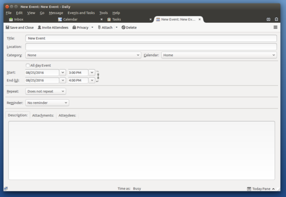
A lot has happened over the last couple months. The big news is that I finished porting the current UI from the window dialog to a tab. Here’s a screenshot of this XUL-based implementation of the UI in a tab (click to enlarge):
Getting this working in a really polished way took more time than I anticipated, largely because the code had to be refactored so that the majority of the UI lives inside an iframe. This entailed using asynchronous message passing for communication between the iframe’s contents and its outer parent context (e.g. toolbars, menus, statusbar, etc.), whether that context is a tab or a dialog window. While this is not a visible change, it was necessary to prepare the way for the new HTML-based design, where an HTML file will be loaded in the iframe instead of a XUL file.
Along with the iframe refactoring, there are also just a lot of details that go into providing an ideal user experience, all the little things we tend to take for granted when using software. Here’s a list of some of these things that I worked on over the last months for the XUL implementation:
- when switching tabs, update the toolbar and statusbar to reflect the current tab
- persist open tabs across application restarts (which requires serializing the tab state)
- ask the user about saving changes before closing a tab, before closing the application window, and before quitting the application
- allow customizing toolbars with the new iframe setup
- provide a default window dialog height and width with the new iframe setup
- display icons for tabs and related CSS/style work
- get the relevant ‘Events and Tasks’ menu items to work for a task in a tab
- allow hiding and showing the toolbar from the view > toolbars menu
- if the user has customized their toolbar for the window dialog, migrate those settings to the tab toolbar on upgrade
- fix existing mozmill tests so they work with the new iframe setup
- test for regressions in SeaMonkey
In the next two posts I’ll describe how to try out this new feature in a development version of Thunderbird, discuss the HTML implementation of the new UI design, and share some thoughts on using React for the HTML implementation.
— Paul Morris
Tags: gsoc
